


 (4.9/5)


Transform Your Space: The Ultimate Guide to Wall Photos
Wall photos are not just visual decorations placed on empty surfaces. They are emotional anchors that quietly shape how a space feels, how people interact within it, and how memories are preserved in daily life. A room without meaningful imagery often feels unfinished, as though something essential to human presence is missing. When photographs are introduced onto walls, they change that feeling completely by adding identity, warmth, and emotional depth.
Unlike furniture or paint, wall photos carry lived experience. Each image contains a moment, a memory, or a perspective that once mattered enough to be captured. When displayed, these moments are no longer stored away in devices or albums but become part of everyday life. They turn walls into storytelling surfaces that reflect personality and history without needing explanation.
The emotional impact of wall photography extends beyond personal memories. Even images without personal connection—such as landscapes, abstract compositions, or architectural photography—can influence mood and perception. A calm beach scene can soften a stressful environment, while bold urban imagery can energize a workspace. In this way, wall photos do not simply decorate a room; they actively shape emotional atmosphere.
Understanding the Space Before Adding Visual Elements
Before placing any photograph on a wall, it is essential to understand the space itself as a living visual environment. Every room has its own rhythm, purpose, lighting behavior, and architectural character. Ignoring these factors often leads to displays that feel disconnected or visually overwhelming.
The function of a room should guide the tone of the photography. Living rooms, which are often shared social spaces, benefit from imagery that encourages connection and openness. Bedrooms, which are more private, often work better with calming and reflective visuals. Hallways and transitional areas offer opportunities for storytelling sequences that guide movement through the home.
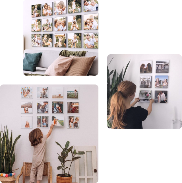
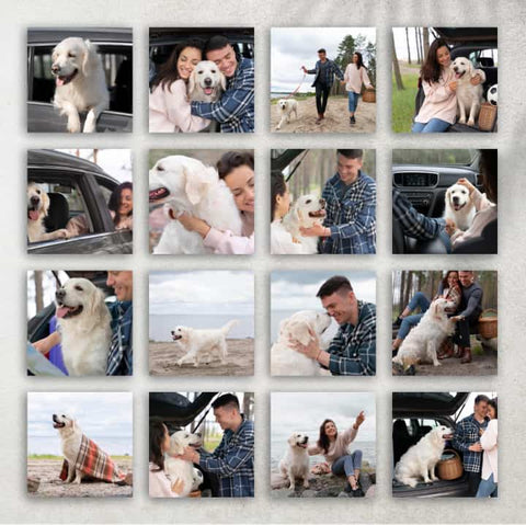
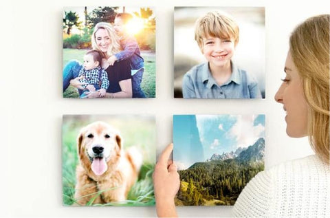
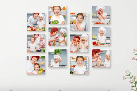
Wall size is another crucial consideration. Large empty walls naturally invite bold compositions or oversized statement pieces. These areas can handle strong visual presence without feeling crowded. In contrast, smaller walls require restraint, where fewer images or minimal arrangements maintain clarity and prevent visual noise.
Lighting conditions play a major role in how photographs are experienced. Natural light can enhance texture and depth, but it may also create glare depending on placement. Artificial lighting introduces consistency but can alter color perception. Observing how light moves through a space during different times of day helps determine where images will appear most effective.
Architectural features such as windows, doors, and built-in structures also influence placement. Wall photos should complement these elements rather than compete with them. When photographs are aligned thoughtfully with architecture, the entire space feels more intentional and cohesive.
Selecting Photographs with Purpose and Intention
Choosing images for wall display is not simply about selecting visually appealing photographs. It is about curating a set of visuals that work together to create meaning within a space. Each image should serve a purpose, whether emotional, aesthetic, or structural within the composition.
Some photographs are designed to act as focal points. These are typically strong, visually compelling images that draw attention immediately. Others serve as supporting visuals, helping to balance composition or guide the viewer’s eye across a wall arrangement. Understanding this hierarchy is essential when building a cohesive display.
Portrait photography often introduces intimacy into a space. Human expressions, gestures, and emotions create a sense of connection that can make rooms feel more personal. Landscape photography, on the other hand, expands visual perception. It creates depth and openness, which is especially useful in compact or enclosed spaces.
Black-and-white photography offers timeless versatility. By removing color distraction, it emphasizes composition, contrast, and emotional tone. This makes it suitable for nearly any interior style, from modern minimalism to traditional environments. Color photography, however, brings vibrancy and energy, allowing rooms to feel more dynamic and expressive.
A well-curated selection does not require uniformity. In fact, variety often strengthens visual interest. What matters is cohesion, whether through shared tones, themes, or emotional resonance. Even diverse images can feel unified when they are intentionally selected to complement one another.
Composition as the Foundation of Visual Harmony
Composition determines how wall photos interact with each other and with the surrounding space. When multiple images are displayed together, their arrangement becomes just as important as the images themselves.
Symmetry creates order and stability. It is often used in spaces that require a sense of calm structure, such as formal living rooms or office environments. Symmetrical arrangements feel balanced and predictable, which can be visually comforting.
Asymmetry introduces movement and energy. It allows images to vary in placement while still maintaining visual harmony. This style often feels more natural and dynamic, making it suitable for creative or informal spaces.
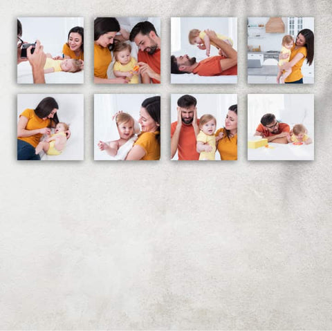
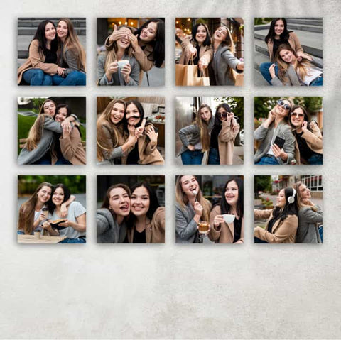
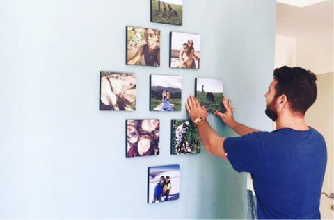
Spacing between images is a subtle but powerful design tool. Tight spacing creates unity, making multiple photographs feel like a single visual piece. Wider spacing allows each image to stand independently, emphasizing individuality. The choice between these approaches depends on whether the goal is cohesion or distinction.
Scale variation also plays an important role. Combining large and small frames can guide the viewer’s attention across the wall in a controlled rhythm. However, without careful balance, scale variation can create visual confusion. A successful composition ensures that no single element feels disconnected from the overall structure.
The wall itself should be treated as a canvas rather than a background. Each photograph contributes to a larger visual experience, and the arrangement should guide the viewer’s eye naturally across the space.
Framing as a Design Language
Frames are not merely protective borders for photographs. They are design elements that influence how images are perceived and how they integrate into interior spaces. The same photograph can feel completely different depending on its framing style.
Minimal frames create a subtle and modern aesthetic. They allow the photograph to remain the primary focus while providing structure. These are often used in contemporary interiors where simplicity is valued.
More substantial or decorative frames introduce presence and formality. They can make images feel more like gallery pieces or artistic statements. These frames are often suitable for traditional or classic interior styles.
Material choice further influences perception. Wooden frames introduce warmth and natural texture, blending well with organic or rustic environments. Metal frames create a sleek and contemporary feel, often aligning with modern or industrial spaces.
Matting adds another layer of visual depth. By creating space between the photograph and the frame, it isolates the image and enhances focus. This technique is especially effective for detailed photographs or images with strong contrast.
Frames should always support the image rather than dominate it. Their purpose is to enhance presentation and ensure that photographs integrate smoothly into the surrounding environment.
Establishing Visual Focus Within a Room
Every well-designed space benefits from a focal point, and wall photography is one of the most effective ways to establish it. A focal point serves as the primary visual anchor of a room, drawing attention and setting the emotional tone of the environment.
A single large photograph can function as a powerful focal point. When placed strategically, it immediately captures attention and defines the character of the space. This approach works particularly well in living rooms or entry areas where first impressions matter.
Alternatively, a carefully arranged group of photographs can also serve as a focal point. In this case, the arrangement itself becomes the central visual feature. Consistency in framing, spacing, or theme helps unify the display and strengthen its impact.
Placement is essential when creating a focal point. The most effective locations are areas naturally visible upon entering a room or directly aligned with seating arrangements. The goal is to guide attention without forcing it.
A strong focal point should not compete with other visual elements in the space. Instead, it should anchor the room and provide a sense of structure that supports the overall design.
The Role of Color in Spatial Atmosphere
Color in wall photography plays a significant role in shaping mood and spatial perception. It can either harmonize with existing interior elements or introduce contrast that energizes the environment.
Warm colors such as reds, oranges, and yellows tend to create feelings of comfort and energy. These tones work well in social spaces where interaction and activity are encouraged. They bring visual warmth that can make a room feel more inviting.
Cool colors like blues and greens introduce calmness and balance. They are often used in private spaces such as bedrooms or reading areas where relaxation is important. These tones help reduce visual tension and create a soothing atmosphere.
Neutral tones offer flexibility. They adapt easily to different interior styles and allow other design elements to stand out. Black-and-white imagery functions as a universal visual language, connecting diverse styles without conflict.
Color coordination does not require exact matching with furniture or walls. Instead, it is about creating visual relationships. A photograph might subtly echo an accent color in the room or intentionally contrast with surrounding tones to create emphasis.
When used thoughtfully, color becomes a powerful tool for shaping emotional and visual harmony within a space.
Creating Flow Across Connected Interior Spaces
In homes with open layouts or interconnected rooms, wall photos can be used to create visual continuity. Instead of treating each wall independently, it is more effective to think of the entire space as a connected visual journey.
A sequence of related photographs can guide movement from one area to another. This does not require identical images but rather a shared theme or visual language. Consistency in tone, subject matter, or framing can create this sense of flow.
For example, a series of nature-inspired photographs might begin with coastal imagery in one area and transition into forest scenes in another. The connection lies in the overarching theme rather than exact repetition.
This approach helps unify large or open spaces, preventing them from feeling fragmented. It also enhances the experience of moving through the environment, making the home feel more intentional and cohesive as a whole.
Building Narrative Through Wall Photography
Wall photography becomes significantly more powerful when it moves beyond decoration and starts functioning as a form of visual storytelling. Instead of treating each image as an isolated piece, narrative-based arrangements allow photographs to work together as chapters in a larger story that unfolds across the wall.
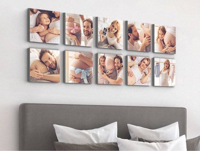
This narrative can be literal or abstract. A literal narrative might follow personal experiences such as travel journeys, family milestones, or evolving life stages. Each photograph becomes a documented moment, and together they create a timeline that reflects growth and memory.
An abstract narrative, however, focuses more on emotion than chronology. It might begin with calm, minimal imagery and gradually transition into more vibrant or energetic visuals. The story here is not about events but about emotional progression, guiding the viewer through shifting moods as they move across the wall.
The strength of narrative wall photography lies in transitions. When images shift too abruptly in tone, color, or subject, the story feels fragmented. But when transitions are gradual and intentional, the viewer experiences continuity. This creates a sense of flow that transforms a static arrangement into a living visual experience.
Creating Depth Through Spatial Layering
Depth in wall photography does not rely on physical dimensions but on visual perception. Through careful arrangement, images can appear layered, dynamic, and multidimensional even on a flat surface.
One effective method of creating depth is vertical variation. Instead of aligning every photograph at the same height, varying placement introduces movement and rhythm. Higher and lower positioning encourages the eye to travel across the wall in multiple directions, creating a more immersive viewing experience.
Another approach involves grouping density. When images are clustered closely together in certain areas and spaced out in others, a natural contrast emerges between visual intensity and visual calm. This interplay between dense and open space creates a sense of breathing within the arrangement.
Depth can also be suggested through directional alignment. When photographs share visual lines—such as horizons, architectural angles, or movement direction—the eye unconsciously connects them. These invisible pathways create continuity across separate frames.
Layering is ultimately about guiding perception. A well-layered wall does not feel flat or static; it feels like it has movement, rhythm, and dimension.
Aligning Wall Photos with Architectural Structure
One of the most overlooked aspects of wall photography design is its relationship with architecture. Walls are not blank canvases; they are part of a structured environment with lines, proportions, and built-in features that influence how visuals should be placed.
Aligning photographs with architectural elements creates harmony. For example, arranging images along the horizontal line of a shelf or window frame helps integrate them into the room rather than making them appear like separate additions. Vertical alignment with structural columns or edges can reinforce stability and balance.
Staircases offer a unique opportunity for dynamic arrangement. Placing images that follow the upward movement of stairs creates a visual rhythm that mirrors physical movement through the space. This transforms a transitional area into a storytelling corridor.
In rooms with irregular shapes or asymmetrical layouts, wall photography can help restore visual balance. Strategic placement can visually counteract uneven proportions or emphasize unique architectural features instead of hiding them.
Equally important is the use of negative space. Empty wall areas are not wasted space; they provide breathing room that enhances the impact of surrounding images. Thoughtful use of emptiness prevents visual overload and allows photographs to stand out more clearly.
Minimalist Wall Photo Styling and Its Impact
Minimalist wall photography focuses on clarity, restraint, and intentional placement. Instead of filling a wall with multiple images, minimalism emphasizes fewer elements with stronger visual presence.
A single large photograph placed on a wide, empty wall can create a powerful focal point. The surrounding negative space amplifies its importance, allowing the viewer to focus entirely on the image without distraction. This approach often creates a sense of calm and sophistication.
Minimalist group arrangements follow similar principles. Even when multiple photographs are used, they are carefully spaced and aligned to maintain simplicity. The goal is not quantity but coherence. Each image must contribute meaningfully to the overall composition.
Minimalism also depends heavily on consistency. Frames, spacing, and visual tone are often unified to avoid fragmentation. When executed properly, minimalist wall photography creates a clean and balanced atmosphere that feels intentional and refined.
The emotional effect of minimalism is often subtle but strong. It reduces visual noise and allows the mind to rest, making it especially effective in environments meant for relaxation or focus.
Expressing Identity Through Curated Visual Themes
Wall photography often serves as an extension of personal identity. The images chosen for display reflect interests, memories, values, and emotional tendencies. When curated intentionally, wall photos become a visual representation of who someone is.
Some people gravitate toward travel-themed imagery that reflects exploration and movement. These collections often include landscapes, cityscapes, and cultural scenes that represent different experiences and journeys.
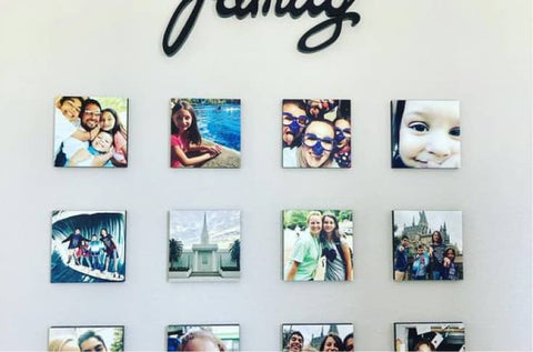
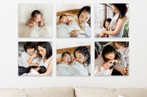
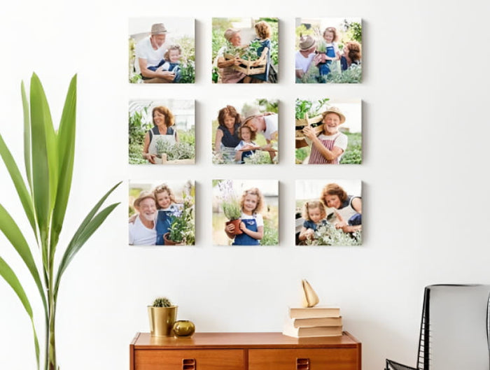
Others prefer family-centered photography that highlights relationships and personal milestones. These images create a sense of belonging and emotional continuity within the home environment.
Artistic and abstract themes allow for creative expression without direct representation. Shapes, textures, and conceptual imagery can communicate mood and personality in a more interpretive way.
Nature-based themes are also widely used because they offer emotional balance. Forests, oceans, mountains, and natural patterns create a sense of calm and grounding that integrates easily into most interiors.
The most compelling thematic arrangements are not rigid. They allow variation within a shared concept, creating richness while maintaining coherence. Over time, these themes can evolve naturally as experiences and preferences change.
The Strategic Use of Contrast in Visual Design
Contrast is one of the most effective tools in wall photography composition. It creates interest, emphasizes differences, and guides visual attention across an arrangement.
Color contrast is the most immediate form. Placing warm-toned images alongside cool-toned ones creates visual tension that draws attention to both. This technique can energize a space and prevent monotony.
Subject contrast introduces conceptual variety. Combining urban environments with natural landscapes, or human portraits with abstract forms, creates a layered visual dialogue. The contrast encourages the viewer to engage more deeply with each image.
Scale contrast is equally powerful. Large and small photographs placed together create hierarchy and rhythm. Larger images dominate attention, while smaller ones provide detail and support.
Framing contrast can also be used strategically. Mixing modern minimal frames with more traditional or textured ones introduces complexity. However, this must be done carefully to avoid visual confusion.
When used with intention, contrast does not create chaos. Instead, it builds structure, rhythm, and depth within the arrangement.
Designing Large Wall Spaces with Emotional Balance
Large walls present unique challenges in wall photography design. Without structure, they can feel empty and disconnected. With too many elements, they can become overwhelming and visually exhausting.
The key to designing large walls is emotional balance. This involves controlling how visual weight is distributed across the surface. Heavy focal points should be balanced with lighter, more open areas to prevent visual congestion.
Dividing large walls into zones is one effective approach. Each zone can serve a different visual purpose, such as a focal cluster, a supporting sequence, or an open breathing space. This creates structure without rigid symmetry.
Rhythm is another important factor. Instead of evenly distributing images, thoughtful variation in spacing and grouping creates a natural flow. Some areas may feel dense and active, while others remain quiet and open.
This rhythm mirrors natural visual behavior, where the eye moves between points of interest and rest. When applied correctly, large walls feel intentional, comfortable, and visually engaging.
Rotational Adaptation of Wall Photography
Wall photography is not a static design element. It can evolve over time as environments, preferences, and lighting conditions change. This adaptability allows spaces to remain fresh and visually relevant.
One approach to adaptation is periodic rotation of images. Changing the placement or grouping of photographs can significantly alter the feel of a room without introducing new content. Even small adjustments can refresh visual energy.
As interior design elements such as furniture or color schemes change, wall photography can be repositioned to maintain harmony. This flexibility ensures that the visual environment remains cohesive over time.
Seasonal adaptation is also possible. Different images can be emphasized depending on mood or time of year, allowing the space to reflect changing atmospheres.
This dynamic approach transforms wall photography from a fixed installation into an evolving design system that grows with its environment.
Emotional Rhythm Across Expansive Walls
Emotional rhythm refers to how visual intensity shifts across a large wall space. Without rhythm, a wall can feel either too chaotic or too flat. With rhythm, it becomes dynamic and engaging.
One method of creating rhythm is alternating between dense and open areas. Clusters of images generate visual energy, while empty or minimal sections provide rest. This balance prevents fatigue and maintains viewer engagement.
Another method involves progressive sequencing. Images can gradually shift in tone, color, or subject matter across the wall, creating a subtle emotional journey. This technique works especially well in storytelling arrangements.
Rhythm is not about uniformity but about controlled variation. It ensures that the viewer’s attention moves naturally without becoming overwhelmed or disoriented.
Integrating Wall Photography into Whole-Home Design
When wall photography is considered across an entire home rather than individual rooms, it becomes part of a broader visual ecosystem. Each space contributes to an overall aesthetic language while maintaining its own identity.
Consistency can be achieved through shared tones, framing styles, or thematic connections. This creates continuity as people move through different areas of the home.
At the same time, variation is essential. Each room should have its own emotional identity, shaped by the type and arrangement of photographs it contains. This balance between unity and individuality creates depth in the overall design.
Wall photography, when thoughtfully integrated across multiple spaces, becomes more than decoration. It becomes a continuous visual narrative that shapes how a home is experienced, remembered, and emotionally understood.
Conclusion
Wall photography holds a unique place in interior design because it connects visual aesthetics with personal meaning in a way few other elements can achieve. It transforms plain surfaces into expressive environments that reflect identity, memory, and emotion. When thoughtfully selected and arranged, wall photos do more than decorate a space—they shape how that space is experienced on a daily level.
The impact of wall photography is not limited to visual appeal. It influences mood, supports emotional balance, and creates a sense of belonging within a room. A well-curated arrangement can make a home feel calmer, more energetic, or more intimate depending on the intention behind it. This flexibility allows wall photos to adapt naturally to different lifestyles and environments.
What makes wall photography especially powerful is its ability to evolve. As people change, grow, and accumulate new experiences, their visual surroundings can shift alongside them. This makes wall displays living elements of interior design rather than fixed decorations. Over time, they become layered records of personal journey and aesthetic expression.
Ultimately, transforming a space with wall photos is about more than arrangement or style. It is about creating environments that feel meaningful, balanced, and emotionally connected—spaces where visuals are not just seen, but felt as part of everyday life.