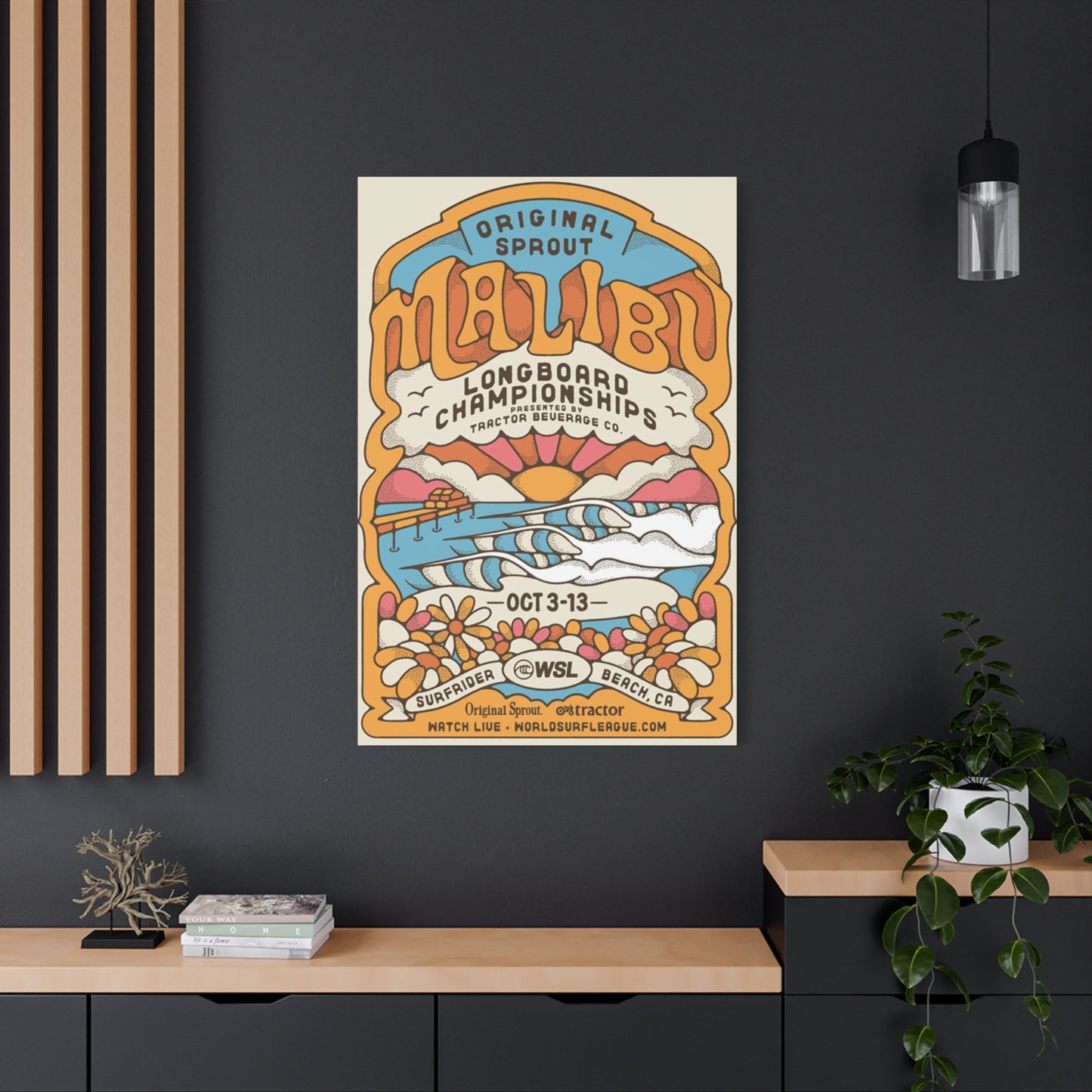
Malibu Surf Poster Wall Art & Canvas Prints
Malibu Surf Poster Wall Art & Canvas Prints
Couldn't load pickup availability
Vintage Malibu Surf Poster Wall Art: Bringing Coastal Wave Riding Culture Into Your Living Space
The allure of ocean waves crashing against sandy shores has captivated humanity for centuries, and nowhere is this fascination more beautifully expressed than through vintage coastal artwork celebrating the surf culture of California's most iconic beaches. When you think about decorating your home or workspace with pieces that tell a story, evoke memories, and transport you to sun-drenched coastlines, few options compare to authentic Malibu surf poster wall art. These visual representations of wave riding culture don't merely serve as decorative elements; they embody an entire lifestyle, a philosophy of freedom, and a connection to nature that resonates deeply with enthusiasts and casual admirers alike.
The phenomenon of surf-themed artwork has evolved dramatically over the decades, transforming from simple promotional materials into highly sought-after collectibles that command attention in galleries, homes, and commercial spaces worldwide. What makes these pieces particularly compelling is their ability to capture a specific moment in time while simultaneously feeling timeless and relevant to contemporary audiences. The imagery typically associated with these posters—golden beaches, turquoise waters, silhouetted riders against spectacular sunsets—speaks to something primal within us, a yearning for adventure, simplicity, and communion with natural forces that seem increasingly rare in our modern, digitally-dominated existence.
How Coastal Wave Riding Imagery Emerged As A Distinct Artistic Movement In Southern California
The genesis of surf-themed visual art can be traced back to the early twentieth century when Hawaii's ancient practice of wave riding began spreading to mainland shores. Initially, documentation of this aquatic pursuit existed primarily in the form of photographs and primitive film reels, capturing the daring exploits of pioneering riders who challenged the ocean's power with wooden boards and sheer determination. However, as the 1950s arrived and post-war prosperity enabled more leisure time and recreational pursuits, a cultural shift began taking place along the Pacific coastline.
Southern California, with its abundant sunshine, consistent swells, and proximity to Hollywood's creative industries, became the epicenter of a burgeoning subculture that would eventually influence music, fashion, language, and visual arts on a global scale. Small surf shops began commissioning local artists to create promotional materials—posters, handbills, and advertisements—that would attract customers and communicate the excitement of their products. These early efforts were often crude by contemporary standards, featuring bold lettering and simplistic illustrations, but they possessed an authentic energy that captured the raw enthusiasm of participants in this growing movement.
As the 1960s dawned, the aesthetic began maturing. Artists with formal training started recognizing the commercial and creative potential of surf-themed work. They brought sophisticated techniques borrowed from fine art traditions, combining them with the rebellious spirit and vibrant energy characteristic of youth culture during that era. The result was a distinctive visual language that balanced commercial appeal with artistic integrity, creating images that functioned simultaneously as advertisements and standalone works worthy of appreciation.
Malibu, specifically, emerged as a legendary location within this cultural landscape. Its perfect point break, relatively gentle waves suitable for beginners yet challenging enough for experts, and proximity to Los Angeles made it a gathering place for riders from diverse backgrounds. The beach became synonymous with a particular style of riding—smooth, flowing, and graceful—that contrasted with the aggressive approach favored at other locations. Artists capturing Malibu's essence naturally gravitated toward imagery that reflected this elegance: long, sweeping lines suggesting the arc of a ride, warm color palettes evoking endless summer days, and compositions emphasizing the harmony between rider and ocean rather than conquest or domination.
Discovering The Visual Elements That Define Authentic Vintage Surf Artwork From Malibu's Golden Era
When examining genuine vintage pieces from Malibu's most celebrated period—roughly spanning from the late 1950s through the early 1970s—certain visual characteristics emerge consistently, creating a recognizable aesthetic that contemporary reproductions attempt to emulate with varying degrees of success. Understanding these elements enables collectors and enthusiasts to distinguish authentic period pieces from modern interpretations, though both can certainly have value and appeal depending on one's objectives.
Typography in vintage surf posters typically reflects the broader design trends of their creation period. Mid-century examples often feature bold, sans-serif fonts with thick strokes and minimal ornamentation, occasionally incorporating hand-lettered elements that give them a personal, handcrafted quality. The lettering might reference location names, event details, or brand identities, but it invariably possesses a casual, approachable character that aligns with the laid-back ethos of beach culture. Color choices in typography tend toward high-contrast combinations—think vibrant yellows against deep blues, or crisp whites against sunset oranges—ensuring readability even from a distance while contributing to the overall visual impact.
Compositionally, authentic vintage surf posters often employ asymmetrical layouts that create visual interest and movement. Rather than centering every element predictably, designers of that era frequently placed focal points off-center, allowing negative space to breathe and guide the viewer's eye through the image in a manner that mimics the flowing, unpredictable nature of waves themselves. This approach contrasts sharply with more rigid, corporate design sensibilities, emphasizing spontaneity and organic beauty.
Color palettes deserve particular attention when analyzing vintage surf artwork. The predominant hues typically mirror the natural environment of coastal Southern California: azure blues representing ocean and sky, golden yellows and warm oranges suggesting sun and sand, occasional greens invoking palm fronds and coastal vegetation. However, these weren't merely literal representations; artists often intensified and stylized these colors, pushing them toward saturation levels that created an idealized, almost dreamlike quality. The resulting images didn't so much document reality as capture the emotional essence of the surfing experience—that heightened state of joy and exhilaration that participants associate with perfect conditions and memorable rides.
Figurative elements in vintage Malibu surf posters range from highly detailed, realistic depictions of riders and equipment to stylized silhouettes that reduce forms to their essential shapes. The silhouette approach proved particularly popular because it solved several creative challenges simultaneously: it simplified reproduction processes (important when working with limited printing technologies), created striking visual contrast, and possessed a universal quality that allowed viewers to project themselves into the scene rather than viewing a specific, identifiable individual. These shadow figures became iconic, representing not just one rider but the entire community and the shared experience of engaging with oceanic forces.
Exploring Various Categories And Styles Within Surf-Themed Wall Decoration Options
The world of surf-themed wall art encompasses far more diversity than casual observers might initially recognize. While vintage-style posters celebrating Malibu remain perhaps the most iconic category, numerous subcategories and variations exist, each appealing to different aesthetic preferences and serving various decorative purposes. Understanding this range allows you to make more informed decisions when selecting pieces for your space.
Photographic prints represent one major category, capturing actual moments of riders in action, beach scenes at various times of day, or detailed close-ups of wave formations. The advantage of photographic work lies in its documentary quality—these images demonstrate what actually occurred at specific moments, preserving historical record alongside aesthetic appeal. Black and white photography from the 1960s and 1970s, in particular, possesses a timeless quality that translates beautifully to contemporary interiors, the absence of color forcing viewers to focus on form, composition, light, and shadow.
Illustrated posters constitute another significant category, ranging from highly realistic paintings reproduced in poster format to stylized, graphic interpretations that emphasize design elements over literal representation. Some of the most sought-after vintage pieces fall into this category, created by talented commercial artists who brought fine art sensibilities to promotional work. These illustrations often feature exaggerated perspectives, dramatic compositions, and imaginative color choices that elevate them beyond simple documentation.
Abstract and minimalist interpretations have grown increasingly popular in recent years, particularly among those seeking to incorporate surf culture references into modern, contemporary interiors where overtly nostalgic or busy imagery might clash with existing design schemes. These pieces might reduce recognizable surf imagery to basic geometric shapes, use limited color palettes, or focus on texture and form rather than representational content. A minimalist poster might feature nothing more than a single curved line suggesting a wave's profile, yet immediately communicate its thematic focus to informed viewers.
Typography-focused designs represent yet another approach, where words and letters become the primary visual elements. These might feature inspirational quotes associated with surf culture, location names rendered in distinctive fonts, or even individual words like "Malibu" treated as the sole content. When executed skillfully, these text-based designs can be remarkably effective, especially in spaces where overly busy or colorful imagery would overwhelm.
Mixed media pieces, though less common in mass-produced formats, combine multiple approaches—perhaps pairing vintage photographs with hand-drawn elements, incorporating actual materials like weathered wood or rope into framed presentations, or layering different printing techniques to create depth and texture. These more complex works often function as transitional pieces between purely decorative posters and fine art, commanding higher prices while offering unique visual experiences.
Methods For Incorporating Ocean Wave Artwork Into Diverse Interior Design Schemes
Successfully integrating surf-themed artwork into your living or working environment requires more than simply hanging a poster on an empty wall. Thoughtful consideration of existing design elements, spatial relationships, lighting conditions, and intended atmosphere ensures these pieces enhance rather than conflict with their surroundings. Whether you're creating a dedicated space celebrating coastal culture or subtly introducing oceanic references into an otherwise unrelated design scheme, strategic placement and thoughtful curation make all the difference.
In residential settings, living rooms and family gathering spaces offer excellent opportunities for displaying larger, statement-making pieces. A substantial vintage-style Malibu surf poster positioned above a sofa or fireplace immediately establishes a focal point and sets the tonal character for the entire room. When pursuing this approach, consider the color palette of the artwork in relation to existing furnishings. If your space features neutral tones—grays, whites, beiges—a poster with vibrant blues and oranges provides striking contrast without clashing. Conversely, if your room already incorporates bold colors, you might select artwork that either complements existing hues or introduces a deliberately contrasting element that creates visual interest through juxtaposition.
Bedroom environments benefit from surf imagery's inherently calming associations. The ocean's rhythmic nature, the sense of escape and tranquility that beaches evoke, and the generally horizontal compositions common in coastal artwork all contribute to creating restful atmospheres conducive to relaxation. Consider positioning surf posters where they're visible upon waking—perhaps on the wall opposite the bed—so the first image you encounter each morning carries these positive associations. Alternatively, creating a gallery wall of multiple smaller pieces allows you to build a more comprehensive visual narrative, perhaps combining different eras, styles, or specific locations along the California coast.
Home offices present interesting opportunities for incorporating surf-themed elements. For many people, these images represent not just aesthetic preferences but also values—freedom, adventure, connection with nature—that contrast with the constraints and stresses of professional responsibilities. Having these visual reminders within your work environment can serve as psychological touchstones, brief mental escapes during challenging moments. In this context, you might select pieces with particularly aspirational qualities—images of perfect waves, empty lineups, or sunset sessions—that represent the experiences you're working toward enjoying during leisure time.
Commercial spaces like surf shops, beach-adjacent restaurants, cafes, or hospitality venues naturally accommodate and indeed benefit from surf-themed artwork. In these contexts, authenticity becomes paramount. Customers and visitors to these establishments often possess considerable knowledge about surf culture and can readily distinguish genuine vintage pieces or quality reproductions from generic, mass-produced alternatives that lack connection to actual surf history or locations. Investing in authentic or carefully curated artwork signals respect for the culture and creates environments that feel legitimate rather than contrived.
Unexpected spaces can also successfully incorporate surf imagery with thoughtful execution. Bathrooms, for instance, already possess thematic connections to water, making them surprisingly appropriate locations for ocean-related artwork. Hallways and transitional spaces benefit from visual interest that doesn't require prolonged contemplation—surf posters can fulfill this role admirably, providing attractive eye-catching elements for areas where people pause briefly. Even kitchens, particularly those with coastal or casual design schemes, can accommodate smaller surf-themed pieces that contribute to an overall sense of relaxed, beach-influenced living.
Guidance For Selecting Authentic Versus Reproduction Surf Posters And Assessing Their Value
The marketplace for surf-themed artwork includes genuine vintage pieces from the 1950s through 1970s, licensed reproductions of classic designs, unlicensed copies of varying quality, and entirely new creations emulating vintage aesthetics. Each category serves different purposes and appeals to different collectors, but understanding the distinctions helps ensure you acquire what you actually intend to purchase and pay appropriate prices.
Authentic vintage posters—those created during the actual era they depict—have become increasingly scarce and consequently more valuable over the past two decades. These pieces were often produced in limited quantities for specific purposes like promoting contests, advertising products, or decorating surf shops. They weren't initially conceived as lasting art objects, so survival rates were relatively low. Many were destroyed through ordinary use, exposure to sun and moisture in coastal environments, or simple neglect. Those remaining often show their age through discoloration, tears, creases, or fading, characteristics that paradoxically can enhance rather than diminish their appeal to serious collectors who value patina as evidence of authenticity.
When evaluating potentially authentic vintage pieces, several factors warrant examination. Printing techniques offer significant clues—older posters typically employed screen printing or offset lithography, creating characteristic texture and color application patterns distinct from modern digital printing. Paper quality and aging patterns also reveal age; vintage papers yellow predictably, often showing foxing (small brown spots caused by oxidation), and possess different tactile qualities than contemporary stocks. Provenance documentation, when available, substantially increases confidence and value. If you can trace a poster's history—perhaps it comes from the collection of a former surf shop owner or well-known rider—that documented connection to surf culture history makes it significantly more desirable.
Licensed reproductions serve an important market function, making classic designs accessible to enthusiasts who either cannot afford or choose not to pursue increasingly expensive originals. Reputable publishers working with rights holders or estates of deceased artists produce these pieces, ensuring proper attribution and quality control. While lacking the mystique and investment potential of authentic vintage items, quality licensed reproductions can be visually indistinguishable from originals when properly framed and displayed, offering excellent aesthetic value at more approachable price points.
Unlicensed reproductions occupy a more problematic category. These pieces copy classic designs without permission, offering no compensation to original creators or rights holders and often misrepresenting their origins to uninformed buyers. Beyond the ethical concerns, these items typically suffer from quality issues—inferior printing techniques, inaccurate colors, and poor paper choices that undermine the visual impact of the original designs. Experienced collectors can usually identify these copies through careful examination, but casual buyers may find themselves misled.
Contemporary artists creating new work inspired by vintage surf aesthetics represent another category entirely. These pieces don't claim to be vintage but rather draw inspiration from that era while incorporating modern sensibilities and techniques. The best contemporary surf artists develop distinctive personal styles that honor tradition while bringing fresh perspectives. Their work appeals particularly to those who appreciate vintage aesthetics but prefer supporting living artists and acquiring pieces with contemporary relevance.
Price considerations vary dramatically across these categories. Authentic vintage posters from notable artists or featuring particularly iconic imagery can command thousands of dollars, especially if in excellent condition with documented provenance. Licensed reproductions typically range from modest sums to several hundred dollars depending on print quality, edition size, and publisher reputation. Unlicensed copies usually occupy the lowest price tier, though their lack of legitimacy makes even bargain prices questionable value. Contemporary original works vary based on artist reputation and piece uniqueness, ranging from affordable to quite expensive for established creators.
Framing Strategies That Enhance And Preserve Surf-Themed Visual Artwork
The manner in which you frame and present surf posters significantly impacts both their visual effectiveness and long-term preservation. While simply thumbtacking a poster directly to drywall might suffice for temporary situations, proper framing transforms a mere poster into a considered design element that commands respect and protects your investment over time.
Frame selection begins with considering the artwork's inherent characteristics and the environment where it will be displayed. Vintage-style surf posters often benefit from frames that acknowledge their period origins without overwhelming their visual content. Simple wooden frames in natural finishes or painted white establish a casual, beach-appropriate feel that complements rather than competes with the imagery. Black frames offer more dramatic contrast and work particularly well when you want the artwork to make a bold statement against lighter-colored walls. Metal frames, especially in brushed aluminum or chrome finishes, can work beautifully with more graphic, stylized surf posters, lending a slightly industrial edge that plays interestingly against the organic subject matter.
Matting decisions similarly influence presentation significantly. A mat creates visual breathing room between the artwork and frame, preventing the image from feeling cramped or claustrophobic within its borders. For surf posters, mat colors typically reference either natural elements or emphasize specific colors within the artwork. White and off-white mats provide clean, classic presentations that work in virtually any context. Sand-colored or cream mats introduce subtle warmth that echoes beach environments. You might also select mat colors that pull specific hues from the poster itself—perhaps a deep blue mat echoing ocean tones, or a coral mat picking up sunset accents—creating cohesive color relationships between presentation elements and content.
Glazing choices—the transparent material protecting the poster's surface—involve balancing protection, aesthetics, and budget. Standard glass offers basic protection at minimal cost but provides no UV filtering, meaning prolonged exposure to direct sunlight will gradually fade your poster's colors. This presents particular concerns for vintage pieces whose value depends partly on color preservation. UV-filtering glass substantially reduces fading risk, extending the life of your artwork significantly. While more expensive than standard glass, the investment makes sense for valuable pieces or those displayed in bright environments. Acrylic glazing offers an alternative worth considering, particularly for larger pieces where glass weight becomes problematic or in situations where breakage concerns exist (children's rooms, earthquake-prone areas). Museum-quality acrylic provides UV protection comparable to specialty glass while remaining much lighter and more shatter-resistant.
Conservation considerations become paramount when framing authentic vintage pieces of significant value. Archival-quality mounting techniques avoid adhesives or materials that might damage the poster over time. Acid-free mats and backing boards prevent chemical reactions that cause yellowing and deterioration. Sealed frames with moisture barriers protect against environmental fluctuations. While these conservation-grade approaches increase framing costs, they're essential for preserving valuable originals. For reproductions and contemporary pieces, such extreme measures may be unnecessary unless you're particularly concerned with longevity.
Display location relative to light sources deserves careful thought. Direct sunlight, even through UV-filtering glazing, gradually affects artwork over years of exposure. If possible, position valuable pieces on walls that don't receive strong direct sun, or use window treatments to control exposure during peak hours. Artificial lighting requires similar consideration—spotlights and close-proximity fixtures generate heat that can accelerate deterioration. If you're using dedicated picture lighting, choose LED fixtures that emit minimal heat compared to traditional incandescent or halogen alternatives.
Creating Cohesive Gallery Arrangements With Multiple Surf-Themed Pieces
While a single striking poster can function effectively as a standalone focal point, arranging multiple pieces into cohesive gallery walls or groupings creates opportunities for more complex visual storytelling and dramatic impact. This approach allows you to explore variations on the surf theme, mix different styles and eras, and create customized arrangements perfectly scaled to your available wall space.
When planning gallery arrangements, begin by considering your overall concept. Will you pursue a highly curated approach where every piece relates closely to others in style, color palette, or subject matter? Or will you embrace eclecticism, deliberately mixing diverse elements unified only by their general surf-culture connection? Neither approach is inherently superior; the choice depends on your aesthetic preferences and the character of your space. Formal, carefully designed interiors often benefit from more controlled, cohesive gallery arrangements, while casual, bohemian environments can successfully accommodate more varied collections.
Layout planning traditionally begins on the floor rather than directly on walls. Lay out your intended pieces on the ground, experimenting with different configurations until you achieve pleasing balance and flow. This process allows unlimited experimentation without creating nail holes or marking walls. When evaluating potential arrangements, step back frequently to view the overall composition from distance, ensuring it reads as a unified whole rather than a collection of unrelated elements awkwardly clustered together.
Several organizational principles guide effective gallery arrangements. Symmetrical layouts, where pieces are arranged in balanced, predictable patterns, create formal, orderly impressions suitable for traditional interiors. A simple example might place four identically sized surf posters in a square grid, creating clean geometric order. Asymmetrical arrangements pursue visual balance through varied positioning rather than mirror-image symmetry, often feeling more dynamic and contemporary. You might cluster several smaller pieces on one side of an arrangement, balanced by a single larger piece on the opposite side—different in form but equivalent in visual weight.
Alignment strategies help create coherence across multiple pieces. Aligning the top edges of all frames in a row establishes a strong horizontal line that feels stable and organized. Alternatively, aligning center points—imagining a horizontal or vertical line running through the center of each piece—can unify items of different sizes. Some gallery arrangements abandon strict alignment entirely, using organic, salon-style hanging where pieces are positioned somewhat randomly but maintain consistent spacing between frames, creating energetic, collected-over-time impressions.
Color relationships between pieces influence overall success significantly. If your posters feature similar color palettes—perhaps all emphasizing blues and golds typical of Malibu imagery—the arrangement will naturally feel cohesive even if the specific images vary. When mixing pieces with more diverse color schemes, consider distribution carefully. Avoid clustering all your vibrant, warm-toned pieces in one area while grouping cooler pieces elsewhere; instead, distribute colors relatively evenly across the arrangement so the eye moves naturally around the entire composition.
Sizing variety adds visual interest while presenting compositional challenges. Gallery walls composed entirely of identically sized pieces can feel static and predictable, but mixing drastically different sizes requires careful balancing. A common approach establishes one or two larger pieces as anchors or focal points, surrounding them with smaller supporting elements that create rhythm without competing for attention. Maintain relatively consistent spacing between frames—typically 2-4 inches—regardless of frame sizes, creating visual breathing room while establishing that all pieces belong to a unified presentation.
Thematic narratives can guide selection and arrangement. You might create a gallery chronicling different aspects of surf culture—perhaps one poster featuring equipment like vintage boards, another capturing wave formations, a third showing the beach scene, and a fourth depicting riders in action. Alternatively, a geographical approach might showcase different renowned surf locations along the California coast, with Malibu as the centerpiece surrounded by Santa Cruz, Huntington Beach, and others. Chronological arrangements documenting the evolution of surf aesthetics across decades tell historical stories while displaying compelling visual variety.
Understanding The Cultural Significance Behind Malibu's Status As An Iconic Surf Destination
Malibu's reputation as perhaps the most legendary surf location in the continental United States wasn't accidental or arbitrary; specific geographical, social, and historical factors converged to establish this particular stretch of Southern California coastline as synonymous with a certain idealized vision of wave riding culture. Understanding this context enriches appreciation for artwork celebrating the location and explains why Malibu imagery continues resonating decades after the beach's golden era.
Geographically, Malibu Surfrider Beach possesses characteristics that make it exceptional for a particular style of wave riding. The point break configuration means swells wrap around the rocky point, creating long, relatively predictable waves that break progressively along the shore. This characteristic allows for extended rides—sometimes several hundred yards in optimal conditions—where riders can execute numerous maneuvers and develop flowing, graceful styles. The wave's relative gentleness compared to more powerful breaks makes it accessible to intermediate riders while still offering sufficient face for advanced maneuvers, creating an inclusive environment where people at various skill levels could participate simultaneously.
During the late 1950s and throughout the 1960s, Malibu became a convergence point for several overlapping communities. Local residents, many working in Hollywood's entertainment industry, discovered the beach as a nearby escape from urban pressures. Dedicated riders who traveled specifically to experience Malibu's waves came from throughout Southern California and eventually from around the world as the location's reputation spread. This mixing of locals and visitors, industry professionals and pure enthusiasts, created a uniquely vibrant social scene where ideas, styles, and personalities cross-pollinated.
The proximity to Hollywood proved particularly significant for establishing Malibu's iconic status. Filmmakers and photographers working in the entertainment industry brought professional-quality equipment to the beach, documenting the scene with production values far exceeding what might occur at more remote locations. Several influential surf films featured Malibu prominently, projecting images of the beach to audiences worldwide and establishing it as representing the quintessential California surf experience. Media attention created a feedback loop—fame attracted more participants, whose presence generated more media coverage, further amplifying the location's reputation.
Certain individuals became indelibly associated with Malibu during its golden era, their names and riding styles nearly synonymous with the location itself. These riders didn't just surf Malibu; they helped define what "surfing Malibu" meant, developing techniques and approaches that harmonized specifically with the wave's characteristics. Their influence extended beyond pure athletic performance into style, attitude, and philosophy, establishing templates that subsequent generations emulated and adapted.
The "Malibu style" itself became a recognized concept within surf culture—an approach emphasizing grace, flow, and harmony with the wave rather than aggressive, forceful riding. This aesthetic aligned with certain philosophical currents of the era, particularly as surf culture intersected with broader countercultural movements emphasizing natural living, rejection of competitive intensity, and seeking transcendent experiences through communion with natural forces. Riders at Malibu embodied these values, and the beach became identified not just as a physical location but as representing an entire worldview.
Commercial developments surrounding Malibu further cemented its legendary status. Surf shops in the area became gathering points and cultural institutions in their own right, places where equipment was sold but also where community formed, stories were exchanged, and cultural transmission occurred. The proximity to manufacturing centers meant new equipment designs and innovations often appeared first at Malibu, making it a trendsetting location where the sport's evolution could be observed firsthand.
As decades passed and surf culture matured, Malibu's significance evolved from current epicenter to historical touchstone. The location represents a mythological past—a time when the sport retained innocence and purity before commercialization, overcrowding, and professionalization transformed it into something more complex and arguably less pure. This nostalgic dimension explains why Malibu imagery remains so potent: it doesn't just depict a beach but evokes an entire era and value system that many feel has been lost or diminished.
Contemporary Malibu presents complications for this romantic narrative. The beach faces severe crowding, particularly during favorable conditions when lineups become dense with riders competing for limited waves. Parking difficulties, local politics regarding beach access, and the general realities of population growth in Southern California mean that experiencing Malibu today differs dramatically from accounts of earlier eras. Yet the power of the location's imagery and mythology persists precisely because it represents not present reality but an idealized past—or perhaps a timeless quality that transcends any specific era.
Analyzing Color Theory And Visual Composition In Classic Surf Poster Design
The most memorable and enduring surf posters succeed not merely because they depict appealing subject matter but because they employ sophisticated design principles that create visual impact and emotional resonance. Even pieces originally created as commercial promotional materials often demonstrate remarkable artistic sophistication when examined through formal compositional and color theory lenses.
Color psychology plays significant roles in surf poster effectiveness. Blue, the dominant hue in most ocean-themed artwork, carries associations of calmness, depth, stability, and transcendence. Different blue values communicate distinct qualities—deep navy suggesting mystery and power, bright azure conveying clarity and optimism, turquoise introducing tropical warmth. Skilled designers manipulate these associations deliberately, selecting specific blue values that align with their intended emotional impact.
Warm colors—yellows, oranges, reds—appear prominently in surf posters, typically representing sun, sand, and sunset conditions. These hues inject energy and excitement into compositions that might otherwise feel too cool or sedate if dominated exclusively by blues. The juxtaposition of warm and cool colors creates visual tension and vibrancy that attracts attention and maintains viewer interest. Classic Malibu sunset imagery exemplifies this principle, pairing golden-orange skies against deep blue water to create dramatic contrast that feels simultaneously natural and intensified beyond ordinary perception.
Color harmony strategies employed in successful surf posters often follow established principles while adapting them to specific subject matter. Analogous color schemes—using colors adjacent on the color wheel—create cohesive, harmonious compositions. A poster might employ various blues transitioning through blue-greens to capture the ocean's complexity while maintaining overall unity. Complementary color schemes—pairing opposites on the color wheel—generate maximum contrast and visual energy. Orange sunsets against blue water exemplify complementary harmony, each color making the other appear more intense through simultaneous contrast.
Compositional strategies in surf posters frequently employ diagonal lines and dynamic angles that suggest movement and energy. Rather than static horizontal compositions, effective posters often position waves, riders, or shorelines at angles that guide the eye through the image while conveying the kinetic excitement of the surf experience. The famous "rule of thirds"—dividing an image into a 3x3 grid and positioning key elements at intersection points—appears frequently in successful compositions, creating balanced asymmetry that feels more dynamic than simple centering.
Negative space—areas of a composition left relatively empty—functions critically in effective poster design. Rather than filling every millimeter with imagery or text, skilled designers understand that empty space provides visual rest, directs attention toward positive elements, and contributes to overall composition balance. In surf posters, negative space might represent vast sky or water, emphasizing the scale and power of natural forces while allowing focal elements like riders or waves to command attention without competing visual distractions.
Scale relationships between compositional elements communicate meaning beyond simple representation. A poster featuring a tiny silhouetted rider against a massive wave emphasizes human vulnerability and natural power, evoking awe and perhaps apprehension. Conversely, a composition showing the rider at larger scale relative to the wave suggests competence, control, and human capability, creating more confident, empowering impressions. These scale choices aren't neutral documentation but active rhetorical decisions that shape viewer responses.
Typography integrated into surf posters requires careful handling to complement rather than compromise visual imagery. The most successful pieces achieve seamless integration where text and image form unified compositions rather than appearing awkwardly cobbled together. This often means customizing or hand-lettering text specifically for each piece rather than simply overlaying generic fonts. Text placement follows compositional principles, respecting focal points and visual flow rather than arbitrarily occupying whatever space remains after imagery placement.
Texture, whether actual or implied, adds depth and visual interest to surf poster designs. Vintage screen-printing techniques created characteristic dot patterns and color overlays that produced distinctive tactile qualities, different from the smooth, continuous tones of photographic or digital prints. Contemporary artists sometimes deliberately replicate these textures to evoke authenticity and period feel, understanding that texture contributes significantly to overall vintage impression even if viewers don't consciously recognize this element.
Poster designs from this period reflect psychedelic influences bleeding over from broader counterculture movements—swirling patterns, vibrant or deliberately clashing colors, experimental typography, and compositions that bent or abandoned conventional rules. Even mainstream commercial surf posters incorporated elements of this experimental aesthetic, creating distinctive period pieces instantly recognizable today as products of their time.
Perspective and viewpoint choices establish relationship between viewer and subject. Eye-level perspectives create direct, relatable connections, positioning viewers as participants or observers at the beach. Elevated perspectives provide overview, suggesting contemplation or removed observation of the scene. Low angles looking up toward riders create dramatic, heroic impressions that emphasize skill and daring. These perspective choices guide how viewers emotionally engage with the imagery, subtly influencing interpretation and response.
Conclusion
Surf-themed artwork hasn't remained static over the decades; rather, it has evolved continuously, reflecting broader artistic movements, changing surf culture itself, and shifting aesthetic preferences across different generations. Tracing this evolution provides insights into both art history and the cultural transformations of wave riding communities.
The 1950s marked the earliest period of commercial surf artwork, though production remained relatively limited and primitive compared to later decades. Posters from this era often featured straightforward photography or simple illustrations with bold, almost crude typography announcing contests or product availability. Color palettes tended toward primaries—simple reds, blues, yellows—partially due to printing limitations but also reflecting the straightforward, optimistic sensibility of the post-war era. These early pieces possess considerable charm precisely because of their simplicity and lack of sophistication, capturing an innocent, formative period before the culture developed self-awareness or artistic pretension.
The 1960s witnessed explosive growth in surf culture's visibility and the corresponding artwork documenting it. This decade saw surf music reaching mainstream audiences, Hollywood producing multiple surf-themed films, and the beach lifestyle becoming commercially marketed to youth nationwide. Poster designs from this period reflect psychedelic influences bleeding over from broader counterculture movements—swirling patterns, vibrant or deliberately clashing colors, experimental typography, and compositions that bent or abandoned conventional rules. Even mainstream commercial surf posters incorporated elements of this experimental aesthetic, creating distinctive period pieces instantly recognizable today as products of their time.
Color saturation in 1960s surf posters frequently pushed toward maximum intensity, creating supersaturated, almost hallucinatory impressions that aligned with era's general fascination with consciousness expansion and altered perception. These weren't documentary representations but interpretive visions attempting to capture the subjective, emotional experience of riding waves and participating in beach culture. The most successful pieces from this period balance this experimental impulse with enough compositional coherence to remain readable and effective as communication pieces rather than descending into pure abstraction.
The 1970s brought several shifts in surf culture and corresponding artistic representation. As the initial excitement and novelty of surf culture matured, artistic approaches became more sophisticated and varied. Some artists pursued photorealistic painting techniques, creating highly detailed, almost hyperreal depictions of surf scenes. Others moved toward increasingly abstract or stylized approaches, reducing surf imagery to essential forms and shapes that suggested rather than depicted their subjects. The decade also saw growing awareness of surf culture's environmental context, with some artwork addressing conservation themes or depicting the natural beauty of coastal ecosystems beyond simple wave-riding imagery.
The 1980s and 1990s witnessed surf culture's full commercialization and professionalization, transforming from alternative subculture to recognized sport with competitive circuits, corporate sponsorships, and global media coverage. Artwork from these decades often reflects these changes, with increased polish and professional production values but arguably less distinctive character than earlier, more spontaneous eras. Corporate branding became more prominent, and the line between art and advertising blurred significantly as major companies commissioned work from talented designers but directed creative decisions toward marketing objectives rather than pure artistic expression.
Contemporary surf art, from the 2000s forward, demonstrates fascinating tensions between nostalgia and innovation. Many artists deliberately reference vintage aesthetics, creating new work that mimics 1960s-era design sensibilities while addressing contemporary subjects or incorporating modern techniques. This retro approach reflects broader cultural nostalgia for pre-digital eras and specific longing within surf culture for the perceived authenticity and purity of early decades. Simultaneously, other contemporary artists pursue entirely modern approaches, using digital tools to create work that wouldn't have been technically possible in previous eras—complex photo manipulations, 3D renderings, or hybrid approaches combining multiple techniques.
The digital revolution has democratized surf art creation while simultaneously presenting challenges. Practically anyone with a computer can now design and produce surf-themed posters, dramatically lowering barriers to entry. This democratization has produced tremendous variety but also considerable volume of mediocre work. Distinguishing exceptional contemporary surf art from generic mass production requires discerning evaluation of composition, originality, and artistic skill—qualities that remain scarce regardless of technical accessibility.
Social media's influence on contemporary surf art cannot be overstated. Artists now distribute work directly to global audiences without requiring gallery representation or publisher relationships. This direct connection enables immediate feedback and allows niche aesthetic preferences to find audiences that might have been commercially unviable in earlier eras dominated by mass-market gatekeepers. However, social media's emphasis on immediate visual impact and rapid scrolling arguably encourages design choices prioritizing instant attention-grabbing over more subtle, slowly-revealing qualities that characterized some of the most enduring vintage work.
Share