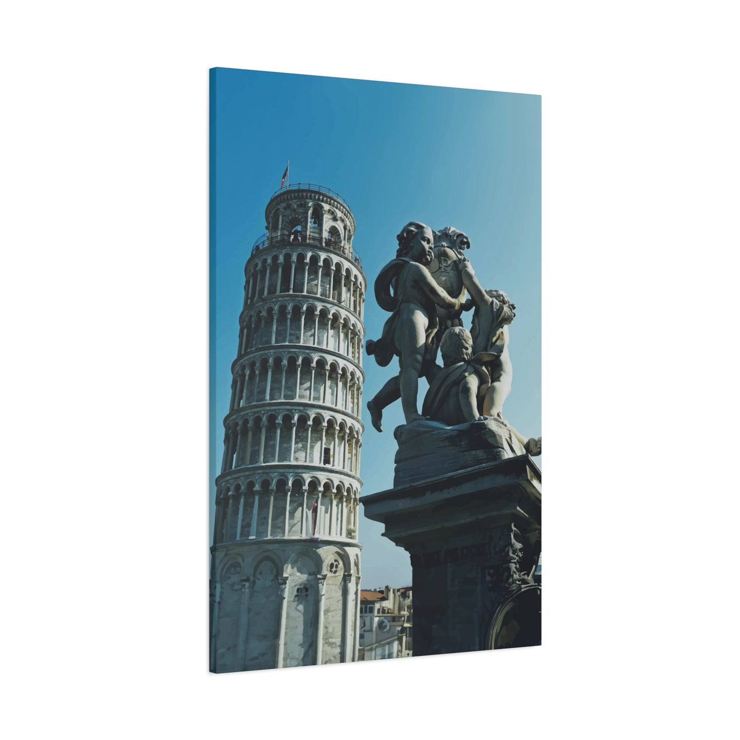
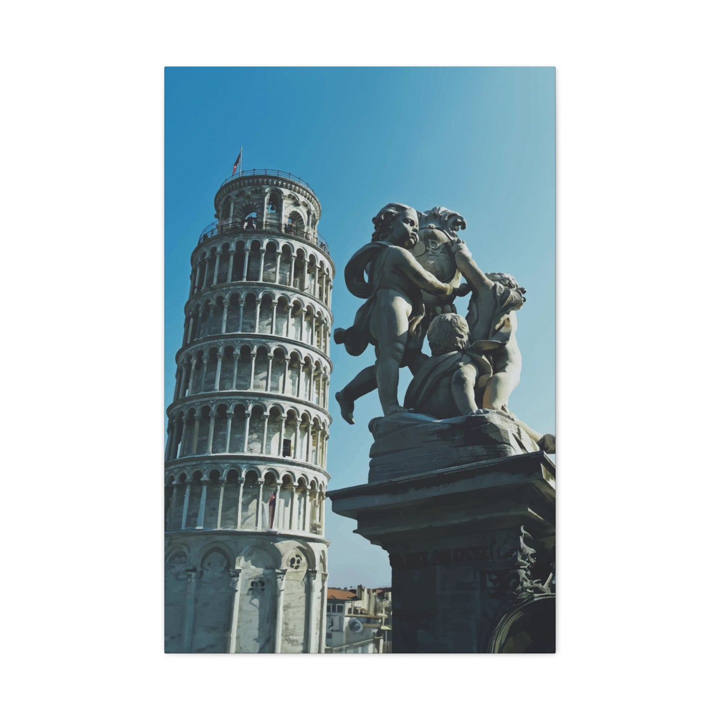
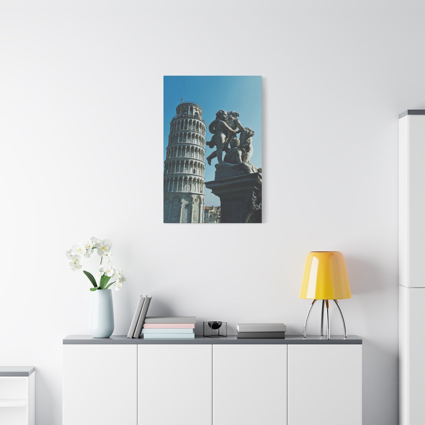
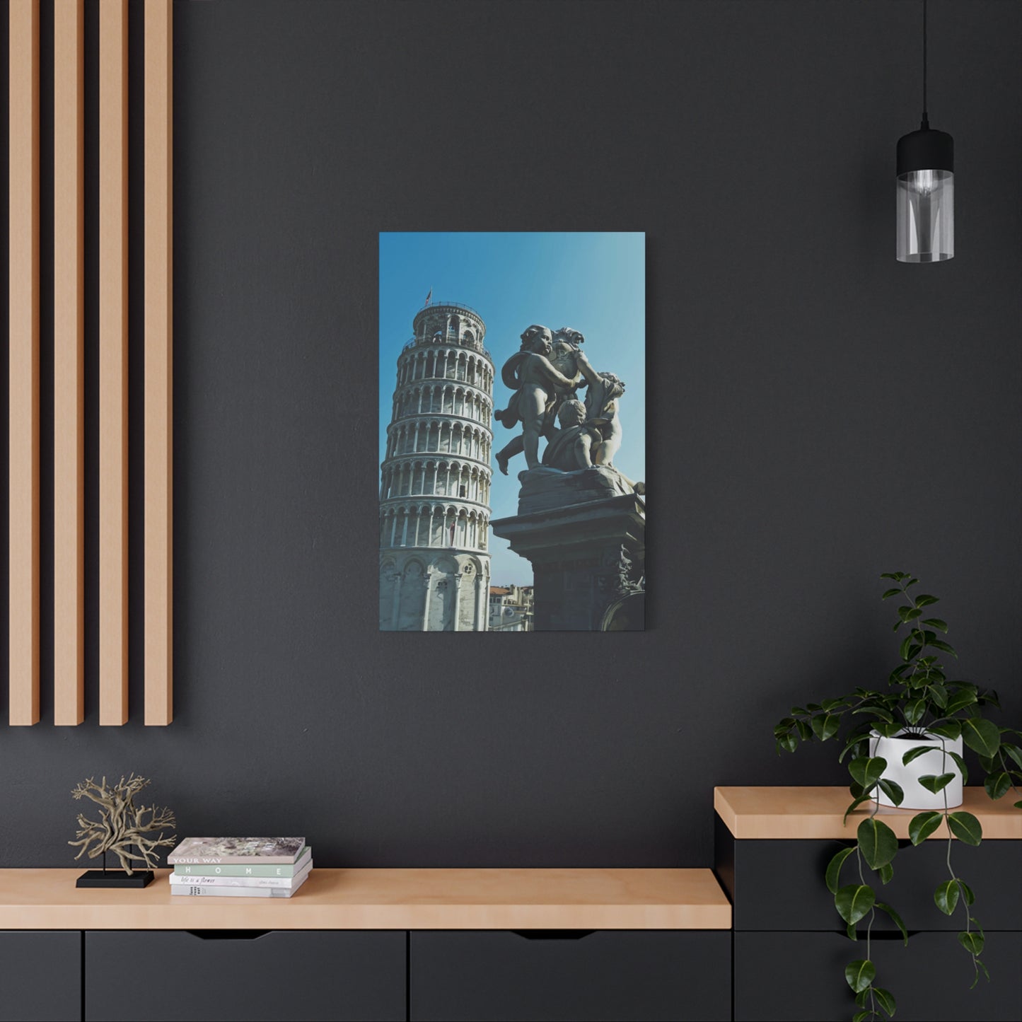
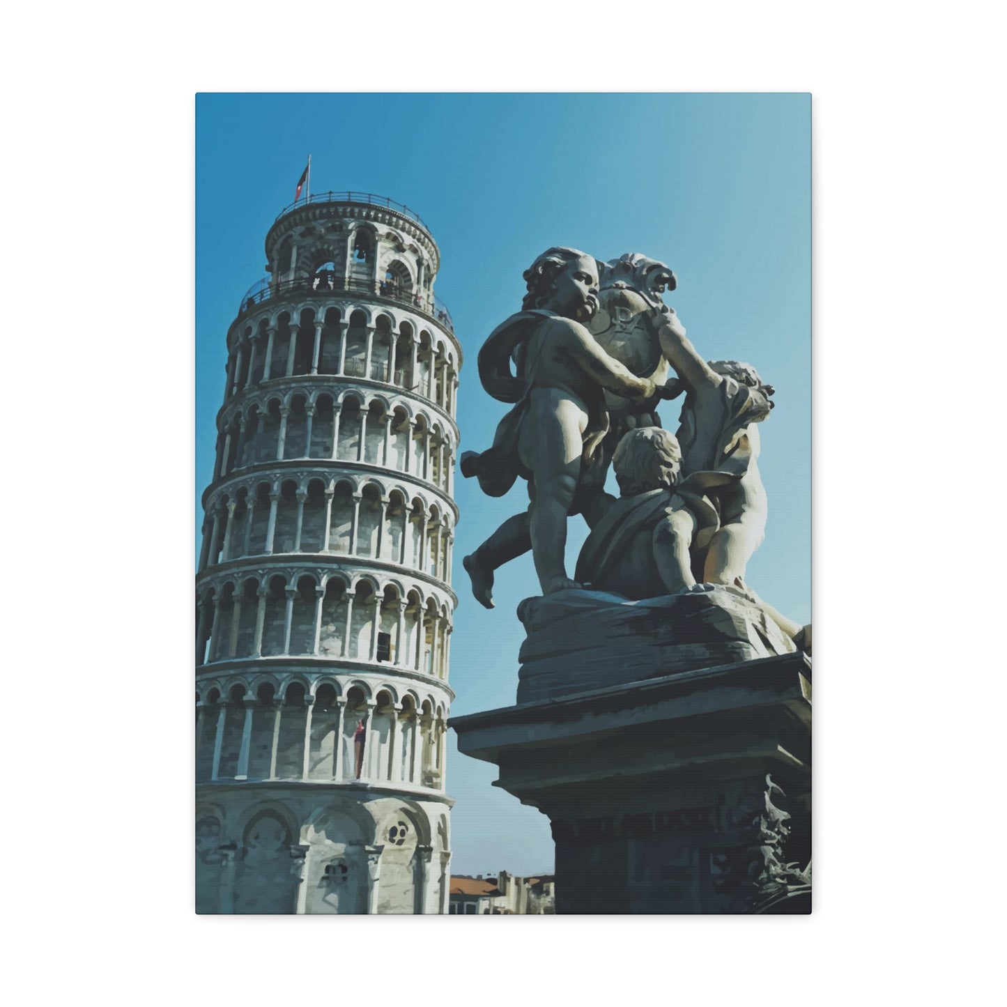
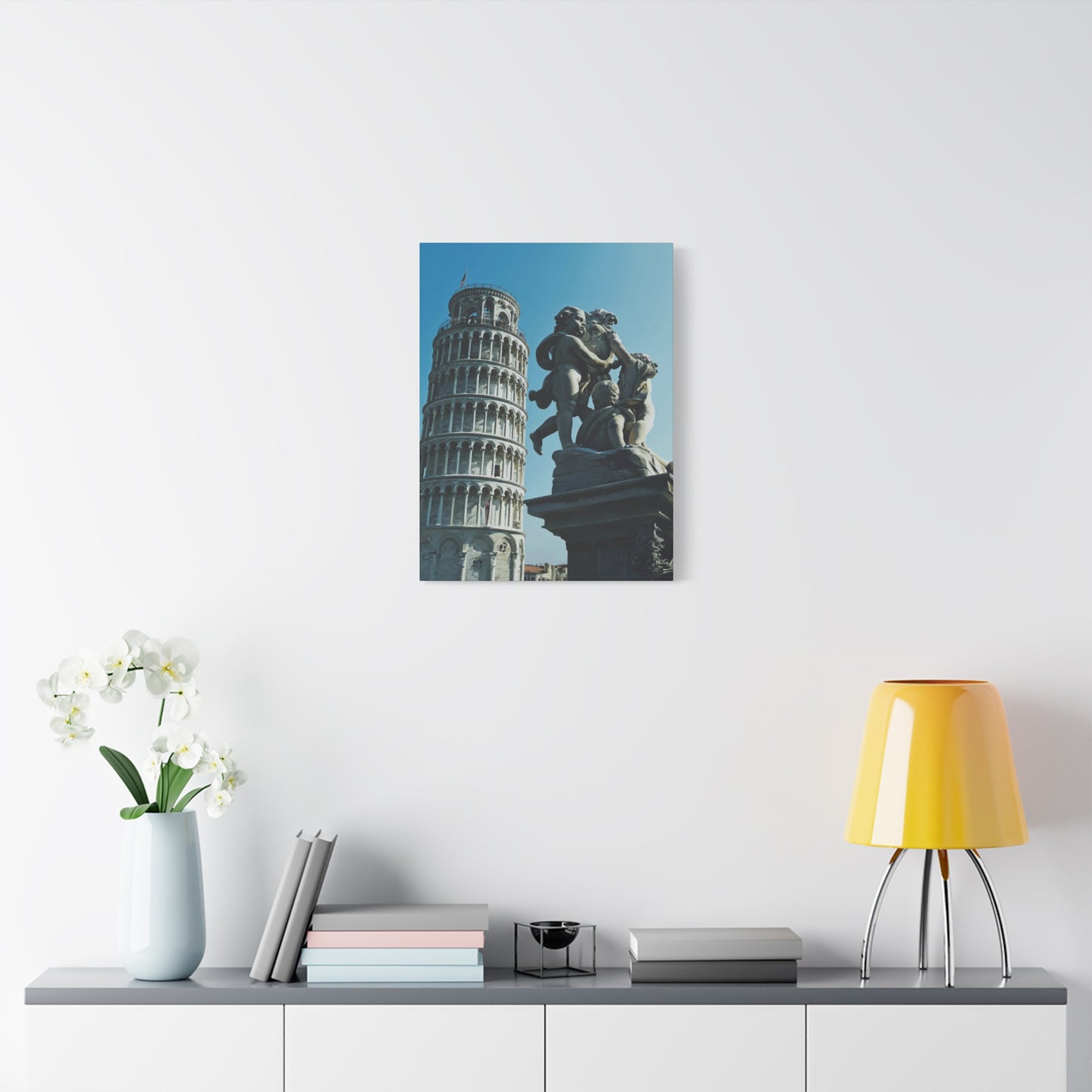
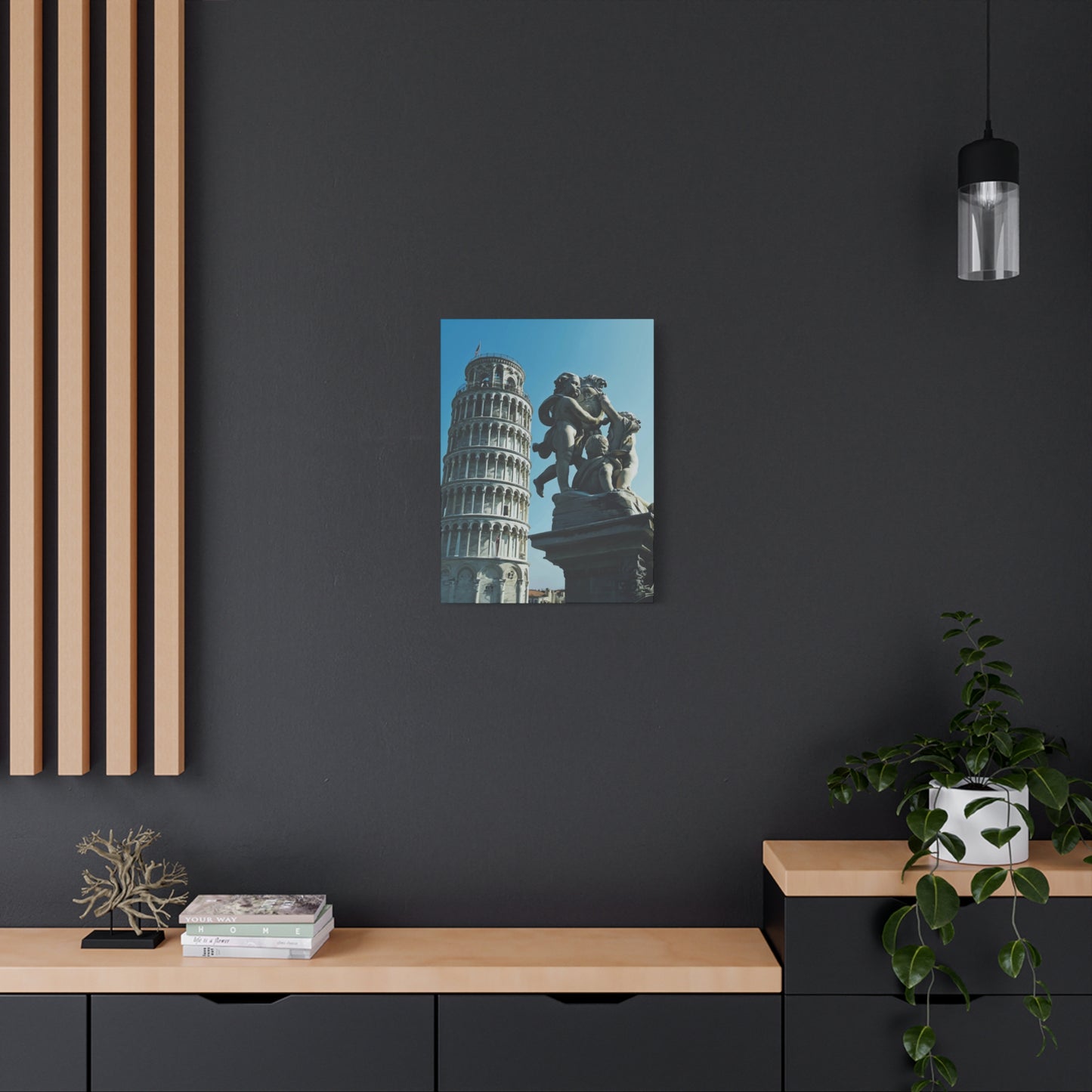
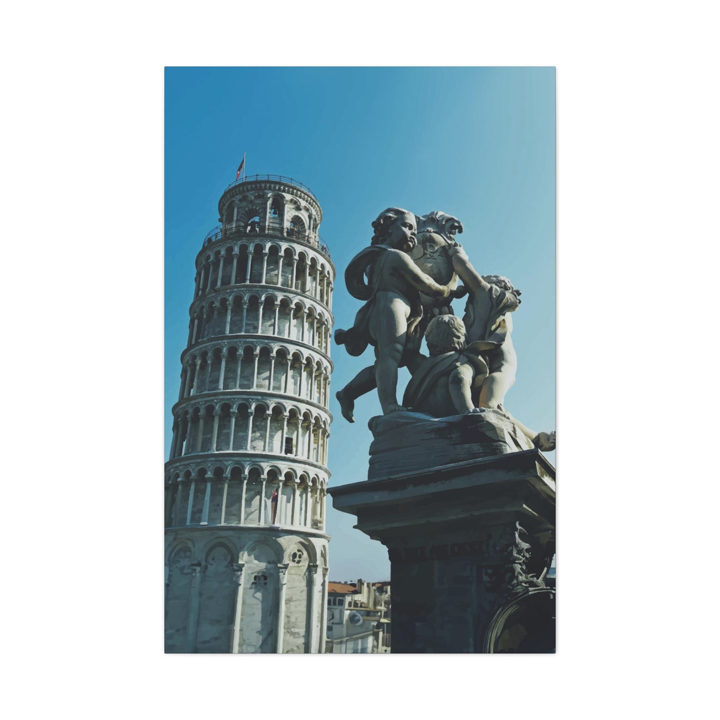
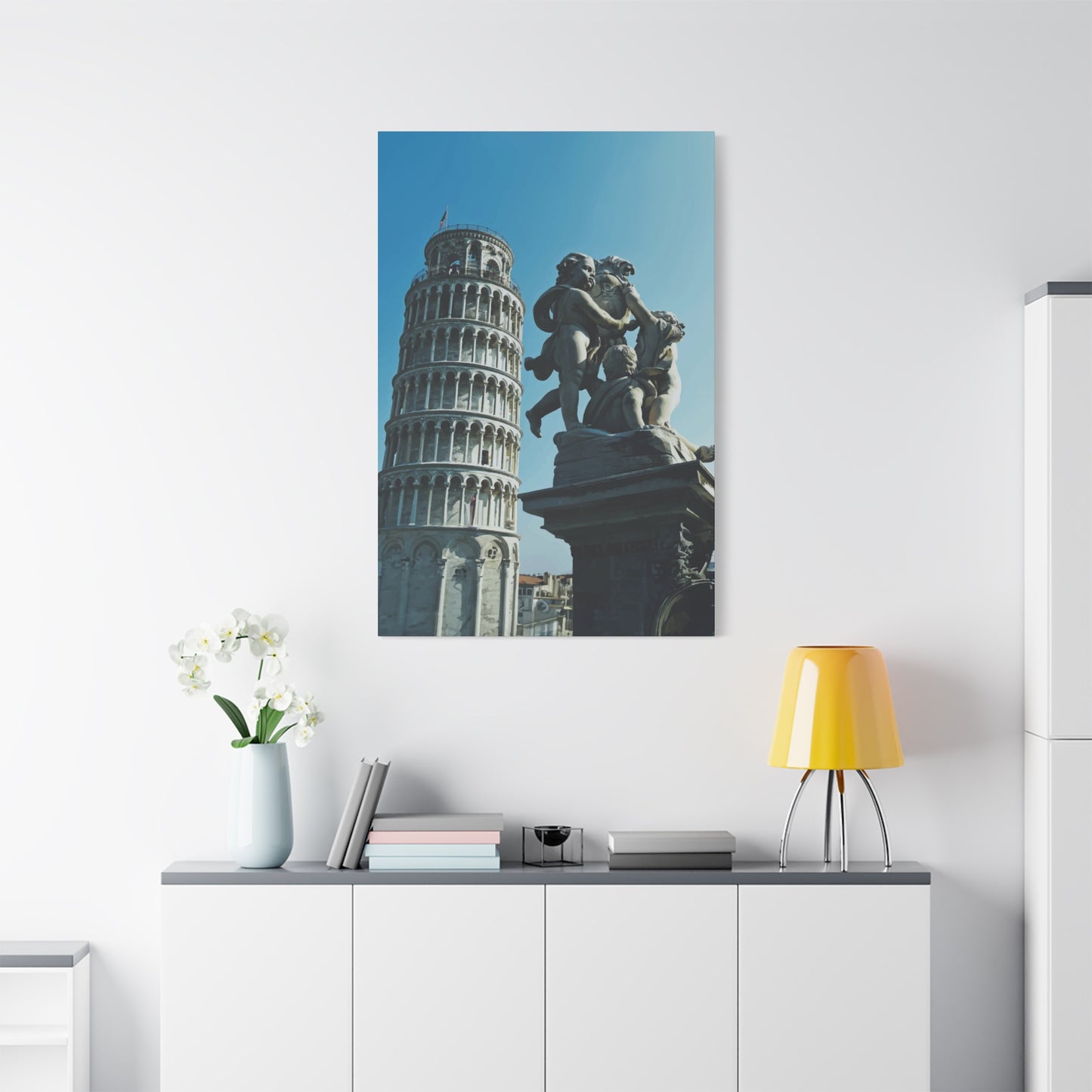
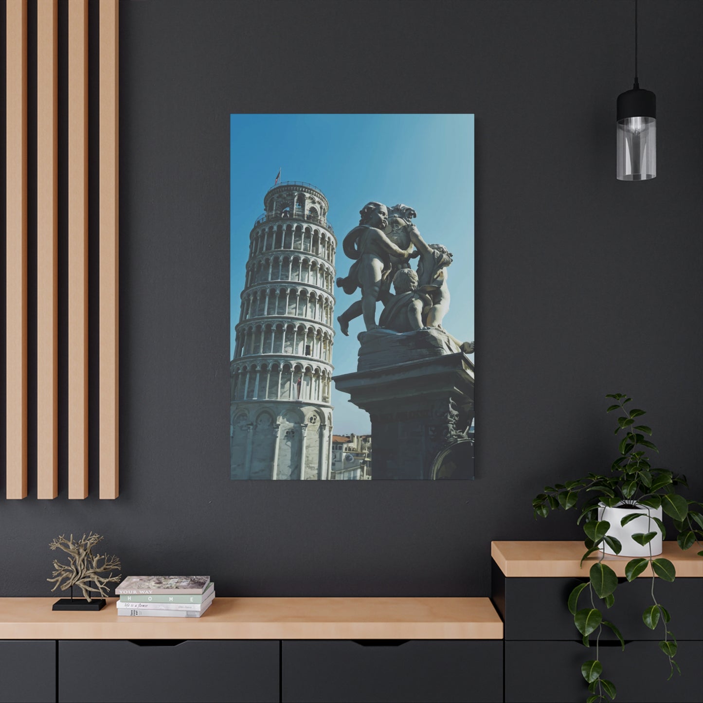
Leaning Tower of Pisa Wall Art & Canvas Prints
Couldn't load pickup availability
Captivating Leaning Tower of Pisa Wall Art: Discovering Italy's Iconic Monument Through Decorative Masterpieces for Your Living Interior
The magnificent structure that defies gravity in the heart of Tuscany has become one of the most recognizable symbols of Italy and architectural wonder worldwide. When we talk about bringing this extraordinary monument into our homes through decorative pieces, we're not just discussing simple photographs or prints. We're exploring a comprehensive world of artistic expression that captures the essence, drama, and timeless beauty of this remarkable landmark. The Leaning Tower of Pisa wall art represents far more than mere decoration; it embodies centuries of heritage, cultural significance, and the human spirit's triumph over architectural challenges.
Throughout countless generations, this bell tower has captivated millions of visitors who make pilgrimages to witness its peculiar tilt firsthand. Now, through various artistic mediums and creative interpretations, anyone can experience the grandeur and mystique of this Renaissance masterpiece within their own dwelling spaces. The journey of transforming this architectural marvel into decorative elements involves understanding its profound cultural resonance, appreciating the artistic skills required to capture its essence, and recognizing how such pieces can dramatically alter the atmosphere of any interior environment.
Architectural Marvel Transformed Into Stunning Visual Representations for Contemporary Interiors
The freestanding bell tower, known locally as the campanile, stands as an unintended monument to architectural miscalculation that paradoxically became its greatest asset. Construction commenced in 1173, and from the very beginning, the soft ground consisting of clay, fine sand, and shells proved inadequate to properly support the structure's weight. This geological instability created the distinctive lean that would eventually define the tower's character and global recognition. When artists set out to capture this monument through various mediums, they face the unique challenge of conveying not just its physical appearance but the sense of wonder and slight unease that comes from observing something so magnificent appearing to defy the laws of physics.
Contemporary artisans and creative professionals approach Leaning Tower of Pisa wall art from numerous perspectives, each bringing their unique vision to represent this iconic structure. Some choose photorealistic approaches that capture every architectural detail with precision, showcasing the intricate Romanesque columns, the delicate arcades that wrap around each of its eight stories, and the subtle variations in marble coloring that have developed over centuries of weathering. These detailed representations appeal to those who appreciate architectural precision and want to study the tower's construction even from the comfort of their homes.
Other creators take more interpretive routes, employing abstract elements, bold color palettes that deviate from reality, or minimalist designs that reduce the tower to its most essential geometric forms. These stylized versions offer a different kind of engagement, inviting viewers to see the familiar structure through fresh perspectives. Watercolor interpretations might capture the dreamy, romantic quality of Italian landscapes, with the tower rising through soft washes of peachy pinks and golden yellows that evoke Tuscan sunsets. Oil paintings might emphasize the texture and weight of the marble, creating almost tactile representations that seem to possess physical depth.
The medium chosen for creating these decorative pieces significantly impacts their final aesthetic qualities and how they interact with surrounding spaces. Canvas prints remain enormously popular due to their classic gallery appearance and the way stretched canvas creates subtle shadows around the edges, giving the artwork dimensional presence. Metal prints offer a sleek, contemporary alternative, with the image infused directly onto aluminum sheets, creating incredibly sharp details and vibrant colors that seem to glow with internal luminescence. Wood-mounted versions bring warmth and organic texture, with the natural grain sometimes showing through lighter areas of the image, creating a fusion between the architectural subject and natural materials.
Capturing the Essence of Tuscan Splendor Through Multiple Artistic Mediums and Styles
The artistic interpretation of this famous landmark extends far beyond simple reproduction. Skilled painters, photographers, and digital artists spend considerable effort studying the tower's relationship with its surroundings, the way light interacts with its pale stone facade at different times of day, and the atmospheric conditions that can dramatically alter its appearance. Morning mist rising from the Arno River might obscure the tower's base while leaving its upper levels floating ethereally above the clouds. The harsh midday sun creates strong contrasts between the illuminated western face and deep shadows on the eastern side. Golden hour bathes the entire structure in warm amber light that makes the marble seem to glow from within.
Photographers who specialize in architectural subjects often wait for optimal conditions to capture the tower in its most compelling states. Some prefer the drama of storm clouds gathering behind the structure, creating ominous backdrops that emphasize the tower's resilience through centuries of weather. Others seek the serenity of clear blue skies that showcase the structure's graceful lines without distraction. The surrounding Piazza dei Miracoli, with its immaculately maintained lawns and companion buildings including the cathedral and baptistery, provides context that some artists choose to include while others crop tightly to focus exclusively on the tower itself.
Black and white photography offers particular advantages when representing this monument. By removing color from the equation, viewers focus entirely on form, texture, light, and shadow. The marble's weathered surface becomes a study in tonal variation, with centuries of exposure creating subtle patterns that might go unnoticed in color versions. The repetitive arcades create rhythmic patterns that carry the eye upward along the tower's height, while the distinctive tilt introduces a dynamic tension that prevents the composition from becoming static. Monochrome versions often possess timeless qualities that make them suitable for a broader range of interior design schemes, from ultramodern minimalist spaces to traditional settings.
Painters working in oils or acrylics bring entirely different sensibilities to their representations. Unlike photographers bound by what exists in front of their lenses, painters enjoy complete freedom to reimagine, reinterpret, and reconstruct the scene according to their artistic vision. Some create hyper-realistic paintings that rival photographs in their detail and accuracy, demonstrating technical mastery through painstaking attention to every architectural element. Others embrace impressionistic approaches, using visible brushstrokes and color mixing directly on the canvas to create vibrant, energetic versions that capture the feeling of experiencing the tower rather than its literal appearance.
Watercolor artists face unique challenges when depicting architectural subjects, as the medium's flowing, unpredictable nature seems at odds with the precision required for buildings. However, skilled practitioners use this seeming limitation to their advantage, allowing controlled accidents and water blooms to suggest weathered stone, dappled sunlight, or atmospheric perspective. The translucent quality of watercolors can create luminous effects particularly suited to depicting the way Italian light seems to penetrate and illuminate everything it touches. Loose, gestural watercolor sketches might capture the essence of the tower with just a few confident brushstrokes, suggesting rather than delineating its form.
Dimensional Perspectives and Compositional Approaches That Enhance Visual Impact
The way artists frame and compose their representations of this monument dramatically affects the emotional impact and visual effectiveness of the resulting artwork. Wide-angle compositions that include significant surrounding architecture and landscape provide geographical context, helping viewers understand the tower's relationship to its environment. These broader views might show the adjacent cathedral with its magnificent facade, the circular baptistery with its unique acoustics, or the cemetery wall that encloses the sacred field. Such contextual compositions appeal to those who appreciate the tower as part of a larger architectural ensemble rather than an isolated curiosity.
Conversely, tightly cropped compositions that fill the frame with the tower itself create more abstract, graphic results. By eliminating contextual clues and focusing purely on the structure's form, these compositions emphasize its sculptural qualities, the repetitive patterns of its arcades, and the mathematical precision of its circular plan. Some artists shoot or paint from directly below, looking upward along the tower's height, creating vertiginous compositions that emphasize its remarkable verticality despite the famous lean. Others prefer horizontal orientations that showcase the full extent of the tilt, making the precarious angle the composition's primary focus.
The famous lean itself presents interesting compositional challenges. Positioned perfectly vertical within the frame, the tower looks unbalanced, creating visual tension as our eyes instinctively want to rotate the image to make the tower upright. Some artists embrace this discomfort, using it to create dynamic, unsettling compositions that refuse to let viewers settle into comfortable viewing. Others compensate by angling their camera or canvas so the tower appears more vertical, reducing the sense of instability but potentially diminishing the very characteristic that makes the structure famous. Neither approach is inherently superior; each serves different aesthetic goals and appeals to different viewer preferences.
Perspective also plays a crucial role in how the tower appears in artistic representations. Shot or painted from ground level, the tower looms dramatically overhead, its upper levels receding according to the rules of perspective, creating a sense of monumentality and power. This low vantage point is how most visitors actually experience the structure, standing in the grass of the Piazza dei Miracoli and craning their necks to take in the full height. Elevated viewpoints, perhaps from surrounding buildings or digitally composited aerial perspectives, offer views rarely seen by casual observers, revealing the circular cross-section and providing unique perspectives on the lean's extent.
Seasonal variations provide yet another dimension for artistic exploration. Spring brings wildflowers to the surrounding grounds, creating colorful foregrounds that contrast beautifully with the pale stone. Summer's intense light and deep blue skies provide maximum contrast and saturation. Autumn introduces warmer, golden light and the possibility of dramatic weather. Winter, though rare in Tuscany, occasionally dusts the tower with snow, creating ethereal scenes that emphasize the structure's endurance through centuries of changing seasons. Artists who create series showing the tower through different seasons or times of day offer viewers the opportunity to appreciate how environmental factors constantly transform the monument's appearance.
Material Considerations and Production Methods for Long-Lasting Decorative Pieces
The physical materials used to produce Leaning Tower of Pisa wall art significantly impact both the aesthetic qualities and longevity of the finished pieces. Understanding these material properties helps collectors and decorators make informed decisions about which options best suit their specific needs, environmental conditions, and aesthetic preferences. The relationship between subject matter, artistic medium, and physical substrate creates complex interactions that determine how successfully the artwork fulfills its decorative and emotional functions.
Canvas remains the most traditional and widely appreciated substrate for printing or painting architectural subjects. The woven texture of canvas provides subtle surface interest that can enhance printed images by preventing them from appearing too flat or mechanical. Gallery-wrapped canvases, where the printed image extends around the edges of thick stretcher bars, create a three-dimensional object that casts shadows and possesses physical presence beyond a simple flat picture. The edges can be printed with mirrored or extended portions of the main image, or left white or black according to preference. Canvas naturally absorbs and diffuses light rather than reflecting it, meaning the image remains clearly visible from any viewing angle without glare or reflections.
Quality canvas prints utilize archival inks specifically formulated to resist fading when exposed to ambient light. These pigment-based inks bond with the canvas fibers in ways that dye-based inks cannot, creating images that retain their color vibrancy for decades when displayed in typical indoor lighting conditions. The canvas itself should be acid-free to prevent yellowing over time, and protective coatings can be applied to resist moisture, dust accumulation, and minor abrasions. Properly produced canvas prints rival traditional paintings in their appearance and can be virtually indistinguishable from a few feet away, making them accessible alternatives for those who appreciate the canvas aesthetic without the price point of original artwork.
Metal prints represent a thoroughly contemporary approach to displaying photographic images. The process involves infusing dyes directly into specially coated aluminum sheets through heat and pressure, creating images that exist within the metal surface rather than sitting on top of it. This fusion creates incredible depth, with colors appearing more saturated and luminous than possible with other printing methods. Whites become particularly brilliant, while blacks achieve remarkable depth. The inherently reflective quality of metal adds a slight sheen that makes images seem to glow with internal light, particularly effective for architectural subjects photographed in bright conditions.
The rigid, lightweight nature of aluminum panels makes them easy to mount using float-mounting systems that hold the panel slightly away from the wall, creating an elegant floating effect with subtle shadow borders. Metal prints resist warping, fading, moisture damage, and scratching far better than most alternatives, making them ideal for bathrooms, kitchens, or other challenging environments where paper or canvas might deteriorate. The sleek, modern aesthetic suits contemporary interiors particularly well, though the style may feel too industrial or cold for more traditional spaces.
Acrylic face mounting involves printing an image on photographic paper, then mounting it behind a thick sheet of crystal-clear acrylic. This creates extraordinary depth and dimensionality, with the acrylic acting as a lens that magnifies and intensifies the image. Colors appear incredibly vibrant, and the glossy surface creates a luxurious, gallery-quality appearance. The acrylic protects the actual photograph from all environmental factors including UV light, moisture, and physical contact, ensuring maximum longevity. However, the glossy surface creates significant reflections that can make viewing difficult in brightly lit spaces or when positioned opposite windows. Additionally, acrylic pieces are quite heavy and require robust mounting solutions.
Wood-mounted prints appeal to those seeking organic warmth in their decorative pieces. Images can be printed directly onto prepared wood panels, allowing the natural grain to interact with the photograph in interesting ways. Alternatively, prints can be mounted to wood backing for stability while preserving the full image integrity. Wood brings inherent warmth and texture that connects the artwork to natural materials, creating a less formal, more approachable aesthetic than sleek metal or acrylic. Various wood types offer different grain patterns and colors, from pale birch to rich walnut, each imparting distinct character to the mounted image.
Sizing Strategies and Placement Principles for Maximizing Visual Effectiveness in Various Spaces
Selecting appropriate dimensions for Leaning Tower of Pisa wall art requires careful consideration of the space where it will hang, the viewing distances involved, and the desired visual impact. Artwork that seems perfectly sized in a showroom or online preview may overwhelm a small room or disappear on a large wall, making it essential to plan dimensions relative to specific placement locations. The tower's inherently vertical proportions influence sizing decisions, as its height-to-width ratio naturally suits certain spaces better than others.
Large-scale pieces, measuring four feet or more in their longest dimension, create commanding focal points that anchor entire rooms. A six-foot-tall vertical canvas showing the tower in its full glory becomes an architectural element itself, demanding attention and organizing the visual hierarchy of the space. Such substantial pieces work beautifully in rooms with high ceilings, open floor plans, or minimal competing visual elements. They're particularly effective in contemporary spaces with clean lines and neutral color palettes, where the artwork provides the primary source of visual interest and personality.
However, oversized artwork can overwhelm smaller rooms, making spaces feel cramped and claustrophobic rather than enhanced. The viewing distance becomes critical; artwork needs adequate space in front of it for viewers to step back far enough to comfortably take in the entire composition. A general guideline suggests viewing distances of one and a half to two times the diagonal measurement of the artwork. A piece measuring forty by sixty inches has roughly a seventy-two-inch diagonal, suggesting optimal viewing distances of nine to twelve feet. Rooms that don't provide this space will force viewers to stand too close, preventing them from appreciating the full composition.
Medium-sized pieces, roughly twenty-four to forty inches in their longest dimension, offer versatility that makes them suitable for a wide range of spaces. These proportions work equally well in bedrooms, home offices, dining areas, or as part of gallery wall arrangements. They provide sufficient visual presence to register as intentional design elements without overwhelming their surroundings. Multiple medium-sized pieces depicting different views or interpretations of the tower can be arranged in groupings, creating more complex visual compositions than single pieces alone could achieve.
Smaller pieces, under twenty-four inches, excel in intimate spaces or as part of larger collections. A tasteful grouping of smaller architectural prints can create sophisticated gallery walls that showcase various Italian landmarks, with the Leaning Tower of Pisa wall art serving as a recognizable anchor among lesser-known structures. Small pieces also work beautifully in unexpected locations like powder rooms, stairwell landings, or narrow hallways where larger artwork wouldn't fit. The key to successfully displaying smaller pieces lies in proper placement and grouping rather than expecting them to individually command attention in larger spaces.
Vertical, horizontal, or square orientations each create different visual effects and suit different architectural features. Vertical pieces emphasize height, drawing the eye upward and making rooms feel taller. They naturally complement vertical architectural elements like narrow wall sections between windows, spaces flanking doorways, or the walls of staircases. The tower's inherent verticality makes it particularly suited to portrait-oriented compositions. Horizontal pieces emphasize width and create a sense of calm, stability, and restfulness. They work beautifully above sofas, beds, or other horizontal furniture pieces, where their proportions echo and complement the furniture's dimensions.
Square formats offer balanced, symmetrical compositions that work in nearly any space. The equal dimensions create a sense of completeness and stability that many find inherently pleasing. Square pieces group beautifully with others of the same size, creating grid patterns that feel organized and intentional. For the tower specifically, square formats require either significant cropping to focus on architectural details or inclusion of substantial surrounding space to accommodate the vertical structure within square boundaries.
Color Palette Selection and Coordination with Existing Interior Design Schemes
The colors present in Leaning Tower of Pisa wall art significantly impact how successfully it integrates with existing interior design schemes. The tower's natural coloring provides a relatively neutral foundation, with its pale marble exterior reading as warm white, cream, or light tan depending on lighting conditions and surrounding elements. This inherent neutrality makes the subject adaptable to various color schemes, though artistic interpretations that introduce bolder palettes require more careful coordination.
Realistic photographic representations typically feature the tower's actual coloring: warm cream stone against blue Italian skies, green surrounding lawns, and perhaps warm earth tones from nearby buildings. These natural colors coordinate easily with the neutral palettes common in contemporary interior design, including whites, grays, beiges, and warm wood tones. The blues of the sky provide a cool accent that can connect with blue elements elsewhere in the room, such as textiles, accessories, or accent furniture. The warm stone tones relate beautifully to natural materials like wood flooring, leather furniture, or warm metallic accents in bronze or brass.
Sepia-toned or black-and-white versions remove color considerations almost entirely, making them the most versatile options for spaces with strong existing color schemes. These monochromatic interpretations coordinate with literally any color palette because they introduce no competing hues. They bring visual interest through tonal variation, contrast, and compositional strength rather than color relationships. This versatility makes them particularly valuable in spaces where wall art needs to complement bold furnishings or colorful design schemes without clashing or competing for attention.
Artistic interpretations employing non-naturalistic color palettes offer opportunities for more daring design statements. A version rendered in jewel tones like sapphire, emerald, and amethyst could echo a luxurious color scheme featuring rich fabrics and metallic accents. Pastel interpretations in soft pinks, lavenders, and mint greens might perfectly suit shabby chic or romantic design styles. Bold, saturated versions employing primary colors could energize modern spaces and coordinate with contemporary furniture and accessories. However, these more interpretive color choices require careful consideration to ensure they enhance rather than conflict with existing design elements.
The surrounding mount, frame, or edge treatment also influences color coordination. A bright white mount creates clean, fresh presentation that works in contemporary settings but might feel too stark in warmer, more traditional spaces. Cream or off-white mounts bridge the gap between pure white and warmer tones, creating softness while maintaining brightness. Colored mats can pick up accent colors from the image or room, creating intentional connections. For frameless options like canvas wraps or metal prints, edge color or the decision to extend the image around the edges versus using solid colors impacts the overall color presentation.
Lighting plays a crucial role in how colors appear and interact with surrounding spaces. Warm incandescent lighting enhances warm tones in the image while potentially dulling cooler blues and greens. Cool LED lighting does the opposite, emphasizing blues and whites while potentially making warm tones appear less vibrant. Natural daylight provides the most accurate color rendering but changes throughout the day and across seasons, meaning the artwork's appearance shifts with these variations. Considering the primary lighting conditions in the display location helps predict how the artwork will actually look in situ rather than under showroom or screen conditions.
Framing Options and Presentation Styles That Enhance Architectural Subject Matter
The decision whether to frame Leaning Tower of Pisa wall art, and if so, which framing style to employ, significantly impacts the artwork's overall aesthetic and how it interacts with its surroundings. Framing serves both protective and decorative functions, safeguarding the artwork while also creating transitions between the image and the wall, often enhancing the perceived value and importance of the piece. The architectural subject matter influences which framing approaches feel most appropriate and effective.
Traditional framing with ornate, detailed moldings creates formal presentations that emphasize the artwork's importance and value. Gold or silver leaf frames with intricate carved details suit classical or traditional interior styles, creating continuity with other formal elements in the space. Such elaborate frames effectively create "windows" into the scene, separating the view of the Italian landmark from the viewer's actual environment. This separation can be desirable when the intent is creating an escape or fantasy, allowing viewers to momentarily transport themselves to the Piazza dei Miracoli. However, ornate frames risk overwhelming simpler images or feeling outdated in contemporary spaces.
Simple, clean-lined frames in wood, metal, or composite materials create more understated presentations that keep attention focused on the image itself. Narrow frames in black, white, or natural wood tones provide definition without distraction, working beautifully in modern and transitional spaces. Metal frames in silver, gold, or bronze finishes add subtle elegance without the formality of traditional gilded frames. These streamlined options suit minimalist aesthetics and allow the architectural subject to take center stage. The frame's profile, whether flat and minimal or stepped and dimensional, subtly affects the overall presentation even when the visual difference seems minor.
Wide mat borders between the image and frame create breathing room that can enhance the viewing experience, preventing the frame from visually crowding the composition. Mats in white or cream create clean, gallery-style presentations that feel professional and polished. The mat's width should relate proportionally to the image size; small images benefit from wider mats that give them more presence, while large images may need only narrow mats or none at all to avoid overwhelming proportions. Double or triple mat configurations using different complementary colors create subtle depth and sophistication, particularly effective for more traditional presentations.
Floating frames create the illusion that the artwork hovers within the frame, with a small gap visible between the image edges and the frame's inner edge. This contemporary mounting style works particularly well for canvas prints, acrylic panels, or metal prints, emphasizing the artwork's three-dimensional nature. The visible gap adds visual interest and modernity, clearly distinguishing the presentation from traditional flat framing. Floating frames suit modern and contemporary interiors where clean lines and intentional design details are celebrated.
Frameless presentation options have gained popularity in contemporary design, with gallery-wrapped canvases, mounted metal prints, and other self-supporting formats eliminating frames entirely. This approach creates clean, modern aesthetics that work beautifully in minimalist spaces and allows the artwork to integrate more seamlessly with its surroundings rather than being separated by framing elements. Frameless options also tend to cost less than framed alternatives while appearing less formal and more casual. However, they may feel unfinished or incomplete in more traditional settings where framed artwork is the norm.
Shadow box framing creates substantial depth by mounting the artwork well inside a deep frame, creating actual three-dimensional shadows around the edges. This dramatic presentation suits contemporary spaces and creates significant visual presence, making even smaller pieces feel more substantial. The depth also offers practical benefits, accommodating textured or dimensional pieces that wouldn't fit in standard flat frames. However, shadow boxes create considerable visual weight that might overwhelm delicate images or feel too heavy in lighter, airier design schemes.
Exploring Various Artistic Styles from Photorealism to Abstract Interpretation
The artistic style employed in creating Leaning Tower of Pisa wall art dramatically affects its emotional impact, aesthetic character, and suitability for different interior environments. Understanding these stylistic variations helps collectors and decorators identify which approaches best align with their personal tastes and design goals. The same subject matter can evoke entirely different responses depending on how artists choose to interpret and represent it.
Photorealistic approaches prioritize accuracy and detail, creating representations virtually indistinguishable from actual photographs. Artists working in this style devote extraordinary attention to every element, ensuring that architectural details, lighting effects, atmospheric conditions, and spatial relationships match reality with exacting precision. These representations appeal to viewers who appreciate technical mastery and want to study or appreciate the tower's actual appearance. Photorealistic paintings demonstrate such remarkable skill that they often command premium prices despite being representations rather than originals in the creative sense.
Impressionistic interpretations prioritize capturing the essence and feeling of a scene rather than literal details. Visible brushstrokes, broken color, and suggestive rather than definitive forms characterize this approach. The tower might be rendered with loose, gestural marks that suggest its form and lean without delineating every window and column. Colors might be brighter and more arbitrary than reality, chosen for emotional impact rather than accuracy. Impressionistic works create more romantic, nostalgic moods and feel less formal than photorealistic versions. They celebrate the act of painting itself, making the artist's hand and creative process visible and part of the artwork's appeal.
Abstract interpretations reduce the tower to its essential geometric forms, perhaps rendering it as a series of curved or angled lines, circular shapes representing the arcades, or simplified silhouettes. Color choices might have nothing to do with reality, selected purely for compositional or emotional purposes. These highly stylized versions appeal to viewers who appreciate modern art and want pieces that function more as design elements than realistic depictions. Abstract versions integrate particularly well into contemporary spaces where they can relate to other geometric or abstract elements without the literalness of realistic representations.
Minimalist approaches strip away all but the most essential elements, perhaps showing only the tower's distinctive silhouette against a plain background or reducing the entire composition to just a few carefully placed lines. These simplified versions create calm, contemplative viewing experiences and work beautifully in spaces where visual quiet is desired. The simplicity allows them to disappear into their surroundings when not actively observed while providing points of interest when attention turns their way. Minimalist architectural art suits spaces designed around principles of simplicity, clean lines, and intentional emptiness.
Pop art interpretations embrace bold colors, graphic simplicity, and often repetition or cultural commentary. The tower might appear in vibrant, unexpected color combinations, repeated in Andy Warhol-style grids with different color variations, or incorporated into collages combining it with other cultural imagery. These playful, irreverent approaches appeal to those who don't take design too seriously and want pieces that inject energy, humor, and personality into their spaces. Pop art versions work wonderfully in eclectic interiors, creative workspaces, or anywhere a less serious, more whimsical mood is desired.
Vintage or antique-style representations create the impression of historical artifacts, perhaps resembling old postcards, travel posters, or architectural drawings from earlier eras. These might employ muted colors, aged textures, period-appropriate typography, or composition styles characteristic of specific historical periods. Such pieces appeal to those who appreciate nostalgia, romanticism, or the aesthetic of specific historical periods. They work beautifully in traditional or transitional interiors where they can relate to antique furniture, vintage accessories, or collections of actual historical objects.
Digital art and graphic design approaches leverage contemporary tools to create highly stylized versions often characterized by perfect precision, bold colors, and intentionally artificial aesthetics that don't attempt to mimic traditional media. Vector-based graphics might render the tower with razor-sharp edges and flat color fields. Digital paintings might employ effects impossible in traditional media, such as light effects, texture overlays, or composite imagery combining multiple sources. These thoroughly modern approaches suit contemporary spaces and appeal particularly to younger collectors who've grown up with digital media and appreciate its distinct aesthetic qualities.
The Cultural Significance and Symbolic Meanings Embedded in Italian Landmark Imagery
Displaying Leaning Tower of Pisa wall art involves more than simple aesthetic decoration; it engages with deep cultural associations, personal memories, and symbolic meanings that extend far beyond the physical structure itself. Understanding these layers of significance helps explain the enduring popularity of Italian landmark imagery and why people feel drawn to having these representations in their homes despite never having visited or having no direct connection to the location.
The tower symbolizes Italy itself in many viewers' minds, serving as shorthand for the entire country's rich cultural heritage, artistic legacy, and romantic appeal. Just as the Eiffel Tower represents France or Big Ben represents England, the Leaning Tower has become an instantly recognizable symbol of Italy that conjures associations with Italian cuisine, Renaissance art, romantic language, and dolce vita lifestyle. Displaying this imagery allows people to signal their affinity for Italian culture, perhaps representing fond memories of visits, family heritage, or simply appreciation for the aesthetic and cultural values associated with Italy.
The tower's famous lean carries symbolic weight beyond its literal architectural circumstance. The structure's precarious angle yet centuries-long persistence represents resilience, endurance, and the ability to thrive despite imperfections. There's something deeply human about a magnificent structure that's flawed, that lists dramatically yet refuses to fall, that turned an engineering failure into its defining characteristic. This resonates with people who see their own imperfections or life challenges reflected in the tower's story. The imagery can serve as a reminder that flaws don't negate value, that adaptation and persistence matter more than initial perfection.
The tower also represents human ambition, craftsmanship, and the artistic achievements of Renaissance Italy. The structure required centuries to complete, with construction interrupted multiple times by wars, financial difficulties, and the growing realization that something was going wrong with the foundation. Yet generations of craftsmen persisted, creating architectural beauty despite the challenges. This speaks to dedication, skill, and the long view of accomplishment that characterizes great human achievements. For some viewers, the imagery serves as inspiration to persist with their own projects and ambitions despite setbacks.
Travel aspirations factor significantly into the appeal of Italian landmark imagery. For many people who've never visited Italy, displaying Leaning Tower of Pisa wall art represents dreams of future travels, bucket list goals, and desires to experience distant places and cultures. The artwork serves as a daily reminder of these aspirations, perhaps providing motivation to save money, plan trips, or simply keep dreams alive during busy daily routines. For others who have visited, the imagery preserves precious memories, allowing them to mentally return to significant moments, relive experiences, and maintain connections to places that touched them deeply.
The tower's inclusion in the UNESCO World Heritage site designation, along with the adjacent cathedral, baptistery, and cemetery, represents humanity's collective agreement about its cultural value and importance. This official recognition elevates it beyond merely interesting architecture to something judged worthy of preservation and protection for all of humanity. Displaying this imagery engages with these larger values, suggesting appreciation for heritage, beauty, and the human achievements worth preserving and celebrating.
The romantic, picturesque quality of Italian landscapes and architecture also plays into the tower's appeal. Tuscany represents a particular aesthetic ideal in Western imagination: rolling hills, cypress trees, golden light, medieval towns, and elegant architecture. The tower exists as part of this larger romantic vision of Italy as a place where beauty, history, and sensory pleasures intertwine. Displaying this imagery brings elements of that romantic ideal into daily life, perhaps offering escape from more mundane or harsh surroundings. The artwork creates a mood and atmosphere that transcends its literal subject matter.
Conclusion
While single substantial pieces of Leaning Tower of Pisa wall art create powerful focal points, incorporating it into larger gallery wall arrangements or multi-piece collections offers opportunities for more complex storytelling and visual interest. These curated groupings can trace personal travel memories, celebrate Italian culture more broadly, or simply create engaging compositions that prevent walls from appearing sparse or underutilized. Successfully designing these arrangements requires understanding principles of visual balance, thematic coherence, and spatial relationships.
Monothematic arrangements featuring multiple views or interpretations of the tower itself create focused collections that explore the subject from various angles, lighting conditions, or artistic approaches. A gallery wall might include a photographic aerial view, a close-up detail of the arcades, a wide scene showing surrounding structures, and perhaps a stylized or abstract interpretation. This variety maintains visual interest while the consistent subject matter creates clear thematic unity. Such arrangements work particularly well in rooms where the owner has strong personal connections to the location or simply finds the structure endlessly fascinating.
Expanding the theme to include other Pisan landmarks creates slightly broader collections while maintaining geographical coherence. The adjacent cathedral, with its stunning striped marble facade and ornate entrance, provides a natural companion subject. The circular baptistery, one of the largest in Italy with remarkable acoustics, offers contrasting forms. The cemetery's Gothic architecture and serene enclosed grounds introduce different moods and architectural styles while remaining within the same sacred complex. These pieces work together to tell a more complete story about the location and create richer, more varied visual compositions.
Broader Italian landmark collections might include famous structures from across the country: the Colosseum and Forum from Rome, Venetian canals and palazzos, the Duomo in Florence, or dramatic Amalfi Coast views. The Leaning Tower of Pisa wall art serves as a recognizable anchor among these pieces, perhaps the most immediately identifiable structure in the collection. This approach celebrates Italian architecture and landscape broadly, creating arrangements that feel like curated travel memories even if the owner hasn't visited all these locations. The variety of architectural styles, geographical settings, and historical periods creates visual richness while the shared Italian theme maintains coherence.
Color coordination becomes important when grouping multiple pieces. Monochromatic collections using only black and white or sepia-toned images create sophisticated, cohesive arrangements that feel intentionally curated. Mixed-color collections require more care to ensure that color palettes complement rather than clash. Using similar tonal values, even if hues vary, helps maintain unity. Alternatively, restricting certain colors to certain pieces while keeping others neutral creates rhythms and patterns within the arrangement. Some collectors intentionally embrace maximum variety, creating eclectic gallery walls where diversity itself becomes the organizing principle.
Frame selection significantly impacts the success of multi-piece arrangements. Using identical frames throughout creates the most cohesive, unified appearance, making varied content read as a single curated collection. Mixing frame styles, colors, or materials creates more casual, eclectic appearances that can feel livelier but risk appearing unintentional or chaotic if not carefully planned. A middle path involves using frames with a consistent characteristic, perhaps all wood in varying finishes, or all simple profiles in different colors, creating variation within parameters that maintain relatedness.
Spatial arrangements follow several common patterns. Grid layouts with equal spacing between pieces create clean, organized appearances that feel intentional and somewhat formal. These work particularly well in modern or contemporary spaces and with collections using identical frame sizes. Salon-style arrangements pack pieces more densely with varied spacing, creating collected-over-time appearances that feel personal and organic. These work beautifully in traditional or eclectic spaces where slight imperfection and density add to the charm. Horizontal or vertical linear arrangements create clear directional flow, guiding eyes across or up walls in intentional paths.
Asymmetrical arrangements can be balanced through careful attention to visual weight, color distribution, and spacing. A large piece on one side might be balanced by several smaller pieces grouped on the opposite side, creating equilibrium without mirror symmetry. Such arrangements feel dynamic and contemporary while avoiding the potential rigidity of perfectly symmetrical layouts. They require more planning and often benefit from creating paper templates in the actual sizes and arranging them on the floor or taping them to the wall before committing to final placement.
Share


