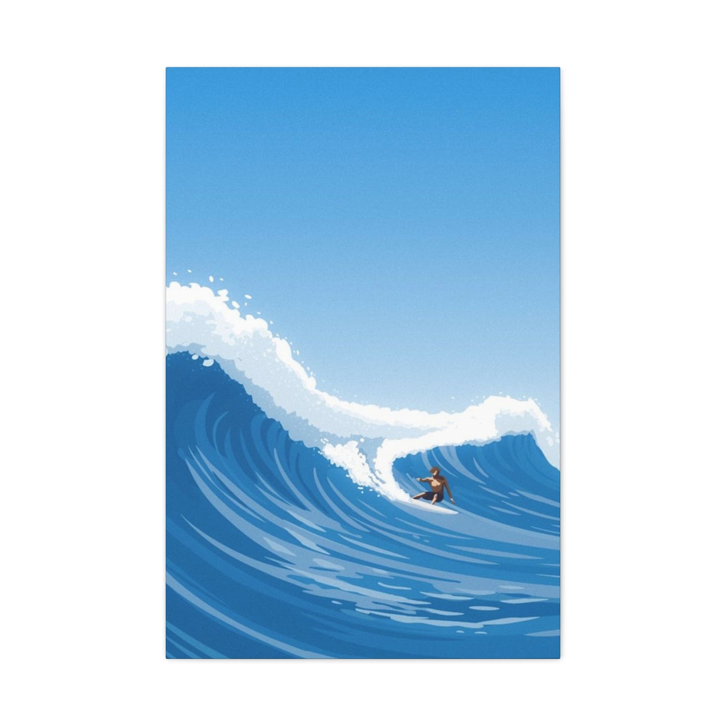
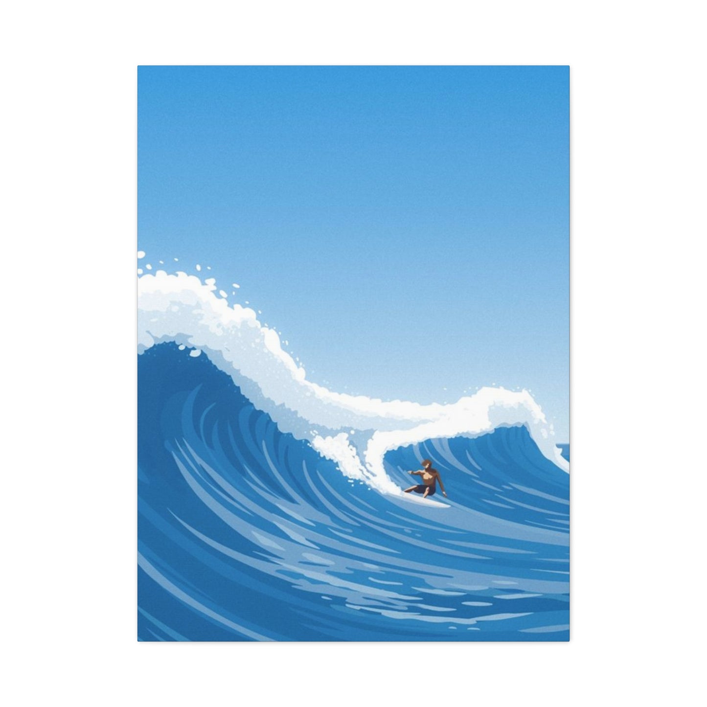
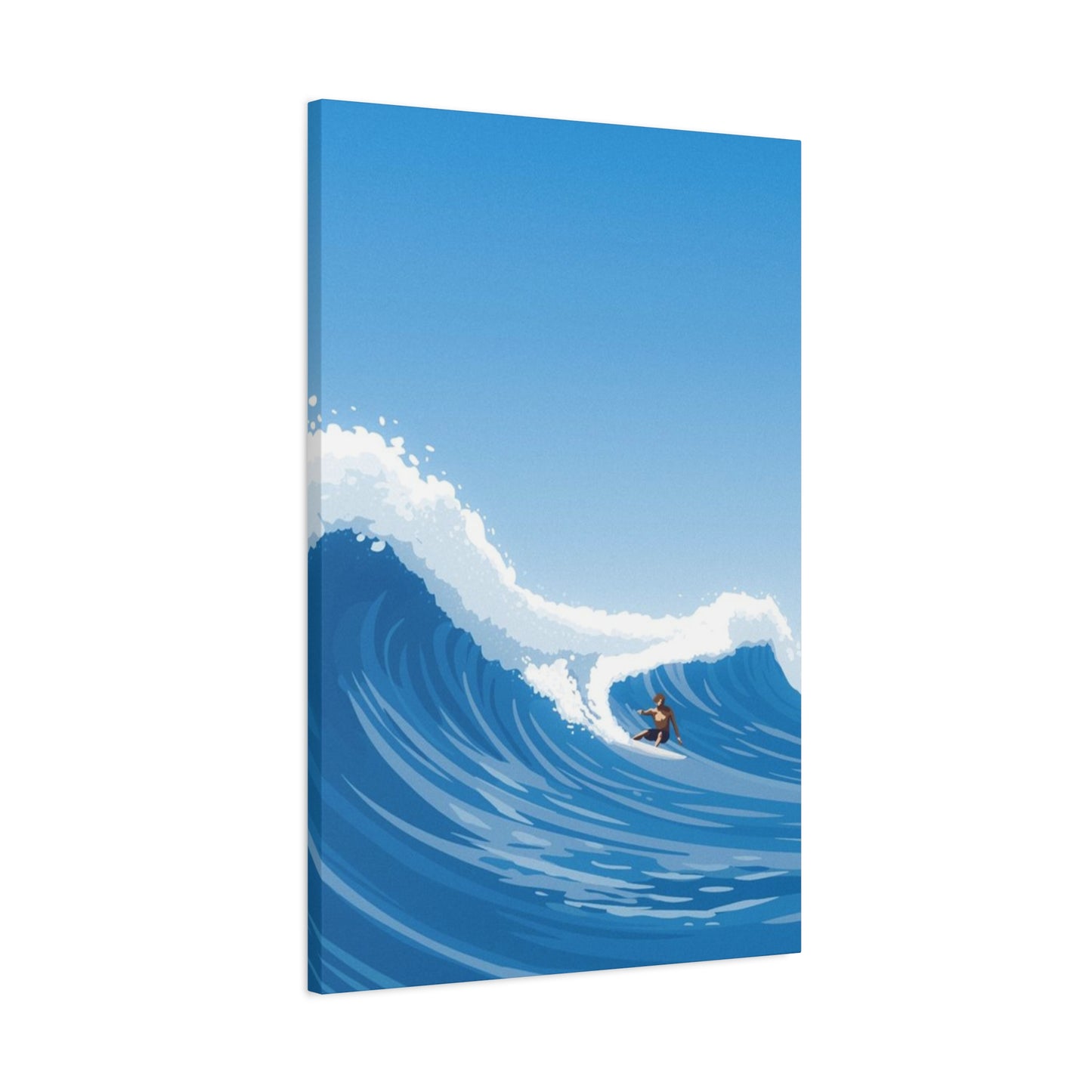
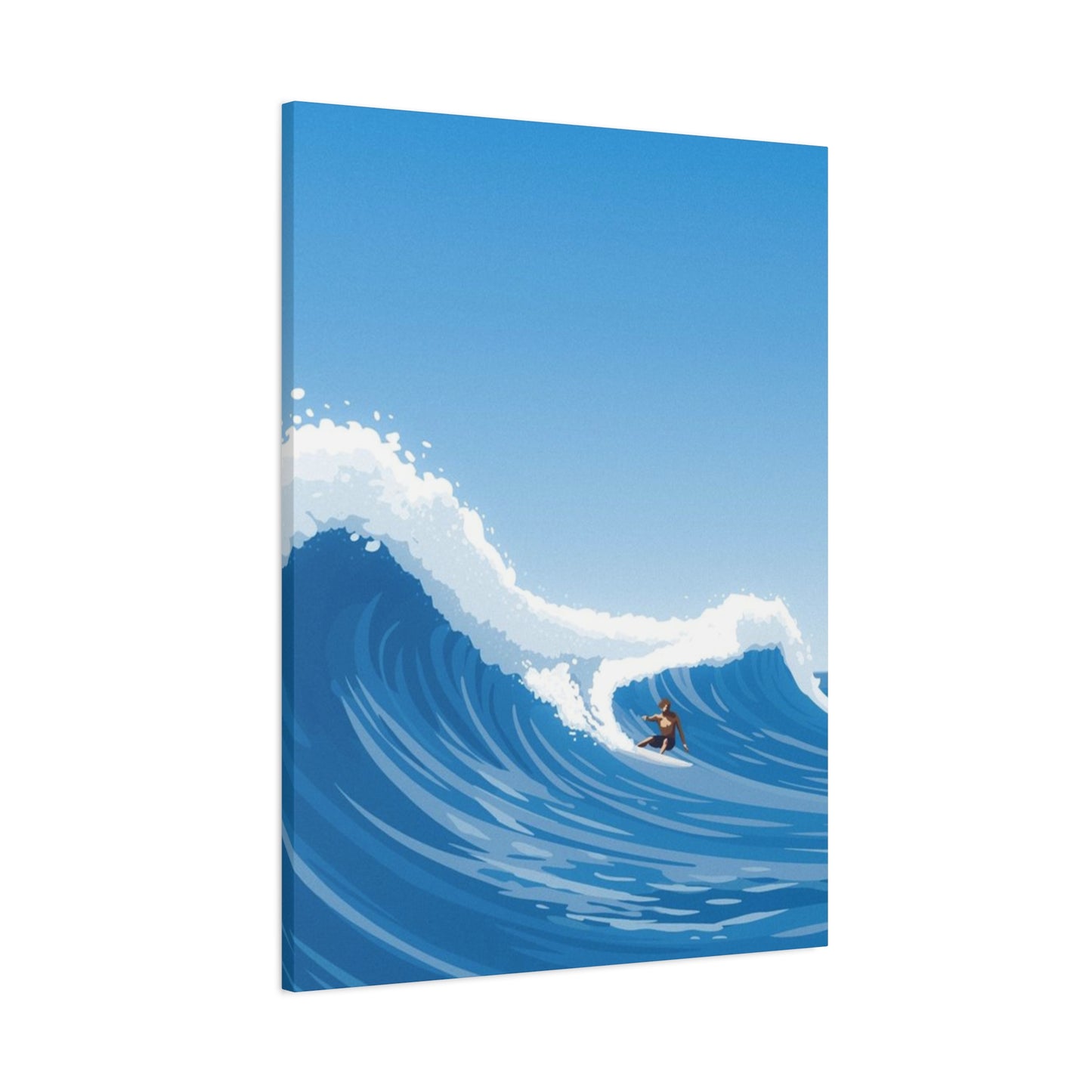
Large Abstract Surfing Wave Wall Art & Canvas Prints
Large Abstract Surfing Wave Wall Art & Canvas Prints
Couldn't load pickup availability
Stunning Large Abstract Surfing Wave Wall Art: A Complete Journey Through Ocean-Inspired Interior Design and Creative Expression
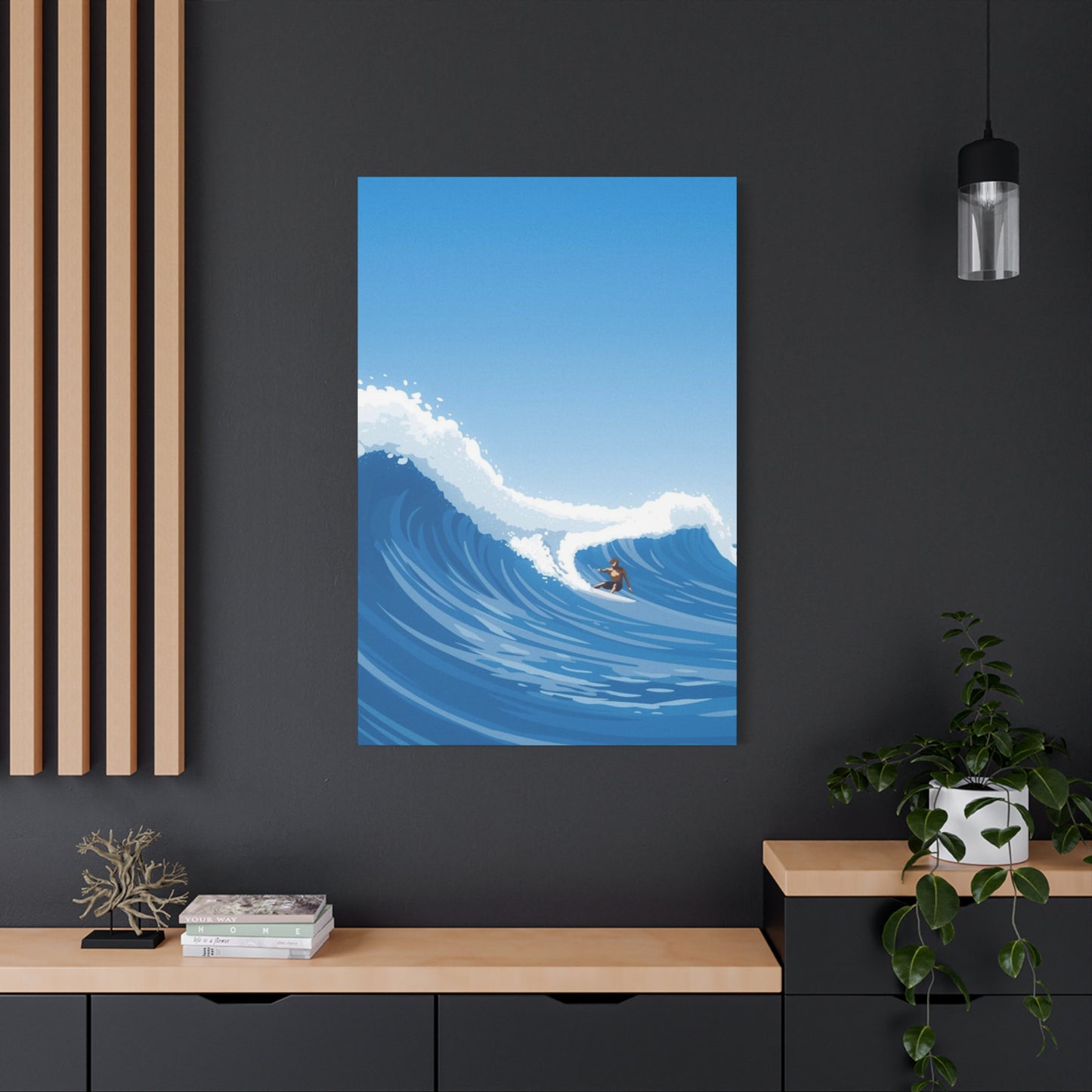
The allure of oceanic aesthetics has captivated humanity for millennia, and in contemporary interior design, few elements capture this fascination as powerfully as large abstract surfing wave wall art. These magnificent pieces transcend mere decoration, becoming portals to the untamed beauty of the sea, bringing the rhythmic energy of coastal environments into living spaces. The marriage of abstract artistic interpretation with the raw power of surfing waves creates visual narratives that resonate deeply with ocean enthusiasts, adventure seekers, and design aficionados alike.
Exploring the Artistic Movement Behind Ocean-Themed Abstract Expression in Contemporary Spaces
The phenomenon of ocean-inspired abstract art represents a confluence of multiple artistic movements, drawing inspiration from abstract expressionism, minimalist design principles, and the organic forms found in nature. When artists approach the subject of surfing waves through an abstract lens, they distill the essence of motion, power, and fluidity into visual compositions that speak to something primal within the human psyche. These creations go beyond photographic realism, instead capturing the emotional and kinetic qualities of the ocean's movements.
Abstract representations of surfing waves allow artists to experiment with color palettes that may not exist in nature, creating dreamlike interpretations of aquatic scenes. Turquoise melding into midnight blue, emerald green flowing into silver-white foam, or even unconventional color schemes featuring coral pinks and sunset oranges can transform a simple wave into a transcendent visual experience. The abstraction process liberates the artist from the constraints of literal representation, enabling them to convey the feeling of standing before a massive swell or the exhilaration of riding a barrel wave.
Contemporary artists working in this genre often employ various methods to achieve their distinctive styles. Some utilize fluid acrylic pouring, allowing gravity and chemistry to create organic wave patterns that mirror the unpredictable nature of the ocean itself. Others employ palette knives to build textured layers that evoke the dimensional quality of water in motion. Digital artists have also embraced this subject matter, using sophisticated software to create mathematical interpretations of wave physics that result in mesmerizing abstract compositions.
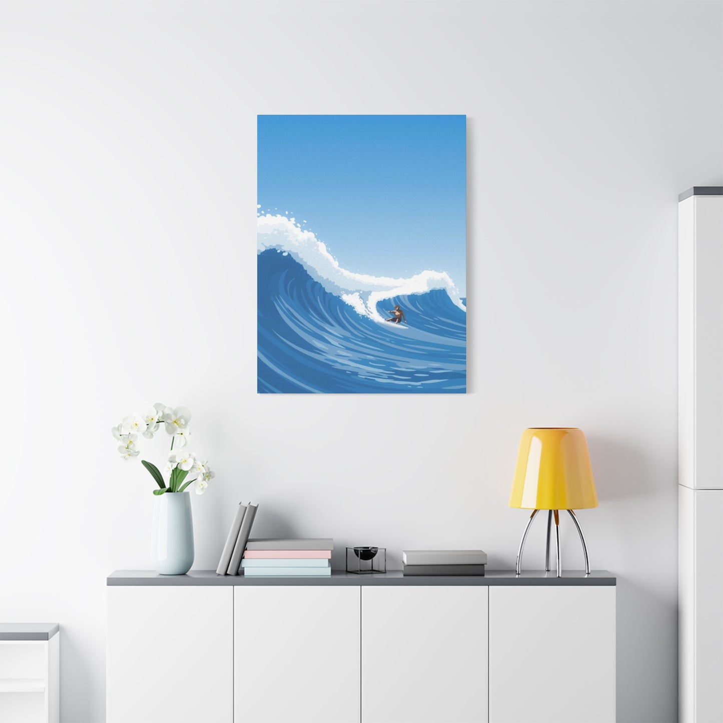
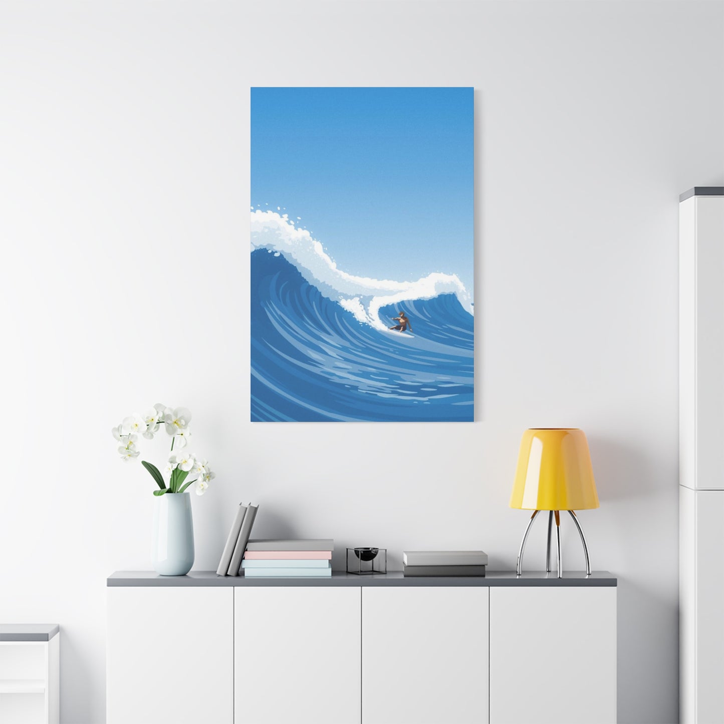
The scale of large abstract surfing wave wall art plays a crucial role in its impact. Oversized pieces, spanning six feet or more in width, create immersive experiences that transform entire rooms. These substantial artworks command attention without overwhelming, provided they are properly proportioned to their environment. The grandeur of a large-scale wave composition mirrors the actual experience of encountering powerful ocean swells, where the sheer magnitude of nature demands respect and admiration.
Discovering the Profound Emotional Resonance of Aquatic Imagery in Residential Environments
The psychological connection between humans and water runs deep, rooted in our evolutionary history and the fundamental role aquatic environments have played in human survival and culture. Incorporating large abstract surfing wave wall art into living spaces taps into this ancient relationship, creating environments that feel both energizing and calming simultaneously. The duality of ocean imagery—representing both danger and vitality, chaos and peace—makes it particularly compelling for residential design.
Research in environmental psychology suggests that images of natural elements, particularly water, can significantly reduce stress levels and promote mental wellbeing. The presence of ocean-themed artwork in a home creates a subconscious connection to coastal environments, even for those living far from actual shorelines. This connection can manifest as reduced anxiety, improved mood, and enhanced creativity. The abstract nature of the artwork adds another dimension, engaging the viewer's imagination and encouraging contemplative thought.
For surfing enthusiasts, large abstract wave art serves as a constant reminder of their passion, keeping the spirit of the sport alive even when landlocked or during seasons when conditions prevent them from getting in the water. These pieces become more than decoration; they transform into talismans that embody the lifestyle, philosophy, and camaraderie associated with surfing culture. The artwork can evoke specific memories of perfect sessions, challenging conditions overcome, or the meditative state achieved while waiting for the next set.
The color psychology embedded within ocean-themed abstract art also influences emotional responses. Blues and greens, dominant in aquatic palettes, are known to promote feelings of tranquility, trust, and stability. The inclusion of white, representing foam and spray, adds elements of purity and new beginnings. When artists incorporate warmer tones like golden yellows or fiery oranges, often inspired by sunrise or sunset sessions, they introduce energy and optimism into the composition. Understanding these color dynamics helps viewers select pieces that align with the emotional atmosphere they wish to cultivate in their spaces.
Examining the Diverse Stylistic Approaches to Rendering Waves in Abstract Artistic Form
Within the realm of large abstract surfing wave wall art, numerous stylistic approaches offer distinct aesthetic experiences. The minimalist interpretation reduces the wave to its essential lines and shapes, often using limited color palettes and clean compositions that emphasize negative space. This approach appeals to those who appreciate understated elegance and contemporary design sensibilities, where the suggestion of a wave proves more powerful than explicit representation.
In contrast, maximalist abstract wave art embraces complexity, layering multiple techniques, textures, and colors to create visually dense compositions that reward extended viewing. These pieces might incorporate metallic paints that catch light differently throughout the day, resin layers that create actual dimensional depth, or mixed media elements that introduce tactile variety. The maximalist approach creates artwork that functions as a focal point, drawing the eye repeatedly as new details reveal themselves over time.
Geometric abstraction applies mathematical precision to organic wave forms, breaking down the curves and swells into angular segments, tessellations, or repeating patterns. This style creates a fascinating tension between the ordered and the chaotic, reflecting the underlying physics that govern wave behavior while maintaining an abstract aesthetic. Geometric wave art often appeals to viewers with scientific or analytical inclinations, as well as those who appreciate mid-century modern design aesthetics.
Expressionistic approaches to abstract wave art prioritize emotional content over formal concerns, using gestural brushwork, bold color choices, and dynamic compositions to convey the feeling of oceanic power. These pieces often feature visible brushstrokes, drips, and marks that testify to the physical process of creation, connecting viewers to the artist's energetic engagement with the subject matter. The raw, unpolished quality of expressionistic wave art can bring authentic vitality to residential spaces.
Photorealistic abstraction represents a paradoxical but increasingly popular approach, where artists begin with detailed representations of actual waves but then selectively abstract certain elements while maintaining others in sharp focus. This creates a dreamlike quality, as if viewing the ocean through water-distorted glass or in a heightened state of consciousness. These pieces bridge the gap between traditional seascape painting and pure abstraction, offering entry points for viewers less familiar with non-representational art.
Understanding the Critical Role of Scale and Proportion in Selecting Oceanic Artwork for Various Spaces
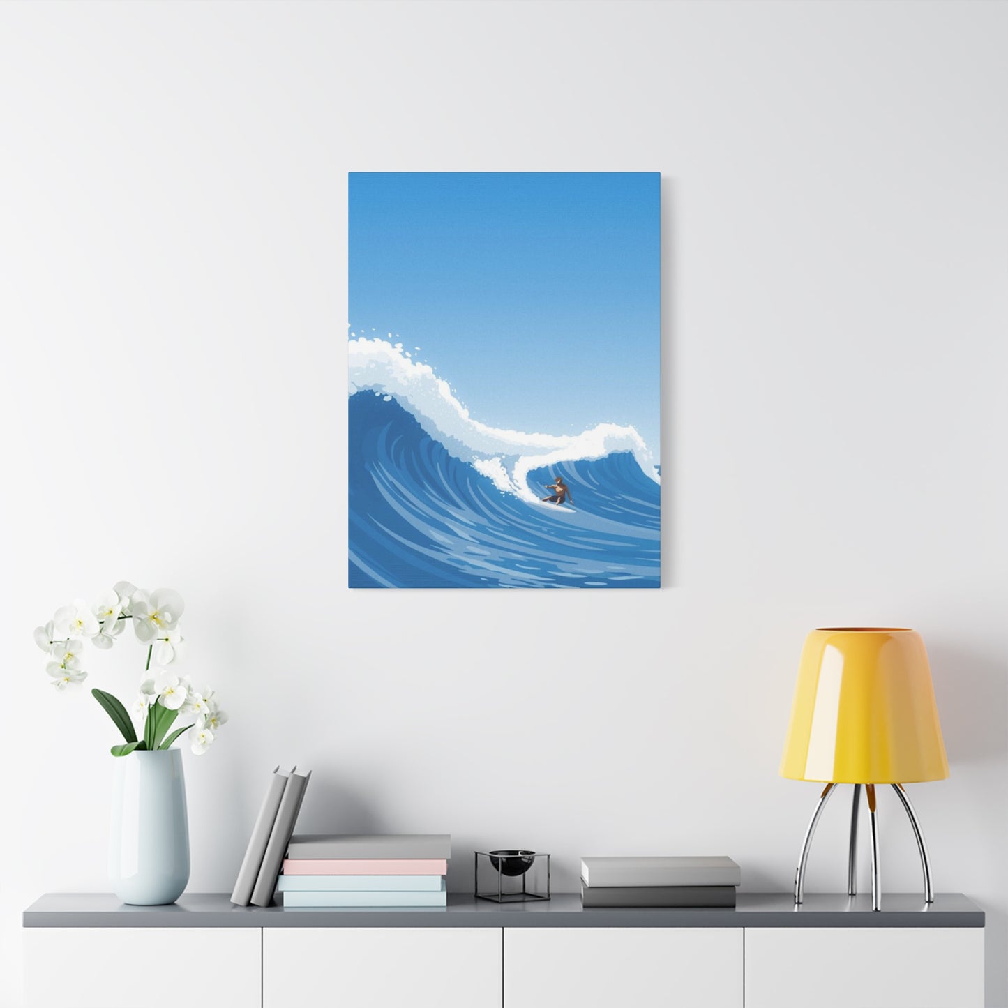
Determining the appropriate size for large abstract surfing wave wall art requires careful consideration of multiple factors, beginning with the physical dimensions of the intended space. Interior designers typically recommend that artwork occupy approximately sixty to seventy-five percent of the available wall space above furniture pieces, creating a proportional relationship that feels balanced rather than overwhelming or insignificant. For standalone walls without furniture, the calculations shift to account for ceiling height and adjacent architectural features.
In living rooms with standard eight-foot ceilings, a large abstract wave piece measuring four to six feet in width typically creates ideal visual impact without dominating the space. For rooms with higher ceilings, such as those found in contemporary open-plan designs or loft conversions, even larger pieces measuring eight to twelve feet across may be appropriate. The vertical orientation of the artwork also matters; horizontal compositions emphasize width and can make walls appear broader, while vertical orientations draw the eye upward, creating the illusion of increased ceiling height.
The viewing distance significantly influences size selection. Artwork intended to be viewed primarily from seating areas across the room can—and should—be larger than pieces positioned in hallways or near doorways where viewers pass closely. Large abstract wave art benefits from being viewed from multiple distances, revealing different details and compositional elements depending on proximity. When positioned appropriately, these pieces create dynamic viewing experiences as one moves through the space.
Room functionality should inform sizing decisions as well. In bedrooms, where the atmosphere tends toward relaxation and intimacy, slightly smaller pieces or those with calmer compositions may prove more suitable than in public areas of the home. Dining rooms can accommodate dramatic, conversation-starting pieces, as can entryways where first impressions matter. Home offices benefit from artwork that inspires without distracting, often calling for pieces with balanced compositions rather than extremely dynamic or chaotic abstractions.
The relationship between artwork and furniture creates another layer of consideration. When positioning large abstract surfing wave wall art above sofas, beds, or console tables, the bottom edge of the artwork should typically sit six to twelve inches above the furniture top. This creates visual connection between the elements while maintaining distinct separation. For artwork displayed on walls without accompanying furniture, centering the piece at average eye level—approximately fifty-seven to sixty inches from floor to the center of the artwork—creates the most comfortable viewing experience.
Investigating the Various Material Substrates and Printing Methods for Reproducing Wave Imagery
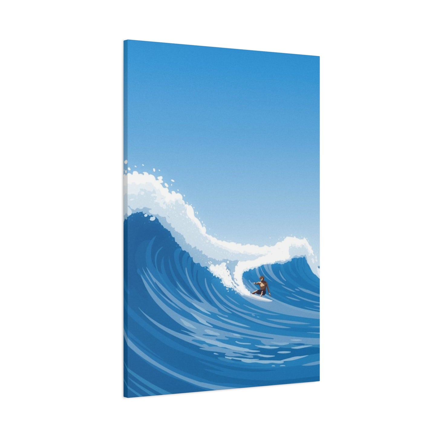
The substrate upon which large abstract surfing wave wall art is printed or created dramatically affects both its visual qualities and longevity. Canvas remains the most popular choice for reproductions, offering a traditional artistic aesthetic with subtle texture that diffuses light gently across the surface. Gallery-wrapped canvas, where the printed image continues around the edges of the stretcher frame, creates a finished appearance that eliminates the need for additional framing, making it an economical choice for large-scale pieces.
Metal prints have gained substantial popularity for ocean-themed artwork, offering vibrant color saturation and a contemporary aesthetic that complements modern interiors. The aluminum substrate provides exceptional durability and resistance to moisture, making metal prints particularly suitable for bathrooms, pool houses, or coastal properties where humidity levels fluctuate. The reflective quality of metal enhances the luminous properties of wave imagery, creating depth and dimensionality that can be striking when lighting conditions are optimized.
Acrylic prints represent a premium option, mounting the image behind clear acrylic panels that create extraordinary depth and color vibrancy. The acrylic face produces a glass-like appearance with superior clarity and impact resistance compared to actual glass. For large abstract surfing wave wall art, acrylic printing creates an almost three-dimensional effect, as if the wave is captured within a transparent medium—a metaphor that resonates beautifully with the aquatic subject matter. The weight of large acrylic prints requires robust mounting solutions, but the visual results often justify this consideration.
Wood substrates offer an organic alternative that introduces natural texture and warmth to abstract wave compositions. Printing directly onto wood panels or planks preserves the grain patterns, creating interesting interactions between the natural material and the artistic image. This approach works particularly well for more rustic or coastal-casual interior styles, where the combination of ocean imagery and natural wood reinforces the connection to natural elements.
For original artwork rather than prints, artists employ various materials and methods to create large abstract surfing wave wall art. Traditional canvas with oil or acrylic paints remains prevalent, offering richness and texture that reproductions cannot fully replicate. Some artists work on wood panels with mixed media, incorporating elements like sand, salt, or crushed shells to add literal coastal materials into their compositions. Resin art has emerged as a particularly fitting medium for wave abstraction, as the liquid resin can be manipulated to create organic flowing patterns before it cures, mimicking the fluid dynamics of actual water.
The printing method significantly impacts final quality, particularly at large scales where flaws become more apparent. Giclée printing, which uses archival inks and high-resolution processes, produces museum-quality reproductions suitable for large abstract surfing wave wall art. These prints maintain color accuracy and resist fading for decades when properly cared for. Dye-sublimation, commonly used for metal prints, infuses ink directly into the substrate coating, creating permanent, scratch-resistant images ideal for high-traffic areas or commercial spaces.
Analyzing Color Theory and Palette Selection for Maximum Visual Impact in Aquatic Compositions
Color selection represents one of the most powerful tools artists employ when creating large abstract surfing wave wall art, directly influencing both the emotional resonance and stylistic compatibility of the piece. Traditional oceanic palettes draw from the natural color spectrum of water, ranging from deep navy and cobalt blues in deep water to turquoise and aquamarine in shallows, with white and seafoam representing foam and spray. These naturalistic approaches create immediate recognition and connection with actual ocean experiences.
However, abstract interpretation allows for creative departures from literal color accuracy. Some artists introduce unexpected hues—purples, pinks, or metallics—that transform familiar wave forms into surreal visions. These unconventional palettes can create striking focal points in spaces decorated with neutral tones, providing controlled pops of color that energize without overwhelming. The key to successful color experimentation lies in maintaining internal consistency within the composition, ensuring that even unusual color choices feel intentional rather than arbitrary.
Monochromatic approaches to abstract wave art explore the full tonal range of a single hue, creating sophisticated compositions that emphasize form, texture, and value over chromatic variety. A large abstract surfing wave rendered entirely in blues, from nearly white to midnight deep, can create dramatic impact while maintaining elegance and versatility. Monochromatic pieces integrate seamlessly into diverse interior schemes, as their limited palette reduces the potential for color clashing with existing decor.
Complementary color schemes, pairing colors opposite each other on the color wheel, generate visual energy and vibrancy. For wave art, the combination of blue-orange or blue-green with reddish tones can create stunning contrast, particularly when representing sunset or sunrise surfing sessions. The tension between warm and cool tones adds dynamism to compositions, drawing the eye across the canvas as it navigates between contrasting areas.
Analogous color schemes utilize adjacent colors on the color wheel, creating harmonious, cohesive compositions that feel natural and restful. A palette of blues, blue-greens, and greens creates an immersive aquatic environment that envelops the viewer. This approach works exceptionally well for large-scale pieces intended for bedrooms or meditation spaces, where visual tranquility supports the room's purpose.
The saturation level of colors significantly affects the mood and style of large abstract surfing wave wall art. Highly saturated, vivid colors create energetic, attention-grabbing pieces suitable for contemporary or eclectic interiors. These bold works make strong statements and serve as primary focal points around which entire rooms can be designed. Conversely, desaturated or muted palettes produce sophisticated, subtle artwork that integrates more quietly into existing schemes while still providing visual interest and depth.
Understanding color temperature—the warmth or coolness of hues—helps in selecting artwork that complements or contrasts with a room's existing palette. Cool-toned wave art featuring blues and greens can refresh spaces dominated by warm woods and earth tones, while incorporating warm accents within the wave composition can create bridges between the artwork and warmer interior elements. The interplay of temperature creates visual complexity that keeps the eye engaged.
Discovering Frame and Mounting Solutions That Enhance Rather Than Distract From Wave Imagery
The presentation of large abstract surfing wave wall art significantly influences its visual impact and integration within a space. The decision between framed and unframed presentation depends on both the artwork medium and the desired aesthetic. Canvas prints commonly appear without traditional frames, instead utilizing gallery wrapping where the image extends around the canvas edges, creating a clean, contemporary appearance. This frameless approach emphasizes the artwork itself and suits modern, minimalist interiors where unnecessary embellishment is avoided.
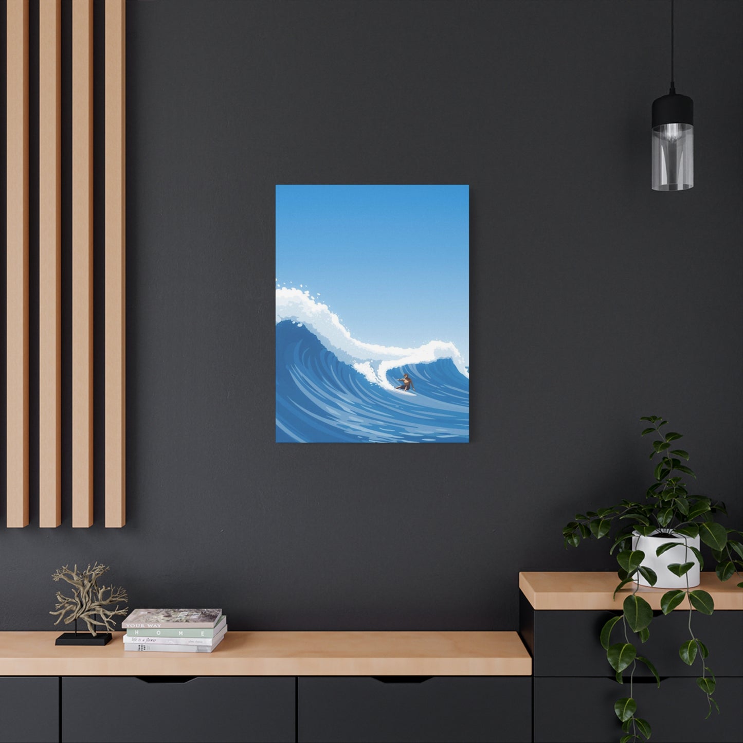
When framing is desired or necessary, selecting the appropriate frame style requires balancing complement and contrast. For abstract wave art with bold colors and dynamic compositions, simple frames with clean lines prevent visual competition between the artwork and its enclosure. Natural wood frames in lighter finishes—maple, ash, or whitewashed oak—evoke coastal aesthetics while providing structure. Darker woods create stronger contrast, making the artwork appear to pop forward from the wall, which can be effective for pieces with lighter overall tones.
Metal frames offer sleek, contemporary alternatives particularly well-suited to modern interiors. Brushed aluminum or stainless steel frames provide industrial edge while their neutral tones avoid clashing with the artwork's palette. Black metal frames create classic elegance and strong definition, making them versatile choices that work across various interior styles. For spaces with metallic design elements—copper fixtures, brass hardware, or gold accents—coordinating the frame material with these existing elements creates cohesive visual flow.
Float mounting represents a sophisticated framing approach where the artwork appears suspended within the frame, with space between the image edges and the frame itself. This presentation style creates a gallery-quality aesthetic, suggesting the artwork's importance and value. The floating effect works particularly well with abstract compositions, as the breathing room around the image allows the eye to focus entirely on the artistic content without the frame creating visual containment.
For artwork on metal or acrylic substrates, standoff mounting creates dimensional presentation that allows the piece to float inches away from the wall. This mounting method casts subtle shadows that shift throughout the day as lighting changes, adding another layer of visual interest. The dimensional quality enhances the sense of depth already present in wave imagery, creating an almost sculptural presence that transforms the artwork from a flat image into an environmental element.
The mounting hardware and method affect both the security and presentation of large abstract surfing wave wall art. Given the substantial weight of oversized pieces, particularly those on metal or acrylic, professional-grade mounting hardware is essential. French cleats provide robust support while allowing easy leveling adjustments, making them popular for heavy artwork. For pieces with wire hanging systems, ensuring the wire and D-rings are rated for significantly more than the artwork's actual weight provides necessary safety margin.
Creating gallery walls featuring multiple pieces of wave-themed artwork requires careful planning of spacing and arrangement. Interior designers typically recommend leaving two to three inches between frames in clustered arrangements, creating visual connection while maintaining distinct separation. For large statement pieces paired with smaller complementary works, asymmetrical arrangements often create more visual interest than rigidly symmetrical layouts, mimicking the organic irregularity of natural wave patterns.
Examining the Interplay Between Lighting Design and Ocean-Themed Artwork Display
Lighting represents perhaps the most underestimated factor in successfully showcasing large abstract surfing wave wall art. Natural light, while desirable in many contexts, presents specific challenges for artwork display. Direct sunlight can cause fading over time, particularly with lower-quality prints or original works using fugitive pigments. Positioning artwork perpendicular to windows rather than directly opposite them minimizes light exposure while still allowing the piece to benefit from natural illumination that reveals its colors and textures accurately.
For spaces where natural light is limited or artwork must be positioned on walls that receive direct sun exposure, UV-filtering window treatments or glazing provide protection without dramatically altering the viewing experience. Museum-quality acrylic or glass with UV-filtering properties can be incorporated into framing solutions, blocking harmful wavelengths while maintaining optical clarity. This proves particularly important for valuable original works or limited edition prints where preservation matters.
Artificial lighting offers greater control and can be specifically designed to enhance abstract wave artwork. Track lighting provides flexibility, allowing individual fixtures to be aimed precisely at artwork while accommodating future rearrangements. LED track lights have become the standard recommendation, offering excellent color rendering, minimal heat output that won't damage artwork, and energy efficiency. Selecting bulbs with color temperatures between 2700K and 3000K provides warm, inviting illumination that flatters most color palettes, while 3500K to 4000K options offer neutral white light that renders colors most accurately.
Picture lights—small fixtures mounted directly above or integrated into the artwork frame—create dramatic, museum-style presentation by concentrating illumination on the piece itself while allowing the surrounding wall to recede into relative shadow. This approach makes the artwork appear to glow, creating focal emphasis that naturally draws attention. Adjustable picture lights allow customization of the beam angle and intensity, accommodating different artwork sizes and room configurations.
Accent washing, where recessed ceiling fixtures cast broad, even illumination across entire walls, creates subtle highlighting suitable for spaces displaying multiple artworks or where dramatic spotlighting would feel excessive. This approach works well in hallways, stairways, or open-plan living areas where multiple visual elements compete for attention. The even illumination prevents harsh shadows while ensuring the artwork remains visible and appreciated.
The direction and angle of lighting significantly affect how textured artwork appears. Side lighting, where illumination comes from an angle rather than head-on, emphasizes surface texture and dimensionality. For large abstract surfing wave wall art with heavy impasto, resin layers, or other three-dimensional elements, strategic side lighting reveals these qualities, creating shifting appearances throughout the day as natural light angles change. This dynamic quality keeps the artwork feeling alive rather than static.
Avoiding glare represents a critical consideration, particularly with glazed, acrylic, or metal artworks that have reflective surfaces. Positioning light sources at thirty-degree angles from the artwork center typically minimizes glare while providing adequate illumination. Testing lighting positions during evening hours, when artificial light is most prominent, ensures comfortable viewing without distracting reflections. Matte or anti-reflective coatings on acrylic or glass can reduce glare issues, though they may slightly soften the image appearance.
The lighting in surrounding areas affects how artwork is perceived. High-contrast situations, where artwork is brightly lit while surrounding areas remain dark, can feel theatrical and dramatic but may cause eye strain during extended viewing. Balancing ambient room lighting with artwork-specific illumination creates more comfortable viewing conditions while still providing emphasis. Dimmable lighting systems offer flexibility, allowing adjustment based on time of day, activities, and mood preferences.
Exploring Diverse Interior Design Styles and Their Relationship With Ocean-Inspired Artwork
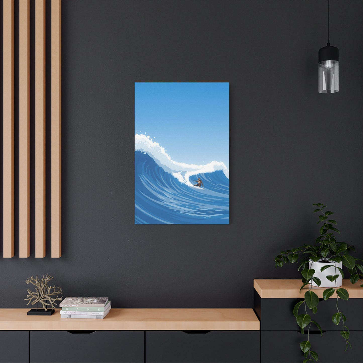
Coastal design represents the most obvious aesthetic partnership with large abstract surfing wave wall art, though even within this category, significant variety exists. Traditional coastal style, characterized by light woods, white and blue color schemes, and nautical accessories, naturally accommodates wave artwork that echoes these palettes. Pieces featuring turquoise and white with touches of sandy beige create harmony with the established aesthetic while providing the visual interest and scale that large-format artwork delivers.
Modern coastal design, sometimes termed "coastal contemporary," strips away the more literal nautical elements in favor of cleaner lines, neutral palettes with blue accents, and natural materials like jute, linen, and weathered wood. Large abstract surfing wave wall art in this context tends toward more sophisticated color palettes—perhaps navy and gray rather than bright turquoise—and compositions that suggest rather than explicitly depict waves. The restraint in both the artwork and surrounding decor creates spaces that feel refined and tranquil rather than themed.
Scandinavian design principles, emphasizing minimalism, functionality, and connection to nature, provide unexpected but compelling context for abstract wave art. The Nordic appreciation for natural elements and the region's extensive coastlines make ocean imagery culturally relevant. In Scandinavian-inspired spaces, wave art with cooler color palettes—whites, grays, pale blues—maintains the aesthetic's characteristic restraint while introducing organic forms that soften the sometimes austere minimalism. The artwork becomes a connection point to nature, fulfilling the biophilic design principles central to Scandinavian philosophy.
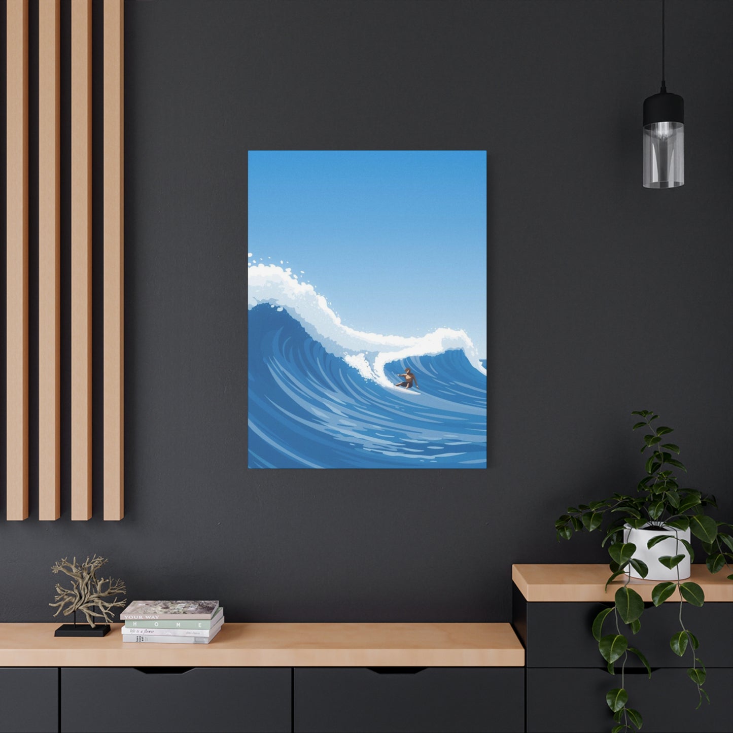
Industrial interiors, with their exposed structural elements, neutral palettes, and raw materials, might seem incompatible with ocean themes, yet thoughtfully selected large abstract surfing wave wall art can create striking juxtaposition. Artwork with cooler tones and dynamic, energetic compositions provides contrast against brick, concrete, and metal surfaces while the large scale matches the proportions typical of industrial spaces with high ceilings and open plans. The organic curves of waves offer visual relief from the predominant right angles and straight lines characteristic of industrial design.
Mid-century modern spaces, defined by clean lines, organic forms, and thoughtful integration of art, naturally accommodate abstract artwork, including wave-themed pieces. The period's embrace of abstract expressionism and the prevalence of ocean and nature themes in mid-century art create historical precedent for this pairing. Wave artwork with geometric abstraction or bold, simplified forms complements the aesthetic particularly well. Color palettes featuring teals, oranges, and mustard yellows—popular mid-century accent colors—can bridge the artwork and surrounding decor.
Bohemian or eclectic interiors thrive on mixing diverse elements, making them particularly accommodating contexts for large abstract surfing wave wall art. The layered, collected-over-time aesthetic of boho design allows ocean artwork to coexist with global textiles, vintage finds, and varied patterns. In these spaces, wave art with more complex color palettes or mixed-media elements that include texture and dimension feel at home. The organic, flowing nature of wave forms echoes the relaxed, unstructured approach central to bohemian design philosophy.
Contemporary luxury design, characterized by sophisticated materials, curated art collections, and attention to detail, can incorporate ocean-themed artwork when pieces demonstrate artistic merit and quality commensurate with the overall design investment. Original artwork or high-end limited editions with museum-quality framing become integral components of the design rather than decorative afterthoughts. In these contexts, large abstract surfing wave wall art functions similarly to sculpture, chosen for its artistic significance and investment value as much as its aesthetic appeal.
Transitional design, blending traditional and contemporary elements, requires artwork that similarly bridges stylistic periods. Abstract wave art with classic color palettes—navy, white, touches of gold or brass—but contemporary compositions can satisfy both traditional and modern sensibilities. The scale and impact of large-format pieces provide the presence that transitional spaces need, while the abstract nature prevents the artwork from reading as either strictly traditional or exclusively contemporary.
Understanding the Physical and Spatial Considerations for Different Residential Rooms
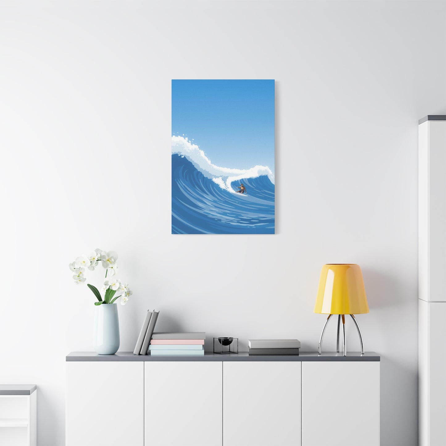
Living rooms represent the most common location for large abstract surfing wave wall art, functioning as primary gathering spaces where significant artwork makes the greatest impact on both residents and guests. The wall above the sofa typically serves as prime real estate, offering substantial uninterrupted space suitable for oversized pieces. The height and length of the sofa should inform artwork dimensions, with the piece generally spanning fifty to seventy-five percent of the sofa's width to create proportional balance.
In open-concept living spaces that combine living, dining, and kitchen areas, large artwork helps define zones without physical barriers. A substantial wave piece anchoring the living area creates visual weight that establishes the space's boundary and purpose. The artwork's colors can be echoed in throw pillows, rugs, or other accessories to create cohesion across the open floor plan while maintaining distinct functional areas.
Bedroom applications of large abstract surfing wave wall art require consideration of the space's restful purpose. Compositions with calmer movements and cooler, more subdued color palettes promote the tranquility appropriate for sleeping spaces. Positioning the artwork above the bed creates a focal point visible upon entering the room, though some designers prefer placing significant artwork on walls opposite the bed, making it the last thing seen before sleep and first upon waking—a consideration that takes on particular meaning when the artwork evokes positive associations with ocean experiences.
Home offices benefit from artwork that inspires without distracting, making abstract wave pieces particularly suitable. The dynamic energy of wave imagery can stimulate creativity and motivation, while the abstract nature prevents the literal distraction that detailed figurative artwork might create. Positioning artwork within the peripheral vision of the primary work position allows for contemplative glances during thinking or planning moments without pulling focus from screen-based tasks.
Dining rooms offer opportunities for more dramatic or conversation-starting pieces, as the room's social function means artwork becomes a topic of discussion rather than quiet contemplation. Bold compositions with striking color contrasts or unusual interpretations of wave forms can energize dining spaces. The wall perpendicular to the table's length typically provides the best viewing angle for diners, who will spend extended periods facing this direction during meals.
Bathrooms and powder rooms, particularly in larger or luxury homes, increasingly feature significant artwork, and ocean themes feel naturally appropriate in these water-focused spaces. Ensuring the artwork medium is suitable for humid environments is crucial; metal prints and properly sealed canvas or acrylic pieces withstand bathroom conditions better than paper-based works. The psychological connection between the artwork subject and the room's function creates intuitive cohesion.
Hallways and stairways present unique opportunities and challenges for large artwork. Long, narrow hallways benefit from horizontal compositions that emphasize the space's length, while vertical pieces in stairwells can mirror the upward movement. Lighting becomes particularly important in these transitional spaces, which often lack natural light. The artwork should be positioned to be appreciated during passage rather than requiring stopping for extended viewing, though exceptional pieces merit the inclusion of seating areas in wider hallways.
Entryways serve as introduction spaces where first impressions form, making them prime locations for statement artwork. Large abstract surfing wave wall art in an entry creates immediate atmosphere, signaling aesthetic priorities and personal interests. The scale should be proportionate to the entry's size; in grand foyers, truly monumental pieces measuring eight feet or more can be appropriate, while smaller entries require more modest dimensions to avoid overwhelming the space.
Investigating the Relationship Between Abstract Wave Art and Surfing Culture's Values
Surfing culture embodies specific values and philosophies that extend far beyond the physical act of riding waves, and large abstract surfing wave wall art can serve as visual representation of these deeper principles. The patience required in surfing—waiting for the right conditions, the right swell, the right wave in a set—translates into a broader life philosophy about timing and recognizing opportunities. Abstract artwork that captures both the stillness before a wave and the explosive energy of its breaking mirrors this duality.
The relationship between surfer and ocean reflects broader environmental awareness central to surfing culture. Many surfers develop deep ecological consciousness through intimate, repeated contact with marine environments, making them advocates for ocean conservation and environmental protection. Abstract wave art in the homes of surfers and ocean advocates serves as reminder of what's at stake, keeping environmental commitments visible and present in daily life. Artists who contribute portions of sales to ocean conservation organizations add another dimension of alignment between the artwork and surfing culture's values.
The concept of flow states—those moments of complete absorption and optimal performance that surfers experience during exceptional sessions—resonates beyond athletics into creative and professional domains. Large abstract surfing wave wall art, particularly pieces with fluid, dynamic compositions, can evoke the feeling of flow, serving as inspiration for achieving similar states in other pursuits. The artwork becomes a touchstone connecting the transcendent experiences of surfing with the challenges of everyday life.
Surfing's global community, united by shared passion despite diverse backgrounds and geographic distances, values authentic experience and genuine connection. Abstract wave artwork that feels authentic—whether because it's created by artist-surfers who understand their subject intimately or because it successfully captures the essence of wave riding—resonates with this community in ways that generic beach scenes cannot. The abstraction allows personal interpretation, meaning each viewer can project their own experiences and memories onto the composition.
The minimalist ethos prevalent in surfing culture, where the surfer, board, and wave represent a stripped-down, essential experience, finds parallel in abstract art that reduces complex scenes to their fundamental elements. Large abstract pieces that employ minimalist approaches—limited palettes, clean compositions, emphasis on essential forms—align aesthetically with surfing's appreciation for simplicity and purity of experience. This alignment makes such artwork particularly appealing to surfers seeking to surround themselves with objects that reflect their values.
The meditative aspects of surfing—the rhythmic paddling, the waiting, the intense focus required to read ocean conditions—connect with contemplative art appreciation. Abstract wave artwork invites prolonged viewing and interpretation, creating opportunities for the same kind of present-moment awareness that surfing cultivates. Living with such artwork can extend the meditative benefits of surfing beyond actual sessions, bringing elements of that mental state into daily domestic life.
Risk-taking and commitment, essential elements of surfing particularly as wave size increases, represent values that many surfers carry into other life areas. Abstract artwork that captures the power and potential danger of large waves can serve as reminder of these experiences, the courage they required, and the rewards they delivered. For those who've committed to dropping into substantial swells, artwork depicting similar scenarios becomes a badge of experience and tribute to adventures undertaken.
Analyzing the Artistic Process Behind Creating Large-Scale Abstract Wave Compositions
Understanding the creative process behind large abstract surfing wave wall art deepens appreciation for the finished works and helps collectors make informed selections. Many artists working in this genre begin with direct observation—spending time at beaches, studying wave patterns, photographing swells, and sometimes surfing themselves to gain intimate knowledge of their subject. This research phase grounds the abstraction in authentic experience rather than imagined or secondhand concepts.
The transition from observation to abstraction involves identifying which elements of the wave experience feel most essential and emotionally resonant. Some artists focus on the color transitions as shallow water moves over reefs, while others emphasize the sculptural quality of water forming peaks and barrels. The movement and energy—the sheer kinetic force of thousands of gallons of water in coordinated motion—captivates some creators, leading to compositions dominated by gestural marks and dynamic flow.
When working at large scales, artists must consider how their chosen medium and process will translate. A technique that works beautifully on a twelve-by-sixteen-inch canvas may behave entirely differently on a six-by-eight-foot surface. Some artists create extensive studies and smaller versions before attempting large pieces, while others embrace the unique challenges of large formats, using the size to create effects impossible at smaller scales. Fluid acrylic pouring, for instance, produces more dramatic effects with larger volumes of paint covering greater areas.
The physical demands of creating large artwork influence the process significantly. Working on substantial canvases often requires floor work rather than easel positioning, fundamentally changing the artist's relationship with the piece. This overhead perspective can enhance the creation of wave art, as it mirrors the view surfers have when diving under waves or the aerial perspectives increasingly common in contemporary surf photography and videography. The physicality of applying paint with large brushes, squeegees, or even body movements echoes the physical nature of surfing itself.
Many artists incorporate experimental processes that introduce controlled unpredictability, mirroring the ocean's combination of pattern and chaos. Techniques like fluid painting, where diluted acrylics are poured and tilted to create organic flows, or resin work, where multiple layers of tinted resin are manipulated before curing, allow materials to move according to their own properties while being guided by the artist's vision. This partnership between intention and chance parallels the surfer's relationship with waves—riding forces beyond control while exercising skill and decision-making.
Color mixing and selection at large scales requires planning to ensure consistency across the entire composition. Artists may mix large batches of custom colors before beginning, or they may work in sessions, building the piece through multiple layers over days or weeks. The drying time between layers, particularly with oils or thick acrylics, necessitates patient working methods that span extended periods. This gradual development allows the artwork to evolve, with each layer responding to what preceded it.
Some artists incorporate mixed media, adding materials beyond traditional paints. Sand, crushed shells, or sea salt embedded in paint layers add textural interest while creating literal connection to coastal environments. Metallic powders or leaf can create luminous passages suggesting sunlight on water. Collage elements, including torn paper or fabric, introduce compositional complexity. These additions transform the artwork from purely visual experience into something more tactile and dimensionally varied.
The decision about when a piece is complete represents one of the most challenging aspects of the creative process, particularly with abstract work where there's no objective standard of accuracy. Some artists work until a specific vision fully manifests, while others embrace the journey-based approach, stopping when the composition achieves balance and interest even if it differs from initial intentions. The best abstract wave art often contains evidence of this wrestling with completion—areas reworked, layers visible beneath surface passages, tensions between competing elements that remain unresolved yet compelling.
Conclusion
Assessing the quality of large abstract surfing wave wall art requires examining multiple factors that collectively determine whether a piece represents worthwhile investment. The first consideration involves the artistic concept itself—does the work present a fresh perspective on the wave theme, or does it feel derivative of countless other ocean pieces? Original artistic voice separates compelling artwork from mere decoration, even when both may be technically well executed.
Examining the execution reveals the skill level and attention to detail the artist brought to the work. In abstract art, where there's no requirement for accurate representation, quality manifests through intentionality—the sense that every color choice, compositional decision, and technical application serves the artistic vision. Random or thoughtless mark-making lacks the resonance of purposeful creation. Looking for consistency in paint application, clean edges where desired, successful blending where intended, and overall technical competence provides insight into the artist's skill.
Share