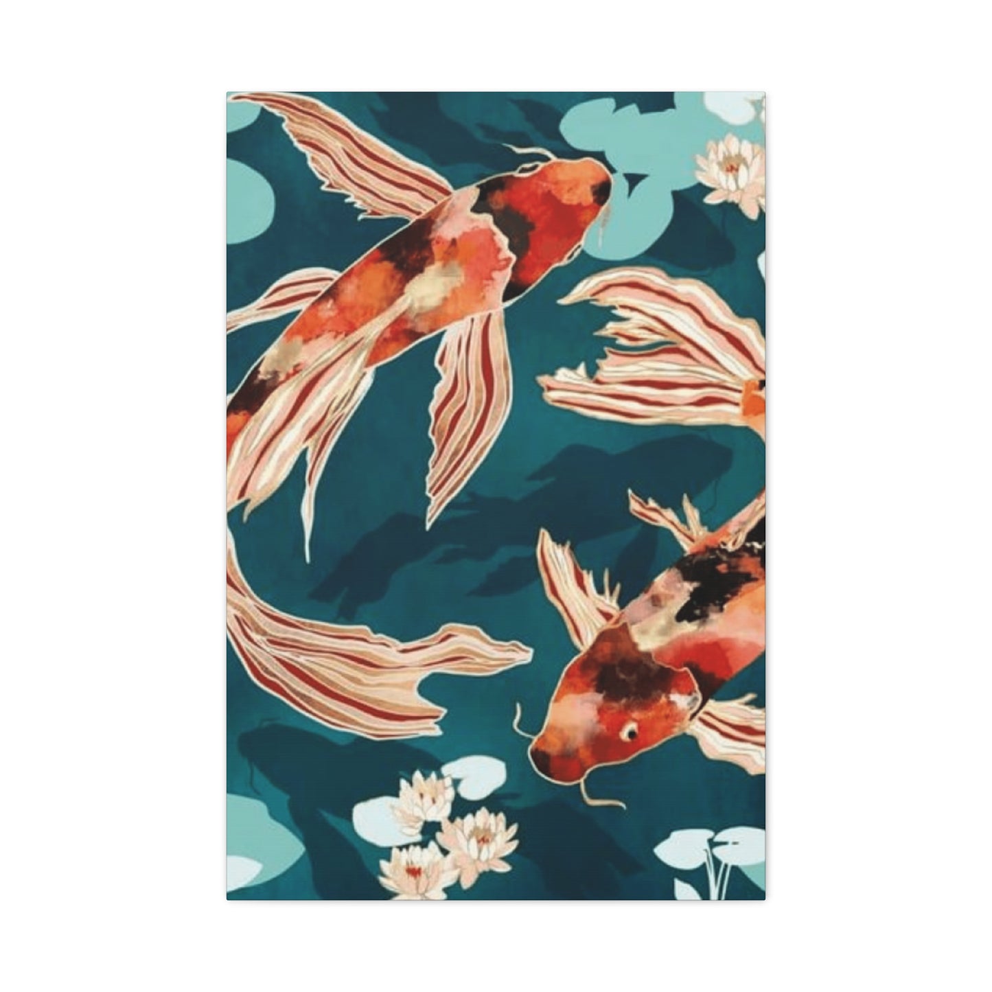
Koi Fish Painting Wall Art & Canvas Prints
Koi Fish Painting Wall Art & Canvas Prints
Couldn't load pickup availability
Bringing Serenity and Prosperity Through Ancient Symbolism Into Modern Living Spaces With Koi Fish Painting Wall Art
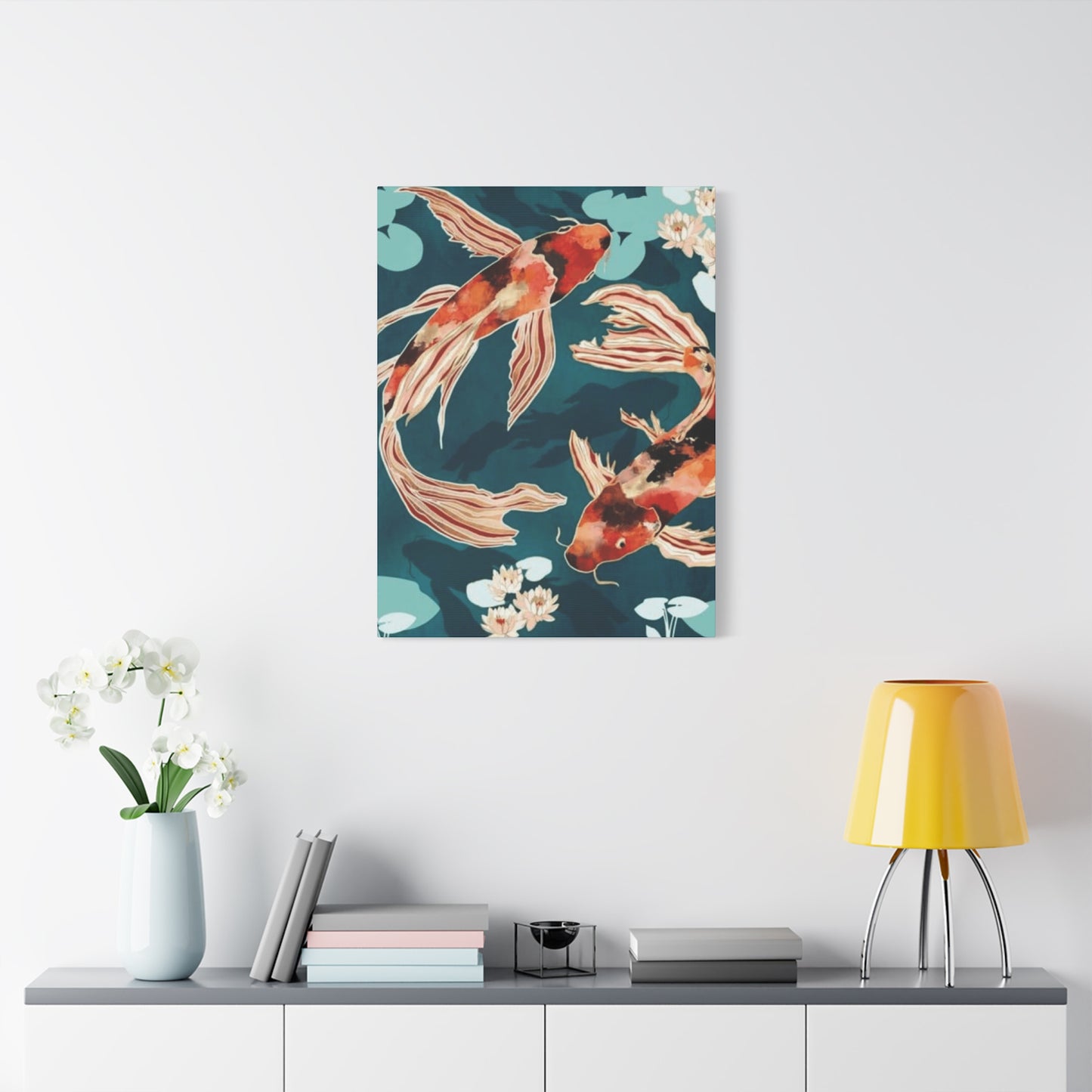
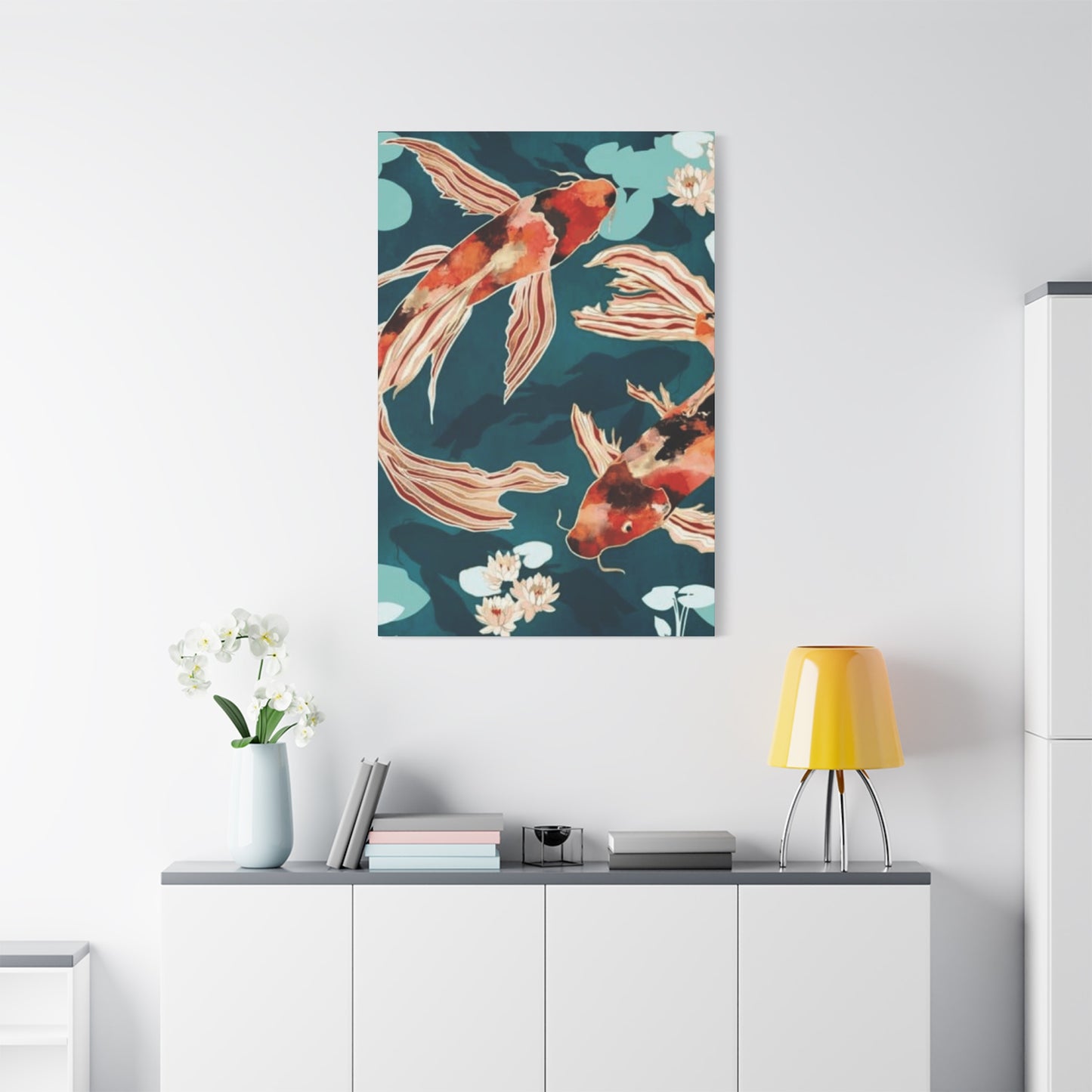
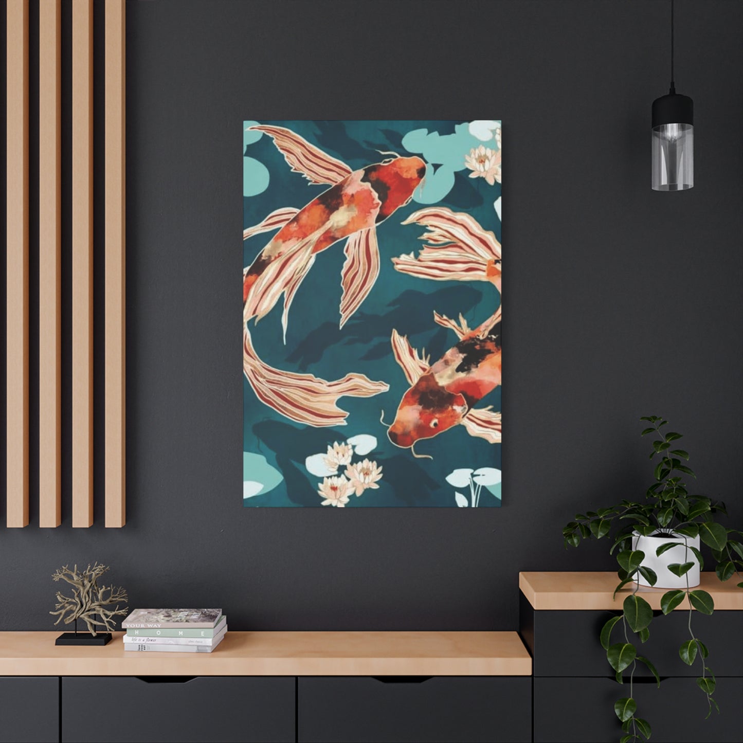
The mesmerizing allure of koi fish has captivated humanity for centuries, transcending cultural boundaries and finding its way into contemporary interior design through stunning visual representations. These vibrant aquatic creatures, rendered in countless artistic styles, have become one of the most sought-after decorative elements for homes, offices, and commercial establishments worldwide. The profound symbolism embedded within these aquatic subjects, combined with their undeniable aesthetic appeal, creates a unique opportunity to infuse living environments with both beauty and meaningful energy.
When contemplating the incorporation of aquatic-themed artwork into residential or professional settings, understanding the multifaceted significance behind these colorful swimming creatures becomes paramount. Originating from ancient Eastern philosophies and gradually permeating Western consciousness, the imagery associated with these ornamental fish carries layers of meaning that extend far beyond mere decoration. Each brushstroke, color selection, and compositional choice contributes to a visual narrative that speaks to prosperity, perseverance, good fortune, and spiritual transformation.
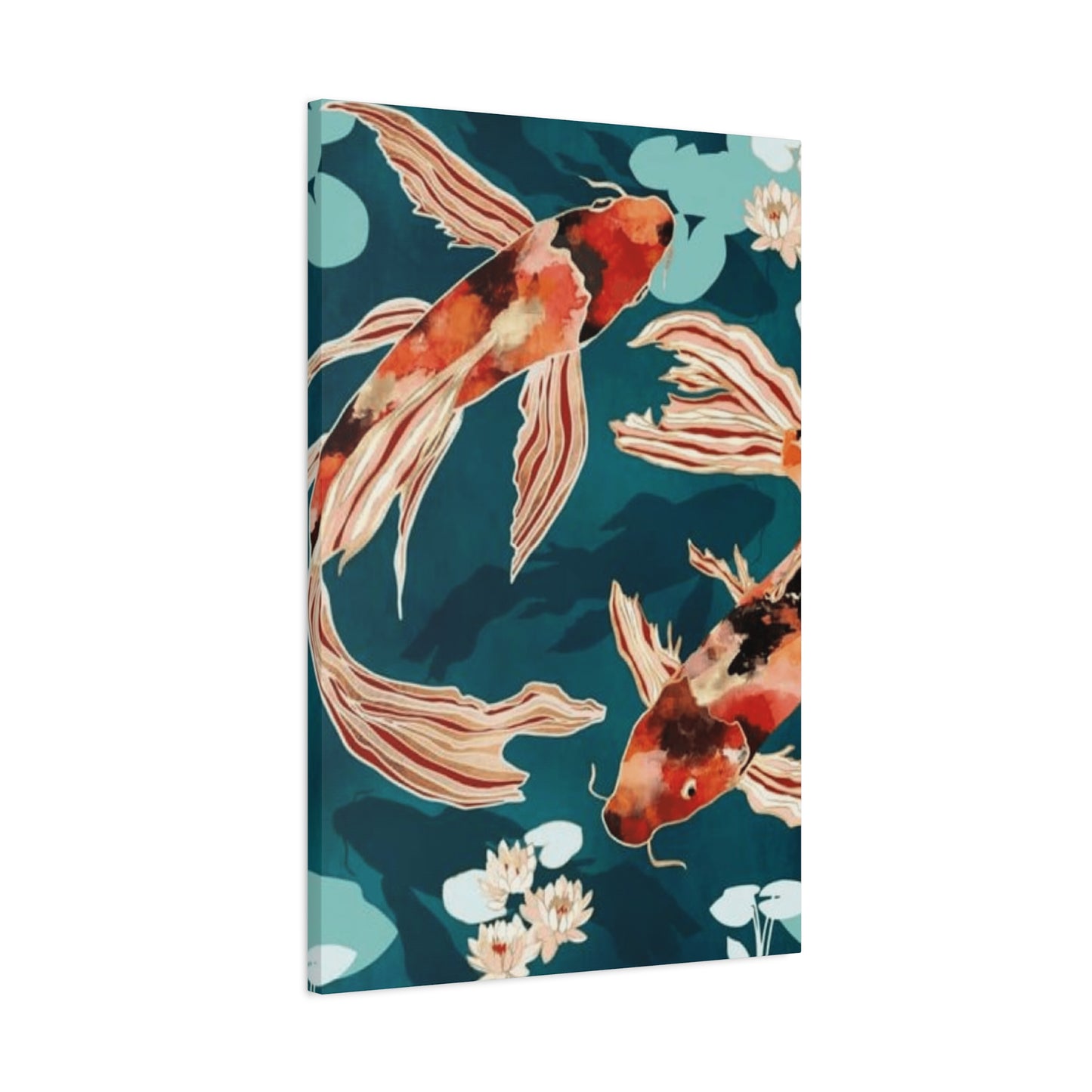
The practice of displaying representations of these magnificent swimmers has evolved from traditional scrolls and screens to encompass a vast array of formats suitable for every conceivable space and aesthetic preference. From minimalist interpretations that emphasize clean lines and negative space to elaborate compositions bursting with chromatic intensity and intricate detail, the versatility of this subject matter ensures relevance across diverse decorating schemes and personal tastes. Whether rendered through watercolor delicacy, oil paint richness, digital precision, or mixed media experimentation, these aquatic subjects maintain their captivating essence while adapting to contemporary sensibilities.
Symbolism and Deeper Meanings Behind Ornamental Fish Imagery in Artistic Representations
The cultural resonance of these aquatic creatures extends back thousands of years, with their symbolic significance deeply rooted in Eastern philosophies, particularly within Chinese and Japanese traditions. These swimming beings represent a constellation of virtuous qualities and auspicious concepts that have made them enduringly popular subjects for artistic interpretation. Understanding these layered meanings enriches the experience of both selecting and living with such artwork, transforming a simple decorative choice into a daily reminder of aspirational qualities and philosophical principles.
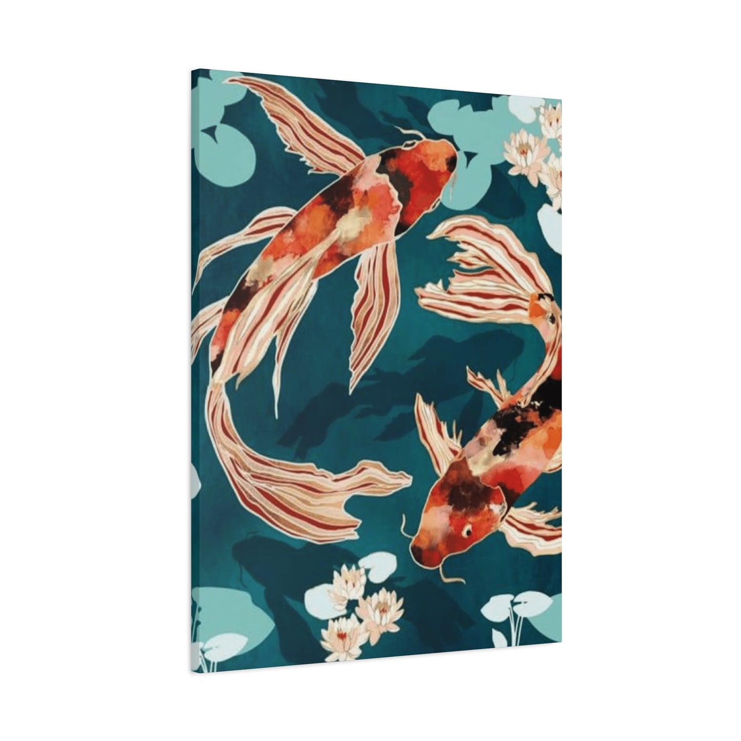
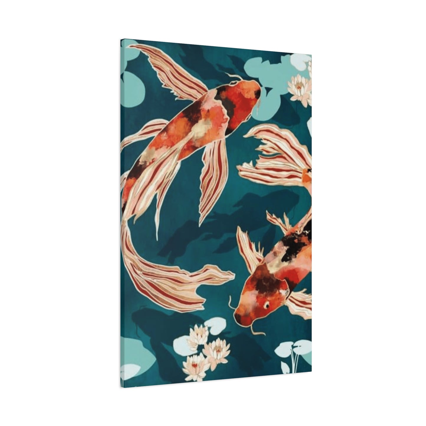
In Chinese cultural contexts, these fish embody abundance and wealth, with their name sharing phonetic similarities with words denoting surplus and advantage. This linguistic connection has elevated them to powerful emblems of financial prosperity and material success. Homes and establishments displaying their imagery traditionally invite positive monetary flow and sustained economic stability. The creatures' ability to swim against powerful currents symbolizes determination, resilience, and the capacity to overcome adversity—qualities universally admired and aspired to across human societies.
Japanese interpretations add additional dimensions to the symbolic framework surrounding these aquatic subjects. Within this context, they represent masculine strength, courage, and the warrior spirit, with specific color variations carrying distinct meanings. Black specimens symbolize overcoming obstacles and emerging stronger from hardship, while red variations denote powerful love and passionate relationships. White fish represent career success and fulfillment in professional endeavors, and yellow or golden specimens signify wealth accumulation and material prosperity. This chromatic symbolism allows collectors and decorators to select pieces that resonate with specific intentions and personal goals.
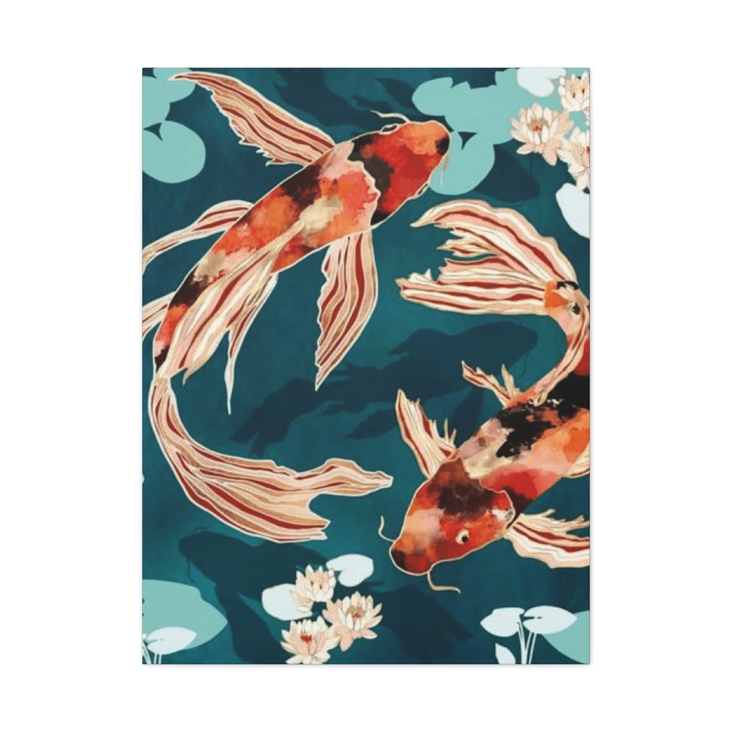
The upward swimming motion frequently depicted in artistic renderings carries particular significance, representing ambition, progress, and the pursuit of elevated consciousness. This directional element transforms the artwork into a visual affirmation of growth and advancement, making such pieces especially popular in workspaces, study areas, and any environment dedicated to personal development. Conversely, downward-swimming representations, while less common, can symbolize the completion of a journey or the fulfillment of a goal, offering a sense of accomplishment and restful achievement.
The number of creatures depicted within a composition also carries symbolic weight, with traditional numerology assigning specific meanings to different quantities. A single fish represents focused concentration and singular purpose, while pairs symbolize harmonious relationships and partnership. Groups of nine fish, considered especially auspicious, represent completion and long-lasting fortune. These numerical considerations provide another layer of intentionality when selecting pieces for specific purposes or locations within a living or working environment.
Varieties of Artistic Styles and Rendering Approaches for Aquatic Subject Matter
The artistic interpretation of these ornamental swimmers spans an impressive spectrum of styles, mediums, and aesthetic philosophies, ensuring that enthusiasts of every artistic preference can find representations that resonate with their personal taste. From faithful naturalistic depictions that capture every scale and fin with photographic precision to abstract interpretations that distill the essence of these creatures into pure form and color, the diversity of approaches reflects both the subject's enduring appeal and its adaptability to evolving artistic movements.
Traditional Eastern approaches to depicting these aquatic subjects emphasize brushwork fluidity, strategic use of negative space, and the philosophical concept of capturing essential spirit rather than surface appearance. These methodologies, refined over centuries of practice, create images that balance technical skill with meditative presence. Contemporary artists working within these traditional frameworks honor ancestral techniques while often introducing subtle innovations that speak to modern sensibilities without compromising the core aesthetic principles that define the style.
Impressionistic interpretations of the subject matter focus on capturing the play of light on water, the shimmering movement of scales, and the dreamlike quality of observing these creatures through their aquatic medium. These works prioritize atmospheric mood and emotional resonance over precise anatomical accuracy, creating pieces that evoke feelings and sensations rather than documenting physical reality. The soft edges, broken color, and emphasis on luminosity characteristic of this approach make such works particularly suitable for spaces intended for relaxation and contemplation.
Photorealistic renderings push in the opposite direction, celebrating technical mastery and the artist's ability to recreate the visual experience of encountering these creatures with astonishing fidelity. Every iridescent scale, every subtle gradation of color, every reflection and refraction receives meticulous attention, resulting in images that can momentarily confuse the boundary between artwork and reality. These pieces appeal to those who appreciate technical virtuosity and the meditative focus required to achieve such precise results.
Abstract and semi-abstract approaches liberate the subject from representational constraints, using the fish form as a starting point for explorations of color relationships, compositional dynamics, and emotional expression. These interpretations might reduce the creatures to essential shapes and gesture, or explode them into kaleidoscopic arrangements that prioritize visual impact over literal depiction. Such works often resonate strongly with contemporary interior design schemes that embrace bold statements and unconventional aesthetic choices.
Mixed media approaches combine multiple materials and techniques within a single composition, potentially incorporating elements like metallic leaf, textured papers, fabric, found objects, or three-dimensional embellishments. These hybrid works blur boundaries between painting, collage, and sculpture, creating pieces with exceptional visual interest and textural complexity. The layered construction of such works often reveals new details upon repeated viewing, rewarding sustained engagement and contemplation.
Digital creation methods have opened entirely new possibilities for rendering these aquatic subjects, with artists utilizing software tools to achieve effects impossible through traditional means. These works might incorporate photographic elements, generate impossible color combinations, or create seamless patterns suitable for large-scale reproduction. The precision and repeatability of digital workflows also enable the production of limited edition prints that maintain exceptional quality while remaining more accessible than unique original works.
Chromatic Considerations and Color Psychology in Aquatic-Themed Artwork
The palette employed within representations of these ornamental swimmers profoundly influences both the aesthetic impact and symbolic resonance of the finished work. Color choices affect mood, perceived energy, and psychological response, making thoughtful chromatic selection essential for achieving desired effects within specific environments. Understanding both traditional color symbolism and contemporary color psychology empowers collectors to make selections that enhance their spaces in precise and intentional ways.
Warm color schemes dominated by reds, oranges, and golds create visual warmth and energetic vitality within spaces. These hues stimulate conversation, appetite, and social interaction, making them particularly suitable for dining areas, entertainment spaces, and commercial establishments seeking to create welcoming, lively atmospheres. Red-toned fish imagery carries associations with passion, courage, and vitality, infusing spaces with dynamic energy that counteracts lethargy and promotes engagement.
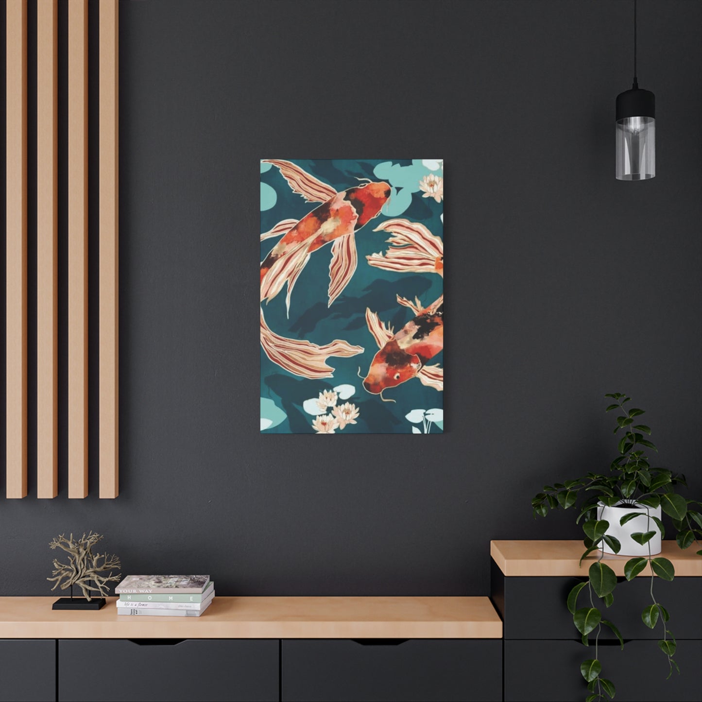
Cool palettes emphasizing blues, greens, and purples generate calming, contemplative environments conducive to relaxation and focused thought. These chromatic choices prove ideal for bedrooms, meditation spaces, home offices, and any setting where mental clarity and emotional tranquility are priorities. Blue and green fish representations evoke the aquatic environment itself, creating visual connections to water's soothing properties and nature's restorative influence.
Monochromatic and near-monochromatic approaches, whether executed in grayscale, sepia tones, or variations within a single hue family, offer sophistication and restraint. These subtle palettes integrate seamlessly with minimalist design schemes and environments where the artwork should complement rather than dominate the overall aesthetic. The tonal subtlety of such works rewards careful observation, revealing complexity within apparent simplicity.
Metallics, particularly gold and silver, add luxurious dimension while connecting to traditional symbolism associating these fish with wealth and prosperity. Artwork incorporating genuine metallic leaf or metallic paints catches and reflects light dynamically throughout the day, creating a living quality as the piece responds to changing illumination. These lustrous elements elevate the perceived value of the work while creating focal points that draw and hold attention.
Complementary color schemes, pairing hues opposite each other on the color wheel, generate visual vibrancy and dynamic tension that energizes spaces. The classic combination of orange fish against blue water exemplifies this approach, creating compositions with inherent drama and visual excitement. These high-contrast palettes work especially well in contemporary settings that embrace bold design choices and striking visual statements.
Analogous color harmonies, utilizing hues adjacent on the color wheel, produce more subtle, unified compositions that feel cohesive and serene. These gentle transitions between related colors create visual flow and organic harmony, making such works particularly suitable for spaces prioritizing peaceful continuity over dramatic impact. The resulting aesthetic feels balanced and complete without requiring the eye to reconcile competing chromatic elements.
Compositional Arrangements and Visual Flow Within Ornamental Fish Artwork
The arrangement of elements within aquatic-themed compositions significantly influences how viewers experience and interpret the work. Compositional choices guide the eye, create narrative implications, and establish the overall energy and mood of the piece. Artists employ various structural strategies to create visual interest while maintaining the coherent, balanced presentations that characterize successful decorative artwork.
Diagonal compositions introduce dynamic movement and visual energy, with fish arranged along angled trajectories that lead the eye through the picture plane. This approach creates inherent momentum and suggests active swimming and purposeful direction. Diagonal arrangements prove particularly effective for rectangular formats, utilizing the elongated dimensions to emphasize movement from one corner toward its opposite, creating visual pathways that activate the entire compositional space.
Circular or spiral arrangements establish continuous movement without clear beginning or end, symbolizing cycles, eternity, and the interconnected nature of existence. Fish arranged in rotating patterns draw the eye in circular paths, creating meditative viewing experiences that encourage sustained contemplation. These compositions often incorporate the yin-yang principle of balanced opposing forces, with fish swimming in contrary directions representing complementary energies in dynamic equilibrium.
Vertical compositions emphasize upward striving and spiritual ascension, particularly effective when depicting fish swimming toward the picture's top edge. This orientation aligns with the symbolic significance of upstream swimming as representing ambition and overcoming obstacles. Vertical formats also suit specific architectural contexts, such as narrow wall spaces flanking doorways or windows, or environments with significant vertical architectural elements that the artwork should complement.
Horizontal arrangements create tranquil, stable compositions that emphasize breadth and peaceful coexistence rather than directional movement. Multiple fish arranged side by side at similar depths suggest harmonious community and collective progress. These compositions suit wide wall spaces above furniture pieces like sofas, beds, or sideboards, where their proportions complement the horizontal lines of the furnishings below.
Asymmetrical balance, a hallmark of traditional Eastern aesthetic philosophy, creates visual interest through seemingly informal arrangements that nonetheless achieve equilibrium through careful weight distribution. Rather than mirroring elements symmetrically, these compositions balance a larger element on one side with multiple smaller elements on the other, or position elements off-center while using color intensity, detail density, or implied movement to maintain overall visual harmony.
Foreground, middle ground, and background layers create dimensional depth within two-dimensional works, with fish positioned at varying apparent distances from the viewer. This spatial complexity adds visual interest and invites the eye to explore the composition's full depth. Overlapping forms, scale variations, and atmospheric perspective techniques all contribute to creating convincing three-dimensional space within the picture plane.
Negative space, the areas surrounding and between the main subjects, plays a crucial role in Eastern-influenced compositions. Rather than filling every inch with visual information, strategic emptiness provides breathing room, focuses attention on essential elements, and creates contemplative openness. This deliberate restraint prevents visual clutter while imbuing compositions with elegant spaciousness that complements minimalist and contemporary design sensibilities.
Material Substrates and Surface Qualities for Aquatic-Themed Artistic Works
The physical materials upon which these aquatic subjects are rendered significantly affect both the aesthetic qualities and practical considerations of the finished work. Different substrates offer distinct textural qualities, interact uniquely with various media, and present different longevity and care requirements. Understanding these material characteristics helps collectors make informed decisions aligned with their specific needs and preferences.
Traditional paper substrates, particularly those crafted according to time-honored methods, offer receptive surfaces ideal for watercolor, ink, and other water-based media. Specialized papers designed for Asian brush painting provide controlled absorbency that allows for the crisp edges and graduated washes characteristic of these traditional styles. The fiber content, sizing treatments, and surface textures of different paper types all influence the final appearance of works created upon them.
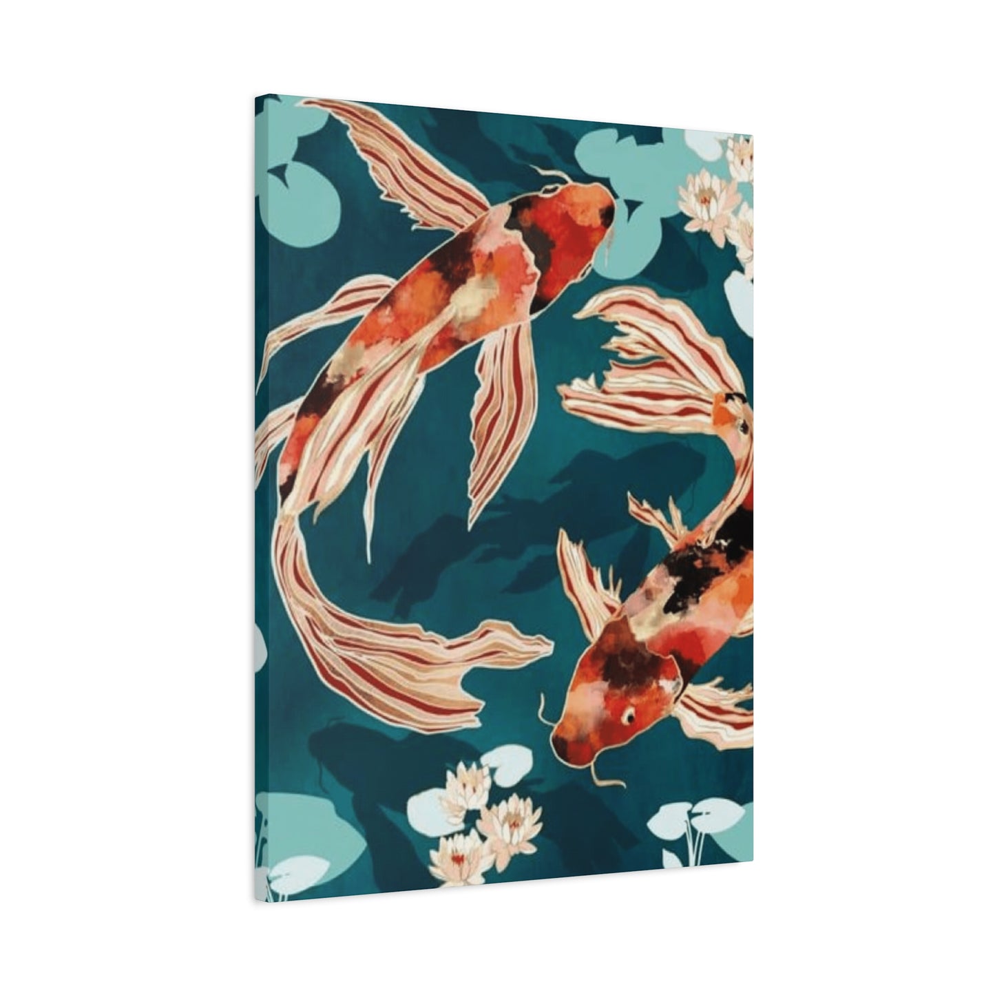
Canvas, whether cotton or linen, provides a textured surface particularly suited to oil and acrylic painting. The woven structure creates subtle tooth that grips pigment while the fabric's flexibility allows for stretching over frames or mounting to rigid supports. Canvas works offer a presence and substantiality that many collectors associate with fine art, while the material's relative lightness facilitates hanging even for larger format pieces.
Wood panels provide smooth, stable surfaces that have been employed for painting since ancient times. Contemporary artists working on wood might embrace the grain patterns as contributing elements within the composition or apply preparatory grounds that create uniformly smooth working surfaces. Wood's rigidity prevents the waviness or sagging that can affect canvas over time, while its weight requires more substantial hanging hardware.
Metal substrates, including aluminum, copper, and steel, enable unique visual effects unachievable on traditional materials. The reflective properties of polished metal add luminosity, while the surface's hardness supports fine detail and sharp edges. Some artists allow the bare metal to show through in places, incorporating its inherent color and sheen as compositional elements. Metal's durability and resistance to environmental factors make it particularly suitable for pieces destined for challenging display conditions.
Acrylic panels and other clear or translucent synthetic materials create opportunities for working with light transmission and layered imagery. Artists might paint on the reverse side of clear acrylic, protecting the painted surface behind the substrate's thickness, or create layered compositions with painted elements suspended at different depths. These contemporary materials suit modern aesthetics while offering practical advantages like shatter resistance and easy cleaning.
Silk and other fine fabrics, traditional substrates within Eastern artistic practices, provide delicate, luminous surfaces with subtle sheen. The fabric's slight translucency creates unique visual qualities, particularly when displayed with backlight or near windows. The fragility of such works requires careful handling and display conditions, but their ethereal beauty justifies the extra consideration for many collectors.
Textured substrates, whether naturally occurring or artificially created, add dimensional interest that enhances certain artistic styles. Heavy watercolor papers with pronounced tooth, canvas with especially prominent weave, or panels treated with textured gesso all contribute tactile qualities that interact with applied media to create surfaces with physical depth and visual complexity.
Framing Choices and Presentation Methods That Enhance Aquatic Imagery
The manner in which artwork is framed and presented profoundly affects both its aesthetic impact and its preservation. Thoughtful framing choices complement the artwork's style and colors while providing protection from environmental hazards. The frame becomes part of the overall visual composition, either enhancing the piece through harmonious coordination or diminishing it through poor choices that compete with or contradict the artwork's character.
Traditional wooden frames offer warmth and organic texture that complements most artistic styles. The enormous variety of available wood species, stains, and finishes ensures suitable options for any color palette or aesthetic preference. Darker woods like walnut or espresso-stained oak lend gravitas and formal presence, while lighter options like natural oak, maple, or blonde finishes maintain airiness and casual approachability. Carved or ornate wooden frames suit traditional or maximalist aesthetics, while simple, clean-lined wooden frames integrate seamlessly with contemporary and minimalist environments.
Metal frames, particularly those in black, silver, gold, or brushed finishes, provide sleek modernity and crisp definition. These frames virtually disappear against dark walls while providing strong containment against lighter backgrounds. The slim profiles typical of metal frames maximize the visible artwork area, making them especially suitable for pieces where every inch of imagery matters. Gold and silver metal frames create subtle connections to any metallic elements within the artwork itself, establishing visual continuity between image and presentation.
Floating frames, which create space between the artwork edges and the frame itself, generate contemporary sophistication while allowing the full artwork to remain visible without overlap. This presentation style suits works with finished edges or pieces mounted on panels with attractive edge treatments. The slight shadow gap around the artwork's perimeter creates subtle dimensionality, making the piece appear to hover slightly away from the wall.
Shadowbox framing introduces even greater depth, creating substantial space between the artwork surface and the protective glazing. This approach works particularly well for dimensional pieces, works with textural elements that should remain untouched, or pieces where the three-dimensional quality contributes significantly to the overall effect. The pronounced depth creates dramatic shadowing that changes throughout the day as lighting angles shift, adding dynamic visual interest.
Mat boards, the paper or board surrounds placed between artwork and frame, serve both protective and aesthetic functions. They prevent the artwork from contacting the glazing, reducing condensation risks and physical damage, while also creating visual breathing room around the image. Mat colors should harmonize with the artwork's palette—either echoing a key color within the piece or providing neutral contrast that allows the imagery to dominate visually. Multiple mat layers in coordinated or contrasting colors can create sophisticated frames-within-frames effects.
Glazing options, including standard glass, museum glass, acrylic, or UV-protective materials, provide crucial protection while affecting viewing experience. Museum glass offers exceptional clarity with virtually invisible reflections and comprehensive UV protection, though at premium cost. Standard glass provides adequate protection for most environments at accessible price points, while acrylic offers shatter resistance valuable in homes with children or in earthquake-prone regions. The choice depends on budget, location, and the artwork's inherent value and fragility.
Gallery wrap presentation for canvas works, where the painted canvas wraps around the stretcher bars with no visible frame, creates contemporary, gallery-style presentation. This approach displays the artwork as a freestanding object rather than a framed window, with the painting continuing around the visible edges. Gallery-wrapped pieces suit modern and industrial aesthetics while eliminating framing costs and decisions, though they offer no protective glazing.
Strategic Placement Positions Within Residential and Professional Environments
Where artwork is positioned within a space dramatically affects both its visibility and its impact on the room's overall atmosphere. Strategic placement considers viewing angles, lighting conditions, surrounding elements, and the room's functional purpose. Thoughtful positioning maximizes the artwork's positive influence while ensuring it receives appropriate attention without creating visual conflicts with other design elements.
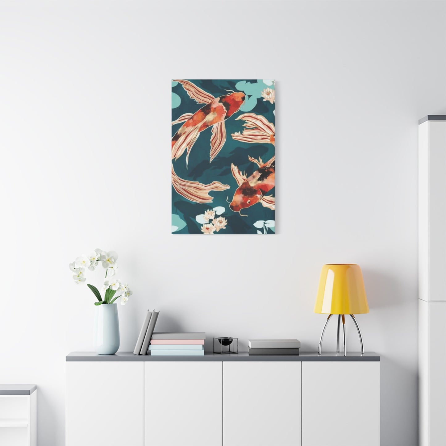
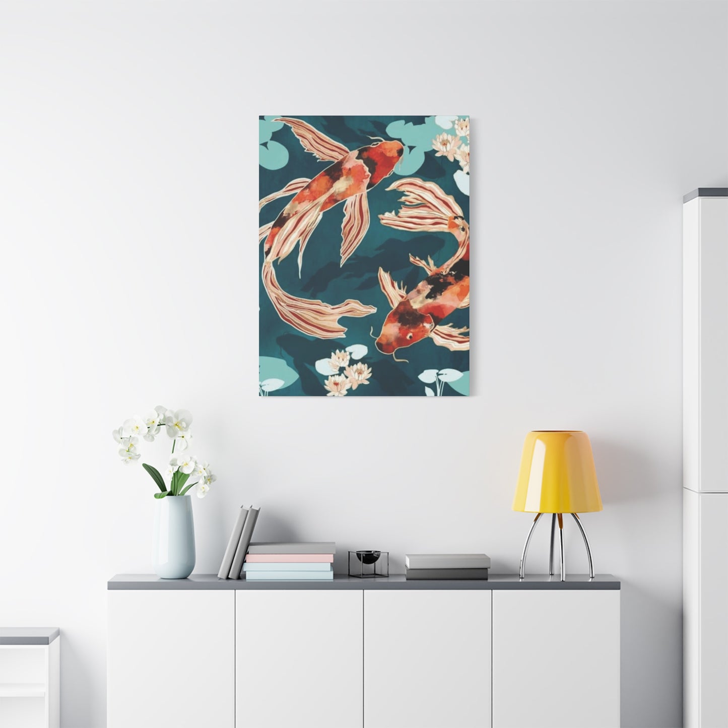
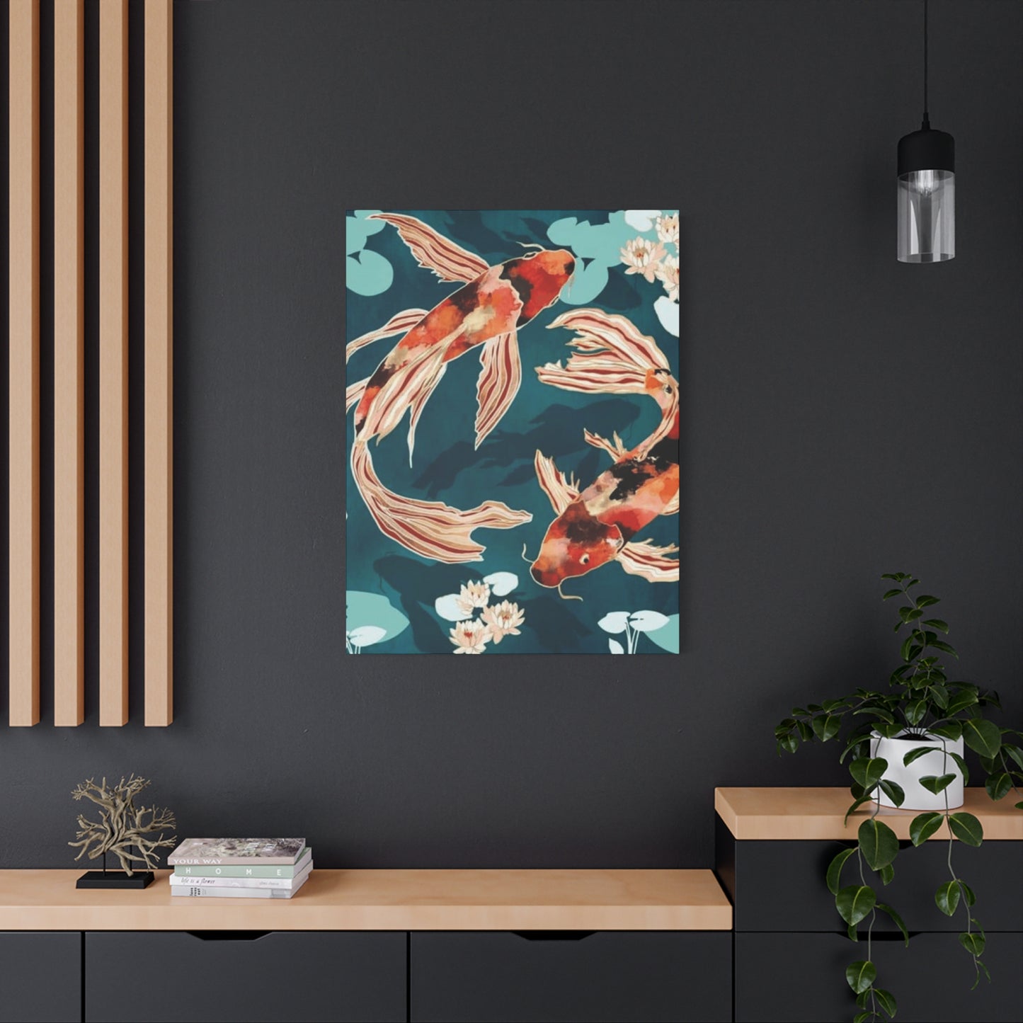
Living room placement typically focuses on the primary seating area's main wall, creating a focal point that anchors the space and provides a contemplative view for seated occupants. Above the sofa represents the most traditional position, with the artwork's center typically positioned fifty-five to sixty inches from the floor—standard gallery height that aligns with average standing eye level. The work's width should generally fall between one-half and three-quarters of the sofa's length to maintain proportional balance.
Dining area installations transform meals into more ceremonial, mindful experiences, with the calming imagery of aquatic subjects promoting relaxed digestion and pleasant conversation. Artwork placed on the wall facing the primary host position ensures maximum visibility for the person most likely to be observing it throughout meals. The piece should be positioned high enough to clear any sideboard or buffet furniture while remaining within comfortable viewing range for seated diners.
Bedroom placement creates opportunities for the artwork to be the first thing seen upon waking and the last before sleep, potentially influencing dream content and mental state during these transitional moments. The wall opposite the bed is the natural choice, ensuring clear visibility from the sleeping position. Alternatively, positioning artwork above the bed's headboard creates a protective, embracing presence, though this requires secure mounting given the vulnerable position of sleepers below.
Home office positioning should support focus and ambition, with imagery placed within the peripheral vision of the primary work position rather than directly in the line of sight where it might prove distracting. Artwork positioned on a wall perpendicular to the desk allows for contemplative breaks without requiring full attention redirection. The symbolic significance of upstream-swimming fish makes such imagery particularly appropriate for spaces dedicated to professional advancement and goal achievement.
Entryway installations establish tone immediately upon entering the home, making this position ideal for pieces that embody qualities you wish to emphasize in your domestic environment. The artwork becomes a daily reminder of intentional values while creating powerful first impressions for visitors. Lighting in entryways often proves challenging, so consider illumination carefully to ensure the piece remains adequately visible.
Hallway galleries transform transitional spaces into opportunities for artistic display, with multiple smaller works or a series of related pieces creating visual interest along otherwise blank walls. The narrow dimensions of hallways suit vertical or square formats better than wide horizontal pieces that might overwhelm the space. Hallway placement works well for collections exploring variations on the aquatic theme, allowing viewers to appreciate similarities and differences as they move past the sequence.
Bathroom installations might seem unconventional, but the thematic appropriateness of aquatic imagery makes these wet spaces natural homes for such artwork. The key consideration involves protecting the piece from moisture damage through appropriate framing with sealed backs and water-resistant materials. The relaxing qualities of both the imagery and the bathing environment create synergistic effects that enhance both activities.
Stairway walls, particularly those along ascending stairways, provide symbolically charged positions for imagery depicting upward-swimming fish. The alignment between the stairway's rising trajectory and the fish's ascending movement creates visual poetry while reinforcing the symbolic significance of both elements. The varying viewing heights along a stairway require considering how the work appears from multiple angles and distances.
Considerations for Various Dimensional Scales and Sizing Proportions
The physical size of artwork dramatically affects its impact, appropriate placement options, and relationship to surrounding architectural and design elements. Scale decisions should account for room dimensions, ceiling heights, viewing distances, and the visual weight of nearby furnishings and features. Understanding how size influences presence and perception enables more successful artwork selection and positioning.
Intimate small-scale works, ranging from miniature sizes up to approximately sixteen by twenty inches, create personal, contemplative viewing experiences that reward close examination. These modest dimensions suit spaces with limited wall area, allow for affordable collection building, and enable creating gallery wall arrangements combining multiple pieces. Small works positioned at closer viewing distances can contain remarkable detail that larger-scale works viewed from greater distances cannot effectively display.
Medium-scale pieces, roughly in the range of twenty by thirty inches up to thirty-six by forty-eight inches, represent the most versatile sizing category. These dimensions suit most residential room types without overwhelming spaces or disappearing into insignificance. Medium works function successfully as either standalone focal points or as anchor pieces within larger arrangements incorporating additional elements.
Large-scale statements, exceeding forty-eight inches in any dimension, command attention and establish dominant focal points that organize entire rooms around their presence. These substantial works require adequate wall space, appropriate viewing distances, and confident display decisions, but reward these requirements with undeniable impact. Large pieces suit spacious rooms with high ceilings, open-concept living areas, and any setting where bold artistic statements align with overall design philosophy.
Panoramic formats, with extreme width-to-height ratios, create horizontal emphases that complement wide furniture pieces and architectural features. These extended formats might span entire walls, creating immersive experiences that surround viewers with imagery. The challenge with panoramic pieces involves maintaining visual interest across the extended horizontal dimension while ensuring the composition doesn't feel repetitive or disjointed.
Vertical formats emphasize height rather than width, drawing the eye upward and creating visual lift within spaces. These proportions suit narrow wall areas and architecturally vertical spaces while reinforcing the upward-striving symbolism of ascending fish imagery. Vertical pieces can make rooms with standard ceiling heights feel more spacious by emphasizing the vertical dimension.
Square formats create balanced, stable compositions without directional bias, functioning equally successfully in any orientation. These proportions integrate easily into various spatial contexts and can be grouped into grid arrangements with satisfying geometric unity. Square works offer compositional challenges for artists working with subjects possessing strong directional qualities, but successful square compositions achieve particularly harmonious results.
Multiple panel works, including diptychs, triptychs, and larger multi-panel installations, create single unified compositions across separate physical elements. These divided works generate visual interest through the intervals between panels while allowing for larger overall dimensions without requiring single massive substrates. Multi-panel formats also provide flexibility in arrangement, potentially allowing for varied spacing or even rearrangement into alternative configurations.
Authentic Artistic Qualities Versus Mass-Produced Reproductions
The spectrum of available aquatic-themed artwork extends from unique original creations through limited edition prints to unlimited mass-produced reproductions. Understanding the distinctions between these categories helps collectors make informed purchasing decisions aligned with their values, budgets, and collecting goals. Each category offers particular advantages and limitations worth considering thoughtfully.
Original unique artworks represent singular creations, with each piece being the only one of its kind in existence. These works carry the artist's direct touch, bearing the physical evidence of the creation process in brushstrokes, tool marks, and material layering. Collecting original art establishes direct connections with working artists, supports creative livelihoods, and offers potential investment appreciation. The exclusivity of owning something utterly unique appeals to many collectors, though original works command premium pricing reflecting their singular nature.
Limited edition prints result from carefully controlled reproduction processes that the artist monitors and approves, with each piece signed and numbered indicating its position within the edition and the total edition size. Once the predetermined quantity has been printed, the edition closes permanently, establishing scarcity that maintains value. Prints from smaller editions and lower numbers within those editions often command higher prices. Reputable limited editions include certificates of authenticity documenting edition details and establishing provenance.
Open edition prints lack the artificial scarcity of limited editions, allowing unlimited reproduction subject only to market demand. While this reduces exclusivity and potential investment value, it also makes such works highly accessible to budget-conscious buyers who prioritize aesthetic enjoyment over collecting considerations. Quality varies tremendously within this category, from fine art giclée prints barely distinguishable from originals to lower-quality reproductions that might fade or deteriorate relatively quickly.
Giclée printing, using archival inks and high-resolution digital processes, produces reproductions of exceptional quality suitable for fine art applications. The term "giclée" distinguishes these premium reproductions from standard poster printing, though marketing sometimes applies the term loosely to less rigorous processes. Authentic giclée prints on quality substrates using lightfast pigment inks can last generations without noticeable fading when properly displayed.
Canvas transfers attempt to replicate the presence of original painted works by reproducing images onto canvas substrates, sometimes with added textural gel treatments mimicking brushwork. While these processes create wall objects with more substance than paper prints, they remain reproductions despite marketing that sometimes obscures this fact. The value and authenticity questions surrounding such pieces deserve careful consideration before purchase.
Print-on-demand services enable easy access to countless images from independent artists and stock libraries, with pieces produced only after orders are placed. This model reduces artist overhead while providing consumers with extraordinary variety, though quality control can be inconsistent. The convenience and selection offered by such platforms have democratized art ownership while raising questions about artistic value in an age of infinite reproducibility.
Hand-embellished prints occupy interesting middle ground, beginning as reproductions that artists then modify through painted additions, mark-making, or applied materials. These interventions create unique variations on printed base images, with each embellished piece differing from others in the edition. The approach allows artists to offer more affordable works retaining originality elements while providing collectors with something beyond simple reproductions.
Light Exposure Management and Long-Term Preservation Considerations
Proper care significantly extends artwork longevity while maintaining visual quality and value. Light exposure, humidity fluctuations, temperature extremes, and physical contamination all threaten artistic works, with preventive measures far more effective than attempting to reverse damage after it occurs. Understanding preservation principles enables collectors to protect their investments while ensuring continued enjoyment for years or decades.
Light damage, caused primarily by ultraviolet radiation but also by visible light at sufficient intensity, represents perhaps the greatest threat to artwork longevity. Fading, discoloration, and material degradation progress irreversibly with accumulated light exposure. Direct sunlight poses extreme hazards, potentially causing noticeable damage within months. Even indirect natural light gradually harms sensitive materials, with the effects accumulating over years of exposure. Artificial lighting, particularly LED and filtered sources without UV emissions, offers the safest illumination options.
UV-filtering glazing intercepts damaging ultraviolet radiation before it reaches the artwork surface, dramatically slowing deterioration. Museum-quality glazing blocks more than ninety-nine percent of UV light while maintaining optical clarity. When budget permits, UV-protective glazing represents worthwhile investment for valuable pieces. Window films applied to glass surfaces can similarly reduce UV transmission into rooms where artwork hangs, protecting not only the art but also furnishings and fabrics throughout the space.
Humidity control matters particularly for works on paper or other hygroscopic materials that absorb atmospheric moisture. High humidity encourages mold growth, causes swelling and cockling of paper substrates, and can degrade adhesives and sizing. Extremely low humidity makes organic materials brittle and prone to cracking. Maintaining relative humidity between forty and fifty-five percent creates stable conditions for most artwork. Dehumidifiers and humidifiers can help stabilize environments in regions with extreme or fluctuating humidity.
Temperature stability proves important for works containing materials with different expansion rates, where thermal cycling can cause mechanical stresses leading to cracking, delamination, or other structural failures. Avoid positioning artwork near heat sources like radiators, forced air vents, or fireplaces. Similarly, exterior walls in poorly insulated buildings can subject artwork to temperature fluctuations following outdoor weather patterns, making interior walls preferable for valuable pieces.
Cleaning requires extreme caution, with improper techniques causing far more damage than the dirt they attempt to remove. Glazed works can be gently cleaned using microfiber cloths dampened with water or approved glass cleaners, being careful to avoid moisture seeping behind the glazing. Unglazed works, including canvas paintings and works on paper, should only be cleaned by conservation professionals, as even light dusting can abrade delicate surfaces or grind particles into porous materials.
Handling considerations include always grasping frames rather than touching artwork surfaces, moving pieces using two-hand support, and avoiding positioning pieces where they might be accidentally struck or brushed against. When storing unframed works, use acid-free materials throughout, maintain flat horizontal positioning rather than vertical storage that can cause bending, and provide protective barriers between pieces to prevent surface contact.
Regular condition monitoring allows early detection of developing problems when intervention remains possible. Every few months, examine pieces carefully in good light, looking for any changes in color, surface quality, or structural integrity. Document significant works photographically, creating dated records showing their condition at various points. This documentation proves valuable for insurance purposes while providing objective comparison when subtle changes might otherwise escape notice.
Selecting Artwork That Harmonizes With Existing Interior Design Schemes
Successfully incorporating aquatic-themed artwork into established interior environments requires considering existing colors, styles, furniture, and architectural features. The goal involves achieving visual harmony where the artwork enhances the space without creating jarring contrasts or competing unsuccessfully with other dominant elements. Thoughtful selection accounting for multiple design factors results in cohesive environments where all elements work together synergistically.
Color coordination represents the most obvious consideration, with artwork hues either harmonizing with existing palette or providing intentional accent notes. Pulling colors directly from the artwork into furnishings, accessories, and architectural elements creates satisfying visual connections that unify the space. Alternatively, selecting artwork that echoes existing dominant colors reinforces those hues while adding visual interest through different applications. Even when introducing contrasting accent colors through artwork, maintaining some shared chromatic elements helps integrate the piece into the overall scheme.
Style consistency matters more in some design philosophies than others. Traditional interiors benefit from artwork that respects period-appropriate aesthetic conventions, while eclectic environments embrace surprising juxtapositions. Contemporary minimalist spaces generally require artwork that shares their restraint and clarity, while maximalist rooms can accommodate busy, complex compositions. That said, intentional style contrasts sometimes create exciting tension—a thoroughly contemporary abstract rendering of aquatic subjects might provide fascinating counterpoint within a traditional room, for instance.
Scale relationships between artwork and surrounding furnishings affect visual balance. Artwork that's too small relative to nearby furniture risks appearing insignificant, while oversized pieces can overwhelm the space. A useful guideline suggests that artwork above a sofa should span roughly two-thirds to three-quarters of the sofa's width, though creative variations on this proportion can work when executed thoughtfully. Consider the visual weight of nearby objects, with substantial furniture or architectural features requiring proportionally substantial artwork to maintain equilibrium.
Architectural features including crown molding, wainscoting, built-in shelving, and doorways all influence optimal artwork placement and sizing. Pieces positioned in relation to such features should acknowledge their presence, either aligning with their lines or deliberately contrasting with them rather than creating accidental near-alignments that feel imprecise. In spaces with particularly strong architectural geometry, simpler artwork that doesn't compete with the architecture often succeeds better than complex busy pieces fighting for attention.
Furniture styles guide artwork selection through their formal qualities and historical associations. Mid-century modern furniture's clean lines and organic forms pair naturally with both period-appropriate abstract works and carefully selected contemporary pieces. Traditional furniture with elaborate carving and formal proportions might call for artwork with comparable sophistication and finish. Industrial furnishings in reclaimed wood and metal create opportunities for artwork with raw energy and bold, unrefined presence.
Textural relationships contribute to overall design success, with smooth glossy artwork surfaces contrasting pleasingly against rough textural elements like exposed brick or natural stone, while heavily textured paintings might echo similar textural qualities elsewhere in the space. Balancing smooth and textured elements throughout a room creates more interesting environments than uniformly smooth or uniformly rough approaches.
Lighting conditions dramatically affect how artwork appears, with pieces selected under one lighting condition potentially looking quite different in the display environment. Whenever possible, view artwork under lighting similar to your intended display location. Cool fluorescent lighting shifts colors toward blue-green while warm incandescent light adds yellow-orange casts. Natural daylight, considered the most accurate, varies throughout the day and by orientation. Understanding these shifts helps predict how pieces will appear in your specific environment.
Conclusion
The market for aquatic-themed artwork spans an enormous price range, from affordable mass-produced prints to museum-quality original works commanding substantial investment. Understanding the factors that determine pricing helps buyers navigate options effectively, set realistic budgets, and make purchases appropriate to their collecting goals and financial circumstances. Substantial artistic enjoyment remains accessible at virtually any budget level through informed, thoughtful selection.
Entry-level pricing, typically ranging from twenty to one hundred dollars, provides access to small prints, poster-quality reproductions, and works by emerging or unknown artists. While these affordable options lack the investment potential of more significant pieces, they offer genuine aesthetic value and allow decorating on minimal budgets. Online print-on-demand services and mass retailers dominate this price segment, offering extensive selection with variable quality.
Mid-range investments, roughly spanning one hundred to one thousand dollars, include limited edition prints from established artists, original works by emerging artists, larger high-quality reproductions, and pieces from local or regional artists building reputations. This price tier offers balance between affordability and artistic significance, with pieces substantial enough to serve as focal points while remaining accessible to middle-class collectors.
Share