Kitchen Quote Wall Art & Canvas Prints
Kitchen Quote Wall Art & Canvas Prints
Couldn't load pickup availability
Inspiring Your Culinary Space With Kitchen Quote Wall Art That Speaks To Your Soul
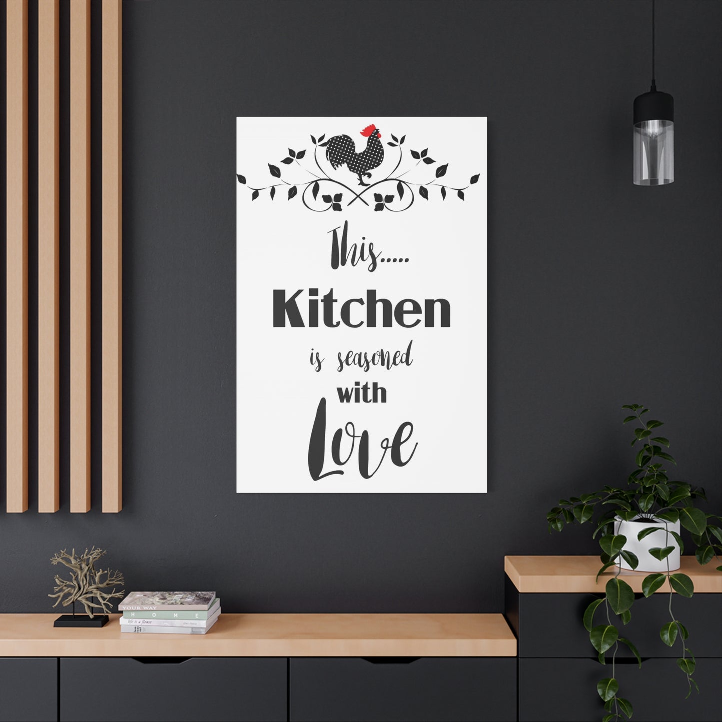
The heart of every home deserves decoration that resonates with warmth, personality, and creative expression. When selecting visual elements for your cooking space, words combined with artistic design create powerful statements that transform ordinary walls into extraordinary focal points. Kitchen quote wall art brings together typography, meaningful phrases, and aesthetic appeal to craft an environment that inspires daily meals and memorable gatherings.
Discovering The Perfect Verbal Expression For Your Cooking Sanctuary
Your culinary workspace reflects your personality, values, and lifestyle choices through every element you select. Verbal expressions displayed prominently on walls serve multiple purposes beyond mere decoration. They motivate morning coffee preparation, encourage experimental recipe attempts, and provide conversation starters during social gatherings. The right phrase selection creates emotional connections between inhabitants and their domestic environment, establishing atmosphere that influences mood and behavior patterns throughout daily routines.
When choosing typography-based decorations, consider phrases that genuinely resonate with your cooking philosophy and household dynamics. Generic statements often fail to capture authentic sentiment, whereas carefully selected words reflect personal experiences, cultural heritage, and individual perspectives on nourishment and hospitality. Some households prefer humorous quips that lighten meal preparation tasks, while others gravitate toward inspirational messages that elevate cooking to meditative practice.
The visual presentation of verbal content matters equally to the message itself. Font selection, color schemes, and layout arrangements dramatically alter perception and impact. Script fonts convey elegance and sophistication, while bold sans-serif typography projects modern confidence. Color choices interact with existing cabinetry, countertops, and flooring to either complement or contrast, depending on desired effect. Size considerations determine whether artwork functions as subtle accent or commanding centerpiece within spatial composition.
Crafting Emotional Resonance Through Carefully Selected Phrases
Words possess remarkable power to shape environments and influence experiences within those spaces. Culinary areas benefit particularly from verbal reinforcement of positive associations with nourishment, community, and creativity. Phrases celebrating family bonds, cultural traditions, or simple pleasures of shared meals create psychological anchors that strengthen household connections and ritualize everyday activities.
Consider how different message categories serve distinct purposes within your cooking domain. Motivational statements energize morning routines and encourage ambitious culinary projects. Humorous observations about kitchen mishaps or food obsessions inject levity into potentially stressful meal preparation. Nostalgic phrases honoring grandmothers' wisdom or childhood memories anchor present experiences to meaningful past connections. Philosophical reflections on nourishment elevate mundane tasks to purposeful acts of care and creation.
The linguistic style of selected phrases should align with household communication patterns and aesthetic sensibilities. Some families thrive on wit and wordplay, making puns and clever observations ideal choices. Others prefer straightforward sincerity that directly expresses values without embellishment. Cultural backgrounds influence language preferences, with multilingual households sometimes selecting phrases in heritage languages to honor ancestry and transmit linguistic traditions to younger generations.
Seasonal rotation of displayed messages keeps visual environment dynamic and responsive to changing circumstances. Summer might feature phrases celebrating fresh produce and outdoor dining, while winter messages emphasize comfort foods and cozy gatherings. Holiday seasons invite temporary displays reflecting festive themes without permanent commitment to seasonal content.
Exploring Diverse Artistic Styles For Typography-Based Decor
The marketplace offers astounding variety in presentation formats for verbal wall decorations, each bringing distinct aesthetic qualities and practical considerations. Canvas prints provide traditional gallery-style presentation with lightweight durability suitable for various mounting locations. Wood signs deliver rustic charm with three-dimensional texture that catches light and shadow throughout the day. Metal fabrications offer industrial sophistication with exceptional longevity in humid cooking environments.
Vinyl decals present flexible, affordable options allowing direct application to wall surfaces without frames or backing materials. This format enables custom sizing and precise placement, adapting to architectural features like windows, cabinets, or irregular wall spaces. Removal and replacement occurs without wall damage, facilitating experimentation with different phrases and arrangements until achieving perfect visual balance.
Chalkboard and whiteboard surfaces transform walls into interactive canvases where messages change regularly according to household needs and creative impulses. Grocery lists, weekly menus, inspirational quotes, and children's artwork rotate through the same physical space, maximizing functionality while maintaining visual interest. These erasable formats encourage spontaneous expression and collaborative family participation in environmental customization.
Framed typography prints under glass protection suit formal dining areas where elegance and preservation matter most. Matting selections and frame finishes coordinate with surrounding furniture and architectural details, creating cohesive visual narratives that extend beyond individual pieces to encompass entire room compositions. Gallery walls combining multiple framed pieces at varying sizes create dynamic arrangements that command attention and anchor spatial design.
Positioning Strategies That Maximize Visual Impact And Daily Engagement
Strategic placement determines whether artwork fades into background neglect or commands attention that fulfills its inspirational purpose. High-traffic areas where household members naturally pause offer prime real estate for message delivery. Above coffee stations, verbal reminders about savoring moments or embracing morning rituals reinforce mindful beverage consumption. Near cooking zones, phrases about experimentation or recipe improvisation encourage culinary creativity during meal preparation.
Eye-level positioning ensures comfortable viewing without neck strain or awkward angles. However, deliberately placing certain pieces above or below typical sightlines creates visual variety and rewards those who explore their environment with diverse perspectives. Unexpected placements surprise guests and household members alike, preventing habituation that causes even meaningful content to disappear from conscious awareness.
Lighting considerations dramatically affect readability and aesthetic impact throughout different times of day. Natural light streaming through windows interacts with colors and finishes, potentially washing out pale tones or creating glare on glossy surfaces. Artificial lighting from overhead fixtures, under-cabinet strips, or accent lamps casts shadows and highlights that either enhance or obscure typography depending on angle and intensity. Testing artwork placement during various lighting conditions prevents disappointment after permanent installation.
Spatial relationships with surrounding elements require thoughtful consideration. Crowded walls overwhelm viewers with competing visual information, diluting impact of individual pieces. Adequate breathing room around each artwork allows proper appreciation of its message and design. However, completely isolated pieces sometimes appear disconnected from their environment, benefiting from subtle visual anchors through nearby objects or coordinating colors that create subtle dialogues between disparate elements.
Selecting Color Palettes That Harmonize With Existing Design Elements
Color relationships between wall decorations and surrounding environment determine whether additions feel integrated or jarring. Monochromatic schemes using variations of existing dominant colors create sophisticated cohesion that appears professionally designed. This approach works particularly well in minimalist spaces where restraint and subtlety define aesthetic philosophy.
Complementary color strategies introduce controlled contrast that energizes spaces without overwhelming senses. When cabinetry features cool tones like blues or grays, warm accent colors in artwork create visual temperature balance that feels complete and satisfying. Conversely, warm wood tones benefit from cool color accents that prevent spaces from feeling too heavy or monotonous.
Neutral backgrounds with colorful typography allow maximum flexibility in coordinating with changing seasonal decorations, dish collections, or textile accents. Black, white, and gray backgrounds never clash with surrounding elements, functioning as reliable foundations for bolder color experimentation elsewhere. However, neutral doesn't mean boring—texture variations, metallic finishes, and subtle patterns add depth and interest within restrained color frameworks.
Triadic color schemes employing three evenly spaced hues on the color wheel create vibrant, balanced compositions suitable for eclectic or bohemian aesthetics. These combinations require careful proportion management, typically designating one color as dominant while using others as accents to prevent visual chaos. The resulting energy suits social cooking spaces designed for lively gatherings and creative culinary adventures.
Incorporating Personal Stories And Family Heritage Into Wall Displays
Generic marketplace phrases serve their purpose, but custom creations incorporating personal narratives transform decorations into meaningful heirlooms. Family recipes passed through generations deserve honored placement with handwritten transcriptions or stylized typographic treatments that preserve culinary heritage. Grandmothers' cooking advice, mothers' mealtime philosophies, or children's innocent observations about food become treasured documentation of household identity and relational bonds.
Commissioning custom artwork from local artisans or independent creators ensures absolute uniqueness while supporting creative economies. Collaborative design processes allow exact specification of phrases, fonts, colors, and formats that perfectly match vision and space requirements. The resulting pieces carry additional sentimental value through connection with their creators and stories behind their fabrication.
Multilingual displays honor diverse cultural backgrounds within blended families or celebrate linguistic heritage worth preserving across generations. Phrases in ancestral languages maintain connections to roots while introducing younger family members to linguistic diversity. Translations can accompany foreign language text or remain unexplained, creating opportunities for storytelling and cultural education during meals and gatherings.
Photography combined with typography creates powerful hybrid formats that layer personal images with meaningful text. Family cooking scenes, heirloom kitchen tools, or generational gatherings provide visual context that amplifies verbal messages. These combinations function as conversation pieces that prompt reminiscence and storytelling, strengthening family narratives and transmitting values through visual media.
Understanding Material Durability Within Humid Cooking Environments
Kitchens present challenging conditions for artwork preservation due to temperature fluctuations, moisture exposure, and airborne grease particles from cooking activities. Material selection significantly impacts longevity and maintenance requirements. Canvas prints sealed with protective coatings resist moisture penetration better than untreated fabrics. Wood signs benefit from waterproof finishes that prevent warping and staining from humidity exposure.
Metal fabrications excel in durability stakes, resisting moisture damage while maintaining visual appeal through years of environmental exposure. Stainless steel, powder-coated aluminum, and treated iron withstand conditions that degrade other materials. However, weight considerations require secure mounting systems capable of supporting substantial mass without wall damage or safety hazards.
Glass-protected framed pieces offer excellent preservation but require regular cleaning to maintain clarity and prevent grease film accumulation. UV-protective glazing prevents fading from sunlight exposure, particularly important for pieces near windows or under intense artificial lighting. Sealed backing prevents moisture infiltration that causes paper degradation and encourages mold growth within frame assemblies.
Acrylic alternatives to glass provide shatter resistance with lighter weight, suitable for households with active children or high-traffic areas where accidental impacts occur. Scratch resistance varies among acrylic grades, with premium options maintaining optical clarity despite regular cleaning. Static properties attract dust more readily than glass, requiring more frequent maintenance to preserve pristine appearance.
Balancing Scale Proportions For Cohesive Visual Composition
Artwork sizing dramatically affects spatial perception and design success. Oversized pieces command attention as statement elements that anchor entire room compositions. These bold choices work best in spacious kitchens with adequate wall real estate and minimal competing visual elements. Undersized pieces disappear on expansive walls, appearing apologetic rather than intentional unless clustered with companion pieces in gallery arrangements.
Mathematical proportions guide sizing decisions relative to surrounding elements. Artwork spanning two-thirds to three-quarters of underlying furniture width creates visually balanced relationships. Pieces smaller than half the furniture width typically appear inadequate, while those exceeding furniture dimensions risk overwhelming their foundations. These guidelines flex according to overall room scale and aesthetic intentions, serving as starting points rather than rigid rules.
Ceiling height influences vertical dimension choices. Standard eight-foot ceilings accommodate taller artwork than perceived, particularly when mounted with appropriate clearance above furniture and countertops. Higher ceilings invite vertical emphasis through tall, narrow formats or stacked multiple-piece arrangements that draw eyes upward and accentuate room volume.
Grouping strategies allow smaller individual pieces to combine into larger visual masses that carry weight equivalent to single large artworks. Odd-numbered groupings typically appear more dynamic than even-numbered arrangements due to asymmetry that prevents static predictability. Grid patterns suit modern aesthetics with clean lines and geometric precision, while salon-style clusters embrace organic irregularity that feels collected and personal rather than rigidly planned.
Discovering Unexpected Locations Beyond Traditional Wall Spaces
Creative placement strategies extend beyond obvious wall-mounting conventions, discovering overlooked surfaces that benefit from verbal decoration. Cabinet doors accept vinyl decals or small magnetic pieces that surprise upon opening and reinforce messages during daily use. Backsplash areas between counters and upper cabinets provide narrow vertical surfaces perfect for slim typography arrangements that don't interfere with functional workspace.
Window glass accepts static-cling decals viewable from both interior and exterior perspectives. These transparent or translucent applications filter natural light while delivering messages that change appearance according to sunlight angle and intensity. Privacy concerns in windows facing neighboring properties find attractive solutions through frosted typography decals that obscure views while adding decorative interest.
Pantry interiors rarely receive decorative attention despite regular access by household members. Door interiors or shelf edges accept small verbal reminders about mindful consumption, gratitude for abundance, or humorous observations about snacking habits. These hidden gems surprise viewers with unexpected delight in utilitarian spaces typically overlooked in design planning.
Ceiling surfaces present unconventional canvases rarely exploited in residential design. Phrases mounted overhead near seating areas become contemplative focal points visible when reclining or tilting heads back during conversation pauses. This unexpected positioning creates memorable impressions on guests while maximizing space utilization in compact kitchens lacking available wall area.
Coordinating Typography Styles With Architectural Character
Architectural contexts provide essential guidance for appropriate stylistic choices that honor spatial character rather than conflicting with inherent qualities. Victorian homes with ornate millwork and decorative moldings pair beautifully with script fonts and embellished frames that echo period ornamentation. Minimalist modern spaces demand restrained typography with clean lines and ample negative space that respects architectural simplicity.
Farmhouse kitchens embrace rustic charm through distressed wood signs, vintage typography styles, and weathered finishes that appear collected over time rather than purchased simultaneously. Authentic aging techniques including sanding edges, applying crackling mediums, and layering paint colors create believable wear patterns that suggest genuine history rather than manufactured nostalgia.
Industrial lofts with exposed brick, concrete surfaces, and metal fixtures call for bold typography with substantial visual weight capable of holding its own against rough textures and strong architectural elements. Raw metal signs, concrete-mounted vinyl, or oversized canvas prints with minimalist designs complement rather than compete with powerful structural features.
Coastal cottages benefit from breezy typography treatments in ocean-inspired colors that reference maritime themes without resorting to obvious nautical clichés. Whitewashed wood, rope accents, and weathered finishes suggest seaside environments while maintaining sophistication appropriate for adult spaces rather than juvenile beach kitsch.
Seasonal Rotation Strategies That Keep Environments Fresh And Responsive
Static environments grow stale through familiarity, losing impact as inhabitants cease noticing unchanging elements. Seasonal rotation maintains visual interest and demonstrates responsiveness to natural cycles and cultural celebrations. Spring welcomes phrases about renewal, growth, and fresh ingredients emerging from dormancy. Summer emphasizes outdoor dining, leisurely meals, and abundant produce preservation projects.
Autumn transitions introduce harvest gratitude, comfort food preparation, and cozy gathering themes that align with cooling temperatures and shortened daylight hours. Winter focuses on warmth, nourishment, hospitality, and celebration during traditional holiday periods. These seasonal shifts need not involve complete replacement—simply swapping one or two key pieces signals environmental refresh without requiring extensive time or financial investment.
Storage systems for off-season artwork prevent damage while maintaining organization for efficient rotation. Flat storage in acid-free portfolios protects paper-based pieces from dust, moisture, and physical damage. Three-dimensional items like wood signs require adequate spacing to prevent scratching and chipping during storage periods. Photographic documentation of hanging arrangements facilitates accurate recreation when reinstalling pieces after storage intervals.
Rotation schedules need not follow rigid quarterly patterns. Some households prefer monthly changes that maintain constant environmental evolution, while others sustain certain beloved pieces year-round while rotating only accent elements. Flexibility according to household bandwidth and interest levels ensures sustainability rather than abandoning rotation practices after initial enthusiasm wanes.
Exploring Humorous Approaches That Lighten Daily Routines
Laughter transforms mundane tasks into enjoyable experiences while strengthening social bonds through shared amusement. Witty observations about cooking disasters, dietary contradictions, or food obsessions acknowledge universal experiences that unite rather than divide. Self-deprecating humor about culinary skill levels or kitchen mishaps creates authentic vulnerability that encourages others to embrace imperfection rather than pursuing unrealistic standards.
Puns and wordplay delight those who appreciate linguistic cleverness, though humor subjectivity means certain jokes resonate strongly with some audiences while falling flat with others. Testing phrases with household members before permanent installation prevents investing in humor that doesn't land with primary audience. Context matters significantly—phrases hilarious among close friends might seem inappropriate or confusing to wider social circles encountering them during larger gatherings.
Visual humor through illustrated typography adds another dimension beyond pure verbal wit. Playful graphics accompanying text enhance comedic impact through visual punchlines or absurd juxtapositions. Cartoon vegetables, anthropomorphized kitchen tools, or exaggerated cooking scenarios amplify written humor through complementary visual storytelling.
Balance prevents humor from overwhelming spaces designed primarily for nourishment and gathering rather than comedy clubs. One or two strategically placed humorous pieces inject personality without transforming serious cooking spaces into joke galleries. Pairing humor with more sincere pieces creates tonal variety that accommodates different moods and occasions within the same environment.
Investigating Minimalist Approaches For Contemporary Aesthetics
Restraint characterizes minimalist philosophy, where less truly becomes more through careful curation and intentional negative space. Single impactful phrases replace multiple competing messages, allowing focused contemplation rather than scattered attention. Black typography on white backgrounds or vice versa creates stark contrast that commands attention through simplicity rather than embellishment.
Geometric sans-serif fonts align with minimalist principles through clean lines devoid of decorative flourishes. Letter spacing and line heights receive meticulous attention, as subtle adjustments dramatically affect readability and aesthetic impact within spare compositions. Generous margins and breathing room prevent designs from feeling cramped despite minimizing visual elements.
Material honesty embraces inherent qualities rather than disguising surfaces through excessive finishing. Raw wood grain remains visible beneath minimal staining or sealing. Exposed metal shows manufacturing marks and natural patinas. Concrete surfaces celebrate industrial textures rather than hiding them beneath smooth veneers. This authenticity aligns with minimalist values of transparency and essentialism.
Functional dual-purpose pieces maximize utility within minimalist frameworks that resist single-function items. Magnetic boards display verbal messages while serving as memo surfaces for grocery lists and scheduling notes. Shelf-mounted phrases incorporate actual storage functionality rather than purely decorative purposes. This integration prevents visual clutter accumulation that contradicts minimalist intentions despite individual pieces qualifying as restrained designs.
Embracing Maximalist Abundance Through Layered Visual Storytelling
Opposite minimalism lies maximalism's exuberant embrace of abundance, pattern, color, and decorative excess. Gallery walls covering entire surfaces from floor to ceiling create immersive environments that reward extended viewing with continual discovery of new details. Mixing frame styles, artwork sizes, and content themes generates dynamic visual interest that feels personally curated rather than commercially coordinated.
Pattern layering through wallpaper backgrounds, textile elements, and artwork itself builds complexity that sophisticated eyes read as intentional rather than chaotic. Color coordination provides unity amid diversity, with repeated hues threading through disparate elements to create cohesive narratives despite surface variety. Metallic accents catch light and draw attention to specific focal points within busy compositions.
Collected aesthetics suit maximalist approaches, where items gathered over time from various sources combine into personal museums reflecting individual journeys and evolving tastes. Vintage finds mingle with contemporary pieces, handmade crafts coexist with mass-produced items, and high art shares space with humble sentimentality. This democratic approach values meaning and personal connection over objective quality hierarchies.
Confidence distinguishes successful maximalism from cluttered confusion. Intentional placement decisions demonstrate curation rather than indiscriminate accumulation. Negative space still exists, strategically deployed to prevent overwhelming visual saturation and provide resting places for eyes navigating dense compositions. Editing skills determine whether maximalism achieves sophisticated abundance or descends into chaotic hoarding aesthetics.
Incorporating Calligraphy And Hand-Lettering For Artisanal Character
Machine-printed typography serves many purposes efficiently, but hand-rendered lettering carries distinct qualities reflecting human touch and individual personality. Calligraphy traditions spanning centuries and cultures bring elegant flourishes and practiced precision that honor written word as artistic medium worthy of contemplation beyond mere communication utility.
Modern hand-lettering movements embrace imperfection as authenticity marker distinguishing genuine craft from mechanical reproduction. Variable line weights, slightly irregular letter sizing, and organic spacing patterns telegraph human creation rather than computer generation. These quirks add character that perfectionistic machine precision lacks, creating warmth and approachability in verbal presentations.
Custom lettering services allow collaboration with skilled artisans who translate desired phrases into unique artistic interpretations. Discussing stylistic preferences, providing reference images, and reviewing preliminary sketches ensure final pieces match vision while benefiting from professional expertise. Original artwork carries additional value as one-of-a-kind creation rather than mass-produced commodity.
Learning basic hand-lettering techniques empowers household members to create personal pieces without commissioning external artists. Numerous resources including books, online tutorials, and local workshops make this craft accessible to motivated beginners. Starting with simple phrases and forgiving materials like chalkboards allows skill development without pressure to produce perfect finished pieces immediately. Progression from basic printing to more elaborate script styles occurs gradually through regular practice and experimentation.
Navigating Online Marketplaces For Diverse Selection And Competitive Pricing
Digital shopping platforms revolutionized access to decorative items, connecting consumers with global sellers offering astounding variety impossible in brick-and-mortar retail contexts. Independent artists, small manufacturers, and print-on-demand services compete alongside major brands, creating vibrant marketplaces where niche preferences find fulfillment regardless of locality limitations.
Search functionality requires strategic keyword selection to surface relevant results amid millions of available listings. Generic terms like wall art return overwhelming options demanding extensive filtering, while specific descriptors like farmhouse kitchen quotes narrow selections toward desired aesthetic directions. Combining multiple search terms and utilizing platform filtering tools saves time compared to manually scrolling through irrelevant options.
Seller ratings and review analysis provide essential quality assessment before purchase commitments. Repeat customer feedback patterns reveal consistent strengths and weaknesses more reliably than individual testimonials that might represent outlier experiences. Reviewing product photos uploaded by buyers rather than only professional listing images shows realistic appearance and quality levels under normal residential conditions.
Shipping costs and timelines significantly impact total investment and project planning. Domestic sellers typically offer faster delivery and predictable transit times compared to international sources requiring customs clearance and extended shipping durations. However, unique items unavailable domestically sometimes justify longer waits and higher shipping expenses when no comparable local alternatives exist.
Return policies protect against disappointments when received items don't match expectations formed from online representations. Generous return windows and seller-paid return shipping indicate confidence in product quality and customer satisfaction commitment. Restrictive policies suggesting difficulty returning unsatisfactory purchases warrant caution, particularly for higher-priced items where financial risk increases.
Supporting Local Artisans Through Direct Commissions And Custom Creations
Beyond mass-market purchases lies rewarding territory of direct artist relationships and custom commission processes. Local craft fairs, art walks, and maker markets provide opportunities to meet creators, view work samples, and discuss project possibilities face-to-face. These personal connections often yield not just artwork but ongoing relationships with talented individuals enriching local creative communities.
Custom commissions begin with clear communication about desired outcomes, including phrase selection, size specifications, color preferences, and stylistic direction. Providing reference images illustrating appealing aesthetics helps artists understand vision even when clients lack precise vocabulary for describing design preferences. Discussing timeline expectations, budget parameters, and revision allowances upfront prevents misunderstandings that sour otherwise positive collaborations.
Collaborative processes vary by artist working methods and project complexity. Some creators present preliminary sketches for approval before proceeding to final execution, while others prefer complete creative freedom with minimal client input beyond initial parameters. Determining preferred collaboration levels before committing ensures compatible working relationships that satisfy both parties.
Pricing custom artwork appropriately acknowledges skill, experience, materials, and time invested while fitting within realistic budget constraints. Professional artists charge rates reflecting legitimate business operations rather than hobby pricing that undervalues creative labor. Clients receive unique pieces unavailable through mass production channels, justifying premium investments for those prioritizing originality and supporting creative livelihoods.
Addressing Rental Restrictions Through Removable Installation Methods
Temporary living situations require decoration strategies respecting property restrictions while maintaining personalized environments. Removable adhesive technologies transformed rental decorating possibilities, allowing substantial visual impact without permanent alterations risking security deposit deductions. Command strips, adhesive hooks, and damage-free hanging systems support artwork weights when properly selected and installed according to manufacturer specifications.
Vinyl wall decals apply directly to painted surfaces and remove cleanly without leaving residue or damaging underlying paint, provided walls feature quality paint application without flaking or loose areas. Testing inconspicuous spots before full installation confirms compatibility with specific wall conditions. Removal techniques matter significantly—slow, gentle peeling at shallow angles minimizes paint adhesion risks compared to rushed, aggressive pulling.
Freestanding easels and shelf-mounted displays avoid wall attachment entirely while providing flexible arrangement options. Leaning artwork against walls on shelves or mantels creates casual, layered looks popular in contemporary design trends. These approaches suit renters and homeowners alike, offering flexibility to rearrange compositions without patching nail holes or repainting walls.
Tension rods and magnetic surfaces offer creative mounting solutions in specific contexts. Tension rods between walls or within window frames hold lightweight pieces without hardware installation. Magnetic paint or adhesive magnetic sheets transform wall sections into flexible display surfaces accepting magnetic-backed artwork that changes easily according to whim or seasonal preferences.
Maintaining Artwork Cleanliness In Active Cooking Environments
Regular maintenance preserves investment and appearance despite challenging kitchen conditions. Dust accumulation dulls colors and obscures details, particularly on textured surfaces where particles settle into crevices beyond casual glance detection. Microfiber cloths attract and capture dust more effectively than traditional feather dusters that merely redistribute particles. Gentle wiping motions prevent scratching delicate finishes while removing surface contamination.
Grease film buildup occurs gradually, often unnoticed until significant accumulation creates obvious discoloration. Appropriate cleaning solutions depend on artwork materials—glass allows standard window cleaners, while wood requires specialized products that clean without removing protective finishes. Metal pieces tolerate stronger degreasers, though reading manufacturer recommendations prevents damaging special coatings or patinas.
Moisture damage from steam and splashing requires preventive positioning strategies and prompt attention when exposure occurs. Mounting artwork away from direct ranges, sinks, and dishwashers minimizes moisture encounter frequency. When unavoidable exposure happens, immediate drying with soft cloths prevents water spots and moisture penetration into absorbent materials. Severe water damage may require professional restoration or replacement depending on extent and material vulnerability.
Frame maintenance includes periodic tightening of hanging hardware, checking backing integrity, and inspecting for insect activity that occasionally affects organic materials. Loose wires or sagging hangers risk unexpected falls causing artwork damage and potential safety hazards. Addressing minor issues promptly prevents escalation into major problems requiring expensive repairs or replacements.
Exploring Cultural Influences From Global Culinary Traditions
Culinary heritage from worldwide sources provides rich inspiration for verbal decoration reflecting specific cultural values and cooking philosophies. Mediterranean cultures emphasize communal dining, fresh ingredients, and leisurely meals as social occasions rather than rushed fuel consumption. Phrases celebrating these values honor traditions while educating household members about cultural contexts informing menu selections and cooking methods.
Asian culinary philosophies often emphasize balance, harmony, and mindful preparation as spiritual practices extending beyond mere sustenance. Concepts like yin-yang balance, five-element theory, or wabi-sabi aesthetics translate into verbal expressions that elevate cooking to contemplative practice. Displaying these principles in both native scripts and translations creates visual interest while preserving linguistic authenticity.
Latin American food cultures celebrate bold flavors, festive gatherings, and family recipes passed through generations with oral traditions rather than written documentation. Verbal decorations honoring these aspects acknowledge cultural contributions to contemporary household cooking practices while maintaining connections to ancestral roots. Bilingual displays in Spanish and English serve linguistically diverse households while introducing younger generations to heritage languages.
Middle Eastern hospitality traditions where guest feeding represents sacred obligation and social status demonstration inspire phrases about generosity, abundance, and welcoming strangers. These values transcend specific religious contexts, resonating with anyone who views meal sharing as relationship-building opportunity rather than mere caloric intake. Displaying such principles reinforces hosting mindsets that prioritize guest comfort and satisfaction.
Incorporating Sustainable And Ethically Sourced Materials
Environmental consciousness influences purchasing decisions across consumer categories including home decoration. Sustainable material sourcing, ethical labor practices, and minimal environmental impact align purchasing behaviors with values increasingly important to conscientious consumers. Reclaimed wood from demolished buildings or fallen trees provides construction materials without requiring additional forest harvesting, carrying historical character and environmental benefits simultaneously.
Low-VOC finishes and non-toxic adhesives protect indoor air quality while minimizing environmental contamination during manufacturing and disposal phases. These considerations particularly matter in kitchens where food preparation occurs and indoor air circulates through respiratory systems during extended daily occupancy. Certifications from recognized environmental organizations help identify genuinely sustainable products amid greenwashing marketing claims lacking substantive backing.
Print-on-demand services minimize waste by producing items only after customer orders rather than manufacturing speculative inventory risking unsold disposal. This model reduces environmental footprints while enabling extensive customization options impossible in mass production contexts. Supporting businesses employing sustainable practices encourages broader industry shifts toward responsible resource management.
Longevity considerations represent crucial sustainability factors beyond initial material sourcing. Durable construction resisting premature degradation prevents frequent replacement cycles that multiply environmental impacts regardless of sustainable material origins. Timeless design avoiding trend-dependent aesthetics extends useful life through decades rather than months, maximizing value extraction from embedded resources and energy.
Pairing Typography With Complementary Visual Elements
Pure typography delivers powerful impact, yet combining words with visual imagery creates richer storytelling possibilities. Botanical illustrations accompanying herb and spice names provide educational content while adding organic beauty to utilitarian reference materials. Vintage kitchen tool drawings paired with nostalgic phrases evoke historical continuity and appreciation for traditional methods in contemporary contexts.
Abstract geometric patterns provide decorative interest without competing for attention with verbal messages. These background elements add visual complexity and texture while maintaining hierarchy that keeps typography primary focus. Color coordination between patterns and lettering creates cohesive designs where all elements work harmoniously rather than conflicting for dominance.
Photographic backgrounds depicting ingredients, cooking processes, or dining scenes ground abstract verbal concepts in concrete reality. These combinations work particularly well for instructional content like technique reminders or measurement conversions where visual references clarify written information. Image selection requires consideration for how overlaying text affects readability—high-contrast areas with minimal detail provide clearest typography placement zones.
Border treatments frame verbal content while adding finished presentation quality distinguishing polished designs from amateur attempts. Simple rules or elaborate decorative frames suit different aesthetic contexts, from minimalist modern to ornate traditional. Border presence or absence significantly impacts whether designs feel complete or unfinished, grounded or floating, contained or expansive. Testing both options during design phases reveals which approach best serves specific compositions.
Utilizing Digital Printing Versus Traditional Art Methods
Production methodology affects final appearance, costs, and available customization options. Digital printing enables photographic precision, unlimited color options, and economical small-batch production impossible with traditional methods. Print-on-demand models allow single-piece orders customized to exact specifications without minimum quantity requirements or setup fees absorbing budgets before physical production begins.
Giclée printing using archival inks on museum-quality substrates produces gallery-worthy results rivaling original artwork longevity and color accuracy. These premium processes justify higher per-piece costs through exceptional quality suitable for serious collectors and permanent installations deserving museum-grade materials. Properly displayed giclée prints remain vibrant and fade-resistant for decades when protected from direct sunlight and environmental extremes.
Screen printing offers handcrafted quality with slight variations between pieces that telegraph artisan involvement rather than mechanical reproduction. Limited color palettes and bold graphic designs suit this method's strengths, creating distinctive aesthetics impossible through photographic printing processes. Lower setup costs make screen printing economical for larger batches despite higher per-piece expenses for single items.
Hand-painted originals represent ultimate uniqueness, with no two pieces identical even when artist attempts replication. Commission timelines extend significantly compared to printed products due to labor-intensive creation processes requiring specialized skills and considerable time investments. Resulting pieces carry artistic merit and potential appreciation value beyond mass-produced items serving purely decorative functions.
Designing Gallery Walls That Tell Cohesive Stories
Multiple-piece arrangements create narrative complexity impossible within single artworks, building themes through accumulated imagery and verbal content. Planning cohesive gallery walls begins with selecting unifying elements—consistent color palettes, complementary typography styles, or thematic verbal content that relates without redundancy. These connections provide visual threads guiding viewers through compositions while allowing sufficient variety maintaining interest across multiple pieces.
Layout experimentation through paper templates prevents wall damage from repeated nail hole attempts. Cutting paper matching frame dimensions and arranging them on walls using removable tape allows unlimited revision until achieving satisfying compositions. Photographing successful arrangements documents exact placement for installation execution, preventing forgotten positioning during final mounting.
Vertical, horizontal, and grid arrangements suit different wall proportions and aesthetic goals. Vertical stacks emphasize ceiling height in narrow spaces, horizontal rows complement long walls above counters or tables, and grid patterns bring geometric order to contemporary spaces valuing clean organization. Asymmetrical organic arrangements feel collected and casual, suitable for eclectic aesthetics embracing comfortable imperfection over formal precision.
Expansion planning accommodates collection growth without requiring complete redesign. Leaving strategic gaps during initial installation provides spaces accepting additions maintaining compositional balance. Starting with core anchor pieces and adding surrounding elements gradually spreads financial investment while allowing thoughtful curation preventing impulse purchases that don't integrate successfully.
Addressing Common Installation Challenges And Solutions
Successful mounting requires appropriate hardware matching wall construction and artwork weight. Drywall anchors distribute load across larger surface areas than nails alone, preventing pull-through failures when supporting heavier pieces. Stud mounting provides maximum security for substantial artwork weights but limits placement flexibility to stud locations typically spaced sixteen inches apart. Combining methods—studs for major anchor points supplemented by drywall anchors for minor positioning adjustments—balances security with flexibility.
Level placement prevents distracting tilts that undermine professional appearance regardless of artwork quality. Laser levels project perfectly straight reference lines simplifying alignment across multiple pieces in gallery arrangements. Traditional bubble levels work reliably for single pieces despite requiring more careful attention during positioning. Measuring precisely before making permanent holes prevents asymmetrical disasters requiring patching and repainting to correct.
Picture-hanging wire provides adjustment flexibility during installation and allows minor repositioning without new nail holes. Wire length determines how far artwork hangs below hooks—longer wire increases drop distance, affecting final vertical placement. Centered wire attachment points balance weights evenly, preventing lean or sagging over time. However, visible wire detracts from clean appearances in minimalist contexts, making direct mounting preferable despite reduced adjustment flexibility.
Alternative hanging systems like gallery rails and cable systems offer maximum flexibility for renters and frequent redecorators. Rails mount near ceiling level with cables descending at desired intervals, allowing height adjustments without wall penetration beyond initial rail installation. Swapping pieces and rearranging compositions happens quickly without tools or wall repair, encouraging experimental approaches discovering optimal arrangements through hands-on trial rather than theoretical planning.
Conclusion
Financial and environmental sustainability encourage maximizing existing inventory before acquiring additional items. Periodic rearrangement creates fresh perspectives from familiar pieces, discovering new relationships and impacts through altered contexts. Artwork languishing unnoticed in current location often gains renewed appreciation when relocated to different spaces where changed lighting, backgrounds, or surrounding elements reveal previously overlooked qualities.
Room-to-room migration introduces pieces to entirely different environments where their messages and aesthetics serve new purposes. Kitchen artwork might transition temporarily to dining rooms during holidays when entertaining focuses attention there, returning afterward to original locations. This circulation prevents staleness while accommodating shifting household priorities and seasonal emphases without permanent commitments.
Rotation into and out of storage prevents overexposure to beloved pieces whose impact diminishes through constant presence. Temporarily removing favorites creates absence that rekindles appreciation upon their eventual return. This strategy works particularly well for large collections where displaying everything simultaneously creates overwhelming clutter rather than curated presentation.
Lending pieces to friends and family members spreads enjoyment beyond single households while strengthening social bonds through shared aesthetic interests. Temporarily housing friends' artwork reciprocally introduces new visual elements without purchase commitments or permanent decisions.
Share