Historic Oakland Pittsburgh Poster Wall Art & Canvas Prints
Historic Oakland Pittsburgh Poster Wall Art & Canvas Prints
Couldn't load pickup availability
Vintage Visual Chronicles: Exploring the Artistic Heritage of Historic Oakland Pittsburgh Poster Wall Art Collections
The fascination with location-based artistic representations has experienced a remarkable renaissance in contemporary home decoration practices. Individuals increasingly seek meaningful connections to places that hold significance in their personal narratives or urban exploration journeys. Historic Oakland Pittsburgh poster wall art exemplifies this growing trend, offering residents and admirers alike an opportunity to celebrate one of Pennsylvania's most culturally rich neighborhoods through visually compelling designs that transform ordinary living spaces into curated galleries of local pride.
This particular district within Pennsylvania's second-largest municipality boasts an extraordinary concentration of cultural institutions, architectural landmarks, and academic facilities that have shaped American intellectual life for generations. The visual documentation of these treasures through carefully crafted decorative prints serves multiple purposes beyond mere aesthetic enhancement. These artistic pieces function as conversation starters, educational tools, and tangible connections to a community's collective memory.
When examining the phenomenon of neighborhood-specific artwork, several factors contribute to their sustained popularity. First, these pieces provide an immediate sense of place and belonging, particularly valuable in an increasingly mobile society where individuals frequently relocate. Second, they offer an accessible entry point into art collecting, allowing enthusiasts to build meaningful collections without the prohibitive costs associated with original paintings or limited-edition lithographs. Third, they serve as thoughtful gifts that demonstrate genuine consideration for the recipient's interests and connections.
The production quality of contemporary decorative prints has evolved dramatically from the mass-produced commercial posters of previous decades. Modern printing methodologies employ archival inks, premium paper stocks, and sophisticated color matching systems that ensure longevity and visual fidelity. This elevation in manufacturing standards has legitimized poster art as a serious component of interior design rather than a temporary placeholder for more substantial pieces.
Discovering the Architectural Treasures Captured in Oakland Neighborhood Artwork
The built environment of this particular Pittsburgh district provides endless inspiration for visual artists and graphic designers. Magnificent structures representing diverse architectural periods create a rich tapestry of styles ranging from Romanesque Revival to contemporary glass-and-steel constructions. These buildings aren't merely functional spaces but rather monuments to human creativity and ambition that deserve celebration through artistic interpretation.
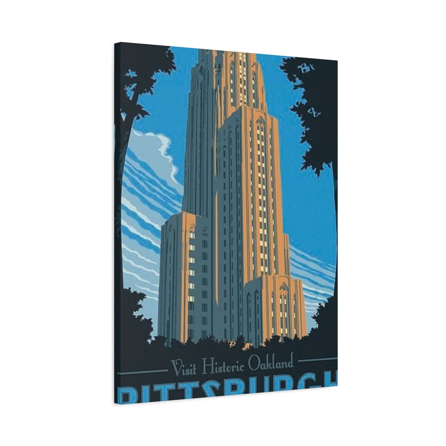
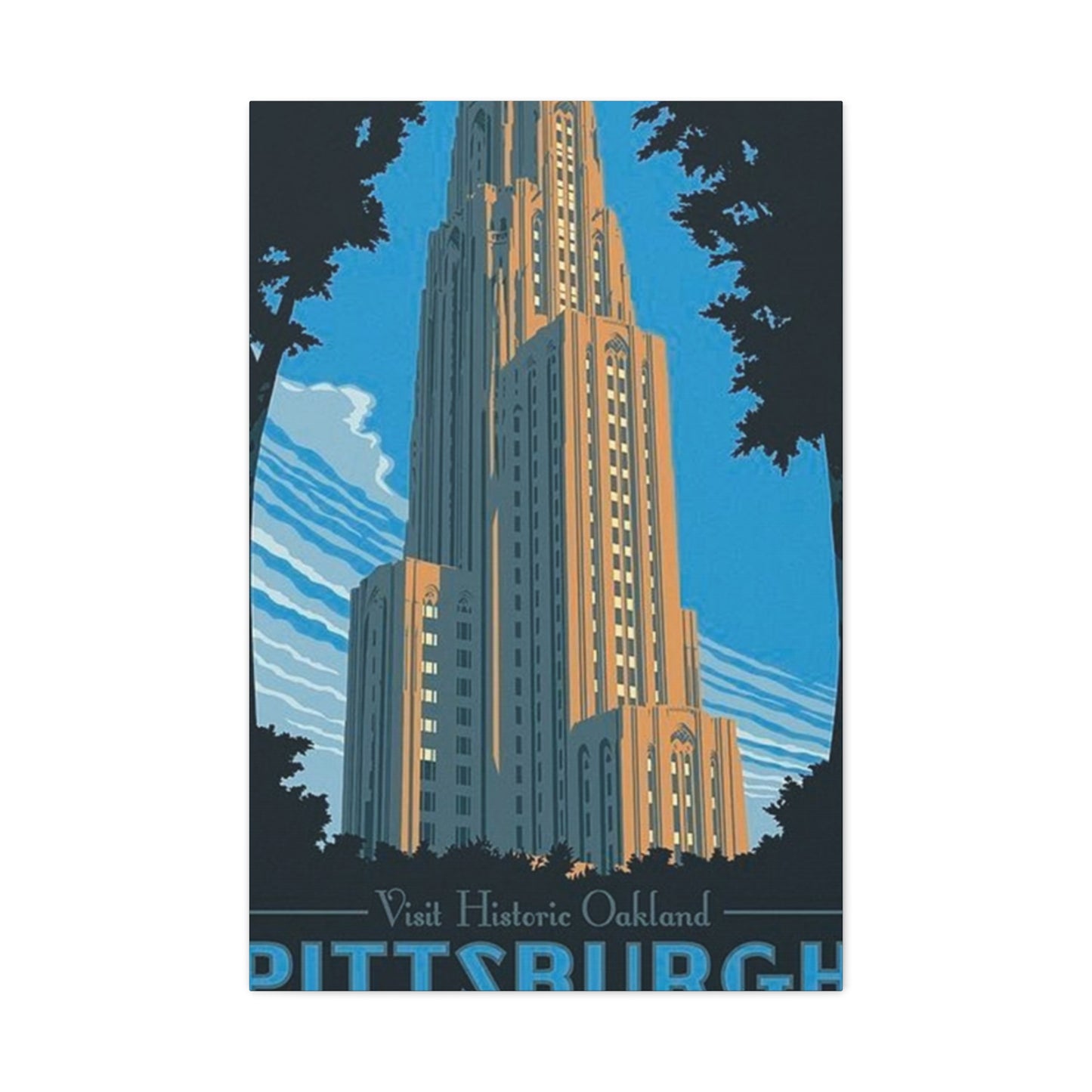
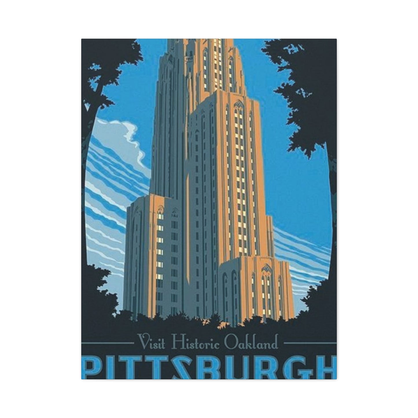
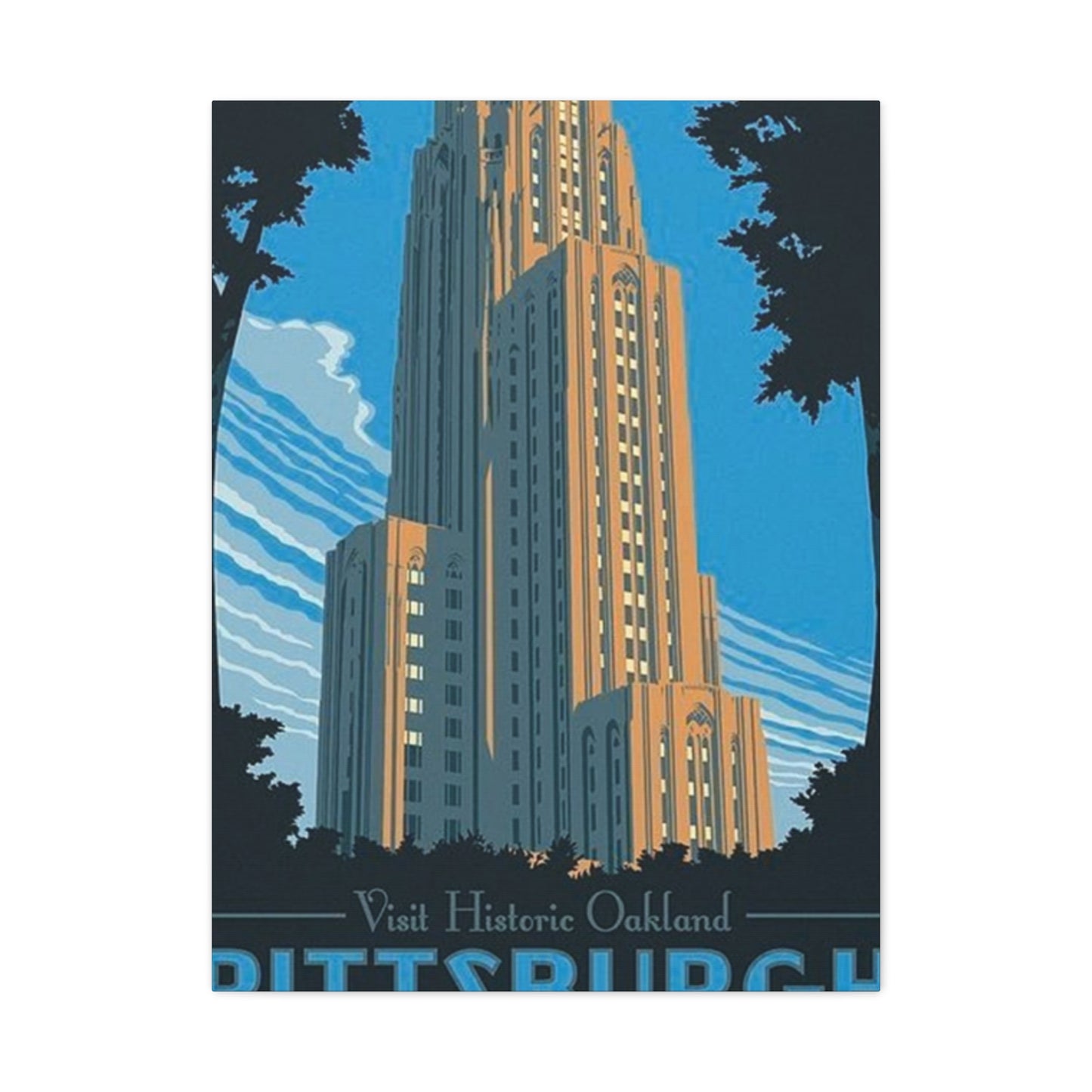
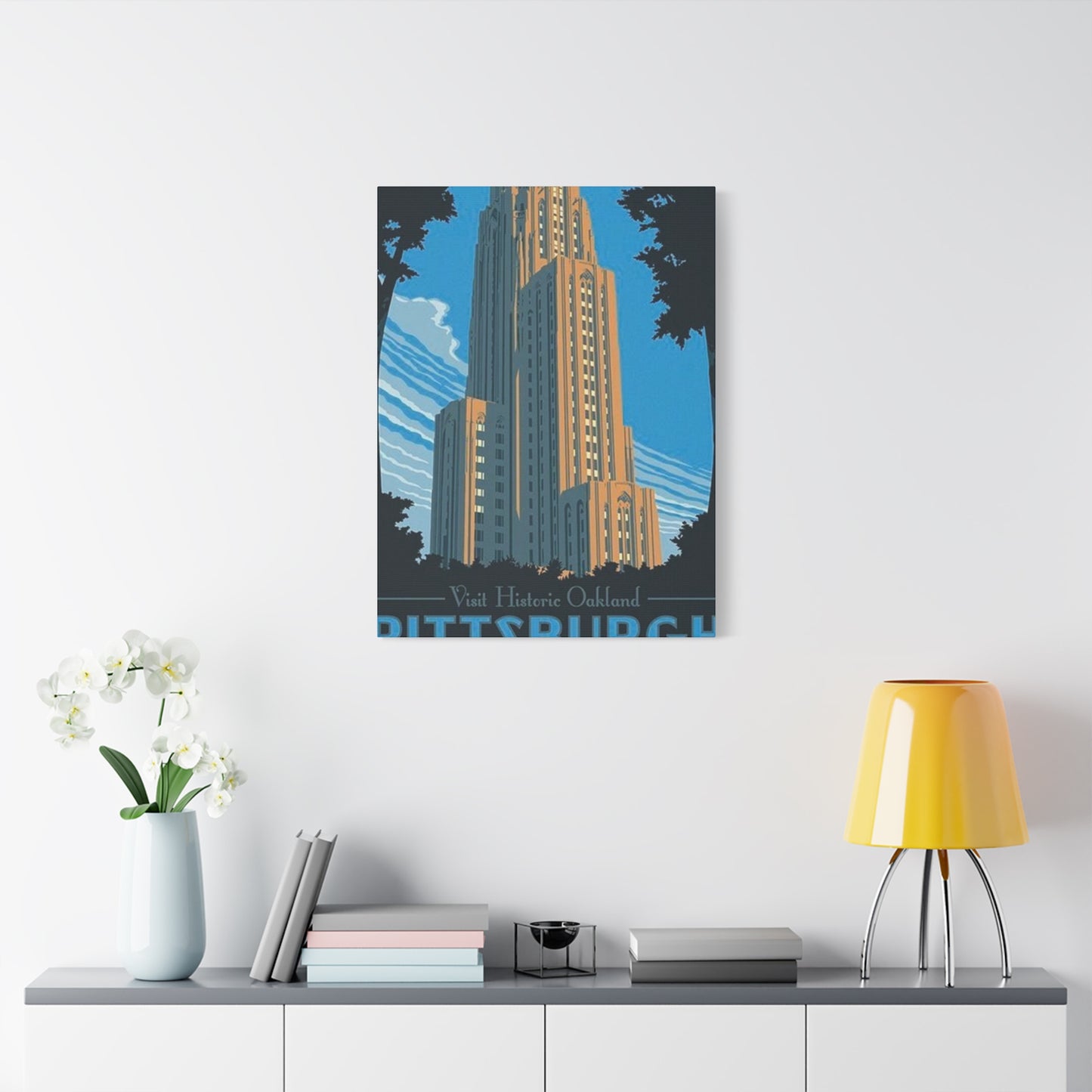
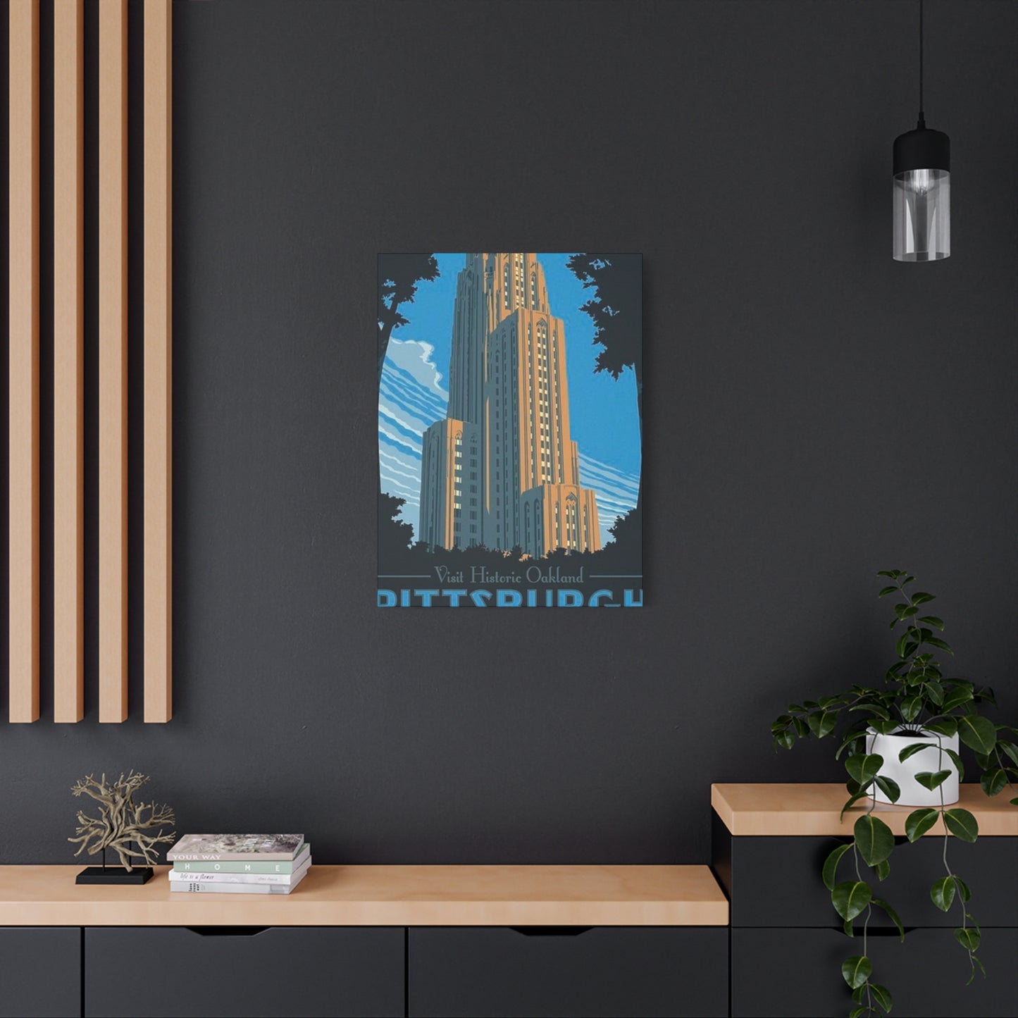
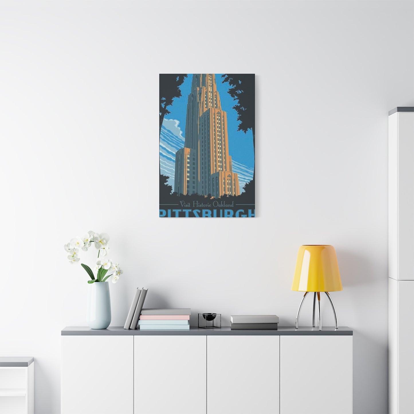
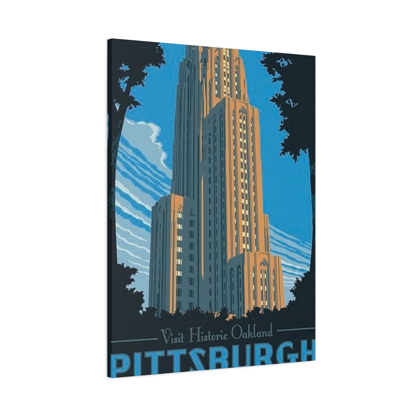
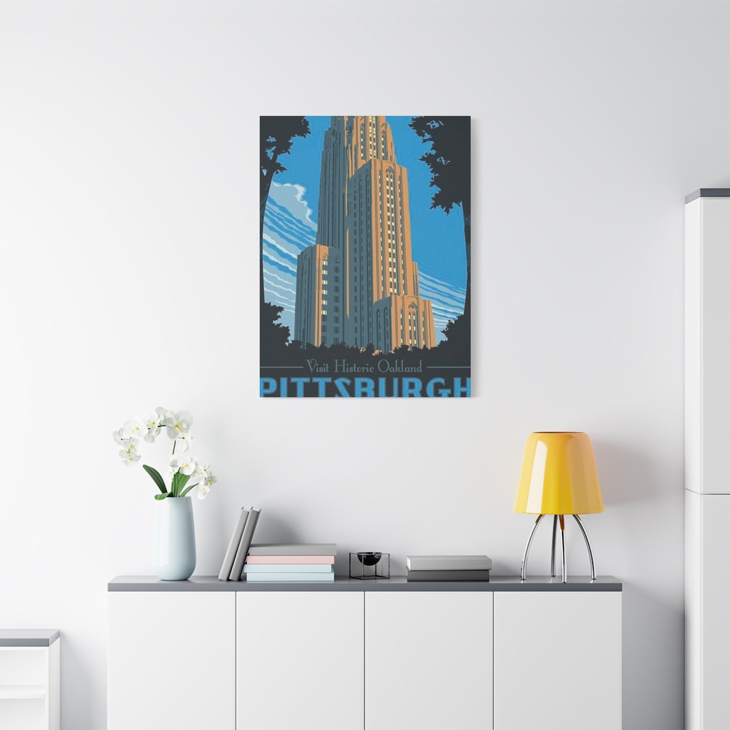
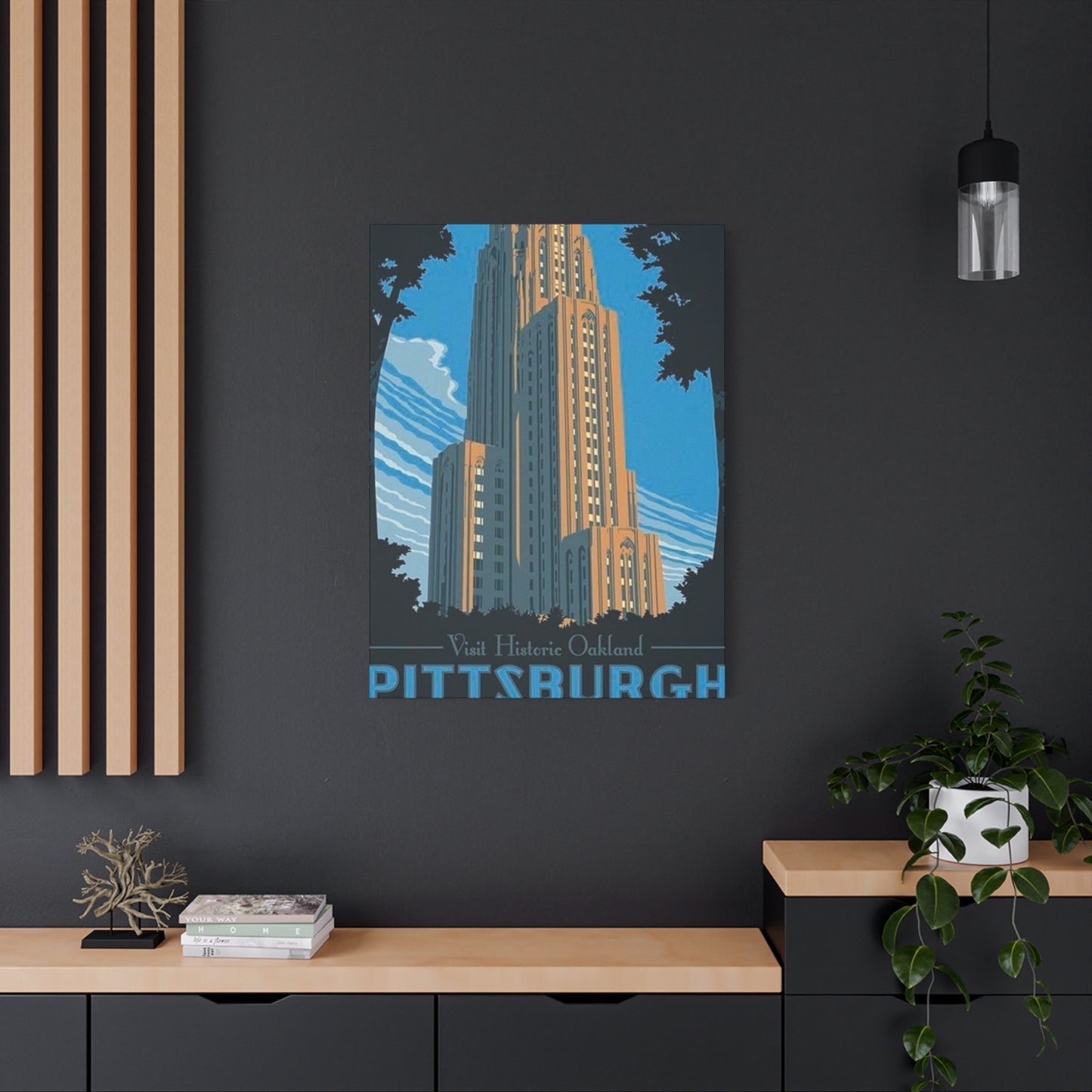
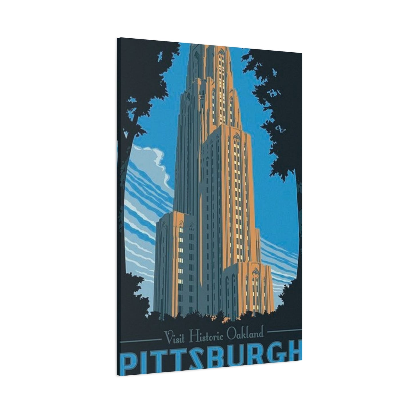
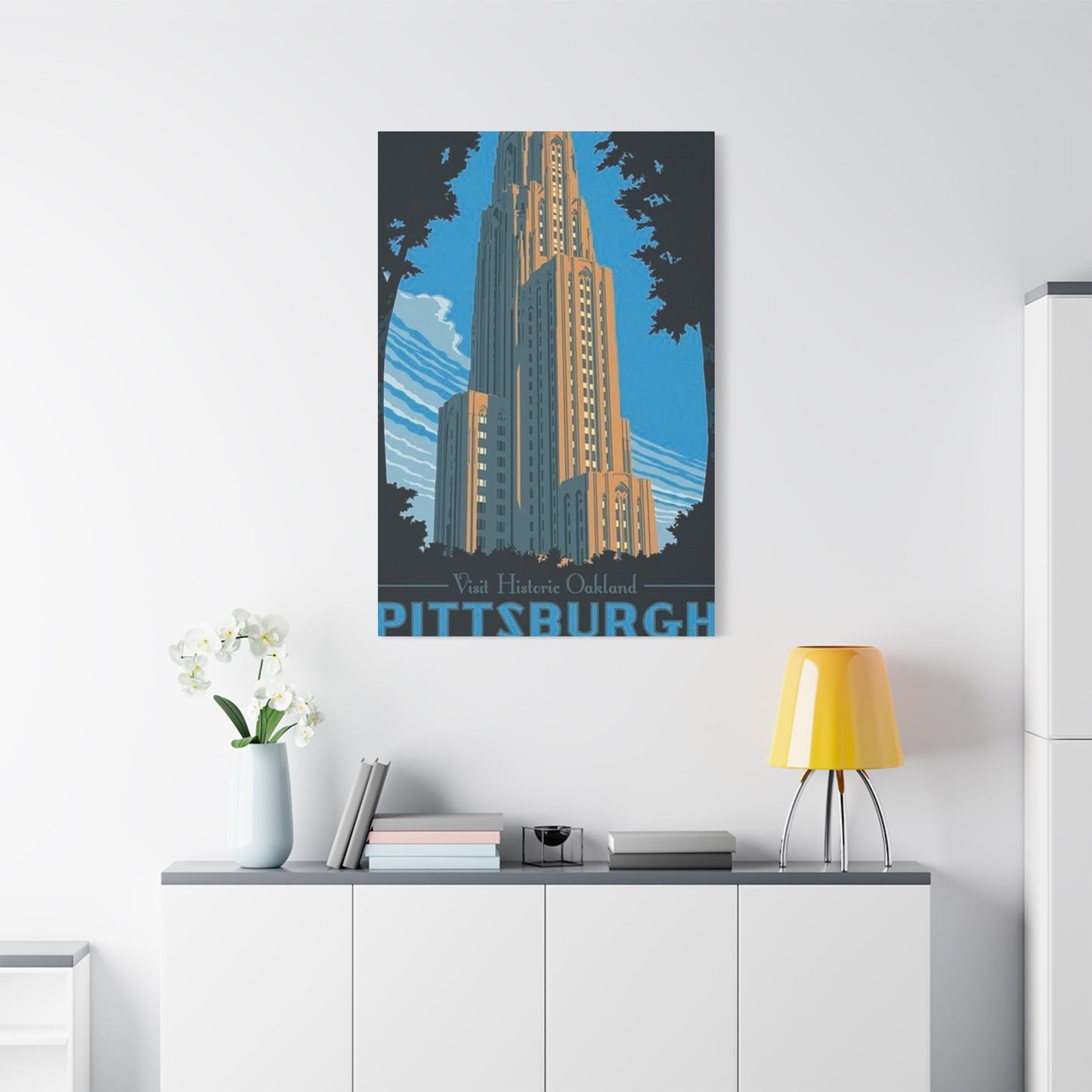
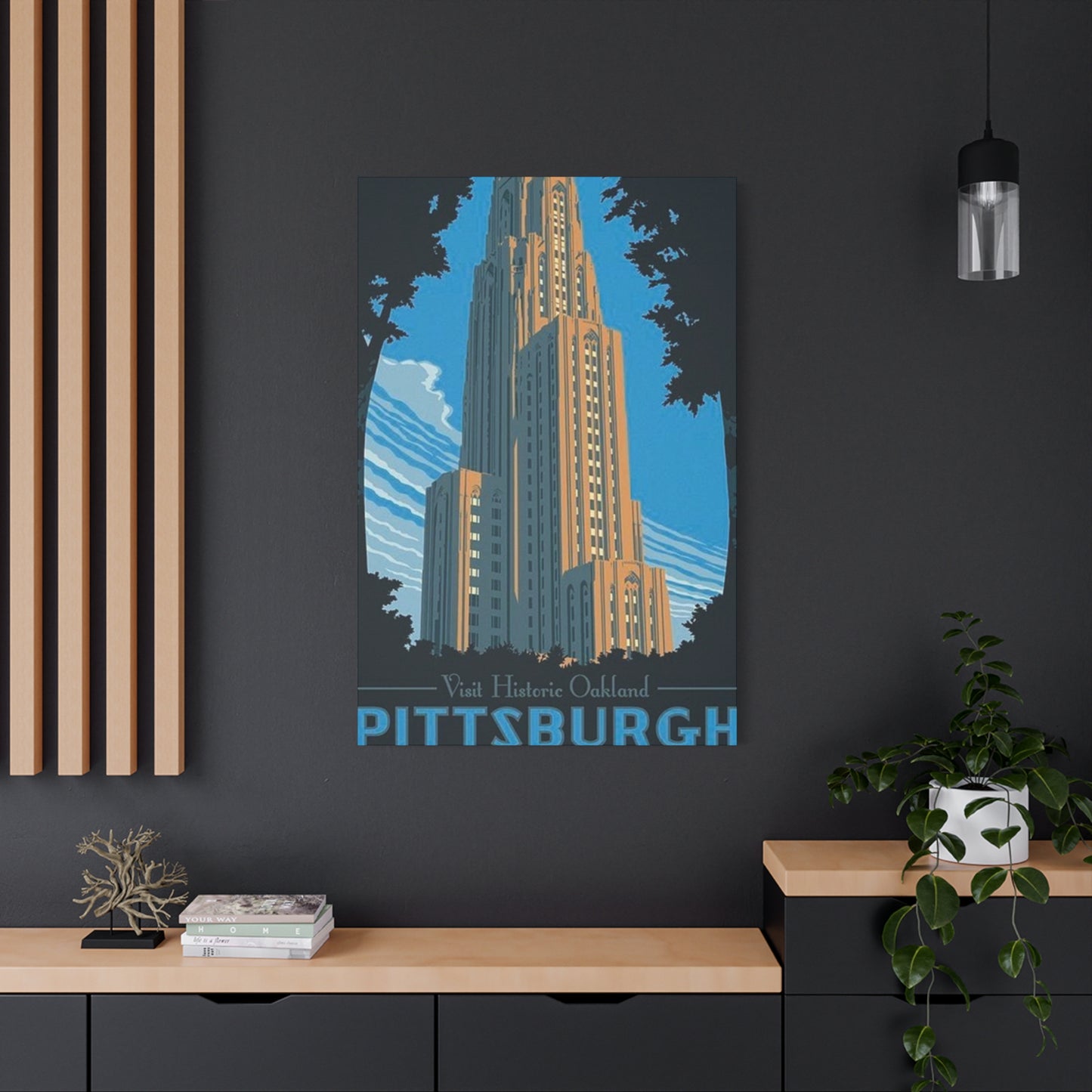
Among the most frequently depicted structures are the massive educational edifices that dominate the neighborhood skyline. The Cathedral of Learning, that extraordinary forty-two-story Gothic Revival tower, commands attention in countless artistic renditions. Its limestone facade and soaring vertical lines translate beautifully into poster format, whether rendered through photographic reproduction, stylized illustration, or abstract interpretation. Artists emphasize different aspects depending on their creative vision—some focus on the building's imposing height and geometric precision, while others capture the interplay of light and shadow across its textured surfaces during different times of day.
Religious architecture also features prominently in Oakland-themed artwork. The Byzantine-influenced designs of certain sacred spaces, with their distinctive domes and elaborate ornamentation, provide visual contrast to the neighborhood's Gothic and Romanesque structures. These buildings represent not only architectural achievement but also the diverse spiritual traditions that have flourished within this urban environment.
Cultural institutions housed in neoclassical buildings offer another popular subject for artistic interpretation. The symmetry and proportion inherent in classical architectural vocabulary translate effectively to two-dimensional representations. Columns, pediments, and sculptural details become focal points that ground compositions and provide visual weight.
Residential architecture, though less monumental in scale, adds human dimension to Oakland-themed artwork. Row houses with their characteristic porches, mansions from the neighborhood's gilded age, and even utilitarian apartment buildings contribute to the area's visual character. Artists who include these structures in their compositions create more comprehensive portraits of the neighborhood that acknowledge the everyday environments where people actually live their lives.
The challenge for artists working with architectural subjects lies in balancing accuracy with artistic interpretation. Overly literal representations can feel sterile and documentary rather than evocative and emotionally resonant. The most successful pieces capture the essence and spirit of these structures while exercising creative license regarding color palettes, perspectives, and compositional arrangements. This approach allows the artwork to function both as recognizable depiction and as standalone aesthetic object.
Commemorating Academic Excellence Through Visual Representations of Campus Landmarks
The concentration of learning institutions within this Pittsburgh neighborhood has profoundly shaped its identity and physical landscape. These academic environments, with their distinctive campuses and iconic buildings, provide rich source material for artists creating commemorative and decorative prints. Students, alumni, faculty, and admirers of higher learning all find particular resonance in artwork that celebrates these intellectual communities.
Campus-specific artwork serves multiple functions within the academic community. For current students, such pieces transform impersonal dormitory rooms or apartments into personalized spaces that reflect school pride and affiliation. During formative years spent pursuing degrees, these visual reminders of beloved campus locations provide comfort and connection during challenging academic periods.
Alumni relationships with campus artwork run even deeper. Graduation marks a transition from daily immersion in campus life to nostalgic memory, and decorative prints bridge this gap by maintaining visual connection to formative experiences. Many graduates display such artwork in their homes or offices for decades, using these pieces as touchstones to recall friendships, intellectual awakening, and personal growth achieved during college years.
The artistic treatment of campus scenes varies widely depending on intended audience and stylistic preferences. Realistic photographic reproductions appeal to those seeking accurate documentation of specific locations as they remember them. These pieces often capture iconic views—the main quadrangle from a particular vantage point, a famous staircase at sunset, or a building entrance framed by seasonal foliage.
Illustrative approaches offer more creative freedom, allowing artists to emphasize certain elements while minimizing others. A skilled illustrator might exaggerate the vertical lines of a prominent tower to convey its dominance of the skyline, or use a warm color palette to evoke the golden light of autumn afternoons when campus trees display their most spectacular colors. These interpretive choices transform documentary record into emotional evocation.
Abstract and minimalist treatments appeal to those with contemporary aesthetic sensibilities. Such pieces might reduce complex architectural forms to their essential geometric components, creating compositions that are simultaneously recognizable and formally satisfying as pure design. A building's distinctive roofline might become a series of angular shapes in bold colors, while a famous archway transforms into concentric curved forms that suggest rather than depict the actual structure.
Vintage-inspired designs tap into nostalgia while appealing to contemporary tastes for retro aesthetics. These pieces often employ the visual vocabulary of mid-century travel posters—simplified forms, limited color palettes, and bold typography—to create artwork that feels both timeless and specifically rooted in a particular design era. The combination of historical subject matter with vintage graphic design creates layered nostalgia that resonates with multiple generations.
Cultural Institution Representations That Celebrate Art, Science, and Natural Wonders
Museums and cultural centers within the Oakland neighborhood have earned international recognition for their collections and contributions to human knowledge. These institutions deserve celebration not only for their contents but also for their architectural distinction and roles as community gathering spaces. Artwork featuring these venues serves as invitation and reminder, encouraging both residents and visitors to engage with the treasures housed within.
The natural history collections housed in Oakland have inspired wonder in generations of visitors. Dinosaur skeletons, mineral specimens, cultural artifacts from around the world, and wildlife dioramas create immersive environments that spark curiosity and learning. Artists who create poster tributes to these institutions often incorporate iconic specimens or exhibit elements into their designs, creating instantly recognizable imagery for anyone who has visited.
Visual art museums in the neighborhood present a fascinating meta-artistic challenge—creating artwork about places that house artwork. Successful pieces in this category often feature the museum building itself, using architectural photography or illustration to convey the grandeur of spaces designed specifically to showcase artistic treasures. Some designers take more conceptual approaches, incorporating famous artworks from the museum's collection into composite designs that celebrate both container and contents.
Science centers dedicated to interactive learning and exploration provide dynamic subject matter for artists. The hands-on exhibits, planetariums, and workshop spaces within these facilities embody curiosity and discovery—qualities that resonate with broad audiences. Artwork celebrating these venues often incorporates scientific imagery—planets, molecules, gears, light spectra—alongside architectural elements to convey the interdisciplinary nature of scientific inquiry.
Performance venues where music, theater, and dance come alive present particular challenges and opportunities for visual artists. How does one capture the ephemeral nature of live performance in a static image? Successful approaches often focus on the architectural spaces themselves—the curve of a concert hall ceiling, the ornate proscenium arch of a theater, the dramatic lighting possibilities of a performance space. These elements serve as metaphors for the artistic experiences that occur within.
Gardens and outdoor cultural spaces add natural elements to the urban cultural landscape. Even in poster format, the organic forms of plants, trees, and landscape design provide visual relief from the geometry of architecture. Artists working with these subjects can explore seasonal variations, creating series that show the same location across different times of year—spring blossoms, summer lushness, autumn colors, winter structure.
Celebrating Green Spaces and Recreational Areas Through Landscape-Focused Poster Designs
Urban parks and recreational areas provide essential breathing room within densely built environments. The Oakland neighborhood includes several significant green spaces that serve as gathering places, exercise venues, and natural sanctuaries for city dwellers. These landscapes, with their trees, paths, water features, and vistas, inspire a different category of commemorative artwork that emphasizes natural beauty within urban context.
The largest park in the vicinity offers extensive grounds with diverse landscapes ranging from formal gardens to naturalistic woodlands. Artists capturing this environment face the pleasant challenge of choosing from abundant compositional possibilities. Some focus on grand vistas that showcase the park's scale and landscape architecture, while others zoom in on intimate details—a particular fountain, a notable tree, a beloved statue.
Seasonal variation provides endless creative possibilities for park-themed artwork. Spring brings flowering trees and bulbs that transform landscapes into pastel wonderlands. Summer offers dense green canopies and vibrant flowerbeds. Autumn explodes with color as deciduous trees display their final spectacle before winter dormancy. Winter reduces the landscape to elegant structure—bare branch silhouettes, evergreen forms, the occasional dusting of snow that emphasizes shapes and contours.
Athletic facilities and recreational spaces within parks attract their own devoted followings. Playing fields, running tracks, swimming pools, and courts serve as stages for personal achievement and community connection. While these utilitarian spaces might seem less obviously picturesque than garden areas, they hold deep meaning for individuals whose lives have been shaped by athletic pursuits. Artwork commemorating these locations validates the significance of physical activity and competition in human experience.
Water features—whether natural streams, designed fountains, or artificial ponds—add sound, movement, and reflective surfaces to park environments. These elements translate beautifully into visual artwork, with artists exploiting the interplay between water and surrounding landscape. A fountain captured in poster form might emphasize the geometric precision of water jets frozen in photographic instant, or take a softer approach showing water in motion blur that conveys movement and fluidity.
Historic monuments and sculpture within parks provide focal points that combine artistic and commemorative functions. These three-dimensional artworks within the landscape become subjects for two-dimensional representation, creating interesting layers of artistic interpretation. A sculpture that commemorates a historical figure or event carries meaning beyond its formal qualities, and poster representations can emphasize either aesthetic or symbolic aspects depending on artistic intent.
Ecological features receive increasing attention as environmental awareness grows. Wetlands, wildlife habitats, native plant gardens, and conservation areas within urban parks represent commitment to sustainability and biodiversity. Artwork highlighting these features serves educational purposes while celebrating natural systems that operate largely unseen by casual park visitors focused on manicured lawns and formal gardens.
Street Scene Compositions That Capture the Vibrant Urban Character of Oakland Districts
The lived experience of a neighborhood happens primarily at street level, where residents and visitors navigate sidewalks, enter businesses, wait at bus stops, and encounter one another in the flow of daily life. Street scene artwork captures this human dimension of place, celebrating the ordinary moments and familiar views that constitute actual neighborhood experience rather than tourist highlights.
Commercial corridors with their distinctive storefronts create visual interest through signage, window displays, and architectural variety. Artists drawn to these subjects often employ perspective that emphasizes the linear quality of streets—buildings receding toward vanishing points, sidewalks creating strong diagonal lines, overhead wires and tree branches forming patterns against sky. These compositional devices create depth and draw viewers into the scene.
The interaction between pedestrians and urban environment provides narrative content that purely architectural views lack. A street scene populated with figures—even simplified or abstracted—feels alive and dynamic compared to empty cityscapes. The challenge lies in depicting people in ways that feel authentic without becoming distracting or dated. Many artists solve this by treating human figures as simplified forms that suggest activity and presence without photographic specificity.
Public transit elements contribute distinctive character to urban street scenes. Bus shelters, trolley tracks, street signs, and transit stops are simultaneously functional infrastructure and visual markers of place. These elements often appear in the middle ground of compositions, providing detail and specificity without overwhelming primary subjects like buildings or street views.
Street trees and urban landscaping soften hardscapes and provide seasonal variation to otherwise static architectural scenes. An artist might choose to depict a particular street in autumn when trees create golden canopies over sidewalks, or in spring when flowering trees add delicate color against brick and stone facades. These natural elements connect urban environments to larger natural cycles and provide visual relief from geometric forms.
Weather and atmospheric conditions dramatically affect the mood of street scenes. Morning fog creates mystery and softens edges. Bright midday sun emphasizes contrast and detail. Rain-slicked streets create reflections that double visual elements. Evening light warms building facades and casts long shadows. Night scenes showcase artificial lighting—streetlamps, storefront windows, vehicle headlights—creating entirely different aesthetic from daylight views. Artists can revisit the same location under different conditions to create series that showcase this variety.
Seasonal decorations and events transform familiar streets into festive spaces. Winter holiday lights, spring flower markets, summer street fairs, autumn harvest displays—these temporary transformations mark the passage of time and celebrate community traditions. Artwork capturing these moments serves as snapshot of neighborhood life beyond permanent architecture and landscape.
Typography and Graphic Design Elements That Define Contemporary Neighborhood Poster Aesthetics
The visual language of contemporary place-based poster art extends well beyond photographic or illustrated depictions of locations. Typography, color theory, compositional principles, and graphic design conventions all contribute to the overall aesthetic impact and communicative effectiveness of these pieces. Understanding these design elements helps viewers appreciate the craft involved and make informed choices when selecting artwork.
Lettering styles convey distinct moods and associations that complement or contrast with visual imagery. Sans-serif typefaces project modernity, clarity, and straightforward communication. Serif fonts suggest tradition, authority, and literary refinement. Script typefaces evoke elegance and personal touch. Display fonts with distinctive character add personality but require careful application to avoid overwhelming compositions.
Successful poster designs typically establish clear typographic hierarchy that guides viewer attention through the composition. The most important information—often the place name or headline—receives visual emphasis through size, weight, position, or color. Secondary information appears in smaller scale or less prominent position. This organizational structure helps viewers quickly grasp essential content while allowing deeper exploration of details.
Color palettes profoundly affect emotional response to artwork. Warm colors—reds, oranges, yellows—create energy and excitement. Cool colors—blues, greens, purples—evoke calm and contemplation. Neutral palettes emphasizing grays, blacks, and whites project sophistication and timelessness. Designers choose colors based on subject matter, intended mood, and coordination with anticipated display environments.
Vintage poster design conventions have influenced contemporary neighborhood artwork significantly. The golden age of travel posters, roughly spanning the nineteen-twenties through nineteen-sixties, established visual vocabulary still referenced today. Simplified forms, limited color palettes, bold graphics, and stylized depictions characterized this era. Contemporary designers mining this aesthetic create work that feels simultaneously nostalgic and fresh, familiar yet distinctive.
Minimalist approaches strip away extraneous detail to focus on essential elements. A minimalist Oakland poster might reduce complex architecture to simple geometric forms in two or three colors, perhaps adding location name in clean sans-serif typography. These pieces appeal to viewers who prefer understated elegance and contemporary aesthetic sensibilities. They also coordinate easily with minimalist interior design schemes that might find busier artwork overwhelming.
Maximalist designs embrace complexity, pattern, and abundant detail. These pieces pack visual information densely, rewarding extended viewing with discoverable elements. A maximalist approach might combine multiple landmark buildings, decorative patterns, flourishing typography, and rich color in a single composition. While potentially overwhelming in small doses, these pieces can become focal points in spaces designed around them.
Collage and mixed-media aesthetics incorporate multiple visual elements and textures into unified compositions. A collage-style Oakland poster might combine vintage photographs, contemporary illustrations, textural elements, pattern, and typography in layers that create depth and visual interest. This approach allows designers to reference multiple aspects of neighborhood identity simultaneously.
Material Considerations and Printing Methodologies for Long-Lasting Decorative Prints
The longevity and visual quality of decorative posters depend heavily on materials and production methods employed during manufacturing. Understanding these factors helps consumers make informed purchasing decisions and properly care for their artwork to ensure years of enjoyment. The gap between cheaply produced commercial posters and museum-quality prints is substantial and worth understanding.
Paper selection forms the foundation of print quality. Standard poster paper sufficiently serves temporary purposes but lacks the weight and durability required for long-term display. Better options include heavyweight matte paper that minimizes glare while providing substantial feel, or glossy finishes that enhance color saturation and visual impact. Premium choices involve cotton-based fine art papers similar to those used for limited edition prints and photography.
Archival considerations become crucial for anyone viewing posters as long-term investments rather than temporary decorations. Acid-free papers resist yellowing and degradation over time. Archival inks resist fading when exposed to light, maintaining color fidelity for decades rather than months. The combination of quality paper and superior inks dramatically extends the lifespan of prints displayed properly.
Printing methodologies vary in quality and appropriateness for different designs. Digital printing dominates contemporary poster production due to its flexibility, color accuracy, and cost effectiveness for small runs. Giclée printing, a premium digital process using archival inks and fine art papers, produces museum-quality results suitable for serious collectors. Traditional offset lithography still finds application for large production runs where economies of scale justify setup costs.
Screen printing offers unique aesthetic qualities that some designers prefer for specific projects. This method layers individual colors sequentially, building up the final image through precise registration of multiple passes. The resulting prints have distinctive color saturation and subtle texture that differs from digital printing. Screen printing works particularly well for designs with limited color palettes and bold graphic elements.
Paper size standards affect both production and framing. Common poster dimensions have evolved around standard frame sizes to simplify the selection and mounting process. Understanding these conventions helps when planning display arrangements and budgeting for framing costs. Oversized prints make dramatic statements but require custom framing that increases overall investment.
Print finishing options add protection and visual refinement. Spot varnishing emphasizes specific design elements with contrasting gloss or matte finishes. Edge treatments create clean borders or allow ink to extend fully to paper edges. Embossing adds tactile dimension to select areas. While these enhancements increase production costs, they can elevate posters from simple decorations to sophisticated art pieces.
Mounting and backing methods affect how prints hang and age. Standard posters require external support through framing or mounting systems. Prints on rigid substrates arrive ready to hang but cost more and weigh considerably more than paper prints. Lamination provides protection but alters the viewing experience through added reflective surface. Each approach involves tradeoffs between cost, convenience, and aesthetic results.
Framing Strategies That Enhance and Protect Neighborhood Poster Collections
Proper framing transforms posters from loose paper sheets into finished art pieces worthy of prominent display. The framing process involves numerous decisions affecting both aesthetics and preservation. While professional framing services provide expertise, understanding basic principles empowers consumers to make appropriate choices for their specific situations and budgets.
Frame style selection should consider both the artwork and the display environment. Modern prints with clean lines and contemporary graphics often benefit from simple frames with minimal ornamentation. Vintage-style pieces might pair better with frames that echo the artwork's era. Traditional architecture and classical compositions can support more ornate frames. The frame should complement rather than compete with the artwork itself.
Material choices affect both appearance and longevity. Wood frames offer warmth and traditional appeal, with species ranging from economical pine to exotic hardwoods. Metal frames project modern sensibility and come in various finishes from brushed aluminum to glossy black. Composite materials provide affordable alternatives that mimic more expensive options. Each material carries different weight, durability, and cost implications.
Color coordination between frame, mat, and artwork requires careful consideration. Frames in neutral colors—black, white, natural wood tones, metallic finishes—coordinate with most artwork and interior schemes. Colored frames make bolder statements but risk clashing with either artwork or surroundings. Conservative choices ensure longevity as tastes evolve, while adventurous selections create distinctive looks that might eventually feel dated.
Matting serves multiple functions beyond pure aesthetics. The neutral border created by mats provides visual breathing room between artwork and frame, preventing compositions from feeling cramped. Mats also create physical separation between print surface and glazing, reducing risk of moisture damage or adhesion. Multiple mat layers add depth and luxury to presentation.
Mat colors dramatically affect artwork perception. White or off-white mats provide neutral surrounds that don't compete with images. Black mats create dramatic contrast and sophistication. Colored mats can pick up specific hues from artwork, though this approach requires skilled coordination to avoid garish results. Mat width must balance with frame size and artwork dimensions to achieve pleasing proportions.
Glazing protects prints from environmental damage while allowing viewing. Standard glass suffices for basic protection but adds weight and creates glare under certain lighting. Acrylic glazing weighs less and resists shattering but scratches more easily than glass. UV-filtering glazing, available in both glass and acrylic, provides crucial protection against light-induced fading for valuable or sentimental pieces. Museum-quality anti-reflective glazing virtually disappears under normal viewing conditions but commands premium pricing.
Conservation framing addresses long-term preservation through archival materials and reversible mounting methods. Acid-free mats and backing prevent chemical deterioration. Archival tape and corners secure artwork without causing damage that would reduce value or require restoration. While conservation framing increases initial cost, it proves essential for valuable prints or those with strong sentimental attachment.
Display Arrangement Principles for Creating Cohesive Wall Galleries
Individual framed prints make statements on their own, but thoughtfully arranged collections create gallery walls with visual impact exceeding the sum of individual pieces. Whether clustering multiple Oakland-themed prints or integrating neighborhood artwork into broader collections, certain principles guide successful arrangements that feel intentional rather than haphazard.
The salon-style approach clusters multiple frames in organic arrangement that covers substantial wall area. This traditional method allows mixing frame sizes, artwork types, and subjects within unified presentation. Success requires careful planning—most designers arrange pieces on floor or use paper templates on walls before committing to nail placement. The goal is balanced composition where visual weight distributes evenly despite varying frame sizes and artwork subjects.
Grid arrangements impose geometric order through consistent spacing and alignment. This contemporary approach works particularly well with uniform frame sizes and complementary artworks. A three-by-three grid of Oakland landmark prints, for instance, creates comprehensive neighborhood portrait with clean, modern aesthetic. Precise measurements and leveling tools prove essential for achieving the crisp alignment that makes grid arrangements successful.
Linear arrangements suit hallways and narrow wall spaces where vertical or horizontal emphasis makes sense. A horizontal series at consistent height creates frieze effect, while vertical stacking draws attention upward. This approach works well for chronological presentations or thematic progressions where sequence matters.
Asymmetric balance achieves visual equilibrium without geometric rigidity. A large statement piece might anchor one side of arrangement, balanced by cluster of smaller pieces on the opposite side. This approach requires intuitive sense of visual weight—larger frames, darker colors, and busier compositions carry more weight than smaller, lighter, simpler pieces.
Color coordination across multiple pieces unifies diverse artworks. Frames in consistent color family create cohesion even when artwork subjects vary. Alternatively, consistent frame style with varying finishes adds subtle variation within unified presentation. Mat colors can echo artwork hues across multiple pieces, creating color relationships that tie arrangements together.
Thematic groupings organize collections around shared subjects or concepts. All architectural prints might cluster in one area, while park scenes group elsewhere. Campus landmarks could form one collection, while street scenes comprise another. This approach allows for focused mini-collections within larger decorative schemes.
Lighting considerations affect both visibility and preservation. Artwork displayed opposite windows receives abundant natural light but risks fading. Gallery lights or picture lights provide controlled illumination that showcases details while avoiding excessive UV exposure. Positioning artwork away from direct sunlight extends longevity while maintaining visibility.
Spacing calculations require balancing visual cohesion with wall coverage. Pieces spaced too closely feel cramped and compete for attention. Excessive spacing breaks visual connections between pieces. A general rule suggests spacing frames two to six inches apart, with wider gaps between distinct groupings. Wall color influences perceived spacing—darker walls require tighter groupings to maintain cohesion, while lighter walls support more generous spacing.
Sourcing Authentic Oakland Neighborhood Artwork from Local and Online Vendors
The marketplace for neighborhood-specific decorative artwork includes diverse vendors ranging from local artists and galleries to national retailers and online platforms. Each source offers distinct advantages and considerations regarding authenticity, quality, price, and selection. Navigating these options successfully requires understanding what different vendors provide and how their offerings align with personal priorities.
Local artists create unique Oakland artwork infused with genuine connection to place. These creators live in or near the neighborhood, experiencing daily the locations they depict. Their work often captures subtle details and perspectives that outsiders might overlook. Purchasing directly from artists supports creative individuals while acquiring pieces with authentic provenance. Finding local artists requires research—attending neighborhood art markets, visiting studios during open houses, following social media accounts, or checking community bulletin boards.
Independent galleries focusing on regional art curate selections emphasizing quality and local relevance. Gallery owners develop expertise in their areas and relationships with talented artists, serving as intermediaries who pre-screen work for quality. Gallery purchases often cost more than buying directly from artists due to retail markup, but galleries provide browsing convenience and confident quality standards.
Museum gift shops offer artwork related to their collections and neighborhoods. Natural history museums might sell prints featuring iconic specimens, while art museums offer reproductions of works in their collections alongside contemporary pieces. These venues generally maintain high standards and their location within cultural institutions adds authenticity.
University bookstores stock campus-specific artwork appealing to students, alumni, and visitors. These retail operations understand their audiences and curate selections accordingly. Quality varies from mass-produced commercial prints to carefully selected artwork from talented designers. Pricing tends to be moderate, reflecting bookstores' educational contexts rather than pure profit motives.
Print-on-demand platforms enable artists to reach global audiences without inventory costs or shipping logistics. These services produce prints as ordered, with artists uploading designs and receiving royalties from sales. Quality varies by platform and individual artist, requiring research into specific sellers before purchasing. Customer reviews provide useful guidance regarding print quality and seller reliability.
Craft marketplaces specializing in handmade and vintage goods connect independent creators with consumers seeking unique items. These platforms emphasize individuality and small-batch production, though definitions of "handmade" vary. Some listings feature genuinely original artwork, while others sell designs applied to commercial products through print-on-demand services. Careful reading of product descriptions reveals important details about creation processes.
General online retailers stock vast selections of decorative posters through third-party sellers. These massive platforms offer convenience and competitive pricing but require vigilant quality assessment. Customer reviews, seller ratings, and return policies become crucial factors when purchasing sight unseen from unfamiliar vendors. The tradeoff between selection and reliability tilts toward convenience at expense of curation.
Vintage and antique markets occasionally yield historical Oakland artwork predating contemporary poster production. These genuine artifacts carry historical interest beyond purely decorative appeal. Authenticating vintage pieces requires knowledge of printing methods, paper types, and historical context. Condition issues affecting old paper—tears, fading, staining, brittleness—must be evaluated against historical significance.
The Role of Neighborhood Artwork in Place-Making and Community Identity Formation
Beyond individual decorative choices, neighborhood-specific artwork participates in larger processes through which communities develop and maintain shared identity. Place-making—the ongoing creation of meaningful human connection to physical locations—happens through countless individual and collective actions, including the creation and display of location-celebrating artwork.
Visual representations of neighborhoods function as both mirror and lens. They reflect existing identity by depicting valued features—the buildings people recognize, the green spaces they frequent, the street scenes they navigate daily. Simultaneously, these representations shape how people perceive their neighborhoods by highlighting certain features while minimizing others, creating idealized versions that influence expectations and aspirations.
The proliferation of Oakland poster art signals neighborhood pride and resident investment in place. When businesses display local artwork, they signal connection to community beyond transactional relationships. When residents hang neighborhood prints in homes, they claim identity tied to physical location rather than abstract affiliation. These displays create visible markers of belonging that accumulate into collective culture of place attachment.
Certain locations become iconic through repeated artistic representation. A building might possess architectural merit that draws initial artistic attention, but subsequent reproductions in posters and other media reinforce its status as neighborhood symbol. This feedback loop between artistic representation and popular consciousness shapes which features become definitional for neighborhood identity.
Artistic interpretation affects how neighborhoods present themselves to outsiders. Carefully curated selections of what merits artistic representation construct particular narratives about place character. Oakland artwork emphasizing cultural institutions projects image as intellectual and artistic center. Pieces featuring green spaces convey livability and environmental quality. Street scenes suggest urban vitality and neighborhood dynamism. Each artistic choice contributes to cumulative impression.
Temporal dimensions add complexity to relationships between artwork and place. Artwork created decades ago documents historical conditions while potentially influencing contemporary perceptions. A vintage poster showing Oakland in mid-century might depict structures now demolished or transformed, creating tension between artistic representation and current reality. This temporal gap can be productive, sparking conversations about neighborhood change and preservation.
Artistic diversity matters for inclusive representation. When only certain neighborhood features receive artistic attention, communities risk developing narrow identity that excludes residents whose experiences differ from mainstream narrative. Comprehensive artistic representation requires depicting residential neighborhoods alongside landmarks, everyday spaces alongside destinations, diversity of residents rather than stereotyped populations.
Community art projects involving neighborhood residents in creation processes build place attachment through active participation rather than passive consumption. Collaborative murals, community poster projects, or neighborhood design competitions engage residents as co-creators of visual identity. This participatory approach fosters deeper connection than simply purchasing commercially produced artwork.
Historic Oakland Pittsburgh Poster Wall Art as Thoughtful Gift Selections
Selecting meaningful gifts challenges even thoughtful givers, particularly for recipients who already possess material comforts. Historic Oakland Pittsburgh poster wall art solves multiple gift-giving dilemmas simultaneously by offering personal relevance, lasting value, and displayed visibility that keeps givers in recipients' awareness. Understanding what makes these items excellent gifts helps identify appropriate recipients and occasions.
Current students living in the Oakland area or attending nearby institutions appreciate artwork that personalizes temporary living spaces. Dormitory rooms and rental apartments often feel sterile and impersonal, but posters transform these spaces into homes that reflect resident identity. A gift of neighborhood artwork helps students feel settled and connected to their communities during transitory college years.
Recent graduates moving away from Oakland often experience keen nostalgia for their college neighborhoods. A carefully selected poster serves as tangible connection to recently concluded chapter, helping new alumni maintain relationships with places that shaped them. Graduation gifts of neighborhood artwork become cherished possessions displayed for years in apartments, first homes, and eventually family residences.
Long-time residents who have devoted years or decades to their neighborhood appreciate artwork that honors their place attachment. For individuals deeply rooted in community, gifts acknowledging this connection demonstrate genuine understanding of what matters to them. Such presents work particularly well for housewarmings, retirement parties, or milestone celebrations.
Relocated alumni who have moved away from the Pittsburgh area but maintain strong connections to their college neighborhoods form prime recipients for Oakland artwork. These individuals often display school and neighborhood pride prominently in their homes, using visual reminders to maintain ties across geographic distance. Alumni networks provide ready-made gift registries for identifying appropriate recipients during milestone occasions.
Individuals with Pittsburgh roots who currently reside elsewhere appreciate artwork celebrating their hometown or familiar neighborhoods. These pieces function as conversation starters that allow displaced Pittsburghers to share memories and maintain identity connections. The gift acknowledges recipient history while respecting current circumstances.
Newcomers to Oakland appreciate guided introductions to neighborhood significance. A well-chosen poster highlighting key landmarks or features helps new residents orient themselves and begin developing place attachment. Including brief descriptions or stories about depicted locations enhances educational value and accelerates community integration.
Architecture and design enthusiasts who collect place-based artwork welcome additions to their collections. These individuals actively seek distinctive representations of locations they've visited or wish to explore. Gifts catering to established collecting interests always land well with recipients who have demonstrated clear preferences.
Parents and family members of students or recent alumni sometimes feel disconnected from important places in their loved ones' lives. Artwork depicting Oakland allows family members to visualize environments where sons, daughters, or other relatives spend formative years. This shared visual reference strengthens family conversations about college experiences.
Wedding couples with shared Oakland connections might appreciate neighborhood artwork as engagement, wedding, or housewarming gifts. These pieces celebrate shared history and early relationship development, marking the location where partners met or grew close. Including personal notes explaining gift significance amplifies emotional impact.
Gift-giving occasions particularly suited for Oakland artwork include graduations, housewarmings, retirements, milestone birthdays, work anniversaries, farewell parties, reunion gatherings, and holidays. The key is matching artwork to genuine recipient connection with the depicted neighborhood rather than imposing place identity where none exists.
Conclusion
The versatility of poster artwork allows successful placement in diverse settings from informal residential spaces to formal professional environments. However, each context requires different approaches regarding frame selection, display height, lighting, and integration with surrounding decor. Understanding these variations helps maximize artwork impact while maintaining appropriate atmosphere.
Living rooms function as primary social spaces where homeowners entertain guests and families gather. Oakland artwork displayed prominently announces resident interests and affiliations to visitors. Large statement pieces above sofas create focal points, while gallery walls transform blank expanses into conversation pieces. Framing should complement existing furniture and architectural details—traditional rooms support ornate frames, while contemporary spaces call for clean-lined alternatives.
Dining rooms benefit from artwork that doesn't overpower mealtime conversations. Scenes depicting peaceful parks or elegant architecture suit these spaces better than busy urban tableaus. Size considerations matter—oversized pieces overwhelm intimate dining spaces, while undersized artwork disappears against expansive walls. Positioning artwork at appropriate height ensures comfortable viewing from seated positions.
Home offices require balancing professional atmosphere with personal expression. Oakland artwork signaling alumni affiliation or neighborhood pride conveys identity without unprofessional casualness. Multiple smaller pieces arranged systematically project organizational competence, while single large prints demonstrate decisive aesthetic judgment. Avoiding overly casual presentation maintains appropriate gravitas for video calls and client meetings.
Bedroom decoration embraces more personal expression since these private spaces serve occupant needs over guest impressions. Oakland artwork in bedrooms often carries sentimental value—campus scenes recalling college memories, park views suggesting peaceful retreat, architectural studies appealing to personal aesthetic preferences. Muted color palettes and calming subjects support restful atmosphere better than stimulating imagery.
Children's rooms accommodate education-focused Oakland artwork featuring museums or natural landmarks. These pieces expose young people to cultural resources while decorating their spaces. Interactive elements—maps with marked locations, timelines showing historical development, or fact-filled captions—transform purely decorative items into learning tools. Durable framing withstands the rougher treatment children's rooms endure.
Hallways and transition spaces suffer from decorative neglect in many homes despite their gallery potential. These narrow spaces suit linear arrangements of related prints creating unified narratives. Oakland street scenes work particularly well, their linear perspective complementing hallway geometry. Lower lighting levels in these spaces require careful placement avoiding glare from ambient sources.
Professional reception areas use artwork to shape visitor impressions and communicate organizational values. Pittsburgh companies might display Oakland artwork demonstrating local roots and community connection. Educational institutions showcase campus landmarks reinforcing institutional pride. Healthcare facilities soften clinical environments with peaceful park scenes. Selection should balance professionalism with personality, avoiding either sterile blandness or inappropriate casualness.
Share