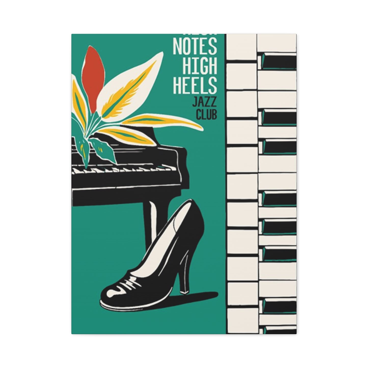
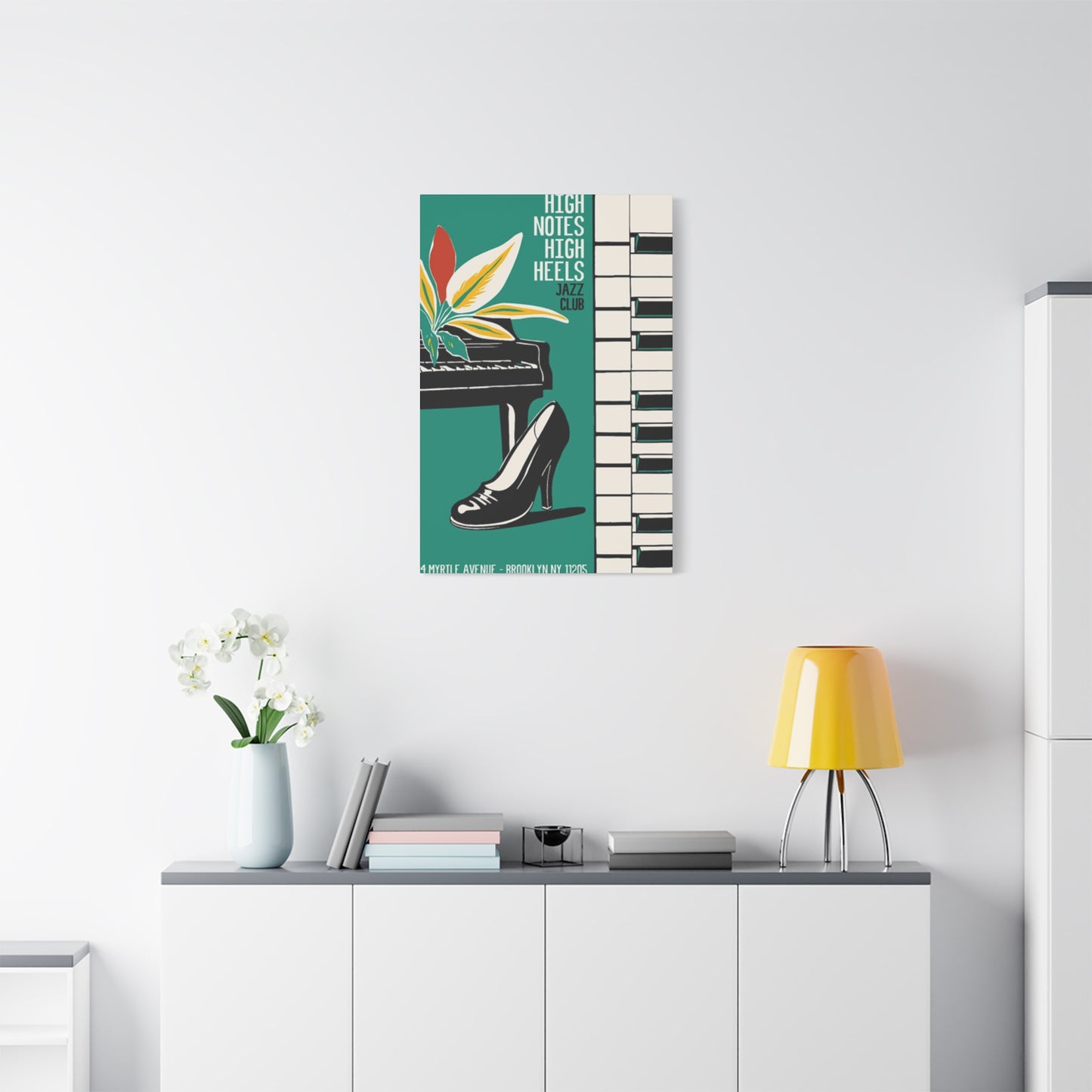
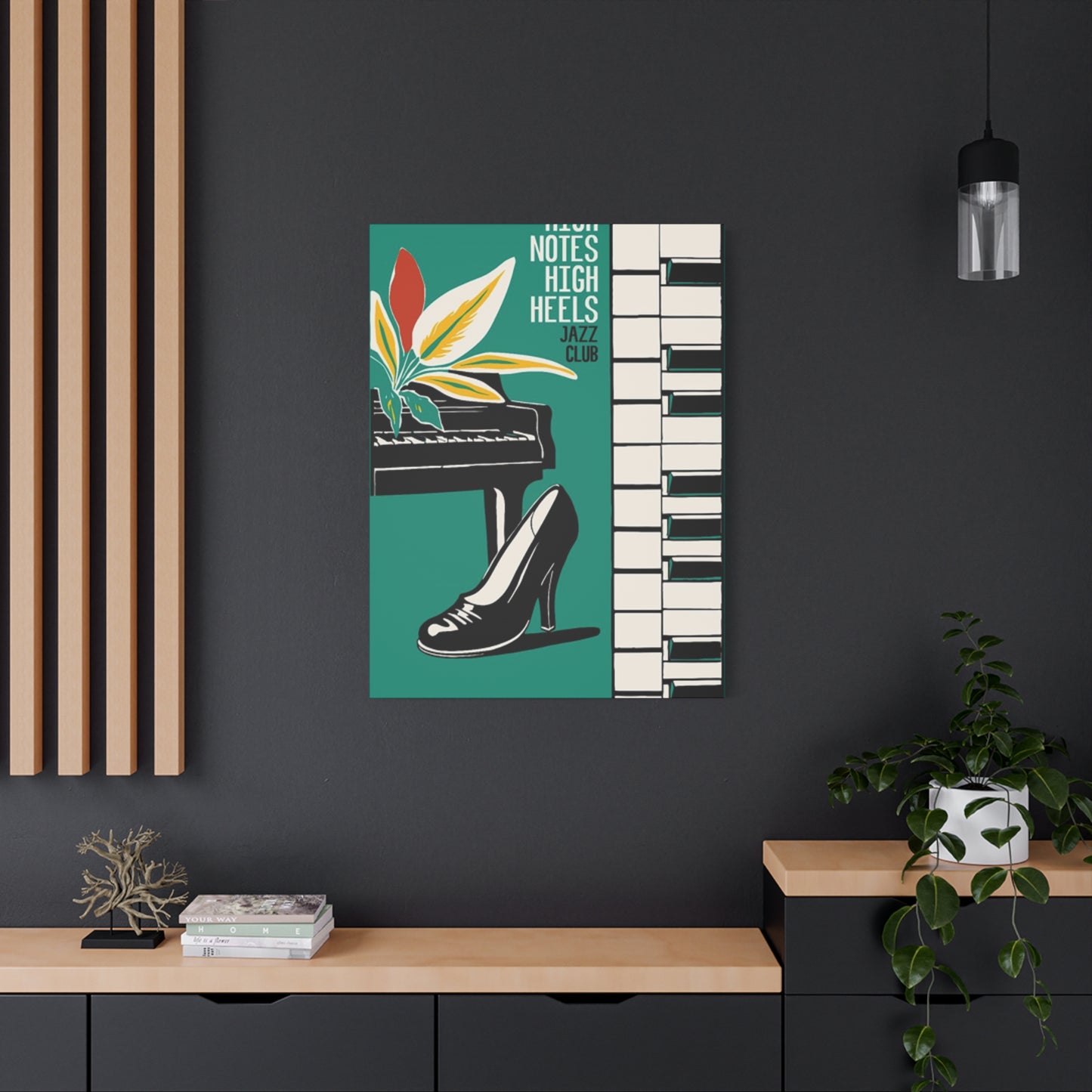
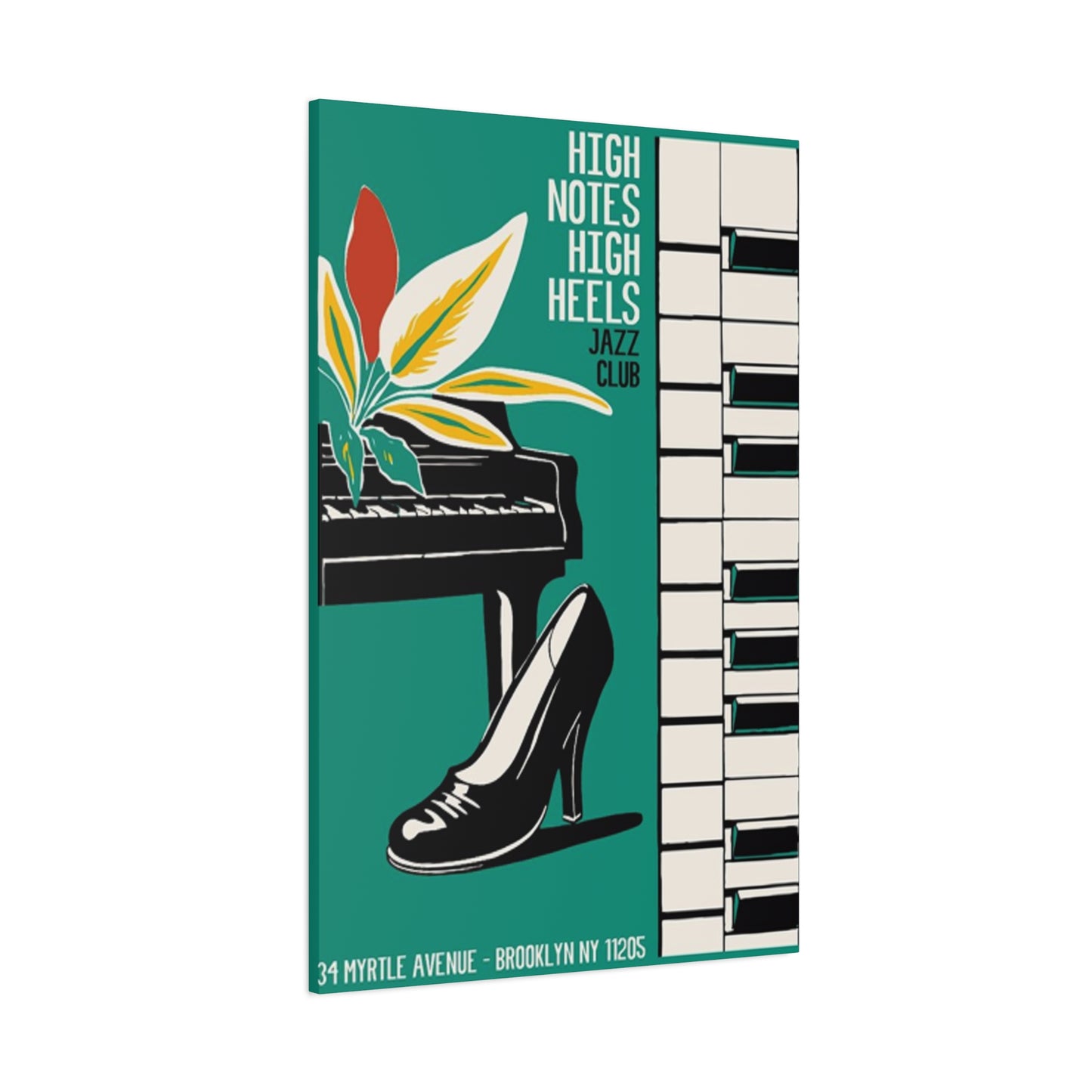
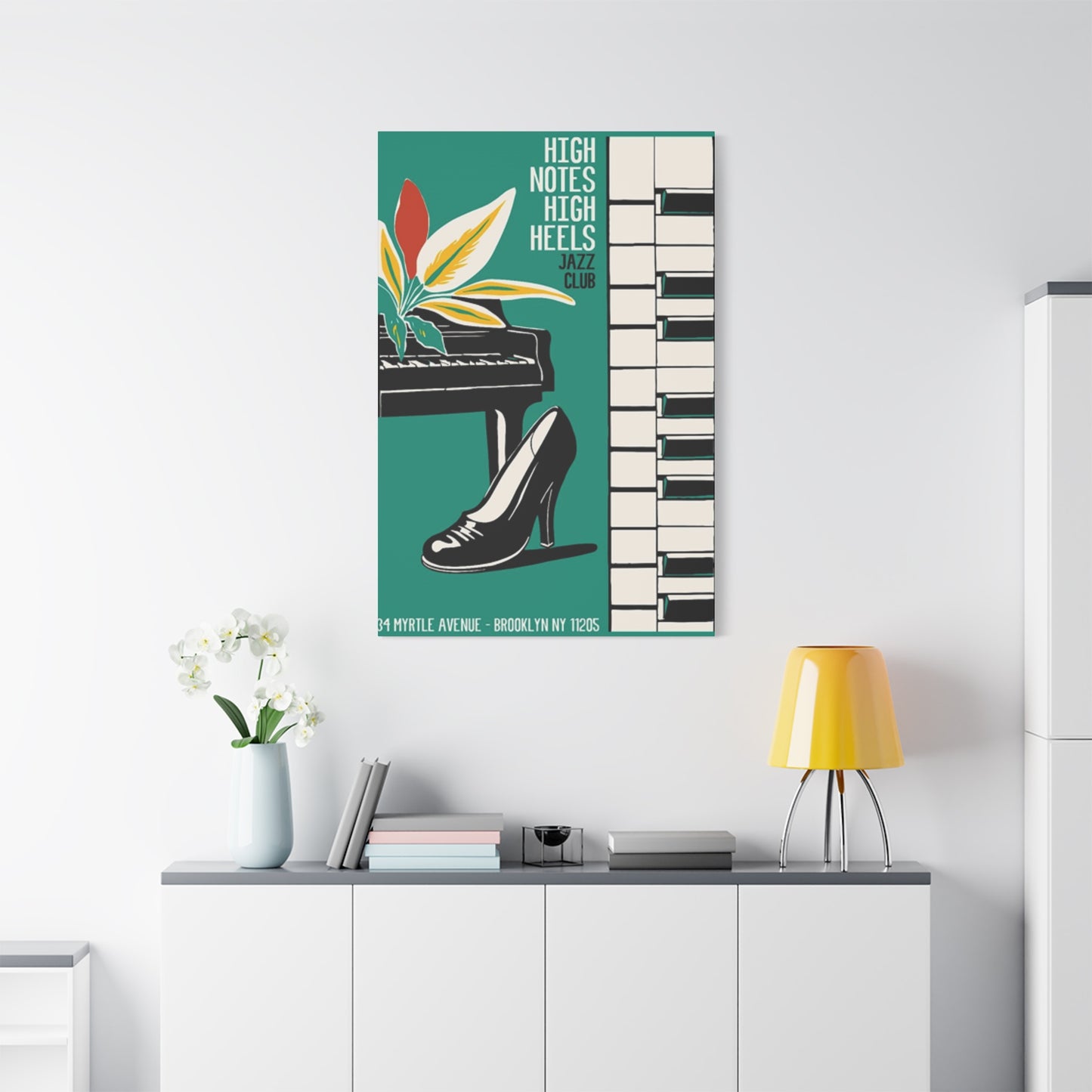
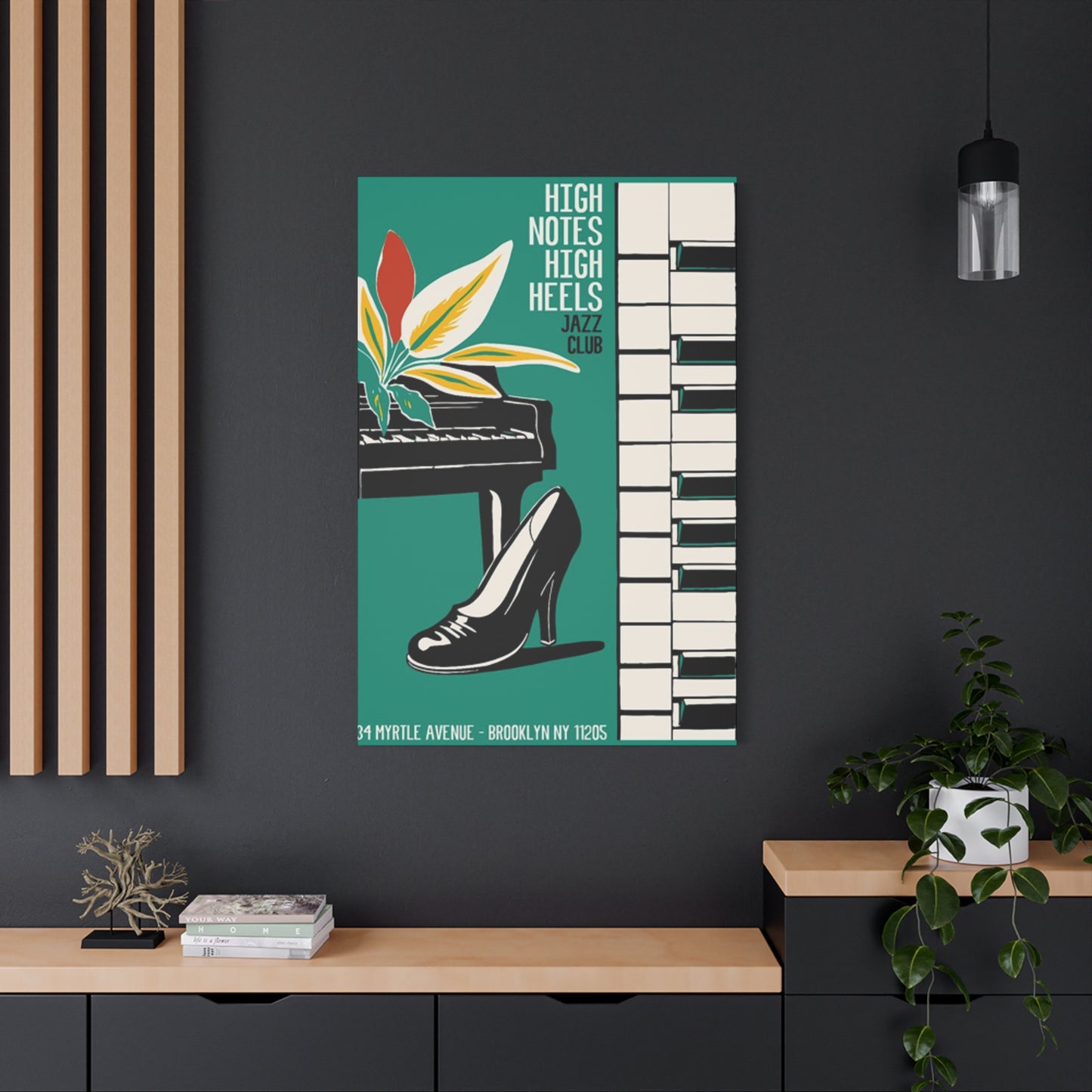
High Notes High Heels Wall Art & Canvas Prints
High Notes High Heels Wall Art & Canvas Prints
Couldn't load pickup availability
High Notes High Heels Wall Art: Elevating Your Interior Spaces with Musical Elegance and Feminine Fashion Statements
The contemporary world of interior decoration has witnessed a remarkable fusion between musical artistry and fashion-forward thinking, creating a distinctive niche that celebrates both sophistication and creative expression. Among the myriad choices available to homeowners and decorators, one particular theme stands out for its ability to capture elegance, power, and artistic sensibility simultaneously. This comprehensive exploration delves into every aspect of incorporating musical and stiletto-themed decorative pieces into your living environment, offering insights that span from selection principles to placement strategies, maintenance considerations, and cultural significance.
The Artistic Marriage Between Musical Expression and Feminine Footwear Imagery in Contemporary Home Decoration
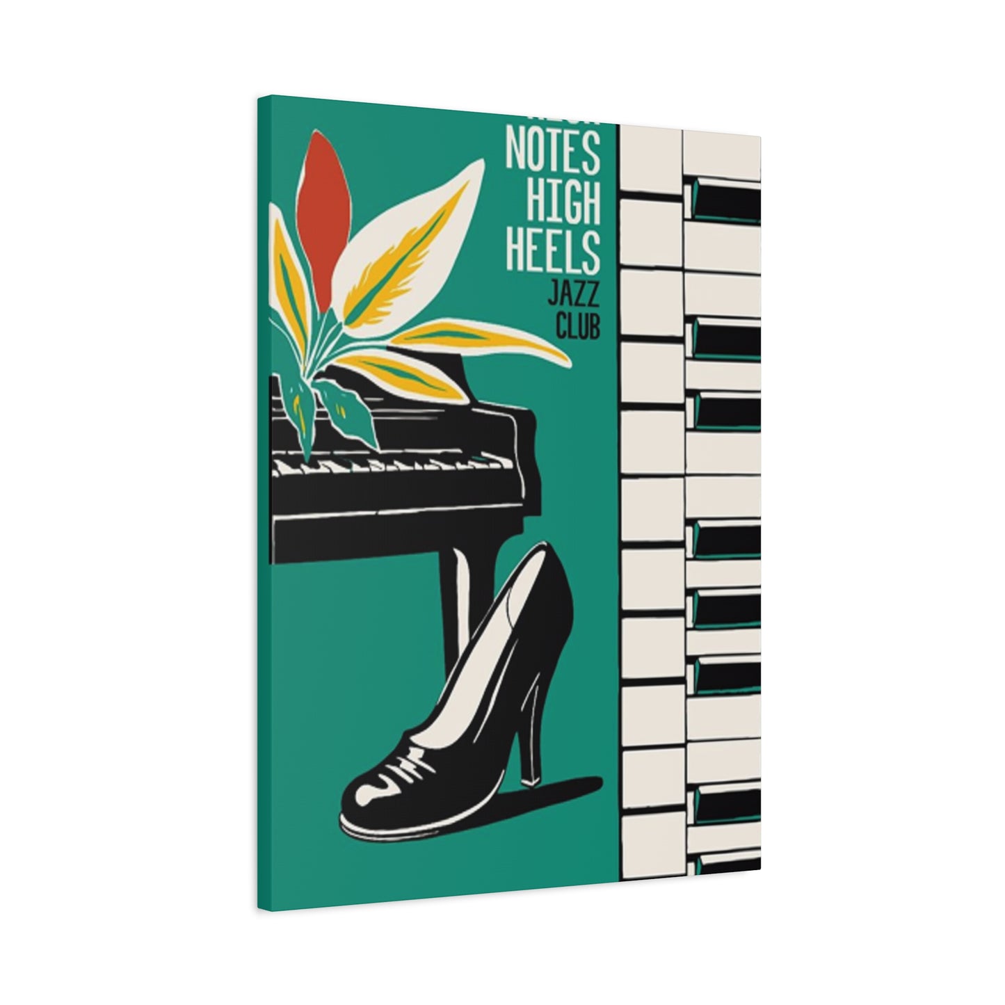
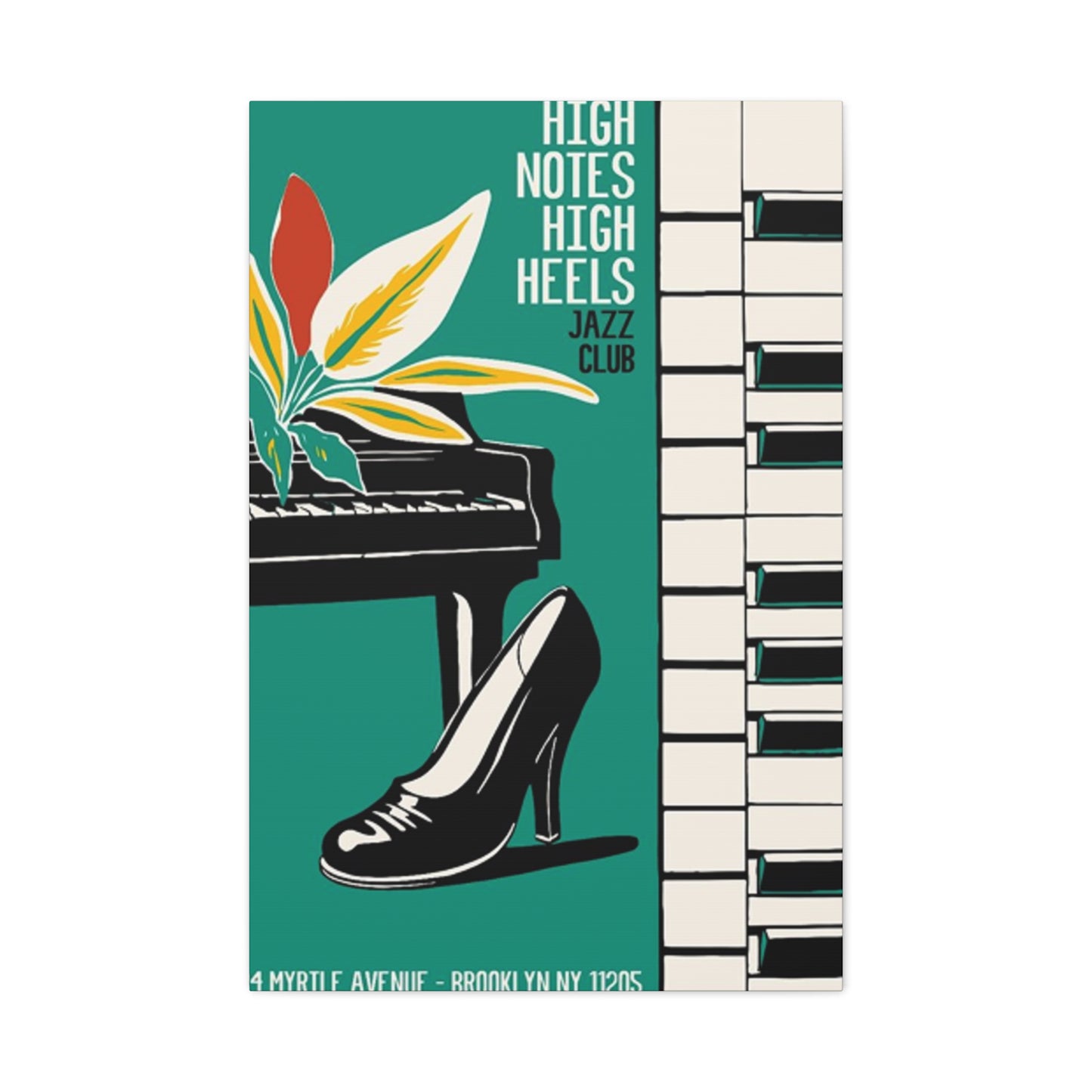
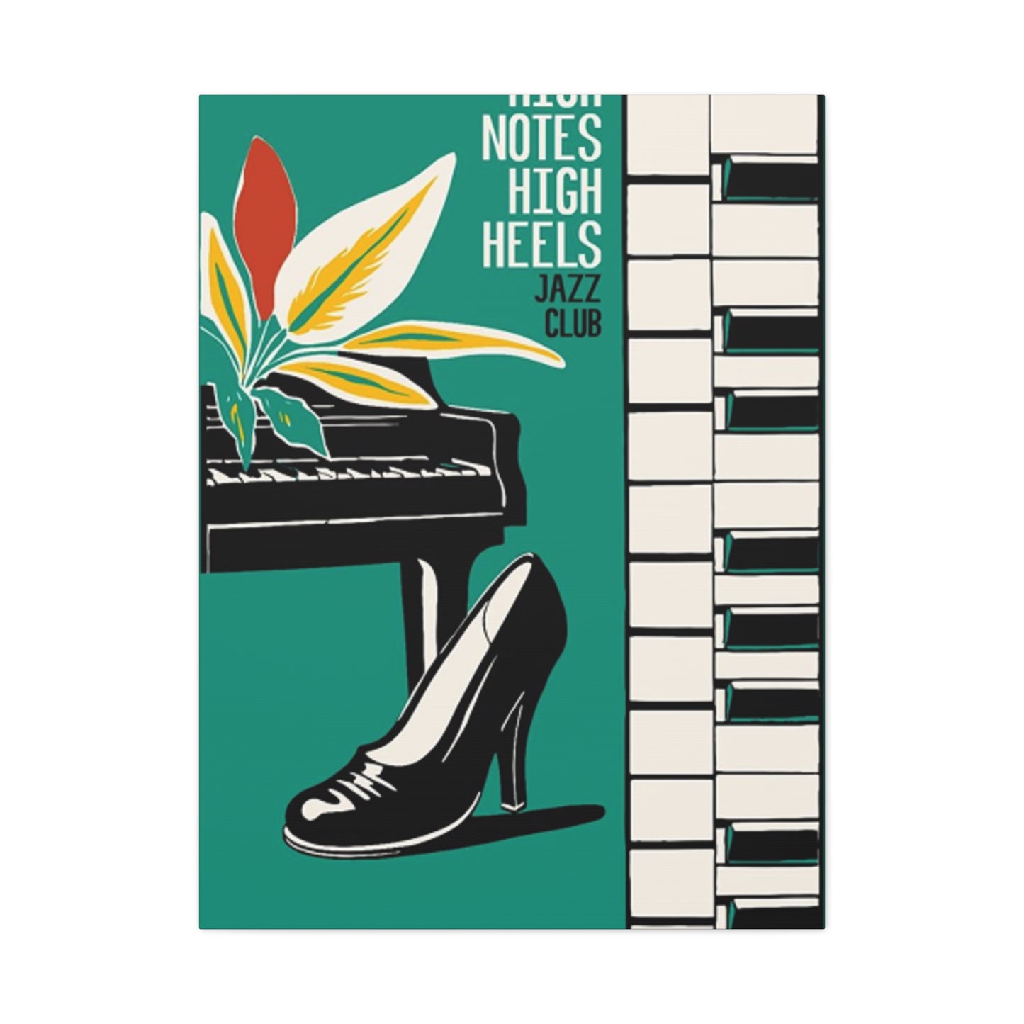
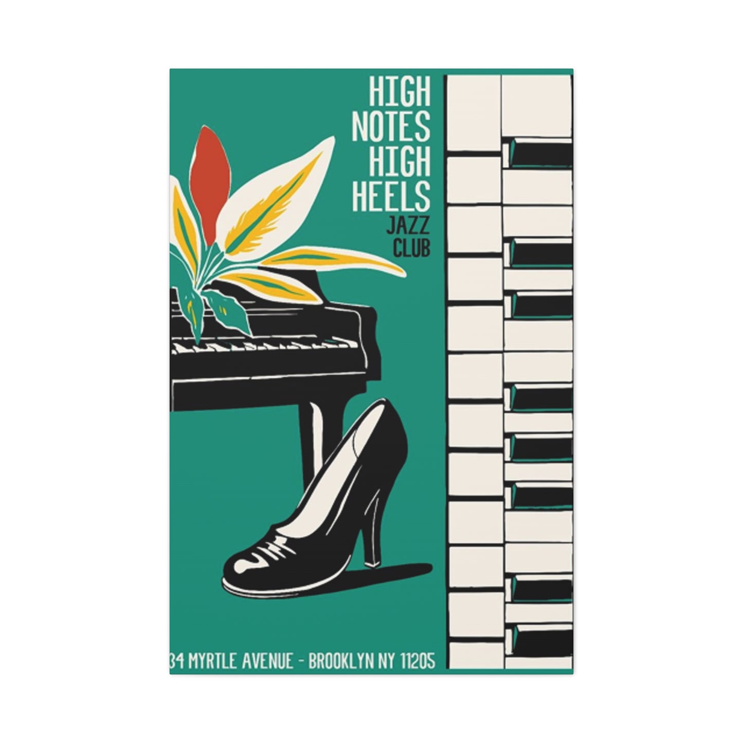
The intersection of melodic symbolism and elegant footwear represents more than mere decorative coincidence. This thematic combination speaks to deeper cultural narratives about confidence, sophistication, and the celebration of artistic pursuits. When examining pieces that feature treble clefs, piano keys, or musical staffs alongside stiletto imagery, we encounter a visual language that communicates multiple messages simultaneously.
Throughout centuries, both music and fashion have served as powerful forms of self-expression. The piano has long been associated with refinement, classical training, and cultural sophistication. Similarly, the elevated shoe has evolved from practical footwear to an iconic symbol of feminine empowerment, professional success, and personal style. When these elements merge within a single artistic composition, they create a narrative that resonates with individuals who identify with both domains.
Contemporary artists working within this genre often employ various techniques to unite these seemingly disparate elements. Some create realistic representations showing actual stilettos positioned alongside instruments or sheet music. Others take more abstract approaches, using the curves of a heel to mirror the curves of a treble clef, or arranging musical notes in patterns that suggest the elegant line of fashionable footwear. The color palettes chosen for these pieces typically range from classic black and white combinations reminiscent of piano keys to bold, vibrant hues that evoke the energy of jazz clubs and fashion runways.
The emotional resonance of such artwork extends beyond mere aesthetics. For many viewers, these pieces evoke memories of piano recitals, dance performances, or significant moments where music and personal presentation intersected. They might recall the nervousness of a first performance, the confidence gained through mastering a difficult piece, or the joy of dressing up for a special musical event. This emotional layering adds depth to the decorative function, transforming simple ornamentation into meaningful personal expression.
Exploring Various Artistic Styles and Mediums for Musical and Fashion-Themed Decorative Pieces
The market offers an impressive diversity of artistic approaches to this theme, each bringing its own aesthetic qualities and atmospheric effects. Understanding these variations helps in selecting pieces that truly resonate with your personal style and complement your existing interior design scheme.
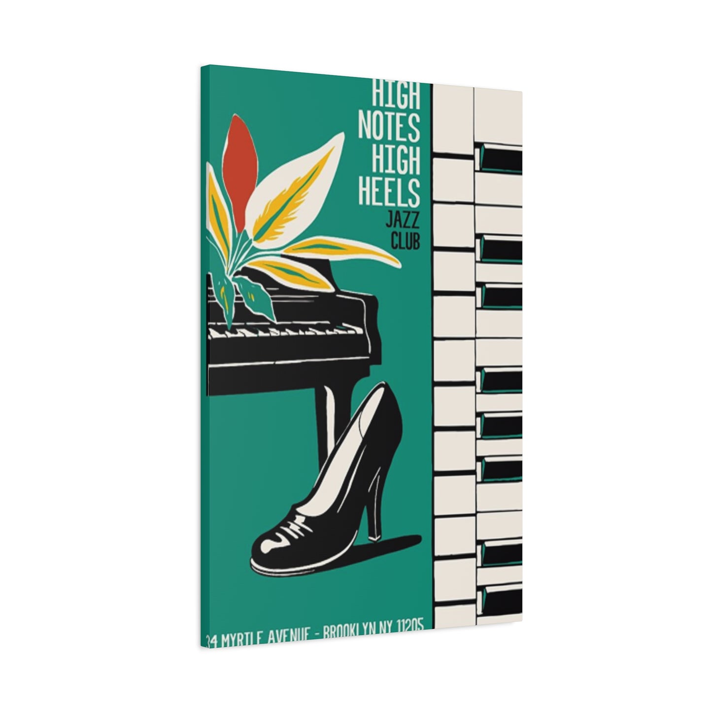
Canvas prints represent one of the most popular formats, offering excellent reproduction quality while remaining relatively affordable. These pieces typically feature high-resolution imagery printed on cotton or polyester canvas, then stretched over wooden frames. The texture of canvas adds depth and dimension to the imagery, creating subtle shadows and highlights that change with ambient lighting throughout the day. Many collectors appreciate how canvas prints bridge the gap between affordable decoration and genuine artistic presence.
Metal prints have gained considerable traction in recent years, particularly among those seeking contemporary, industrial, or minimalist aesthetics. The process involves infusing dyes directly onto specially coated aluminum sheets, creating images with exceptional clarity, vibrant colors, and remarkable durability. The reflective quality of metal surfaces adds a luminous dimension to the artwork, making colors appear more saturated and details more crisp. This medium works particularly well for modern interpretations of the musical-footwear theme, especially those featuring bold graphics or high-contrast compositions.
Framed prints remain a classic choice, offering versatility through the selection of frame styles, mat colors, and glass types. A carefully chosen frame can dramatically alter the overall impression of a piece, making it appear more traditional, contemporary, rustic, or glamorous depending on the materials and finish selected. Museum-quality framing with archival mats and UV-protective glass ensures longevity while adding an air of sophistication that elevates the perceived value of the artwork.
Three-dimensional pieces, including sculptural elements and mixed-media compositions, provide tactile interest that flat prints cannot match. These might incorporate actual miniature instruments, embellished footwear forms, or layered materials creating shadow-box effects. Such pieces become conversation starters, inviting closer inspection and physical interaction in ways that two-dimensional works do not.
Watercolor interpretations bring softness and fluidity to the theme, with their characteristic gentle color transitions and organic edges. These pieces often convey a more romantic, whimsical feeling compared to the precision of digital prints. The translucent quality of watercolor creates ethereal effects particularly suited to more feminine, delicate interior schemes.
Strategic Placement Principles for Maximizing Visual Impact in Different Room Settings
The location where you display these artistic pieces significantly influences their impact and how they interact with your overall interior design. Thoughtful placement considers factors including viewing angles, lighting conditions, surrounding colors, and the functional purpose of each space.
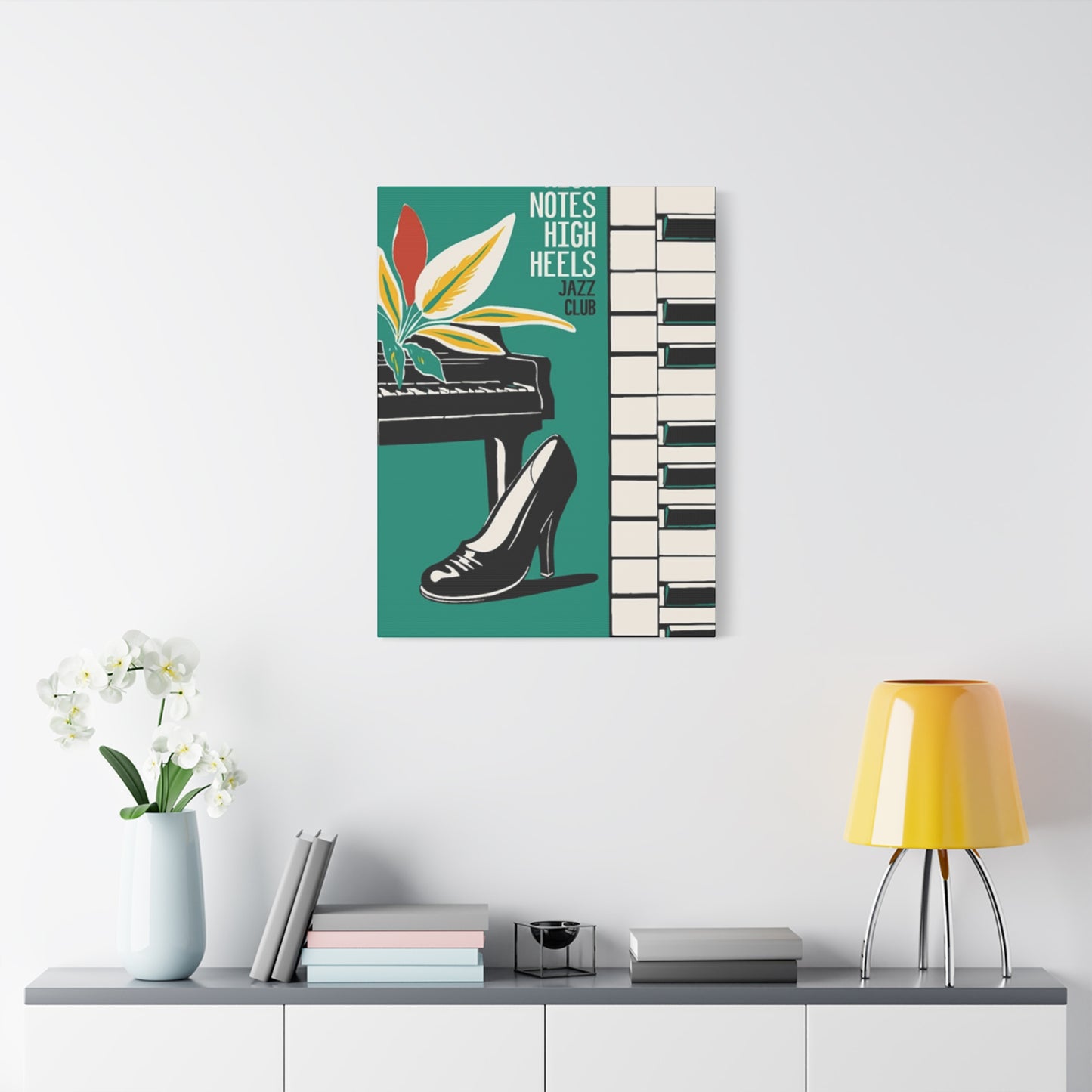
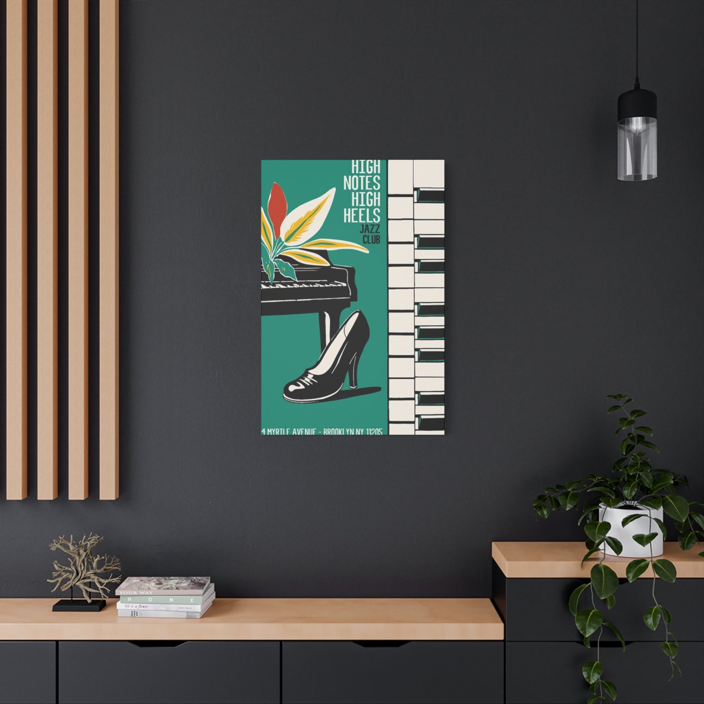
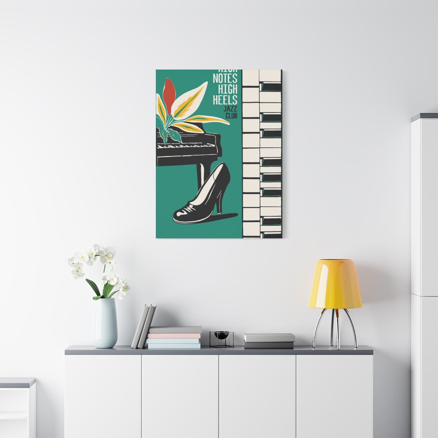
Living rooms offer prime opportunities for showcasing statement pieces. The expanses of wall space typically available in these gathering areas can accommodate larger works or curated collections of related pieces. Consider positioning a significant piece above the sofa as a focal point, ensuring it hangs at an appropriate height where the center of the artwork aligns with average eye level when standing, typically around 57 to 60 inches from the floor. This positioning creates natural visual flow and ensures the piece commands attention without requiring awkward viewing angles.
In music rooms or dedicated practice spaces, these pieces take on additional meaning, creating environments that inspire creativity and celebrate the art form. Here, you might arrange multiple related pieces in a gallery formation, mixing different sizes and orientations to create dynamic visual interest. The proximity to actual instruments creates a thematic coherence that reinforces the space's purpose while adding personality beyond purely functional considerations.
Bedrooms provide intimate settings where personal expression takes precedence over public presentation. These private retreats allow for more personal, perhaps more adventurous choices that reflect individual taste without concern for wider audience reception. Positioning artwork opposite the bed creates something visually engaging to contemplate upon waking, while pieces placed above headboards or on the wall adjacent to the bed contribute to the room's overall ambiance without dominating the space.
Home offices and creative workspaces benefit enormously from inspirational artwork that reflects the occupant's passions and aspirations. In these productivity-focused environments, surrounding yourself with imagery that resonates with your identity and values can enhance motivation, creativity, and overall satisfaction with the working environment. The combination of musical and fashion elements suggests sophistication, creativity, and attention to detail—qualities that translate well to professional contexts.
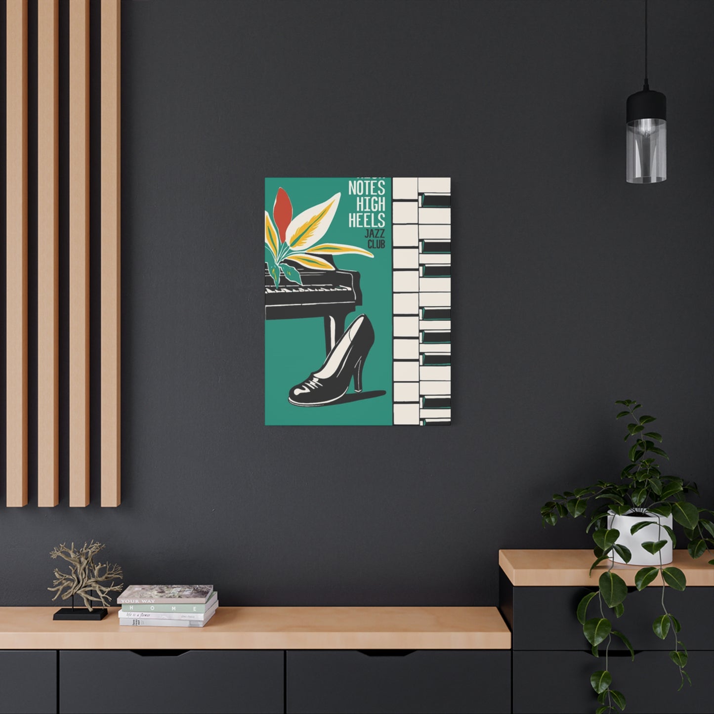
Dressing rooms and walk-in closets represent particularly appropriate venues for footwear-themed artwork. These spaces dedicated to personal presentation and style choices naturally complement decorative pieces celebrating fashion elements. Here, you might incorporate illuminated displays or pieces with metallic finishes that catch light from vanity fixtures, creating a boutique-like atmosphere.
Entryways and hallways, though often overlooked in decorating schemes, provide excellent opportunities for making strong first impressions. A striking piece featuring bold imagery immediately communicates something about the homeowner's personality and interests to arriving guests. In narrow hallway spaces, consider creating gallery arrangements with multiple smaller pieces rather than attempting to force a single large work into insufficient space.
Color Coordination Strategies for Harmonious Interior Design Schemes
The colors present within your chosen artwork should neither clash with nor disappear into your existing color scheme. Instead, they should engage in visual dialogue with surrounding elements, creating cohesion while adding interest and energy to the space.
Monochromatic approaches using variations of single colors create sophisticated, calming environments. If your room features predominantly neutral tones—whites, grays, beiges, or taupes—artwork incorporating similar values with perhaps slightly warmer or cooler undertones can add depth without disruption. Black and white pieces work exceptionally well in such settings, their high contrast providing visual interest while maintaining the overall restrained palette.
Complementary color schemes employ colors opposite each other on the color wheel, creating vibrant, energetic combinations. If your room features warm amber or gold tones, artwork incorporating cool blues or purples creates pleasing contrast. Conversely, spaces dominated by cool tones benefit from artwork introducing warm accents. This approach requires careful balance to prevent visual chaos; typically, one color should dominate while its complement appears as accent.
Analogous color schemes use colors adjacent on the color wheel, creating harmonious, naturally pleasing combinations. If your room incorporates blues and greens, artwork featuring these colors along with related shades of teal or aqua reinforces the existing palette while adding nuance. This approach creates cohesive, relaxing environments particularly suited to bedrooms and personal retreat spaces.
Accent color strategies involve selecting artwork that introduces a bold hue not present elsewhere in the room, using the piece as the primary source of that particular color. This approach works best when the accent color appears in at least one or two other small elements—perhaps throw pillows, vases, or other accessories—to create visual connection without overwhelming the space. The artwork becomes a bridge linking disparate elements into a cohesive whole.
Metallic accents within artwork—gold, silver, copper, or bronze—add glamour and sophistication while maintaining versatility. Metallics work across various color schemes, adding luminous quality that changes with lighting throughout the day. Pieces featuring metallic elements photograph particularly well, an increasingly relevant consideration in our social media-influenced era.
Illumination Techniques for Enhancing Artwork Visibility and Atmospheric Qualities
Proper lighting transforms good artwork into stunning focal points while inadequate illumination allows even exceptional pieces to disappear into their surroundings. Understanding various lighting approaches helps you showcase your chosen pieces to maximum advantage.
Natural light offers the truest color rendering but varies dramatically throughout the day and across seasons. When positioning artwork in naturally lit spaces, consider how morning, afternoon, and evening light will affect visibility and color perception. Be mindful that direct sunlight can cause fading over time, particularly with certain printing methods and materials. UV-protective glazing helps mitigate this concern for framed pieces, while positioning artwork away from direct sun exposure provides additional protection.
Picture lights mounted directly above or below individual pieces provide dedicated illumination that highlights artwork regardless of ambient conditions. Traditional picture lights extend from the frame or mount directly to the wall, projecting focused beams that eliminate shadows and glare. LED versions offer energy efficiency, reduced heat output, and extended lifespans compared to incandescent alternatives. When selecting picture lights, ensure the fixture width corresponds appropriately to the artwork dimensions—typically, the light should span roughly two-thirds to three-quarters of the piece's width.
Track lighting systems provide flexibility, allowing you to direct individual fixtures toward specific pieces while maintaining the ability to adjust positions as your collection evolves. This approach works particularly well for gallery-style arrangements featuring multiple pieces, as you can illuminate each work individually while maintaining overall ambient lighting for the space. Adjustable fixtures enable you to modify beam angles to minimize glare on glazed surfaces while ensuring even illumination across the entire piece.
Recessed spotlights create clean, unobtrusive lighting that focuses attention on the artwork rather than the fixtures themselves. These require more involved installation, typically necessitating ceiling modifications, but deliver exceptional results in contemporary settings where visible hardware would detract from minimalist aesthetics. Dimmer controls allow you to adjust intensity based on time of day, mood, or specific activities occurring within the space.
Accent lighting from nearby floor lamps, table lamps, or sconces contributes to overall illumination while adding atmospheric warmth. This indirect approach creates gentler, more diffused lighting compared to focused spotlights, reducing harsh shadows and creating inviting ambiance. Position these fixtures to complement rather than compete with artwork, ensuring they enhance rather than overpower the pieces.
Cultural Significance and Symbolism Within Musical and Fashion Iconography
Understanding the deeper meanings embedded within these artistic themes enriches appreciation and helps identify pieces that resonate with personal values and aspirations. Both musical notation and fashionable footwear carry rich symbolic traditions spanning centuries and cultures.
Musical notation itself represents human achievement in creating systems to preserve ephemeral art forms. The treble clef, perhaps the most recognizable musical symbol, specifically denotes the higher registers and has become virtually synonymous with music itself in popular imagination. Its graceful, scrolling form possesses inherent aesthetic appeal independent of its functional purpose, explaining its frequent appearance in decorative contexts. The bass clef, though less commonly featured, carries similar associations while suggesting depth, foundation, and grounding—qualities that translate metaphorically beyond purely musical contexts.
Piano keys epitomize the marriage of visual elegance and functional design. Their distinctive black-and-white pattern creates instant recognition while evoking associations with classical refinement, dedicated practice, and artistic accomplishment. The physical layout of piano keys, with their alternating sizes and colors creating repeating patterns, provides inherently appealing visual structure that translates well to decorative purposes.
Stiletto heels have evolved from practical Victorian footwear to powerful cultural symbols encompassing femininity, confidence, power, and sexuality. The act of wearing elevated heels literally and figuratively elevates the wearer, changing posture, gait, and presence. Their appearance in artwork taps into these associations, suggesting strength, sophistication, and unapologetic femininity. The elongated, sculptural form of a well-designed heel possesses artistic merit independent of its function, explaining why stilettos frequently appear as objects of artistic contemplation.
The combination of these elements—musical notation and elegant footwear—creates compound symbolism suggesting individuals who embrace both artistic sensibility and personal style. Such imagery appeals particularly to those who refuse to compartmentalize different aspects of their identity, who see no contradiction between intellectual pursuits and attention to appearance, between artistic dedication and fashion consciousness.
Selecting Appropriate Sizes and Proportions for Different Wall Spaces
Artwork dimensions significantly impact visual effectiveness and must correspond appropriately to both the available wall space and surrounding furnishings. Pieces that are too small appear tentative and disconnected, while oversized works in confined spaces feel overwhelming and claustrophobic.
For spaces above furniture—sofas, beds, dressers, or console tables—the general guideline suggests artwork should span roughly two-thirds to three-quarters the furniture width. A 90-inch sofa, for example, pairs well with artwork or an arrangement measuring between 60 and 68 inches wide. This proportion creates visual connection between furniture and artwork while maintaining appropriate balance. When using multiple pieces rather than a single work, calculate the total width including spaces between pieces to determine whether the arrangement falls within the recommended range.
Large, empty walls benefit from substantial pieces or carefully composed gallery arrangements. A common mistake involves hanging artwork that's too small for the space, creating a floating, disconnected appearance. In spacious rooms with high ceilings and expansive walls, don't hesitate to select large-scale pieces—works measuring 40 by 60 inches or even larger. Such substantial pieces possess the visual weight necessary to anchor large spaces and prevent them from feeling cold or unfinished.
Small spaces and narrow walls require more delicate approaches. Powder rooms, narrow hallways, and compact home offices may accommodate only modest-sized pieces. Here, quality trumps quantity; a single well-chosen small piece often succeeds where attempts to force larger works fail. Consider vertical orientations for narrow spaces, as these emphasize height while conserving horizontal space.
Ceiling height influences appropriate artwork proportions as well. Standard eight-foot ceilings limit vertical space, making horizontal orientations generally more suitable. Rooms with higher ceilings can accommodate taller pieces or vertical arrangements of multiple works that draw the eye upward, emphasizing the architectural feature.
Gallery arrangements combining multiple pieces require careful planning to achieve cohesive results. When creating such displays, treat the entire arrangement as a single compositional unit. Lay out pieces on the floor first, arranging and rearranging until you achieve pleasing balance and appropriate spacing. Photograph your floor arrangement for reference during installation, or create paper templates matching each piece's dimensions to position on the wall with removable tape before committing to nail holes.
Material Quality Considerations and Longevity Expectations for Various Formats
The materials and production methods used in creating decorative pieces directly impact their appearance, durability, and long-term value. Understanding these factors helps you make informed purchasing decisions that balance immediate budget constraints against long-term satisfaction.
Canvas quality varies considerably based on the fabric composition, weave density, and coating treatments applied. Cotton canvas offers excellent durability and traditional texture appreciated by many collectors. Polyester canvas provides superior resistance to stretching and environmental fluctuations while maintaining lower price points. Blended compositions attempt to capture advantages of both materials. Examine the canvas surface closely before purchasing; quality pieces should exhibit even texture without visible printing artifacts or color banding.
Printing methods dramatically affect both appearance and longevity. Giclée printing represents the gold standard for fine art reproduction, using archival inks and high-resolution printers to create museum-quality results. These prints resist fading for decades when properly displayed and maintained. Less expensive printing methods may use dye-based inks susceptible to relatively rapid fading, particularly when exposed to bright light. When budget allows, prioritize pieces created using archival materials and processes, as these maintain their appearance and value far longer than economy alternatives.
Frame construction quality significantly impacts durability and appearance. Solid wood frames offer superior strength and longevity compared to frames constructed from composite materials or plastic. Examine corner joints; quality frames feature tight, clean joins without gaps or excess adhesive. The finish should appear even without drips, bubbles, or thin spots. Metal frames should feel substantial rather than flimsy, with smooth welds or joins and even powder-coating or plating.
Glazing options for framed pieces range from basic glass to museum-quality acrylic alternatives. Standard glass provides adequate protection for casual settings but offers no UV filtering and can break relatively easily. UV-filtering glass blocks harmful wavelengths that cause fading while maintaining clear visibility. Non-glare glass reduces reflections but can slightly diminish color vibrancy and clarity. Acrylic glazing offers lightweight, shatter-resistant alternatives particularly suitable for large pieces or homes with children and pets. Museum acrylic combines UV protection, clarity, and durability at premium price points.
Mounting and hanging hardware quality often correlates with overall construction quality. Examine the backing of canvas pieces and the reverse of frames; quality pieces feature secure mounting hardware appropriately sized for the work's weight. Wire hanging systems should use appropriate gauge wire securely attached at multiple points. D-rings should be screwed rather than stapled into place. Sawtooth hangers, while common, represent the least secure mounting option and should be avoided for pieces weighing more than a few pounds.
Creating Cohesive Collections and Gallery Arrangements for Maximum Visual Impact
Rather than displaying single isolated pieces, many decorating enthusiasts create curated collections that tell visual stories and create more substantial design statements. Developing such collections requires consideration of thematic connections, visual relationships, and compositional principles.
Thematic coherence provides the foundation for successful collections. Your pieces should relate conceptually even if they vary in style, size, or color. The musical-footwear theme itself provides strong thematic foundation, but you might narrow further, focusing specifically on piano-related imagery, treble clef variations, or particular color schemes. This focused approach creates more sophisticated, intentional results compared to random accumulations of vaguely related pieces.
Visual variety within thematic consistency prevents monotony while maintaining cohesion. Vary sizes, orientations, and specific imagery while staying within your chosen theme. Mix realistic and abstract interpretations, incorporate different color palettes that nonetheless harmonize, or combine various mediums and formats. This diversity creates visual interest that encourages prolonged viewing and discovery of new details.
Scale relationships between pieces in grouped arrangements require careful consideration. One approach involves selecting a single dominant piece serving as the arrangement's focal point, surrounded by smaller supporting works. This hierarchical approach creates clear visual organization easily processed by viewers. Alternatively, you might group pieces of similar sizes for more democratic compositions without clear dominance, appropriate when displaying equal-importance works.
Spacing between pieces influences whether viewers perceive them as related components of a single arrangement or as separate, independent works. Generally, maintaining consistent spacing of two to four inches between pieces creates visual cohesion suggesting deliberate arrangement. Wider spacing begins reading as separate entities sharing wall space rather than composed collections.
Alignment strategies help organize gallery arrangements. One approach aligns tops or bottoms of all pieces, creating strong horizontal lines that organize the composition. Another centers all pieces vertically along a common line, typically positioned at standard eye level. Some arrangements align edges of pieces along an invisible grid, creating structured but varied compositions. More organic approaches deliberately vary alignments while maintaining careful balance, creating dynamic compositions suggesting movement and energy.
Maintaining and Protecting Your Decorative Pieces for Long-Term Enjoyment
Proper care preserves the appearance and value of your artwork while preventing common forms of damage. Most maintenance requires minimal effort, primarily involving regular attention and avoiding harmful practices.
Dust accumulation dulls colors and diminishes visual impact over time. Regular gentle dusting using soft, clean microfiber cloths removes surface dust without scratching or damaging finishes. For canvas pieces, use very light pressure and dust in the direction of the weave. Framed pieces with glass or acrylic glazing can tolerate slightly firmer pressure but should still be cleaned gently. Avoid feather dusters, which can scratch surfaces and often merely redistribute dust rather than removing it.
Moisture represents a significant threat to most decorative pieces. Avoid displaying artwork in bathrooms or other high-humidity environments unless specifically designed for such conditions. Canvas pieces are particularly vulnerable, as moisture can cause sagging, mold growth, or delamination of printed surfaces. If you must display pieces in humid environments, ensure adequate ventilation and consider using dehumidifiers to maintain appropriate moisture levels.
Direct sunlight causes fading in most printed materials, with rates varying based on ink types and substrate materials. Even pieces marketed as fade-resistant eventually show deterioration under prolonged direct sun exposure. When possible, position artwork away from windows receiving direct sunlight. For pieces displayed in sunny locations, window treatments filtering UV radiation provide protection while still allowing natural light into the space.
Temperature extremes and fluctuations can damage artwork through expansion and contraction of materials. Avoid placing pieces above heating vents, fireplaces, or radiators where they'll experience repeated heating and cooling cycles. Exterior walls in poorly insulated homes can subject artwork to greater temperature variations than interior walls, making them less ideal for valuable pieces.
Cigarette smoke and cooking fumes deposit sticky residues that attract dust and cause yellowing over time. While obvious smoke damage appears relatively quickly, subtle deterioration occurs gradually in homes with smokers or inadequate kitchen ventilation. Regular professional cleaning can address some damage, but prevention through proper ventilation and air filtration remains preferable.
Handling artwork properly during cleaning, repositioning, or moving prevents accidental damage. Always grasp frames firmly at the sides rather than from the top, where gravity works against your grip. For large, heavy pieces, use two people to ensure secure handling. When moving framed pieces, never carry them by the hanging wire, which may not support the weight in that orientation and could pull free from mounting points.
Understanding the Psychology of Space and How Artwork Influences Mood and Behavior
The images surrounding us in our living environments influence our psychological state, sometimes consciously but often below the threshold of awareness. Selecting artwork strategically can shape the emotional tone of spaces in ways that support our wellbeing and daily activities.
Imagery featuring musical elements tends to create associations with creativity, harmony, and emotional expression. These pieces can inspire creative thinking, evoke pleasant memories, or simply create atmospheres conducive to relaxation and reflection. The specific type of musical imagery influences these effects; piano keys suggest classical refinement and disciplined practice, while more abstract musical notations might evoke jazz's spontaneity or the energy of contemporary performances.
Fashion-forward imagery, including elegant footwear, contributes associations with confidence, sophistication, and self-expression. Such pieces can serve as daily reminders to present your best self, maintain standards of personal presentation, or embrace feminine power. In dressing areas and bedrooms, these images reinforce the importance of self-care and personal style as forms of self-respect and self-expression.
Color psychology plays significant roles in artwork's emotional impact. Cool colors—blues, greens, purples—generally calm and soothe, making them appropriate for bedrooms, meditation spaces, and areas designated for relaxation. Warm colors—reds, oranges, yellows—energize and stimulate, suiting social spaces, creative work areas, and environments where you want to encourage activity and interaction.
Abstract versus realistic imagery creates different psychological effects. Realistic representations provide clear, easily processed information that feels familiar and comfortable. Abstract works require more cognitive engagement, potentially stimulating thought and offering opportunities for personal interpretation. Neither approach is inherently superior; the appropriate choice depends on the space's purpose and the emotional effect you wish to create.
Scale and visual weight influence how artwork affects the psychological experience of space. Large, bold pieces with high contrast and strong imagery create dominant presences that command attention and can make spaces feel more intimate through visual weight. Smaller, more delicate pieces create gentler effects, allowing spaces to feel more open while still adding visual interest and personality.
Personal resonance matters more than any theoretical consideration. Artwork that connects with your experiences, aspirations, or aesthetic preferences will affect your mood more positively than pieces selected purely based on design principles or others' recommendations. Trust your instinctive reactions; pieces that immediately appeal to you, that you can imagine viewing daily with pleasure, are likely to contribute positively to your environment regardless of whether they conform to conventional decorating wisdom.
Sourcing High-Quality Pieces from Various Vendors and Marketplaces
The contemporary marketplace offers numerous channels for acquiring decorative artwork, each with distinct advantages, limitations, and considerations. Understanding these options helps you identify sources most likely to provide pieces meeting your specific requirements.
Online marketplaces have revolutionized access to decorative artwork, connecting buyers directly with artists, manufacturers, and retailers worldwide. These platforms offer staggering variety, competitive pricing, and convenient browsing from home. However, the inability to view pieces in person before purchasing creates challenges regarding color accuracy, size perception, and quality assessment. Carefully review product descriptions, examine customer reviews, and verify return policies before committing to purchases. High-resolution images showing the piece from multiple angles and in various lighting conditions help bridge the gap between online presentation and physical reality.
Print-on-demand services enable you to order custom pieces featuring specific imagery, sizes, and formats tailored to your requirements. These services maintain extensive libraries of licensed images or allow you to upload your own designs. Quality varies significantly across providers, so research production methods, material quality, and customer satisfaction before ordering. Request samples when possible, particularly for large or expensive commissions where color accuracy and material quality significantly impact the final result.
Local artists and craftspeople offer opportunities to acquire unique, original works while supporting creative communities. Directly commissioning custom pieces ensures you receive exactly what you envision while establishing relationships with talented individuals. Artist studios, local art festivals, and community galleries provide venues for discovering regional talent. Original artwork typically commands higher prices than mass-produced prints, but the uniqueness and provable providence may justify the investment for serious collectors.
Home decor specialty retailers, both chain stores and independent boutiques, curate selections reflecting current trends and offer the advantage of in-person viewing before purchase. Sales staff can provide decorating advice and may offer installation services. Physical retailers typically maintain limited inventory compared to online sources, but what they sacrifice in selection breadth they compensate for through immediate availability and the ability to examine quality directly.
Second-hand sources including consignment shops, estate sales, and online resale platforms can yield remarkable discoveries at advantageous prices. Patience and persistence are required, as inventory constantly changes and locating specific themes involves luck as much as systematic searching. Carefully examine condition before purchasing pre-owned pieces; minor condition issues may be acceptable if priced accordingly, but significant damage or deterioration seldom justifies even seemingly attractive prices.
Incorporating Personal Touches and Customizing Existing Pieces
While commercially produced artwork serves most decorating needs effectively, incorporating personalized elements creates deeper connections and ensures true uniqueness. Various approaches enable you to transform standard pieces into personally meaningful expressions.
Custom framing dramatically alters artwork's appearance and can reflect personal style through material selection, finish choices, and design details. Even mass-produced prints become more distinctive when presented in carefully chosen frames. Consider non-traditional framing materials like reclaimed wood for rustic charm, metallic finishes for contemporary sophistication, or ornate gilded frames for traditional elegance. Custom matting using unexpected colors or multiple layers adds dimension and can coordinate artwork with specific room colors.
Adding embellishments to existing pieces introduces texture and three-dimensionality that distinguishes your work from identical mass-produced versions. Fabric elements, dimensional paint, rhinestones, or metallic leaf can be applied to canvas prints to create custom effects. This approach requires artistic confidence but need not involve advanced skills; simple additions of strategic embellishments in key areas can significantly enhance visual interest without requiring comprehensive redesign.
Combining multiple smaller pieces into singular large-scale compositions creates custom arrangements impossible to purchase ready-made. Consider commissioning an artist to create a triptych where a single image spans three separate canvases, or arrange complementary pieces into geometric patterns using identical frames and careful spacing. These assembled compositions become architectural features intimately connected to specific spaces.
Incorporating meaningful text—inspirational quotes, song lyrics, personal mantras, or significant dates—personalizes artwork while maintaining visual appeal. Many print-on-demand services enable custom text addition to existing designs, or you can commission graphic designers to create entirely custom pieces incorporating both imagery and text. Choose typography carefully; fonts convey personality as powerfully as imagery, with script fonts suggesting elegance and formality while sans-serif types feel modern and approachable.
Photography offers another avenue for personalization. If you possess photography skills or work with professional photographers, consider creating custom pieces featuring your own images related to the theme. Photographs of your instrument, performance moments, or creatively composed still-life arrangements of musical elements and fashion accessories create artwork impossible to replicate and deeply connected to your personal experience.
Exploring Color Theory Principles for Creating Harmonious Visual Environments
Understanding fundamental color relationships empowers more confident, effective decorating decisions. While instinct and personal preference rightly guide choices, awareness of color theory principles helps avoid common pitfalls and achieve cohesive results.
The color wheel organizes hues in a circular arrangement showing relationships between colors. Primary colors—red, yellow, and blue—form the foundation from which all other hues derive. Secondary colors—orange, green, and purple—result from mixing adjacent primaries. Tertiary colors arise from mixing primary and secondary colors, creating red-orange, yellow-orange, yellow-green, blue-green, blue-purple, and red-purple.
Warm colors including reds, oranges, and yellows advance visually, appearing closer and more dominant. These hues energize spaces and create feelings of warmth, excitement, and intimacy. Rooms with warm color schemes feel cozier but potentially smaller due to colors' advancing properties. Warm-toned artwork injects energy into neutral spaces or reinforces existing warm palettes.
Cool colors including blues, greens, and purples recede visually, appearing more distant. These hues calm and soothe, creating serene atmospheres conducive to relaxation and concentration. Cool color schemes make spaces feel larger and more open but can appear cold without sufficient warm accents. Cool-toned artwork balances warm room colors or reinforces cool schemes for cohesive tranquility.
Value refers to lightness or darkness of colors, independent of hue. High-value colors appear light and airy, expanding spaces visually and creating open, welcoming feelings. Low-value colors feel heavier and more grounded, adding drama and sophistication but potentially making spaces feel smaller. Artwork incorporating value contrast—light elements against dark backgrounds or vice versa—creates visual interest regardless of actual hues employed.
Saturation describes color intensity or purity. Highly saturated colors appear vivid and energetic, commanding attention and creating focal points. Desaturated colors appear softer and more subtle, supporting rather than dominating visual environments. Most successful rooms incorporate range of saturations, with highly saturated elements providing accent interest against predominantly desaturated backgrounds.
Neutral colors—white, black, gray, brown, and beige—provide visual rest and allow other elements to shine. Rooms dominated by neutrals benefit enormously from artwork introducing color, pattern, and visual interest. Conversely, colorful rooms may benefit from artwork emphasizing neutrals to provide balance and prevent visual chaos.
Understanding these principles helps you evaluate whether potential artwork purchases will harmonize with existing spaces. You need not become a color theory expert; simple awareness of warm versus cool, light versus dark, and saturated versus desaturated enables more confident, successful choices.
Addressing Common Decorating Challenges and Problem-Solving Strategies
Even well-planned decorating projects encounter obstacles. Recognizing common challenges and understanding potential solutions helps you achieve desired results despite complications.
Budget constraints limit options for many decorators, but financial limitations need not prevent attractive results. Prioritize quality in fewer pieces rather than filling spaces with numerous inferior items. A single well-chosen, well-made piece creates better impressions than multiple mediocre works. Consider phasing your decorating, acquiring pieces gradually as finances allow rather than attempting to complete everything immediately. Watch for sales, particularly during holiday periods when many retailers offer significant discounts.
Rental restrictions prevent mounting hardware installation in many properties, forcing creative solutions. Command strips and similar adhesive hanging systems support surprising amounts of weight when properly installed and distributed. Easels transform artwork into freestanding decorative elements requiring no wall mounting. Leaning large pieces against walls rather than hanging them creates casual, contemporary appearances while preserving walls. Gallery ledges or picture shelves mounted with adhesive strips provide platforms for displaying multiple pieces with easy rearrangement capability.
Indecision paralyzes many decorators who fear making wrong choices. Remember that decorating represents ongoing evolution rather than permanent commitment. Most pieces can be relocated, replaced, or repurposed if they ultimately prove unsatisfactory. Take chances on pieces that appeal to you; worst-case scenarios remain quite manageable. Consider purchasing one piece, living with it briefly, then deciding whether to continue with complementary works or try different approaches.
Clashing with existing elements occasionally becomes apparent only after bringing artwork home. Sometimes the solution involves returning pieces that simply don't work, but consider whether adjustments to surrounding elements might resolve conflicts more easily. Changing throw pillow colors, swapping artwork to different rooms, or adjusting lighting sometimes transforms problematic pieces into perfect ones.
Scale misjudgments occur frequently when purchasing online without ability to visualize pieces accurately in space. Before ordering, create paper templates matching artwork dimensions and position them on walls using removable tape. Live with templates several days, observing how they interact with furniture, lighting, and traffic flow. This simple step prevents expensive mistakes from pieces proving too large or too small for intended locations.
Difficulty achieving cohesion across multiple pieces frustrates many who attempt gallery arrangements. Return to fundamentals: select a unifying element present in all pieces, whether color, theme, style, or subject matter. Maintain consistent spacing between pieces. Consider matting all pieces using identical mat colors and frame styles, which creates cohesion even across disparate imagery.
Conclusion
Various design aesthetics suit different personalities, lifestyles, and architectural contexts. Recognizing your preferred style and understanding how artwork functions within it guides more appropriate, satisfying selections.
Contemporary design emphasizes clean lines, minimal ornamentation, and neutral color palettes punctuated by strategic color accents. In contemporary spaces, artwork often provides primary color and visual interest against restrained backgrounds. Choose pieces with bold graphics, strong color contrasts, or striking imagery that commands attention without cluttering the visual field. Metal prints and frameless canvas wraps suit contemporary aesthetics particularly well through their clean, unadorned presentations.
Traditional design draws from European decorating heritage, emphasizing symmetry, rich colors, and ornamental details. Traditional spaces typically feature warm color palettes, wood furniture with carved details, and luxurious textiles. Artwork in traditional settings should feel refined and sophisticated, perhaps featuring realistic rather than abstract imagery. Ornate gilded frames or rich wood frames with decorative profiles complement traditional furnishings while honoring the style's historical roots.
Modern design, distinct from contemporary despite frequent confusion, refers specifically to mid-century aesthetic emphasizing organic forms, minimal ornament, and honest materials. Modern spaces feature furniture with sculptural forms, warm wood tones, and period accessories. Artwork suited to modern settings often features abstract or geometric compositions in warm, earthy palettes. Simple wood frames or frameless presentations respect the style's rejection of unnecessary ornamentation.
Share