Hallow Eve Painting Wall Art & Canvas Prints
Hallow Eve Painting Wall Art & Canvas Prints
Couldn't load pickup availability
Spooky Season Canvas Creations: Your Path to Perfect Hallow Eve Painting Wall Art That Captures October's Enchanting Spirit
The crisp autumn air carries whispers of mystery and magic as October unfolds, bringing with it the most bewitching celebration of the year. When darkness falls earlier and leaves paint the landscape in burnt oranges and deep crimsons, homes transform into portals of imagination through carefully curated decor. Among all decorative elements that breathe life into spaces during this supernatural season, Hallow Eve painting wall art stands as the quintessential expression of creativity and atmosphere. These captivating pieces transcend mere decoration, becoming storytelling canvases that invoke centuries-old traditions while embracing contemporary aesthetic sensibilities.
The allure of spooky season artwork extends far beyond simple ornamentation. Each brushstroke carries meaning, each color choice evokes emotion, and every composition tells a tale as old as autumn itself. From whimsical jack-o-lanterns grinning in moonlight to haunting Gothic landscapes shrouded in mist, the diversity within this artistic realm offers endless possibilities for personal expression. Whether adorning the walls of a cozy cottage or commanding attention in a modern loft, these visual masterpieces create immersive environments that celebrate the thin veil between worlds during October's mystical nights.
Creating or selecting the perfect Hallow Eve painting wall art requires understanding various artistic elements, cultural influences, and design principles that make certain pieces resonate while others fall flat. This comprehensive exploration delves into the multifaceted world of autumn's most captivating artwork, examining everything from color psychology to compositional strategies, from historical influences to contemporary trends. By journey's end, you'll possess the knowledge to curate, create, or appreciate these seasonal treasures with newfound depth and sophistication.
The Cultural Tapestry Behind October's Artistic Traditions and Their Modern Interpretations
Ancient Celtic festivals marked the transition between harvest abundance and winter's scarcity, celebrating a liminal period when supernatural forces walked freely among mortals. These observances, particularly Samhain, established visual motifs that persist in contemporary artwork. The symbolic representation of death's temporality, nature's cyclical renewal, and the honoring of ancestral spirits created a rich iconographic language that artists continue mining for inspiration. Skulls adorned with flowers, skeletal figures dancing joyously, and portraits depicting the boundary between life and afterlife all trace their lineage to these primordial celebrations.
European folklore contributed additional layers to this artistic tradition. Medieval woodcuts depicting witches' sabbaths, Victorian mourning portraiture with its elaborate symbolism, and Germanic harvest festivals celebrating abundance while acknowledging mortality each added distinctive elements to the visual vocabulary. The Gothic revival movement of the nineteenth century particularly influenced how we perceive and depict spooky aesthetics, emphasizing dramatic architecture, mysterious landscapes, and atmospheric lighting that still defines much seasonal artwork today.
American immigration patterns blended these diverse traditions into something uniquely eclectic. Irish immigrants brought jack-o-lantern carving traditions, while Mexican DĂa de los Muertos celebrations introduced vibrant, life-affirming approaches to mortality's representation. German settlers contributed harvest imagery, and various Indigenous peoples' autumn rituals influenced symbolic connections between natural cycles and spiritual transformation. This cultural melting pot created the distinctive American approach to October artwork—simultaneously spooky and playful, reverent and irreverent, ancient and contemporary.
Contemporary artists working with Hallow Eve painting wall art draw from this deep well of imagery while adding personal vision and modern sensibilities. Some embrace traditional Gothic darkness with moody palettes and mysterious subjects, while others inject humor through cartoonish characters and bright colors. Still others pursue fine art approaches, using seasonal themes to explore deeper concepts about transformation, fear, memory, and celebration. This diversity ensures that regardless of personal taste or interior design philosophy, compelling seasonal artwork exists to suit every aesthetic preference.
The commercialization of October celebrations has paradoxically both diluted and enriched artistic possibilities. Mass production has made seasonal decor accessible to broader audiences, yet this democratization sometimes sacrifices artistic integrity for profitability. However, this same commercial interest has supported countless independent artists who create genuinely innovative work, using seasonal demand as a platform for artistic expression. The tension between commercial accessibility and artistic authenticity shapes the contemporary landscape of Hallow Eve painting wall art, creating spaces for both mass-market appeal and niche artistic excellence.
Understanding this cultural context enriches appreciation for any seasonal artwork encountered. That vintage-inspired poster featuring a black cat silhouetted against a full moon carries echoes of medieval superstition and Victorian sentimentality. The colorful sugar skull portrait blends pre-Columbian spirituality with Catholic iconography and contemporary street art influences. Even seemingly simple pumpkin patch scenes connect to harvest traditions spanning millennia across multiple continents. Each piece serves as a visual time capsule, preserving and reinterpreting cultural memory through artistic expression.
Mastering Color Palettes That Transform Spaces Into Atmospheric Sanctuaries of Seasonal Splendor
Color wields tremendous power in establishing mood, directing attention, and evoking visceral responses. The palette choices in Hallow Eve painting wall art largely determine whether a piece feels genuinely eerie, playfully whimsical, elegantly sophisticated, or warmly nostalgic. Traditional autumn palettes featuring burnt orange, deep burgundy, golden yellow, and rich brown create comfortable, harvest-inspired atmospheres that feel welcoming and abundant. These warm earth tones connect viewers to agricultural traditions and natural seasonal transitions, grounding artwork in familiar, comforting contexts.
Alternatively, cool-toned palettes emphasizing midnight blues, charcoal grays, deep purples, and silver create mysterious, otherworldly atmospheres. These colors evoke nighttime landscapes, moonlit forests, and shadow-filled spaces where imagination runs wild. When punctuated with strategic warm accents—perhaps the orange glow of candlelight or the crimson of autumn leaves—these cool palettes achieve dramatic contrast that draws eyes and holds attention. The interplay between cool dominance and warm accents creates visual tension that mirrors the seasonal theme's balance between cozy comfort and spine-tingling mystery.
Monochromatic approaches offer sophisticated alternatives to multicolored compositions. A piece rendered entirely in shades of gray, from palest silver to deepest charcoal, can achieve haunting elegance that transcends seasonal trends. Black and white artwork with strategic use of negative space creates striking visual impact while maintaining versatility that allows seamless coordination with various interior design schemes. These neutral presentations let subject matter and composition speak loudly without chromatic distraction, often resulting in timeless pieces that remain relevant long after seasonal decorations are packed away.
Bold, unexpected color choices can transform familiar seasonal imagery into fresh, contemporary statements. Imagine a jack-o-lantern rendered in jewel-toned teals and magentas rather than traditional oranges, or a haunted mansion depicted in sunset pinks and lavenders instead of Gothic grays. These unconventional palettes challenge viewer expectations, creating memorable visual experiences that stand apart from conventional seasonal artwork. Artists willing to experiment with non-traditional colors often produce the most innovative and conversation-starting pieces in the genre.
Color psychology plays a crucial role in how artwork affects space and mood. Orange stimulates enthusiasm and creativity while maintaining friendly approachability—ideal for family-friendly seasonal decor. Purple combines red's energy with blue's stability, evoking mystery and magic without threatening darkness. Green represents nature's vitality but can also suggest supernatural otherworldliness, particularly in acidic or neon variations. Black provides drama and sophistication while emphasizing other colors through contrast. Understanding these psychological associations helps in selecting or creating artwork that achieves desired emotional impact.
Metallic accents—gold, silver, copper, or bronze—add luxurious dimension to seasonal artwork. These reflective elements catch light dynamically, causing pieces to visually transform as natural and artificial lighting changes throughout the day. Gold brings warmth and opulence, silver provides cool elegance, copper offers earthy richness, and bronze suggests antique charm. Whether used as full background elements, subtle highlights, or decorative accents, metallic inclusion elevates artwork from simple decoration to sophisticated design element.
The interaction between artwork colors and surrounding interior colors determines ultimate visual success. A piece featuring deep, saturated tones may overwhelm a small space with light walls but could perfectly complement a room with rich, dark architectural elements. Conversely, artwork with predominantly light palettes might disappear against pale walls but could provide welcome relief in spaces dominated by dark furniture and dramatic paint colors. Considering this relationship between artwork and environment ensures cohesive, intentional design rather than haphazard decoration.
Subject Matter Selection That Resonates With Personal Narrative and Universal Themes Simultaneously
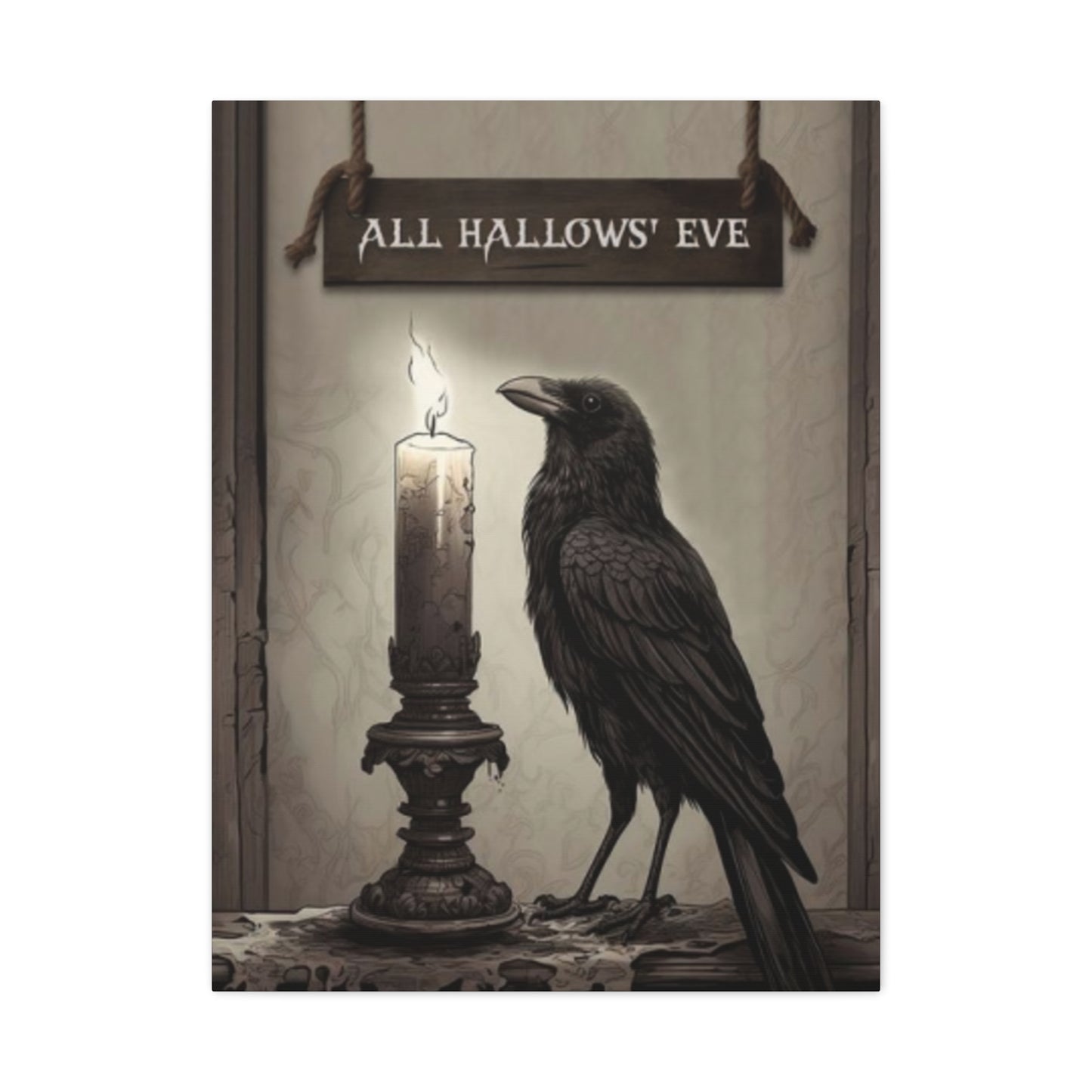
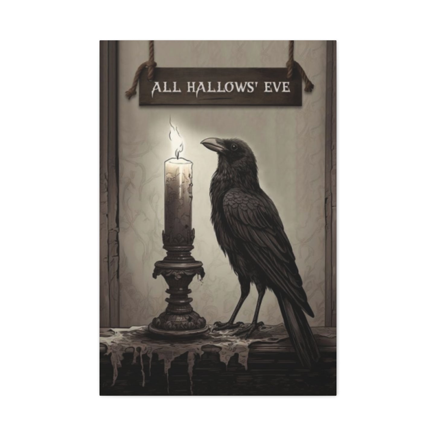
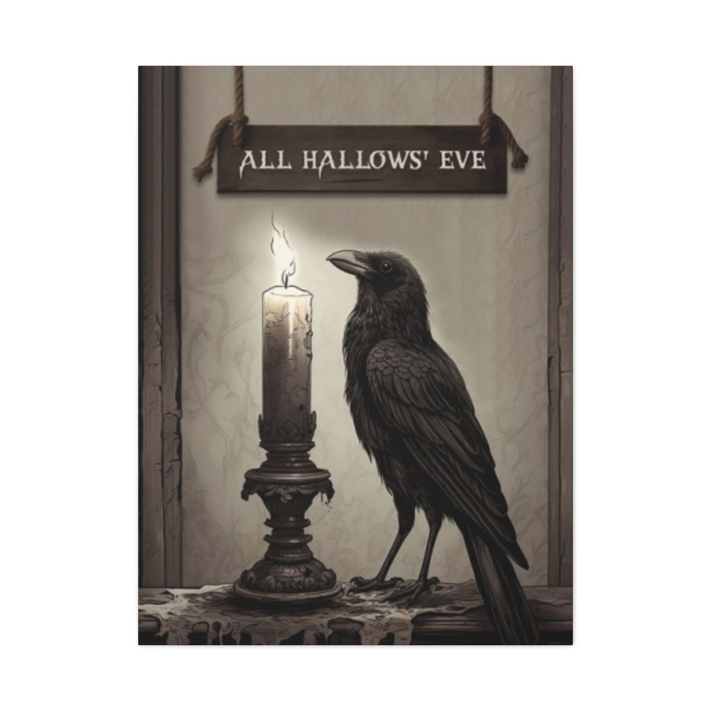
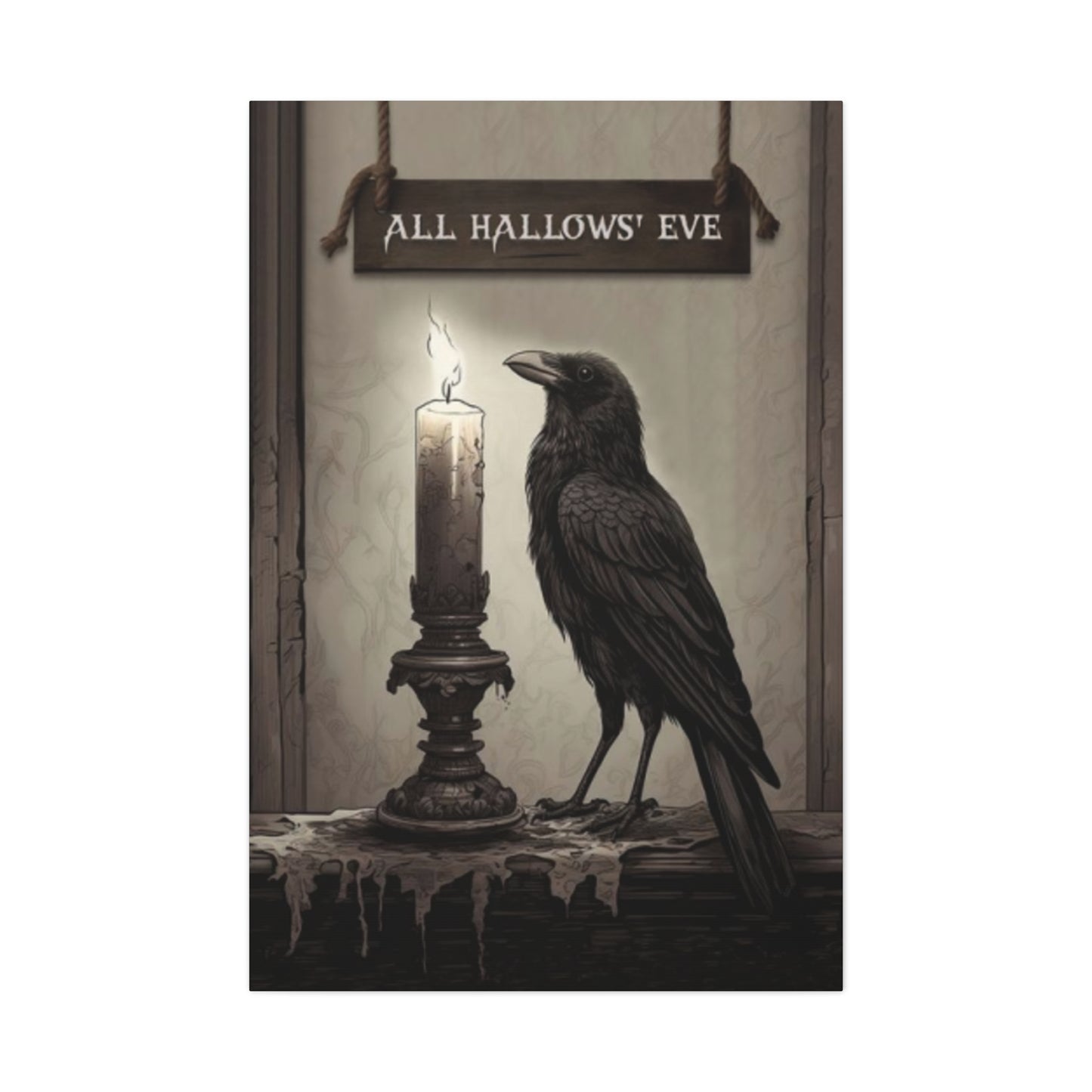
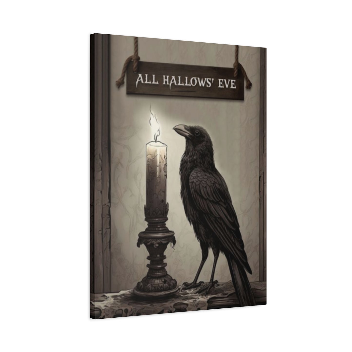
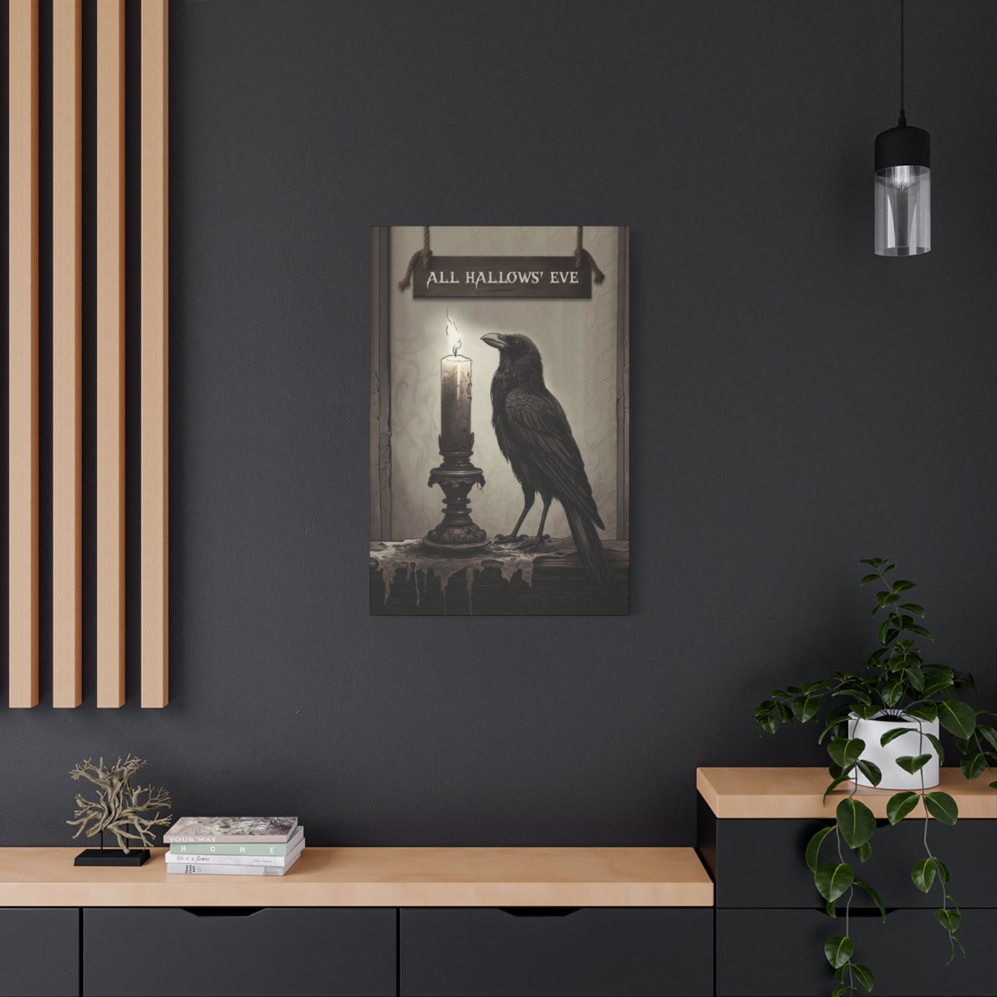
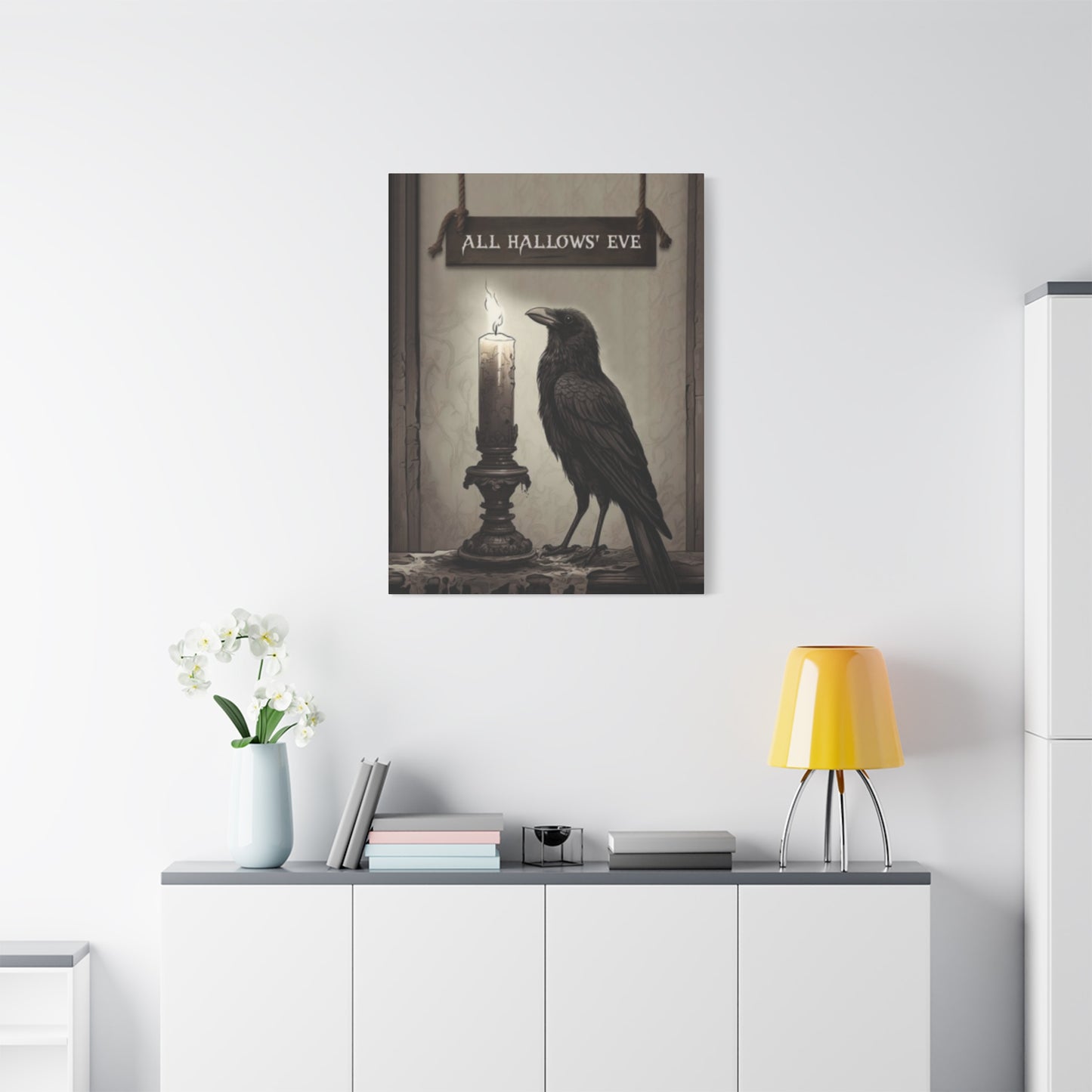
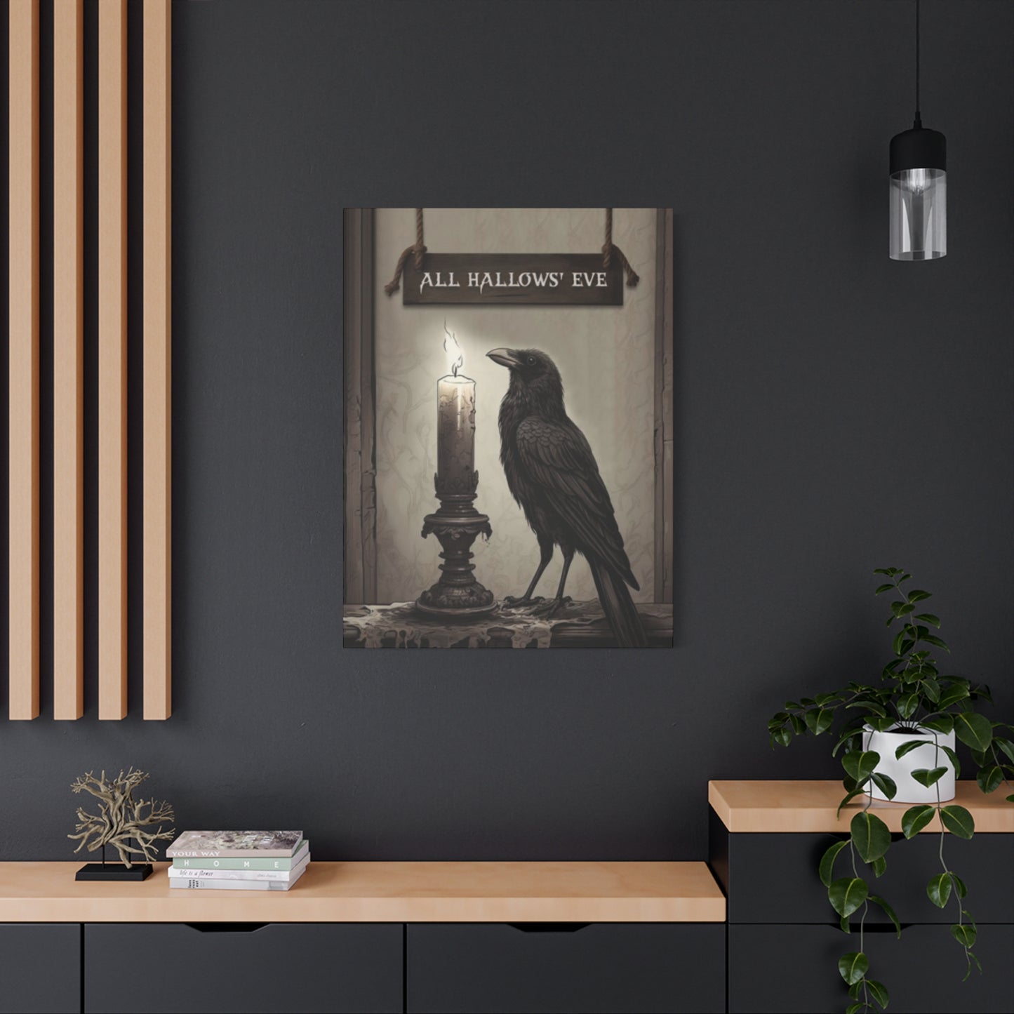
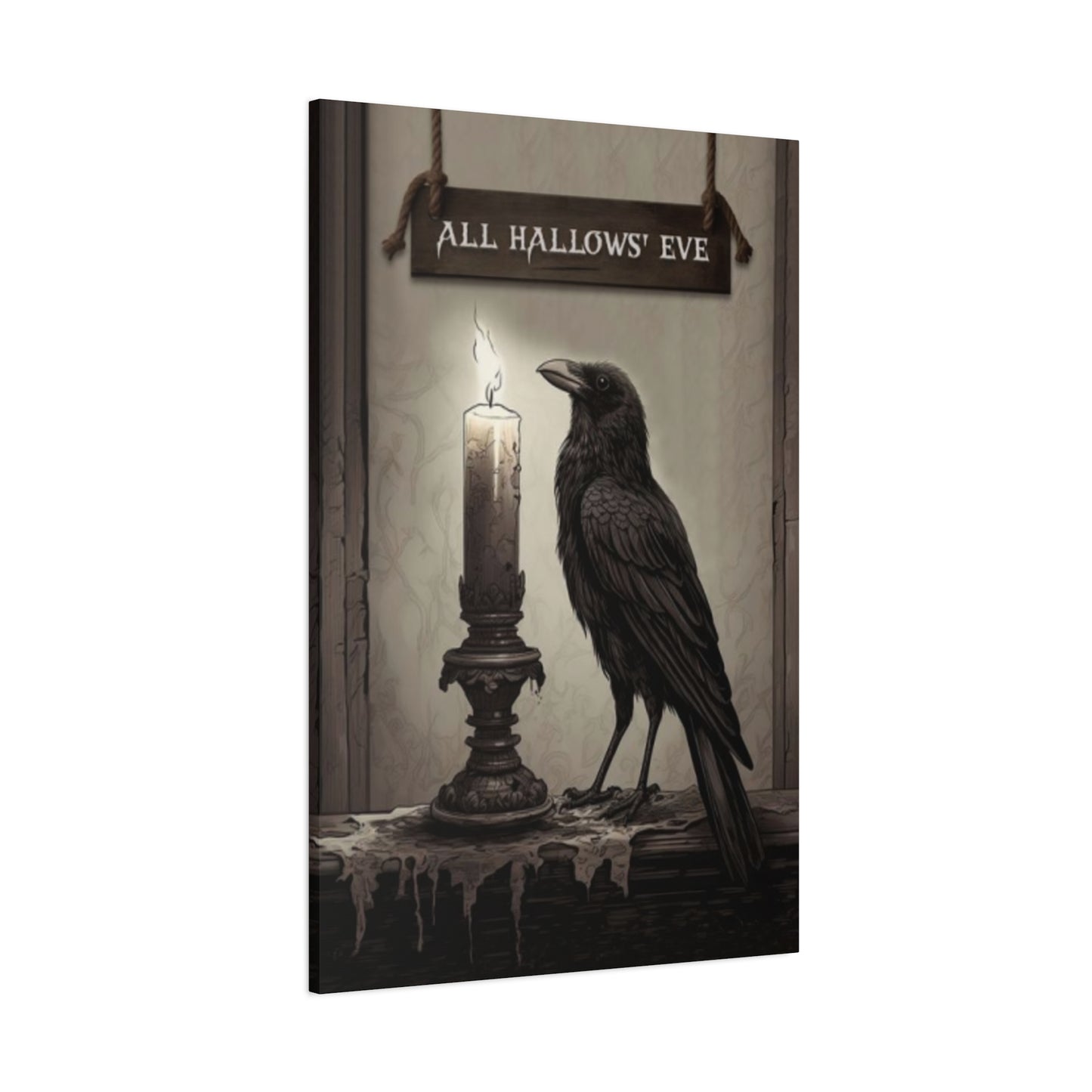
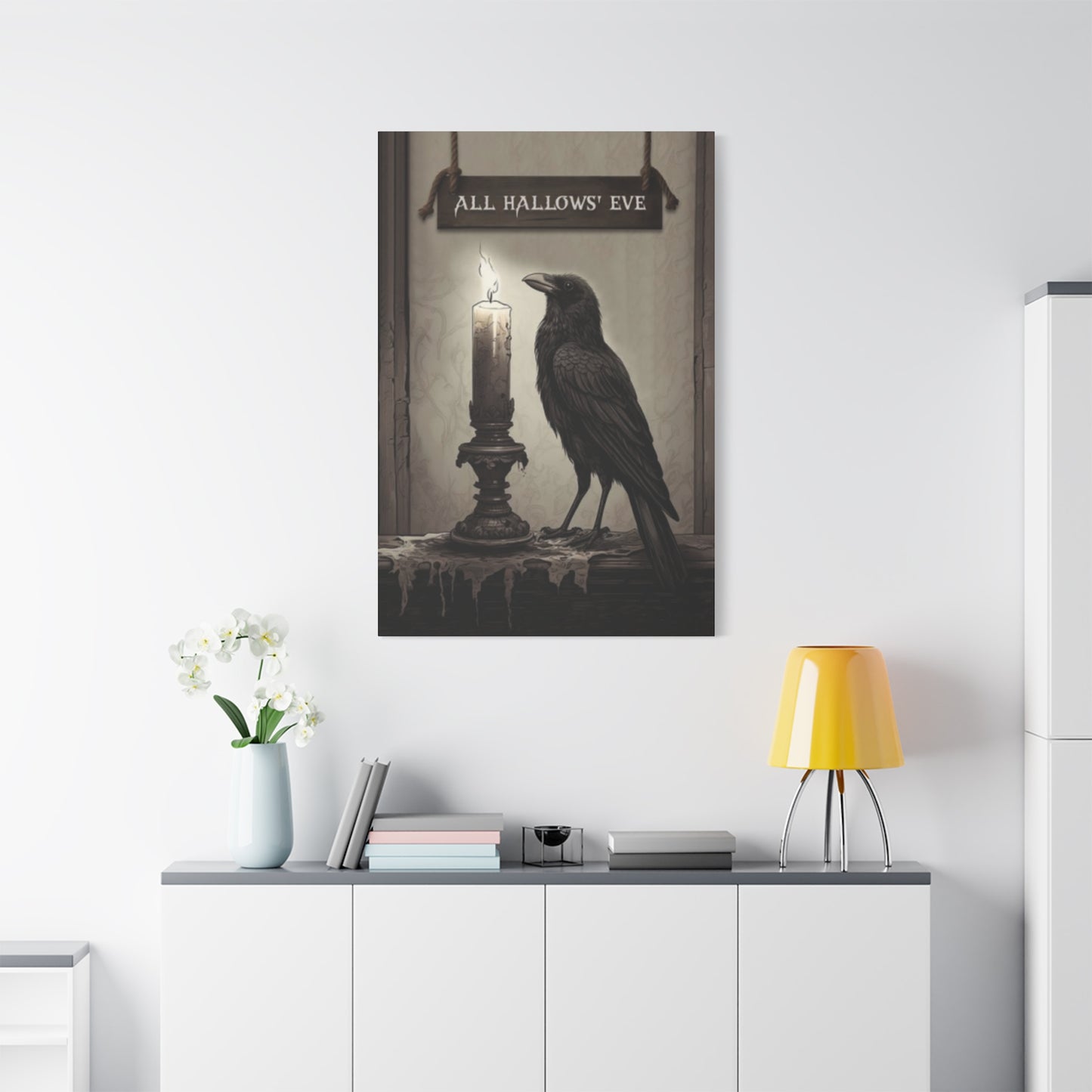
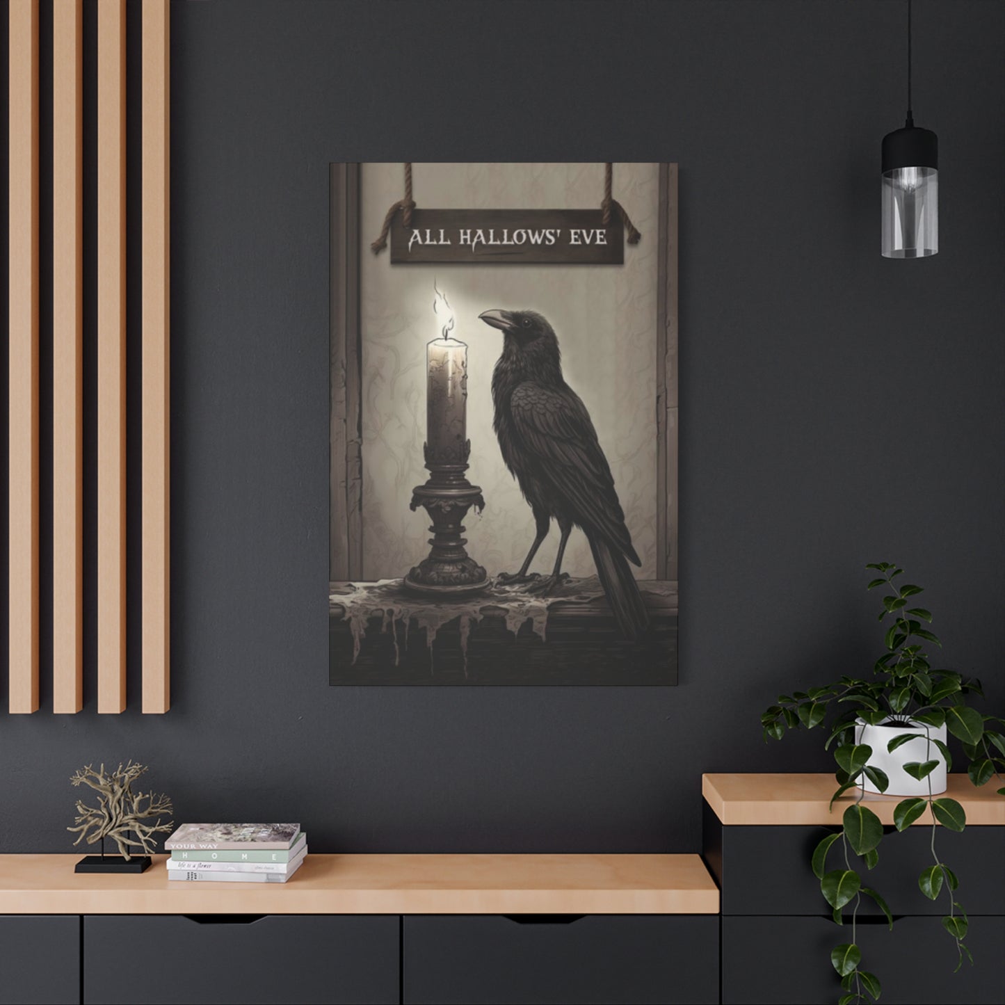
The subjects depicted in Hallow Eve painting wall art range from literal representations of seasonal symbols to abstract interpretations of autumn's essence. Traditional motifs include jack-o-lanterns with carved grins that range from friendly to frightening, black cats with arched backs and knowing eyes, witches on broomsticks silhouetted against full moons, and haunted mansions with Gothic architecture shrouded in fog. These familiar images carry immediate recognition, triggering nostalgic associations and cultural memory that require no explanation or artistic education to appreciate.
Natural elements provide rich subject matter that connects seasonal celebration to earth's cycles. Autumn leaves in various stages of color transformation, from summer's green through flame-like oranges to dried browns, tell visual stories about change and temporality. Bare trees with skeletal branches reaching toward gray skies suggest both endings and the promise of eventual renewal. Harvest bounty—pumpkins, gourds, corn stalks, and late-blooming flowers—celebrates abundance while acknowledging the approaching dormancy of winter months. These nature-focused subjects appeal to those who appreciate seasonal shifts as natural phenomena rather than purely supernatural occasions.
Creature features extend beyond black cats to encompass owls with their ancient associations with wisdom and mystery, bats representing transformation and navigation through darkness, spiders symbolizing creativity and patience, and ravens carrying messages between worlds. These animals possess rich symbolic histories across multiple cultures, adding layers of meaning beyond their literal representations. When rendered with artistic skill, these creatures transcend Halloween cliché to become compelling studies in form, movement, and character.
Supernatural beings populate much seasonal artwork, from classic ghosts and ghouls to vampires, werewolves, and witches. The portrayal of these entities varies dramatically based on artistic intent—some artists emphasize horror elements, creating genuinely unsettling imagery, while others present these beings with humor or even sympathy, reimagining monsters as misunderstood characters rather than pure threats. This spectrum of interpretation reflects broader cultural negotiations around fear, otherness, and our relationship with the unknown.
Abstract representations offer sophisticated alternatives to literal imagery. Swirling forms suggesting wind and transformation, geometric patterns evoking mystical symbols, or color field compositions capturing autumn's emotional essence allow viewers to project personal meaning onto less prescriptive imagery. These abstract approaches particularly suit contemporary interior design schemes where literal seasonal symbols might feel too literal or juvenile. The ambiguity inherent in abstraction creates space for individual interpretation and contemplation.
Vintage and retro subjects tap into nostalgia for earlier eras' seasonal celebrations. Artwork reproducing or reinterpreting mid-century Halloween party decorations, Victorian-era greeting cards, 1920s die-cut decorations, or 1950s trick-or-treat scenes connects contemporary viewers with generational memory. Even those too young to have experienced these eras directly often respond to their aesthetic charm, finding comfort in imagined "simpler times" of seasonal celebration. This nostalgic approach provides emotional warmth that balances seasonal spookiness.
Portrait-based artwork featuring costumed figures, character studies, or imaginative depictions of witches, fortune tellers, and other mysterious personas adds human element to seasonal themes. These faces—whether realistic, stylized, or fantastical—create emotional connections that landscape or object-focused work sometimes lacks. The human presence, even when depicting supernatural beings, provides relatable entry points for viewer engagement, transforming wall art from mere decoration into character-driven narrative.
Compositional Strategies That Guide Eyes and Establish Visual Hierarchy Within Seasonal Narratives
Strong composition separates mediocre artwork from compelling visual experiences regardless of subject matter or medium. In Hallow Eve painting wall art, compositional choices determine how effectively a piece communicates its mood and narrative. The rule of thirds, borrowed from photography but equally applicable to painting, suggests placing key elements along imaginary lines dividing the canvas into thirds both horizontally and vertically. Positioning a full moon, prominent tree, or central figure at these intersection points creates naturally pleasing balance that feels satisfying without conscious awareness of the underlying structure.
Asymmetrical balance generates visual interest through strategic weight distribution rather than mirror-image symmetry. A large, dark haunted house occupying the left two-thirds of a composition might balance against a small, bright moon in the upper right corner. The house's visual weight through size and value contrasts with the moon's weight through contrast and position. This dynamic tension creates more engaging compositions than centered, symmetrical arrangements, which can feel static and predictable despite their orderly appeal.
Leading lines direct viewer attention through deliberate compositional pathways. A winding path disappearing into mysterious woods, the diagonal thrust of a witch's broomstick, or the vertical lines of bare tree trunks all create visual movement that guides eyes through the artwork. These directional elements prevent compositions from feeling aimless or scattered, instead creating clear visual journeys that viewers unconsciously follow when engaging with the piece.
Foreground, middle ground, and background layering creates depth that transforms flat surfaces into dimensional spaces. A composition might feature detailed autumn leaves in the foreground, a moonlit graveyard in the middle ground, and a distant haunted mansion against stormy skies in the background. This spatial layering invites eyes to travel through the pictorial space, discovering details and relationships at various depths rather than absorbing everything simultaneously at a single plane.
Negative space—the empty or less-detailed areas surrounding and between subjects—contributes as significantly to composition as the subjects themselves. A single black cat silhouetted against a large expanse of moonlit sky gains drama and focus through generous negative space. Crowded compositions can feel energetic and abundant, but strategic emptiness often communicates more powerfully by allowing key elements to breathe and command attention without competition.
Framing devices within compositions create pictures within pictures, adding layers of visual interest. An artwork might show a seasonal scene viewed through a window frame, within a doorway, or framed by overhanging tree branches. These internal frames focus attention while creating depth and context, suggesting that viewers are glimpsing into rather than simply observing the depicted scene. This voyeuristic quality can enhance mysterious or secretive atmospheric qualities appropriate to seasonal themes.
Scale relationships between elements establish narrative hierarchies and emotional impact. An enormous jack-o-lantern looming over a tiny Victorian house tells a different story than a small pumpkin sitting on a vast, empty porch. Exaggerated scale differences create surreal, dreamlike qualities, while more naturalistic proportions ground images in relatable reality. Artists manipulate these relationships intentionally to guide interpretation and emotional response.
Repetition and pattern create visual rhythm that can feel hypnotic or energetic depending on application. Repeating forms—multiple jack-o-lanterns with varied expressions, a murder of crows in flight, rows of tombstones marching into the distance—establish rhythm that moves eyes through composition while reinforcing thematic elements. The variation within repetition prevents monotony; those jack-o-lanterns might share form but display unique carved expressions, those crows might fly in coordinated but individualized poses.
Diverse Artistic Styles Ranging From Photorealism to Abstract Expressionism Within Seasonal Artwork
Photorealistic approaches render seasonal subjects with such precision that images rival photography in detail and accuracy. These technically demanding pieces showcase masterful observation and execution skills, capturing the exact play of light on a carved pumpkin's surface, the individual fibers in a dried corn stalk, or the complex patterns in autumn leaves. Photorealism appeals to viewers who appreciate technical virtuosity and prefer artwork that clearly depicts recognizable subjects. These pieces often work well in formal spaces where refined craftsmanship is valued.
Impressionistic interpretations prioritize capturing light, atmosphere, and emotional essence over precise detail. Visible brushstrokes, broken color, and slightly blurred forms create dreamlike qualities that suggest rather than explicitly state. An impressionistic autumn landscape might use dabs of orange, red, and yellow to evoke foliage without painting individual leaves, or suggest a haunted mansion through architectural gestures rather than architectural accuracy. This approach particularly suits those who prefer subtle, sophisticated seasonal references over bold, literal declarations.
Folk art styles embrace naive charm, flattened perspective, and decorative pattern over academic realism. These pieces often feature simplified forms, bold outlines, and cheerful colors even when depicting traditionally spooky subjects. The accessible, unpretentious quality of folk art creates welcoming, approachable seasonal decor that feels handmade and personal rather than mass-produced or intimidatingly artistic. This style particularly resonates in country, farmhouse, or cottage-style interiors where informal charm is prioritized.
Gothic and dark romantic styles emphasize dramatic lighting, architectural grandeur, and atmospheric mystery. Drawing inspiration from nineteenth-century Romanticism, these pieces often feature crumbling ruins, moonlit landscapes, and baroque detail rendered in moody palettes. The aesthetic leans heavily into the "dark" aspect of seasonal themes, creating genuinely mysterious or melancholic atmospheres rather than playful spookiness. These sophisticated pieces appeal to viewers drawn to Victorian Gothic sensibilities and dramatic interior design.
Contemporary illustrative styles borrow from graphic design, animation, and commercial art, featuring clean lines, flat colors, and strong graphic impact. These pieces often have a poster-like quality with bold compositional choices and limited but strategic color palettes. The style works particularly well for creating cohesive sets of seasonal artwork, as the graphic consistency allows multiple pieces to function as a curated collection. This approach suits modern, minimalist interiors where visual clutter is avoided.
Surrealist interpretations take seasonal imagery as starting points for fantastical explorations. A pumpkin might transform into a carriage mid-metamorphosis, trees might have faces that whisper secrets, or autumn leaves might dissolve into flights of bats. These imaginative compositions challenge reality's constraints, creating visual puzzles and symbolic narratives that reward close examination. Surrealism's dreamlike illogic perfectly suits the liminal, magical qualities associated with late October's supernatural reputation.
Abstract approaches distill seasonal themes to pure form, color, and gesture. Rather than depicting a jack-o-lantern, an abstract piece might capture the essence of carved light through glowing oranges against deep blacks. Instead of illustrating autumn leaves, gestural brushstrokes in seasonal palettes might evoke falling's movement and transformation's energy. These non-representational works appeal to sophisticated collectors who prefer artwork that complements rather than commands space, suggesting rather than declaring seasonal spirit.
Mixed media and collage approaches combine various materials and artistic techniques within single compositions. A piece might incorporate actual dried leaves, vintage paper ephemera, fabric elements, and painted sections to create rich, textured surfaces. These layered works offer tactile interest and dimensional depth that purely painted surfaces cannot achieve. The assemblage approach also allows incorporation of found objects and personal memorabilia, creating deeply personalized seasonal artwork with unique stories embedded within its materials.
Size Considerations and Placement Strategies for Maximum Visual Impact Within Various Room Contexts
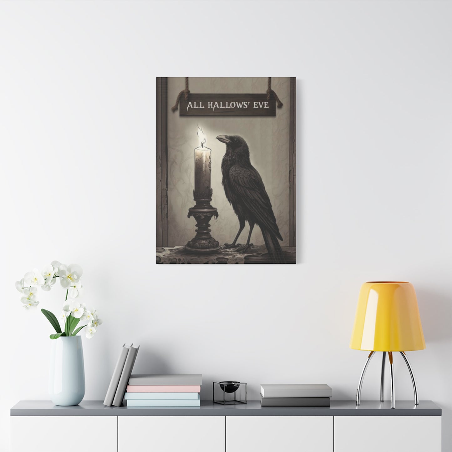
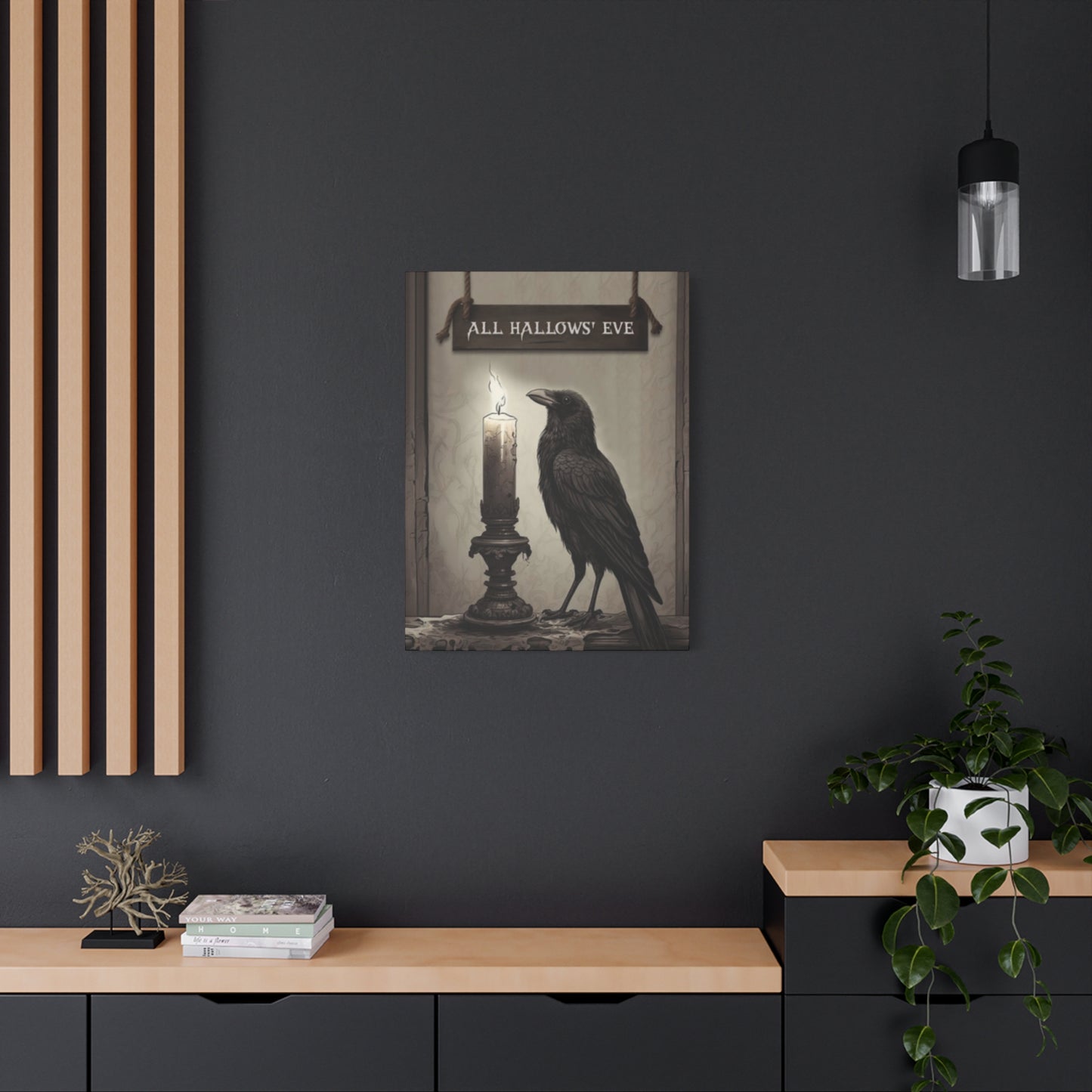
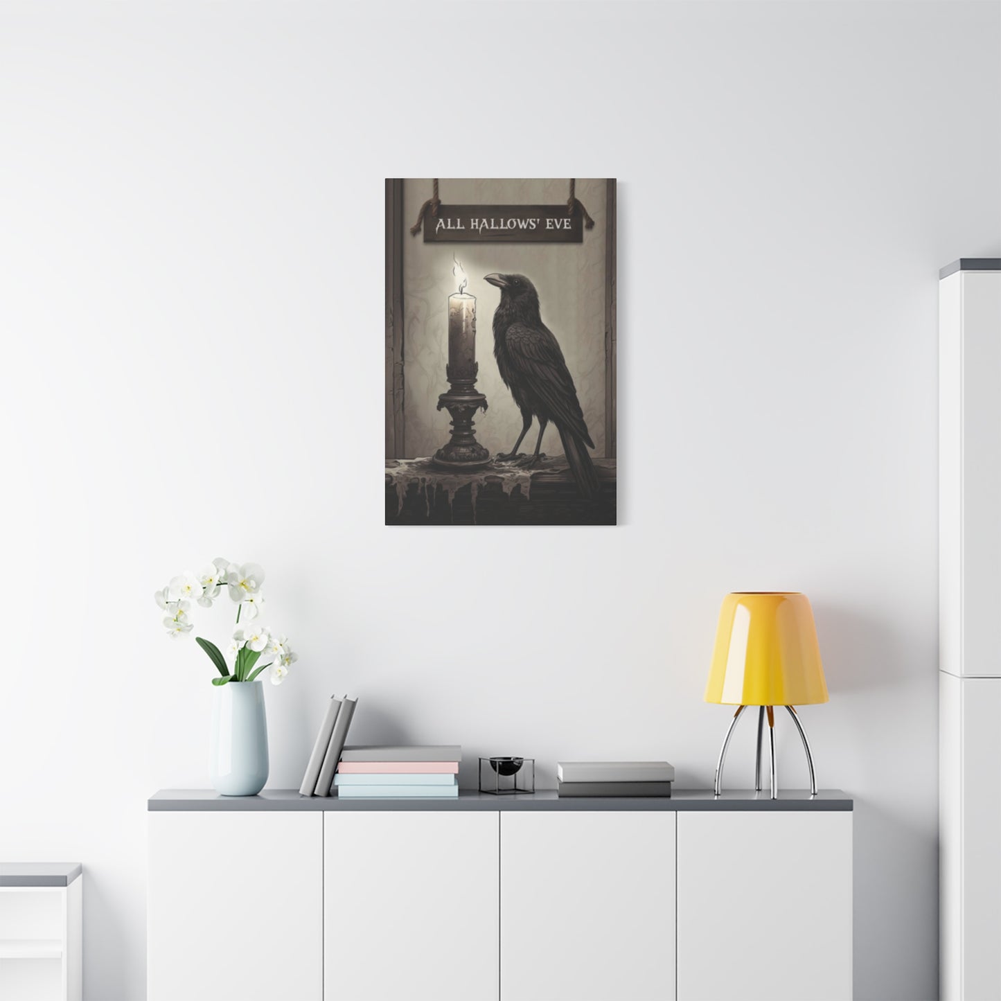
The physical dimensions of Hallow Eve painting wall art dramatically affect its presence and impact within spaces. Large-scale statement pieces, measuring several feet in width or height, command attention and establish focal points around which entire room designs can revolve. These substantial works suit spacious walls above sofas, fireplaces, or buffets where their size can be properly appreciated without overwhelming the space. A single large piece often creates more sophisticated impact than multiple smaller works scattered across the same wall area.
Medium-sized pieces, roughly two to three feet in their largest dimension, offer versatility for various placement options. These moderately scaled works function well as standalone features in smaller rooms or can be grouped in arrangements on larger walls. Their manageable size allows for seasonal rotation without requiring major furniture rearrangement or heavy lifting. This practical consideration makes medium-sized pieces particularly popular for those who enjoy regularly refreshing their decor.
Small works and miniatures provide opportunities for intimate viewing experiences and flexible placement. These compact pieces work beautifully on bookshelves, mantels, narrow walls in hallways, or grouped in gallery arrangements mixing multiple images. Small scale doesn't necessitate less impact; a jewel-like miniature with exquisite detail can captivate viewers who lean in close to appreciate its intricacies. These pieces also offer budget-friendly options for building seasonal collections gradually over time.
Gallery wall arrangements allow multiple pieces to function as cohesive installations rather than isolated artworks. Creating these successful groupings requires considering how individual pieces relate in terms of style, color palette, subject matter, and physical size. Some gallery walls feature uniform frame styles in grid arrangements for clean, contemporary looks, while others embrace eclectic mixing of frame styles, artwork sizes, and spacing for more casual, collected-over-time aesthetics. Planning these arrangements on the floor before hanging prevents walls from becoming Swiss cheese from misplaced nail holes.
Vertical versus horizontal orientation affects how artwork interacts with architectural features and furniture. Vertical pieces draw eyes upward, making walls feel taller—particularly useful in rooms with low ceilings. These portrait-oriented works suit narrow wall sections between windows or beside doorways. Horizontal pieces emphasize width, making spaces feel broader and working especially well above low furniture like sofas and beds where horizontal lines complement the furniture's orientation.
Height placement significantly impacts viewing experience and room flow. The general guideline suggests hanging artwork so its center point aligns approximately with average eye level—typically fifty-seven to sixty inches from the floor. However, this rule adjusts based on context; pieces meant for viewing while seated should hang slightly lower, while artwork in high-traffic corridors where people primarily walk past might hang slightly higher. Consider how you'll primarily experience the piece—standing in conversation, sitting on furniture, or passing through—and adjust accordingly.
Relationship to furniture placement requires thoughtful consideration. Artwork hung above a sofa should generally measure roughly two-thirds the sofa's width to maintain proportional balance. Leaving six to twelve inches of space between furniture tops and artwork bottoms prevents pieces from appearing to sit on furniture while maintaining visual connection between elements. Freestanding artwork on easels or leaning against walls creates casual, studio-like aesthetics while offering flexible placement that easily changes with seasonal rotations.
Lighting dramatically affects artwork visibility and impact. Natural light from windows can beautifully illuminate pieces during daytime but risks causing fading over time, particularly for works on paper or those using fugitive pigments. Artificial lighting allows controlled display—track lighting or picture lights can highlight artwork dramatically while recessed lighting provides ambient illumination. Consider how pieces will appear during both daylight and evening hours, as colors and details that shine in one lighting condition might disappear in another.
Material Choices and Surface Qualities That Affect Durability, Aesthetics, and Perceived Value
Canvas remains the most traditional support for painting, offering textured surfaces that showcase brushwork beautifully while providing durability and dimensional stability. Gallery-wrapped canvases where the image continues around the edges allow frameless display for contemporary, clean-lined presentations. Traditional stretched canvases require framing but offer protection and formal presentation. Canvas prints—high-quality reproductions on canvas material—provide affordable alternatives to original paintings while maintaining the textured surface associated with fine art.
Paper supports range from lightweight sketch paper to heavyweight watercolor paper with varying textures and archival qualities. Original works on paper require protection from handling, humidity, and light damage, making proper framing with UV-protective glass essential for longevity. The intimacy of works on paper creates different viewing experiences than canvas paintings, often feeling more precious and delicate. Fine art paper prints offer excellent reproduction quality for limited editions and affordable artwork options.
Wood panels provide rigid, stable surfaces that have supported painting for centuries. Contemporary artists often paint directly on prepared wood surfaces, allowing the grain to show through in places or incorporating the wood's natural character into compositions. Wood's stability prevents warping and sagging that can affect canvas over time. Wooden signs with painted seasonal imagery offer casual, rustic charm particularly suited to farmhouse and country-style interiors.
Metal surfaces, particularly aluminum, offer contemporary alternatives for both original art and high-quality prints. Images can be printed directly onto metal surfaces or painted on prepared metal panels. The resulting pieces have luminous quality from light reflecting off the metal substrate, creating vibrant colors and unique visual depth. Metal's durability makes these pieces suitable for high-humidity environments where paper or canvas might suffer, though direct sunlight can heat metal uncomfortably.
Acrylic sheeting provides modern, high-gloss presentations for photographic prints and some paintings. Images mounted behind thick acrylic (often called acrylic face mounting) achieve intense color saturation and contemporary gallery aesthetics. The glossy surface reflects light dramatically, creating eye-catching display that suits modern interiors. However, acrylic shows fingerprints easily and reflects surrounding environments, potentially creating viewing challenges in brightly lit spaces.
Fabric and textile approaches transform seasonal artwork into tapestries, quilts, or fabric panels that introduce soft, tactile qualities. These fiber-based artworks particularly suit cozy, comfortable spaces where traditional hard-surfaced paintings might feel too formal. Textile arts also carry strong craft tradition associations, connecting seasonal celebration to handwork heritage. The flexibility of fabric allows easy storage when not displayed, though proper folding prevents creasing that might show when rehung.
Dimensional and textured surfaces created through impasto painting techniques, mixed media layering, or collage elements add tactile interest beyond flat painted surfaces. These textured pieces interact dynamically with light, creating shadows and highlights that shift as lighting changes throughout the day. The physical depth transforms wall art from purely visual experience to one that suggests tactile exploration, though actual touching risks damage and should be discouraged.
Surface finishes—matte, satin, or glossy—affect how artwork reflects light and appears within spaces. Matte surfaces minimize glare and reflections, making artwork easily viewable from various angles and in various lighting conditions. These finishes create sophisticated, understated presentations. Glossy finishes maximize color intensity and create dramatic light reflections, though they can make viewing difficult from certain angles. Satin finishes split the difference, offering moderate sheen without excessive glare. Finish choice should consider room lighting conditions and viewing angles.
Framing Choices That Complement Artwork While Protecting and Presenting It Effectively
Frame style dramatically impacts how artwork is perceived and how successfully it integrates with surrounding decor. Traditional ornate frames with carved details and antiqued finishes suit vintage, Victorian, or Gothic-style seasonal artwork, enhancing period atmosphere and adding luxury. These elaborate frames become part of the artistic statement rather than mere protective borders, contributing to the overall aesthetic experience. However, ornate framing can overwhelm delicate or minimalist artwork, requiring careful matching between frame elaboration and image complexity.
Simple frames with clean lines and minimal ornamentation offer versatile options that work with various artwork styles and interior designs. Black frames provide classic sophistication that makes colors appear more vibrant through strong contrast. White or light-colored frames create airy, casual presentations particularly suited to contemporary or coastal-inspired spaces. Natural wood frames in various finishes—from light birch to dark walnut—bring warmth and organic character that complements nature-focused seasonal imagery.
Rustic frames constructed from reclaimed wood, barn wood, or weathered materials enhance casual, farmhouse aesthetics popular in country-style interiors. The distressed character of these frames adds authentic charm to folk art pieces and vintage-inspired imagery. However, the rustic approach can feel incongruous with sleek, contemporary artwork, so matching frame character to image style prevents visual discord. The texture and color variation in rustic wood creates interest even with simple frame profiles.
Floating frames, where artwork appears suspended within the frame with space between image edges and frame interior, create contemporary presentations with architectural clarity. This treatment particularly suits canvas pieces, showing the depth of stretched canvases and creating clean, gallery-like displays. The floating effect adds dimensional interest while maintaining minimalist aesthetics. These frames work especially well with modern or abstract seasonal artwork where traditional framing might feel too decorative.
Metal frames in various finishes—black, silver, gold, copper, or bronze—offer sleek, modern alternatives to wooden frames. Thin metal profiles create almost invisible borders that maximize image visibility while providing structural support and protection. Metallic finishes can coordinate with metallic elements within artwork or room decor, creating cohesive design relationships. Metal's durability suits high-traffic areas where wooden frames might get bumped or damaged.
Matting—the bordered material between artwork and frame—serves both aesthetic and protective functions. Mats prevent artwork from touching glass, which could trap moisture and cause damage. Aesthetically, mats create breathing room between busy images and frames, providing visual rest that allows compositions to feel less cramped. Mat color choice affects how artwork is perceived; neutral mats (white, cream, black, gray) maintain focus on the image, while colored mats can either complement or contrast with artwork palettes. Wide mats create formal, gallery-like presentations, while narrow mats feel more casual.
Glass and acrylic glazing protect artwork from dust, moisture, and physical damage while allowing visibility. Standard glass provides basic protection but reflects light noticeably, sometimes making viewing difficult. Non-glare glass reduces reflections through etched surface treatments but can slightly soften image appearance. Museum-quality UV-protective glass filters harmful light wavelengths that cause fading while maintaining crystal clarity, though at significantly higher cost. Acrylic glazing weighs less than glass and resists shattering, making it safer for large pieces or homes with children, though it scratches more easily than glass.
Frameless presentations offer contemporary alternatives where artwork mounts directly to walls or stands on easels without traditional frames. Gallery-wrapped canvases with finished edges need no frames, creating clean, modern displays. Artwork can be mounted to backing boards and hung without surrounding frames for minimalist aesthetics. Clips or rail systems allow easy artwork swapping for those who frequently rotate seasonal displays. While frameless options reduce costs and emphasize contemporary aesthetics, they offer less physical protection than traditional framing.
The Process of Commissioning Custom Artwork That Perfectly Matches Personal Vision and Spatial Requirements
Commissioning original Hallow Eve painting wall art allows complete customization to personal preferences, specific spatial requirements, and unique design visions impossible to find in mass-produced options. The commissioning process begins with identifying artists whose existing work aligns with your aesthetic preferences. Browsing independent artists on platforms showcasing handmade goods, attending art fairs and craft shows, or exploring local gallery representations helps discover working artists whose styles resonate. An artist skilled in photorealism won't likely produce successful abstract work, so matching their demonstrated strengths to your desired aesthetic is crucial.
Initial consultations establish whether artistic vision and practical expectations align. Share reference images illustrating desired mood, color palettes, and subject matter. Discuss size requirements, intended placement location, and any architectural or design constraints. Explain what draws you to the artist's work and what specific qualities you hope to capture in your commissioned piece. Honest artists will indicate whether your vision falls within their capabilities and comfort zone, preventing mismatched expectations that lead to disappointment.
Budget discussions should happen early and frankly. Original artwork pricing reflects materials, time investment, artistic skill, and the artist's professional positioning. Larger pieces require more materials and time, commanding higher prices than smaller works. Complex compositions with multiple elements and detailed rendering require more hours than simpler subjects. Established artists with strong reputations justifiably charge more than emerging artists building their careers. Understanding pricing factors prevents sticker shock and allows informed decision-making about size, complexity, and artist selection.
Timeline expectations need clear establishment from the project's beginning. Most artists maintain waiting lists, particularly during busy seasons when commission demand peaks. Production time varies based on piece size, medium, complexity, and the artist's working speed. Rushing artwork often compromises quality, so respecting reasonable timelines benefits everyone. If artwork needs completion by specific deadlines—perhaps for autumn parties or as seasonal gifts—communicate these requirements during initial discussions to ensure feasibility.
Contracts protect both parties by documenting agreed-upon terms. These agreements should specify dimensions, subject matter descriptions, color palettes, completion timelines, payment schedules, and revision policies. Clarify whether payment occurs as a single sum upon completion or in installments (often deposit upon agreement, progress payment partway through, final payment upon completion). Understand revision policies—how many rounds of changes are included, what constitutes minor versus major revisions, and whether additional changes incur extra fees.
Progress updates maintain communication and allow early course correction if the developing work diverges from expectations. Many artists provide photographs at various stages, allowing feedback before completing details that might be difficult to change later. These checkpoints prevent unpleasant surprises when viewing finished pieces, though remember that works-in-progress photographs never perfectly represent how completed artwork will appear. Trust the artist's process while remaining engaged enough to catch genuine misunderstandings early.
Receiving finished artwork marks exciting culmination of the commission process. Examine the piece carefully, comparing it to contracted specifications and communicated expectations. Minor variations from initial sketches often occur as artists solve compositional problems during execution, and these changes usually enhance rather than detract from final results. However, significant departures from agreed specifications warrant discussion. Most professional artists want clients satisfied and will address legitimate concerns, though understanding that artwork is interpretation rather than mechanical reproduction helps maintain reasonable expectations.
Proper artist credit and care instructions ensure your investment's longevity and respect the creator's rights. Original artwork carries copyright, which remains with the artist unless specifically transferred in writing. This means you own the physical object but not reproduction rights—you cannot create prints, products, or derivative works without permission. Displaying artwork publicly (including social media) with proper attribution respects the artist's work and builds their reputation. Following provided care instructions regarding cleaning, humidity control, and light exposure protects your investment's condition over decades.
Conclusion
Environmental conditions dramatically affect artwork longevity, with temperature and humidity being primary concerns. Extreme heat accelerates chemical degradation in paints and supports, while cold temperatures can cause brittleness. Wide temperature fluctuations stress materials through expansion and contraction cycles. Humidity extremes prove equally problematic—excessive moisture encourages mold growth and causes paper to buckle, while extreme dryness makes materials brittle and prone to cracking. Maintaining moderate, stable conditions (roughly sixty-five to seventy-five degrees Fahrenheit and forty to fifty-five percent relative humidity) provides ideal preservation environments.
Light exposure, particularly ultraviolet radiation, causes irreversible fading and material degradation. Sunlight contains high UV levels that rapidly damage artwork, but even artificial lighting contributes to photochemical damage over time. Positioning artwork away from direct sunlight protects against the most damaging exposure. Using UV-filtering glazing on framed works provides additional protection without affecting visibility. LED lighting produces minimal UV radiation compared to incandescent or fluorescent bulbs, making it preferable for illuminating valuable artwork. Simply reducing daily light exposure by drawing curtains or turning off lights extends artwork lifespan significantly.
Dust accumulation dulls surfaces and can attract moisture that encourages mold growth. Regular gentle dusting with soft, clean, dry cloths or brushes prevents buildup that becomes difficult to remove. Never use cleaning products, water, or abrasive materials on artwork surfaces without professional guidance, as these can cause irreversible damage. Framed artwork with glass or acrylic glazing can have those protective surfaces cleaned with appropriate cleaners, but never allow moisture near the artwork itself.
Physical damage from impacts, scratching, or crushing threatens artwork integrity. Hanging artwork securely prevents falls that could tear canvases, break glass, or dent corners. Using appropriate hanging hardware rated for artwork weight prevents accidents. Positioning pieces away from high-traffic areas where they might be bumped reduces accident risk. Corners of frames and canvases are particularly vulnerable, so careful handling during display changes prevents chipping and crushing.
Pest prevention protects against insects and rodents that find organic art materials attractive. Insects like silverfish eat paper and fabric, while rodents nest in stored artworks. Maintaining clean storage areas discourages infestations. Cedar or lavender sachets repel insects naturally without chemical treatments that might damage artwork. Regular inspection of stored artwork allows early detection of pest problems before significant damage occurs. If infestations are discovered, consulting conservation professionals ensures appropriate treatment that eliminates pests without harming artwork.
Share