Greeting From Texas Poster Wall Art & Canvas Prints
Greeting From Texas Poster Wall Art & Canvas Prints
Couldn't load pickup availability
Celebrating Lone Star Pride: Creative Ways to Display Your Greeting From Texas Poster Wall Art in Modern Living Spaces
The vibrant culture and boundless spirit of the Lone Star State have captivated hearts across generations, inspiring countless individuals to bring a piece of this magnificent region into their homes. When considering decorative pieces that embody this distinctive character, few items capture the essence quite like authentic artwork celebrating regional heritage. A Greeting From Texas Poster Wall Art serves as more than mere decoration—it becomes a conversation starter, a nostalgic reminder, and a bold statement of pride that transforms ordinary walls into extraordinary displays of personal identity.
Homeowners and decorating enthusiasts increasingly seek meaningful pieces that reflect their connections to places they cherish. The resurgence of vintage-inspired artwork has created renewed interest in retro travel posters and state-themed decorations. These pieces evoke memories of road trips, family gatherings, and the unique characteristics that make certain locations unforgettable. Whether you've called the region home for decades or simply admire its distinctive personality from afar, incorporating themed artwork creates warmth and character in any environment.
This comprehensive exploration delves into the multifaceted world of regional artwork, examining everything from selection criteria and design principles to preservation methods and creative display strategies. We'll uncover the hidden potential of these decorative pieces, revealing how they can completely transform your living quarters while honoring the remarkable heritage they represent. Through detailed examination of placement options, complementary décor elements, and innovative styling approaches, you'll discover countless ways to maximize the visual impact of your chosen artwork.
Discovering the Cultural Significance Behind Regional Artwork Representations
Regional artwork carries profound meaning that extends far beyond aesthetic appeal. These pieces serve as cultural artifacts, preserving memories and traditions while celebrating the unique characteristics that define specific geographical areas. When examining vintage-style posters celebrating particular states, we encounter layers of historical context, artistic movements, and social commentary that enrich our understanding of both past and present.
The tradition of commemorative travel posters dates back to the golden age of American tourism, when roadside attractions and cross-country journeys captured the national imagination. Artists created bold, colorful designs that highlighted distinctive landmarks, natural wonders, and cultural elements associated with various destinations. These promotional materials weren't merely advertisements—they were artistic expressions that distilled complex regional identities into single, powerful images.
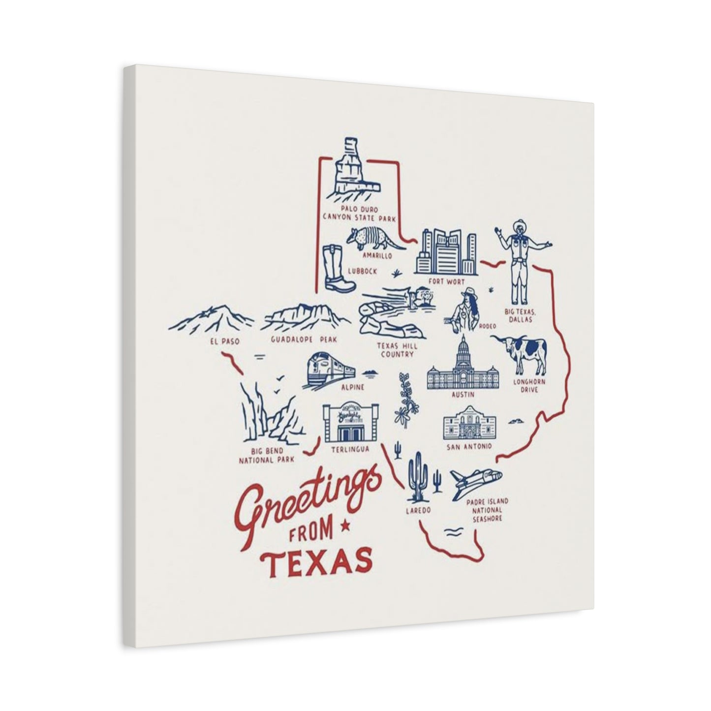
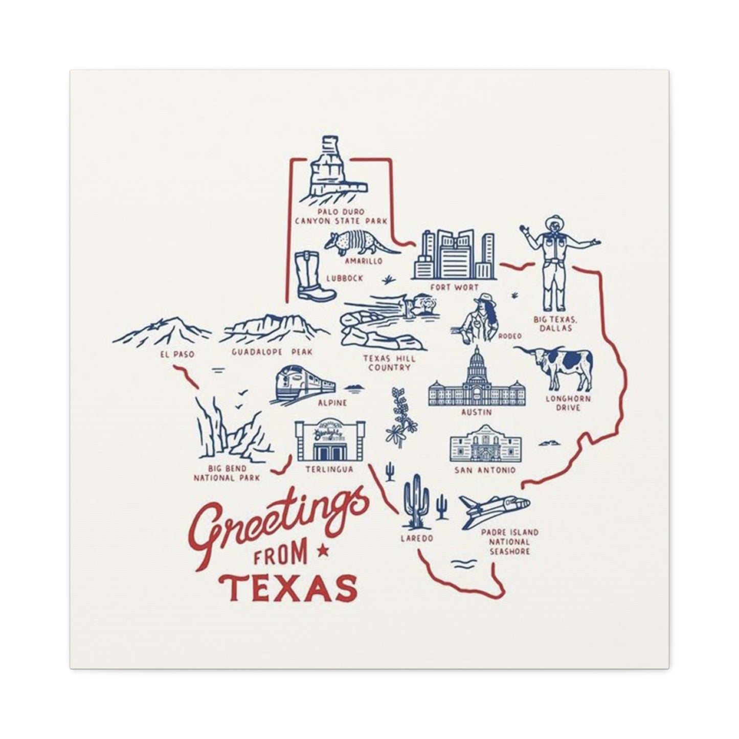
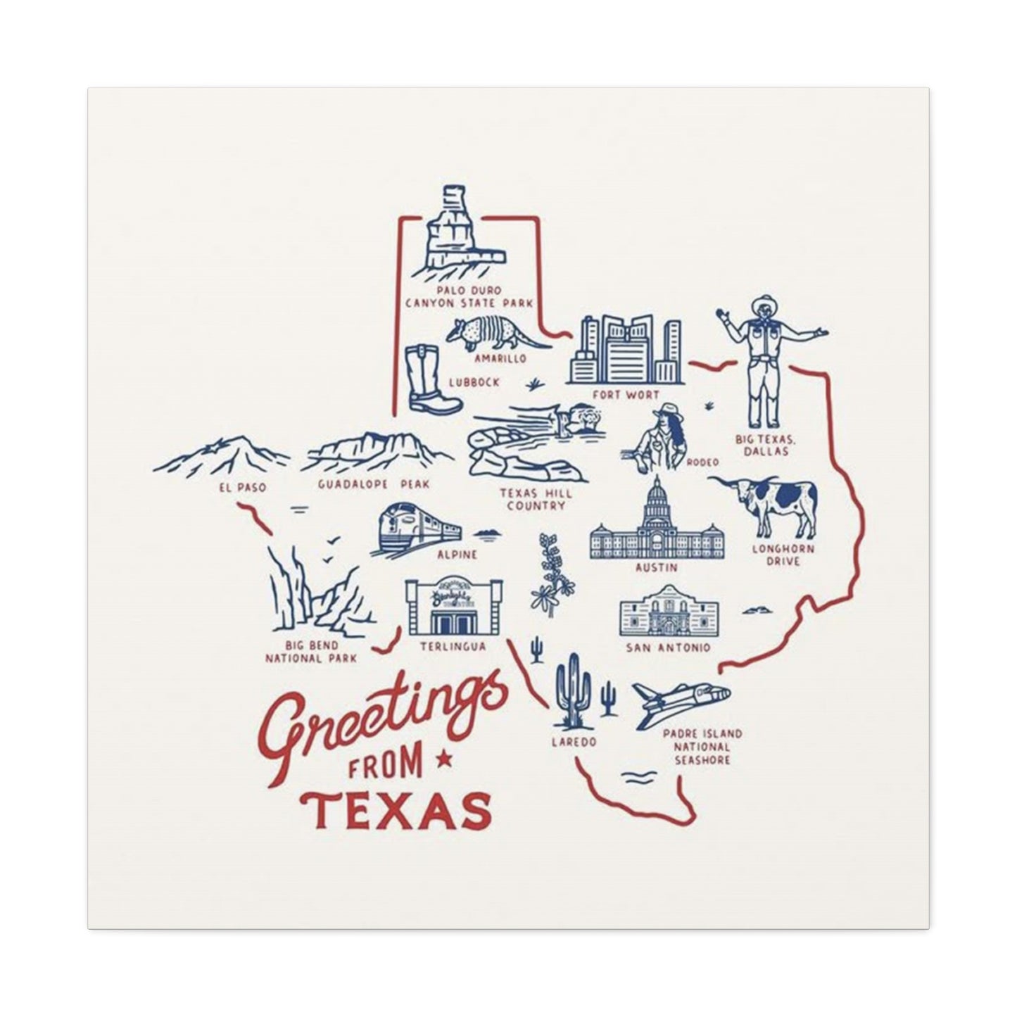
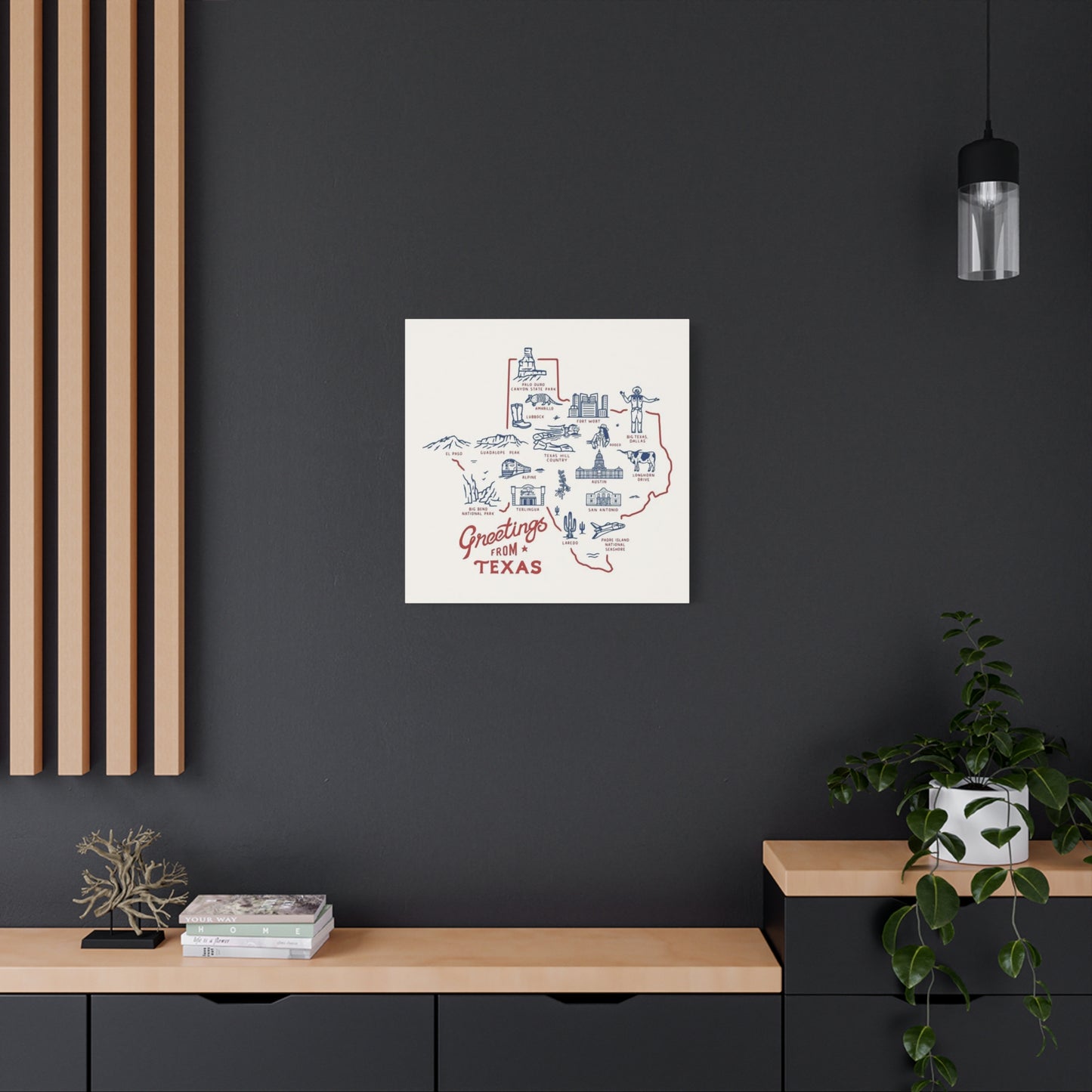
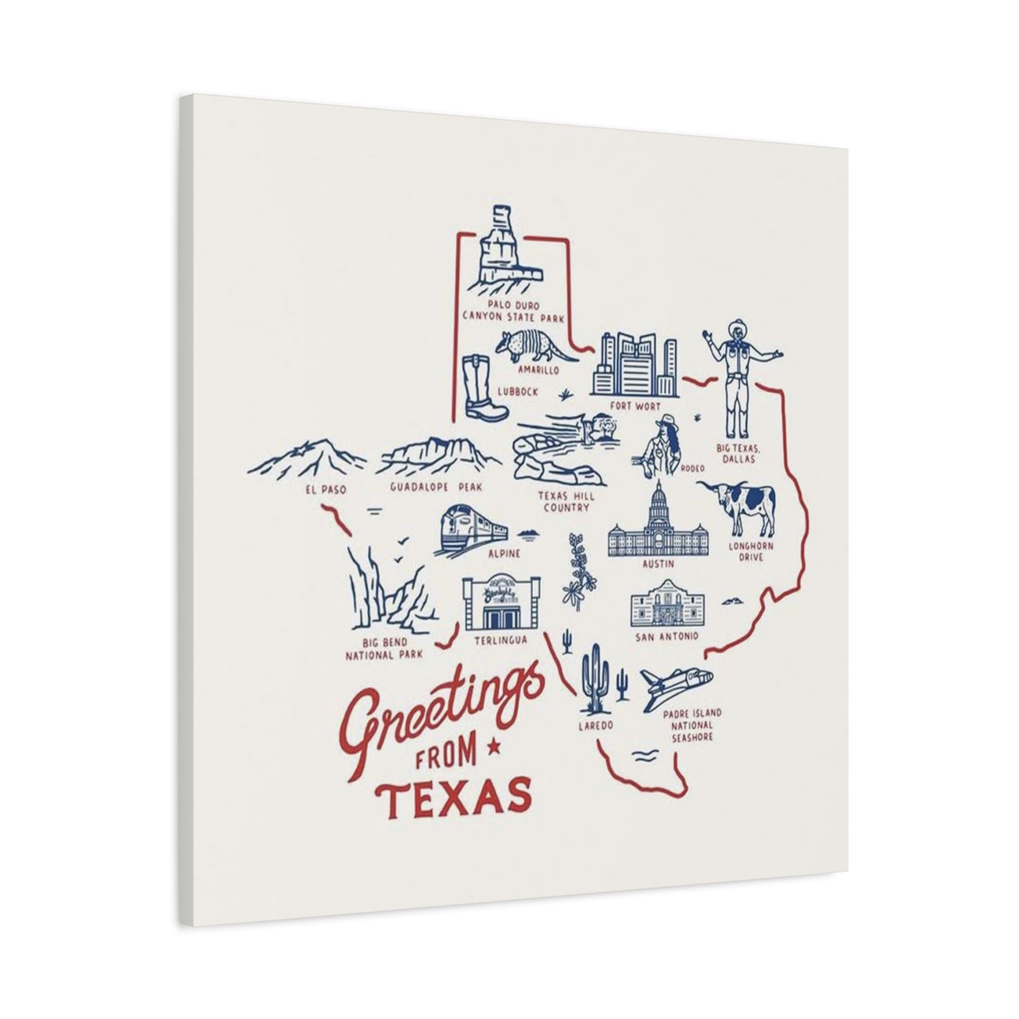
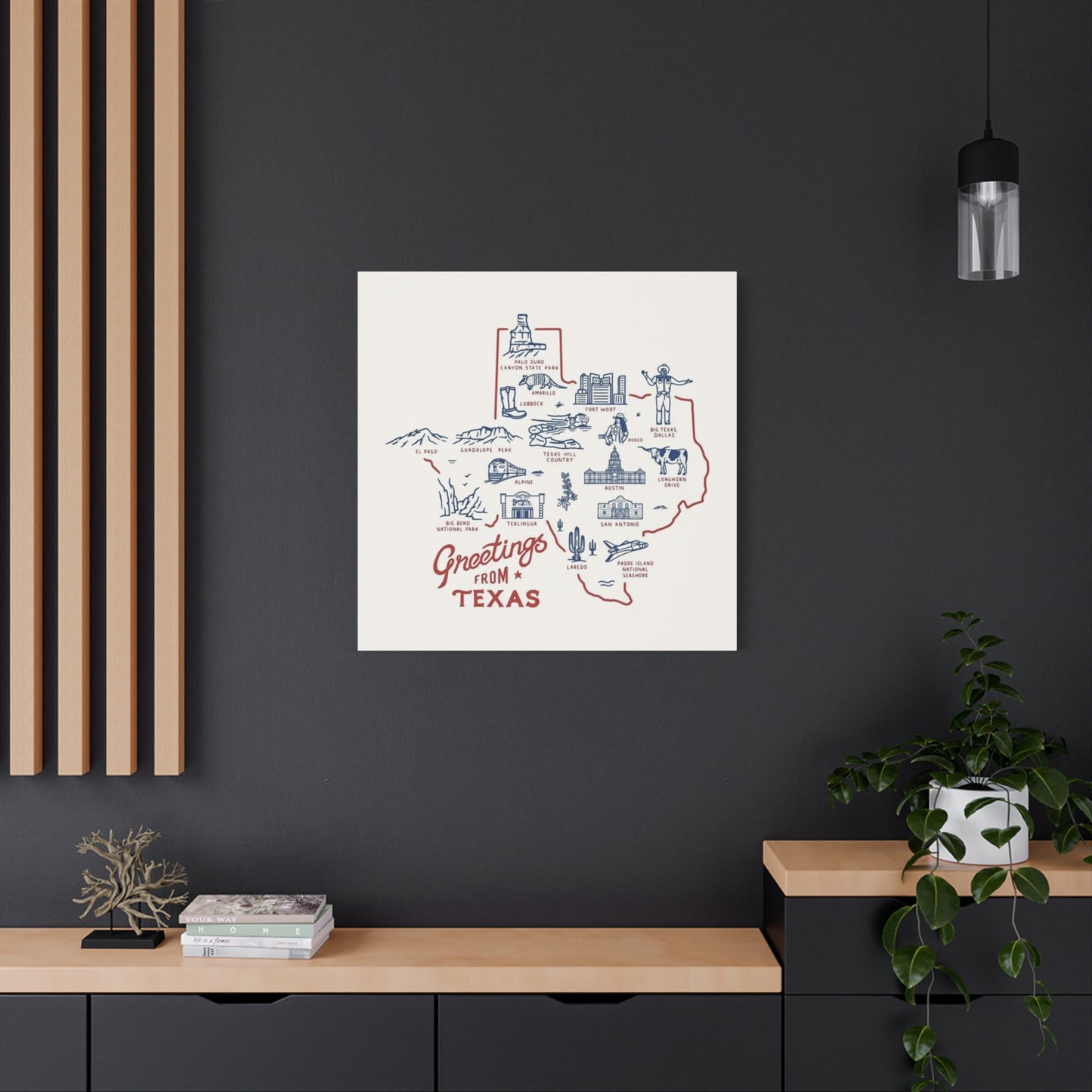
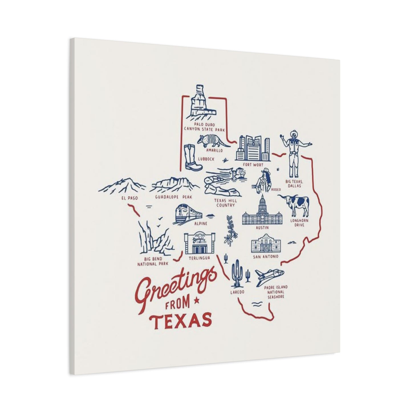
For the Lone Star State specifically, artwork typically incorporates recognizable symbols: wide-open landscapes, distinctive architecture, native wildlife, and iconic landmarks. The color palette often draws from the natural environment—deep blues representing endless skies, warm earth tones reflecting arid terrain, and vibrant accents suggesting lively urban centers and blooming wildflowers. Each design choice contributes to an overall impression that feels authentically connected to the region's character.
Contemporary artists and designers continue this tradition, creating new interpretations that honor vintage aesthetics while incorporating modern sensibilities. The result bridges generations, appealing to those who remember earlier eras and younger audiences discovering these visual traditions for the first time. This timeless quality makes such artwork particularly valuable for home décor, as pieces remain relevant and appealing regardless of shifting trends.
Understanding this background enriches your appreciation when selecting and displaying your Greeting From Texas Poster Wall Art. You're not simply hanging decoration—you're participating in a long-standing artistic tradition that celebrates place, memory, and identity. This awareness can inform your choices about placement, framing, and the surrounding environment you create to showcase your piece.
Exploring Various Styles and Design Elements in State-Themed Artwork
The diversity of available designs ensures that every individual can find artwork resonating with their personal taste and decorative vision. From bold, graphic interpretations to subtle, sophisticated renderings, the range of styles accommodates virtually any preference. Examining these variations helps you identify pieces that align perfectly with your existing décor while making the desired visual statement.
Vintage-inspired designs often feature hand-lettered typography reminiscent of mid-century advertisements. These pieces typically employ a limited color palette with high contrast, creating eye-catching compositions that demand attention. The deliberately aged appearance, complete with subtle texture and distressed elements, evokes nostalgia and authenticity. Such designs work exceptionally well in spaces embracing retro aesthetics, farmhouse charm, or eclectic mixing of periods and styles.
Minimalist interpretations strip away ornamental details, focusing on essential elements that capture regional essence through simplified forms and restrained color choices. Clean lines, geometric shapes, and carefully balanced negative space characterize these designs. This approach suits contemporary environments, modern interiors, and spaces prioritizing understated elegance over bold statements. Despite their simplicity, these pieces often convey profound meaning through thoughtful composition and deliberate editing.
Illustrative styles incorporate detailed drawings or paintings that showcase specific landmarks, landscapes, or cultural elements. These pieces might depict recognizable buildings, natural formations, or scenes from daily life that exemplify regional character. The artistic technique varies widely—from photorealistic renderings to whimsical interpretations—allowing for tremendous variety within this category. Such artwork particularly appeals to those seeking pieces with narrative quality and rich visual interest.
Typographic designs prioritize words and letters as primary visual elements, sometimes incorporating minimal imagery or relying entirely on creative text arrangement. These pieces might feature famous regional sayings, lists of notable cities, or artistic arrangements of the state name itself. Bold fonts, unexpected color combinations, and innovative layouts transform simple text into compelling visual compositions. This style works beautifully in modern spaces and appeals to those who appreciate graphic design and contemporary aesthetics.
Abstract interpretations use color, shape, and composition to evoke regional feeling without literal representation. These pieces might incorporate the state outline as a compositional element or use colors associated with the region in non-representational ways. This approach offers maximum flexibility for integration with existing décor, as the abstraction allows viewers to find personal meaning and connection. Such artwork suits sophisticated spaces and those who prefer suggestion over explicit statement.
When selecting your Greeting From Texas Poster Wall Art, consider which style resonates most strongly with your personal taste and complements your existing environment. Don't feel constrained by a single approach—mixing styles across different rooms or within carefully curated gallery walls can create dynamic, interesting spaces that reflect the complexity of your own aesthetic preferences.
Selecting the Perfect Location for Maximum Visual Impact and Appreciation
Placement decisions dramatically influence how artwork functions within your space, affecting both aesthetic impact and daily experience. Thoughtful location selection considers multiple factors: viewing angles, lighting conditions, surrounding elements, and the role you want the piece to play in your overall design scheme. Strategic placement transforms artwork from mere decoration into integral architectural elements that define and enhance your environment.
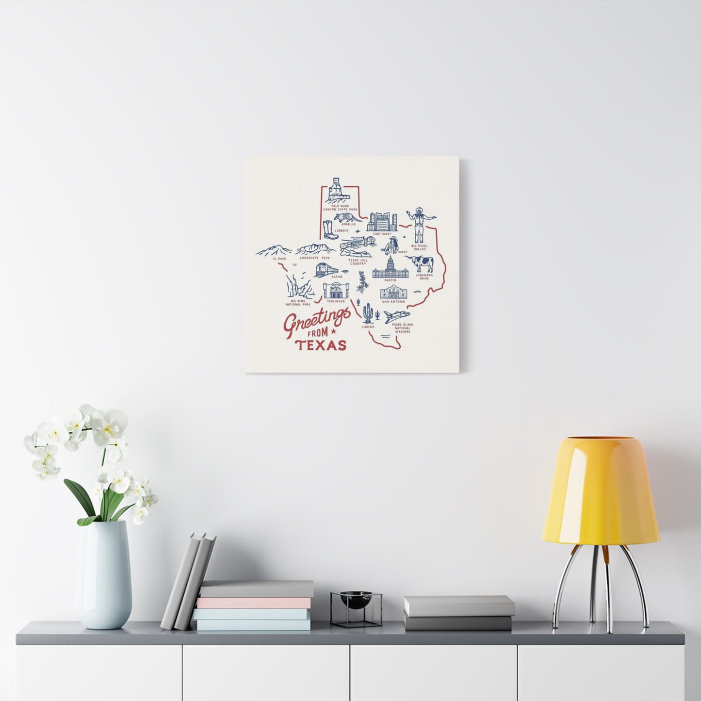
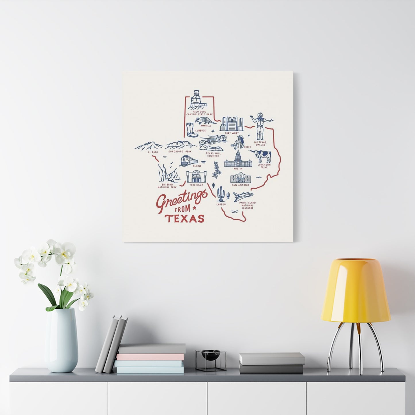
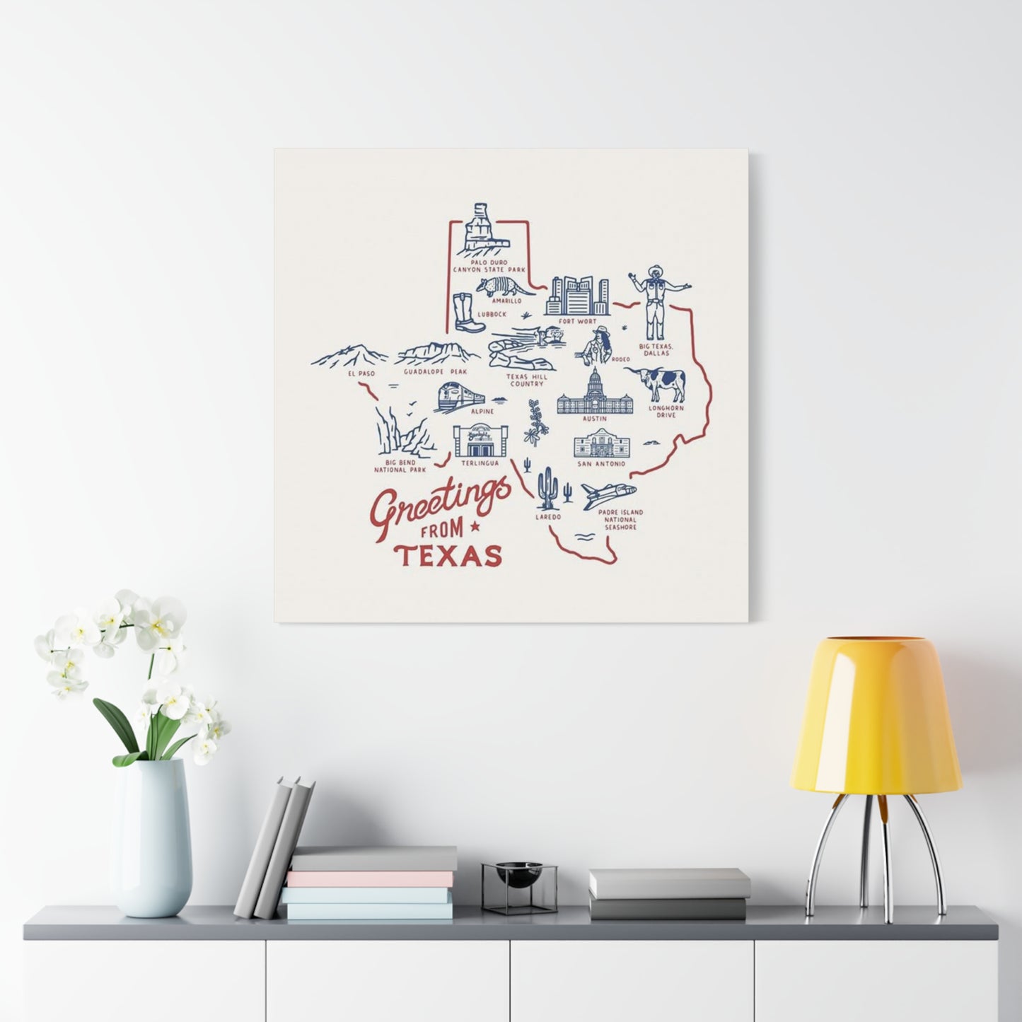
Living rooms offer prime opportunities for displaying significant artwork pieces. As gathering spaces where families congregate and guests are entertained, these rooms benefit from conversation-starting pieces that reflect homeowner personality. Consider positioning your poster above a sofa, fireplace mantel, or console table—locations that naturally draw the eye and provide appropriate visual anchoring. The scale of living room walls often accommodates larger pieces or multiple coordinated prints arranged as a cohesive display.
Dining areas present another excellent venue for regional artwork. The walls surrounding your eating space set the tone for meals and gatherings, making them ideal for pieces that spark conversation and create welcoming atmosphere. A well-chosen print positioned where diners can appreciate it throughout meals becomes part of the dining experience itself. Consider the sight lines from various seating positions to ensure maximum visibility and impact.
Home offices and study spaces benefit from artwork that provides visual interest without distraction. Regional pieces celebrating places you love can offer momentary mental escape during work sessions while reinforcing positive associations and personal identity. Position your poster where you can easily view it during breaks, perhaps on a wall facing your desk or in a corner that catches your eye when you look up from your computer screen.
Bedrooms represent highly personal spaces where artwork choices can be more intimate and reflective. Regional pieces in sleeping quarters might commemorate places with special meaning—perhaps where you grew up, where you met your partner, or where you experienced transformative moments. The bedroom's private nature allows for selections based purely on personal resonance rather than broader appeal, making it perfect for pieces with deep individual significance.
Hallways and stairways, often overlooked in decorating schemes, provide excellent opportunities for creating gallery-like displays. These transitional spaces benefit from visual interest that makes movement through your home more engaging. A series of related prints arranged along a hallway or ascending a staircase creates narrative flow and architectural interest. The contained nature of these spaces allows for bolder color choices and more dramatic presentations than might work in larger, more complex rooms.
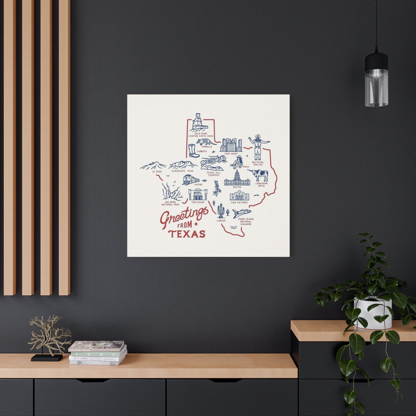
Entryways and foyers make powerful first impressions, introducing your home's character immediately upon arrival. A striking piece positioned in this location announces your personality and sets expectations for what visitors will encounter throughout your space. Choose something that welcomes guests while authentically representing your identity—your Greeting From Texas Poster Wall Art can serve this function beautifully, especially if regional pride forms an important part of your self-concept.
Kitchen spaces increasingly feature artwork as homeowners recognize these rooms as more than purely functional areas. The walls surrounding cooking and gathering spaces can accommodate themed pieces that enhance the room's personality. Consider areas above cabinets, on walls adjacent to eating nooks, or in sight lines from work zones where you'll appreciate visual interest during meal preparation.
Mastering Framing Choices That Enhance Without Overwhelming Your Artwork
Framing decisions significantly impact how artwork appears and how well it integrates with surrounding décor. The frame serves multiple purposes: protecting the piece, providing physical boundary, and contributing its own aesthetic qualities to the overall presentation. Understanding framing options and their effects empowers you to make choices that elevate your artwork while maintaining cohesive visual harmony.
Traditional wood frames offer warmth and versatility, available in countless finishes, stains, and profiles. Light woods like oak, maple, or ash create casual, approachable presentations that work well with farmhouse, rustic, and Scandinavian-inspired interiors. Medium-tone woods such as walnut or cherry provide classic elegance suitable for traditional and transitional spaces. Dark woods including mahogany or ebony create formal, sophisticated presentations that command attention and anchor surrounding elements.
The profile or molding style of wooden frames ranges from simple, flat designs to ornate, carved patterns. Narrow profiles maintain focus on the artwork itself, creating minimal visual interruption between piece and wall. Wider, more elaborate frames make stronger statements, adding their own decorative elements to the overall presentation. Consider the complexity of your chosen artwork when selecting profile—busier, more detailed pieces often benefit from simpler frames, while minimalist artwork can handle more ornate framing.
Metal frames provide contemporary edge and work exceptionally well with modern, industrial, and minimalist aesthetics. Aluminum and steel frames offer clean lines and come in various finishes including brushed, polished, matte black, and metallic colors. These frames typically feature narrow profiles that create crisp boundaries without adding visual weight. Their sleek appearance complements bold graphic designs and works particularly well with artwork featuring strong geometric elements.
Floating frames create the illusion that artwork hovers within the frame, with visible space between the piece and the frame edge. This presentation style adds dimension and contemporary flair while drawing attention to the artwork itself. Floating frames work beautifully with canvas prints and heavier paper stocks, creating gallery-quality presentations that elevate the perceived value of your piece.
Gallery-style frames with wide mats provide museum-quality presentation that emphasizes the artwork's importance. The mat—typically white, cream, or a carefully chosen complementary color—creates breathing room around the image, focusing viewer attention and preventing visual crowding. This approach works exceptionally well with smaller prints, allowing them to command wall space appropriate for larger pieces. Multiple mat layers can add additional depth and sophistication.
Frameless presentations offer ultra-modern alternatives where artwork mounts directly to backing boards or substrates without traditional frames. This approach creates seamless, contemporary displays that work particularly well with large-scale pieces and in spaces where minimal visual interruption is desired. Various hanging systems allow frameless pieces to appear to float off the wall, adding dimensional interest.
Color coordination between frame and artwork requires careful consideration. Neutral frames—black, white, natural wood, or metallic—offer safe choices that rarely clash with artwork or surrounding décor. However, carefully selected colored frames can create striking effects by pulling accent colors from the artwork or providing intentional contrast. When selecting your frame for your Greeting From Texas Poster Wall Art, examine the dominant and accent colors within the piece, considering how various frame options interact with these hues.
Custom framing, while more expensive than ready-made options, provides ultimate control over every element of presentation. Professional framers can guide you through choices about frame style, mat colors, glazing options, and mounting methods, ensuring your piece receives treatment that maximizes its impact and longevity. For particularly meaningful or valuable artwork, custom framing represents worthwhile investment that significantly enhances the final result.
Creating Harmonious Color Schemes That Complement Your Regional Artwork
Color relationships between artwork and surrounding environment dramatically affect overall aesthetic success. A thoughtfully coordinated palette creates visual flow, while clashing colors produce jarring discord. Understanding color theory basics and applying these principles to your space ensures your Greeting From Texas Poster Wall Art enhances rather than conflicts with existing décor.
Analogous color schemes use hues adjacent on the color wheel, creating harmonious, related palettes. If your artwork features warm tones—oranges, reds, yellows—surrounding elements in similar warm families will produce cohesive, unified effects. This approach works well for creating enveloping, comfortable spaces with gentle visual flow. The subtlety of analogous schemes suits rooms where you want artwork to integrate smoothly rather than create dramatic contrast.
Complementary color schemes employ opposites on the color wheel—blue and orange, red and green, yellow and purple—creating vibrant, energetic spaces. When your artwork contains strong complementary relationships, repeating these contrasts throughout the room amplifies the dynamic quality. This approach suits personalities who appreciate bold statements and spaces designed for activity and energy rather than quiet relaxation.
Monochromatic schemes use various tints, tones, and shades of a single color, creating sophisticated, cohesive environments. If your chosen artwork prominently features a particular hue, building the room's palette around variations of that color produces elegant, unified results. This approach allows artwork to shine as the most complex and interesting element while maintaining strong visual connection to its surroundings.
Triadic color schemes use three colors equally spaced around the color wheel, creating balanced yet vibrant palettes. This approach works particularly well when your artwork incorporates multiple distinct colors, allowing you to pull various hues into surrounding décor elements. The resulting complexity creates visual interest while maintaining overall harmony through the balanced color relationships.
Neutral backgrounds provide versatile foundations that accommodate virtually any artwork palette. White, cream, gray, beige, and taupe walls allow colorful pieces to command full attention without competition from surrounding surfaces. This approach offers maximum flexibility for changing artwork or updating décor elements without requiring complete color scheme overhauls. Neutral environments also create gallery-like presentations that emphasize the artwork itself.
Accent walls in colors pulled from your artwork create intentional visual connections between piece and environment. Painting the wall behind your poster in a hue drawn from the image establishes immediate relationship and can make the artwork appear more integrated and intentional. This technique works particularly well with colors that appear as smaller elements within the artwork, amplifying their presence and creating satisfying echoes throughout the space.
Textile choices—curtains, throw pillows, rugs, upholstery—offer flexible opportunities for color coordination. Selecting fabrics that incorporate colors from your artwork creates visual bridges between the piece and three-dimensional elements. This approach allows you to strengthen color relationships without permanent commitments like paint, making it ideal for renters or those who frequently update their décor.
Metallic accents—gold, silver, copper, bronze—can enhance artwork without competing coloristically. These reflective elements add dimension and luxury while remaining neutral enough to work with virtually any color scheme. Consider incorporating metallics through frames, decorative objects, lighting fixtures, or furniture hardware to create subtle visual richness that complements rather than overwhelms your poster.
When working with your Greeting From Texas Poster Wall Art, identify the dominant colors and consider how you might echo these throughout your space. Even small touches—a throw pillow in the same shade of blue, a vase in a complementary rust tone—create satisfying visual connections that make your room feel intentionally designed rather than randomly assembled.
Building Cohesive Gallery Wall Arrangements That Tell Visual Stories
Gallery walls offer creative opportunities to showcase multiple pieces in coordinated displays that feel curated and intentional. These arrangements allow you to incorporate your regional poster alongside complementary pieces, creating visual narratives that reflect complex identities and interests. Successful gallery walls require planning, but the results transform blank walls into compelling focal points.
Symmetrical arrangements create formal, balanced presentations with pieces arranged in regular patterns. Grid layouts—with prints in identical frames and equal spacing—produce clean, organized effects suitable for modern and transitional spaces. This approach works particularly well when displaying a collection of related prints, perhaps multiple regional posters or a series exploring similar themes. The predictability of symmetrical arrangements creates visual calm and emphasizes the individual pieces rather than the arrangement itself.
Asymmetrical arrangements embrace organic, less predictable layouts that feel more casual and dynamic. These displays might feature pieces of varying sizes in different frame styles, arranged to create visual balance without formal symmetry. Asymmetrical gallery walls suit eclectic, bohemian, and casual spaces where relaxed personality matters more than formal presentation. This approach allows for greater flexibility in incorporating diverse pieces and can grow organically as you add to your collection.
Salon-style arrangements densely pack walls with artwork, creating immersive, museum-like presentations. This approach works beautifully for serious collectors or those who want to make bold statements with their walls. Pieces might vary significantly in size, style, and framing, unified by overall arrangement and possibly by a connecting theme or color palette. Salon walls suit dramatic personalities and spaces where visual abundance creates desired atmosphere.
Linear arrangements position pieces in horizontal or vertical lines, creating clean, contemporary presentations. A horizontal line of similarly sized pieces stretches across a wall, creating visual width and emphasizing horizontal architectural elements. Vertical arrangements draw the eye upward, making ceilings feel higher and rooms more spacious. This approach works well in hallways, stairways, and narrow wall spaces where horizontal or vertical emphasis serves architectural goals.
Clustered arrangements group pieces closely together, treating the collection as a single large-scale element. This approach works particularly well above furniture pieces like sofas, beds, or consoles, where the grouped artwork visually anchors the furniture below. Tight clustering creates impact through unity, making even smaller individual pieces feel substantial and significant.
When incorporating your Greeting From Texas Poster Wall Art into a gallery wall, consider what other pieces might complement and enhance its message. Vintage photographs from regional travels, maps highlighting significant locations, other state-themed artwork, nature prints featuring native landscapes, or personal memorabilia all potentially work depending on the specific narrative you want to create. The goal is building a cohesive story that feels personally meaningful while maintaining visual harmony.
Before committing to wall holes, plan your arrangement on the floor or create paper templates representing each piece's size and shape. Tape these templates to the wall, experimenting with various configurations until you achieve satisfying balance and flow. This planning prevents frustration and excess wall damage from repositioning actual artwork multiple times. Photograph various arrangements to compare options before making final decisions.
Spacing between pieces significantly affects overall impression. Closer spacing—two to three inches—creates unified, cohesive gallery walls where the arrangement reads as a single element. Wider spacing—four to six inches or more—emphasizes individual pieces, allowing each work to maintain distinct identity while participating in the larger grouping. Consider the room's scale and the effect you want to achieve when determining appropriate spacing.
Hanging height affects how viewers engage with gallery walls. Center points at eye level—typically 57 to 60 inches from the floor—create comfortable viewing experiences. For arrangements with multiple pieces, consider the center point of the entire grouping rather than individual elements. This ensures the arrangement as a whole occupies the visually optimal zone even if some individual pieces hang higher or lower.
Incorporating Regional Décor Elements That Reinforce Thematic Connections
Building layered, cohesive environments requires coordinating various décor elements that reinforce your chosen themes. When your focal point is regional artwork, incorporating complementary objects, textiles, and furnishings creates immersive spaces that feel authentically connected to the celebrated location. These additional elements strengthen the visual narrative while adding dimension and interest.
Textile patterns reflecting regional characteristics create immediate thematic connections. Geometric patterns inspired by native traditions, prints featuring regional flora or fauna, or fabrics in colors associated with the landscape all reinforce sense of place. Incorporate these through throw pillows, area rugs, curtains, or upholstered furniture. The layered effect of multiple textile elements creates richness and depth while strengthening the overall theme.
Natural materials evoke outdoor environments and create organic warmth that complements nature-inspired artwork. Wood furniture in various finishes, stone or ceramic accessories, leather upholstery, and woven baskets all contribute earthy, grounded qualities. These materials work particularly well with regional themes tied to landscapes and natural environments, creating sensory experiences that extend beyond the visual into the tactile realm.
Collections of objects related to your chosen region—whether acquired through personal travels or carefully curated purchases—add personal dimension and authenticity. Vintage souvenirs, artisan-made crafts, natural specimens like preserved plants or minerals, or books about the region all potentially enhance your thematic presentation. Display these collections on shelves, in cabinets, or grouped on tables where they contribute to the overall narrative.
Architectural elements, when possible to incorporate, dramatically enhance thematic environments. Exposed beams, stone or brick accent walls, specific window treatments, or architectural salvage pieces all potentially reinforce regional connections. While these elements require more significant commitment than easily changed accessories, they create foundational character that grounds all other decorating choices.
Lighting fixtures contribute both functional illumination and decorative personality. Fixtures crafted from materials associated with your region, in styles characteristic of local architectural traditions, or featuring motifs drawn from regional themes all strengthen the overall presentation. Consider both overhead lighting and accent fixtures like table lamps or sconces as opportunities for thematic reinforcement.
Furniture styles reflecting regional aesthetics create cohesive environments where every element supports the overall vision. Ranch-style furnishings, pieces crafted from native woods, furniture featuring specific regional influences in construction or decoration—all contribute to immersive thematic spaces. When selecting major furniture pieces, consider how well they harmonize with your regional artwork and overall decorating direction.
Plant selections inspired by native species bring literal pieces of the region into your home. Even if you can't grow outdoor natives in your climate, many houseplants echo the forms and textures of regionally significant vegetation. Cacti and succulents, specific flowering plants, or even artistic arrangements suggesting native landscapes all reinforce botanical connections. Living plants add dimension and sensory richness—color, texture, subtle scent—that static décor cannot provide.
Personal photographs from visits or time spent in the region create intimate connections between the artwork and your lived experience. Displaying family photos taken against recognizable backdrops, travel snapshots capturing significant moments, or documentary images exploring the region's character personalizes the thematic presentation. These images transform abstract regional appreciation into concrete personal narrative.
When building these layered environments around your Greeting From Texas Poster Wall Art, aim for balance between thematic coherence and restraint. Over-theming can feel heavy-handed and cartoonish, while subtle incorporation of complementary elements creates sophisticated spaces that feel authentic rather than forced. Let your artwork serve as the anchor, with supporting elements enhancing rather than overwhelming its message.
Understanding Material Quality and Printing Processes for Lasting Artwork
The physical characteristics of your chosen artwork significantly affect both immediate appearance and long-term durability. Understanding various substrates, printing methods, and quality indicators empowers you to make informed selections that balance aesthetic preferences, budgetary constraints, and preservation priorities. Investing in quality materials ensures your piece remains beautiful for years or even decades.
Paper quality varies tremendously, affecting everything from color reproduction to longevity. Archival-quality papers manufactured from acid-free materials resist yellowing and degradation, maintaining their appearance far longer than standard papers. Heavyweight papers—typically 200 GSM or higher—feel substantial and resist warping or damage from handling. Textured papers add dimensional quality and can enhance certain artistic styles, while smooth papers provide crisp detail reproduction.
Printing methods dramatically influence final appearance and durability. Giclée printing, using archival inks and sophisticated inkjet technology, produces museum-quality reproductions with exceptional color accuracy and detail. These prints resist fading and maintain vibrancy for decades when properly displayed and cared for. Offset lithography, a traditional commercial printing method, produces excellent results for larger runs at lower per-unit costs. Digital printing technologies continue improving, offering increasingly high-quality results at accessible price points.
Ink types affect both immediate color quality and long-term stability. Pigment-based inks offer superior lightfastness and longevity compared to dye-based alternatives, resisting fading even with prolonged light exposure. UV-resistant inks provide additional protection in bright environments. When evaluating artwork, inquire about ink types and expected lifespan—quality producers readily provide this information and often offer guarantees about color stability.
Canvas prints offer texture and presence that paper cannot match. Gallery-wrapped canvases, where the printed material extends around frame edges, create finished presentations that don't require additional framing. Canvas suits larger-scale pieces and creates substantial visual weight. The material choice works particularly well with painterly or illustrative artwork styles where texture enhances the overall effect.
Metal prints represent contemporary alternatives that produce luminous, high-impact presentations. The printing process infuses dyes into specially coated aluminum, creating water-resistant, durable pieces with remarkable color depth and vibrancy. Metal prints suit modern aesthetics and work particularly well with photography and graphic designs. The material's durability makes it excellent for high-traffic areas or spaces with humidity concerns.
Acrylic and glass presentations create depth and luxury through layering. Face-mounting artwork behind clear acrylic or glass produces sophisticated, gallery-quality presentations with exceptional color saturation and dimensional quality. These presentations command attention and elevate perceived value, making them suitable for focal point placements and formal environments. The protective layers also shield artwork from environmental damage.
Wood-mounted prints offer rustic charm and contemporary edge simultaneously. Printing directly onto prepared wood surfaces or mounting prints to wood substrates creates unique textural presentations where the wood grain contributes to the overall aesthetic. This approach particularly suits casual, natural, or industrial-inspired spaces and works beautifully with certain artistic styles.
When selecting your Greeting From Texas Poster Wall Art, consider where the piece will hang and how much light exposure it will receive. Pieces in direct sunlight require maximum fade resistance, potentially justifying investment in premium materials and protective glazing. Pieces in controlled lighting conditions can use somewhat less robust materials without significant longevity concerns. Balance quality considerations with your budget, recognizing that spending more upfront often provides better value through enhanced durability and sustained appearance.
Implementing Proper Care Procedures That Preserve Artwork Indefinitely
Even high-quality artwork requires appropriate care to maintain its appearance over time. Understanding preservation principles and implementing protective measures ensures your piece remains beautiful for years or potentially generations. Most preservation strategies require minimal effort but produce significant long-term benefits.
Light exposure represents the primary threat to artwork longevity. Ultraviolet radiation causes fading, discoloration, and material degradation. Position artwork away from direct sunlight whenever possible, particularly avoiding walls where sun streams through windows for extended periods. If prime display locations receive significant natural light, consider UV-filtering window films or specialized glazing for framed pieces. These protective measures block harmful radiation while maintaining visible light transmission and view quality.
Artificial lighting requires consideration as well. Incandescent and LED bulbs produce less UV radiation than fluorescent lighting, making them preferable for illuminating artwork. Position lights to minimize direct heat exposure, which can accelerate deterioration. Specialized picture lights with UV-filtering capabilities offer optimal solutions for important pieces requiring dedicated illumination.
Humidity fluctuations cause paper to expand and contract, potentially leading to warping, buckling, or damage to mounting materials. Maintain relatively stable humidity levels—ideally between 40 and 60 percent—through climate control or dehumidifiers/humidifiers as needed. Avoid hanging artwork in bathrooms, kitchens, or other high-humidity environments unless using water-resistant materials like metal or properly sealed canvas.
Temperature extremes and fluctuations similarly stress artwork materials. Maintain moderate, stable temperatures, avoiding locations near heating vents, fireplaces, or air conditioning units where temperature varies dramatically. Consistent environmental conditions preserve both the artwork itself and any adhesives or mounting materials.
Dust accumulation diminishes appearance and can cause long-term damage as particles become embedded in surfaces or react chemically with materials. Regular, gentle dusting using soft, clean cloths or specialized art-cleaning tools removes surface contamination. For framed pieces, clean the glass or acrylic glazing using appropriate cleaners—avoid spraying directly on the frame, instead applying cleaner to your cloth. Never use harsh chemicals or abrasive materials that might scratch or damage surfaces.
Proper mounting and hanging prevent physical damage. Use appropriate hardware rated for your piece's weight, ensuring secure attachment to wall studs or using suitable wall anchors for hollow walls. Level hanging prevents stress on frame corners and creates professional appearance. Periodically check hanging hardware for security, particularly for heavier pieces or in high-traffic areas where accidental bumps might occur.
Handling artwork properly prevents damage during cleaning, moving, or rehang. Always handle framed pieces by the frame rather than touching glazing or exposed artwork. Support large or heavy pieces with both hands, distributing weight evenly. When transporting artwork, protect it with appropriate wrapping materials and avoid flexing or bending.
For unframed pieces or those with exposed artwork edges, acidic mats and backing boards cause discoloration and deterioration over time. Use only archival, acid-free materials for mounting and matting. If you're uncertain about existing materials, consider having pieces professionally reframed with archival materials—the investment protects your artwork and can dramatically improve appearance.
Glazing protections vary in quality and effectiveness. Standard glass provides basic protection from dust and physical contact but offers minimal UV filtering. UV-filtering glass or acrylic blocks harmful radiation while maintaining clarity. Museum glass combines UV protection with anti-reflective coatings that virtually eliminate glare, creating optimal viewing experiences. Select glazing appropriate for your piece's value and display conditions.
Periodic inspection allows early detection of deterioration signs. Examine your Greeting From Texas Poster Wall Art several times yearly, looking for fading, discoloration, warping, or other changes. Address problems promptly—often simple interventions like relocating artwork or adjusting environmental conditions prevent significant damage. For valuable or sentimentally important pieces showing deterioration, consult professional conservators who can assess conditions and recommend appropriate treatments.
Exploring Creative Styling Approaches That Showcase Individual Personality
Beyond basic display considerations, creative styling transforms artwork from simple decoration into expression of individual identity and aesthetic sensibility. These approaches push beyond conventional presentations, creating memorable environments that reflect unique personalities and perspectives. Experimenting with unconventional methods can yield surprising and delightful results.
Layered arrangements create depth and visual interest by overlapping elements rather than maintaining strict separation. Position your poster behind or in front of other objects—perhaps leaning it against the wall on a mantel or shelf where it overlaps with three-dimensional objects. This casual, collected approach suits eclectic and bohemian aesthetics, creating spaces that feel personally curated rather than professionally staged.
Unexpected locations surprise and delight by placing artwork where viewers don't anticipate finding it. Consider positioning pieces inside bookcases among books and objects, on cabinet doors, within window frames, or on ceilings. These unconventional placements create discovery moments and demonstrate confidence in defying conventional decorating rules. Such approaches work particularly well for playful personalities or in spaces designed to entertain and engage.
Seasonal rotations keep environments fresh and dynamic. Rather than displaying the same artwork year-round, rotate pieces seasonally or whenever you crave change. This approach allows you to maintain larger collections than wall space would otherwise accommodate while preventing visual stagnation. Store rotated pieces carefully in acid-free sleeves or portfolios in climate-controlled locations, ensuring they remain pristine for future display.
Thematic groupings beyond gallery walls create focused collections around specific ideas or subjects. Dedicate entire walls or rooms to particular themes, creating immersive environments that fully explore specific interests. Your regional poster might anchor a larger collection exploring various aspects of the area—history, nature, culture, personal experiences—creating comprehensive visual essays that reward extended contemplation.
Mixing mediums creates dynamic, textured presentations that engage multiple senses. Combine your two-dimensional artwork with sculptural elements, textile pieces, mirrors, or lighting features to create complex, layered installations. The interplay between flat and dimensional, rigid and flexible, light and shadow produces richness that purely two-dimensional displays cannot achieve.
Color blocking uses paint or wallpaper to create geometric backgrounds that frame and emphasize artwork. Paint rectangles, circles, or organic shapes in colors complementing or contrasting with your piece, positioning the artwork within or overlapping these painted areas. This approach creates architectural interest and draws attention to specific pieces, making them feel important and intentional.
Oversized matting or floating mounts create breathing room and emphasis around smaller pieces, allowing them to command more wall space than their physical dimensions might suggest. This gallery technique acknowledges that negative space contributes as significantly as the artwork itself, creating balanced, sophisticated presentations that feel thoughtfully composed.
Lighting integration goes beyond simply illuminating artwork to make light itself part of the presentation. Backlighting, uplighting, or colored lighting creates dramatic effects that transform how artwork appears and how viewers experience it. Programmable lighting systems allow you to change the mood and appearance throughout the day or for different occasions, adding flexibility and performance quality to your displays.
Interactive elements invite engagement beyond passive viewing. Position artwork where viewers can easily approach and examine details, perhaps including related objects they can handle or information cards providing context and stories. This approach particularly suits homes with children, transforming artwork into learning opportunities and conversation starters.
Documentation through photographs or journaling creates records of your evolving styling choices and helps you understand which approaches succeed and why. Photograph your spaces after completing arrangements, noting what works and what doesn't. Over time, these records reveal patterns in your preferences and can inspire future creative directions.
When styling your Greeting From Texas Poster Wall Art, trust your instincts and don't fear experimentation. The worst consequence of trying unconventional approaches is needing to rehang or rearrange—easily remedied and often providing valuable learning experiences. Homes should reflect the personalities inhabiting them, and creative styling choices make spaces truly yours rather than anonymous or generic.
Conclusion
The marketplace for regional artwork spans numerous venues, each offering distinct advantages and considerations. Understanding where to shop, what to look for, and how to evaluate options ensures you find pieces matching your aesthetic preferences, quality standards, and budget constraints. Informed purchasing leads to greater satisfaction and reduces likelihood of regrets.
Online marketplaces provide vast selection and convenient browsing from home. These platforms connect countless sellers offering everything from mass-produced prints to original artwork, spanning enormous price ranges and styles. The advantages include easy comparison shopping, access to sellers worldwide, and often competitive pricing. Disadvantages include inability to examine pieces physically before purchasing and quality variations between sellers. When shopping online, carefully read descriptions, examine photographs closely, check seller ratings and reviews, and understand return policies before committing.
Artist websites and independent sellers offer opportunities to purchase directly from creators. These sources often provide unique, limited-edition, or completely original works unavailable through mass-market channels. Direct purchasing supports working artists and often allows for customization or commissioned pieces created specifically for your needs. Prices vary based on the artist's reputation and career stage, ranging from very affordable emerging artists to premium pricing for established names.
Specialty retailers focusing on home décor, gifts, or regional merchandise typically curate selections balancing quality, style, and price accessibility. These venues provide edited choices that reflect current trends and popular styles, eliminating the overwhelming selection of broader marketplaces. Shopping specialty retailers often includes customer service support and straightforward return processes. The trade-off is reduced selection and potentially higher prices compared to direct or mass-market sources.
Local art fairs and craft markets provide opportunities to see work in person and meet creators. These venues showcase regional artists and often feature pieces with strong local character and authentic connections to place. Purchasing at art fairs supports local creative communities and allows you to ask questions, request customizations, and develop relationships with artists whose work you admire. Prices at these venues are typically fair and negotiable, particularly late in events when sellers prefer sales to transporting inventory home.
Share