Golden Teal Art Wall Art & Canvas Prints
Golden Teal Art Wall Art & Canvas Prints
Couldn't load pickup availability
Discovering the Captivating World of Golden Teal Art Wall Art: A Journey Through Colors, Creativity, and Home Transformation
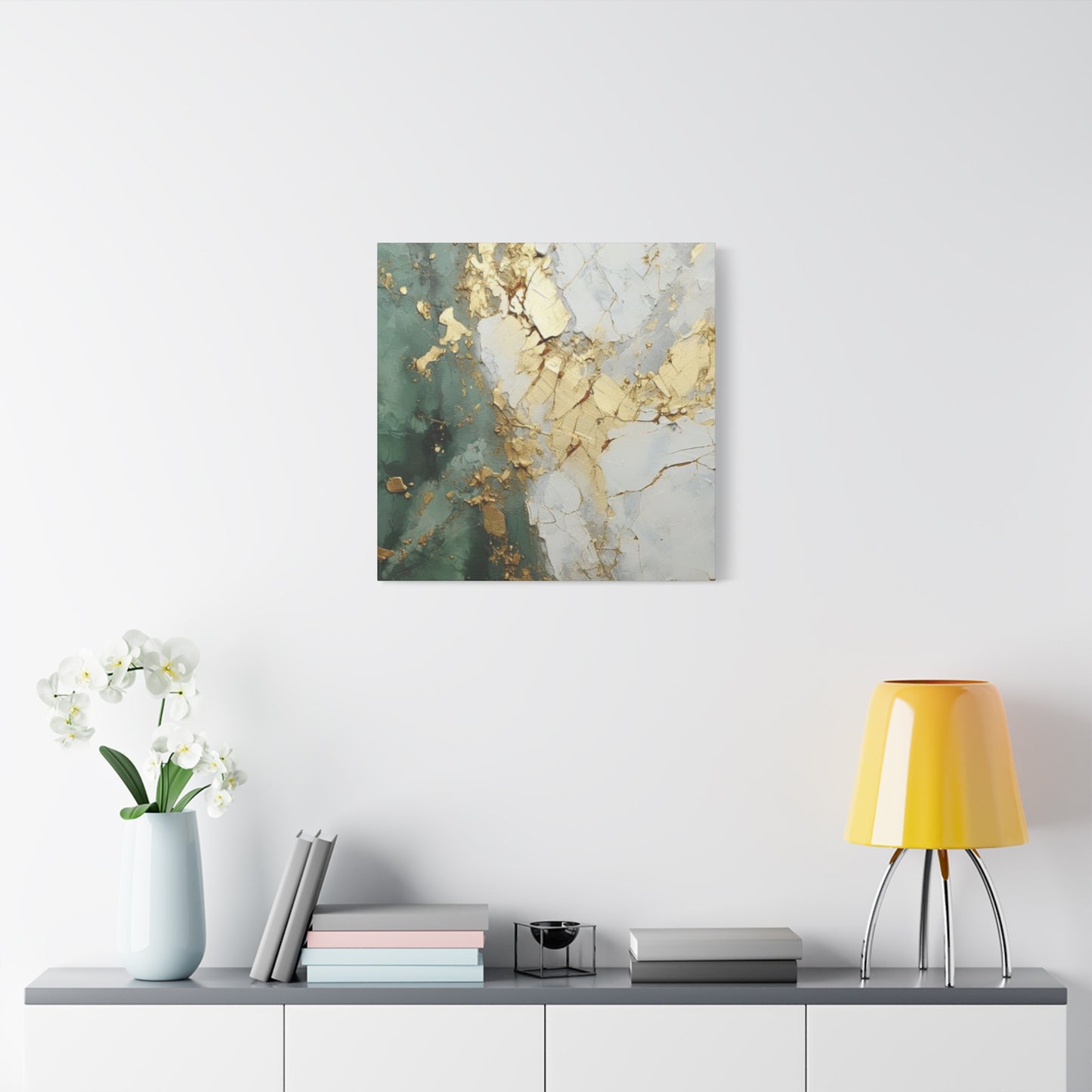
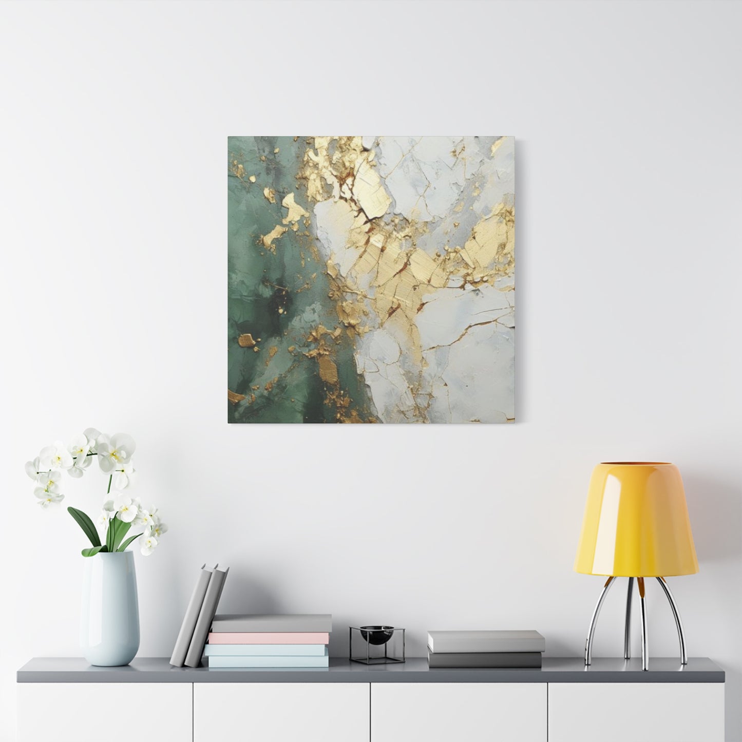
The realm of interior decoration has witnessed a remarkable surge in the popularity of vibrant color combinations that breathe life into living spaces. Among these captivating palettes, the fusion of golden hues with teal tones has emerged as a sophisticated choice for those seeking to elevate their home aesthetics. This magnificent blend represents more than just a decorative trend; it embodies a harmonious marriage between warmth and tranquility, luxury and serenity. When you introduce golden teal art wall art into your dwelling, you're not merely hanging a piece on your walls—you're inviting an entire narrative of elegance, depth, and visual poetry into your everyday environment.
The journey into understanding why this particular color combination resonates so deeply with homeowners, designers, and art enthusiasts requires us to explore the intricate layers of visual perception, emotional response, and spatial dynamics. Throughout this comprehensive exploration, we'll delve into the multifaceted dimensions of incorporating these stunning pieces into various settings, examining everything from the psychological impact of these colors to the practical considerations of placement, maintenance, and styling.
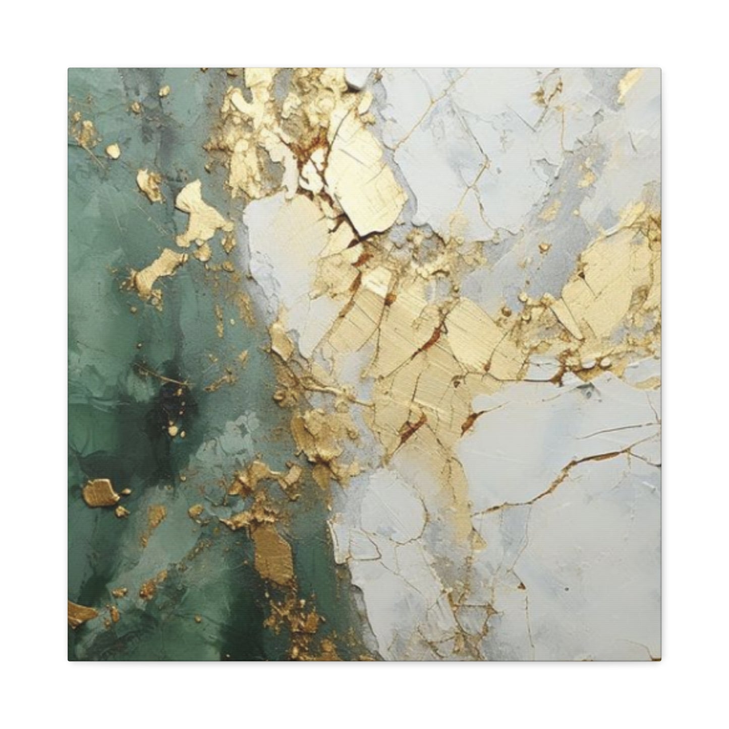
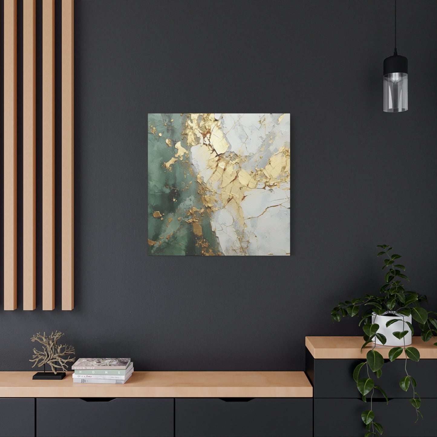
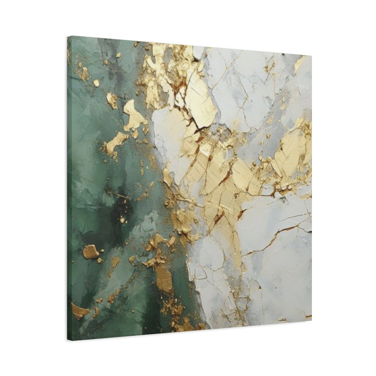
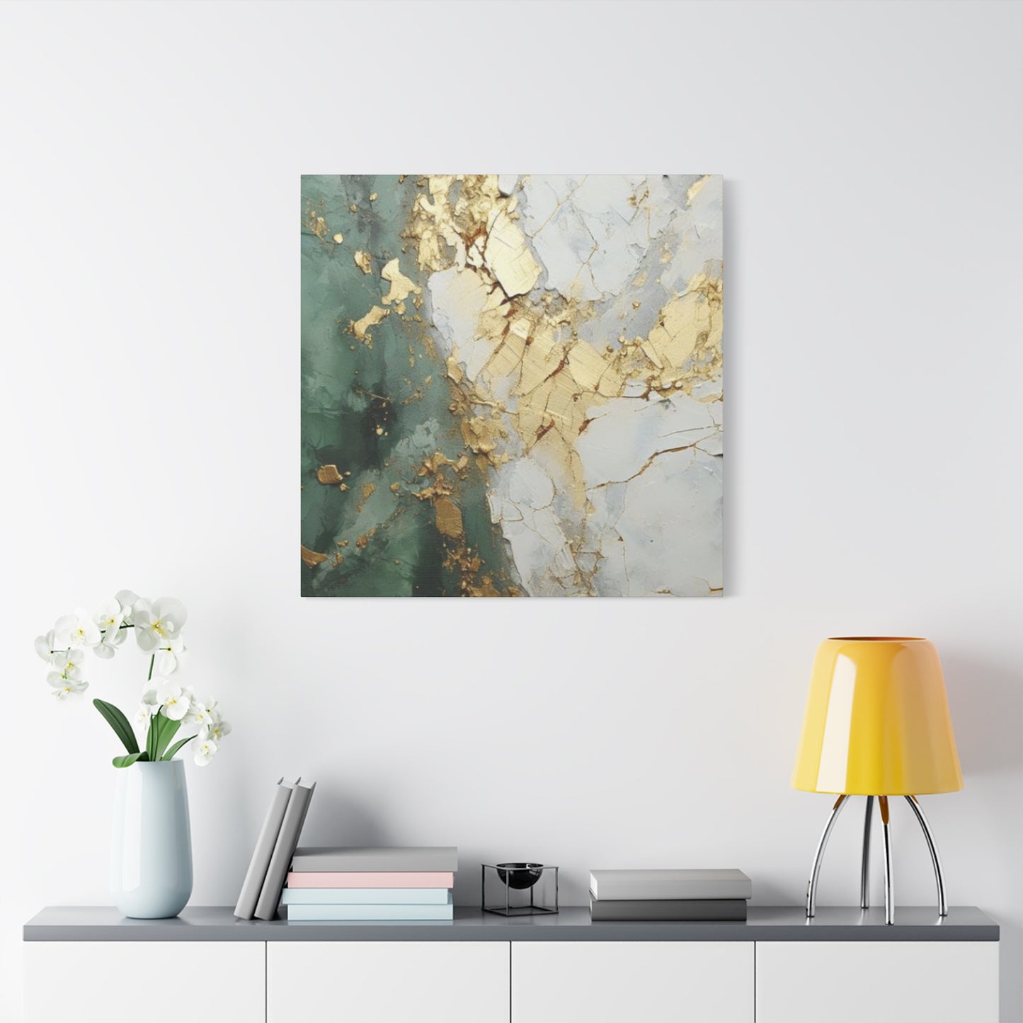
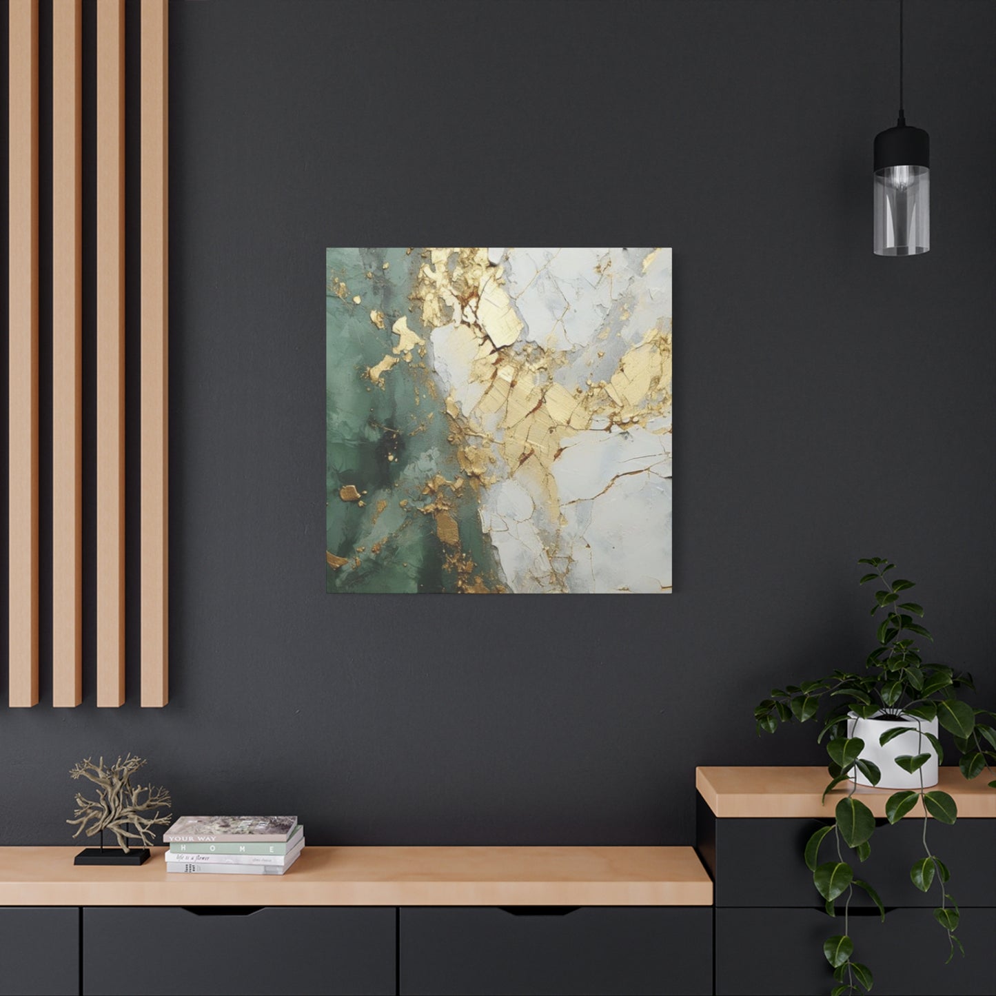
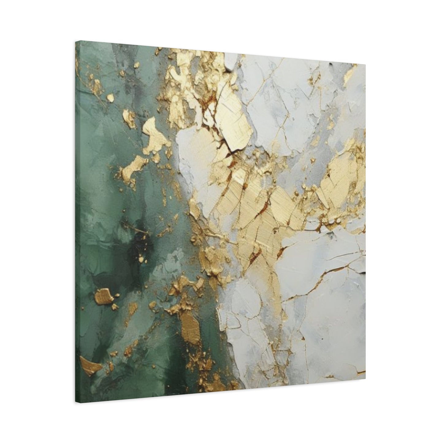
The Mesmerizing Chemistry Between Golden Hues and Teal Tones in Visual Artistry
The relationship between gold and teal represents one of nature's most compelling color dialogues. Golden shades evoke the warmth of sunlight filtering through autumn leaves, the glimmer of precious metals, and the radiance of prosperity and abundance. These warm tones carry an inherent energy that stimulates mental activity and generates feelings of optimism and joy. When you gaze upon golden elements in artwork, your mind subconsciously connects to concepts of value, achievement, and illumination.
Teal, conversely, emerges from the cool spectrum, blending the calming properties of blue with the rejuvenating qualities of green. This color brings to mind serene ocean depths, the tranquility of forest streams, and the refreshing essence of mineral-rich waters. Teal possesses a unique capacity to create visual breathing room within a composition, offering the eye a place to rest while simultaneously maintaining interest through its complex undertones.
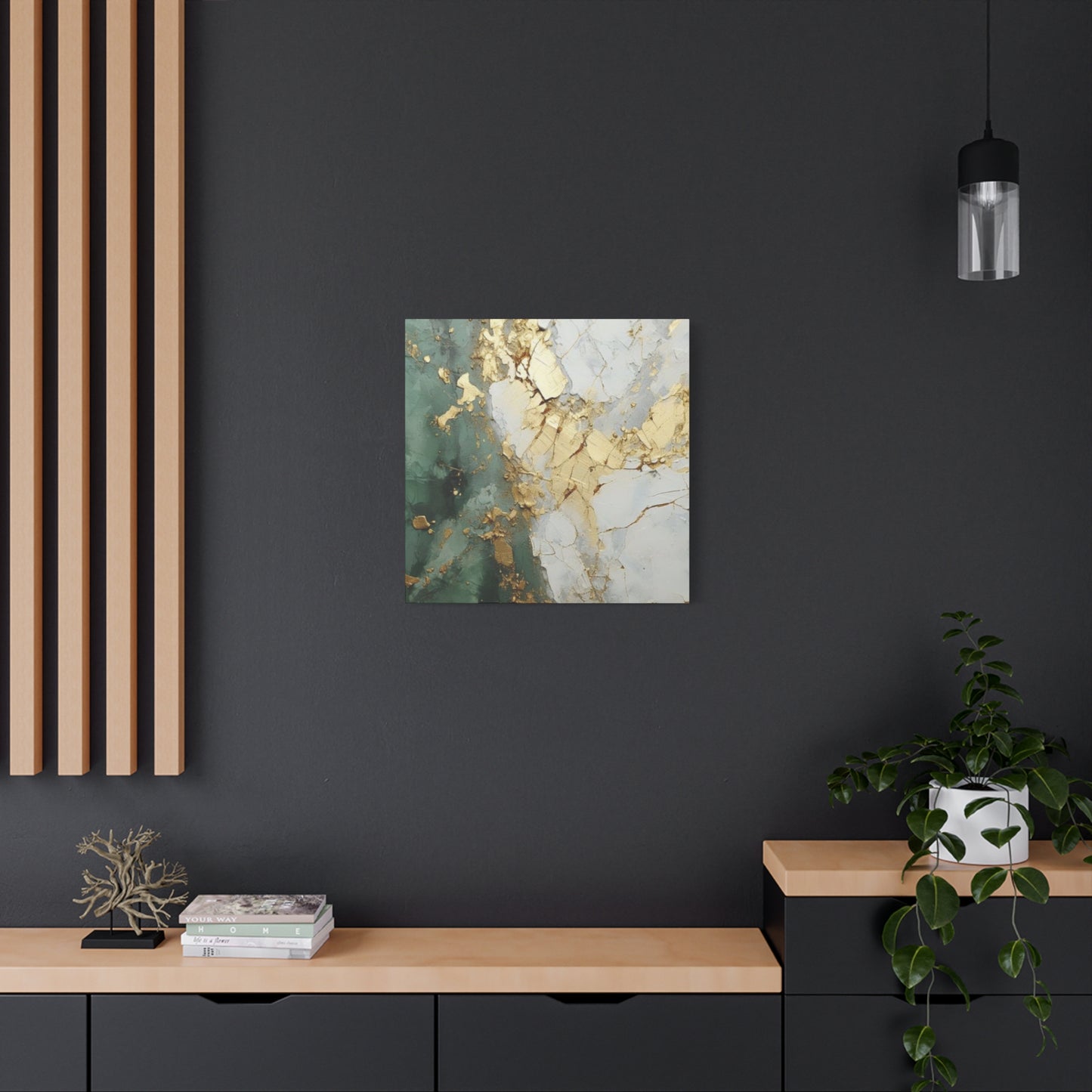
When these two color families converge within golden teal art wall art, they create a dynamic tension that is simultaneously soothing and invigorating. The warmth of gold prevents teal from becoming too cold or distant, while the coolness of teal tempers gold's potential to overwhelm. This balance makes such artwork exceptionally versatile, capable of complementing a wide range of interior design schemes while maintaining its distinctive character.
The interaction between these colors also creates fascinating optical effects. Gold naturally reflects light, creating luminous focal points that draw the eye and make spaces feel more expansive. Teal absorbs certain wavelengths while reflecting others, creating depth and dimension that can make two-dimensional art appear to have sculptural qualities. Together, they establish layers of visual interest that reward extended viewing, revealing new details and relationships each time you encounter the piece.
Exploring the Rich Varieties of Golden Teal Art Wall Art Available for Modern Spaces
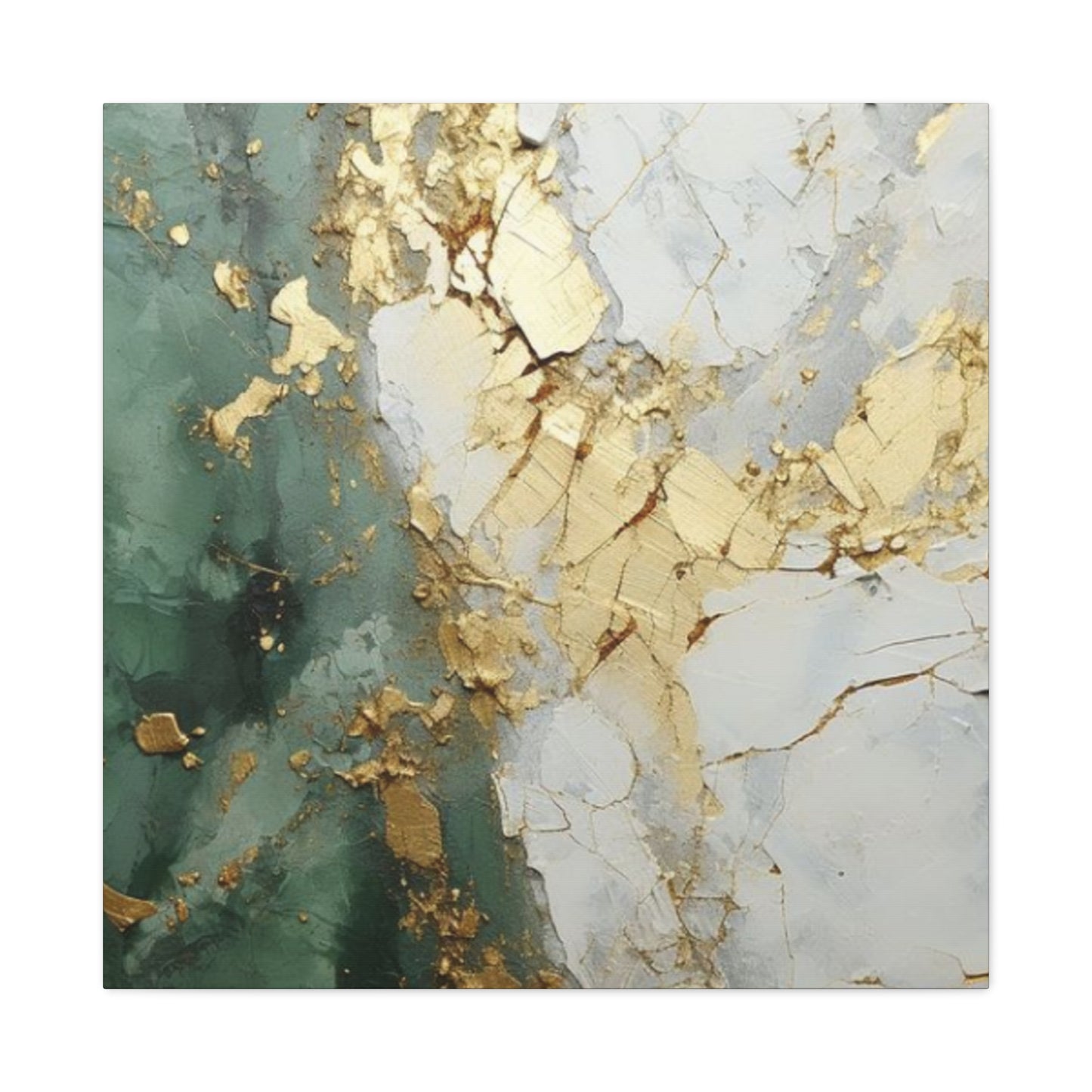
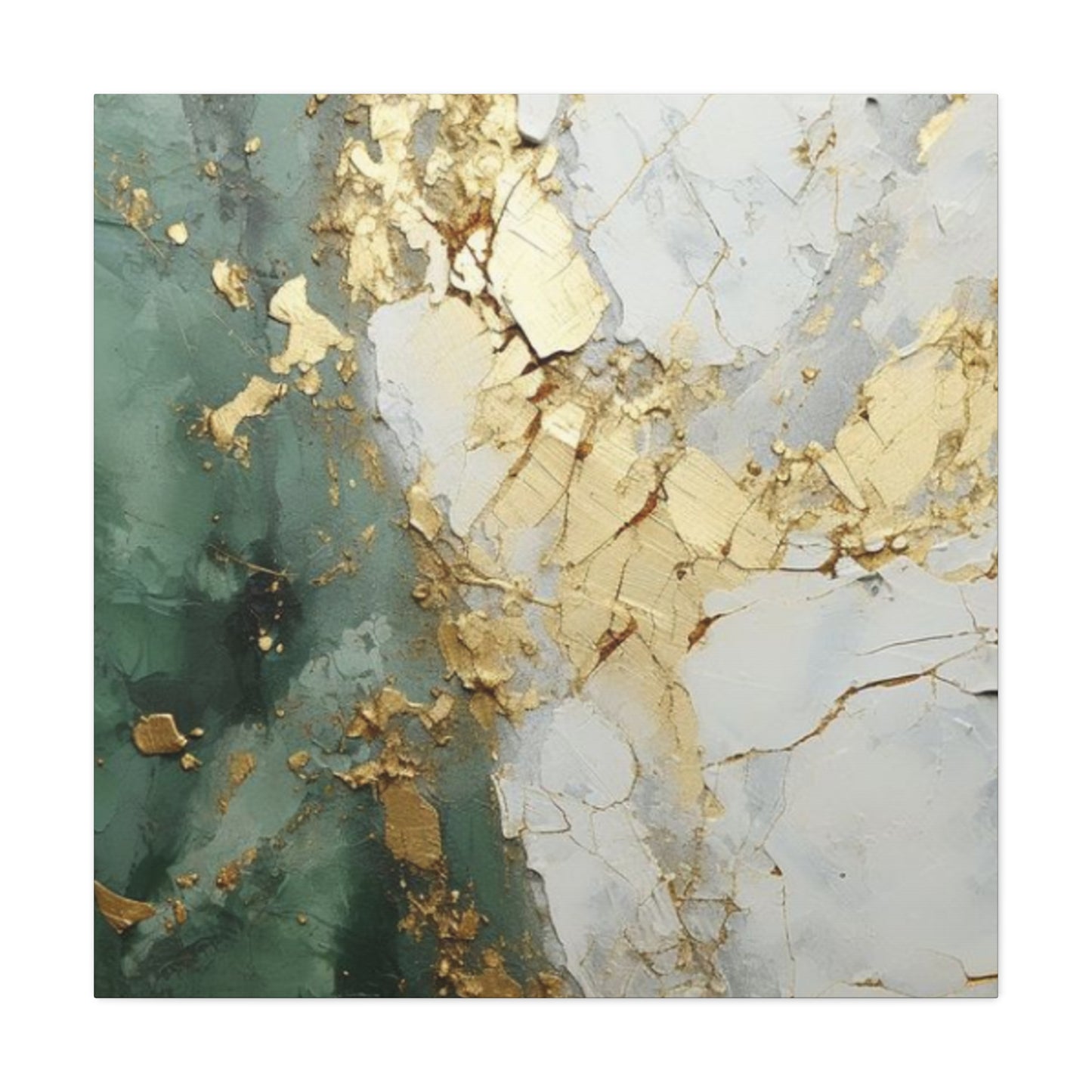
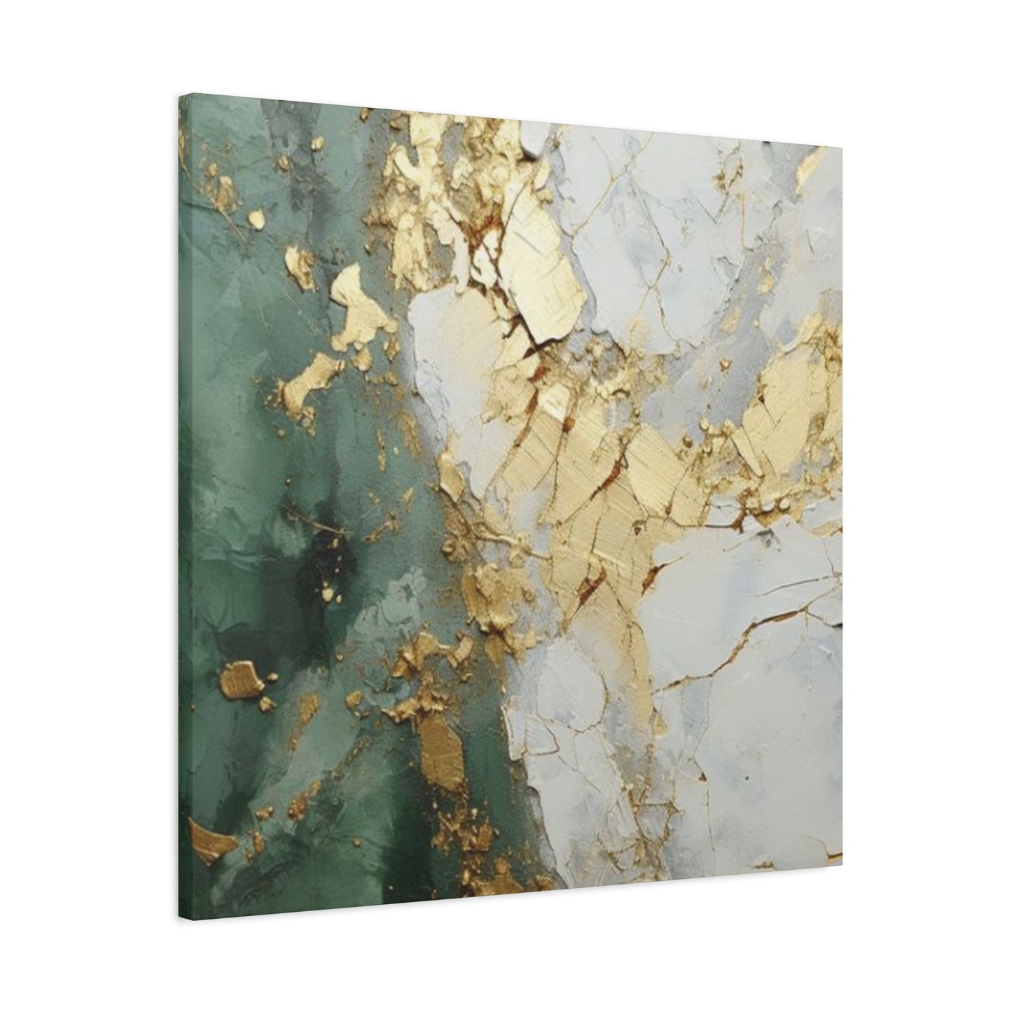
The market for these striking decorative pieces encompasses an impressive diversity of styles, mediums, and formats. Abstract compositions form perhaps the largest category, featuring fluid forms, geometric patterns, or gestural marks that prioritize color relationships and emotional resonance over representational accuracy. These works often employ techniques like pouring, dripping, or palette knife application to create texture and movement that enhance the interplay between golden and teal elements.
Landscape interpretations offer another popular avenue, translating natural scenes through this distinctive color lens. Artists might depict coastal vistas where teal represents water and sky while golden tones illuminate sandy shores or sunset-kissed horizons. Forest scenes gain mysterious qualities when rendered in these hues, with gold suggesting filtered sunlight through canopies while teal conveys the cool shadows of undergrowth. Even urban landscapes take on a dreamlike quality when interpreted through this palette, transforming cityscapes into something both familiar and fantastical.
Botanical subjects provide fertile ground for exploring this color combination. Metallic gold leaf might define delicate veins in oversized leaves while teal backgrounds create striking contrast. Floral compositions benefit from the inherent associations both colors carry—gold suggesting precious beauty and teal evoking natural vitality. These pieces often incorporate multiple layers and mixed media elements, building complexity through the juxtaposition of organic forms with luxurious materials.
Geometric and contemporary minimalist works represent another significant category. These pieces might feature simple shapes—circles, rectangles, or triangles—arranged in thoughtful compositions where the golden teal palette provides all necessary visual interest. Such works appeal to those seeking sophisticated understatement, allowing the inherent drama of the color combination to speak without additional embellishment. The clean lines and uncluttered compositions of these pieces make them particularly suitable for modern architectural environments.
Three-dimensional and mixed-media creations push boundaries by incorporating actual metallic elements, resin applications, or found objects alongside traditional painting techniques. These works create fascinating interplays between matte and glossy surfaces, smooth and textured areas, allowing the golden and teal components to interact in unexpected ways. The dimensional quality of such pieces means they change appearance throughout the day as lighting conditions shift, offering ever-evolving visual experiences.
Understanding How Color Psychology Shapes Your Experience with These Artistic Pieces
The science of color psychology reveals fascinating insights into why golden teal art wall art creates such powerful responses in viewers. Research into human perception demonstrates that colors trigger specific neurological reactions, influencing mood, cognitive function, and even physiological states. When you surround yourself with particular hues, you're essentially creating an environmental influence that subtly shapes your daily experiences.
Golden tones activate areas of the brain associated with reward and pleasure. This warm color family has been shown to increase feelings of happiness, confidence, and mental clarity. In spaces where concentration and positive energy are desired—home offices, creative studios, or dining areas—the presence of gold can enhance productivity and social warmth. The color also carries cultural associations with success and prosperity across numerous societies, adding layers of symbolic meaning that operate below conscious awareness.
Teal occupies a unique position in the color spectrum, combining blue's calming properties with green's associations with growth and renewal. Studies indicate that teal and similar blue-green hues can lower heart rate and blood pressure, creating physiological relaxation. This makes teal elements particularly valuable in spaces dedicated to rest and recuperation, such as bedrooms or meditation areas. The color also promotes clear communication and emotional balance, making it beneficial in family gathering spaces.
The combination of these effects explains why golden teal art wall art proves so effective across various settings. In a bedroom, the piece can simultaneously calm the nervous system through its teal components while providing cheerful energy through golden accents. In a living room, it can create a welcoming atmosphere that feels both relaxing and stimulating, perfect for entertaining guests or enjoying quiet evenings. The psychological versatility of this palette makes it adaptable to shifting moods and purposes throughout your home.
Beyond individual color effects, the contrast between warm and cool tones creates perceptual dynamism that keeps the mind engaged. Unlike monochromatic schemes that can become visually monotonous, the golden-teal combination provides enough variety to maintain interest while preserving overall harmony. This quality makes such artwork particularly valuable in spaces where people spend extended periods, as the visual complexity prevents the environment from feeling stale or boring.
Strategic Placement Considerations for Maximizing the Impact of Your Wall Art
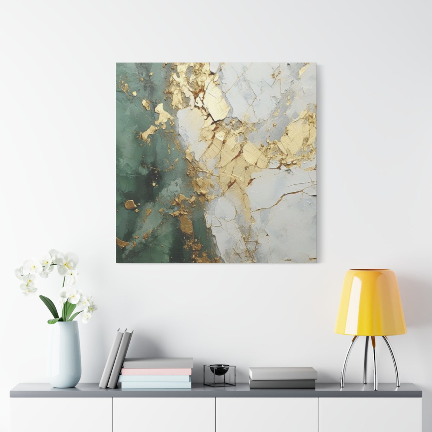
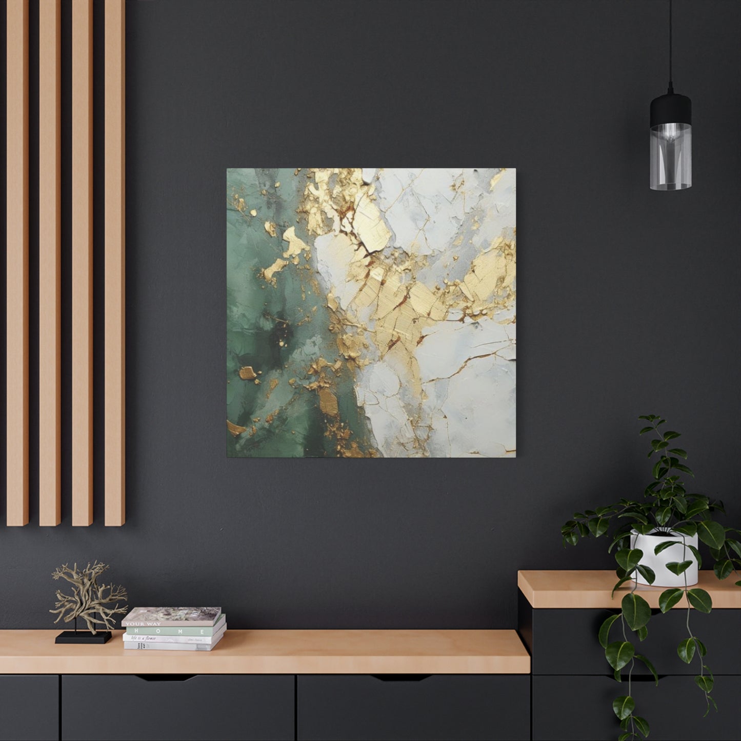
The location you select for displaying golden teal art wall art significantly influences both its visual impact and its effect on the surrounding space. Each room in your home offers distinct opportunities and challenges for showcasing these pieces effectively. Understanding the specific characteristics of different areas helps you make placement decisions that optimize both aesthetic appeal and functional benefits.
Living rooms typically serve as primary gathering spaces, making them ideal locations for statement pieces. Consider positioning your artwork above a sofa or fireplace mantel, where it becomes a natural focal point. The height at which you hang the piece matters considerably—generally, the center of the artwork should align with eye level when standing, approximately 57 to 60 inches from the floor. However, if you'll primarily view the piece while seated, adjust this height downward to maintain visual connection.
Dining areas benefit tremendously from the presence of golden teal pieces, as these colors naturally stimulate appetite and conversation. A large canvas positioned on the main wall creates an anchor for the room, while a series of smaller coordinated pieces can establish rhythm and movement. Ensure adequate distance between the artwork and the dining table—at least 6 to 8 inches of clearance prevents accidental damage while maintaining visual connection.
Bedrooms offer opportunities for more intimate engagement with your artwork. Positioning a piece above the headboard creates immediate visual interest upon entering the room while providing a pleasant view from within the bed. The calming properties of teal make such placement particularly appropriate for sleep spaces. Alternatively, placing artwork on a wall opposite the bed creates something beautiful to contemplate before sleep and upon waking.
Home offices and creative workspaces thrive with the inclusion of this color palette. The energizing qualities of gold can boost productivity and creativity, while teal's calming influence prevents overstimulation. Position artwork where you'll see it while working, but not directly in your primary line of sight, which could prove distracting. A placement to the side or behind your seating position provides subconscious benefits without competing for attention with work tasks.
Entryways and hallways present unique opportunities for creating strong first impressions. These transitional spaces often lack natural focal points, making them perfect for striking artwork. A golden teal piece positioned prominently near your entrance immediately establishes your aesthetic sensibility and creates welcoming energy. In hallways, consider creating gallery walls with multiple coordinated pieces that guide movement through the space while maintaining visual interest.
Bathrooms and powder rooms, though sometimes overlooked for artwork placement, can be transformed by the right pieces. The water associations of teal make it particularly appropriate for these spaces, while gold adds unexpected luxury. Ensure any artwork in moisture-prone areas receives proper protection—sealed canvases, framed prints under glass, or metal wall sculptures all work well in these conditions.
Illumination Strategies That Bring Your Golden Teal Artwork to Life
Lighting represents one of the most crucial yet frequently underestimated factors in displaying artwork effectively. The way light interacts with golden teal art wall art can dramatically alter its appearance, mood, and impact. Understanding various lighting approaches allows you to create optimal viewing conditions that showcase your pieces to their fullest potential.
Natural illumination provides constantly shifting conditions that reveal different aspects of your artwork throughout the day. Morning light tends toward cool tones, which can make teal elements appear more vibrant while slightly muting golden hues. Afternoon and evening light grows warmer, reversing this relationship and causing gold to glow while teal recedes slightly. This natural variation keeps artwork feeling alive and dynamic. However, direct sunlight poses preservation concerns, potentially causing fading over time. Position pieces where they receive indirect natural light, or use window treatments that diffuse harsh rays while maintaining overall brightness.
Ambient lighting refers to the general illumination in a room, typically provided by overhead fixtures or multiple distributed sources. This baseline lighting should be sufficient to view your artwork comfortably without creating harsh shadows or glare. For rooms featuring golden teal pieces, consider using bulbs with a color temperature between 2700K and 3000K—warm enough to enhance golden tones without making teal appear muddy or greenish.
Accent lighting specifically targets artwork, creating drama and emphasis. Track lighting, picture lights, or adjustable spotlights can be directed onto your golden teal pieces to create focal points even in dimly lit rooms. Position accent lights at approximately 30-degree angles from the artwork to minimize glare while creating subtle shadows that enhance texture. LED options prove particularly valuable, as they generate minimal heat that could damage artwork while offering precise color rendering and dimming capabilities.
Uplighting and backlighting create sophisticated effects particularly suited to certain types of golden teal art. Placing LED strips behind floating canvas panels creates halos of light that emphasize the artwork's silhouette while casting a gentle glow onto surrounding walls. This technique works exceptionally well with abstract pieces featuring bold shapes or with works that have transparent or translucent elements. The interplay between illuminated areas and shadows adds another dimension to the viewing experience.
Smart lighting systems allow you to program different lighting scenarios throughout the day, automatically adjusting to optimize artwork viewing under various conditions. You might create a bright, energizing setting for morning viewing, a balanced midday configuration, and a warm, relaxing evening ambiance. These systems can also compensate for seasonal changes in natural light, ensuring your golden teal pieces always appear at their best.
Consider the color of your walls and how they reflect or absorb light in relation to your artwork. Lighter walls reflect more light onto artwork, increasing visibility but potentially creating glare on glossy surfaces. Darker walls absorb light, creating more dramatic contrast but requiring stronger illumination. Neutral tones like soft gray, warm white, or even deep charcoal can all complement golden teal pieces when properly lit.
Pairing Your Golden Teal Art with Complementary Decor Elements and Furnishings
Creating cohesive interior environments requires thoughtful coordination between your golden teal art wall art and surrounding decor elements. Rather than simply matching colors directly, successful styling involves building relationships between the artwork and other design components that enhance each element while creating unified visual experiences.
Furniture selection plays a fundamental role in supporting or undermining your artwork's impact. Neutral-toned pieces in gray, beige, cream, or white provide versatile backgrounds that allow golden teal art to shine without competition. These foundational pieces create breathing room that prevents visual overwhelm while maintaining sophisticated simplicity. Conversely, furniture incorporating either gold or teal accents can create intentional echoes of the artwork, establishing thematic connections throughout the space.
Textile choices offer opportunities for both subtlety and boldness in coordinating with your artwork. Throw pillows might pick up the exact shades of teal from your pieces, creating direct visual links, while other cushions in complementary neutrals or accent colors provide balance. Curtains and drapes in sheer fabrics that match the lighter tones in your artwork can soften room boundaries while maintaining color relationships. Area rugs that incorporate golden or teal threads within complex patterns ground the space while tying diverse elements together.
Metallic accessories create particularly powerful synergies with golden elements in your artwork. Brass, copper, or gold-finished lamps, mirrors, candleholders, and decorative objects amplify the luxurious qualities of golden tones while adding three-dimensional interest. These reflective surfaces also interact dynamically with lighting, creating sparkle and movement that enlivens the entire room. Mix metallic finishes thoughtfully—pairing warm golds with cool silvers or chromes can create interesting tension, though maintaining consistency within metallic families often produces more cohesive results.
Plants and natural elements provide beautiful counterpoints to golden teal art. The organic forms and living energy of houseplants create textural contrast against the flatness of wall art while introducing additional shades of green that harmonize with teal. Select planters in materials and colors that coordinate with your overall scheme—ceramic vessels in glossy teal, weathered copper containers, or simple white pots all work beautifully. Driftwood, stone, or crystal elements bring earthy grounding that balances the sophistication of gold and teal.
Additional artwork and decorative pieces should be selected with care to avoid creating chaotic competition. If your golden teal piece serves as a focal point, supporting artwork might employ related but not identical palettes—perhaps incorporating just one of the colors, or using similar tones in different contexts. Alternatively, black and white photography or neutral-toned pieces can provide visual rest between more colorful elements, creating rhythm and preventing sensory overload.
Architectural elements like trim, molding, or built-in shelving offer opportunities for enhancing artwork display. Painting these features in colors that echo or complement your golden teal pieces can create seamless visual flow. Crisp white trim might emphasize the brightness of golden elements, while charcoal-painted molding could enhance the depth of teal tones. Display shelving offers chances to arrange smaller decorative objects in coordinating colors, creating three-dimensional echoes of your two-dimensional art.
Exploring Various Mediums and Materials in Golden Teal Artistic Creations
The physical composition of golden teal art wall art significantly influences its appearance, durability, and appropriateness for different spaces. Understanding various mediums and materials helps you make informed choices that align with your aesthetic preferences, practical requirements, and budget considerations.
Traditional canvas paintings remain among the most popular formats for this type of artwork. Stretched canvas provides a classic presentation that suits both contemporary and traditional interiors. Artists working in acrylics can achieve brilliant color saturation and sharp edges ideal for bold golden teal compositions, while oil paintings offer rich, luminous depths with subtle color transitions. The texture of brushstrokes and palette knife marks on canvas adds tactile dimension that photographic reproductions cannot replicate. Gallery-wrapped canvases, where the image continues around the sides, create modern, frameless presentations particularly suitable for contemporary spaces.
Paper-based works including watercolors, mixed media compositions, and prints offer different aesthetic qualities. Watercolor paintings achieve delicate, translucent effects particularly beautiful in teal applications, while opaque gouache or mixed media techniques can create bold golden passages. When properly framed under glass, paper works gain protection from environmental factors while the glazing adds subtle reflective qualities that can enhance viewing. Fine art prints reproduced through giclée or other high-quality processes make original designs accessible at various price points, democratizing access to this stunning color palette.
Metal prints represent an increasingly popular contemporary option. Direct printing onto aluminum creates extraordinarily vivid colors with depth and luminosity particularly effective for golden tones. The metallic substrate adds inherent shimmer that animates the artwork, causing it to appear differently from various viewing angles. These prints resist fading, moisture, and scratches, making them excellent choices for high-traffic areas or spaces with challenging conditions. The modern, sleek appearance suits minimalist and industrial design schemes particularly well.
Textured and sculptural works add dimensional interest beyond flat surfaces. Artists might build up acrylic paint or modeling paste to create relief effects, causing light to play across the surface in fascinating ways. Incorporating actual metal leaf—gold, copper, or metallic pigments—creates genuine metallic shine that shifts as you move past the piece. Some works combine painting with collaged elements, affixed objects, or resin applications that create depth and complexity. These dimensional pieces often benefit from specific lighting that emphasizes their sculptural qualities.
Wood-mounted panels offer durability and a contemporary aesthetic. Printing or painting directly onto prepared wood surfaces creates artworks with built-in rustic character. The natural grain might show through intentionally in places, adding organic texture that complements both the earthiness of teal and the warmth of gold. These panels typically feature smooth, finished edges that don't require additional framing, simplifying installation while maintaining clean, modern presentations.
Fabric and tapestry works introduce softness and warmth particularly appropriate for residential settings. Woven or printed textiles in golden teal patterns can hang like traditional paintings or drape with flowing movement. These pieces absorb sound rather than reflecting it, contributing to acoustic comfort in addition to visual beauty. The textile nature creates inherent textural interest that invites closer examination.
Photographic works interpreted through golden teal filters or color grading offer yet another approach. Photographers might capture natural scenes that inherently feature these colors or apply post-processing techniques to achieve the desired palette. Printing on various substrates—from traditional photo paper to canvas or metal—creates diverse presentations, each with distinct characteristics.
Size Considerations and Scale Relationships in Artwork Selection
Choosing appropriately sized golden teal art wall art involves more than simply measuring wall space. Effective selection requires considering the room's dimensions, ceiling height, furniture scale, and viewing distances to create harmonious proportions that enhance rather than overwhelm or underwhelm the space.
Large-scale pieces, typically measuring 40 inches or more in any dimension, create powerful focal points that immediately command attention. These statement works suit expansive walls in living rooms, dining areas, or open-concept spaces where they can be appreciated from various distances. The generous size allows intricate details and subtle color transitions to remain visible across rooms, while the bold presence anchors furniture groupings and defines spatial zones. When selecting oversized pieces, ensure adequate surrounding space—a general guideline suggests artwork should occupy approximately two-thirds to three-quarters of the available wall area above furniture, leaving breathing room on all sides.
Medium-sized works, ranging from approximately 20 to 40 inches, offer versatility for diverse applications. These pieces work beautifully above sofas, beds, or console tables, providing visual interest without overwhelming. They're also ideal for creating gallery wall arrangements where multiple pieces combine to cover larger areas while maintaining individual identity. Medium works suit rooms with standard eight to nine-foot ceilings particularly well, as their proportions naturally complement typical residential scale.
Smaller pieces, under 20 inches in any dimension, excel in intimate settings or as components of larger arrangements. A series of small golden teal works can create visual rhythm along a hallway, climb a staircase wall, or surround a window or architectural feature. These pieces suit smaller rooms like bathrooms, home offices, or cozy reading nooks where viewing distances remain close. Despite their modest dimensions, quality small works can deliver significant impact through concentrated color and refined detail.
Multi-panel installations, such as diptychs, triptychs, or larger sets, distribute a single composition across multiple canvases. This format creates dynamic visual interest through the spaces between panels while allowing impressive overall dimensions. The separation between pieces can echo architectural rhythms, such as the spacing between windows or doors, integrating the artwork more fully into the room's structure. Multi-panel works also offer installation flexibility—you might maintain equal spacing between all panels, vary gaps intentionally for effect, or even arrange pieces at different heights for unconventional presentations.
Vertical versus horizontal orientation significantly affects perception and application. Vertical works draw the eye upward, making ceilings appear higher and rooms feel more spacious. These orientations suit narrow wall sections or areas where you want to emphasize height, such as beside tall windows or in rooms with impressive ceiling architecture. Horizontal works, conversely, expand visual perception laterally, making walls appear wider and creating calming, stable compositions. These orientations work beautifully above sofas, beds, and console tables where they echo the horizontal lines of furniture.
When determining appropriate artwork size, consider viewing distance as a crucial factor. A general principle suggests that optimal viewing distance equals approximately 1.5 to 2 times the artwork's diagonal measurement. For pieces viewed from across a room, this means larger dimensions work better, ensuring details remain appreciable. For artwork in spaces where you'll examine it closely, smaller works can deliver intimate viewing experiences that reward detailed inspection.
Room proportions also influence size selection. In a small room, an oversized piece can feel overwhelming and make the space seem cramped. Conversely, undersized artwork in a large room appears lost and insignificant, failing to fulfill its decorative potential. Strike balance by selecting sizes that feel substantial without dominating—artwork should claim its space confidently while leaving room for other design elements to contribute.
Color Theory Principles That Enhance Your Understanding of Golden Teal Palettes
Delving into the scientific and artistic principles underlying color relationships deepens appreciation for why golden teal art wall art creates such compelling visual experiences. Color theory provides frameworks for understanding how hues interact, influence perception, and generate emotional responses, offering insights that inform both creation and display choices.
The color wheel organizes hues in a circular arrangement that reveals natural relationships. Gold derives from yellow, one of the primary colors, while teal emerges from combining blue, another primary, with small amounts of yellow to create the green influence. This places them at different positions on the wheel—gold in the warm half, teal in the cool half. Their separation creates inherent contrast that generates visual energy, yet the yellow component shared between them provides subtle harmony that prevents clashing.
Complementary colors sit opposite each other on the color wheel, creating maximum contrast and vibrancy when juxtaposed. While gold and teal aren't strict complements, they exhibit complementary-like behavior due to their warm-cool opposition. This relationship explains why they intensify each other's appearance when placed in close proximity—the warmth of gold makes teal appear cooler and more refreshing, while teal's coolness makes gold seem warmer and more radiant. Artists exploit this phenomenon by positioning these colors strategically within compositions, creating areas of high visual interest where they meet.
Analogous color schemes employ hues adjacent on the color wheel, creating harmonious, unified palettes. While gold and teal don't occupy adjacent positions, they can anchor opposite ends of an analogous scheme that includes intermediate shades. A composition might transition from pure gold through peachy tones and muted greens before reaching full teal, creating a gradient that feels cohesive despite spanning considerable color space. This approach builds complexity while maintaining visual unity.
Triadic color schemes incorporate three hues equally spaced around the color wheel, typically creating vibrant, balanced compositions. A scheme based on yellow, red-violet, and blue-green (teal) creates dynamic tension while maintaining equilibrium. Introducing hints of the third color—perhaps burgundy or deep pink accents—can add sophistication to golden teal artwork, creating unexpected pops that prevent the palette from feeling too predictable.
Value refers to the lightness or darkness of colors, independent of hue. Effective golden teal compositions typically employ a range of values, from pale champagne and seafoam tints through rich gold and deep teal tones to nearly black shadows. This value range creates depth and dimension, preventing flatness. Light values advance visually, seeming closer to viewers, while dark values recede. Strategic value placement can create illusions of space, emphasizing certain elements while allowing others to fall back.
Saturation describes color intensity—fully saturated hues appear vivid and pure, while desaturated colors seem grayed or muted. Varying saturation within golden teal artwork prevents monotony while creating hierarchy. Highly saturated passages draw attention, serving as focal points, while quieter, less saturated areas provide visual rest. Many successful pieces employ mostly moderate saturation with strategic high-intensity accents, balancing impact with sophistication.
Temperature, beyond the simple warm-cool dichotomy, influences perception subtly. Even within gold, some shades lean toward orange (warmer), while others approach yellow-green (cooler). Similarly, teal can shift toward pure blue (cooler) or toward green (warmer). Playing with these temperature variations within a generally golden-teal palette creates subtle complexity that rewards extended viewing. An artwork might employ cooler golds with warmer teals in some areas while reversing this relationship elsewhere, creating rhythmic temperature shifts that guide the eye through the composition.
Color proportion significantly affects overall impression. A composition dominated by teal with gold accents feels very different from one where gold claims most of the canvas with teal details. The golden ratio—approximately 60% dominant color, 30% secondary color, 10% accent—often creates pleasing proportions, though artists frequently deviate intentionally for specific effects. Understanding these proportional relationships helps in both creating and selecting artwork that achieves desired moods and impacts.
The Enduring Appeal of Metallic Elements in Contemporary Wall Decor
Metallic accents have captivated human aesthetic sensibilities throughout history, and their prominent role in golden teal art wall art reflects deep-seated responses to these materials. Understanding why metallics prove so universally appealing illuminates the enduring power of golden elements in particular.
Evolutionary psychologists suggest humans' attraction to shiny, reflective surfaces stems from ancient associations with water—a critical survival resource. Anything that gleams suggested water sources in ancestral environments, creating positive neurological responses that persist today. Gold's reflective shimmer may unconsciously trigger these deep-seated associations, creating favorable reactions that operate below conscious awareness.
Historically, gold's rarity and difficulty of working established it as a symbol of wealth, power, and divine connection across cultures. From ancient Egyptian pharaohs to Renaissance religious icons, gold leaf adorned the most precious objects and sacred imagery. These historical associations imbue golden tones with implied significance that enhances their perceived value, even in contemporary contexts divorced from literal precious metals. When viewing artwork incorporating golden elements, viewers unconsciously access these cultural memories, adding layers of meaning beyond pure visual pleasure.
The physical properties of metallic substances create unique interactions with light. Unlike matte surfaces that absorb and diffuse light evenly, metallics reflect light directionally, creating highlights and sparkles that shift as viewers move or as lighting conditions change. This dynamic quality gives artwork a living character—the piece appears different each time you view it, preventing the visual fatigue that can affect static imagery. In golden teal compositions, this movement creates engaging contrast with the more stable, matte teal passages.
Metallics also introduce textural variety that enriches sensory experiences. Even when incorporated through paint rather than actual metal leaf, golden passages typically exhibit different surface qualities than surrounding areas—sometimes smoother and glossier, other times deliberately textured to maximize light interaction. This textural variety engages peripheral awareness, creating subtle sensory richness that contributes to overall appeal even when viewers don't consciously register it.
The transparency and layering possibilities of metallic mediums enable sophisticated visual effects. Artists can apply translucent golden glazes over teal base layers, allowing color to show through while adding luminous shimmer. Alternatively, opaque metallic paints create solid passages of brilliance. Combining these approaches within single compositions builds complexity through varied relationships between layers, colors, and finishes.
Contemporary metallics extend beyond traditional gold to include copper, bronze, rose gold, and champagne tones, each carrying distinct character. These variations allow artists to create unique takes on golden teal themes while maintaining the essential warm-cool dynamic. Copper's earthier warmth pairs beautifully with deep teal for more rustic or organic aesthetics, while champagne's subtlety creates sophisticated restraint suitable for minimalist sensibilities.
Creating Cohesive Gallery Walls Featuring Golden Teal Artwork
Gallery walls offer dynamic approaches to displaying multiple pieces of golden teal art wall art, creating impressive visual impact through thoughtful arrangement. Successfully executing these installations requires balancing individual pieces' identities with overall compositional unity, resulting in collections that feel intentional rather than haphazard.
Planning begins with selecting pieces that share visual relationships while maintaining sufficient variety to create interest. A purely monochromatic approach—all golden teal works—can feel cohesive but risks monotony. Instead, consider using your golden teal pieces as anchors within arrangements that incorporate complementary works. Black and white photographs, neutral-toned abstracts, or pieces featuring just one of your primary colors can provide visual breathing room while maintaining connection to the overall scheme.
Layout templates provide starting frameworks that ensure balanced weight distribution and pleasing negative space. The grid arrangement places identically sized pieces in regular rows and columns, creating orderly formality suitable for modern spaces. The salon style mixes various sizes in tighter, more organic configurations, evoking traditional gallery installations with bohemian flair. Symmetrical arrangements mirror compositions across vertical or horizontal axes, creating stable, formal impressions. Asymmetrical layouts distribute visual weight unequally for dynamic, contemporary effects that feel more relaxed despite requiring careful planning.
Before committing to wall installation, create floor or table mockups of your intended arrangement. Lay pieces out in your planned configuration, adjusting until you achieve satisfying balance. Photograph the arrangement from standing height for reference during installation. Some designers create paper templates matching each piece's dimensions, taping these to walls to visualize placement before driving a single nail. These preparatory steps prevent installation regrets and unnecessary wall damage.
Spacing between pieces significantly influences the gallery wall's character. Tight spacing, with just 1-2 inches between frames, creates unified fields where individual pieces merge into collective impact. This approach works well when you want the arrangement to read as a single large-scale installation. Moderate spacing of 3-4 inches maintains connection while respecting individual identities, striking balance between unity and variety. Wide spacing of 5 or more inches emphasizes each piece's independence, creating collections of related but distinct works. Consistency matters—maintain uniform spacing throughout for intentional appearance, or vary strategically to create specific effects.
Anchoring larger pieces provides organizational structure that guides arrangement of smaller works. Place your most substantial golden teal piece first, typically at eye level, then arrange smaller works around it in balanced configurations. The largest piece serves as a visual anchor that prevents the arrangement from feeling scattered or chaotic. Alternatively, create visual balance by distributing several medium-sized pieces evenly throughout the arrangement rather than concentrating size in one location.
Alignment strategies organize visual relationships between pieces. Center alignment runs an imaginary line through the center of the arrangement, with pieces balanced around it. This creates stable, formal impressions suitable for spaces where symmetry matters. Edge alignment maintains consistent spacing from a baseline—typically the bottom edges of lower pieces—creating grounded, architectural order. Organic alignment ignores strict rules, responding to pieces' individual characteristics and creating flowing, informal compositions. Each approach produces distinct effects appropriate for different aesthetic goals.
Color distribution requires conscious attention in arrangements combining golden teal pieces with others. Scatter golden and teal elements throughout rather than clustering all warm or cool tones together, creating visual rhythm through color repetition. This approach guides the eye around the entire arrangement rather than allowing it to fixate on concentrated areas. Alternatively, intentional clustering can create focal areas of intense color impact with surrounding neutral breathing room.
Frame selection influences cohesion significantly. Identical frames create strong unity, making diverse artwork feel collected and intentional. Frames in a consistent style but varying sizes accommodate different pieces while maintaining connection. Mixing frame styles, materials, and colors creates eclectic, collected-over-time impressions that suit bohemian or maximalist aesthetics. When incorporating golden teal art wall art, consider frames that complement without competing—simple metals, natural woods, or clean white or black frames typically work beautifully.
Conclusion
Protecting your investment in golden teal art wall art requires implementing appropriate preservation practices. While artwork proves remarkably durable when properly maintained, neglect can cause deterioration that diminishes appearance and value over time. Understanding preservation principles helps you enjoy your pieces for decades while maintaining their original vibrancy.
Dust accumulation represents the most common threat to displayed artwork. Airborne particles settle on surfaces gradually, dulling colors and creating grimy films that obscure details. Regular dusting prevents buildup that becomes increasingly difficult to remove. For canvas works without glass protection, use soft, lint-free cloths or specialized art dusting brushes with gentle strokes. Microfiber cloths work excellently, lifting dust through electrostatic attraction without scratching. Avoid feather dusters, which can scratch delicate surfaces and often simply redistribute rather than remove particles. Dust every few weeks in typical conditions, more frequently in dusty environments.
For framed pieces protected by glass or acrylic glazing, glass cleaner maintains clarity. Spray cleaner onto your cloth rather than directly onto glass to prevent liquid from seeping behind glazing and damaging artwork. Wipe in gentle circular motions or straight lines, buffing to streak-free clarity. Avoid ammonia-based cleaners on acrylic glazing, which they can cloud over time. Instead, use cleaners specifically formulated for plastics, or simple water with mild dish soap.Environmental conditions dramatically affect artwork longevity. Humidity extremes cause particular damage—high moisture encourages mold growth on organic materials and can cause paper to cockle or canvas to sag, while extreme dryness leads to cracking and brittleness. Maintain indoor humidity between 40-60% for optimal preservation. Dehumidifiers help in damp climates or humid seasons, while humidifiers counteract excessively dry conditions. Small hygrometers provide inexpensive humidity monitoring, alerting you to conditions requiring adjustment.
Temperature stability also matters. Dramatic temperature swings cause materials to expand and contract at different rates, potentially loosening connections between layers or frames. Avoid hanging artwork near heat sources like radiators, fireplaces, or heating vents. Similarly, exterior walls that transmit outdoor temperature fluctuations prove less ideal than interior walls with more stable conditions. Maintain moderate, consistent temperatures between 65-75°F when possible.
Light exposure causes cumulative, irreversible damage through photochemical reactions that break down pigments and media. Direct sunlight proves particularly destructive, capable of causing noticeable fading within months. Position artwork away from windows receiving direct sun, or use UV-filtering window films, shades, or curtains. Artificial lighting also contributes to degradation, though typically more slowly.
Share