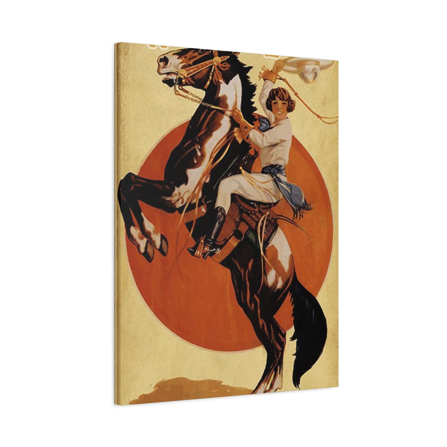
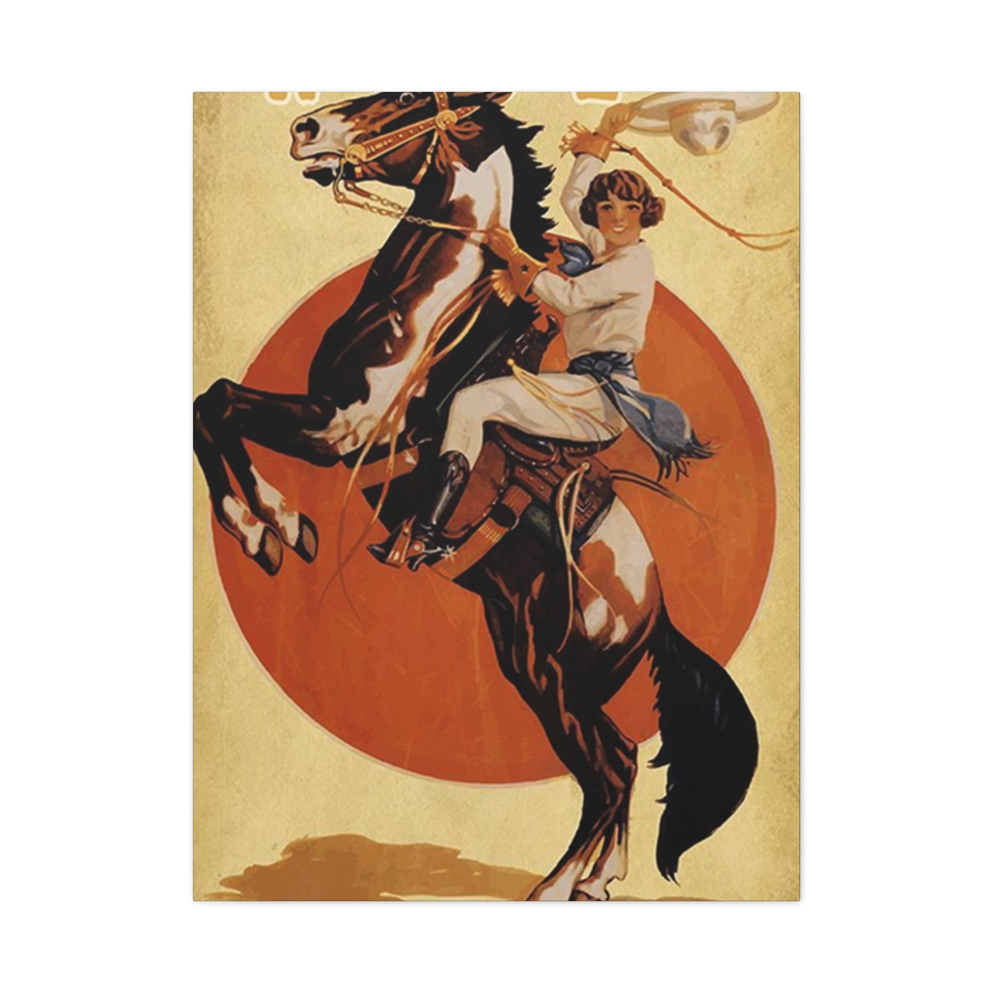
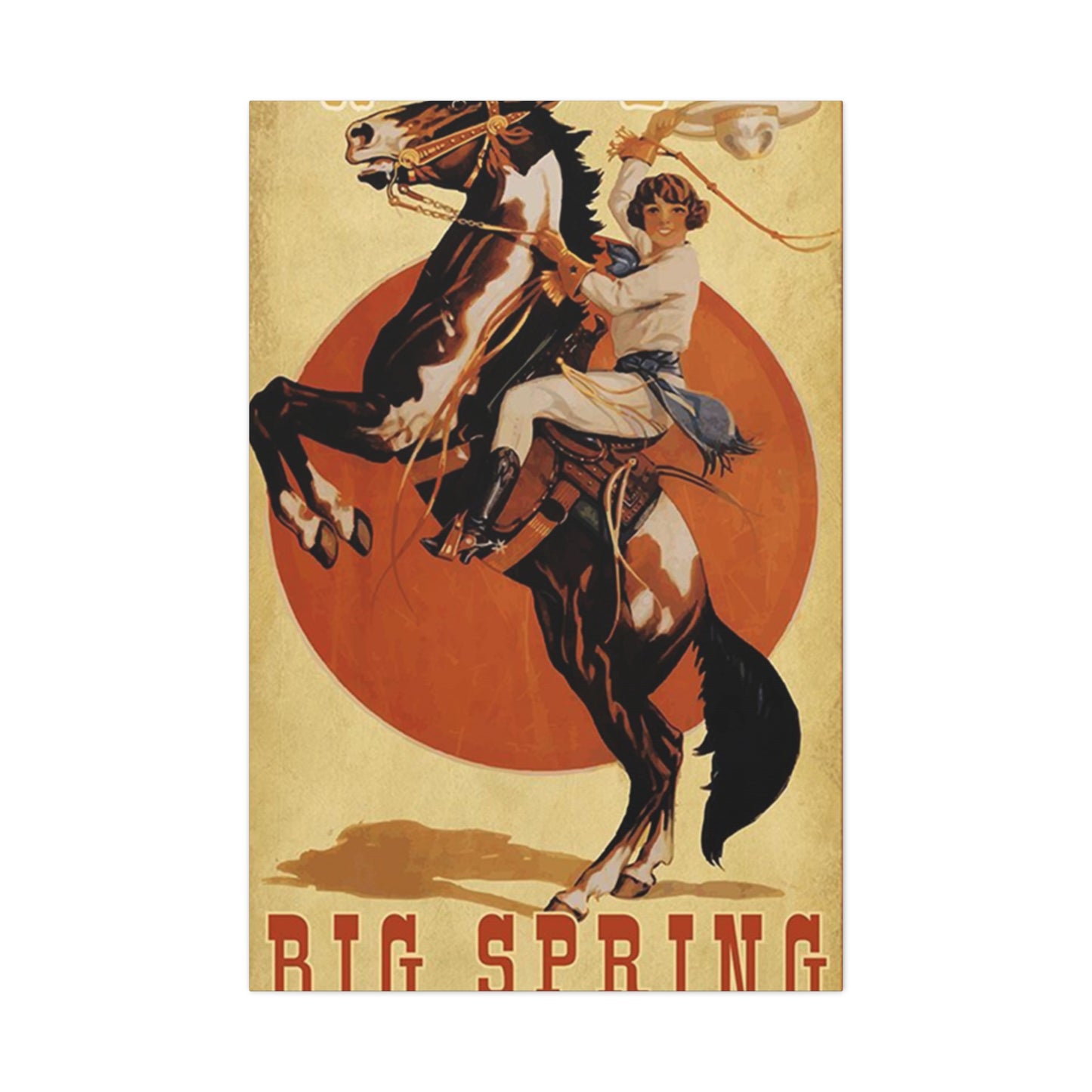
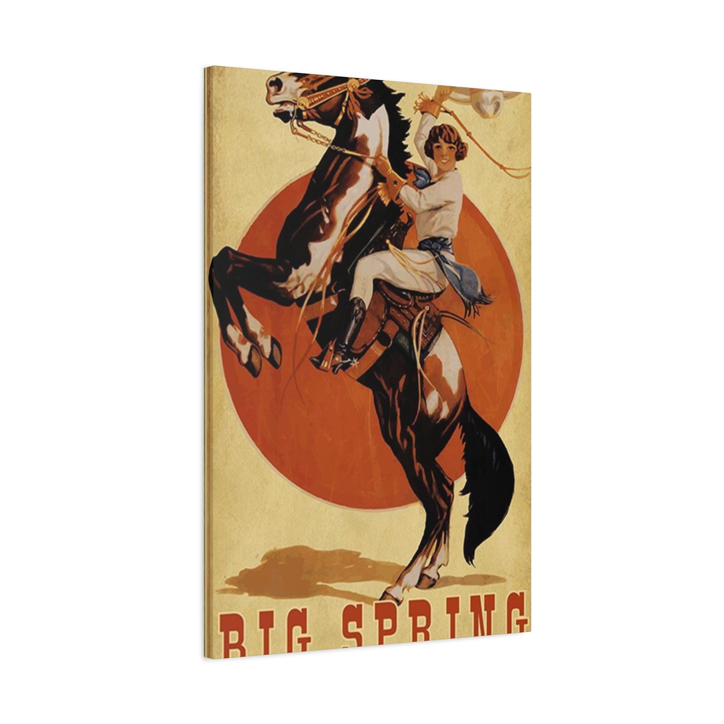
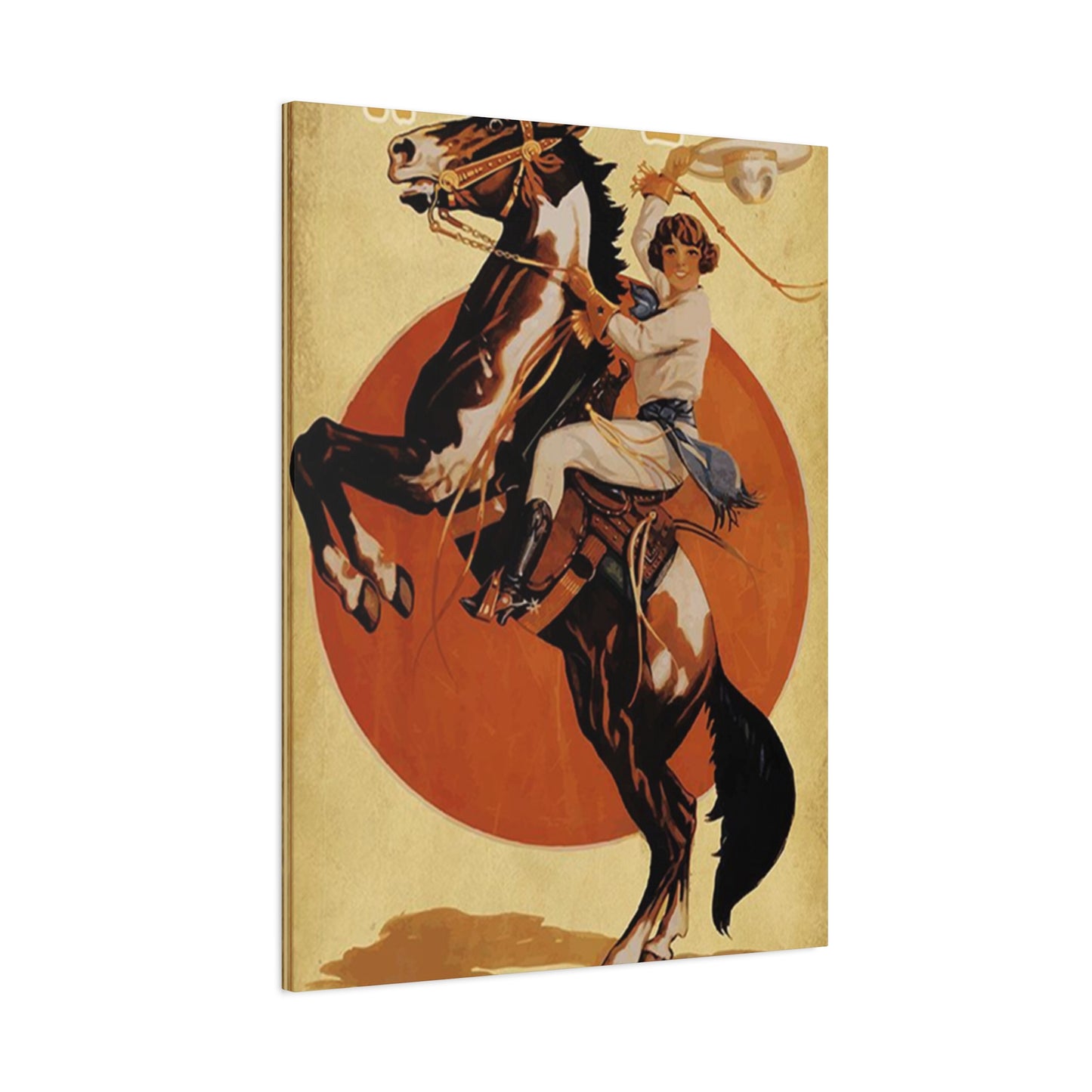
Girl Riding Horse Poster Wall Art & Canvas Prints
Girl Riding Horse Poster Wall Art & Canvas Prints
Couldn't load pickup availability
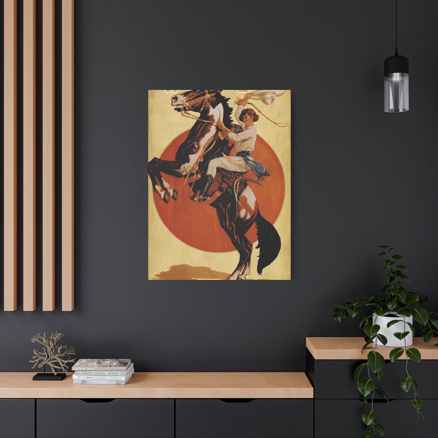
Enchanting Equestrian Art: Beautiful Girl Riding Horse Poster Wall Art That Brings Life to Your Living Spaces
The world of decorative art has witnessed a remarkable transformation in recent years, with equestrian-themed imagery capturing the hearts of countless admirers. Among the most captivating pieces that have emerged are those featuring a graceful girl riding horse poster wall art, which combines the elegance of horsemanship with the beauty of artistic expression. These stunning visual representations offer more than mere decoration; they embody a spirit of freedom, grace, and the timeless bond between humans and horses.
The allure of such artwork extends far beyond simple aesthetics. When you introduce a girl riding horse poster wall art into your environment, you create an atmosphere that speaks to adventure, natural beauty, and the untamed spirit that resides within us all. These pieces serve as windows into a world where strength meets gentleness, where power harmonizes with grace, and where the relationship between rider and steed becomes a symphony of movement and trust.
Captivating Visual Elements That Define Exceptional Equestrian Artwork for Modern Interiors
When examining the characteristics that make girl riding horse poster wall art truly exceptional, several elements come together to create pieces that resonate with viewers on multiple levels. The composition typically showcases a young woman in harmony with her equine companion, often captured in moments of movement, stillness, or connection that speak volumes about the relationship between horse and rider.
The finest examples of this artwork category demonstrate meticulous attention to anatomical accuracy in depicting both the human and equine forms. Artists who create these pieces understand that horses possess distinct musculature, proportions, and movement patterns that must be accurately represented to create believable and engaging imagery. Similarly, the positioning of the rider, her posture, and the way she interacts with her mount all contribute to the overall authenticity and emotional impact of the artwork.
Color palettes employed in these pieces range from naturalistic earth tones that evoke outdoor settings to more dramatic and stylized approaches that emphasize mood and atmosphere. Some artists prefer muted, vintage-inspired hues that give their work a timeless quality, while others embrace vibrant, contemporary color schemes that make their pieces pop against modern interior backgrounds. The choice of palette significantly influences the emotional tone of the artwork and its ability to complement various decorating schemes.
Lighting plays a crucial role in creating depth and dimension within equestrian artwork. The interplay of light and shadow can transform a flat image into a dynamic scene that seems to pulse with life. Whether depicting golden hour sunlight filtering through a forest canopy, the soft glow of dawn illuminating a misty field, or dramatic backlighting that creates silhouettes against colorful skies, lighting choices profoundly affect the viewer's emotional response to the piece.
Textural elements add another layer of visual interest to girl riding horse poster wall art. Some artists incorporate techniques that suggest the smoothness of a horse's coat, the flowing movement of a mane in the wind, or the texture of riding attire and tack. Even in printed poster format, these textural suggestions create visual richness that draws the eye and invites closer examination.
The background environment surrounding the central figures contributes significantly to the overall narrative of the artwork. Whether set against sweeping landscapes, woodland paths, beach scenes, or more abstract backgrounds, the setting helps establish mood and context. Some pieces feature detailed, realistic backgrounds that place the scene firmly in a specific location and time, while others opt for simplified or impressionistic backgrounds that keep focus on the horse and rider while still providing environmental context.
Transformative Power of Equestrian Imagery in Residential and Commercial Environments
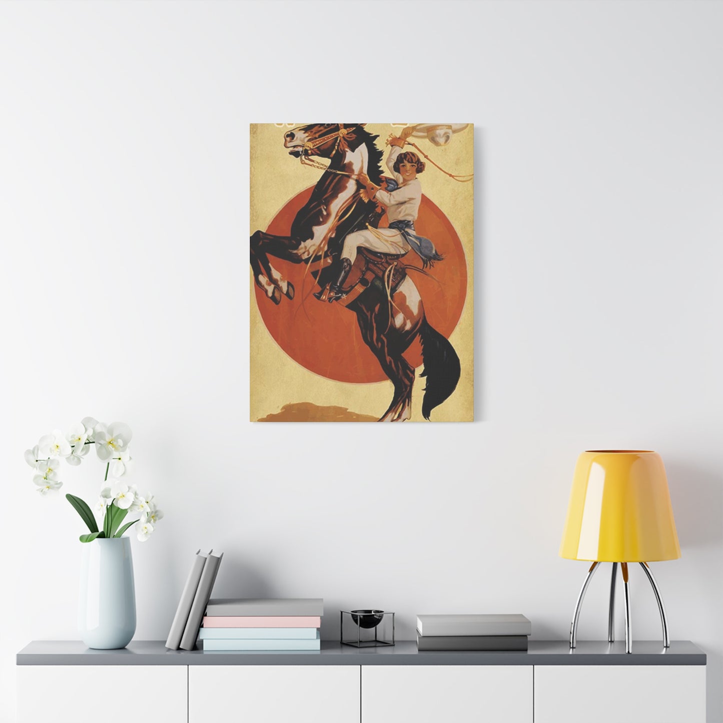
The presence of a girl riding horse poster wall art within a space does more than fill an empty wall; it fundamentally alters the character and atmosphere of the environment. In residential settings, these pieces can serve as focal points that anchor entire rooms, establishing themes and setting tones that influence all subsequent decorating decisions.
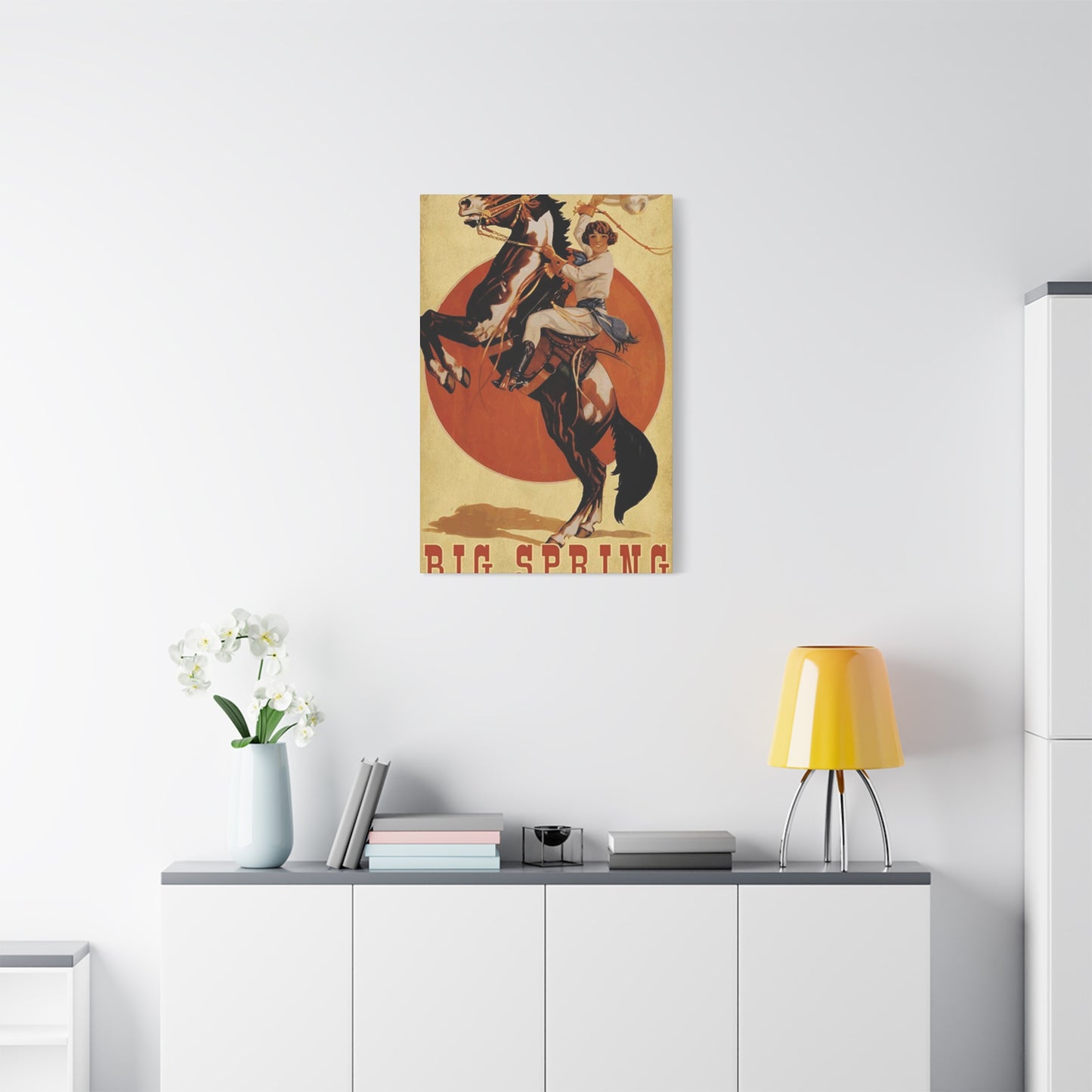
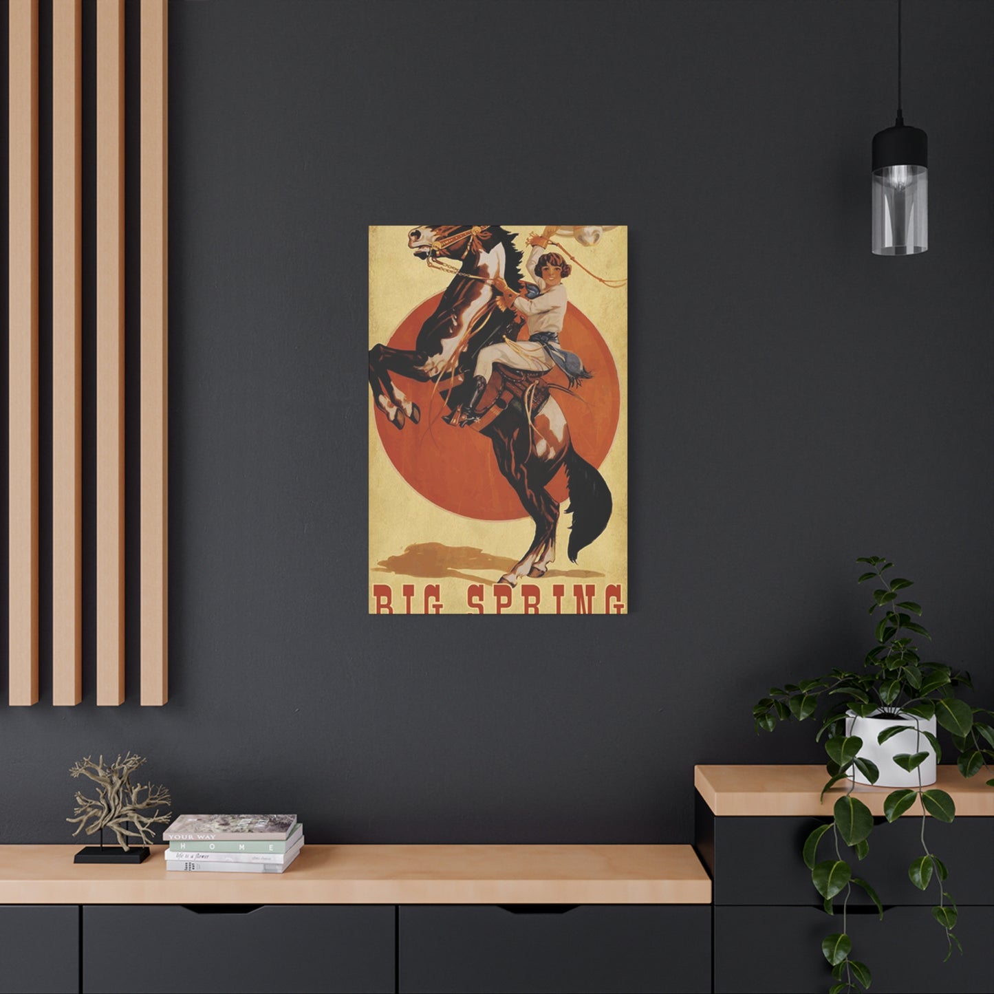
Living rooms benefit tremendously from the addition of equestrian artwork, particularly larger pieces that command attention without overwhelming the space. When positioned above a sofa, fireplace, or console table, such artwork creates a visual hierarchy that naturally draws the eye and provides a conversation starter for guests. The dynamic energy suggested by the imagery of horse and rider introduces movement and vitality to spaces that might otherwise feel static or lifeless.
Bedrooms transform into personal sanctuaries when adorned with carefully chosen equestrian pieces. The presence of a girl riding horse poster wall art can evoke feelings of freedom, adventure, and peaceful connection with nature—all sentiments that contribute to creating restful, rejuvenating sleeping environments. For young equestrians or those who simply appreciate horses, such artwork reinforces personal identity and passion within their most private spaces.
Home offices gain character and inspiration from equestrian imagery that speaks to qualities like determination, partnership, and grace under pressure. The symbolism inherent in the relationship between horse and rider—mutual trust, clear communication, and working together toward common goals—resonates particularly well in professional environments where these same qualities prove essential for success.
Dining areas take on sophisticated, country-estate ambiance when decorated with equestrian artwork that references the long tradition of horses in agricultural and aristocratic settings. The presence of such imagery creates an atmosphere of refined elegance that elevates casual meals into more special occasions and provides visual interest that enhances the dining experience.
Commercial spaces, particularly those catering to clients who appreciate nature, animals, or outdoor pursuits, find that girl riding horse poster wall art helps establish appropriate atmosphere and brand identity. Veterinary clinics, equestrian supply shops, country clubs, and hospitality venues with rustic or outdoor themes all benefit from incorporating such imagery into their visual branding and interior design strategies.
Waiting rooms and reception areas become more welcoming and less sterile when adorned with artwork that depicts harmonious relationships between humans and animals. The calming presence of equestrian imagery can help reduce anxiety and create more positive associations with spaces that people might otherwise find stressful or uncomfortable.
Diverse Artistic Styles and Interpretations Within Equestrian Poster Art Collections
The realm of girl riding horse poster wall art encompasses an impressive variety of artistic approaches, each offering distinct aesthetic qualities and emotional resonances. Understanding these different styles helps art enthusiasts select pieces that align with their personal tastes and decorating objectives.
Photorealistic representations strive to capture every detail with camera-like precision, creating imagery so lifelike that viewers might momentarily forget they're looking at artistic interpretation rather than documentary photography. These pieces appeal to those who value accuracy and authenticity, who want artwork that faithfully represents the physical reality of horses and their riders. The meticulous rendering of textures, lighting, and anatomical details showcases the artist's observational skills and technical mastery.
Impressionistic approaches take a different path, emphasizing mood, atmosphere, and the subjective experience of a moment rather than precise details. These pieces often feature looser brushwork, visible strokes, and a focus on capturing the essence of light and movement. The resulting artwork conveys emotion and energy in ways that hyper-realistic pieces sometimes cannot, inviting viewers to engage with the work on a more intuitive, emotional level.
Minimalist interpretations reduce equestrian subjects to their most essential elements, eliminating unnecessary details to create clean, striking compositions. These pieces work exceptionally well in contemporary interiors where simplicity and negative space play important roles in the overall design philosophy. The restrained aesthetic of minimalist equestrian art allows the fundamental relationship between horse and rider to take center stage without visual competition from excessive detail.
Vintage and retro styles evoke nostalgia by incorporating design elements from specific historical periods. Whether mimicking Victorian-era illustrations, mid-century modern graphics, or 1970s color palettes, these pieces create immediate emotional connections for viewers who associate particular artistic styles with cherished memories or romanticized visions of the past. The deliberate use of period-appropriate techniques and aesthetics gives these works a timeless quality that transcends fleeting trends.
Abstract interpretations deconstruct the equestrian subject into shapes, colors, and patterns that suggest rather than literally depict horses and riders. These pieces challenge viewers to engage more actively with the artwork, finding their own meanings and connections within compositions that prioritize emotional impact over representational accuracy. Abstract equestrian art works particularly well in spaces where bold, thought-provoking pieces complement avant-garde or eclectic decorating schemes.
Watercolor styles bring softness and fluidity to equestrian subjects, with their characteristic translucent layers and flowing edges creating dreamlike qualities. The medium's inherent unpredictability adds organic spontaneity to the imagery, while its delicate appearance works beautifully in spaces seeking gentle, feminine energy. Watercolor techniques excel at capturing the flowing movement of manes and tails, the subtle gradations of light on horsehair, and the atmospheric qualities of outdoor settings.
Digital art has opened entirely new possibilities for creating girl riding horse poster wall art, with artists employing software tools to achieve effects impossible through traditional media. These pieces might combine photographic elements with painted layers, incorporate geometric patterns or graphic design elements, or utilize color manipulations that create surreal, fantastical atmospheres. Digital techniques allow for precise control and endless revision possibilities while enabling artistic visions that push beyond the constraints of physical materials.
Selecting Perfect Dimensions and Placement Strategies for Maximum Visual Impact
The size and positioning of your girl riding horse poster wall art significantly influence its effectiveness within a space. Thoughtful consideration of these factors ensures that your chosen piece enhances rather than detracts from the overall environment.
Large-scale artwork, typically measuring 36 inches or more in any dimension, creates dramatic focal points that command immediate attention. These substantial pieces work best on expansive walls where they have room to breathe, surrounded by adequate negative space that allows viewers to appreciate the full composition without feeling visually crowded. Oversized equestrian posters make powerful statements in spacious living areas, above king-sized beds, or in commercial lobbies where they need to be visible from considerable distances.
Medium-sized pieces, ranging from 18 to 36 inches, offer versatility that makes them suitable for numerous applications. These dimensions work well above furniture pieces like sofas and dressers, in hallways where they won't overwhelm narrower spaces, and as components of gallery walls where multiple pieces create collective impact. Medium-scale artwork provides presence without dominating, making it an excellent choice for those who want equestrian imagery to complement rather than define their spaces.
Smaller posters, measuring under 18 inches, excel in intimate settings where viewers will appreciate them from close range. These dimensions suit personal spaces like home offices, reading nooks, bathroom accents, or children's rooms where appropriately-scaled artwork creates comfort rather than intimidation. Small equestrian pieces also work beautifully in grouped arrangements where multiple images tell a collective story or create visual rhythm through repetition and variation.
Vertical orientation emphasizes height and upward movement, creating impressions of elegance and aspiration. Portrait-oriented equestrian artwork works particularly well in spaces with high ceilings where vertical emphasis helps fill the available visual field. These proportions naturally suit imagery showing horses rearing, riders in vertical postures, or compositions that emphasize the verticality of trees, cliffs, or other environmental elements.
Horizontal orientation suggests breadth, landscape, and movement across space. Landscape-oriented pieces complement wide furniture arrangements, work well above horizontal architectural features like mantles and headboards, and effectively depict scenes of horses moving laterally across fields or beaches. These proportions create calming, grounded effects that suit restful environments.
Square formats offer balanced, stable compositions that work equally well in various contexts. Their symmetrical proportions create modern, contemporary feels while providing flexibility in placement since they don't require specific orientation considerations. Square equestrian artwork adapts readily to gallery wall arrangements and creates pleasing visual rhythm when displayed in series.
Height placement significantly affects how artwork interacts with viewers. The standard guideline suggests hanging pieces so their centers align approximately at eye level, typically 57-60 inches from the floor. However, this rule requires adjustment based on ceiling heights, furniture arrangements, and viewing angles. Artwork meant to be appreciated while seated should hang lower than pieces viewed primarily while standing. In spaces with vaulted ceilings or two-story walls, multiple hanging heights might be necessary to create visually coherent arrangements.
Relationship to surrounding furniture influences optimal placement. Artwork hung above sofas, beds, or console tables should relate proportionally to the furniture pieces beneath them. General guidelines suggest artwork width should measure between two-thirds and three-quarters the width of the furniture below, though these proportions can be adjusted based on personal preference and specific spatial considerations. Maintaining appropriate negative space between furniture tops and artwork bottoms—typically 6-12 inches—creates visual connection without awkward crowding.
Cultural Significance and Symbolic Meanings Embedded Within Equestrian Artistic Representations
The imagery of a girl riding horse poster wall art carries layers of meaning that extend far beyond surface aesthetics. Understanding these symbolic dimensions adds depth to our appreciation of such pieces and informs more intentional selection of artwork that resonates with personal values and aspirations.
Throughout human civilization, horses have represented freedom, power, and humanity's ability to form partnerships with the natural world. When we see a rider in harmony with her mount, we witness the culmination of trust, respect, and mutual understanding—qualities that transcend the specific context of horsemanship to speak to broader relationship dynamics in our lives.
For many cultures, horses symbolize nobility, courage, and spirited independence. Their presence in artwork elevates the piece beyond mere decoration to become a statement about the values and characteristics the viewer admires or aspires to embody. A girl riding horse poster wall art becomes not just an image of an activity but a representation of qualities like confidence, grace under pressure, and the ability to direct powerful forces through gentle guidance rather than brute domination.
The feminine presence within these artworks adds another layer of meaning. Historically, women's relationships with horses have represented both transgression against limiting gender roles and the expression of nurturing, communicative qualities associated with femininity. The image of a girl on horseback captures this duality—simultaneously depicting strength, independence, and adventurousness while showcasing partnership, empathy, and harmonious collaboration.
In many contexts, horses serve as metaphors for our own untamed aspects—the wild, instinctive parts of ourselves that require understanding rather than suppression. The rider represents consciousness, discipline, and intention, while the horse embodies emotional power, physical vitality, and instinctive wisdom. Together, they model the ideal relationship between these aspects of human nature, showing how we can acknowledge and work with our powerful impulses rather than constantly fighting against them.
Different cultural traditions imbue horses and horsemanship with specific meanings. In Western cultures, they connect to frontier spirit, agricultural heritage, and the mythology of cowboys and pioneer women. Asian cultures associate horses with success, vitality, and forward momentum. Native American traditions revere horses as sacred beings that transformed entire ways of life. When selecting girl riding horse poster wall art, awareness of these cultural resonances helps ensure the piece speaks authentically to your intended meanings rather than inadvertently suggesting associations you don't intend.
The specific activities depicted in equestrian artwork carry their own symbolic weight. Images showing leisurely trail riding suggest peaceful communion with nature and escape from daily pressures. Action scenes featuring jumping, racing, or other competitive activities emphasize achievement, skill, and the thrill of challenge. Quiet moments of connection between horse and rider—touching foreheads, gentle grooming, or simply standing together—highlight relationship, trust, and emotional bonds that transcend words.
Material Quality and Printing Methods That Ensure Longevity and Visual Excellence
The physical production of your girl riding horse poster wall art significantly impacts both its immediate visual appeal and its durability over years of display. Understanding the various material options and printing processes helps you make informed decisions that balance aesthetic preferences with practical considerations.
Paper quality forms the foundation of any poster's appearance and longevity. Premium art papers feature higher weight, measured in grams per square meter (gsm), with quality posters typically using stocks ranging from 170 to 300 gsm. Heavier papers resist warping, maintain flatness during framing, and convey substantial, valuable qualities that lighter stocks cannot match. The texture and finish of the paper—whether smooth, slightly textured, or deliberately roughened—affects how ink sits on the surface and how light reflects from the finished piece.
Matte finishes minimize glare and reflection, making them ideal for spaces with significant natural light or where artwork might be viewed from angles that would cause shiny surfaces to create distracting bright spots. The subdued surface of matte papers allows colors to appear rich and saturated without the interference of surface shine. Many viewers prefer matte finishes for fine art reproductions because they more closely approximate the appearance of original paintings and drawings.
Glossy finishes enhance color vibrancy and create depth through their reflective surfaces. The shine adds visual pop that makes colors appear more intense and blacks deeper. However, glossy surfaces can be problematic in bright conditions where reflection and glare become distracting. These finishes work best in controlled lighting environments or positions where viewing angles minimize reflection issues.
Semi-gloss or satin finishes offer compromise positions between matte and glossy extremes, providing some color enhancement and depth while maintaining relatively controlled reflection. These versatile finishes adapt well to various lighting conditions and viewing preferences, making them popular choices for those who want color richness without excessive shine.
Canvas prints transfer equestrian imagery onto textile surfaces stretched over wooden frames, creating presentations that mimic painted artwork. The texture of canvas adds dimensional interest that flat paper cannot provide, while the gallery-wrap presentation—where the image continues around the sides of the stretcher frame—eliminates the need for additional framing. Canvas works particularly well for artwork with painterly qualities where the textile surface enhances rather than conflicts with the artistic style.
Metal prints involve infusing inks directly into specially coated aluminum surfaces, creating incredibly durable pieces with remarkable color luminosity and modern aesthetic appeal. The rigid, lightweight metal substrate eliminates concerns about warping or deterioration, while the unique visual qualities—particularly the way light interacts with the metallic surface—create striking contemporary presentations. Metal prints suit modern interiors and commercial spaces where durability and distinctive appearance justify their typically higher costs.
Acrylic mounting elevates prints by adhering them to transparent acrylic panels, creating depth and luminosity that flat mounting cannot achieve. Light passes through the acrylic layer, interacting with the print in ways that enhance color richness and create subtle dimensional effects. The glossy, modern appearance of acrylic-mounted prints complements contemporary spaces, though the technique works less well with imagery intended to have rustic or traditional character.
Printing method significantly influences final appearance and durability. Giclée printing, using archival-quality pigment inks and high-resolution processes, produces museum-quality reproductions with exceptional color accuracy and longevity. These prints resist fading for decades when properly displayed and protected, making them worthwhile for pieces intended as long-term décor. The superior quality comes at higher cost, but for artwork you intend to cherish for years, the expense proves justified.
Standard digital printing offers more affordable production while still delivering acceptable quality for many purposes. Though less archival than giclée and potentially more prone to fading over time, modern digital printing produces vibrant, detailed results suitable for most residential applications. For pieces you might update as tastes change or for less prominent display locations, standard printing provides good value without excessive expense.
Framing Options and Display Methods That Enhance and Protect Your Equestrian Artwork
Once you've selected your girl riding horse poster wall art, choosing appropriate framing and display methods ensures the piece looks its best while receiving protection that extends its lifespan. The framing decisions you make profoundly impact how the artwork interacts with its surroundings and how effectively it serves your decorative goals.
Traditional framing with mat boards and glazing provides classic presentation that suits virtually any artistic style. The mat board creates breathing room between the artwork and frame, preventing the image from feeling cramped while allowing your eye to focus on the composition itself. Mat colors should be chosen thoughtfully—neutral tones like white, cream, and soft gray offer versatile options that don't compete with the artwork, while more adventurous choices can create deliberate color harmonies or contrasts that enhance specific aspects of the image.
Multiple mat layers add depth and sophistication to the presentation. A thinner accent mat in a complementary color beneath the primary mat creates subtle visual interest that elevates the overall appearance without overwhelming the artwork. This technique works particularly well for equestrian pieces where you might want to draw out specific colors from the image—a thin mat in a shade that matches the horse's coat, the rider's attire, or elements of the landscape can create subtle visual unity.
Glass glazing protects artwork from dust, moisture, and physical contact while potentially affecting appearance through reflection and UV filtering capabilities. Standard glass provides basic protection at minimal cost but offers no defense against ultraviolet light that causes fading over time and creates reflection that can obscure artwork under certain lighting conditions. Conservation glass adds UV filtering that blocks harmful wavelengths while maintaining clarity, significantly extending the life of your poster without drastically increasing cost.
Museum-quality glass represents the premium glazing option, combining UV protection with anti-reflective coatings that virtually eliminate glare. The crystal-clear appearance allows unobstructed viewing from any angle and in any lighting conditions, while comprehensive protection ensures maximum longevity. Though considerably more expensive than standard glass, museum glazing proves worthwhile for valuable or particularly beloved pieces intended as permanent décor.
Acrylic glazing offers lightweight, shatter-resistant characteristics that make it ideal for large pieces, high-traffic areas, or homes with children and pets where safety concerns outweigh other considerations. Modern acrylic formulations provide clarity approaching that of glass while being significantly lighter and safer. Some acrylic products include UV filtering and anti-reflective coatings that approach the protective qualities of museum glass at moderate price points.
Frame styles range from simple to ornate, with selection depending on both the character of the artwork and the style of your space. Clean, simple frames in wood or metal tones work well with contemporary interiors and allow the artwork itself to remain the focus. More decorative frames with carved details, gilding, or distinctive finishes suit traditional settings or can create deliberate contrast when pairing ornate framing with more casual imagery.
Wood frames offer warmth and traditional appeal, with species, stain colors, and finishes providing countless options. Light woods like maple and ash create bright, modern feels, while medium tones like oak and walnut provide classic versatility. Dark woods such as mahogany and espresso lend formal sophistication and create strong contrast against lighter wall colors. The grain and texture of wood add organic visual interest that complements the natural subject matter of equestrian artwork.
Metal frames convey contemporary elegance through their clean lines and consistent finishes. Silver and chrome create cool, modern aesthetics, while gold and bronze tones add warmth and can reference classical artistic traditions. Black metal frames provide bold contrast and work particularly well with dramatic, high-contrast imagery. The slim profiles typical of metal frames suit minimalist sensibilities and allow focus to remain on the artwork.
Floating frames create the illusion that artwork hovers within the frame structure, with visible gaps between the image edges and the frame. This presentation style works beautifully with canvas prints and creates modern, gallery-like aesthetics that suit contemporary spaces. The dimensional quality adds visual interest while maintaining clean, uncluttered appearance.
Frameless mounting offers the most minimal presentation, with artwork displayed without borders or glazing. This approach works well with certain print types, particularly canvas and metal, where the artwork itself has substantial physical presence. Frameless display creates casual, approachable feels and works particularly well in informal spaces or when creating gallery wall arrangements where individual pieces blend into collective presentations rather than standing as distinct, formally framed objects.
Creating Stunning Gallery Walls and Multi-Piece Arrangements With Equestrian Themes
A single girl riding horse poster wall art makes a statement, but thoughtfully arranged collections create even more powerful visual impact while allowing for more complex storytelling and greater design flexibility. Gallery wall arrangements transform ordinary walls into curated displays that reflect personality, interests, and aesthetic sensibilities.
Thematic cohesion helps gallery walls feel intentional rather than haphazard. When building collections around equestrian subjects, consider whether you want to maintain strict visual consistency—using similar color palettes, artistic styles, and compositional approaches throughout—or whether you prefer more eclectic arrangements that create interest through diversity. Consistent approaches create harmonious, restful effects, while varied collections generate energy and stimulate visual exploration.
Grid arrangements impose orderly structure on multiple pieces, with uniform spacing and alignment creating clean, modern aesthetics. This approach works well when pieces share similar dimensions and framing styles, allowing the collective arrangement to read as a unified whole. Grid layouts suit contemporary spaces and work particularly effectively in commercial settings where professional appearance matters. The predictable structure of grids creates calm, organized impressions that balance the dynamic energy within individual equestrian images.
Salon-style arrangements embrace organized chaos, with pieces of various sizes arranged in asymmetrical compositions that cover substantial wall areas. This traditional hanging method creates intimate, collected-over-time feels that suit eclectic and bohemian interiors. Successful salon walls require careful planning despite their casual appearance—pieces should relate to each other through color, theme, or style elements, while the overall arrangement should maintain visual balance even without geometric precision.
Horizontal arrangements align pieces in rows, creating directionality that makes walls appear wider while drawing the eye along the sequence. This approach works well in hallways, above long furniture pieces, and in spaces where horizontal emphasis suits the architecture. Varying the sizes of pieces within horizontal arrangements creates rhythm and visual interest while maintaining overall linear organization.
Vertical stacking emphasizes height, making walls and rooms appear taller while creating elegant columns of imagery. This arrangement style suits narrow wall spaces and works well flanking architectural features like windows or doorways. Graduated sizing—placing larger pieces at the bottom and progressively smaller ones above—creates stability, while inverting this pattern generates more dynamic, unexpected effects.
Central focus arrangements position one dominant piece at the center with smaller related pieces arranged around it. This approach clearly establishes hierarchy while allowing supporting imagery to complement and expand upon the themes of the central work. When the central piece features a girl riding horse poster wall art, surrounding pieces might show close-up details of horse features, landscape elements, riding equipment, or related subjects that enrich the primary image's narrative.
Color coordination across multiple pieces creates unity within diversity, allowing varied imagery to cohere through shared palettes. When assembling equestrian gallery walls, pulling consistent color themes from your overall space or deliberately choosing pieces that share key hues helps the arrangement feel intentional. This doesn't require identical colors in every piece, but rather thoughtful relationships where colors echo, complement, or deliberately contrast with each other according to your design intentions.
Spacing between pieces significantly affects how gallery walls read visually. Closer spacing—typically 2-3 inches between frames—creates cohesive, unified appearances where individual pieces merge into collective impressions. Wider spacing—4-6 inches or more—allows each piece to maintain more individual identity while still participating in the group arrangement. The optimal spacing depends on piece sizes, overall wall dimensions, and whether you want the arrangement to read primarily as a collection or as individual artworks that happen to share a wall.
Color Harmony and Coordination Between Equestrian Artwork and Interior Design Schemes
Successfully integrating a girl riding horse poster wall art into your space requires thoughtful consideration of how its colors interact with existing decorating schemes. Understanding color relationships and intentionally managing these interactions ensures artwork enhances rather than clashes with its environment.
Complementary color schemes utilize colors opposite each other on the color wheel to create vibrant, high-energy combinations. If your room features predominantly cool colors like blues and grays, equestrian artwork with warm oranges, golds, or sunset hues creates exciting contrast that makes both the room and the artwork feel more alive. Conversely, cool blues and greens in artwork provide refreshing contrast against warm-toned rooms dominated by reds, oranges, and yellows.
Analogous color schemes employ colors adjacent on the color wheel, creating harmonious, cohesive effects that feel naturally unified. If your space uses green tones, equestrian artwork featuring yellows, blues, or additional shades of green integrates seamlessly while adding visual interest through subtle variation rather than dramatic contrast. These schemes create restful, sophisticated environments where everything feels like it belongs together.
Monochromatic approaches utilize various shades, tints, and tones of a single color, creating subtle, elegant effects through variation within a narrow color range. Black and white equestrian artwork offers ultimate versatility, adapting to virtually any color scheme while adding graphic impact through tonal contrast. Sepia-toned or grayscale pieces similarly provide neutrality that allows them to complement rather than compete with room colors.
Accent color strategies use artwork to introduce pops of color that add excitement to neutral spaces. If your room primarily features whites, grays, beiges, or other neutral tones, equestrian artwork with vibrant colors becomes a focal point that energizes the space without requiring complete redesign. This approach works particularly well for those who want color impact without committing to painting walls or replacing furniture.
Earth tone palettes emphasize browns, greens, tans, and other colors associated with natural landscapes. Equestrian artwork naturally lends itself to these palettes given its outdoor subject matter and frequent depiction of natural settings. Earth tones create warm, welcoming atmospheres that feel grounded and comfortable, making them popular choices for living spaces, bedrooms, and casual entertaining areas.
Cool color schemes dominated by blues, greens, and purples create calm, serene environments that suit restful spaces like bedrooms and bathrooms. Equestrian artwork featuring seaside riding scenes, evening landscapes, or winter settings reinforces these cool tones while adding visual interest and thematic depth. The combination of calming colors with the graceful movement of horses creates particularly peaceful, meditative effects.
Warm color schemes emphasizing reds, oranges, and yellows generate energy, warmth, and welcoming atmospheres. Equestrian artwork showing sunrise or sunset rides, autumn landscapes, or warm golden-hour lighting reinforces these schemes while adding narrative content and focal points. Warm schemes suit gathering spaces where you want people to feel energized and socially engaged.
Neutral foundations with strategic color accents represent one of the most versatile approaches to color scheming. When your walls, floors, and major furniture pieces maintain neutral tones, artwork becomes one of the primary sources of color in the space. This strategy allows you to change the room's color feel relatively easily by swapping artwork rather than undertaking major renovation projects. Your girl riding horse poster wall art might emphasize whatever colors you're currently drawn to, with the flexibility to change direction when preferences evolve.
Lighting Considerations That Showcase Equestrian Artwork to Greatest Advantage
The way light interacts with your girl riding horse poster wall art dramatically affects its appearance and impact. Thoughtful lighting design ensures your carefully chosen piece displays to its full potential while avoiding common problems that diminish artwork's effectiveness.
Natural daylight provides the most accurate color rendering and creates dynamic viewing experiences as light quality changes throughout the day. However, direct sunlight poses significant risks to artwork, causing fading, yellowing, and deterioration over time. Positioning artwork away from windows where direct sun strikes, or using window treatments that diffuse and control natural light, allows you to enjoy daylight's benefits while minimizing its harmful effects.
Indirect natural light—where daylight illuminates the room without directly striking artwork—offers ideal conditions for viewing while minimizing damage risks. North-facing windows in northern latitudes provide consistent, indirect light throughout the day, making these positions relatively safe for artwork display. Southern exposures deliver more intense light that requires more careful management to prevent damage.
Ambient artificial lighting establishes the overall illumination level in a room and significantly affects how artwork appears. Warm-toned ambient lighting (measured in Kelvin temperatures around 2700-3000K) creates cozy, welcoming atmospheres but shifts color perception toward yellows and oranges. Cool-toned lighting (4000-5000K) provides more neutral color rendering similar to daylight, allowing artwork colors to appear closer to their true values.
Accent lighting specifically directed at artwork creates drama and ensures pieces remain visible even when ambient light levels drop. Picture lights mounted directly to frames or walls above artwork provide traditional solutions that work well for prominently displayed pieces. These focused light sources draw attention to artwork while allowing viewers to appreciate details that might be lost under ambient lighting alone.
Track lighting and directional ceiling fixtures offer flexibility for illuminating artwork without adding visible light fixtures directly at the pieces. Adjustable heads allow you to direct light precisely where needed and modify angles as artwork changes or as you refine your display strategy. Track systems work particularly well in rooms with multiple art pieces requiring individual attention.
LED strip lighting provides contemporary solutions for illuminating artwork while consuming minimal energy and generating little heat. These systems can be installed in shelving, floating frame designs, or along walls to create even, glowing illumination that enhances artwork dramatically. The cool operation of LEDs eliminates concerns about heat damage that traditional incandescent and halogen sources pose.
Light angles affect how viewers perceive artwork, with different positions creating various effects. Lighting from directly above at about a 30-degree angle generally provides even illumination without creating glare on glazed surfaces. Steeper angles risk creating hot spots and reflection, while shallower angles may not provide adequate illumination. Side lighting creates more dramatic effects with stronger shadows and can emphasize texture, but requires careful positioning to avoid excessive contrast.
Dimmers allow you to adjust light levels for different times of day, activities, and moods. The ability to increase illumination when you want to showcase your girl riding horse poster wall art while reducing light for evening relaxation provides valuable flexibility. Dimming capability also extends bulb life and saves energy, offering practical benefits beyond aesthetic advantages.
Avoiding glare requires attention to both light positioning and surface finishes. When artwork includes glazing, positioning lights at angles that reflect away from primary viewing positions prevents bright spots that obscure the image. Using matte glazing eliminates reflection issues at the source, though at some cost to the depth and vibrancy that glossy surfaces provide.
Color rendering index (CRI) measures how accurately light sources reproduce colors compared to natural daylight. High CRI values (90-100) ensure colors in your equestrian artwork appear true and vibrant, while low CRI lighting causes colors to look washed out or distorted. When selecting bulbs for illuminating artwork, choosing high-CRI options ensures you see pieces as artists intended them to appear.
Conclusion
While permanent display allows you to continuously enjoy favorite pieces, periodically rotating your girl riding horse poster wall art offers several benefits that enhance both the artwork's longevity and your ongoing appreciation of your collection.
Preventing light damage through rotation ensures no single piece receives continuous exposure to light that gradually causes fading and deterioration. By changing which pieces are displayed and which are stored, you distribute light exposure across your collection, extending the lifespan of all pieces. This strategy proves particularly valuable when you have favorite artwork you want to preserve for decades.
Maintaining fresh visual appeal prevents habituation—the phenomenon where we stop really seeing things we encounter daily. When the same artwork hangs in place for years, it fades into background awareness rather than remaining a source of active enjoyment. Rotating pieces periodically refreshes your visual environment and allows you to rediscover appreciation for artwork that had become invisible through overfamiliarity.
Seasonal coordination aligns displayed imagery with changing outdoor conditions and holiday themes. During spring, equestrian artwork emphasizing fresh greenery, new life, and renewal feels particularly appropriate. Summer calls for images suggesting activity, adventure, and outdoor enjoyment. Autumn imagery might emphasize warm colors, harvest themes, and preparations for winter. Winter pieces can showcase snowy landscapes, cozy warmth, or quiet reflection. Aligning your displayed artwork with seasons creates harmony between indoor and outdoor environments while marking the passage of time in meaningful ways.
Mood and energy shifts throughout the year can be supported by choosing artwork that matches or intentionally contrasts with your current needs. During darker, more challenging periods, displaying uplifting equestrian imagery that suggests freedom, adventure, and joy can provide psychological support. When life feels frantic, images emphasizing peaceful connection between horse and rider might offer needed calm.
Proper storage of rotated pieces preserves them for future display. Artwork should be stored flat or vertical, never leaning at angles that create warping pressure. Cool, dry locations with stable temperatures and humidity prevent damage from moisture, heat, and dramatic environmental changes. Acid-free materials should separate pieces to prevent transfer of harmful chemicals, while protective coverings keep dust and debris away without trapping moisture that encourages mold growth.
Share