Giambattista Marino Portrait Wall Art & Canvas Prints
Giambattista Marino Portrait Wall Art & Canvas Prints
Couldn't load pickup availability
Giambattista Marino Portrait Wall Art: Baroque Literary Excellence Captured in Visual Magnificence for Modern Interior Spaces
The realm of classical literary figures immortalized through artistic expression offers collectors and enthusiasts an extraordinary avenue to celebrate intellectual heritage within contemporary living environments. Among these celebrated personalities, the Italian Baroque poet whose revolutionary verses transformed seventeenth-century literature stands as a compelling subject for decorative wall pieces that bridge historical significance with aesthetic sophistication. This comprehensive exploration delves into every facet of acquiring, displaying, and appreciating artistic representations of this renowned wordsmith, whose influence on European letters remains profound centuries after his quill last touched parchment.
The Baroque Poet's Life Journey and Lasting Influence on European Literary Movements
Born in Naples during 1569, this literary virtuoso emerged during a period of tremendous cultural flourishing across the Italian peninsula. His formative years coincided with the Counter-Reformation's artistic explosion, when Catholic Europe sought to combat Protestant austerity through sensory magnificence and emotional intensity. The young scholar demonstrated prodigious talent from childhood, mastering classical languages and contemporary verse forms with remarkable facility. His education under prominent humanist tutors equipped him with the rhetorical tools that would later characterize his distinctive poetic voice.
The poet's early career unfolded in Naples, where he circulated among aristocratic circles and gained initial recognition for lyric compositions that displayed technical virtuosity and startling metaphorical inventiveness. However, his ambitions extended far beyond regional acclaim. In 1600, he relocated to Rome, seeking patronage from the papal court and prominent noble families. This strategic move proved pivotal, as the Eternal City provided access to wealthy benefactors and placed him at the epicenter of Italian cultural life.
His most celebrated composition, an epic narrative poem completed in 1614, revolutionized Italian verse through its ornate descriptiveness and mythological elaboration. The work recounted a biblical tale through thousands of octaves, each stanza dripping with sensory details, audacious metaphors, and linguistic pyrotechnics that dazzled contemporary readers. This magnum opus established him as the preeminent Italian poet of his generation, though critics divided sharply over his baroque excesses. Admirers praised his imaginative abundance and verbal dexterity, while detractors condemned what they perceived as stylistic decadence and metaphorical obscurity.
The controversy surrounding his poetic manner extended throughout Europe, influencing literary debates for decades. His approach to verse, characterized by elaborate conceits, unexpected comparisons, and luxuriant imagery, came to define an entire aesthetic movement. Poets across Italy, Spain, France, and England either embraced his innovations or recoiled from his perceived excesses. This polarizing effect ensured his permanent place in literary consciousness, whether as exemplar or cautionary tale.
Beyond his creative output, the poet's life exemplified the baroque artist's dependence on aristocratic patronage. He served various nobles throughout his career, composing celebratory verses, occasional poems, and panegyrics in exchange for financial support and social protection. His relationship with patrons proved complex and sometimes fraught, as his extravagant lifestyle and sharp tongue occasionally strained these essential connections. Despite these challenges, he maintained sufficient support to live comfortably and produce his extensive oeuvre.
His final years brought continued productivity despite declining health. He spent his last decade in Paris under the patronage of Queen Marie de' Medici, where he enjoyed international celebrity and continued composing until shortly before his death in 1625. His passing marked the end of an era, yet his literary legacy continued shaping European verse for generations. The aesthetic principles he championed—sensory richness, metaphorical boldness, and verbal elaboration—persisted in various forms across subsequent centuries, influencing movements from Spanish Gongorism to English metaphysical poetry.
Examining Portrait Representations Throughout Centuries of Artistic Interpretation
Visual depictions of this literary giant span multiple centuries and artistic periods, each reflecting the aesthetic sensibilities and representational conventions of its era. The earliest portraits date from his lifetime, when commissioned paintings captured his physical appearance for posterity. These contemporary likenesses provide invaluable documentation of his actual features while incorporating baroque portraiture conventions that emphasized aristocratic bearing and intellectual gravitas.
Seventeenth-century portraits typically depicted him in formal attire, often with attributes signifying poetic vocation—a laurel wreath, manuscript scrolls, or classical volumes. These iconographic elements situated him within the venerable tradition of poeta laureatus, linking him to ancient bards and Renaissance humanists. The compositional arrangements favored three-quarter poses that conveyed dignified authority, while lighting effects created dramatic contrasts characteristic of baroque visual rhetoric.
Later interpretations reflect evolving artistic movements and changing perceptions of the poet's significance. Eighteenth-century neoclassical renditions streamlined baroque ornamentation, presenting more austere representations that emphasized rational intellect over sensory exuberance. Nineteenth-century romantic reinterpretations, conversely, often heightened emotional expressiveness and individualistic character, portraying him as a passionate artist-rebel challenging conventional strictures.
Twentieth-century artistic treatments introduced modernist perspectives that fragmented traditional representation or employed abstract elements to convey the poet's linguistic experimentation. Some contemporary artists created conceptual pieces that referenced his work through visual metaphors rather than literal depiction, translating his verbal conceits into pictorial equivalents. These varied approaches demonstrate how each era reimagines historical figures through its own aesthetic lens.
Photographic reproductions of original portraits became widely available during the nineteenth century, democratizing access to these images beyond aristocratic collections and institutional holdings. This technological shift enabled broader public familiarity with the poet's likeness, supporting scholarly study and popular interest. Contemporary digital reproduction has further expanded accessibility, allowing high-resolution images to circulate globally through online platforms.
Artistic quality varies considerably across different representations. Original oil paintings by accomplished baroque masters naturally possess greater aesthetic merit and historical value than derivative copies or mass-produced prints. Collectors and institutions prize authenticated works by recognized portraitists, particularly those created during the subject's lifetime or shortly thereafter. These primary sources carry both artistic significance and documentary authenticity that later interpretations cannot replicate.
Contemporary artists continue creating new representations that dialogue with traditional iconography while introducing fresh perspectives. Some employ digital manipulation to generate entirely novel depictions, while others work in traditional media to produce handcrafted interpretations. This ongoing artistic engagement testifies to the poet's enduring cultural relevance and the perennial appeal of visualizing literary genius.
Material Composition and Production Methods for Contemporary Wall Decorations
Modern reproductions of historical portraits employ diverse materials and manufacturing processes, each offering distinct aesthetic qualities and practical characteristics. Understanding these variations helps consumers make informed selections aligned with their preferences, budgets, and intended display environments. The most common production methods include canvas printing, metal printing, acrylic mounting, framed paper prints, and wood panel transfers, each possessing unique attributes.
Canvas prints replicate the texture and appearance of original oil paintings, providing an authentic artistic feel at accessible price points. The production process involves printing high-resolution digital images onto specialized cotton or polyester canvas using pigment-based archival inks. The printed canvas is then stretched over wooden stretcher bars, creating a gallery-wrapped presentation that eliminates the need for additional framing. This method offers several advantages: the canvas texture adds visual depth and reduces glare compared to glossy surfaces, the stretched presentation creates a modern frameless aesthetic, and the lightweight construction simplifies hanging and repositioning.
Quality variations in canvas prints depend on several factors. Premium products utilize heavyweight canvas with tighter weaves, producing sharper detail and greater durability. Archival-grade inks resist fading from ultraviolet exposure, maintaining color fidelity for decades when displayed away from direct sunlight. Stretcher bar thickness affects the dimensional presence, with deeper profiles creating more dramatic shadow effects and substantial visual impact. Some manufacturers apply protective coatings that enhance water resistance and facilitate cleaning, extending the product's functional lifespan.
Metal prints represent a distinctly contemporary presentation method that produces vivid colors and exceptional durability. The dye-sublimation process infuses specially formulated inks directly into polymer-coated aluminum sheets through heat and pressure, creating permanent images that resist scratching, moisture, and ultraviolet degradation. The resulting pieces display remarkable color vibrancy and sharp detail, with a subtle luminosity created by light reflecting through the ink layer from the metallic substrate. Metal prints suit modern interiors particularly well, offering sleek, minimalist aesthetics that complement contemporary design schemes.
The inherent properties of metal substrates provide significant practical advantages. Aluminum's lightweight strength facilitates secure mounting while simplifying handling during transport and installation. The material's dimensional stability prevents warping under temperature and humidity fluctuations that might distort other substrates. Metal's imperviousness to moisture makes these pieces suitable for environments like bathrooms or kitchens where humidity levels might damage paper or canvas alternatives. Additionally, the surface's easy-clean properties allow simple maintenance using damp cloths, preserving appearance without specialized treatments.
Acrylic-mounted prints combine photographic sharpness with dimensional depth and glossy sophistication. This method adheres high-quality prints to rigid backing boards before mounting them behind clear acrylic sheets, creating a floating effect with substantial visual impact. The acrylic face sheet acts as a protective barrier while adding optical depth that enhances color saturation and detail perception. The resulting pieces convey gallery-quality presentation with modern elegance, particularly suited to formal settings and professional environments.
Multiple acrylic thicknesses are available, ranging from standard quarter-inch sheets to substantial half-inch or thicker options that create dramatic shadow-gap effects when mounted with standoffs. Thicker acrylic increases both visual impact and cost, while also adding weight that may require more robust mounting solutions. Edge finishing options include polished transparency or painted backing that conceals the mounting substrate. Some manufacturers offer face-mounting variations that place the print on the acrylic's front surface for maximum sharpness, though this approach increases vulnerability to surface damage.
Traditional framed prints remain popular for their classical presentation and extensive customization possibilities. This category encompasses various print substrates—including fine art papers, photographic papers, and archival matte papers—paired with diverse framing materials and mat board configurations. Frame selection dramatically influences overall aesthetic, with options ranging from ornate gilded profiles echoing baroque opulence to minimalist metal frames emphasizing contemporary simplicity. Mat boards provide color contrast, visual breathing space, and physical separation between artwork and glazing that prevents adhesion or damage.
Glazing choices significantly impact both appearance and preservation. Standard glass offers basic protection at minimal cost but may produce distracting reflections and provides limited ultraviolet filtration. Museum glass incorporates anti-reflective coatings and ultraviolet-absorbing additives, virtually eliminating reflections while protecting prints from light-induced fading. Acrylic glazing alternatives offer shatter resistance and reduced weight compared to glass, though surface softness increases scratch susceptibility. Conservation-quality framing assemblies incorporate acid-free materials and proper spacing techniques that maximize longevity for valuable or sentimental pieces.
Wood panel mounting creates rustic, organic presentations with natural material warmth. This method adheres prints to prepared wood surfaces—typically birch, maple, or composite panels—through various lamination processes. The wood substrate's visible grain and color contribute to the overall aesthetic, creating earth-toned complements to the printed image. Edges may be left natural, painted, or stained to coordinate with the image or surrounding decor. Wood-mounted pieces project casual, approachable character suited to relaxed residential environments.
Manufacturing quality varies significantly across suppliers, directly impacting longevity and satisfaction. Reputable producers employ color-managed workflows ensuring accurate reproduction of source images, use archival materials resistant to deterioration, and execute finishing processes with precision craftsmanship. Budget alternatives often compromise these factors, producing initially acceptable results that degrade prematurely through fading, delamination, or structural failure. Verifying manufacturer credentials, reading customer reviews, and examining product specifications helps identify quality offerings worth their investment.
Dimensional Specifications and Spatial Considerations for Effective Room Placement
Selecting appropriate sizes for wall decorations requires balancing multiple factors including viewing distance, wall dimensions, surrounding furnishings, and desired visual impact. Decorative pieces that harmonize proportionally with their display environments create cohesive, professionally designed appearances, while poorly scaled selections either overwhelm spaces or disappear ineffectually. Understanding size principles helps optimize aesthetic results across various room types and viewing contexts.
Small formats typically range from eight-by-ten inches to sixteen-by-twenty inches, suitable for intimate viewing spaces, gallery wall compositions, or secondary decorative accents. These modest dimensions work effectively in personal areas like bedrooms, home offices, or narrow hallways where viewing distances remain relatively close. They also serve well as components within larger arrangements combining multiple pieces, creating visual interest through quantity and variety rather than individual scale. Small formats often appeal to collectors building curated displays that evolve over time through gradual additions.
Medium sizes spanning twenty-by-thirty inches to thirty-by-forty inches represent versatile options accommodating diverse spaces and purposes. These dimensions provide sufficient visual presence to serve as focal points in moderately sized rooms while remaining manageable for most walls without overwhelming surrounding elements. Medium formats suit living rooms, dining areas, bedrooms, and professional office spaces, offering enough detail to reward closer examination while remaining comprehensible from typical furniture arrangements. This size range often represents the optimal balance between impact and practicality for residential applications.
Large-scale presentations from forty-by-sixty inches to sixty-by-ninety inches create dramatic focal points that command attention and anchor interior designs. These substantial pieces require significant wall space and benefit from greater viewing distances that allow proper visual comprehension without uncomfortable proximity. Large formats excel in spacious rooms with high ceilings, open-concept areas, or above substantial furniture pieces like sofas or sideboards. They particularly suit formal spaces, commercial environments, or residential areas designed around singular statement pieces.
Oversized installations exceeding standard dimensions venture into custom territory, often requiring specialized production and mounting solutions. These monumental pieces transform walls into immersive visual experiences, suitable for grand spaces like hotel lobbies, corporate headquarters, or luxury residences with exceptional scale. Practical considerations including weight, shipping logistics, and mounting requirements become increasingly significant at these dimensions, often necessitating professional consultation and installation services.
Proportional relationships between artwork and walls merit careful consideration. Design principles suggest wall decorations occupy roughly two-thirds to three-quarters of the width of furniture pieces they accompany, creating visual balance without excessive dominance or insufficient presence. For standalone wall placements without furniture reference points, pieces should generally fill approximately one-half to two-thirds of the available wall width to appear properly scaled rather than lost or cramped.
Vertical orientations suit narrow walls, spaces between architectural features, or areas where vertical emphasis enhances room proportions. Portrait-oriented pieces draw eyes upward, potentially making rooms with standard ceiling heights feel taller and more spacious. Conversely, horizontal orientations complement wider walls, create horizontal flow across spaces, and often feel more restful and grounded. Landscape formats work particularly well above horizontal furniture arrangements, echoing their proportions.
Multiple-piece arrangements offer flexibility for filling larger areas while maintaining individual components at manageable sizes. Diptych and triptych configurations divide single images across two or three panels, creating contemporary segmented presentations with dimensional depth between sections. Gallery wall arrangements combine multiple distinct pieces in composed groupings, allowing personalized collections that reflect individual taste and evolve over time. These approaches require thoughtful planning regarding spacing, alignment, and visual balance but reward effort with distinctive custom appearances.
Ceiling height significantly influences appropriate artwork scale. Rooms with standard eight-foot ceilings generally accommodate medium-sized pieces most effectively, while higher ceilings in contemporary construction or historic structures can support correspondingly larger formats. Proportional relationships should maintain visual harmony, with artwork heights typically not exceeding wall height divisions that create top-heavy or bottom-heavy appearances.
Viewing distance calculations help determine optimal sizes for specific locations. A general guideline suggests multiplying artwork height in inches by two to estimate the ideal viewing distance in feet. This relationship ensures sufficient perspective for comprehending the entire composition without excessive proximity that reveals production details or excessive distance that obscures finer elements. Adjusting for room dimensions and typical occupant positions within spaces refines these estimates.
Furniture arrangements constrain placement options and influence size selections. Pieces hung above sofas should extend within the furniture's width boundaries rather than floating disconnected from the arrangement below. Dining room artwork should relate proportionally to table dimensions, while bedroom pieces should coordinate with bed sizes. These relationships create visual cohesion between architectural elements, furnishings, and decorative accessories.
Personal preference ultimately guides size selection within practical parameters. Some individuals favor bold statement pieces that dominate awareness, while others prefer subtler presences that complement rather than command. Considering personal aesthetic sensibilities, collecting goals, and emotional responses to various scales helps identify options that provide lasting satisfaction beyond mere dimensional appropriateness.
Strategic Placement Methodologies for Maximizing Visual Impact and Environmental Harmony
Positioning wall decorations effectively requires understanding visual dynamics, spatial relationships, and environmental factors that influence both aesthetic success and preservation. Thoughtful placement transforms decorative pieces from mere wall coverings into integral design elements that enhance spaces while safeguarding their longevity. Multiple considerations inform optimal positioning decisions across residential and commercial contexts.
Height positioning fundamentally affects viewer engagement and spatial harmony. The standard guideline recommends hanging artwork so the center point aligns at approximately fifty-seven to sixty inches from the floor, corresponding to average human eye level in standing positions. This placement facilitates comfortable viewing without awkward upward or downward gaze angles that strain neck muscles or create psychological discomfort. The principle applies broadly across most spaces, though adjustments accommodate specific circumstances.
Rooms where occupants primarily sit—such as dining areas, living rooms, or office conference spaces—may benefit from slightly lower placements that align with seated eye levels. Conversely, corridors and hallways where viewers remain standing throughout their passage may accommodate standard or even slightly elevated positions. Considering typical viewer postures within each space optimizes engagement and comfort.
Above-furniture placements require additional calculations to establish appropriate relationships between decorative pieces and supporting elements. When hanging artwork above sofas, consoles, or sideboards, the piece's bottom edge should float approximately six to twelve inches above the furniture top, creating visual connection without excessive gap or cramping proximity. This spacing allows the arrangement to read as unified while maintaining breathing room between components. Narrower gaps suit smaller pieces or lower ceilings, while greater separation accommodates larger artworks or taller rooms.
Lighting conditions dramatically impact both appearance and preservation. Natural light sources, particularly direct sunlight, pose significant threats through ultraviolet radiation that degrades inks, dyes, and substrates over time. Fading occurs gradually and often goes unnoticed until comparison with protected examples reveals substantial color loss. Positioning artwork away from windows receiving direct sun exposure or implementing protective measures like ultraviolet-filtering window films significantly extends display life.
Indirect natural light provides flattering illumination that reveals colors accurately while minimizing degradation risks compared to direct exposure. North-facing windows in northern hemisphere locations offer consistent, diffused light throughout the day without harsh direct rays. Supplementing natural illumination with artificial lighting expands viewing opportunities during evening hours while allowing precise control over intensity and directionality.
Artificial lighting systems range from ambient ceiling fixtures to dedicated picture lights that spotlight individual pieces. LED technology now dominates this category, offering energy efficiency, minimal heat generation, and long service life. Color temperature selection influences appearance, with warmer temperatures around 2700-3000 Kelvin creating inviting, traditional ambiances while cooler temperatures near 4000-5000 Kelvin produce crisp, contemporary effects. Adjustable systems accommodate varying moods and preferences.
Dedicated picture lights mount directly above or below framed pieces, creating focused illumination that highlights artwork while generating dramatic effects through controlled shadows and gradients. Track lighting systems offer flexibility for multi-piece installations, allowing individual adjustment of each fixture's position and aim. Recessed ceiling spots provide clean, minimalist solutions that illuminate without visible hardware, particularly suited to contemporary interiors emphasizing architectural clarity.
Avoiding problematic locations preserves both artwork and enjoyment. High-humidity environments like bathrooms or kitchens may damage moisture-sensitive materials unless pieces specifically designed for such conditions. Temperature fluctuations near heating vents, radiators, or fireplaces stress materials through expansion and contraction cycles while accelerated chemical degradation. Vibration-prone locations near frequently slammed doors or high-traffic areas risk loosening hanging hardware or causing accidental impacts.
Wall composition influences mounting security and methods. Solid surfaces like concrete, brick, or wood studs provide robust anchoring points for heavy pieces using appropriate fasteners. Hollow drywall requires specialized hardware like toggle bolts or wall anchors that distribute loads across broader areas, preventing pull-through failures. Locating studs with electronic detectors enables the most secure mounting on standard residential walls, though not all desired positions align with framing members.
Room focal points guide strategic positioning decisions. Architectural features like fireplaces, built-in shelving, or prominent windows establish natural emphasis areas where decorative pieces reinforce existing hierarchy. Conversely, artwork itself may create focal points in undifferentiated spaces, anchoring furniture arrangements and organizing visual flow. Identifying intended emphasis helps determine whether artwork should reinforce or establish spatial hierarchy.
Sightlines from entry points merit consideration, as initial impressions form rapidly upon entering rooms. Positioning notable pieces within natural views from doorways creates immediate visual interest and guides attention intentionally. This principle applies particularly in reception areas, living rooms, and formal dining spaces where first impressions contribute significantly to atmospheric tone.
Scale relationships with surrounding elements create visual balance or deliberate contrast. Pairing large artwork with substantial furniture pieces creates harmonious proportion, while juxtaposing contrasting scales generates dynamic tension and interest. Neither approach holds universal superiority; selection depends on desired effects and personal aesthetic preferences. Understanding these relationships enables intentional outcomes rather than accidental results.
Multiple-piece arrangements demand additional planning for spacing, alignment, and visual balance. Consistent gaps between components—typically two to six inches depending on overall scale—create organized, intentional appearances versus haphazard clustering. Aligning edges or centers establishes visual order, whether through strict geometric grids or more organic arrangements. Laying out proposed configurations on floors before mounting allows experimentation without wall damage.
Rotation strategies maximize enjoyment while allowing pieces to rest from environmental exposure. Periodically exchanging displayed works from storage refreshes spaces, accommodates seasonal themes, or simply provides variety without additional purchases. This practice also distributes exposure-related wear across collections rather than concentrating degradation on continuously displayed items.
Color Palette Coordination and Interior Design Harmony Across Diverse Aesthetic Frameworks
Integrating historical portrait representations within contemporary interiors requires balancing authenticity to source materials with cohesive relationships to surrounding palettes, styles, and atmospheres. Successful coordination honors artistic integrity while creating harmonious environments that feel intentional and unified. Multiple strategies facilitate this integration across various design philosophies and aesthetic preferences.
Analyzing the artwork's dominant hues, secondary colors, and overall tonal character provides foundation for coordination efforts. Baroque portraits typically feature rich, saturated colors—deep reds, luxurious golds, forest greens, and warm browns—reflecting period pigments and aristocratic preferences. These historical palettes may contrast sharply with contemporary neutrals or modern brights, requiring thoughtful bridging strategies.
Complementary approaches extract accent colors from artwork to inform surrounding decor selections. Identifying secondary or tertiary hues within the portrait and echoing them in throw pillows, rugs, curtains, or other accessories creates visual threads connecting the piece to its environment. This technique allows historically rich artwork to coexist with otherwise neutral spaces, providing colorful emphasis without overwhelming restraint.
Analogous color schemes employ hues adjacent on the color wheel to the artwork's dominant tones, creating harmonious progressions that feel cohesive and intentional. If the portrait features warm golden tones, surrounding spaces might incorporate related ambers, oranges, or yellows in varying saturations. This approach creates unified color stories that feel sophisticated and planned.
Neutral frameworks allow bold or complex artwork to command attention without competing visual noise. Surrounding historically rich portraits with whites, grays, beiges, or blacks creates clean backgrounds that highlight the piece's colors and details. This strategy proves particularly effective in contemporary or minimalist interiors where decorative elements receive selective emphasis rather than comprehensive layering.
Contrasting approaches intentionally juxtapose historical artwork with contradictory modern palettes, creating dynamic tension that energizes spaces. Placing richly colored baroque portraits against stark white walls or pairing them with bold contemporary hues generates striking effects that celebrate both elements' distinctive qualities. This strategy requires confidence and careful execution but rewards boldness with memorable, individualistic environments.
Monochromatic schemes derive entire palettes from the artwork's color range, using various tints, tones, and shades of its dominant hue throughout the space. This sophisticated approach creates unified, immersive atmospheres with subtle complexity. A portrait featuring deep burgundy clothing might inspire a room employing various reds from pale blush to rich crimson, maintaining thematic consistency while avoiding monotony through value and saturation variations.
Material selections beyond color influence cohesion and character. Pairing gilded baroque frames with metallic accents in light fixtures, hardware, or decorative objects creates threads of luxurious shimmer. Incorporating textiles with period-appropriate patterns or textures—damasks, brocades, velvets—bridges temporal distance through tactile references. Conversely, deliberately modern materials like polished concrete, brushed steel, or acrylic emphasize contrast while allowing coexistence.
Style fusion acknowledges that most contemporary interiors blend multiple influences rather than maintaining period purity. Successfully incorporating historical portraits within eclectic environments requires identifying common threads—perhaps formal symmetry, rich materials, or dramatic contrasts—that allow disparate elements to cohere. Recognizing these connections helps curate collections that feel intentional rather than randomly assembled.
Contemporary interiors emphasizing clean lines, minimal ornamentation, and restrained palettes may initially seem incompatible with ornate baroque imagery. However, strategic placement can create compelling juxtapositions that enhance both elements. A single dramatic portrait becomes a sculptural focal point against minimalist backgrounds, its complexity and richness providing visual interest within otherwise spare environments. Frameless mounting options or simple modern frames bridge aesthetic distances.
Traditional interiors decorated with period furnishings, classical proportions, and historical references naturally accommodate baroque portraits as reinforcing elements. These environments may employ ornate gilded frames, coordinating antique furniture, and rich textile treatments that create cohesive historical atmospheres. Success depends on avoiding excessive matchy-matching that feels contrived, allowing slight variations and personal touches that convey collected authenticity rather than staged museum recreations.
Transitional styles blending traditional and contemporary elements offer versatile frameworks for incorporating diverse artworks. These hybrid approaches might pair classical architectural details with modern furnishings, or combine traditional furniture silhouettes in updated fabrics and finishes. Baroque portraits fit naturally within transitional contexts, their historical significance satisfying traditional sensibilities while their bold visual presence provides the impact contemporary tastes favor.
Bohemian or eclectic styles embrace diverse influences, pattern mixing, and collected-over-time aesthetics that readily accommodate baroque imagery alongside varied decorative elements. These environments celebrate individuality and personal narrative over stylistic purity, allowing freedom to combine beloved pieces without rigid coordination rules. Success relies on maintaining some unifying elements—perhaps a consistent level of visual richness, similar saturation levels, or recurring motifs—that create cohesion amidst diversity.
Industrial aesthetics featuring exposed materials, raw textures, and utilitarian objects benefit from baroque portraits' contrasting refinement. The juxtaposition of ornate historical imagery against brick walls, concrete floors, or metal fixtures creates dynamic tension and unexpected sophistication. This strategy proves particularly effective in converted lofts, urban residences, or commercial spaces seeking character beyond purely industrial vocabulary.
Cultural or global styles incorporating diverse international influences may integrate baroque portraits as European representatives within broader collections. Pairing them with Asian textiles, African sculptures, or Latin American folk art creates worldly environments reflecting cosmopolitan sensibilities and travel experiences. Successful execution requires balancing visual weights and establishing rhythms that prevent chaos while celebrating diversity.
Seasonal considerations allow palette adjustments that refresh spaces without permanent changes. During warmer months, lighter surrounding palettes and airier textiles create brighter contexts for baroque portraits, while cooler seasons might introduce deeper, richer tones that emphasize the artwork's historical warmth. This cyclical approach maintains interest and allows experimentation without commitment.
Personal preference ultimately governs coordination decisions beyond prescriptive rules. Some individuals favor exact color matching and tight coordination, while others embrace contrast and unexpected combinations. Trusting instincts and selecting arrangements that resonate emotionally produces more satisfying results than rigidly following formulas. Living with pieces allows relationships to develop organically, informing future decisions through accumulated experience.
Frame Selection Principles and Presentation Alternatives for Enhanced Aesthetic Expression
Framing decisions profoundly influence how viewers perceive and respond to artwork, transforming presentation from purely functional protection into aesthetic statements that enhance or obscure underlying images. Understanding framing principles empowers informed selections that honor artwork while expressing personal style and coordinating with broader interior contexts. Contemporary options span traditional formality to modern minimalism, accommodating diverse preferences and budgets.
Ornate gilded frames evoke historical authenticity and baroque opulence, creating direct connections to period presentation practices. These elaborate profiles feature carved details, burnished gold leaf finishes, and substantial proportions that project luxurious gravitas. Styles range from French baroque with flowing curves and delicate florals to Italian rococo with asymmetric scrollwork and playful exuberance. Such frames particularly suit traditional interiors, formal spaces, or collections emphasizing historical continuity.
Gold finishes vary considerably in appearance and durability. Genuine gold leaf applications produce warm, lustrous surfaces that age gracefully, developing subtle patinas that enhance character. Less expensive gold-painted or gold-toned finishes simulate the appearance economically but may lack depth and may degrade less attractively. Quality variations merit consideration when investing in framing, particularly for valuable prints or long-term installations.
Silver and pewter finishes offer cooler-toned metallic alternatives to traditional gold, providing formal elegance with subdued character. These options coordinate effectively with contemporary color schemes emphasizing grays, blacks, and cool neutrals while maintaining classical profile complexity. Antiqued or distressed metallic finishes combine formal profiles with softened appearances that feel less imposing than highly polished alternatives.
Wood frames spanning rustic to refined suit diverse aesthetics through species selection, finish choices, and profile designs. Dark hardwoods like walnut or mahogany project serious, scholarly character appropriate for formal libraries or traditional offices. Medium-toned woods like cherry or oak offer warm versatility suiting transitional or casual traditional interiors. Light woods such as maple, birch, or ash create bright, airy presentations suited to Scandinavian, coastal, or contemporary farmhouse aesthetics.
Wood finishes range from natural oils revealing grain beauty to opaque paints concealing wood character entirely. Natural and stained finishes emphasize material authenticity and organic warmth, while painted options—particularly whites, blacks, and grays—provide color coordination flexibility. Distressed finishes artificially aging wood through sanding, scraping, or chemical treatments create vintage character suiting shabby chic, farmhouse, or eclectic styles.
Metal frames in brushed aluminum, stainless steel, or powder-coated finishes project contemporary sophistication and minimalist restraint. Slim profiles emphasize artwork over framing, creating clean presentations that disappear functionally while providing necessary structure. These options particularly suit modern interiors, professional environments, or galleries emphasizing content over decoration. Various finishes from bright chrome to matte black accommodate specific palette requirements.
Black frames represent versatile classics suitable across nearly any style or palette. Their neutral darkness provides definitive boundaries without introducing competing colors, allowing artwork to command full attention. Black coordinates universally while offering visual weight and presence that lighter options may lack. Profiles ranging from ultra-slim metal to substantial wood accommodate varying aesthetic preferences within this color family.
White and off-white frames create fresh, clean presentations particularly popular in contemporary, coastal, and Scandinavian interiors. These light options brighten spaces while providing soft contrast against most wall colors. White's association with gallery presentations lends artistic credibility, while its brightness complements images with dark or heavy content by providing visual relief.
Natural and raw wood frames celebrating unfinished or minimally processed lumber suit organic, rustic, and craftsman-oriented aesthetics. These options emphasize material honesty and handcrafted character, often featuring visible grain, natural edge details, or simple joinery that showcases construction. Such frames appeal to environmentally conscious consumers and those favoring artisanal aesthetics over industrial perfection.
Floating frames create contemporary presentations where artwork appears suspended within the frame structure rather than concealed behind it. This approach works particularly effectively with canvas or panel-mounted prints, creating dimensional depth and modern sophistication. The visible gap between artwork edges and frame creates shadow effects that add visual interest while allowing appreciation of the entire image including edges.
Shadow box frames accommodate dimensional objects, preserving memorabilia or incorporating three-dimensional elements alongside two-dimensional images. These deeper frames create miniature display cases that protect while presenting, suitable for mixed-media presentations or collections combining prints with related artifacts. Depths range from one inch to several inches depending on object requirements.
Gallery wraps eliminate traditional framing entirely by printing images onto canvas stretched around wooden frames, allowing continuous images to wrap around side edges. This frameless presentation creates contemporary, informal aesthetics that work particularly well in casual spaces or multi-piece installations. The approach maximizes visible image area while minimizing costs and visual weight compared to framed alternatives.
Profile width significantly impacts visual presence and appropriateness for various artwork sizes. Narrow profiles under one inch wide provide subtle definition suitable for small to medium pieces, while substantial profiles exceeding three inches create dramatic emphasis appropriate for large-scale works or formal presentations. Matching profile scale to artwork dimensions and intended visual impact prevents mismatched relationships that feel awkward or inadequate.
Mat board selection offers extensive customization for framed prints, influencing both aesthetics and preservation. Single mats provide simple, clean presentations in countless colors coordinating with artwork or decor. Double or triple mats layer complementary hues creating sophisticated depth and dimensional interest. Mat width significantly affects overall composition, with narrower borders creating intimate presentations while wider expanses provide breathing room and formal dignity.
Color selection for mats ranges from neutral whites and creams that disappear functionally to bold colors that make deliberate statements. Choosing mat colors from within the artwork's palette creates cohesion, while contrasting selections generate dynamic emphasis. Off-whites and creams offer warmth compared to stark whites, while grays provide contemporary neutrality. Colored mats risk distracting from artwork unless carefully selected for harmony or intentional contrast.
Acid-free archival materials prevent chemical degradation that yellows paper and weakens fibers over time. Conservation-quality framing employs only acid-free mats, backing boards, and mounting methods, significantly extending artwork longevity particularly for valuable or irreplaceable pieces. While adding initial cost, preservation benefits justify investment for serious collectors or works of personal significance.
Custom framing services provide professional expertise and vast material selections unavailable through ready-made options. Experienced framers guide decisions through consultations considering artwork characteristics, display environments, preservation requirements, and budget parameters. Custom work accommodates unusual sizes, complex assembly requirements, and specialized treatments beyond standardized offerings. Quality varies among framers; seeking recommendations, examining previous work, and verifying credentials ensures satisfactory outcomes.
Ready-made frames offer economical alternatives for standard sizes, available through retailers, craft stores, and online suppliers. Quality ranges from inexpensive imports with minimal craftsmanship to respectable domestic products providing adequate service. This category suits budget-conscious consumers, temporary displays, or situations where convenience outweighs customization desires. Adapting odd-sized artwork to available frame dimensions may require custom mats or mounting strategies.
DIY framing appeals to crafty individuals and those seeking personal involvement in presentation decisions. Component suppliers provide frames, mats, backing, and glazing separately, allowing custom assembly at reduced costs compared to professional services. This approach demands basic carpentry skills, appropriate tools, and patience but rewards effort with hands-on satisfaction and budget savings. Online tutorials and instructional videos support learning for motivated beginners.
Mounting Hardware Selection and Proper Installation Protocols for Secure, Level Hanging
Safely and securely mounting wall decorations requires appropriate hardware selections, correct installation procedures, and understanding of wall compositions and load requirements. Proper hanging prevents damage to both artwork and walls while ensuring level, stable presentations that maintain positions indefinitely. Various mounting systems accommodate different weight classes, wall types, and aesthetic preferences.
Wire hanging systems remain traditional standards for framed artwork, utilizing wire strung across frame backs suspended from wall hooks. This method offers adjustment flexibility since lateral positioning can be modified slightly without rehang.
Conclusion
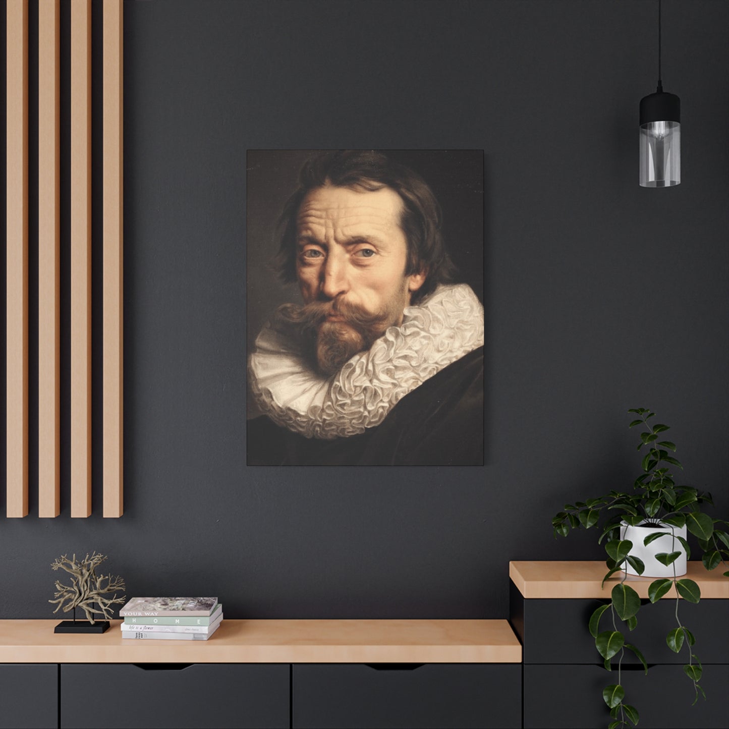
The Giambattista Marino Portrait Wall Art serves as a stunning tribute to one of the Baroque era's most influential literary figures, seamlessly blending the richness of historical significance with the grandeur of visual artistry. As a key figure in the development of Italian Baroque literature, Marino’s work was known for its elaborate style and profound impact on poetry and literary culture. The portraiture inspired by Marino captures both his intellectual stature and the flamboyant elegance of his time, transforming these historical references into captivating visual masterpieces that can enhance modern interior spaces.
What makes Giambattista Marino Portrait Wall Art particularly remarkable is the way it encapsulates the essence of the Baroque period. Baroque art is renowned for its dramatic use of light and shadow, intricate detailing, and larger-than-life grandeur, and these elements are beautifully preserved in the portrayal of Marino. His likeness, often depicted in richly textured attire and surrounded by luxurious settings, invites the viewer into the opulent world of 17th-century Italy. The sweeping robes, the elaborate curls of his hair, and the somber yet distinguished expression on his face speak to the intellectual gravitas of the era, while also showcasing the visual magnificence of Baroque art.
Incorporating Marino’s portrait into a modern interior is a perfect way to marry classical sophistication with contemporary style. The contrast between the Baroque aesthetic and modern décor creates an intriguing dynamic that can make any room feel both timeless and forward-thinking. The richness of the colors, often deep golds, dark reds, and muted browns, can serve as an elegant focal point in spaces that embrace opulent yet sophisticated design elements. Whether displayed in a study, living room, or hallway, Marino’s portrait elevates the space, imbuing it with an intellectual and artistic history that sparks conversation and admiration.
The Giambattista Marino Portrait wall art also offers a more profound connection to the world of literature and the arts. As a celebrated poet known for his "poetical" writings and the development of the marinism movement, Marino’s legacy extends beyond his visual likeness. His works, filled with ornate language and metaphysical depth, offer a lens into the cultural and intellectual currents of his time. By hanging his portrait in your home, you’re not only celebrating the visual magnificence of Baroque art but also honoring the literary excellence that shaped the intellectual landscape of the 17th century. This creates an environment where art, literature, and history intertwine, fostering a sense of cultural richness that resonates with anyone who appreciates the classics.
In terms of décor versatility, Giambattista Marino Portrait Wall Art is highly adaptable. Whether you’re decorating a traditional space with antique furniture and classical accents, or pairing it with minimalist, modern elements, the portrait brings an air of elegance and historical weight that can complement diverse design schemes. The juxtaposition of Baroque extravagance with clean, contemporary lines creates a visual tension that feels both dramatic and harmonious—showcasing the ability of timeless art to fit into today’s diverse interior styles.
Moreover, the portrait of Marino serves as a perfect conversation starter for guests who are intrigued by history, literature, or the fine arts. The Baroque period, with its lavish expression and emotional intensity, offers a fascinating story that is brought to life through the portrait, making it an ideal piece for any setting where conversation and reflection are encouraged. Whether placed in a study, library, or an intimate reading nook, the portrait inspires a sense of intellectual curiosity and aesthetic appreciation.
In conclusion, Giambattista Marino Portrait Wall Art is more than just a decorative piece—it is a celebration of Baroque literary excellence and visual magnificence that transcends time and style. Through its dynamic representation of Marino’s grandeur and intellectual influence, it brings both historical richness and artistic beauty into modern interiors. As a bold statement piece, it bridges the gap between past and present, offering an elegant focal point that enriches any space with a sense of cultural depth, intellectual history, and timeless elegance. Whether you’re drawn to its historical significance, its Baroque opulence, or its cultural resonance, Marino’s portrait adds a sophisticated layer to your home, inviting admiration and reflection for years to come.
Share