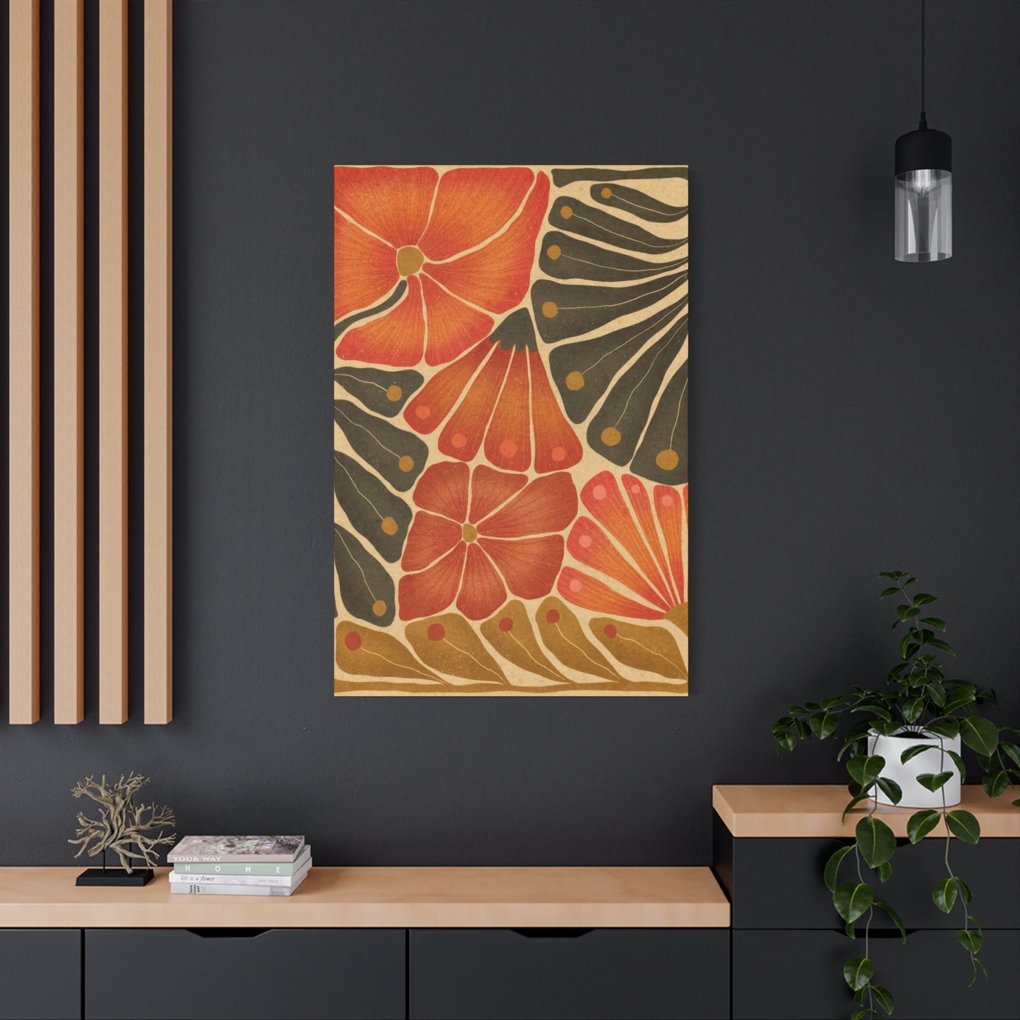
Flower Abstract Colorful Wall Art & Canvas Prints
Flower Abstract Colorful Wall Art & Canvas Prints
Couldn't load pickup availability
Vibrant Botanical Expressions: Exploring the World of Flower Abstract Colorful Wall Art for Modern Living Spaces
The realm of interior decoration has witnessed a remarkable transformation in recent years, with homeowners and design enthusiasts increasingly gravitating toward pieces that blend natural beauty with contemporary artistic vision. Among these captivating choices, flower abstract colorful wall art stands as a bridge between the organic elegance of nature and the bold, expressive strokes of modern creativity. This comprehensive exploration delves into every facet of this captivating art form, revealing how these magnificent pieces can revolutionize residential and commercial environments while offering profound aesthetic and emotional benefits.
The Timeless Allure of Botanical Imagery Reimagined Through Contemporary Artistic Lenses
Throughout human civilization, floral motifs have maintained an unshakeable presence in artistic expression across diverse cultures and epochs. From ancient Egyptian tomb paintings featuring lotus blossoms to the intricate botanical illustrations of the Renaissance period, flowers have served as powerful symbols of beauty, transience, renewal, and the cyclical nature of existence. What distinguishes contemporary flower abstract colorful wall art from these predecessors is the innovative fusion of representational elements with non-objective compositional approaches, creating visual experiences that transcend literal interpretation.
The contemporary artist working with floral abstractions possesses the freedom to deconstruct, reimagine, and reconstruct botanical forms according to their unique vision. Rather than meticulously rendering each petal, stamen, and leaf with photographic precision, these creators capture the essential spirit, movement, and emotional resonance of their botanical subjects. The resulting artworks vibrate with energy, color, and form in ways that purely realistic depictions cannot achieve. This approach allows viewers to engage with the familiar comfort of recognizable floral elements while simultaneously experiencing the intellectual and emotional stimulation that abstraction provides.
The color palettes employed in these artworks often diverge dramatically from those found in nature, with artists embracing vivid magentas, electric blues, luminous oranges, and chromatic combinations that exist solely within the imagination. This chromatic liberty enables creators to evoke specific moods, atmospheres, and psychological states that extend beyond what natural observation would permit. The interplay between recognizable floral silhouettes and unexpected color relationships generates visual tension that captivates viewers and invites prolonged contemplation.
Compositional Approaches That Define Contemporary Floral Abstraction in Wall-Mounted Artwork
The structural organization of flower abstract colorful wall art varies tremendously depending on the artist's conceptual intentions, stylistic preferences, and desired emotional impact. Some creators favor densely packed compositions where blossoms, leaves, and stems overlap in lush, almost overwhelming profusion, creating visual experiences that immerse viewers in botanical abundance. These maximalist approaches often incorporate layered textures, varied mark-making techniques, and complex color interactions that reward close examination while maintaining coherent visual impact when viewed from a distance.
Conversely, other artists embrace minimalist sensibilities, isolating single blooms or small clusters against expansive neutral backgrounds. These reductive compositions emphasize negative space as an active compositional element, allowing viewers' eyes to rest while simultaneously heightening the visual and emotional significance of the depicted floral forms. The stark contrast between simplified botanical elements and vast empty areas creates dramatic tension that can prove equally compelling as more elaborate arrangements.
Gestural abstraction represents another significant approach within this artistic category, where the physicality of the creative process becomes an integral part of the finished work. Bold, sweeping brushstrokes suggest petals unfurling or stems reaching skyward without describing these elements in explicit detail. The visible evidence of the artist's hand—drips, splatters, energetic marks—imbues these pieces with kinetic vitality that static, carefully controlled renderings cannot replicate. This immediacy and spontaneity resonate particularly well with viewers seeking authentic, emotionally direct artistic experiences.
Geometric interpretations of floral subjects offer yet another compelling direction within flower abstract colorful wall art. Here, organic botanical forms are translated into angular shapes, precise lines, and structured compositions that emphasize pattern, symmetry, and mathematical relationships. This approach appeals to sensibilities that appreciate order, clarity, and the intellectual satisfaction that comes from recognizing how natural forms can be systematically analyzed and reconstructed according to geometric principles.
Color Theory Principles That Amplify the Visual Impact of Botanical Abstract Artwork
Understanding chromatic relationships proves essential for both creators and collectors of flower abstract colorful wall art. The strategic deployment of complementary colors—those positioned opposite each other on the color wheel—generates maximum visual vibration and dynamic tension. When warm oranges nestle against cool blues, or vibrant reds contrast with deep greens, the resulting optical effects command attention and create memorable visual experiences. These high-contrast pairings work particularly effectively in large-scale pieces intended to serve as focal points within interior spaces.
Analogous color schemes, featuring hues that neighbor each other on the color wheel, produce markedly different effects. Compositions built around progressions of blues, greens, and teals, or sequences moving through yellows, oranges, and reds, generate harmonious, flowing visual experiences that many viewers find soothing and aesthetically pleasing. These approaches prove particularly effective for creating cohesive atmospheres in residential environments where tranquility and relaxation take precedence over visual excitement.
Monochromatic explorations—variations of a single hue ranging from its lightest tints to its darkest shades—offer sophisticated elegance and refined restraint. A composition exploring the complete spectrum of blues, from barely-there whispers of sky to midnight depths, can achieve remarkable complexity and visual interest while maintaining serene unity. These subtle investigations reward patient observation and complement spaces where understated refinement is desired.
Temperature variations within color selections dramatically influence the emotional tenor of flower abstract colorful wall art. Warm-dominated palettes featuring reds, oranges, yellows, and warm pinks create energetic, welcoming, optimistic atmospheres that can energize social spaces and stimulate creativity. Cool-dominant schemes built around blues, greens, purples, and cool pinks tend toward calming, contemplative, sometimes melancholic moods that suit private retreats and spaces designated for reflection or rest.
Saturation levels—the intensity or purity of colors—also profoundly impact viewer response. Highly saturated, vivid hues project confidence, vitality, and contemporary flair, making bold statements that suit modern, eclectic, or energetically decorated environments. Desaturated, muted tones convey sophistication, restraint, and timeless elegance, integrating seamlessly into spaces where subtlety and refinement predominate. Many compelling pieces strategically combine both approaches, using saturated accents to draw attention to specific compositional areas while employing muted tones to provide visual respite and structural support.
Material Considerations and Surface Qualities That Enhance Aesthetic Expression in Floral Abstract Pieces
The physical substrates and mediums employed in creating flower abstract colorful wall art significantly influence both visual characteristics and longevity. Canvas remains the predominant choice for many artists, offering a receptive surface that accepts diverse media including oils, acrylics, and mixed media approaches. Stretched canvas presents a slight give when touched, creating a subtle three-dimensionality that enhances viewing experiences. Gallery-wrapped canvas, where the image continues around the sides of the stretcher bars, eliminates the need for framing and creates a contemporary, finished appearance particularly suited to modern interiors.
Wooden panels provide rigid, unforgiving surfaces that enable meticulous detail work and precise mark-making impossible on flexible canvas. The absolute flatness of these supports appeals to artists whose visions demand exacting control. Many creators prepare these surfaces with multiple layers of gesso, building up smooth, luminous grounds that enhance color vibrancy and create almost jewel-like surface qualities. Others embrace the natural texture of wood, allowing grain patterns to emerge through translucent paint layers, creating dialogues between organic material properties and applied imagery.
Paper-based works, whether executed on watercolor sheets, handmade artisan papers, or archival printmaking stocks, offer distinct aesthetic qualities and practical advantages. The absorbent nature of paper creates unique interactions with water-based media, producing soft edges, organic bleeds, and ethereal atmospheric effects difficult to achieve on sealed surfaces. Heavyweight papers can support surprisingly robust layering and mixed-media approaches while maintaining the characteristic delicacy associated with works on paper.
Metal substrates have gained popularity for contemporary flower abstract colorful wall art, with aluminum panels offering smooth, non-porous surfaces that create brilliant color saturation and striking luminosity. The inherent reflective properties of metal add another dimension to viewing experiences as ambient light conditions change throughout the day. Some artists deliberately exploit these properties, using transparent or semi-transparent media to allow metallic substrate qualities to interact with applied pigments.
Acrylic mediums dominate contemporary production due to their quick drying times, minimal odor, ease of cleanup, and remarkable versatility. Artists can manipulate acrylics to achieve effects ranging from transparent watercolor-like washes to impasto applications with pronounced sculptural texture. The permanent nature of dried acrylics and their resistance to yellowing over time make them particularly suitable for works intended for long-term display.
Oil paints, despite their longer drying times and more complex handling requirements, remain cherished by artists who value their unmatched richness, blending capabilities, and luminous depth. The extended working time oils provide allows for subtle gradations and seamless transitions between hues that many creators find essential to their artistic visions. The slight translucency of oil paint layers creates optical depth as light penetrates the surface and reflects back through multiple strata, producing radiance impossible to replicate with opaque media.
Mixed-media approaches combining diverse materials—collage elements, textural additives, metallic leafs, found objects—expand expressive possibilities exponentially. These hybrid creations blur categorical boundaries, creating works that function simultaneously as paintings, assemblages, and sculptural reliefs. The unexpected juxtapositions and material contrasts inherent in mixed-media approaches generate visual intrigue and tactile complexity that flat paint applications alone cannot provide.
Strategic Placement Guidelines for Maximizing the Visual Impact of Floral Abstract Artwork Within Interior Environments
The location selection for flower abstract colorful wall art profoundly influences both the artwork's visual effectiveness and the overall atmosphere of the inhabited space. In residential contexts, living rooms represent prime display opportunities, as these gathering spaces receive frequent use and benefit from conversational focal points that spark dialogue and reflection. Large-scale pieces positioned above sofas or mantels command attention without overwhelming, provided appropriate scale relationships between furniture and artwork are maintained. As a general guideline, artwork spanning approximately two-thirds to three-quarters of the furniture width below creates visually balanced, professionally composed arrangements.
Dining areas offer excellent venues for botanical abstractions, as the association between flowers and celebration, abundance, and hospitality creates intuitive conceptual connections. Vibrant, warm-hued pieces can stimulate appetite and conversation, while cooler, more subdued compositions encourage lingering and contemplative dining experiences. The relatively controlled lighting conditions typical of dining spaces allow for precise highlighting of artworks through strategic fixture placement.
Bedroom environments benefit tremendously from thoughtfully selected flower abstract colorful wall art, as the psychological and emotional associations carried by floral imagery—renewal, growth, beauty, natural cycles—align well with rest and regeneration. Scale considerations become particularly important in sleeping chambers, where overwhelming or excessively stimulating imagery can interfere with relaxation. Many designers recommend softer color palettes and less frenetic compositional approaches for bedroom artwork, though individual preferences naturally vary considerably.
Entryways and foyers present unique opportunities for creating powerful first impressions through strategically positioned botanical abstractions. These transitional spaces benefit from artwork that welcomes, intrigues, and establishes the aesthetic character of the home beyond. Bold, confident pieces in these locations announce the residents' appreciation for art and design while setting expectations for the visual experiences that await in other rooms.
Home offices and creative workspaces gain inspiration and energy from well-chosen flower abstract colorful wall art. The presence of botanical elements, even in stylized form, has been shown to enhance creative thinking, reduce stress, and improve overall wellbeing in work environments. Pieces featuring energetic compositions and stimulating color combinations can counteract the mental fatigue associated with prolonged focused work, while more contemplative pieces support sustained concentration.
Bathroom spaces, often neglected in artwork placement discussions, provide surprisingly effective locations for smaller-scale botanical abstractions. The associations between flowers, beauty rituals, and self-care create natural thematic resonance. Moisture considerations necessitate proper framing and protective measures, but these practical concerns should not preclude incorporating art into these intimate spaces.
Commercial environments including corporate offices, hospitality venues, healthcare facilities, and retail establishments increasingly recognize the value of flower abstract colorful wall art for enhancing client experiences and supporting brand identities. In medical settings particularly, research demonstrates that exposure to nature-inspired imagery reduces patient anxiety, lowers blood pressure, and accelerates recovery processes. Abstract rather than literal representations often work more effectively in professional contexts, offering sophistication and broad appeal without the potentially polarizing specificity of realistic depictions.
Illumination Strategies That Reveal the Full Potential of Botanical Abstract Wall Pieces
Proper lighting represents perhaps the most frequently overlooked factor in successfully displaying flower abstract colorful wall art. Natural daylight, while desirable in many contexts, presents challenges due to its constantly changing quality, intensity, and direction. Morning light entering from eastern exposures casts different chromatic characteristics than afternoon western light or consistent northern exposure. Artists and collectors should evaluate how works appear under varying natural light conditions throughout daily cycles before committing to permanent placement.
Artificial lighting provides control and consistency, allowing precise highlighting and optimal presentation regardless of time or weather. Track lighting with adjustable fixtures offers maximum flexibility, enabling viewers to direct illumination exactly where desired while accommodating future artwork changes. Picture lights—dedicated fixtures mounted directly above or to the sides of frames—create focused, dramatic lighting that emphasizes artwork while minimizing illumination of surrounding walls, creating gallery-like presentation quality.
LED technology has revolutionized artwork lighting, providing cool-temperature operation that prevents heat damage, extended operational lifespans reducing maintenance requirements, and excellent color rendering capabilities that reveal artworks' true chromatic qualities. Color rendering index (CRI) ratings should exceed 90 for artwork lighting applications, ensuring that perceived colors closely match those under ideal daylight conditions. This becomes particularly crucial for flower abstract colorful wall art where chromatic relationships form essential compositional elements.
Ambient light levels throughout rooms significantly impact artwork visibility and emotional tone. In brightly lit spaces, artwork must compete with overall illumination levels, sometimes requiring supplemental dedicated lighting to prevent visual receding. Dimmer environments naturally emphasize lit artworks, creating dramatic focal points, though excessive contrast between dark surroundings and brightly lit pieces can cause viewer discomfort. Balanced approaches that consider both ambient and dedicated lighting typically yield the most satisfying results.
Glare represents a persistent challenge when displaying artwork behind protective glazing or when surface textures create reflective hotspots. Strategic angling of both artwork and light sources helps minimize these issues, as does selecting matte or anti-glare glazing products when framing is employed. For unframed canvas pieces, the naturally light-absorbing properties of most paint surfaces reduce but do not eliminate glare concerns.
Size and Scale Relationships That Create Harmonious Visual Dialogues Between Artwork and Architecture
Determining appropriate dimensions for flower abstract colorful wall art requires careful consideration of multiple factors including wall size, ceiling height, furniture scale, and viewing distances. A common miscalculation involves selecting pieces that are too small for their intended locations, resulting in insignificant visual presence and lost opportunities for impact. When in doubt between two sizes, the larger option typically proves more satisfying, provided it does not overwhelm the space or dominate inappropriately.
For walls above furniture such as sofas, beds, or buffets, the previously mentioned guideline of artwork spanning two-thirds to three-quarters of the furniture width creates balanced, professionally proportioned arrangements. This ratio ensures visual connection between furniture and artwork while maintaining breathing room that prevents cramped, claustrophobic impressions. Single large-scale pieces generally create more dramatic, cohesive impact than multiple small works scattered across equivalent wall space.
Ceiling height significantly influences appropriate artwork scale. Standard eight-foot ceilings limit vertical dimension options, while taller ceilings enable dramatic vertical compositions that draw eyes upward and emphasize architectural volume. In spaces with generous ceiling heights, oversized pieces measuring six feet or more in height can create breathtaking impact without overwhelming, whereas these same dimensions might prove oppressive in compact rooms.
Gallery wall arrangements—collections of multiple pieces displayed in deliberate relationships—offer alternatives to single large-scale works. These installations work particularly effectively with flower abstract colorful wall art, as variations in composition, color emphasis, and scale create visual rhythm and sustained interest. Successful gallery walls require careful planning, with pieces arranged to create balanced visual weight distribution and intentional sight lines that guide viewer attention across the entire installation.
Diptychs and triptychs—artworks split across two or three separate panels—provide solutions for extremely large walls while creating dynamic compositional possibilities. The spaces between panels become active design elements, allowing wall color to participate in the overall composition. These multi-panel formats also offer practical advantages for shipping, handling, and installation compared to single massive pieces of equivalent total dimensions.
Proportion considerations extend beyond simple measurements to encompass orientation choices. Horizontal compositions emphasize width and can make spaces feel broader, while vertical formats draw attention upward and can create impressions of increased height. Square formats offer balanced, stable qualities that work effectively in many contexts though they can sometimes feel static compared to dynamic rectangular alternatives.
Stylistic Categories Within Contemporary Botanical Abstraction for Wall-Mounted Artistic Expressions
The vast landscape of flower abstract colorful wall art encompasses numerous distinct stylistic approaches, each with characteristic visual qualities and appropriate contexts. Impressionistic interpretations emphasize capturing fleeting moments, atmospheric conditions, and subjective perceptions of botanical subjects rather than precise details. These works feature broken color, visible brushwork, and emphasis on light effects, creating dreamy, romantic qualities that appeal to viewers seeking emotional resonance and lyrical beauty.
Expressionistic approaches prioritize emotional intensity and subjective experience over objective observation. Bold, sometimes violent color applications, distorted forms, and energetic mark-making convey the artist's intense feelings about their subjects. These works radiate raw energy and psychological depth that can prove either exhilarating or overwhelming depending on viewer sensibilities. Expressionistic flower abstract colorful wall art suits environments where passion, vitality, and authentic emotional expression are valued.
Cubistic botanical studies deconstruct floral subjects into geometric planes and facets, presenting multiple simultaneous viewpoints within single compositions. This analytical approach appeals to intellectually oriented viewers who appreciate seeing familiar subjects reimagined through systematic structural analysis. The fragmented, reassembled quality of cubistic works creates visual puzzles that reward sustained examination.
Surrealistic floral abstractions incorporate unexpected juxtapositions, impossible spatial relationships, and dreamlike atmospheres that challenge rational interpretation. These works tap into subconscious associations and symbolic meanings, creating mysterious, sometimes unsettling viewing experiences. Surrealistic approaches work particularly well for viewers who enjoy ambiguity, metaphor, and artworks that resist simple categorization or explanation.
Pointillist and divisionist techniques apply color in small, distinct marks rather than blended passages, relying on optical mixing when viewed from appropriate distances. These methodical approaches create vibrant, luminous surfaces with characteristic shimmer and visual texture. The meticulous labor evident in pointillist works appeals to viewers who value craft, patience, and systematic working methods.
Abstract botanical photography represents an increasingly popular category, where artists use cameras, lenses, and post-processing techniques to capture flower subjects in unexpected, non-literal ways. Extreme close-ups revealing microscopic structures, intentional motion blur creating ethereal effects, and chromatic manipulations transforming natural colors into fantastical palettes all contribute to this growing field. These works offer different authenticity than painted abstractions, being rooted in actual botanical subjects despite their transformed appearances.
The Emotional and Psychological Dimensions of Living With Botanical Abstract Artwork
Beyond purely aesthetic considerations, flower abstract colorful wall art exerts significant psychological and emotional influences on inhabitants of decorated spaces. Research in environmental psychology consistently demonstrates that visual art exposure affects mood states, stress levels, cognitive performance, and overall wellbeing. The specific content, style, and chromatic qualities of artwork modulate these effects in complex ways that deserve careful consideration during selection processes.
Floral imagery, even in abstracted form, carries powerful associations with natural environments, organic processes, growth cycles, and seasonal changes. These connections tap into deeply rooted human responses to nature that evolved over millennia when survival depended on intimate environmental awareness. Biophilic design principles—approaches that incorporate natural elements into built environments—recognize these innate inclinations and leverage them to create spaces that support human flourishing. Flower abstract colorful wall art serves as a relatively effortless means of introducing biophilic elements into environments where living plants may prove impractical.
Color psychology research reveals consistent patterns in how different hues affect emotional states, though individual responses vary based on personal experiences, cultural conditioning, and contextual factors. Red stimulates, energizes, and can raise blood pressure and heart rate. Orange promotes enthusiasm, creativity, and social connection. Yellow evokes happiness, optimism, and mental clarity while potentially causing eye strain and agitation in excessive quantities. Green calms, balances, and connects viewers to nature while promoting focus and renewal. Blue soothes, reduces anxiety, and can enhance productivity though it may feel cold or depressing in certain contexts. Purple suggests luxury, spirituality, and creativity while potentially feeling heavy or oppressive in large doses. Understanding these general principles helps in selecting flower abstract colorful wall art that will support desired emotional atmospheres.
The abstract quality of non-literal botanical representations offers psychological advantages over realistic depictions. Abstraction invites personal interpretation and imaginative engagement rather than simply presenting objective information. This openness allows viewers to project their own meanings, associations, and emotions onto artworks, creating more personally relevant experiences. The same abstract floral piece might suggest joyful celebration to one viewer, peaceful contemplation to another, and melancholic beauty to a third, with each interpretation being equally valid.
Artistic presence in living environments signals values, aspirations, and self-conception. Choosing to display flower abstract colorful wall art communicates appreciation for beauty, willingness to engage with aesthetic complexity, and alignment with contemporary sensibilities. These signals function both as personal reminders of identity and as communications to visitors about household character. The psychological boost from inhabiting spaces that reflect authentic self-expression and cherished values should not be underestimated.
Practical Acquisition Guidance for Building Collections of Contemporary Botanical Abstract Pieces
Navigating the contemporary art marketplace requires understanding various acquisition channels, price determinants, and authentication considerations. Original one-of-a-kind pieces command premium prices reflecting artist reputation, materials, dimensions, and labor investment. Emerging artists typically offer more accessible entry points while established creators with exhibition histories, critical recognition, and strong market presence command substantially higher prices. Collectors must balance personal aesthetic preferences against investment considerations, recognizing that tastes and market values sometimes diverge significantly.
Gallery relationships provide valuable benefits including professional curation, authentication guarantees, condition assurances, and ongoing client services. Reputable galleries vet artists carefully, selecting only those whose work meets established quality standards. This pre-screening saves collectors considerable time and reduces risk compared to unmediated direct purchases. Gallery commissions, typically ranging from 40 to 60 percent of sales prices, support operational costs and professional services provided.
Art fairs and festivals offer opportunities to view multiple artists' works simultaneously, compare approaches, and sometimes acquire pieces at favorable prices. These events range from prestigious international fairs showcasing blue-chip galleries to local community festivals featuring regional creators. The less formal atmosphere compared to traditional galleries can make these venues less intimidating for novice collectors while providing direct artist access that enriches understanding and appreciation.
Online platforms have democratized art acquisition, connecting artists directly with collectors worldwide while eliminating traditional geographic and institutional barriers. This accessibility comes with increased responsibility for buyers to research artist credentials, understand return policies, and verify artwork conditions. High-resolution imagery helps but cannot fully substitute for in-person examination. Reputable online venues provide detailed condition reports, authentication documentation, and buyer protections comparable to physical galleries.
Limited edition prints and reproductions make flower abstract colorful wall art accessible to broader audiences at significantly reduced price points compared to originals. Giclée printing technology produces archival-quality reproductions with excellent color fidelity and longevity. Numbered limited editions maintain some collectible cachet while remaining affordable. Open edition prints offer maximum accessibility with minimal collectible value. Collectors should clarify whether editions include artist signatures, certificates of authenticity, and clearly understand the distinction between reproductions and original works.
Commission opportunities allow collectors to collaborate with artists in creating custom pieces tailored to specific spaces, color schemes, and personal preferences. This personalized approach ensures perfect fit and unique ownership but requires clear communication, reasonable timelines, and acceptance that final results may diverge somewhat from initial concepts as artists' creative processes unfold. Commission agreements should specify dimensions, general color palettes, style parameters, timelines, payment schedules, and ownership rights clearly to prevent misunderstandings.
Authentication and provenance documentation gain importance as collection value increases. Certificates of authenticity should include artist signatures, creation dates, medium specifications, edition numbers if applicable, and unique identifier numbers corresponding to artwork backing markings. Maintaining purchase receipts, appraisal documents, exhibition histories, and publication references establishes provenance that supports resale values and insurance claims.
Conservation Practices That Preserve the Visual Integrity of Floral Abstract Wall Artwork Over Time
Proper care significantly extends the lifespan and maintains the aesthetic quality of flower abstract colorful wall art. Environmental conditions exert perhaps the greatest influence on artwork longevity, with temperature fluctuations, humidity extremes, and light exposure causing the most common degradation. Stable temperature ranges between 65 and 75 degrees Fahrenheit prove ideal, while dramatic swings cause expansion and contraction cycles that stress materials and contribute to cracking, warping, and delamination.
Relative humidity levels between 40 and 55 percent prevent the moisture-related problems that plague artworks in both excessively damp and arid conditions. High humidity encourages mold growth, paper buckling, and adhesive failure, while excessively dry conditions cause embrittlement, cracking, and loss of flexibility in organic materials. Dehumidifiers and humidifiers help maintain appropriate levels in challenging climates, with continuous monitoring devices providing early warning of problematic conditions.
Light exposure represents an insidious threat because damage accumulates gradually and irreversibly. Both natural and artificial light contain ultraviolet radiation that breaks down organic molecules in pigments, binders, and substrates, causing fading, discoloration, and structural weakening. UV-filtering glazing for framed works and UV-filtering window films for rooms containing unframed pieces provide essential protection. Limiting cumulative light exposure through strategic placement away from direct sun and using lower-intensity illumination when possible further extends artwork lifespans.
Physical damage from handling, impacts, and inappropriate storage practices requires vigilance to prevent. Moving artworks should always involve clean hands or cotton gloves, careful lifting from solid support points rather than fragile frames, and adequate protection from bumps and scrapes. Leaning unframed canvases against walls risks punctures and dents, while stacking without adequate separation causes surface abrasion. Purpose-designed storage racks, padded blankets, and rigid corner protectors prevent most common handling injuries.
Regular gentle dusting removes particulate accumulation that can abrade surfaces and attract moisture. Soft natural-bristle brushes or microfiber cloths applied with light strokes from top to bottom prevent dust resettlement while minimizing surface contact. Compressed air dusters work well for reaching recessed areas and textured surfaces, though excessive pressure can dislodge loose paint or drive particles into porous surfaces. Never apply cleaning solutions, even plain water, without professional consultation, as inappropriate cleaning represents one of the most common causes of irreversible artwork damage.
Professional conservation assessments every three to five years provide expert evaluation of condition, identification of emerging problems, and recommendations for preventive measures. Conservators possess specialized training in artwork examination, material science, and treatment protocols unavailable to general practitioners. Their services prove particularly valuable for historically significant pieces, works by important artists, or emotionally treasured items where preservation justifies professional intervention costs.
Framing Choices That Enhance Presentation While Providing Essential Physical Protection
Frame selection profoundly influences both the visual presentation and physical preservation of flower abstract colorful wall art. The tension between aesthetic enhancement and protective function requires balanced consideration of multiple factors. Traditional framing approaches place artworks behind glazing within recessed frames, providing maximum protection from environmental contaminants, physical damage, and handling risks. This encapsulation proves particularly important for works on paper, fragile mixed media pieces, and valuable items requiring museum-quality preservation.
Glazing material options include standard glass, UV-filtering glass, anti-reflective glass, and acrylic alternatives. Museum-quality conservation glass filters 99 percent of UV radiation while maintaining exceptional clarity, making it the gold standard for valuable pieces. Anti-reflective coatings eliminate glare that can obscure artwork visibility, particularly important for high-traffic areas or spaces with unavoidable direct lighting. Acrylic glazing weighs considerably less than glass and resists shattering, making it preferable for large-scale works, overhead installations, or earthquake-prone regions, though it scratches more easily and attracts static-charged dust.
Mat boards serve multiple functions including aesthetic enhancement, physical separation between artwork and glazing, and provision of neutral borders that focus viewer attention. Acid-free conservation-grade matting prevents the discoloration and deterioration that afflicts works mounted with conventional wood-pulp materials. Mat color selections significantly influence artwork perception, with white and off-white providing classic neutrality, black creating dramatic contrast, and colored mats offering opportunities for chromatic harmonies or complementary relationships.
Frame profiles range from ornate traditional moldings to sleek contemporary designs, with selection depending on artwork style, interior décor, and personal preferences. Highly decorative frames can overwhelm subtle artworks while competing visually with elaborate compositions. Conversely, minimal contemporary frames sometimes fail to provide adequate visual weight for commanding large-scale pieces. The frame's visual mass should roughly correspond to the artwork's visual complexity and scale, creating balanced rather than lopsided impressions.
Floater frames, which create the illusion of artworks suspended within frame structures without actually contacting the pieces, offer popular contemporary alternatives particularly suited to canvas works. This presentation style emphasizes artwork materiality while providing clean, gallery-quality presentation. The visible depth between canvas edges and frame interiors creates subtle shadows that enhance three-dimensionality and visual interest.
Alternative presentation methods including magnetic hanging systems, cleat hangers, and wire suspensions offer frameless alternatives that suit contemporary aesthetics while simplifying artwork rotation and rearrangement. These approaches work particularly well for unframed canvases, gallery-wrapped pieces, and works where visible mounting hardware feels inconsistent with artistic intentions. Safety considerations become paramount with frameless hanging, requiring secure mounting appropriate to artwork weight and wall construction.
The Role of Floral Abstract Artwork in Supporting Various Interior Design Philosophies and Aesthetic Movements
Contemporary interior design encompasses diverse philosophical approaches, each with characteristic principles, preferred aesthetics, and conceptual underpinnings. Understanding these frameworks helps identify flower abstract colorful wall art compatible with specific design directions. Modernist interiors emphasizing clean lines, functional efficiency, and elimination of superfluous decoration benefit from bold, simplified botanical abstractions that honor these principles. Geometric floral interpretations with strong compositional structure and controlled color palettes complement modernist sensibilities without introducing visual chaos or decorative excess.
Mid-century modern aesthetics celebrating organic forms, natural materials, and connections between interior and exterior environments find natural partners in botanical abstractions that echo period sensibilities. Warm wood tones, sculptural furniture forms, and characteristic color palettes from this era harmonize beautifully with floral artworks featuring similar chromatic approaches and organic asymmetry. The optimistic, forward-looking spirit of mid-century design aligns well with the vitality inherent in floral subjects.
Scandinavian design principles emphasizing simplicity, functionality, natural light, and connection to nature create ideal contexts for understated floral abstractions featuring predominantly neutral palettes with judicious color accents. The restrained elegance and emphasis on essential elements characteristic of Nordic interiors complement similarly refined botanical works that avoid excessive elaboration or chromatic intensity. The psychological warmth needed to counterbalance stark Nordic minimalism comes naturally through carefully selected floral pieces that introduce organic softness.
Maximalist approaches that embrace abundance, pattern mixing, and bold color fearlessly incorporate elaborate floral abstractions as components within visually rich environments. In these contexts, flower abstract colorful wall art need not serve as singular focal points but rather contributes to overall sensory richness. Layered, complex compositions with exuberant color and elaborate detail complement rather than compete with surrounding decorative elements.
Bohemian and eclectic styles celebrating personal expression, cultural fusion, and rejection of rigid rules provide particularly hospitable environments for diverse botanical abstractions. The experimental spirit and artistic freedom characteristic of these approaches welcome unexpected chromatic combinations, unconventional compositions, and mixed-media explorations. Botanical artwork selection in bohemian contexts can follow intuitive attraction rather than systematic coordination, with happy accidents and surprising juxtapositions contributing to overall charm.
Industrial aesthetics featuring exposed structural elements, raw materials, and utilitarian functionality benefit from floral abstractions that provide organic counterpoints to hard architectural features. The visual and emotional softness of botanical subject matter balances the sometimes harsh qualities of concrete, steel, and brick surfaces while the abstract treatment prevents overly romantic or decorative impressions inconsistent with industrial design philosophy.
Transitional styles bridging traditional and contemporary approaches find versatile partners in botanical abstractions that acknowledge recognizable subject matter while embracing non-literal interpretation. These pieces satisfy preferences for identifiable content without the dated quality sometimes associated with strictly representational traditional artwork. The inherent flexibility of floral abstraction makes it adaptable to various transitional aesthetic directions.
Conclusion
Viewing residential and commercial interiors as unified compositions rather than isolated rooms enables sophisticated artwork programs that create visual rhythms, thematic connections, and intentional progressions throughout spaces. Flower abstract colorful wall art proves particularly effective for these holistic approaches due to its versatility, broad appeal, and capacity for variation within consistent parameters. Establishing overall color palettes that recur across multiple rooms while varying in emphasis and supporting hues creates subtle connections that unify without monotonous repetition.
Stylistic consistency in abstraction approaches—maintaining similar levels of geometric structure versus organic freedom, comparable mark-making qualities, or related compositional strategies—generates visual coherence while allowing subject matter and color variations to distinguish individual spaces. Alternatively, deliberately contrasting styles between adjacent rooms creates dynamic transitions that announce functional shifts and provide visual variety while botanical subject continuity maintains underlying connection.
Scale progressions from smaller intimate pieces in private spaces to commanding large-scale works in public gathering areas mirror the hierarchy of spaces themselves. This dimensional strategy reinforces architectural programming while creating appropriate visual impacts suited to each environment's social function. The gradual or dramatic transitions between scales as inhabitants move through spaces contribute to experiential richness and environmental legibility.
Seasonal progressions represent another sophisticated organizational strategy, with artworks suggesting spring's fresh emergence in entryways, summer's full bloom in active social spaces, autumn's mature ripeness in dining areas, and winter's quiet dormancy in private retreats. These metaphorical alignments between botanical subjects and room functions create poetic resonances that enrich daily experiences while honoring natural cycles.
Chromatic journeys beginning with energizing warm hues in wake-up spaces, progressing through balanced neutrals in circulation areas, and concluding with calming cool tones in evening relaxation zones support natural daily rhythms and activity patterns. This chromatic choreography subtly influences mood and behavior while creating satisfying aesthetic experiences as inhabitants move through daily routines.
Artist-focused programs showcasing multiple works by individual creators demonstrate committed patronage while providing insights into artistic development, range, and thematic preoccupations. This curatorial approach suits art enthusiast households where supporting particular artists and building meaningful relationships with their work takes precedence over decorative coordination. The depth of engagement possible through extended artist relationships offers rewards unavailable through scattered single-work acquisitions.
Share