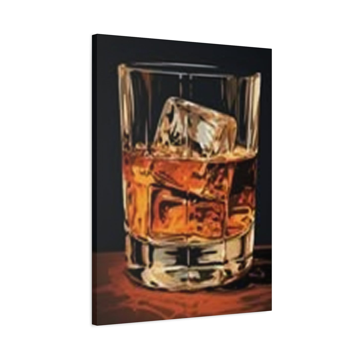
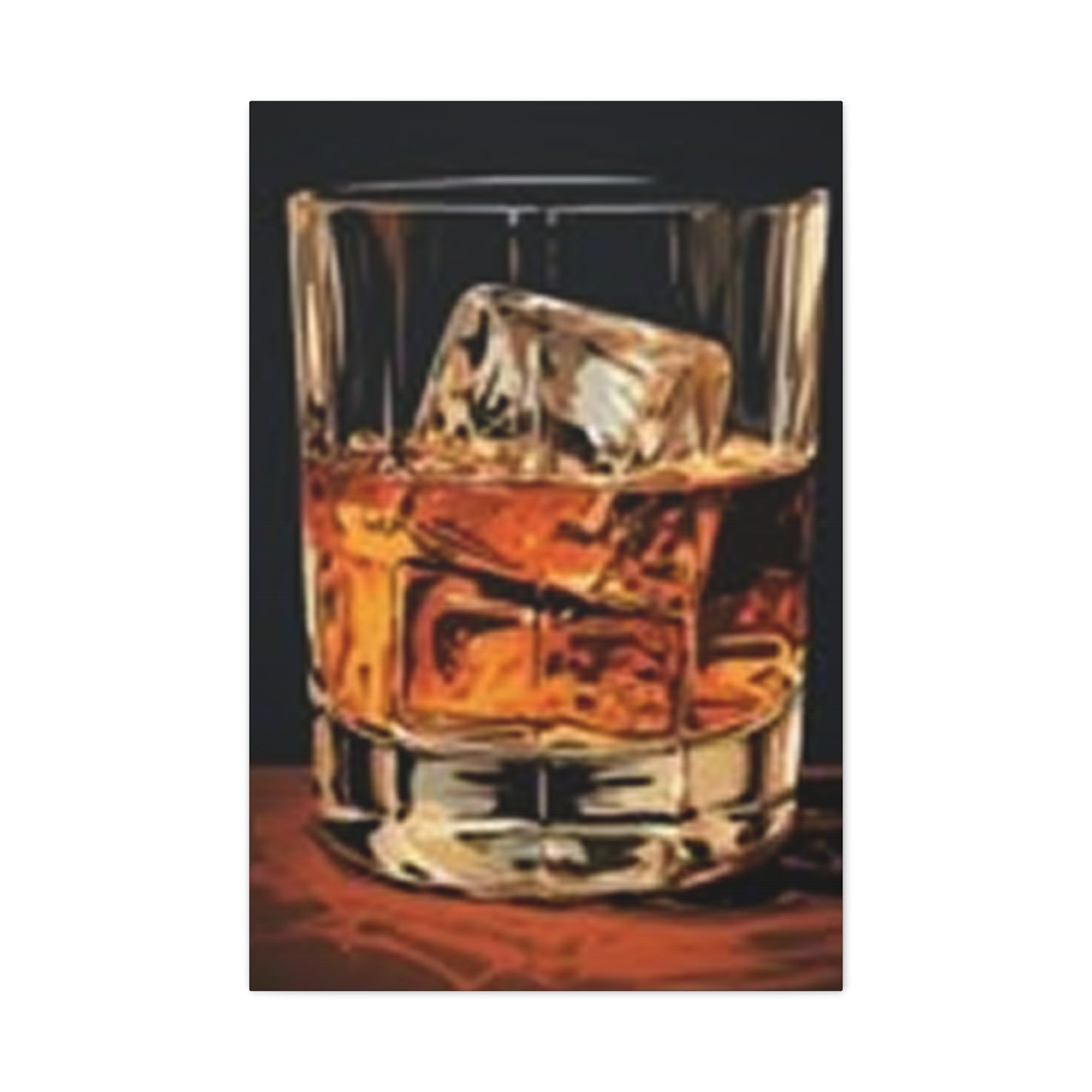
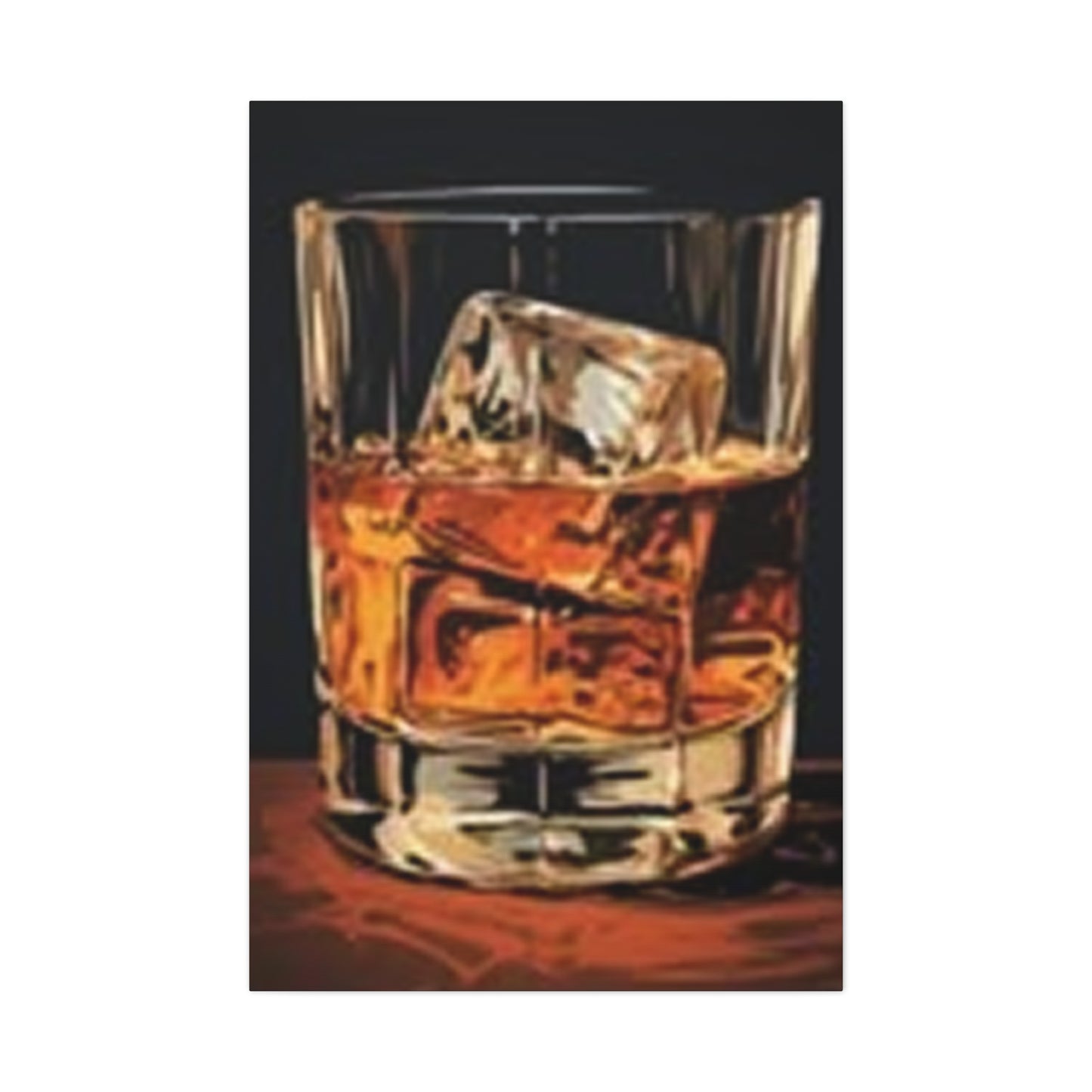
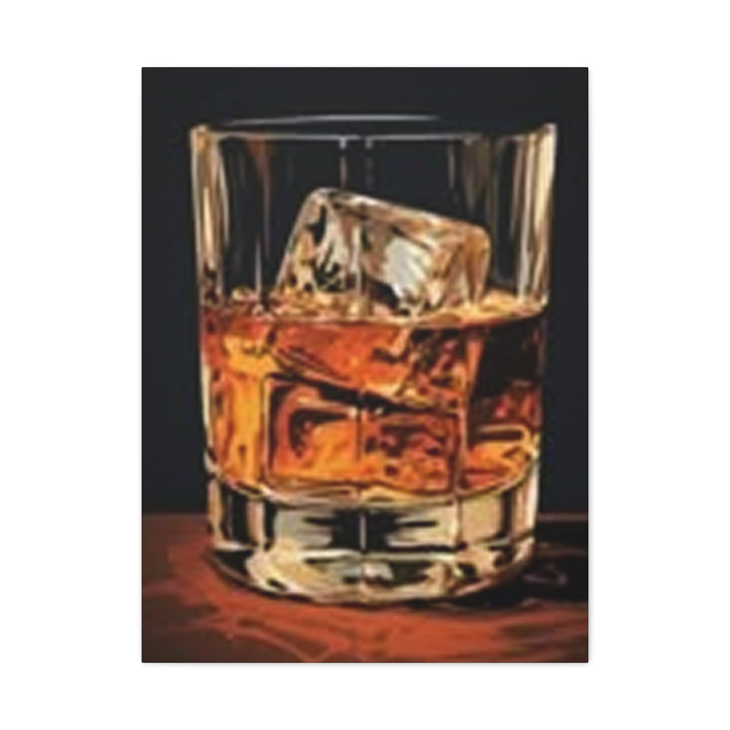
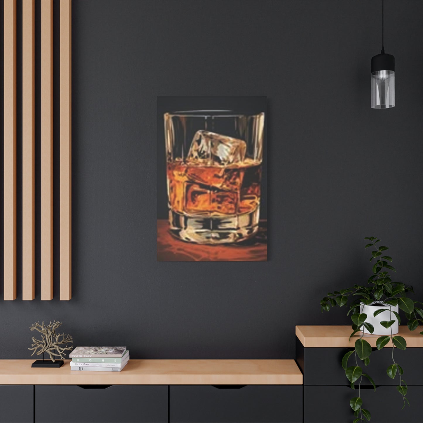
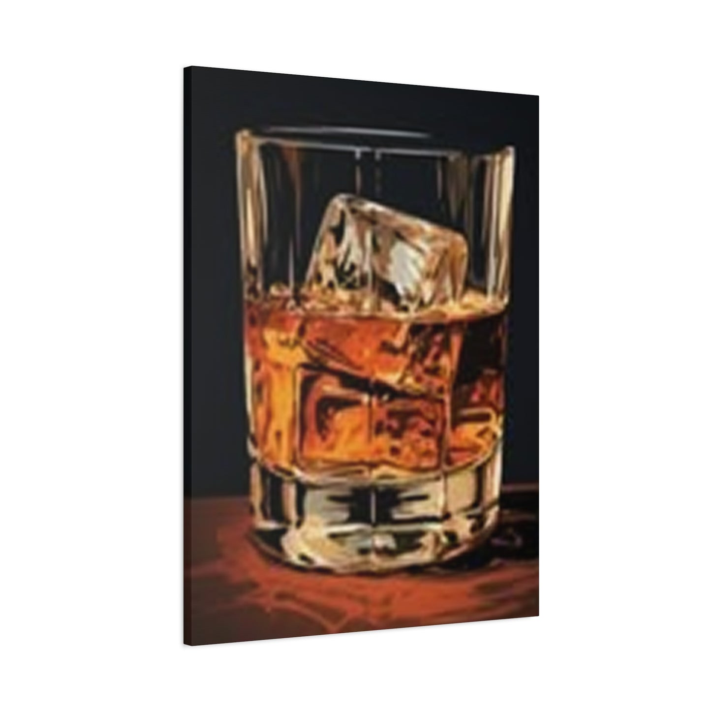
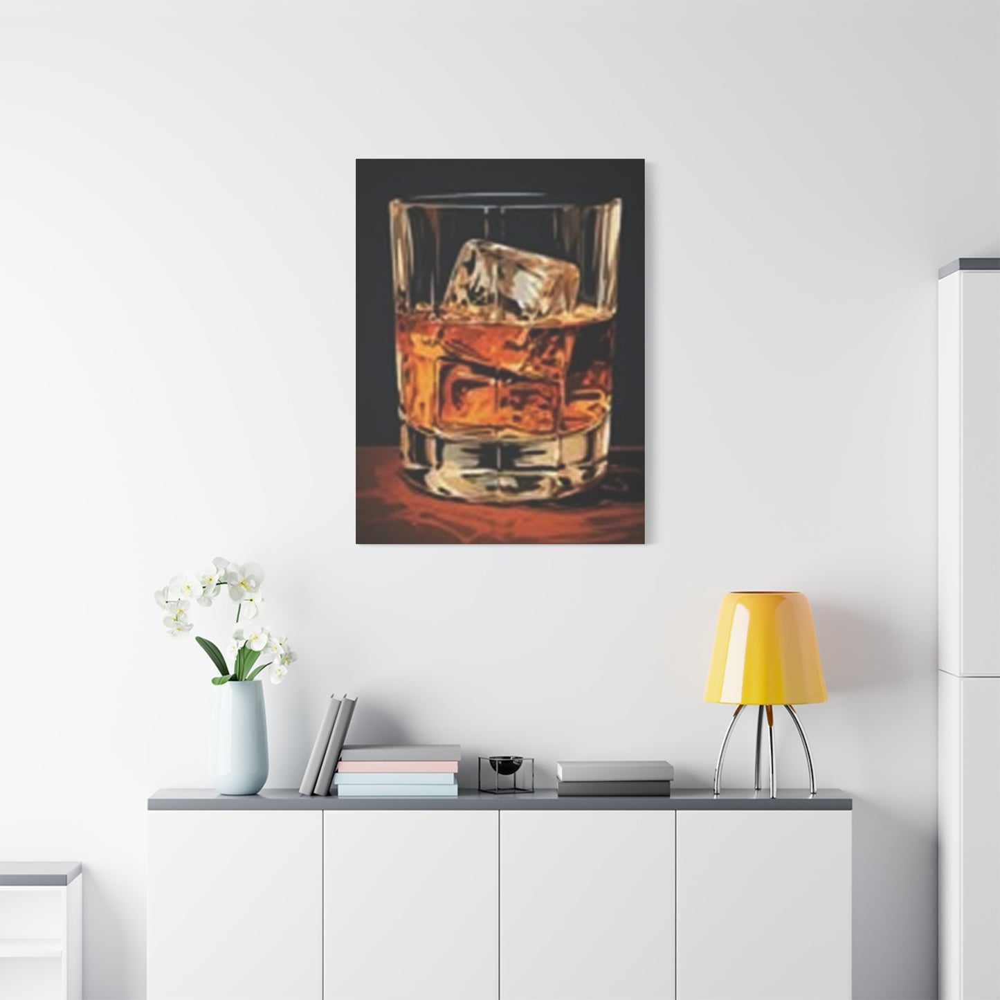
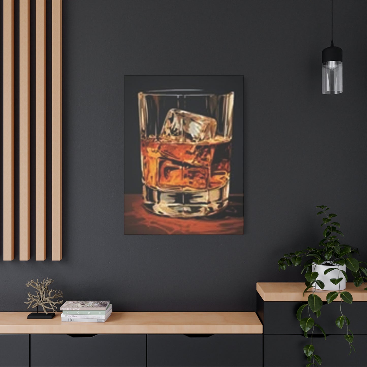
English Whiskey With Ice Wall Art & Canvas Prints
English Whiskey With Ice Wall Art & Canvas Prints
Couldn't load pickup availability
Premium English Whiskey With Ice Wall Art: Elevating Your Living Spaces Through Sophisticated Visual Narratives
The realm of interior décor has witnessed a remarkable transformation over recent years, with enthusiasts seeking distinctive pieces that reflect their refined tastes and personal narratives. Among the most captivating additions to contemporary living spaces are visual representations showcasing the amber-hued allure of spirits served in crystalline vessels accompanied by frozen elements. These artistic interpretations have become increasingly sought-after by connoisseurs who appreciate the intersection of beverage culture and aesthetic expression.
Discovering The Captivating Allure Behind Beverage-Inspired Artistic Expressions
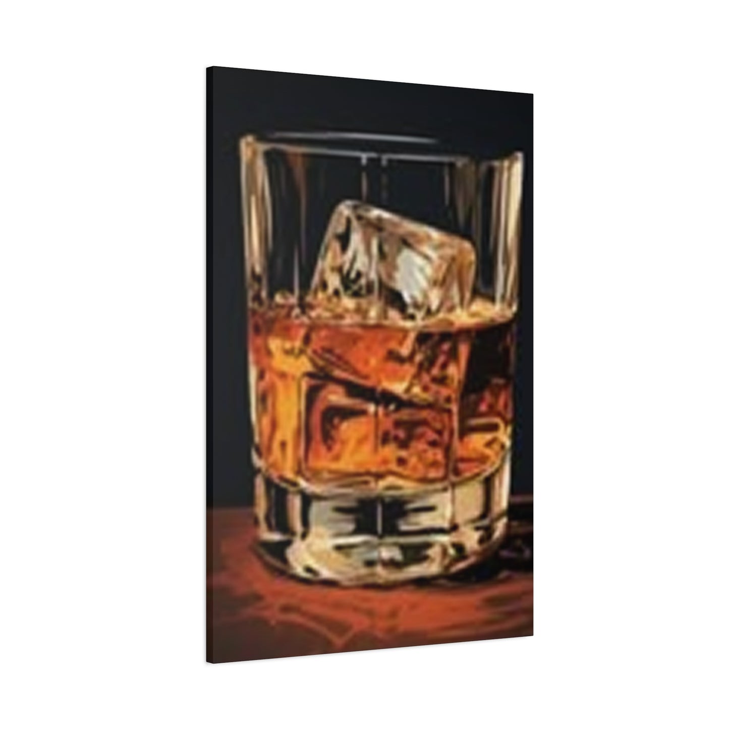
When examining the magnetic appeal of these visual compositions, one cannot overlook the multifaceted dimensions they bring to residential and commercial environments. The imagery captures more than mere liquid refreshment; it encapsulates an entire lifestyle philosophy centered around refinement, contemplation, and appreciation for life's finer moments. Each carefully composed photograph or illustration tells a story of craftsmanship, patience, and the timeless ritual of savoring premium distilled beverages.
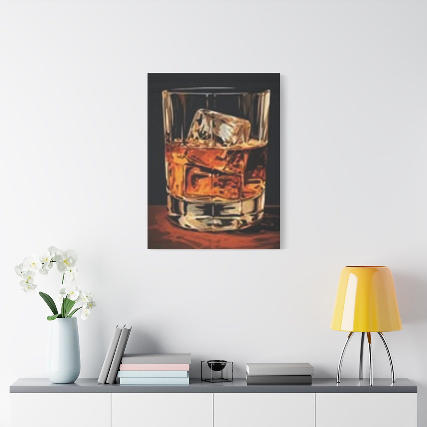
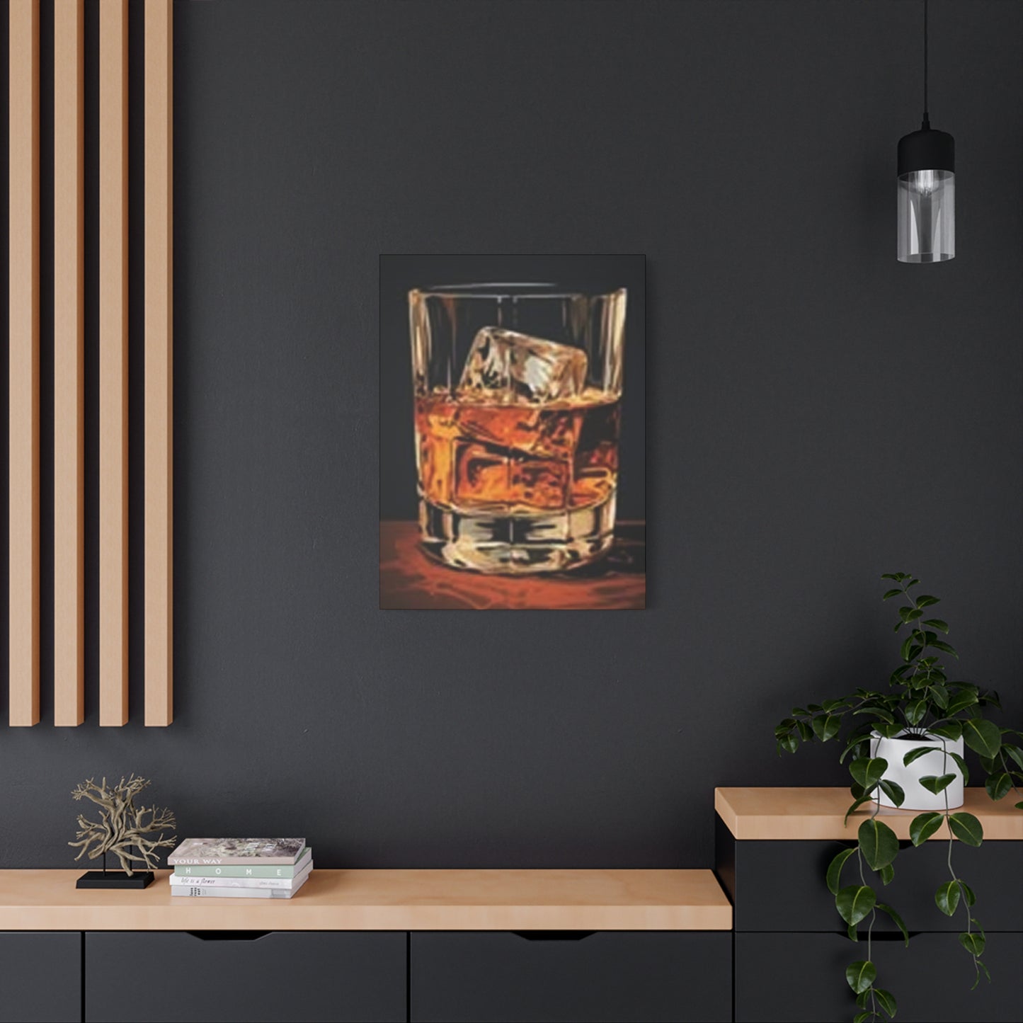
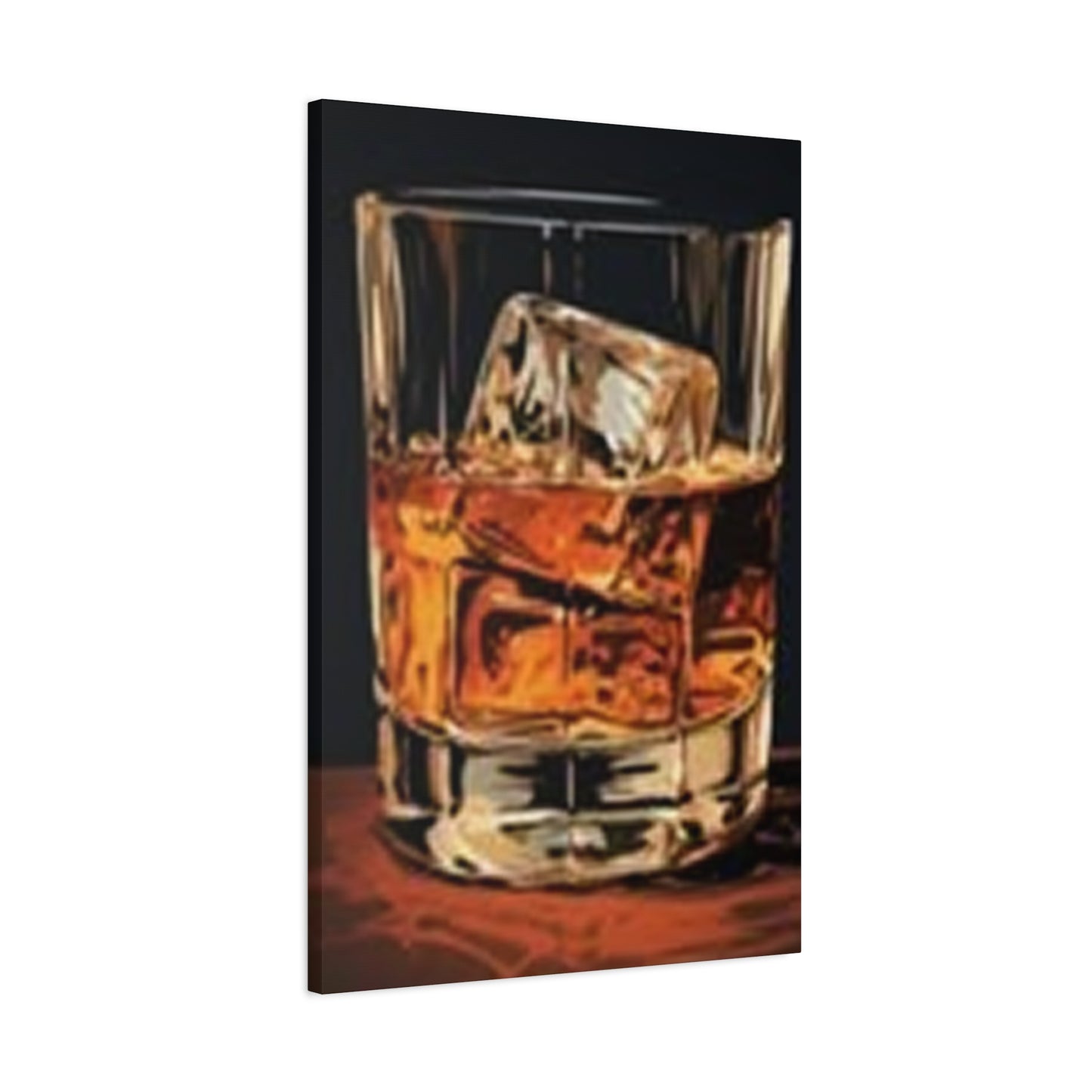
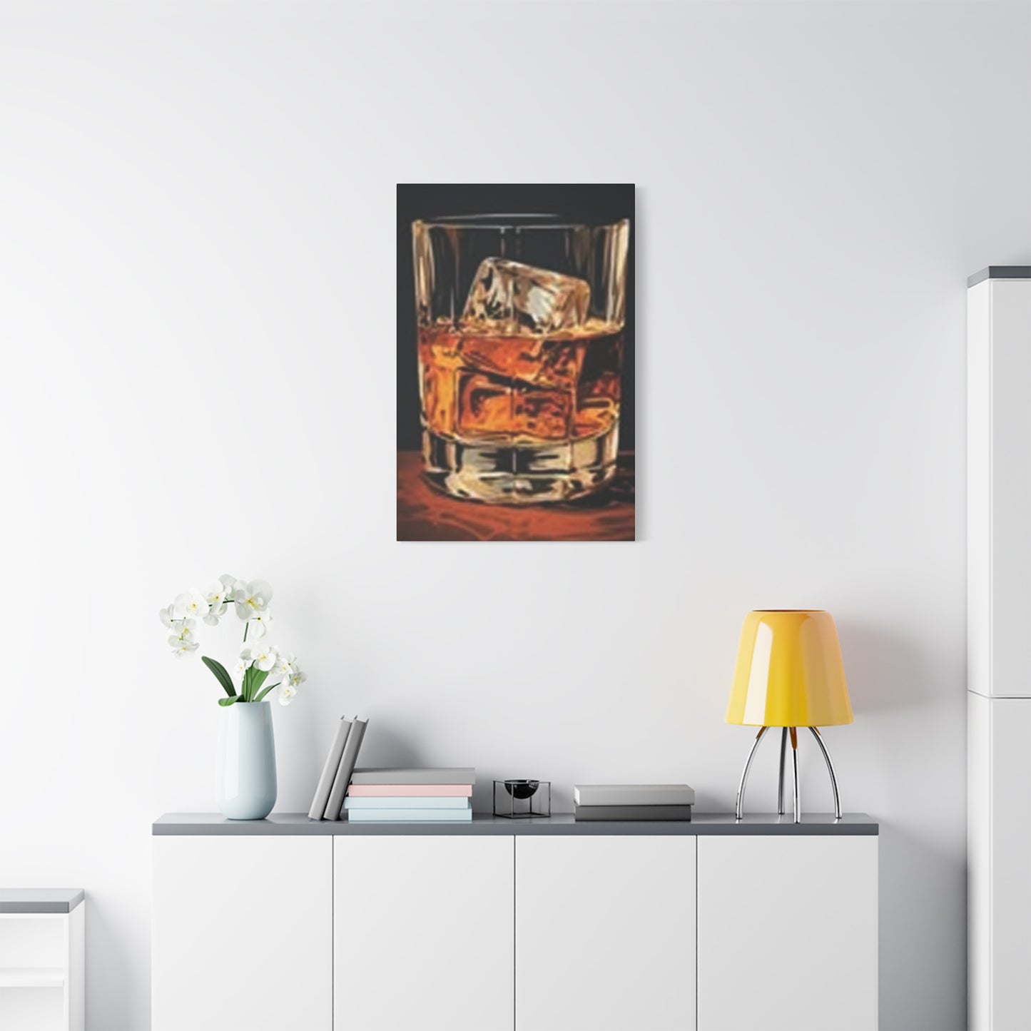
The visual elements within these compositions work harmoniously to create depth and intrigue. The translucent quality of frozen water formations contrasts beautifully against the warm, golden tones of aged spirits, creating a dynamic interplay that draws the eye and invites prolonged observation. This juxtaposition represents the balance between opposing forces—cold and warmth, solid and liquid, simplicity and complexity—all coexisting within a single frame.
Interior designers and homeowners alike have recognized the transformative power of such imagery. Unlike generic decorative pieces that fade into the background, these representations command attention while maintaining an air of understated elegance. They serve as conversation starters, reflecting the owner's sophisticated palate and appreciation for the ceremonial aspects of beverage enjoyment. The visual narrative extends beyond the physical boundaries of the canvas, inviting viewers to imagine the sensory experience—the clink of frozen cubes against crystal, the subtle aroma of oak and grain, the smooth texture of a well-aged spirit.
Selecting Ideal Locations Throughout Your Property For Maximum Visual Impact
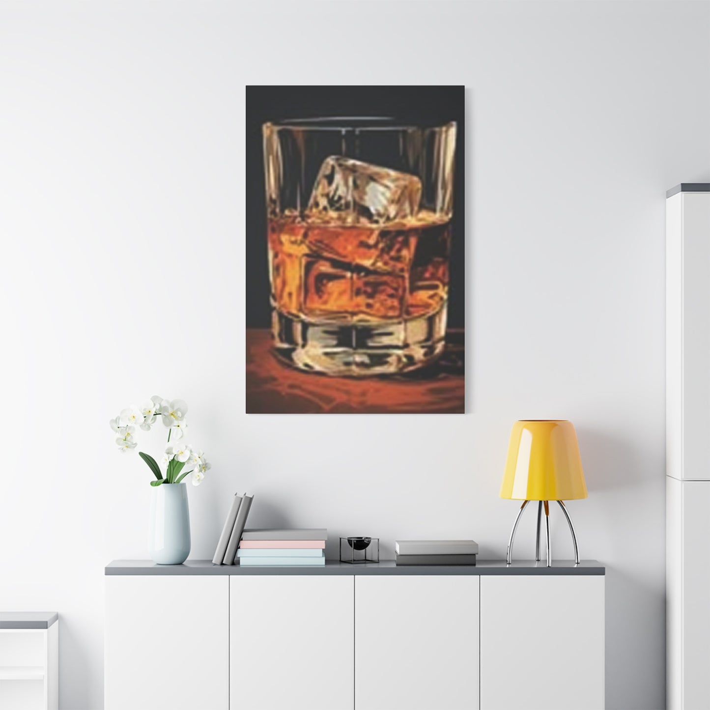
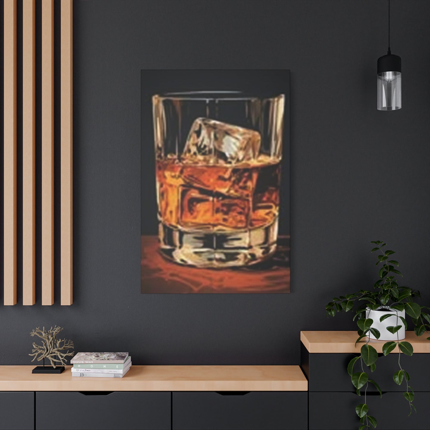
Placement strategy plays a crucial role in maximizing the aesthetic contribution of these artistic pieces. The location you choose will significantly influence how the artwork interacts with existing décor elements and natural lighting conditions. Understanding spatial dynamics and visual flow helps create cohesive environments that feel both intentional and effortlessly stylish.
Private entertainment spaces represent natural candidates for such imagery. Whether you maintain a dedicated room for hosting gatherings or have carved out a corner of your living area, these visual pieces reinforce the atmosphere of conviviality and refined taste. They complement the functional elements within these spaces—glassware collections, decanters, and serving accessories—while elevating the overall aesthetic beyond mere functionality.
Dining areas benefit tremendously from the sophisticated ambiance these pieces provide. The imagery creates an immediate association with leisure, celebration, and the pleasure of shared meals. When positioned within sightlines from seating arrangements, they contribute to the overall dining experience, encouraging guests to linger and engage in meaningful conversation. The warm tones present in quality pieces harmonize beautifully with wooden furniture and ambient lighting typically found in dining environments.
Personal retreats such as studies and libraries gain character and personality through strategic placement of beverage-themed artwork. These spaces often serve as sanctuaries for reflection, reading, and intellectual pursuits—activities that pair naturally with the contemplative nature suggested by the imagery. A well-chosen piece can transform a functional workspace into a gentleman's study or a literary haven that reflects personal refinement.
Kitchen environments, particularly those featuring open concepts that flow into entertaining areas, provide unexpected yet highly effective locations. Modern culinary spaces have evolved beyond purely functional rooms into lifestyle hubs where family and friends naturally congregate. The imagery bridges the gap between preparation and enjoyment, celebrating the craftsmanship inherent in both culinary arts and beverage creation.
Even bedrooms can accommodate such pieces when scaled and framed appropriately. In master suites, particularly within dressing areas or reading nooks, they contribute to an atmosphere of personal luxury and adult sophistication. The key lies in selecting imagery with appropriate tonal qualities that promote relaxation rather than stimulation.
Exploring Diverse Artistic Styles And Presentation Formats Available To Collectors
The market offers remarkable variety in how these visual compositions are rendered and presented. Understanding the distinctions between various approaches helps collectors make informed decisions aligned with their aesthetic preferences and existing décor schemes.
Photographic representations capture reality with stunning clarity and detail. High-resolution imagery showcases every nuance—the way light refracts through liquid, the crystalline structure of frozen water, the subtle variations in amber coloring, and even condensation patterns on glass surfaces. These realistic portrayals appeal to those who appreciate documentary-style aesthetics and the beauty inherent in authentic moments.
Illustrated interpretations offer artistic flexibility that photography cannot always achieve. Talented artists can emphasize certain elements, adjust color palettes for specific moods, and create compositions that feel simultaneously realistic and idealized. Some illustrations adopt minimalist approaches with clean lines and limited color schemes, while others embrace rich, layered techniques that add texture and depth to the image.
Abstract renditions take conceptual liberties, distilling the essence of the subject into shapes, colors, and forms that suggest rather than explicitly depict. These pieces appeal to collectors with contemporary tastes who appreciate artwork that invites interpretation and personal connection. The abstract approach allows the imagery to complement a wider range of décor styles while maintaining thematic relevance.
Vintage-inspired aesthetics draw from historical advertising and promotional materials from distillery heritage. These nostalgic interpretations often feature typography, color treatments, and compositional elements reminiscent of mid-century or Victorian-era design sensibilities. They particularly appeal to those who appreciate the historical dimensions of spirits production and the romanticized imagery associated with traditional craftsmanship.
Dimensional presentations extend beyond flat surfaces to incorporate relief elements, layered materials, or mixed media approaches. These pieces create physical depth that changes appearance based on viewing angle and lighting conditions. The three-dimensional quality adds tactile interest and makes the artwork more dynamic within the space.
Understanding Material Choices That Influence Longevity And Aesthetic Qualities
The substrate and surface treatment selected for these artistic pieces dramatically affect both their visual characteristics and durability over time. Savvy collectors consider multiple factors when evaluating material options.
Canvas remains a popular choice for its traditional artistic associations and textural qualities. Gallery-wrapped canvas creates a finished appearance without requiring additional framing, with the image extending around the edges of the stretcher bars. The fabric surface accepts ink beautifully, producing rich colors with subtle texture that adds warmth to the overall presentation. Canvas pieces integrate seamlessly into traditional and transitional décor schemes while maintaining appropriate formality.
Metal substrates offer contemporary appeal with exceptional durability. Aluminum panels provide smooth, rigid surfaces that produce vibrant colors with a slightly luminous quality. The material resists warping, moisture damage, and color fading far better than paper-based alternatives. Metal presentations work particularly well in modern settings where clean lines and industrial materials dominate the aesthetic vocabulary.
Acrylic glass presentations create stunning visual depth by mounting images behind transparent polymer sheets. This approach produces a glossy, gallery-quality appearance with colors that appear almost luminous. The substantial physical presence of thick acrylic adds perceived value while protecting the image from environmental factors. These pieces command attention in contemporary and upscale environments.
Wood substrates connect the artwork to natural materials and rustic aesthetics. Printing directly onto prepared wood surfaces or mounting images to wooden panels creates organic warmth that complements farmhouse, lodge, and traditional décor styles. The visible wood grain adds an additional layer of texture and interest, making each piece truly unique.
Framed paper prints represent the most traditional and versatile option. High-quality archival paper produces exceptional detail and color accuracy, particularly when paired with appropriate framing materials. The combination of paper, matting, glass, and frame allows for extensive customization to match specific décor requirements. This approach offers the widest range of size options and price points.
Considering Dimensional Specifications To Achieve Proper Visual Balance
Scale relationships between artwork and surrounding space fundamentally influence aesthetic success. Pieces that are too small disappear visually, while oversized options can overwhelm and create uncomfortable visual tension. Thoughtful consideration of dimensional specifications ensures harmonious integration.
Substantial statement pieces measuring 40 inches or larger in their longest dimension create focal points that anchor entire walls. These commanding presentations work best in spacious environments with high ceilings and minimal competing visual elements. They transform blank expanses into curated features that define the character of the room. When selecting pieces of this magnitude, ensure adequate viewing distance exists—typically at least 1.5 times the artwork's diagonal measurement.
Medium-scale pieces ranging from 24 to 40 inches offer versatility for most residential applications. These dimensions provide sufficient presence to be noticed and appreciated without dominating the space. They work well as singular focal points in smaller rooms or as components within gallery wall arrangements in larger spaces. This size range accommodates the widest variety of placement strategies.
Compact presentations under 24 inches suit intimate spaces, narrow wall segments, and grouped arrangements. While individually modest, these pieces can be combined in multiples to create sophisticated gallery walls or triptychs. The smaller scale allows for more experimental placement in unexpected locations like hallway niches, powder rooms, or above architectural features.
Proportional considerations extend beyond simple measurements to encompass the relationship between width and height. Horizontal orientations emphasize expansiveness and work well above furniture pieces, creating visual connections between artwork and functional elements. Vertical presentations draw the eye upward, making them ideal for narrow wall sections and for creating the illusion of increased ceiling height. Square formats offer balanced neutrality that adapts to various placement scenarios.
Harmonizing Color Palettes With Existing Interior Design Schemes
Chromatic coordination between artwork and surrounding environment creates visual cohesion that makes spaces feel intentionally designed rather than randomly assembled. Understanding color relationships helps ensure your selected piece enhances rather than conflicts with existing elements.
Warm-toned presentations featuring rich ambers, deep browns, golden honey hues, and russet accents naturally complement wood furniture, leather upholstery, and traditional color schemes. These warm palettes create inviting, comfortable atmospheres associated with heritage, stability, and classic refinement. They pair beautifully with earth tones, terracotta, sage green, and warm neutrals commonly found in traditional and transitional interiors.
Cool-toned interpretations emphasizing blues, silvers, and grays suit contemporary environments with minimalist sensibilities. The cooler palette creates sophisticated, modern atmospheres that feel clean and uncluttered. These presentations work exceptionally well in spaces featuring stainless steel, glass, concrete, and other industrial materials. They complement white, gray, navy, and charcoal color schemes prevalent in contemporary design.
Monochromatic approaches featuring variations of single color families offer timeless elegance that transcends style trends. Black and white presentations provide dramatic contrast with universal compatibility. Sepia-toned pieces evoke nostalgia and vintage charm. These neutral presentations allow maximum flexibility in coordinating with existing furnishings and accessories.
Accent color strategies use the artwork to introduce vibrant hues that energize otherwise neutral spaces. A piece featuring unexpected pops of color—perhaps highlighting garnish elements or background details—can serve as the inspiration for accent pillows, throws, or decorative objects throughout the room. This approach creates intentional color echoes that tie diverse elements together.
Examining Frame Selections That Enhance Rather Than Distract From Visual Content
The boundary treatment surrounding your chosen imagery significantly influences its presentation and integration with surrounding décor. Thoughtful frame selection elevates the artwork while respecting its inherent character.
Natural wood frames bring organic warmth and textural interest to the presentation. The grain patterns, color variations, and tactile qualities of real wood create connections to traditional craftsmanship. Lighter woods like oak, maple, and ash contribute casual, approachable character, while darker selections such as walnut, mahogany, and espresso stains convey formality and gravitas. Wood frames particularly complement pieces displayed in spaces featuring other wooden elements.
Metal frames offer sleek, contemporary aesthetics with exceptional durability. Brushed aluminum, matte black steel, and brass-finished options provide clean lines that don't compete with the image content. Metal frames work particularly well with modern and industrial décor schemes, creating sophisticated presentations that feel current and refined. The slim profiles characteristic of metal framing maximize image visibility while providing necessary protection.
Floating frames create the illusion that the artwork hovers within the frame structure, with visible space between the image edge and the frame inner boundary. This presentation style adds dimensional interest and contemporary flair. The technique works especially well with canvas and acrylic presentations, emphasizing the artwork as an object rather than merely a two-dimensional surface.
Ornate frames featuring carved details, gilded finishes, and elaborate profiles suit traditional and classical interiors. These decorative boundaries recall museum presentations and historical portrait traditions. When paired with appropriate imagery, ornate frames elevate the perceived value and importance of the piece. However, such frames require careful consideration to avoid overwhelming simpler compositions.
Frameless presentations allow the artwork to stand independently without added boundaries. Gallery-wrapped canvas with image continuation around the edges, mounted metal panels, and standoff-mounted acrylic all create clean, modern appearances. The absence of framing creates seamless integration with contemporary architecture and minimalist design philosophies.
Investigating Quality Indicators That Distinguish Premium Pieces From Mediocre Alternatives
The market offers vast selection at varying price points, making it essential to recognize characteristics that indicate superior quality and lasting value. Educated collectors can identify pieces worthy of investment.
Print resolution fundamentally determines image clarity and detail reproduction. Premium pieces utilize high-resolution source imagery printed at 300 dots per inch or greater, ensuring crisp edges, smooth color gradations, and the ability to reveal details even under close examination. Inferior products suffer from visible pixelation, blurred details, and banding in color transitions.
Color accuracy and vibrancy separate exceptional prints from disappointing reproductions. Quality pieces demonstrate true-to-life color representation with appropriate saturation levels that bring the image to life without appearing artificially enhanced or garishly oversaturated. The inks used in production should resist fading when exposed to indirect natural light, maintaining color integrity for years.
Material quality affects both appearance and longevity. Canvas should be heavy-weight with tight weave patterns that prevent sagging over time. Metal substrates should be properly coated to prevent oxidation and should feature sufficient thickness to resist bending. Paper should be acid-free and archival quality to prevent yellowing and deterioration.
Construction quality becomes apparent through examination of edges, corners, and mounting hardware. Gallery-wrapped canvas should show taut, even tension across the surface with neatly folded corners. Frames should feature secure joinery with properly seated glazing. Hardware should be appropriately rated for the weight being supported with professional installation considerations.
Presentation details like protective backing, dust covers, and ready-to-hang hardware indicate manufacturer attention to the complete product rather than merely the visible surface. These seemingly minor elements contribute to the overall ownership experience and facilitate proper installation.
Recognizing Proper Hanging Heights And Positioning For Optimal Viewing Experience
Even the most beautiful piece fails to achieve its potential when improperly positioned. Understanding spatial relationships and viewing dynamics ensures your investment receives the visibility it deserves.
The standard guideline suggests positioning artwork so the center point sits at approximately 57 to 60 inches from the floor—the average human eye level. This principle derives from museum display standards and ensures comfortable viewing without excessive neck tilting. However, this guideline requires adjustment based on specific circumstances.
When hanging above furniture, the artwork should float 6 to 10 inches above the top edge of the piece below. This creates visual connection between the two elements while providing adequate separation to define them as distinct entities. The artwork width should ideally span two-thirds to three-quarters of the furniture width to maintain proportional relationships.
Gallery wall arrangements require careful planning to create cohesive presentations from multiple pieces. Begin by laying out the arrangement on the floor, adjusting spacing and positioning until achieving visual balance. Maintain consistent spacing between pieces—typically 2 to 4 inches—to create unified groupings rather than disconnected collections. Consider the overall shape of the grouping, whether rectangular, organic, or gridded, and how it relates to architectural features.
Lighting conditions dramatically affect how artwork appears throughout the day. Natural light creates changing conditions that can enhance or detract from viewing experience. Consider how morning versus evening light interacts with the piece, and whether direct sunlight might cause glare or accelerate fading. Supplemental accent lighting using picture lights, track lighting, or directional fixtures allows you to control how the piece is illuminated, particularly during evening hours.
Architectural features like windows, doorways, and built-in elements influence optimal placement. Centering artwork above architectural features creates formal symmetry, while off-center positioning can introduce dynamic visual tension. Consider sightlines from various positions within the room and from adjacent spaces to ensure the piece receives visibility from multiple vantage points.
Maintaining And Preserving Your Visual Treasures For Lasting Beauty
Proper stewardship extends the life and appearance of your artistic pieces, protecting your investment and ensuring continued enjoyment for years to come. Establishing simple routines prevents common deterioration issues.
Dust accumulation dulls surfaces and can cause scratching if particles are ground into the material during cleaning. Regular dusting using soft, lint-free cloths or microfiber dusters prevents buildup. For canvas surfaces, gentle dry brushing removes surface dust without disturbing the printed surface. Glass and acrylic surfaces benefit from specialized cleaning solutions designed for those materials, applied with appropriate cloths to prevent streaking and scratching.
Environmental factors including humidity, temperature fluctuations, and light exposure affect longevity. Avoid positioning pieces in locations receiving direct sunlight for extended periods, as ultraviolet radiation degrades inks and substrate materials. Maintain consistent humidity levels between 40 and 50 percent to prevent canvas sagging or paper buckling. Extreme temperature variations can cause materials to expand and contract, potentially leading to warping or delamination.
Smoke and airborne contaminants from cooking, fireplaces, and tobacco products create surface films that diminish clarity and can discolor materials over time. In environments where these factors exist, more frequent cleaning becomes necessary. Consider positioning pieces away from primary sources of airborne particles when possible.
Professional conservation becomes advisable if damage occurs or if pieces show signs of deterioration. Attempting DIY repairs on valuable pieces often causes additional damage. Qualified conservators possess specialized knowledge and materials to address issues while preserving value and appearance.
Insurance documentation protects against loss or damage. Photograph your pieces and retain purchase documentation establishing provenance and value. This information facilitates replacement or restoration should unfortunate circumstances arise.
Exploring Personalized Approaches To Creating Truly Unique Statements
While ready-made options offer convenience and immediate availability, customized creations allow expression of individual taste and incorporation of meaningful personal elements. Several avenues enable personalization while maintaining professional quality.
Custom sizing accommodates architectural realities and specific design visions. When standard dimensions don't quite fit your space or aesthetic goals, many producers offer made-to-order fabrication in precisely specified measurements. This flexibility ensures perfect proportional relationships and eliminates the frustration of "almost right" sizing.
Personal photography transformed into professional-quality prints allows you to feature your own captured moments. Perhaps you've photographed a particularly meaningful bottle or captured the perfect lighting conditions on glassware from your own collection. Working with qualified print services can transform these personal images into polished presentations rivaling commercially produced alternatives.
Commissioned artwork from professional photographers or illustrators creates one-of-a-kind pieces impossible to duplicate. Collaborating with artists allows you to specify compositional elements, color treatments, and stylistic approaches aligned with your vision. The resulting piece becomes a true original reflecting your personal aesthetic sensibilities.
Inscription and personalization options add text elements commemorating special occasions, meaningful dates, or inspirational phrases. These additions transform decorative pieces into commemorative items with personal significance. Subtle incorporation maintains visual elegance while adding layers of meaning apparent to those who know the backstory.
Collection development across multiple pieces creates thematic continuity throughout your space. Selecting complementary images that share stylistic approaches, color palettes, or compositional elements allows you to build cohesive visual narratives spanning multiple rooms or creating sophisticated gallery walls.
Investigating Contemporary Trends Shaping Visual Décor Preferences
The world of interior design constantly evolves, with emerging preferences reflecting broader cultural shifts and changing lifestyles. Understanding current directions helps make selections that feel contemporary while possessing lasting appeal.
Maximalist approaches embrace bold colors, pattern mixing, and layered visual complexity. In contrast to the minimalism dominating recent years, maximalist trends celebrate abundance and personal expression. Within this context, richly detailed pieces featuring complex compositions and vibrant color palettes find enthusiastic reception.
Vintage and retro revivals continue gaining momentum as people seek connections to pre-digital eras and craftsmanship traditions. Imagery incorporating nostalgic elements, historical references, and classic composition styles appeals to those romanticizing earlier periods. This trend particularly resonates with younger generations discovering aesthetic languages predating their own experiences.
Sustainable and ethical considerations increasingly influence purchasing decisions. Consumers research production methods, material sources, and manufacturer practices. Companies utilizing eco-conscious materials, renewable energy in production, and fair labor practices gain competitive advantages among socially conscious buyers.
Local and artisan production receives preference over mass-manufactured imports. Supporting regional artists and small-batch producers aligns with broader movements valuing craftsmanship, individual creativity, and community connections. These pieces often carry stories about their creators, adding meaning beyond mere visual appeal.
Experiential and storytelling elements become increasingly valued. Rather than simply selecting decorative objects, consumers seek pieces that facilitate conversations, evoke memories, or represent meaningful experiences. Artwork functioning as visual narratives rather than mere decoration achieves deeper connections with owners and viewers.
Pairing Beverage-Themed Visual Elements With Complementary Décor Accessories
Creating cohesive environments requires considering how various elements interact and reinforce common themes. Thoughtful accessory selection amplifies the impact of your featured artwork.
Functional barware displayed nearby creates logical thematic connections. Crystal decanters, vintage glassware collections, cocktail shakers, and professional-grade tools arranged on open shelving or within glass-fronted cabinets echo the subject matter while serving practical purposes. These functional elements blur the line between utility and decoration, creating lifestyle environments rather than merely decorated rooms.
Complementary artwork featuring related subjects builds thematic depth without redundancy. Consider pairing beverage-focused pieces with representations of complementary subjects—leather-bound books suggesting contemplative enjoyment, vintage timepieces implying patience and tradition, or abstract pieces in harmonizing color palettes. The goal involves creating visual conversations between multiple elements rather than redundant repetition.
Textiles in coordinating colors and appropriate textures add layers of comfort and visual interest. Leather upholstery, velvet drapery, wool throws, and linen pillows in colors echoing the artwork's palette create sophisticated environments engaging multiple senses. Texture variety prevents spaces from feeling flat or one-dimensional.
Lighting fixtures serving both functional and decorative purposes enhance ambiance while illuminating featured artwork. Industrial-style pendants, traditional chandeliers, modern sconces, and accent lamps should be selected considering both their own aesthetic contribution and how they illuminate surrounding elements. Dimmer controls allow adjustment for different occasions and times of day.
Natural elements including live plants, wooden accents, stone surfaces, and organic textiles prevent spaces from feeling too contrived or theme-heavy. These grounding elements introduce casualness and livability that balance more formal or refined components.
Navigating Online Marketplaces To Locate Quality Pieces From Reliable Sources
The digital marketplace offers unprecedented access to diverse options, but also presents challenges in assessing quality and reliability without physical examination. Strategic approaches help identify trustworthy vendors and worthy pieces.
Established retailers with proven track records and substantial customer review databases offer relative security. Companies operating for multiple years with thousands of documented transactions demonstrate stability and accountability. Review patterns revealing consistent satisfaction with product quality, accurate descriptions, and reliable shipping inspire confidence.
Detailed product specifications and imagery from multiple angles facilitate informed decisions. Reputable vendors provide comprehensive dimensional information, material specifics, and high-resolution photographs showing the piece from various perspectives. Close-up details revealing texture, edge treatments, and finish quality help set accurate expectations.
Customer photograph sections showing pieces installed in actual homes provide invaluable perspective on how products appear in real environments under normal lighting conditions. These authentic images often reveal details professional product photography obscures or idealizes. Pay particular attention to reviews including customer photographs, as these typically represent candid assessments.
Return and exchange policies indicate vendor confidence in their products and commitment to customer satisfaction. Generous return windows, prepaid return shipping, and straightforward processes demonstrate consumer-friendly practices. Carefully review policy details regarding condition requirements and potential restocking fees.
Production location and method transparency allows assessment of ethical and quality considerations. Vendors openly sharing where and how pieces are produced demonstrate confidence in their practices. Domestic production often indicates higher labor standards and quality control, though imported products certainly can meet high standards when properly vetted.
Understanding Pricing Structures And Value Propositions Across Different Tiers
The marketplace spans vast price ranges reflecting different production methods, material qualities, and brand positioning. Understanding factors driving pricing helps identify appropriate investment levels for your priorities.
Economy tier offerings prioritize affordability through scaled production, basic materials, and streamlined processes. These pieces typically feature thin canvas, lightweight frames, and standard printing techniques. They serve budget-conscious consumers furnishing rental properties, temporary spaces, or rooms requiring multiple pieces where cumulative costs become prohibitive at higher tiers. While adequate for some purposes, expect shorter lifespans and more modest visual impact.
Mid-range products balance quality and affordability through moderate material specifications and professional production standards. This tier typically delivers satisfying results for most residential applications, with properly pigmented inks on adequate substrates housed in decent frames. The sweet spot for many consumers, mid-range offerings provide reasonable longevity and visual appeal without premium pricing.
Premium segment pieces justify higher costs through superior materials, exceptional print quality, and careful construction. These investments feature heavy-duty canvases with museum-quality stretching, premium archival papers, thick acrylic presentations, or substantial metal substrates. Frame materials include solid hardwoods with professional joinery or high-grade metals. Expect these pieces to maintain appearance and structural integrity for decades.
Luxury tier offerings transcend functional requirements to become true collector pieces. Limited editions, artist proofs, custom commissions, and pieces featuring precious materials like hand-applied gold leaf or genuine gemstone accents occupy this rarefied space. These acquisitions appeal to serious collectors and those for whom budget considerations are secondary to acquiring truly exceptional works.
Size directly correlates with pricing due to material costs and production complexity. Larger pieces require more substrate, more ink, larger frames, and more complex shipping logistics. The relationship isn't always linear—doubling dimensions typically more than doubles cost due to handling difficulties and material waste factors.
Appreciating The Cultural Significance Behind Spirit Enjoyment Rituals
The imagery we're discussing connects to rich cultural traditions spanning centuries and continents. Understanding these deeper contexts enhances appreciation beyond mere aesthetic considerations.
Distillation traditions trace back over a millennium, with different regions developing distinctive approaches reflecting local ingredients, climate conditions, and cultural preferences. The careful aging processes, blending expertise, and quality standards represent accumulated knowledge passed through generations. Visual representations honoring these beverages pay tribute to this heritage.
Social rituals surrounding consumption reflect values of hospitality, celebration, contemplation, and camaraderie. The practice of sharing drinks has facilitated business negotiations, sealed friendships, marked significant occasions, and provided comfort during difficult times. Imagery capturing these moments reminds us of our connections to others and to traditions larger than ourselves.
Craftsmanship appreciation extends beyond the beverages themselves to encompass cooperage, glassmaking, and other allied trades. The barrels providing flavor complexity, the crystal vessels enhancing presentation, and the tools facilitating service all represent specialized skills worthy of recognition. Comprehensive appreciation encompasses these interconnected crafts.
Regional pride and identity connect strongly to local spirits and drinking traditions. Certain beverages become synonymous with their places of origin, representing geographic identity and cultural distinctiveness. Displaying imagery celebrating these connections expresses personal heritage or affinity for particular regions.
Mindfulness and savoring represent counterpoints to our accelerated modern lifestyles. The deliberate appreciation of complex flavor profiles, aromas, and textures encourages presence and consciousness. Visual reminders of these practices promote mindfulness as a daily value rather than an occasional indulgence.
Incorporating Pieces Into Diverse Architectural Styles With Aesthetic Success
Successful integration requires understanding how different design philosophies approach décor and what characteristics define various architectural styles. Adapting your selections and presentations ensures harmony rather than discord.
Traditional environments emphasizing symmetry, formal arrangements, and classical proportions benefit from framed presentations with substantial borders and perhaps ornate frame selections. Positioning should respect architectural features like mantels, windows, and built-in cabinetry. Color palettes should coordinate with rich wood tones, classic upholstery fabrics, and heritage color schemes common in traditional spaces.
Contemporary architecture featuring clean lines, open floor plans, and minimal ornamentation calls for streamlined presentations without excessive embellishment. Frameless options, slim metal frames, or gallery-wrapped canvas suit these environments. Bold colors work well in contemporary contexts, as do monochromatic approaches. Scale tends larger in contemporary spaces, with substantial pieces serving as focal points in otherwise spare environments.
Transitional design blending traditional and contemporary elements offers maximum flexibility. These spaces accommodate various frame styles and presentation formats, making them forgiving for diverse tastes. The key involves maintaining consistency with other décor choices rather than introducing jarring stylistic contradictions.
Industrial aesthetics celebrating raw materials, exposed structure, and urban warehouse influences pair naturally with metal substrate presentations and minimal framing. The imagery complements reclaimed wood, exposed brick, concrete surfaces, and metal fixtures characteristic of industrial design. Authentic rather than idealized presentations align with industrial philosophy.
Farmhouse and rustic styles emphasizing natural materials, comfortable lived-in qualities, and connections to agrarian traditions benefit from wood frames and canvas presentations. The imagery should integrate with shiplap walls, reclaimed wood furniture, vintage accessories, and earth-toned color palettes. Avoid overly formal presentations that contradict the casual, approachable character of these spaces.
Recognizing Psychological Impacts Of Strategic Visual Décor Choices
Our environments profoundly influence mood, behavior, and overall wellbeing. Understanding these connections helps make décor decisions that enhance quality of life beyond mere aesthetics.
Color psychology demonstrates that different hues trigger distinct emotional responses. Warm colors like the ambers and golds prominent in many beverage images promote feelings of comfort, energy, and optimism. These tones create inviting atmospheres that encourage social interaction and lingering presence. Cooler tones in some interpretations promote calmness and mental clarity.
Imagery suggesting luxury and refinement can influence how we perceive ourselves and our environments. Surrounding ourselves with representations of quality and craftsmanship may elevate our standards and behaviors. This principle underlies the concept that our environments shape our identities and aspirations.
Nostalgia triggers through vintage aesthetics or familiar rituals provide psychological comfort and connection to personal or collective pasts. In uncertain times, these connections to tradition and continuity offer reassurance and grounding. The sense of timelessness counterbalances the rapid change characterizing modern life.
Conversational catalysts within our environments facilitate social connection by providing topics for discussion. Interesting artwork gives guests something to comment on and ask about, breaking social ice and leading to deeper conversations. In this way, décor choices directly enhance social experiences within our spaces.
Personal expression through curated environments contributes to psychological wellbeing by allowing us to communicate identity and values. Creating spaces reflecting our authentic selves rather than generic showroom aesthetics promotes comfort and satisfaction with our surroundings.
Extending Visual Themes Throughout Multiple Rooms For Cohesive Flow
Creating visual continuity across your entire living space results in environments feeling intentionally designed rather than randomly assembled. Strategic theme extension requires balance between consistency and variety.
Repetition of color palettes across rooms creates subtle connections without requiring identical décor. Pulling accent colors from artwork in one space into textiles or accessories in adjacent areas creates visual echoes that tie spaces together. This approach works particularly well in open-concept layouts where multiple functional zones exist within a single large space.
Stylistic consistency regarding frame selections, presentation formats, and aesthetic approaches prevents jarring transitions between spaces. If one room features sleek metal frames with modern presentations, transitioning to heavily ornate gilded frames in the next room creates confusion. Maintaining consistent design language while varying specific subjects creates cohesion.
Thematic variations allow individual rooms to maintain distinct identities within an overall coordinated scheme. Perhaps your entertaining space features the primary beverage-themed pieces, while adjacent areas incorporate related but distinct subjects—culinary themes in the kitchen, literary subjects in the study, botanical prints in the bedroom. The themes differ but share stylistic approaches creating unity.
Scale progression can create visual journeys through spaces, with larger statement pieces in primary gathering areas and more intimate presentations in private zones. This approach respects the different functions and emotional characters of various spaces while maintaining overall coordination.
Transitional spaces including hallways, staircases, and entryways benefit from lighter décor touches that preview themes elaborated more fully in destination rooms. These areas shouldn't compete for attention but rather create anticipation for the more developed environments they connect.
Discovering Gift-Giving Potential For Spirit Enthusiasts And Design Lovers
These artistic pieces make thoughtful presents for various occasions, combining aesthetic appeal with personal relevance. Understanding gifting contexts helps select appropriate options.
Housewarming celebrations traditionally involve gifts contributing to the new residence. These pieces particularly suit this occasion, helping recipients transform empty walls into curated spaces reflecting their personalities. Consider the recipients' existing décor style and color preferences when selecting specific options.
Milestone celebrations including significant birthdays, anniversaries, and retirements provide opportunities for more substantial or personalized gifts. Custom pieces featuring meaningful dates, initials, or personal photographs create commemorative items with lasting significance beyond decorative function.
Holiday gifting traditions accommodate these items within moderate-to-premium budgets. The combination of practical utility and aesthetic contribution makes them suitable for gift exchanges where parameters specify value ranges. They avoid the pitfalls of clothing sizing, technology obsolescence, or consumable brevity.
Professional accomplishments like promotions, business launches, or career transitions can be acknowledged with sophisticated pieces appropriate for office environments. Consider pieces with more restrained color palettes and professional aesthetics when selecting for workplace contexts.
Collector and enthusiast recipients particularly appreciate imagery celebrating their passions. For spirit aficionados, these pieces demonstrate understanding of their interests while contributing to their living environments. The gift transcends generic presentation to reflect genuine thoughtfulness about their specific preferences.
Conclusion
Building coordinated collections around related subjects creates visual depth and demonstrates curatorial sophistication. Several subject areas naturally complement beverage themes.
Cigar imagery shares lifestyle associations with premium spirits, both representing craftsmanship, patience, and savoring experiences. The visual elements—rich browns, textural details, traditional accessories—harmonize naturally with beverage compositions. Combined presentations suggest gentlemen's club atmospheres and traditional masculine leisure pursuits.
Vintage timepiece representations share themes of craftsmanship, aging gracefully, and valuing quality over convenience. The mechanical complexity of fine timepieces parallels the careful processes involved in distillation and aging. Shared color palettes featuring metallics, browns, and blacks facilitate coordination.
Leather-bound book collections suggest intellectual pursuits, quiet contemplation, and accumulated wisdom—activities naturally paired with thoughtful beverage enjoyment. The visual textures of aged leather, gilt lettering, and warm browns create harmonious pairings with beverage imagery.
Architectural elements including industrial features, vintage factories, or classical buildings can provide contextual backgrounds for beverage themes. Distillery architecture particularly makes compelling subjects, connecting the beverage to its production environment and heritage.
Abstract compositions in complementary color palettes offer visual variety while maintaining chromatic harmony. These pieces prevent collections from feeling too literal or theme-heavy while contributing to the overall aesthetic through color and mood rather than explicit subject matter.
Share