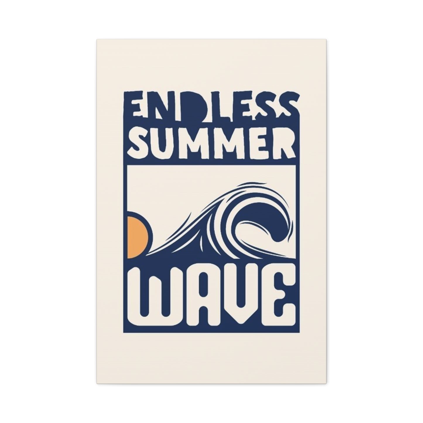
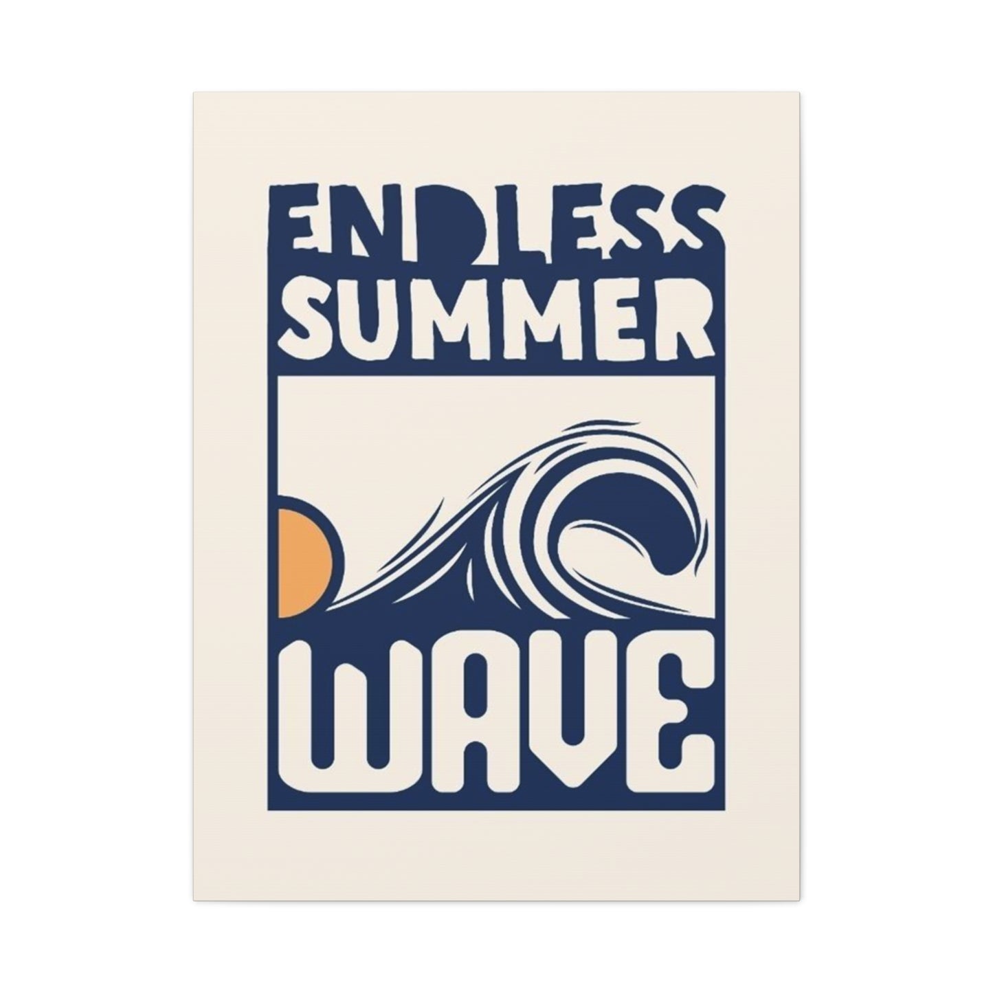
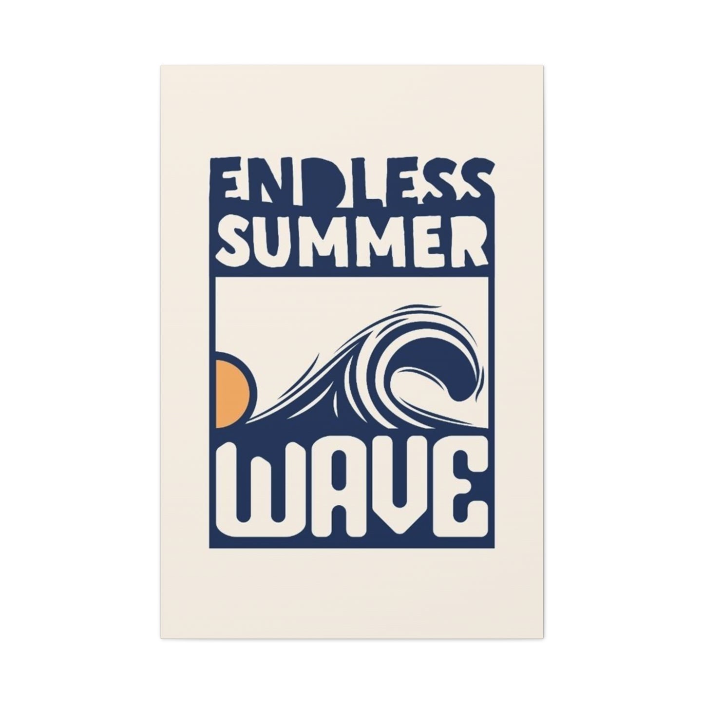
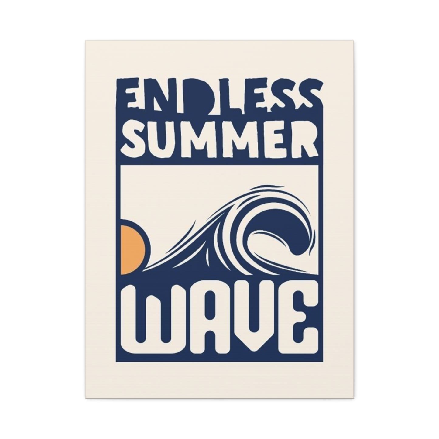
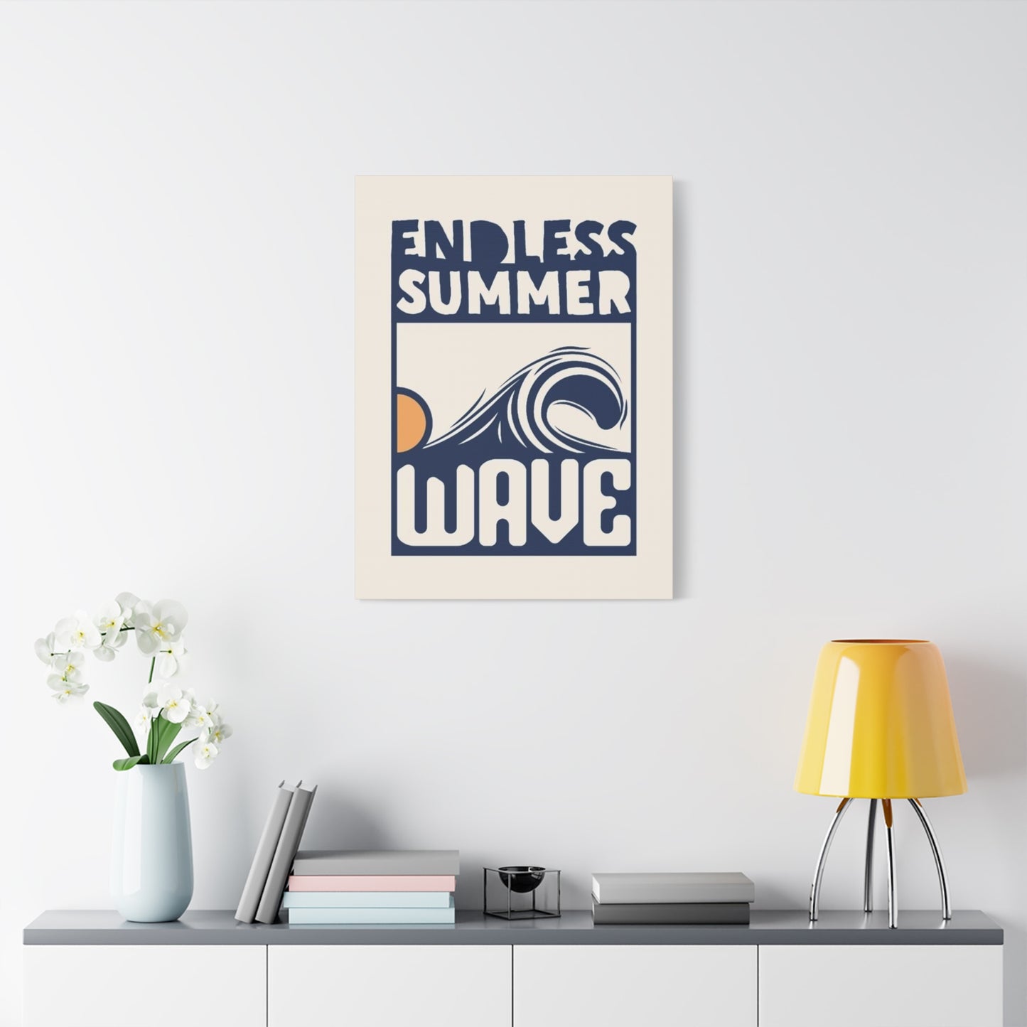
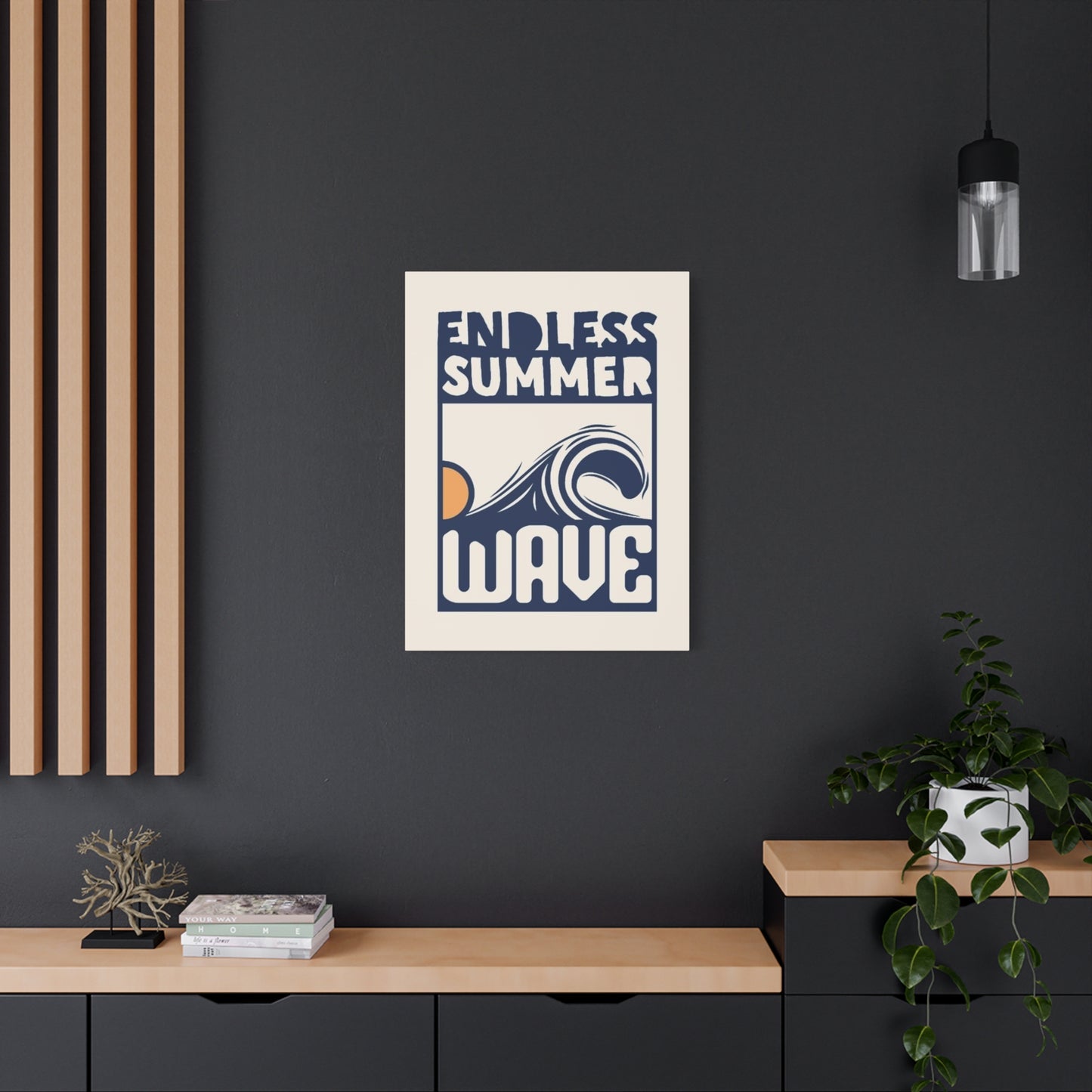
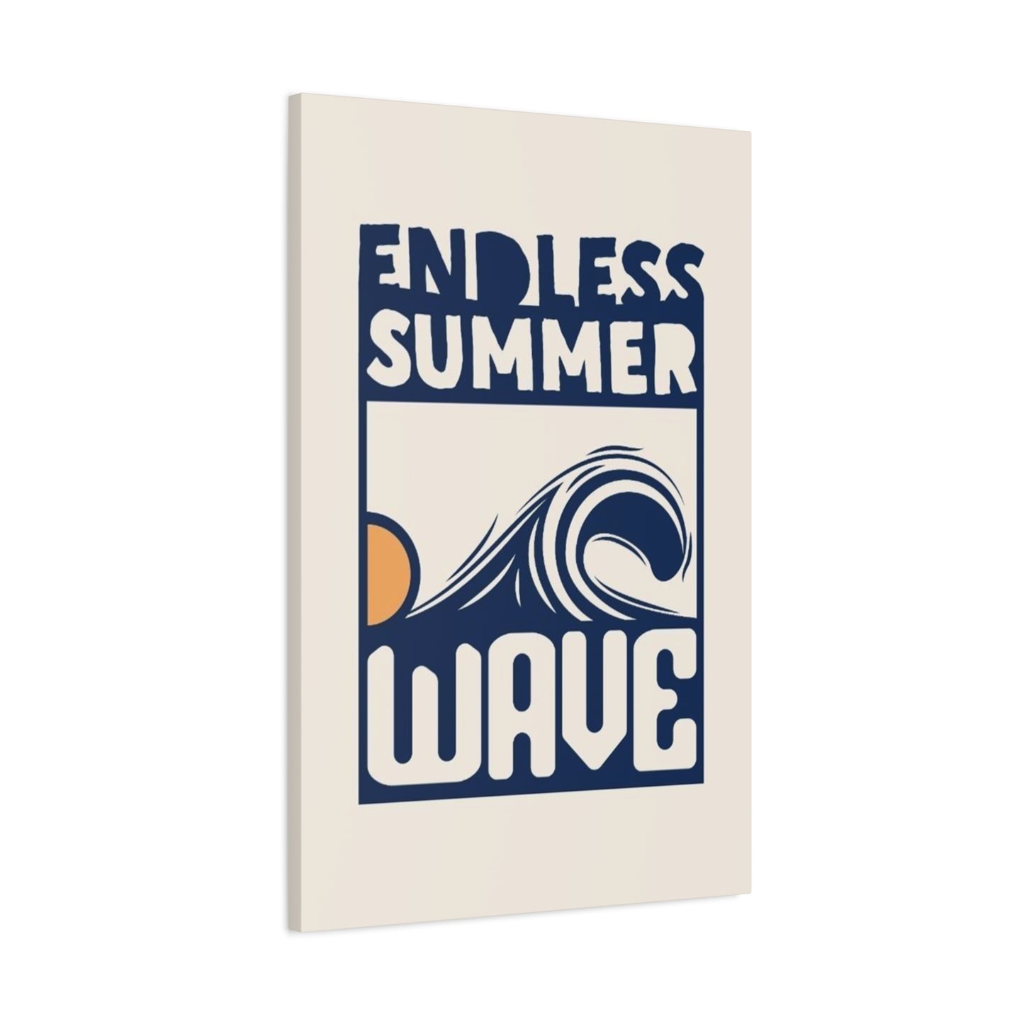
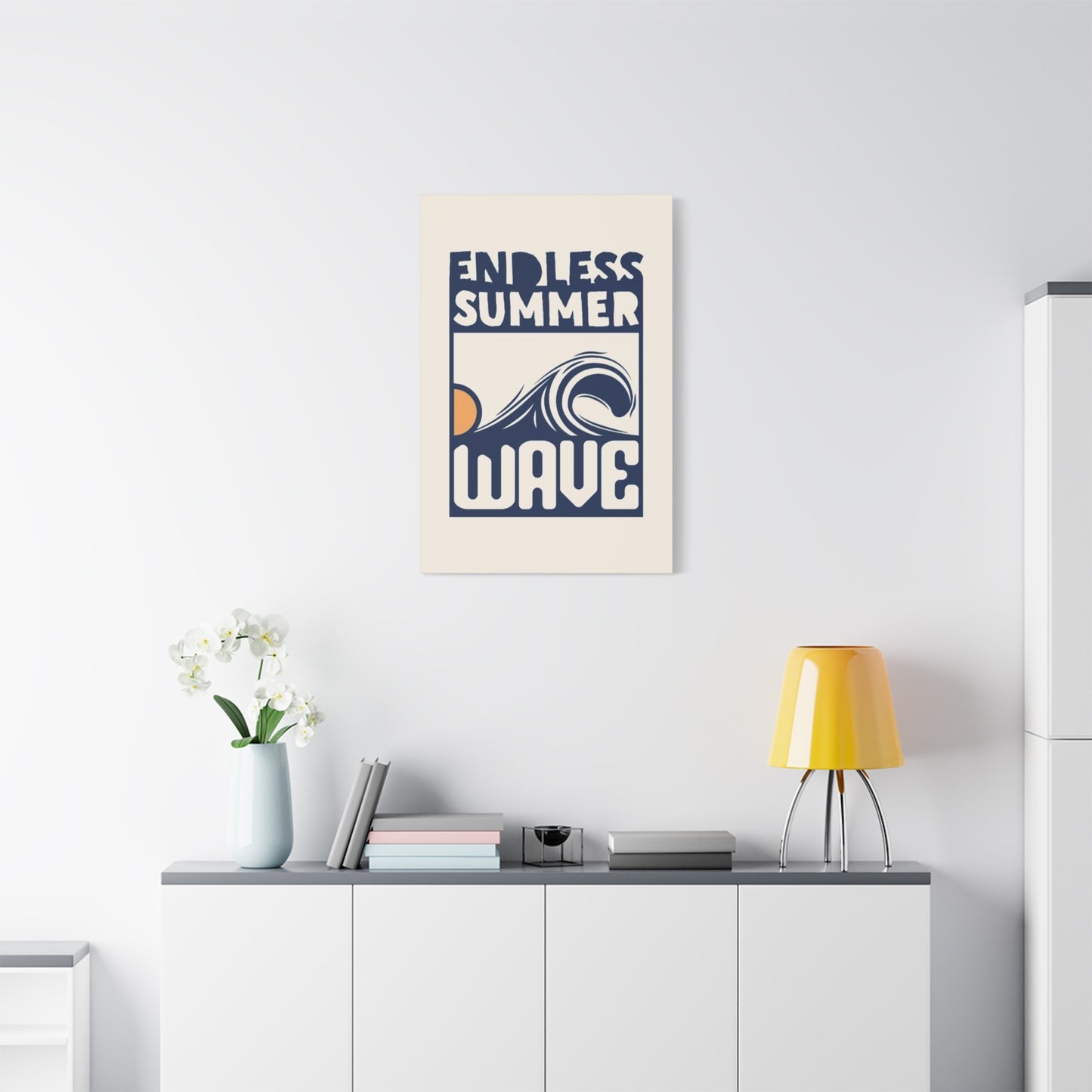
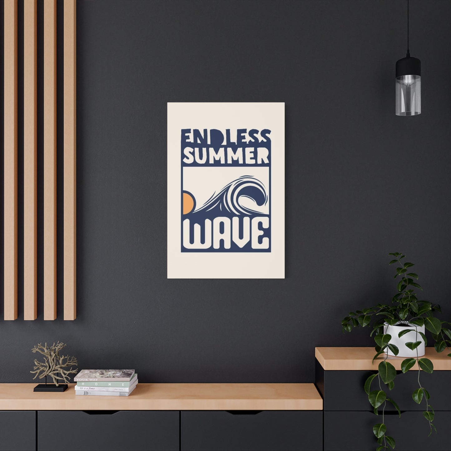
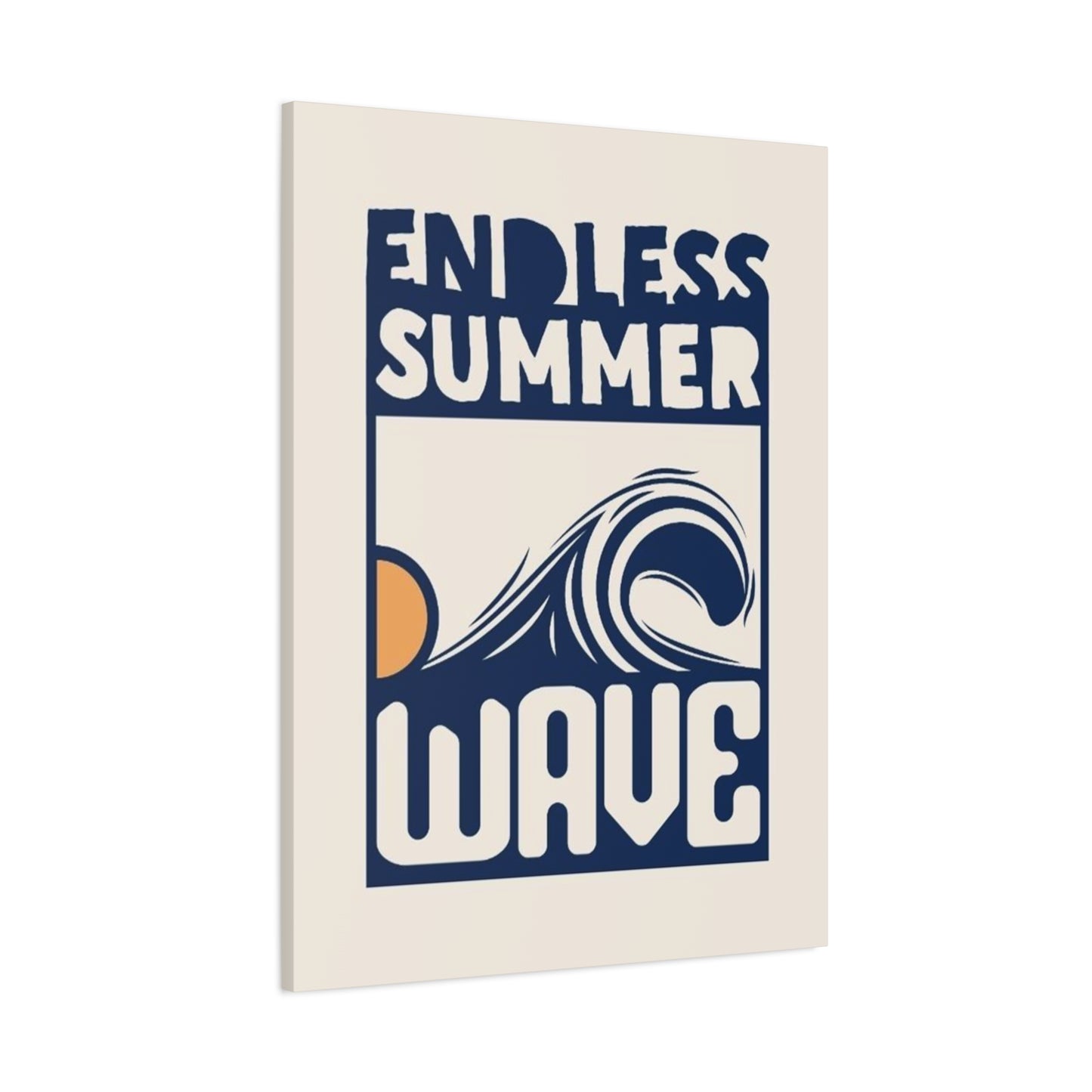
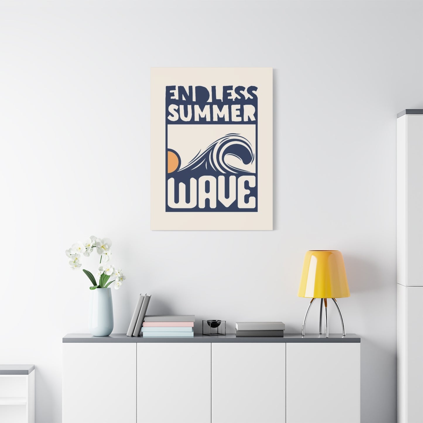
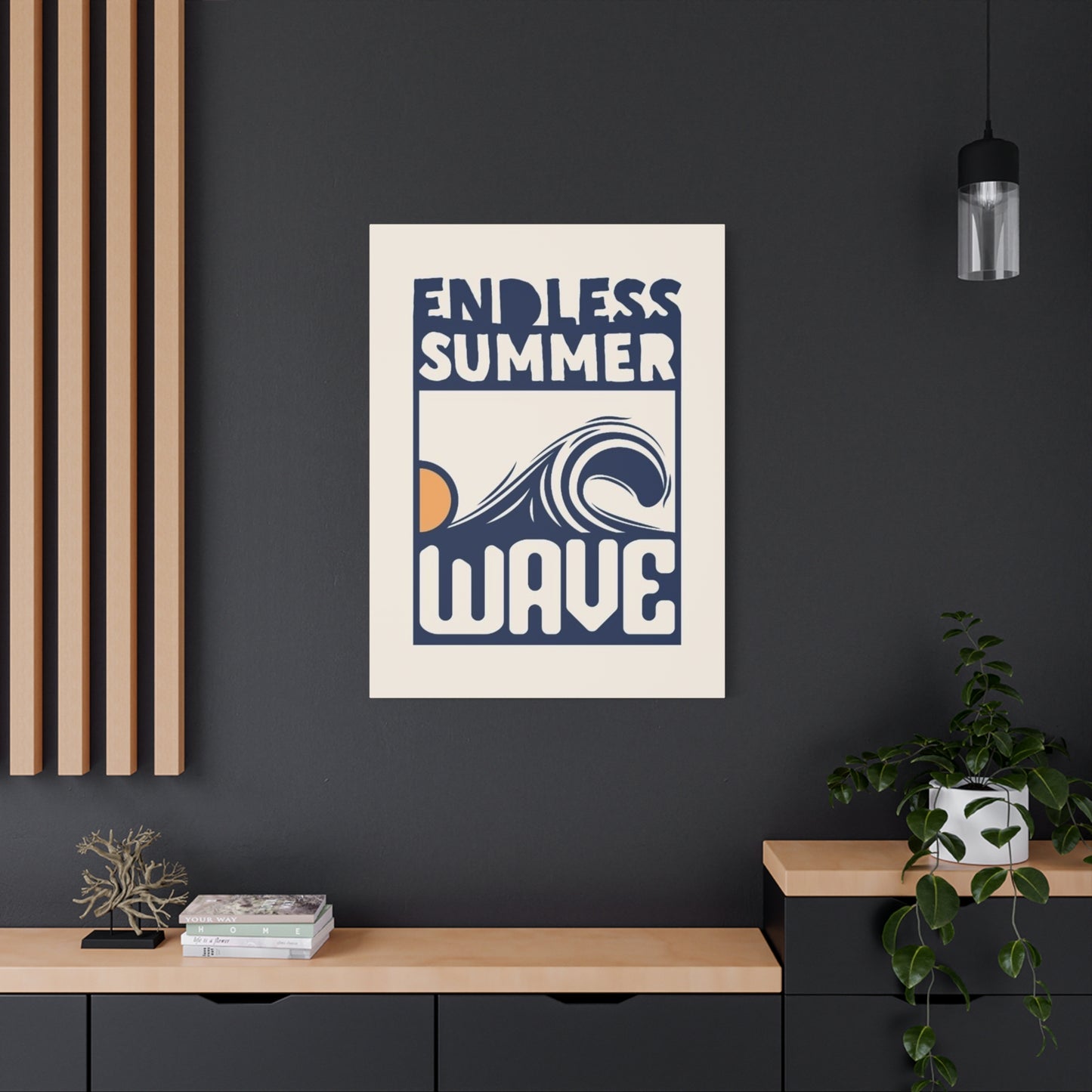
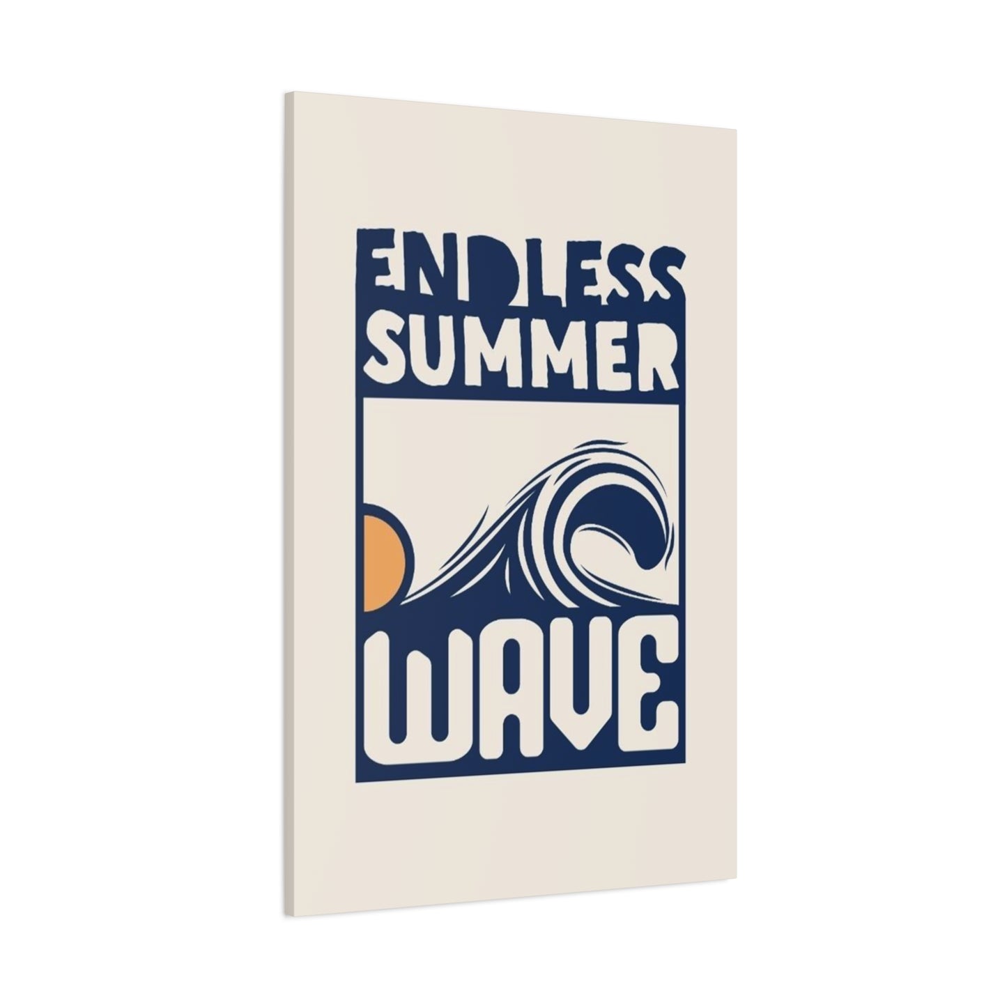
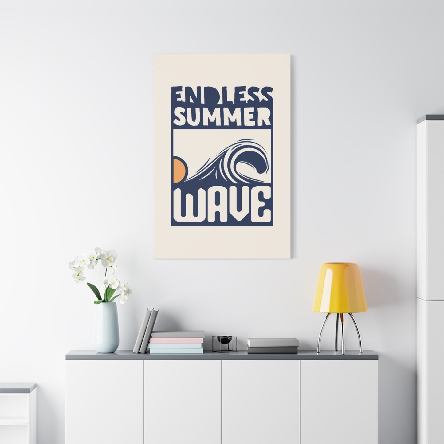
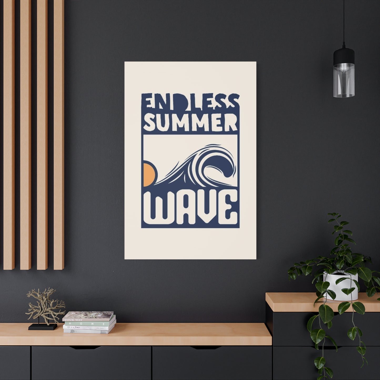
Endless Summer Wave Poster Wall Art & Canvas Prints
Endless Summer Wave Poster Wall Art & Canvas Prints
Couldn't load pickup availability
Capturing Ocean Majesty in Your Living Space Through Coastal Decor Excellence- Endless Summer Wave Poster Wall Art
The allure of oceanic imagery has captivated humanity for millennia, and in contemporary interior design, the endless summer wave poster wall art represents more than mere decoration. This artistic expression embodies the perpetual motion of coastal waters, frozen in time yet emanating dynamic energy that transforms residential and commercial spaces alike. When you introduce these carefully crafted visual masterpieces into your environment, you're not simply hanging a picture; you're inviting the spirit of boundless horizons and rhythmic tides into your daily existence.
Wave-themed artwork has evolved from simple nautical prints to sophisticated visual statements that resonate with diverse aesthetic preferences. The endless summer concept captures that fleeting moment when light dances across water crests, creating an eternal sensation of warmth, freedom, and natural wonder. These poster designs range from photographic realism to abstract interpretations, each offering unique perspectives on the ocean's character and personality.
The Timeless Appeal of Ocean Wave Imagery in Contemporary Living Spaces
Ocean wave imagery possesses an inherent magnetism that transcends cultural boundaries and geographic limitations. The visual representation of water in motion speaks to something primal within human consciousness, evoking memories of seaside vacations, childhood beach adventures, or simply the universal longing for natural beauty. When incorporated as endless summer wave poster wall art, these images become focal points that anchor entire room designs while simultaneously opening up spaces to feel more expansive and breathable.
The psychological impact of viewing water imagery has been documented extensively, with research indicating that coastal scenes can reduce stress levels, lower blood pressure, and promote feelings of tranquility. The specific aesthetic of wave posters captures water at its most dramatic and beautiful moments, suspended in time for perpetual enjoyment. Unlike fleeting vacation experiences, these artistic representations provide year-round access to the calming influence of oceanic vistas.
Different artistic approaches to wave imagery offer varied emotional resonances. Photographic wave posters deliver stunning realism, capturing every droplet and foam pattern with crystalline clarity. These images often showcase the raw power of nature, with towering swells that command attention and inspire awe. Alternatively, illustrated or painted wave representations offer stylized interpretations that can range from minimalist line drawings to explosive color compositions that prioritize emotional impact over literal accuracy.
The color palette associated with wave posters typically gravitates toward blues and greens, though sunset-tinged variants introduce warm oranges, pinks, and purples that evoke specific times of day. These color choices significantly influence the mood and energy of a space. Cool blues promote serenity and focus, making them ideal for bedrooms, meditation areas, or professional offices. Warmer tones inject vitality and optimism, perfect for social spaces, creative studios, or anywhere that benefits from uplifting energy.
How Wave Poster Wall Art Revolutionizes Interior Design Principles
Interior designers increasingly recognize wave poster wall art as a versatile tool for achieving multiple design objectives simultaneously. These pieces serve as statement elements that establish color schemes, create visual interest, and inject personality into otherwise neutral spaces. The horizontal orientation common to many wave compositions naturally complements furniture arrangements while drawing the eye across rooms to make them appear wider and more spacious.
When strategically positioned, endless summer wave poster wall art functions as a visual anchor that grounds furniture groupings and defines separate zones within open floor plans. Above a sofa in a living room, the artwork creates a natural focal point that directs attention upward, enhancing ceiling height perception. In dining areas, wave imagery introduces a conversational element that stimulates discussion while maintaining a sophisticated ambiance appropriate for entertaining.
The scale of wave posters dramatically affects their impact on interior environments. Oversized pieces spanning four to six feet in width create gallery-worthy statements that dominate walls and define entire rooms. These large-format presentations work exceptionally well in contemporary spaces with high ceilings and minimal furnishings, where they command attention without competing with other design elements. Conversely, smaller wave prints can be grouped in multiples to create dynamic gallery walls that tell visual stories through varied perspectives, angles, and artistic interpretations of ocean waves.
Framing choices further customize the presentation and integration of wave posters within existing decor schemes. Natural wood frames with visible grain patterns reinforce coastal themes and complement beach-inspired interiors featuring rattan, jute, or weathered finishes. Sleek metal frames in black, white, or metallic finishes provide contemporary sophistication that suits modern minimalist spaces. Frameless mounting options, including canvas wraps or direct wall mounting, offer clean presentations that allow the imagery itself to take center stage without competing borders.
Lighting considerations prove crucial when displaying wave poster wall art for maximum visual impact. Natural daylight enhances photographic prints, bringing out subtle details in wave textures and highlighting color variations that might otherwise go unnoticed. However, direct sunlight can fade prints over time, necessitating UV-protective glazing or strategic positioning away from harsh sun exposure. Artificial lighting, including adjustable track lights or picture lights, provides controlled illumination that can emphasize specific aspects of the artwork while creating dramatic shadows that add depth perception.
Selecting the Perfect Wave Poster for Your Unique Space Requirements
Choosing the right endless summer wave poster wall art involves considering multiple factors that extend beyond simple aesthetic preferences. The first consideration centers on the specific room where the artwork will reside. Bedrooms benefit from calmer wave representations that promote relaxation and peaceful sleep, with softer colors and gentler compositions. Living rooms and entertainment areas can accommodate more dramatic imagery featuring powerful swells and dynamic compositions that energize social interactions.
Room size and wall dimensions dictate appropriate poster proportions. Measuring the available wall space before purchasing prevents common mistakes like selecting artwork that appears lost on expansive walls or overwhelms smaller areas. A general guideline suggests that artwork should occupy sixty to seventy-five percent of the available wall width above furniture pieces to achieve visual balance. For standalone walls without adjacent furnishings, the proportions shift based on overall room dimensions and the desired visual weight of the artwork.
Existing color schemes within your space should inform wave poster selection to ensure cohesive design flow. While wave imagery naturally incorporates blues and aquas, many compositions feature secondary colors that can either complement or contrast with surrounding decor. Analogous color schemes, using adjacent hues on the color wheel, create harmonious environments that feel unified and intentional. Complementary approaches, pairing opposite colors like blue waves against warm beige or coral walls, generate visual excitement and dynamic tension that energizes spaces.
The artistic style of wave posters should align with your broader design philosophy and personal aesthetic preferences. Photographic realism suits spaces embracing authenticity and nature-inspired themes, bringing the outdoors inside with scientific accuracy. Impressionistic interpretations work beautifully in eclectic or bohemian interiors where creativity and individuality take precedence over strict design rules. Abstract wave representations appeal to modernist sensibilities, reducing oceanic forms to essential shapes, lines, and colors that suggest rather than depict water movement.
Considering the emotional response you desire from your space guides poster selection toward appropriate imagery. Do you seek energizing motivation to start productive days, or calming sanctuary from external stresses? Crashing waves with visible power and motion inspire action and determination, making them suitable for home offices, workout spaces, or anywhere requiring motivational energy. Gentle rolling swells or calm ocean surfaces promote introspection and relaxation, better suited for personal retreats, reading nooks, or meditation areas.
The Artistic Journey Behind Creating Exceptional Wave Imagery
Understanding the creative process behind endless summer wave poster wall art deepens appreciation for these visual treasures. Photographers specializing in ocean imagery often spend years mastering the timing, positioning, and equipment necessary to capture waves at their most spectacular moments. These artists wade into surf zones with waterproof camera housings, sometimes swimming beneath waves to photograph them from unique perspectives that reveal translucent beauty invisible from shore.
The decisive moment in wave photography lasts mere fractions of seconds, requiring anticipation, expertise, and often considerable luck. Photographers must understand tidal patterns, swell directions, wind conditions, and light quality to position themselves optimally for capturing extraordinary images. Early morning and late afternoon "golden hours" provide the warm, directional light that transforms ordinary waves into luminous masterpieces glowing with internal radiance.
Illustrators and painters approaching wave imagery employ different skill sets that prioritize artistic interpretation over documentary accuracy. These creators study wave mechanics to understand how water behaves, moves, and interacts with light, then translate this knowledge into stylized representations that distill essential characteristics while eliminating extraneous details. The Japanese hokusai wave tradition exemplifies this approach, reducing complex natural phenomena to powerful graphic statements that have influenced artists for centuries.
Digital artists working in contemporary mediums bring yet another perspective to wave imagery creation. Using software tools, these creators can manipulate colors, textures, and compositions in ways impossible with traditional media. They might combine multiple wave photographs into impossible composite scenes, or generate entirely synthetic waves that exist only in digital realms. These approaches expand creative possibilities while raising interesting questions about authenticity and the nature of representation in art.
The production process for high-quality poster prints involves sophisticated printing technologies that reproduce original artwork with remarkable fidelity. Giclée printing, considered the gold standard for fine art reproduction, uses archival inks and specialized papers or canvases to create prints that rival original artwork in detail and longevity. These museum-quality reproductions can last generations without significant fading or degradation when properly displayed and maintained.
Crafting Cohesive Coastal Themes Through Complementary Design Elements
While endless summer wave poster wall art serves as an excellent focal point, creating fully realized coastal-themed spaces requires thoughtful integration of complementary design elements. The color palette established by wave imagery should ripple throughout the room via textiles, accessories, and secondary decor items. Throw pillows in coordinating blues, aquas, and sandy neutrals reinforce the oceanic theme while providing comfortable functionality.
Natural materials echo the coastal environment and enhance the authenticity of beach-inspired interiors. Jute rugs underfoot mimic sandy textures while providing durable, low-maintenance flooring solutions. Rattan or wicker furniture pieces introduce organic textures that reference beachside resorts and tropical locales. Driftwood accents, whether as sculptural objects, lamp bases, or decorative bowls, bring literal pieces of the shore into your space with their weathered beauty and unique organic forms.
Textile choices significantly impact the overall ambiance of rooms featuring wave poster wall art. Lightweight, flowing fabrics like linen or gauze curtains filter natural light while allowing gentle breezes to create subtle movement that echoes wave motion. These natural fibers wrinkle characteristically, adding relaxed, lived-in charm that resists the stiffness of more formal design approaches. For upholstery and bedding, consider cotton, linen, or cotton-linen blends in colors that complement rather than compete with your wave imagery.
Layering different shades of blue creates visual depth that prevents monochromatic boredom in coastal-themed rooms. Start with a base of soft, pale aqua or sky blue on walls, then introduce medium-toned navy or teal through furniture upholstery or area rugs. Finally, punctuate with deep indigo or cobalt accessories that provide visual anchors and prevent the space from feeling washed out. This gradation mimics natural ocean coloring, where water transitions from pale turquoise in shallows to deep sapphire in ocean depths.
Metallic accents in brass, copper, or gold introduce warmth that balances cool oceanic blues while suggesting sunlight glinting off water surfaces. These metallic touches appear in light fixtures, drawer pulls, mirror frames, or decorative objects, adding sophistication and preventing coastal themes from skewing too casual or beach-cottage kitsch. Silver and chrome finishes offer alternative metallic options that maintain cooler temperature profiles while still providing reflective sparkle.
Understanding Different Artistic Interpretations of Ocean Waves
The representation of ocean waves varies dramatically across artistic movements, cultural contexts, and individual creative visions. Examining these different approaches enriches your appreciation for endless summer wave poster wall art while helping you identify which aesthetic resonates most deeply with your personal sensibilities.
Realistic photographic representations dominate contemporary wave poster markets, offering viewers windows into actual oceanic moments captured by skilled photographers. These images showcase the infinite variety of wave forms, from gentle rollers to towering barrels, each with unique characteristics determined by underwater topography, wind patterns, and tidal forces. The appeal of photographic wave art lies partly in its authenticity; these are real waves that actually existed, however briefly, in specific locations at particular moments.
Impressionistic wave interpretations prioritize emotional response over precise representation, using loose brushwork, vibrant colors, and suggestive forms to convey the feeling of ocean environments rather than their exact appearance. Artists working in this tradition might exaggerate wave heights, intensify colors beyond natural ranges, or simplify forms to essential gestures. The resulting artworks communicate visceral experiences of being near, in, or observing the ocean rather than documenting its precise visual characteristics.
Abstract wave art reduces oceanic imagery to fundamental elements like line, shape, color, and texture, creating compositions that suggest water movement through non-representational means. These works might feature flowing blue forms against contrasting backgrounds, rhythmic patterns that echo wave repetition, or color gradations that reference water depth variations. Abstract approaches appeal to viewers seeking sophisticated, intellectually engaging artwork that stimulates contemplation rather than providing escapist windows to beach environments.
Cultural artistic traditions bring unique perspectives to wave representation that reflect different relationships with marine environments. Japanese wave art, influenced by ukiyo-e woodblock printing traditions, often features stylized waves with distinctive curling forms and decorative patterns. Polynesian and Hawaiian artistic traditions incorporate waves into broader cultural narratives about navigation, spirituality, and humanity's relationship with the ocean. Contemporary artists drawing on these traditions create works that honor ancestral knowledge while speaking to modern sensibilities.
Minimalist wave imagery strips away complexity to reveal essential forms and relationships. These sparse compositions might feature a single wave form against empty backgrounds, monochromatic color schemes, or simplified geometric interpretations of water movement. The power of minimalist wave art lies in what's omitted rather than included, inviting viewers to complete the visual experience through imagination and personal projection.
The Profound Influence of Color Selection in Wave Poster Displays
Color constitutes perhaps the most immediate and emotionally impactful aspect of endless summer wave poster wall art. The specific hues chosen for wave representations dramatically influence mood, spatial perception, and the overall atmosphere of environments where these pieces reside. Understanding color psychology and its practical applications helps you select wave posters that achieve your desired emotional and aesthetic objectives.
Traditional blue wave imagery evokes classic oceanic associations while offering remarkable versatility across various blue tones. Pale, almost gray-blue representations suggest misty morning seascapes or overcast coastal days, introducing contemplative, meditative qualities to spaces. These subdued tones work exceptionally well in bedrooms, reading areas, or any environment where tranquility takes priority. Mid-range turquoise and aqua blues capture tropical waters and sunny day energy, bringing cheerful vitality without overwhelming intensity. Deep navy and midnight blue waves convey drama, mystery, and depth, creating sophisticated statements appropriate for formal spaces or wherever gravitas is desired.
Warm-toned wave imagery, featuring oranges, pinks, and purples, represents sunset or sunrise moments when low-angle sunlight transforms standard blue waters into spectacular color displays. These warmer palettes inject energy and optimism into spaces while maintaining connection to oceanic themes. The psychological impact shifts from the cooling, calming influence of blue waves toward more stimulating, social energies appropriate for gathering spaces, creative studios, or anywhere benefiting from uplifting atmospheres.
Monochromatic wave posters in black and white or sepia tones offer timeless sophistication that transcends trend cycles. These high-contrast images emphasize form, texture, and composition over color relationships, creating dramatic visual statements that command attention through tonal variation rather than chromatic intensity. Black and white wave photography particularly excels at revealing wave structure, highlighting the interplay between light and shadow that defines three-dimensional form. These classic presentations integrate seamlessly into virtually any color scheme while providing flexibility for future design updates.
Green-tinted wave imagery, though less common, captures specific oceanic conditions like shallow reef breaks or algae-rich waters. These unusual color choices distinguish your wave poster from more typical blue representations while introducing unexpected visual interest. Green tones bridge the gap between cool blues and warm yellows, offering versatility that complements both warm and cool color schemes. The psychological associations with green, including growth, renewal, and nature, add additional layers of meaning to wave imagery.
Multi-colored or gradient wave representations showcase the full spectrum of oceanic color variation, often depicting light refraction through water or the complex color relationships present in churning surf. These rainbow-influenced pieces bring playful energy and visual complexity that suits eclectic interiors and creative personalities. The variety within single images provides multiple color cues that can tie together diverse design elements throughout a room.
Exploring Various Printing Methods and Material Choices
The physical production of endless summer wave poster wall art involves numerous decisions affecting appearance, durability, and price points. Understanding these options empowers informed purchasing decisions that align with your quality expectations, budget constraints, and display intentions.
Standard paper poster prints represent the most economical option for wave artwork, utilizing quality printing papers that reproduce colors accurately while maintaining reasonable durability. These prints typically feature matte or semi-gloss finishes that minimize glare while protecting the printed surface. Paper posters work well for renters, frequent redecorators, or anyone seeking affordable artwork that can be easily replaced or updated. However, paper prints require framing with protective glazing to prevent damage from humidity, handling, or environmental factors.
Canvas prints elevate wave poster presentations through textured, fabric-like surfaces that add tactile dimension to visual imagery. The canvas material, stretched over wooden frames, creates gallery-wrapped presentations that require no additional framing. The three-dimensional quality of stretched canvas adds physical presence that flat paper prints cannot match. Canvas naturally resists glare, making it viewable from multiple angles without reflective interference. The material breathes slightly, making it somewhat more forgiving of humid environments than paper, though direct moisture exposure should still be avoided.
Metal prints represent cutting-edge reproduction methods where images are infused directly onto aluminum sheets through dye-sublimation processes. The resulting prints exhibit extraordinary color vibrancy, exceptional durability, and unique visual characteristics including slight metallic shimmer that enhances wave imagery. Metal prints resist moisture, fading, and physical damage better than paper or canvas alternatives, making them ideal for challenging display locations including bathrooms, kitchens, or humid climates. The modern, sleek appearance of metal prints particularly suits contemporary interiors and minimalist design schemes.
Acrylic prints mount photographic images behind clear acrylic sheets, creating luminous presentations with remarkable depth and dimensional quality. Light passes through the acrylic, illuminating the image from within and creating spectacular color saturation and visual impact. These premium presentations make bold statements appropriate for feature walls or primary living spaces. The glossy surface produces some glare, requiring careful positioning relative to light sources. Acrylic prints command premium prices but deliver unmatched visual drama for discerning collectors.
Wood-mounted prints transfer images directly onto natural wood surfaces, creating rustic presentations that emphasize texture and organic character. Visible wood grain interacts with the printed image, adding unique character that varies from piece to piece. These presentations particularly suit farmhouse, rustic, or natural design aesthetics where the interplay between image and substrate creates additional layers of visual interest. Wood-mounted wave prints bring earthy groundedness that balances the ethereal quality of water imagery.
Framed print presentations offer maximum customization through countless frame style, color, mat, and glazing options. This traditional approach provides formal elegance and protection while allowing precise coordination with existing decor. Frame molding choices range from ornate traditional styles to sleek contemporary profiles, each dramatically affecting the overall presentation. Matting creates breathing room between image and frame while allowing subtle color coordination. Glazing options include standard glass, non-glare glass, or museum-grade acrylic with UV protection for heirloom-quality presentations.
Strategic Placement Positions That Maximize Visual Impact
Where you position endless summer wave poster wall art within your space significantly affects its visual impact and functional success. Strategic placement considers sightlines, furniture relationships, lighting conditions, and traffic patterns to ensure artwork receives appropriate attention while contributing to overall room functionality.
Living room placement traditionally centers artwork above sofas, creating natural focal points that anchor seating arrangements. The poster should hang centered on the wall, with its lower edge approximately eight to ten inches above the sofa back. This positioning creates visual continuity between furniture and artwork while maintaining appropriate scale relationships. Large wave posters spanning most of the wall width behind sectional sofas create dramatic statements that define entire living spaces.
Bedroom wave poster placement should prioritize visibility from the bed while promoting restful atmospheres conducive to sleep. Positioning artwork on the wall opposite the foot of the bed creates a welcoming visual greeting upon waking. Alternatively, placing wave imagery above the headboard creates an immersive environment where ocean views surround your rest. This placement works particularly well with horizontal wave compositions that extend across the full bed width.
Dining room wave posters add visual interest to otherwise underutilized wall space while providing conversation prompts during meals. Centering artwork on the wall behind a dining table creates balanced symmetry that complements formal dining arrangements. The artwork should hang high enough to clear the heads of seated diners while remaining low enough to maintain visual connection with the table. Consider wave imagery in complementary colors to your dining ware for cohesive presentation.
Home office wave poster placement can strategically influence work productivity and emotional states during professional hours. Positioning calming wave imagery within your direct sightline while working provides opportunities for brief visual breaks that reduce eye strain and mental fatigue. Alternatively, placing energizing wave compositions on walls you face away from during work creates motivational focal points when you turn from your desk, marking transitions between focused work and contemplative thinking.
Hallway wave posters transform transitional spaces into gallery-like experiences that elevate entire homes. Long corridors particularly suit horizontal wave compositions that draw the eye forward, making spaces feel longer and more dynamic. Creating gallery walls with multiple wave images at varying sizes tells visual stories about coastal environments while maximizing impact in narrow spaces where furniture placement is limited.
Bathroom wave poster placement extends coastal themes into often-overlooked spaces while embracing the logical connection between rooms dedicated to water and artwork celebrating aquatic environments. Ensure any bathroom artwork uses moisture-resistant materials like metal or sealed canvas prints to withstand humid conditions. Position artwork away from direct shower spray while maintaining visibility from key positions like the vanity or bathtub.
Staircase walls offer dramatic opportunities for large-scale wave poster displays that command attention across multiple floors. The ascending or descending sightlines along staircases create unique viewing angles that showcase artwork differently depending on observer position. Large wave images that span multiple stairs create dynamic vertical presentations impossible in standard room configurations.
Maintaining and Preserving Your Wave Poster Investment
Proper care ensures your endless summer wave poster wall art remains vibrant and beautiful for years or decades. Different materials require specific maintenance approaches, though general principles apply across all poster types to maximize longevity and preserve visual quality.
Dust accumulation represents the most common maintenance challenge for wall art. Fine particles settle on surfaces, dulling colors and potentially scratching prints during cleaning if removed improperly. Regular, gentle dusting using soft, dry microfiber cloths prevents buildup without damaging delicate surfaces. For framed pieces behind glass or acrylic, standard glass cleaners work effectively, though ensure no liquid seeps behind glazing onto the print itself. Canvas and unglazed prints require special care, using only soft, dry cloths with gentle brushing motions that follow the weave direction.
Environmental factors significantly impact poster longevity, with light exposure representing the primary concern. Ultraviolet radiation from sunlight causes photochemical reactions that fade pigments over time, particularly affecting red and yellow tones first. Positioning wave posters away from direct sunlight preserves color integrity, though this may not always align with optimal viewing positions. UV-protective glazing on framed pieces or museum-quality archival prints with fade-resistant inks mitigate sun damage for pieces that must occupy sunny locations.
Humidity and temperature fluctuations threaten poster integrity through moisture damage, material warping, and mold growth. Maintain consistent indoor environments between sixty-five and seventy-five degrees Fahrenheit with relative humidity between forty and fifty-five percent. Avoid hanging wave posters in bathrooms without exhaust fans, above heat sources, or in basements prone to dampness. For valuable pieces in challenging climates, consider climate-controlled rooms or protective measures like sealed frames with silica gel packets.
Physical damage from impacts, tears, or handling requires preventive rather than reactive approaches. Frame corners and edges are particularly vulnerable during cleaning or furniture rearrangement. Careful handling when cleaning nearby surfaces prevents accidental contact that could dislodge or damage artwork. For unframed prints, exercise extreme care during handling, touching only edges or backing materials, never the printed surface where skin oils leave permanent marks.
Hanging hardware maintenance ensures secure mounting that prevents falls. Periodically check that wall anchors remain firmly embedded and that hanging wire or brackets show no signs of wear, corrosion, or stress. Heavy canvas or framed pieces require substantial hardware rated for weights exceeding the artwork's actual mass to provide safety margins. Replace any questionable hardware immediately rather than risking artwork damage or injury from falls.
Professional cleaning and restoration services address issues beyond routine maintenance capabilities. Conservators can repair tears, remove stains, flatten warped prints, and perform other interventions that restore damaged artwork. While professional services involve costs, they often prove economical compared to replacing damaged pieces, particularly for high-value artwork or pieces with sentimental significance.
Creating Stunning Gallery Wall Arrangements with Multiple Wave Posters
Gallery walls featuring multiple endless summer wave poster wall art pieces create dynamic visual displays that maximize impact through thoughtful arrangement and curation. These multi-image presentations offer creative opportunities to showcase waves from different perspectives, scales, or artistic interpretations within unified compositions.
Symmetrical gallery wall arrangements create orderly, balanced presentations that suit formal interiors and traditional design sensibilities. These layouts typically center on a primary, larger wave poster flanked by smaller complementary pieces in matching frames. The symmetry provides visual stability and predictability that calms rather than energizes spaces. Grid-based symmetrical arrangements feature wave posters of identical sizes in precise rows and columns, creating architectural precision and contemporary sophistication.
Asymmetrical gallery walls embrace visual tension and dynamic energy through varied image sizes, mixed orientations, and irregular spacing. These organic arrangements feel more casual and creative, allowing personality to shine through seemingly spontaneous compositions. Despite appearing random, successful asymmetrical galleries require careful planning to achieve visual balance, ensuring that the combined visual weight distributes relatively evenly across the display area. Mixing different wave perspectives, from close-up details to wide ocean vistas, creates visual variety within the unifying theme.
The salon-style gallery wall packs numerous wave posters of varying sizes tightly together, minimizing negative space between frames. This European-inspired approach maximizes visual density and creates immersive walls of imagery that command attention through sheer quantity and variety. Salon walls work particularly well in eclectic interiors where abundant visual stimulation enhances rather than overwhelms spaces. The key to successful salon arrangements involves maintaining consistent spacing between all pieces, typically one to three inches, which creates cohesive unity despite apparent disorder.
Linear gallery walls arrange wave posters in single horizontal or vertical rows, creating clean, contemporary presentations ideal for hallways, above furniture, or on narrow wall sections. Horizontal arrangements mimic horizon lines, reinforcing the oceanic theme through compositional structure. Vertical arrangements draw eyes upward, emphasizing ceiling height while creating vertical rhythms. Linear galleries benefit from consistent frame styles and spacing, which emphasize the architectural quality of the arrangement.
Themed gallery walls curate wave imagery around specific concepts like color progression, wave size variation, or different coastal locations. A color-focused wall might transition from cool blue waves through warmer sunset-tinted imagery, creating visual gradient effects. A location-themed wall could showcase waves from different oceans or famous surf breaks, telling geographic stories through imagery. Thematic curation adds intellectual depth that transcends pure visual appeal.
Mixed-media gallery walls combine endless summer wave poster wall art with three-dimensional objects like driftwood, shells, or surfboard fins, creating multi-sensory experiences that extend beyond flat imagery. This approach adds tactile dimension while reinforcing coastal themes through varied representations. The combination of two-dimensional imagery and sculptural elements creates shadow play and physical depth impossible with prints alone.
Planning gallery wall layouts before installing prevents costly mistakes and unnecessary wall damage. Create full-scale paper templates matching your poster dimensions, then experiment with different arrangements directly on walls using removable tape. This preview process allows unlimited adjustments until achieving ideal composition. Photograph successful arrangements before removing templates, providing installation guides that show exact positioning.
How Wave Poster Wall Art Enhances Wellness and Mental Clarity
The presence of endless summer wave poster wall art in living and working environments offers documented benefits extending beyond aesthetic pleasure. The visual connection to natural water environments influences psychological states, stress responses, and even cognitive performance through mechanisms that researchers continue exploring and validating.
Biophilic design principles explain humanity's innate attraction to natural environments and elements, suggesting that we possess evolutionary predispositions favoring environments where our ancestors thrived. Water sources represented survival essentials for early humans, making contemporary reactions to water imagery partly instinctual. When we view wave posters, we unconsciously register visual cues our ancestors associated with life-sustaining resources, triggering positive emotional responses that manifest as reduced stress and increased wellbeing.
The color blue, dominant in most wave imagery, carries specific psychological associations that promote calmness and mental clarity. Color psychology research indicates that blue tones lower blood pressure, slow heart rate, and reduce anxiety levels compared to warmer colors like red or orange. These physiological responses create measurable relaxation effects that accumulate through repeated exposure. Spending time in rooms decorated with blue wave artwork essentially provides ongoing low-level stress reduction that supports overall mental health.
Visual complexity in wave photography engages attention in ways that promote cognitive restoration. The intricate patterns of foam, the interplay of light through translucent water, and the rhythmic repetition of wave forms provide what environmental psychologists call "soft fascination." Unlike jarring stimuli that demand attention, soft fascination allows minds to rest while remaining engaged, facilitating the mental recovery necessary after periods of focused concentration. This explains why viewing wave imagery during work breaks can restore mental energy more effectively than simply closing your eyes.
The sense of vastness and expansiveness communicated by ocean imagery creates psychological effects related to perspective-taking and mindfulness. When contemplating the immense scale of oceans frozen in poster form, viewers often experience shifts in self-perception, recognizing their place within larger natural systems. This cognitive reframing reduces the subjective importance of minor daily stressors while promoting gratitude and contentment. The endless horizon lines common in wave photography particularly support these expansive mental states.
Movement and flow depicted in wave imagery can inspire metaphorical thinking about life challenges and changes. Waves represent natural cycles of ebb and flow, tension and release, chaos and calm. Viewers dealing with difficult transitions or uncertain periods may find comfort in wave imagery that visually represents change as natural, inevitable, and ultimately manageable. The poster becomes not just decoration but a source of philosophical reflection and emotional support.
Social connection benefits emerge when wave poster wall art serves as conversation catalyst among family members, guests, or colleagues. Shared appreciation for coastal beauty creates common ground that facilitates bonding. Discussing favorite beaches, ocean experiences, or surfing adventures prompted by wave imagery deepens relationships through shared storytelling. The artwork thus functions as social infrastructure that brings people together around positive, life-affirming themes.
Seasonal Styling Approaches for Wave Poster Wall Art Displays
While endless summer wave poster wall art maintains year-round appeal, adjusting surrounding decor elements seasonally keeps spaces feeling fresh and responsive to changing moods and weather patterns. These updates need not involve moving or changing the poster itself; instead, modify complementary accessories to shift the overall ambiance while maintaining your core coastal theme.
Spring refreshes introduce lighter, brighter accessories that echo seasonal renewal and increasing daylight. Swap heavy winter textiles for airy linen curtains in crisp whites or pale blues that coordinate with wave poster colors. Introduce fresh flowers in blues, purples, or whites that mirror ocean hues. Light, translucent vases in glass or acrylic maintain visual connection to water themes. Consider pastel accent pillows that soften the intensity of deep ocean blues while welcoming spring's gentler energy.
Summer intensifies coastal themes, embracing the full celebration of warm weather and beach culture. Layer in coral, turquoise, and sunny yellow accessories that complement wave imagery while adding tropical vibrancy. Lightweight cotton throws in nautical stripes provide functional comfort for air-conditioned spaces while reinforcing maritime aesthetics. Display seashells, coral pieces, or sand dollars collected during summer beach trips, creating personal connections between poster imagery and lived experiences. Fresh white or cream slipcovers on furniture brighten rooms and reflect summer's abundant light.
Autumn transitions introduce warmer tones that acknowledge seasonal shifts while maintaining coastal connections. Burnt orange, deep gold, and rich brown accessories reference sunset waves and fall foliage simultaneously. Chunky knit throws in neutral tones add textural warmth that balances cool blue wave imagery. Incorporate natural elements like driftwood branches arranged in tall vases, creating sculptural statements that bridge oceanic and autumnal themes. Richer, heavier fabrics replace summer's lightweight textiles, preparing spaces for cooler temperatures while maintaining design coherence.
Winter styling embraces the drama and moody beauty of storm-tossed seas. Deepen the color palette with navy, charcoal, and steel gray accessories that mirror winter ocean conditions. Faux fur throws or velvet pillows add luxurious warmth while providing textural contrast to smooth poster surfaces. Incorporate metallic accents in silver or brushed nickel that suggest ice crystals and winter light. Candlelight becomes particularly effective in winter, with coastal-inspired candle holders casting flickering reflections that animate static wave imagery.
Holiday decorations can incorporate coastal elements that complement rather than clash with wave poster wall art. For winter holidays, consider white or blue ornaments, starfish tree toppers, or garlands made from shells and driftwood. Coastal-themed holiday cards displayed near wave posters extend the maritime aesthetic. Avoid traditional red and green color schemes that fight with blue wave imagery; instead, embrace white, silver, and blue palettes that maintain year-round design consistency.
Transitional periods between seasons offer opportunities to blend elements from departing and arriving seasons. This gradual approach prevents jarring visual shifts while acknowledging nature's unhurried pace. Maintain some spring accessories while introducing early summer pieces, or keep summer colors while adding autumn textures. This layered approach mirrors the gradual seasonal transitions observed in natural environments.
Conclusion
While endless summer wave poster wall art makes powerful standalone statements, pairing it with complementary imagery creates richer visual narratives and more sophisticated design schemes. Thoughtful curation across multiple artworks establishes thematic consistency while providing variation that maintains visual interest.
Coastal landscape photography extends wave poster themes through related oceanic imagery. Rocky shorelines, sandy beaches, or dramatic cliffs photographed from different perspectives broaden the coastal story. These companion pieces work particularly well in gallery wall arrangements where varied perspectives create comprehensive portraits of coastal environments. Ensure stylistic consistency across images, maintaining similar color palettes, photographic approaches, or editing styles that unify disparate subjects.
Abstract ocean-inspired artwork introduces interpretive elements that balance photographic wave realism. These non-representational pieces might feature fluid color fields suggesting water movement, gestural marks evoking wave energy, or geometric compositions inspired by maritime themes. The contrast between literal wave photography and abstract interpretation adds intellectual depth while preventing spaces from feeling too literal or theme-park-like in their coastal references.
Marine life imagery provides natural thematic partnerships with wave posters, populating the oceanic environments suggested by water imagery. Photographs or illustrations of fish, sea turtles, dolphins, or seabirds add narrative elements and biological specificity. These creature features particularly appeal to nature enthusiasts and families with children who enjoy identifying different species. Maintain aesthetic consistency through matching frame styles, similar color treatments, or coordinated artistic approaches.
Botanical prints featuring coastal plants and sea grasses ground oceanic themes in terrestrial contexts where land meets sea. Dune grasses, palm fronds, or maritime succulents photographed or illustrated in complementary styles create environmental context for wave imagery. These botanical elements add green tones that provide color variety while maintaining thematic coherence. The combination suggests complete coastal ecosystems rather than isolated oceanic moments.
Share