Cute Fox Wall Art & Canvas Prints
Cute Fox Wall Art & Canvas Prints
Couldn't load pickup availability
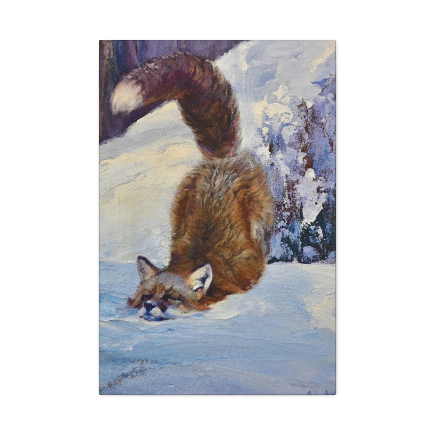
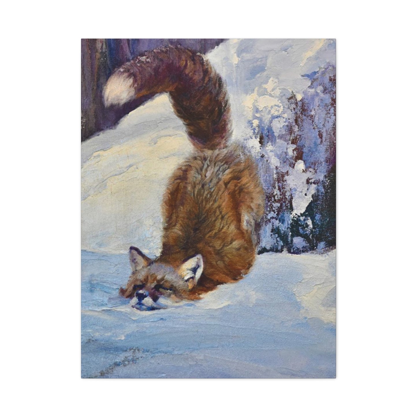
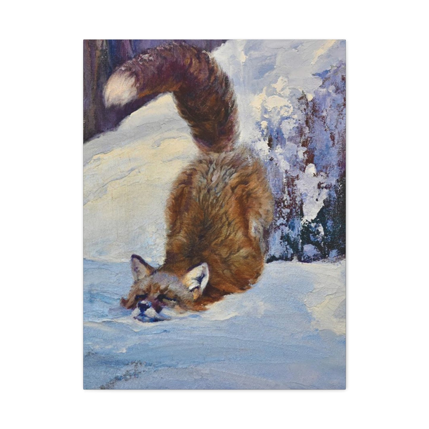
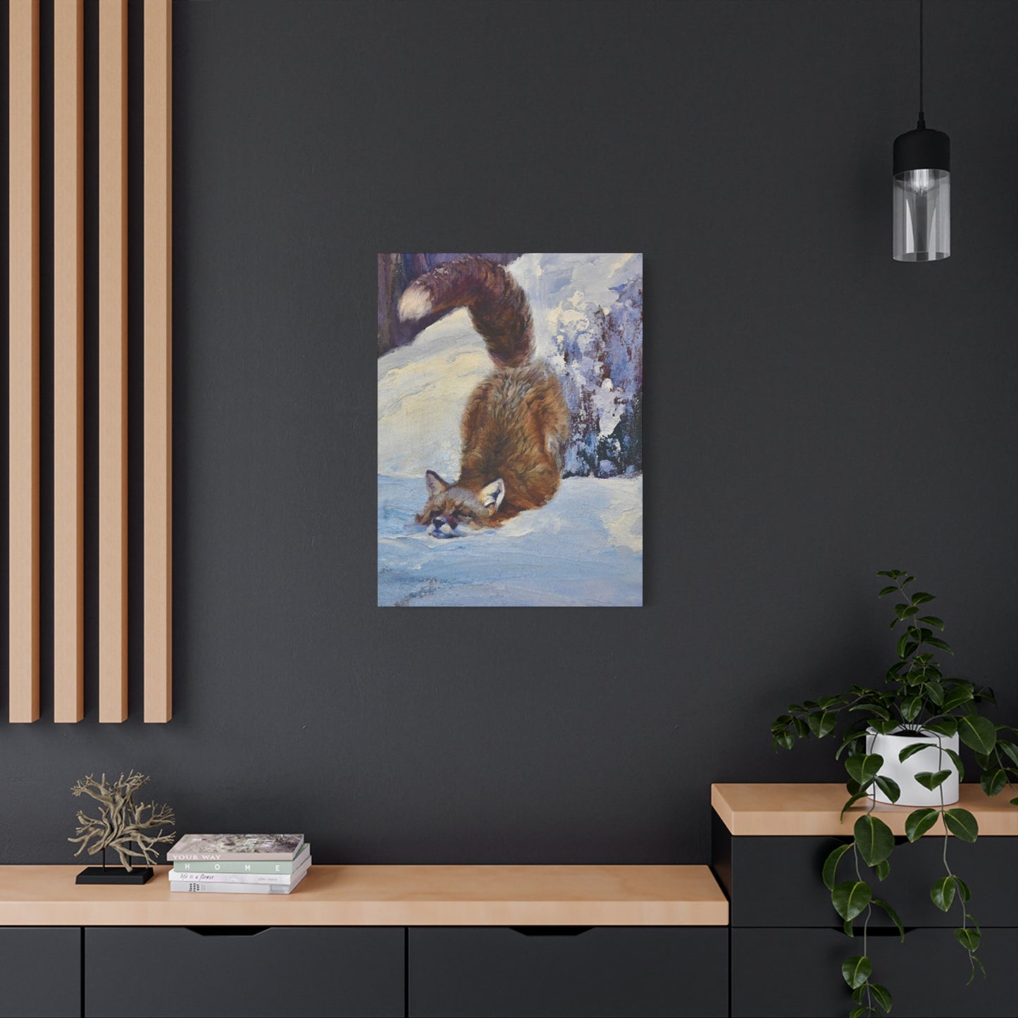
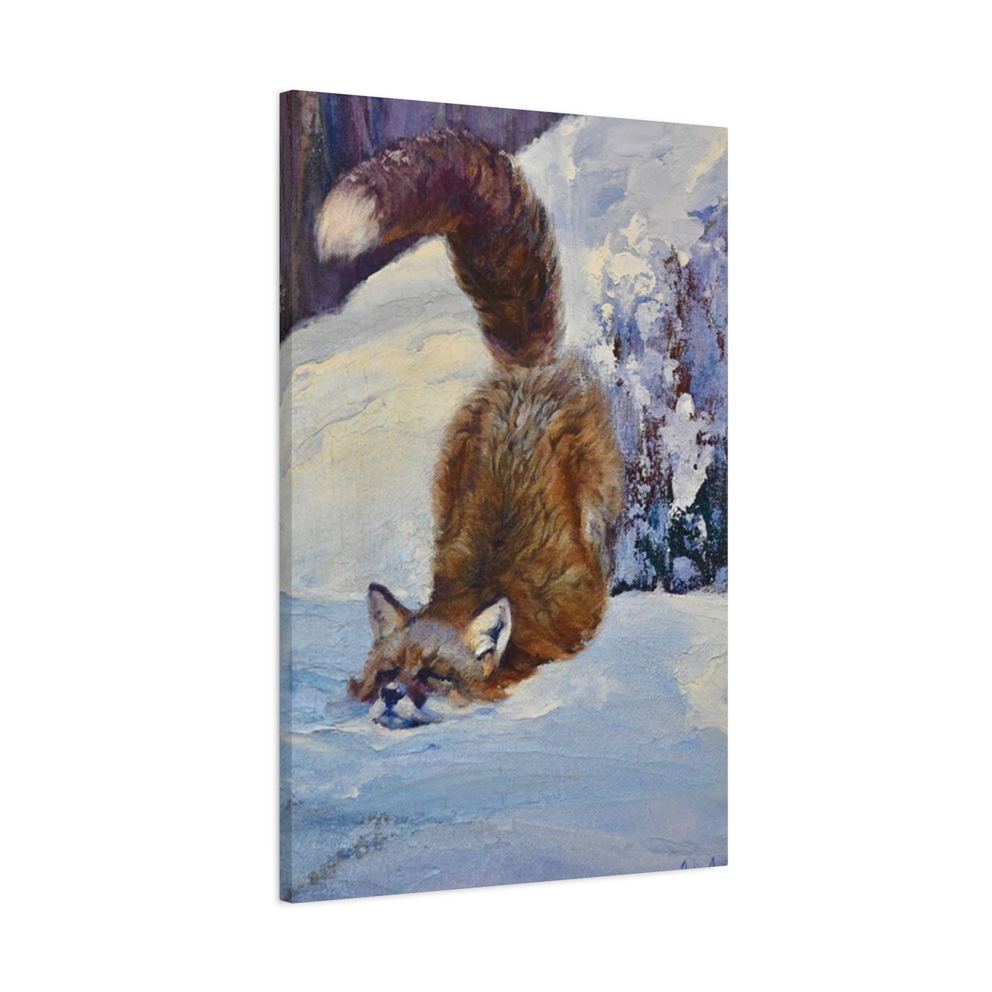
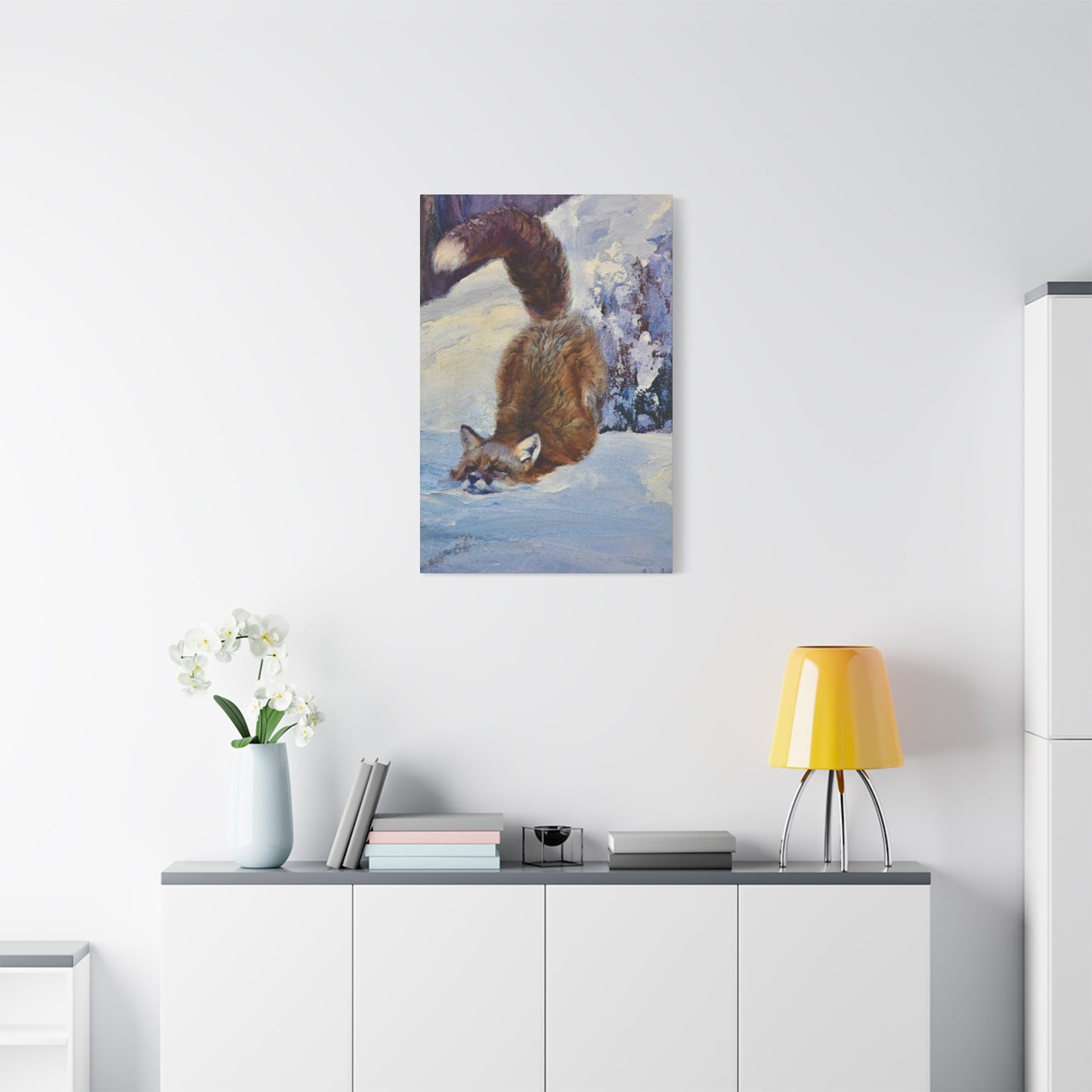
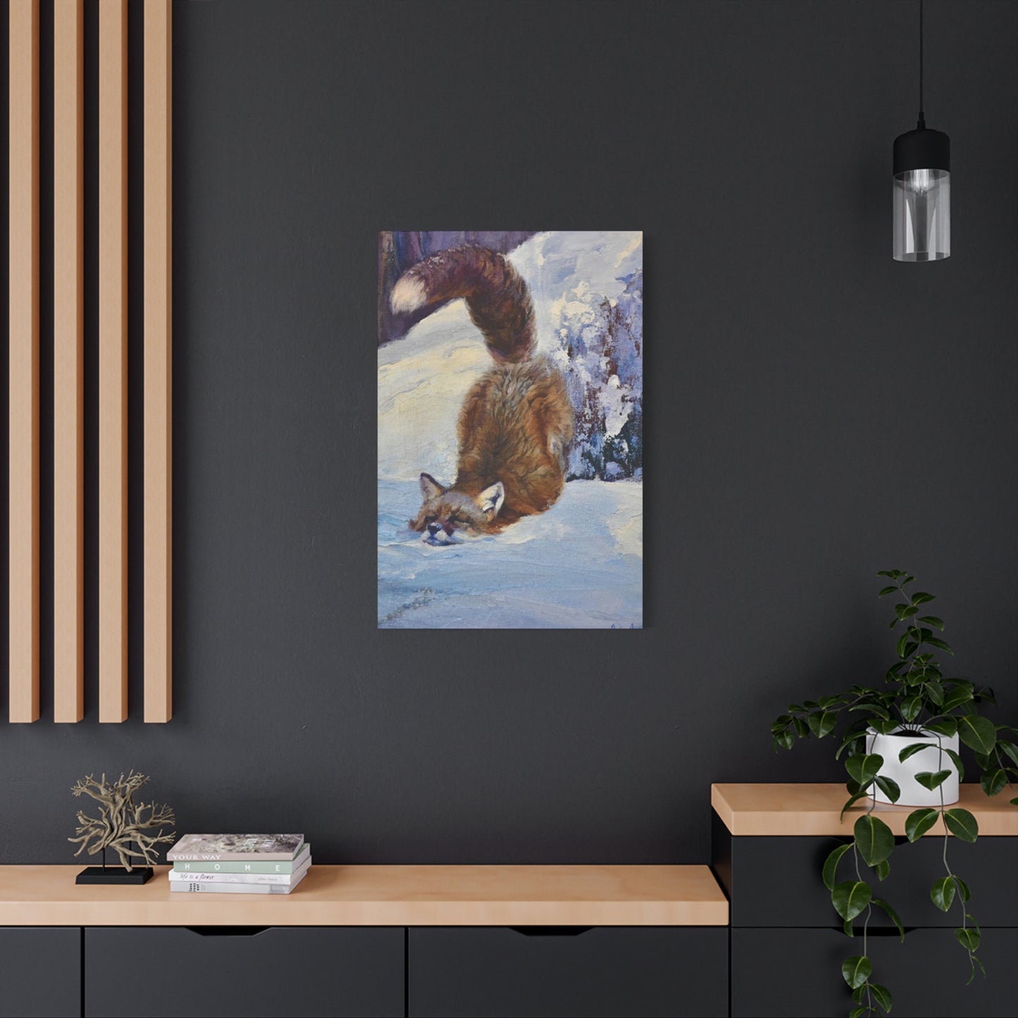
Adorable Vulpine Canvas Prints: Transform Your Living Space with Charming Cute Fox Wall Art That Captures Nature's Most Enchanting Creature
The allure of woodland creatures has captivated human imagination for centuries, and among these fascinating animals, the fox stands out as a symbol of cleverness, beauty, and natural grace. When we bring images of these magnificent creatures into our homes through carefully selected decorative pieces, we create an atmosphere that resonates with both warmth and wilderness. Cute fox wall art has emerged as one of the most sought-after decorative elements for homeowners, interior designers, and nature enthusiasts who wish to infuse their living spaces with a touch of the untamed world while maintaining an aesthetic that feels both contemporary and timeless.
The phenomenon of incorporating animal imagery into residential and commercial spaces stretches back through millennia of human civilization. From cave paintings depicting hunted prey to Renaissance tapestries showcasing mythological beasts, humans have always found ways to surround themselves with representations of the animal kingdom. In our modern era, this ancient impulse has evolved into a sophisticated market for decorative pieces that celebrate wildlife in all its diverse forms. Among these representations, the fox has carved out a particularly special niche, appealing to a wide demographic that appreciates both the creature's physical attractiveness and its rich symbolic meaning across various cultures.
The Captivating Appeal of Vulpine Imagery in Contemporary Interior Design
When examining why certain animal motifs gain traction in home decoration trends, we must consider multiple factors that contribute to their popularity. The fox possesses several qualities that make it an ideal subject for artistic representation. Its distinctive features—pointed ears, bushy tail, slender snout, and expressive eyes—create a silhouette that is instantly recognizable yet endlessly varied in artistic interpretation. Artists can render these creatures in styles ranging from photorealistic portraits that capture every detail of fur texture to minimalist line drawings that distill the essence of vulpine form into its most basic components.
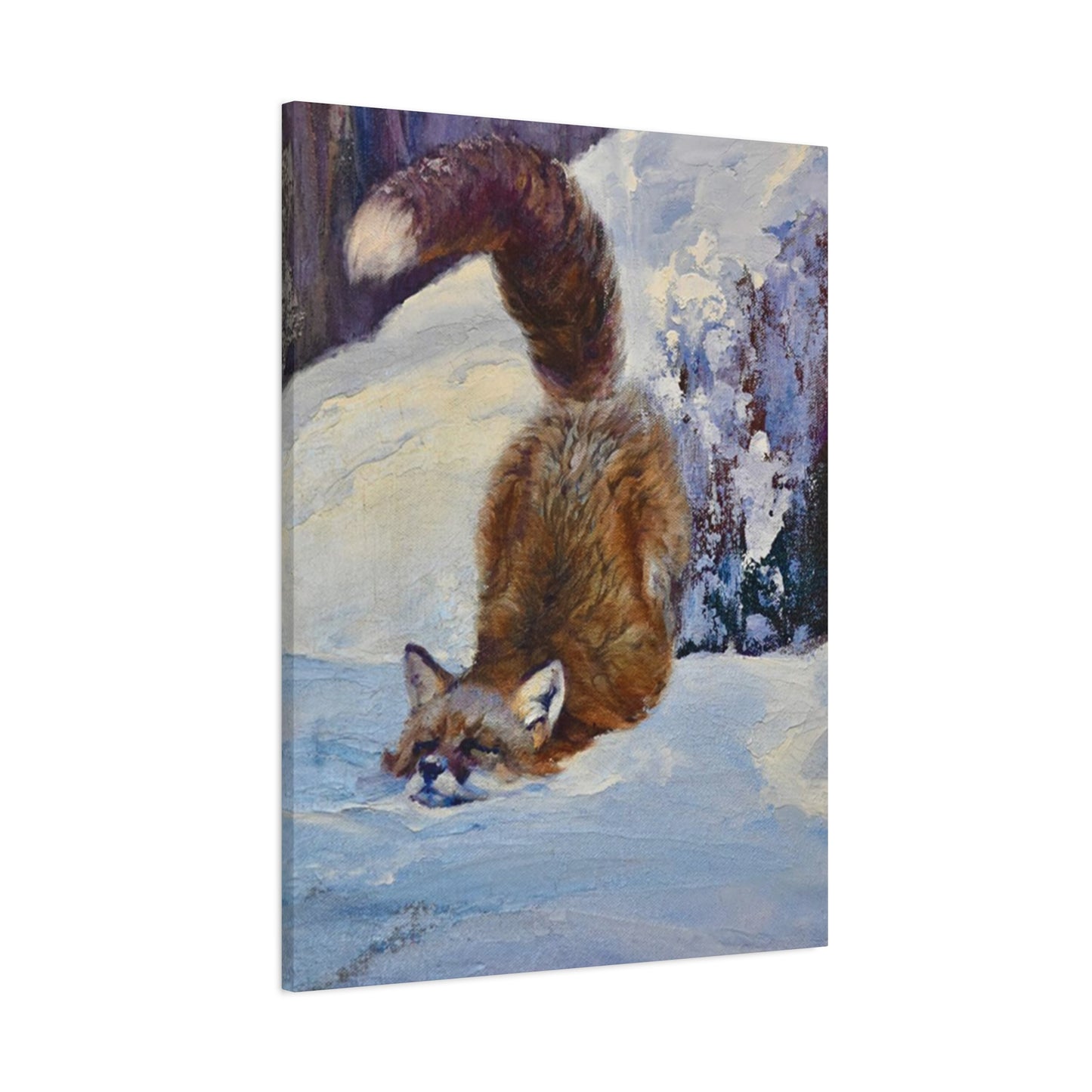
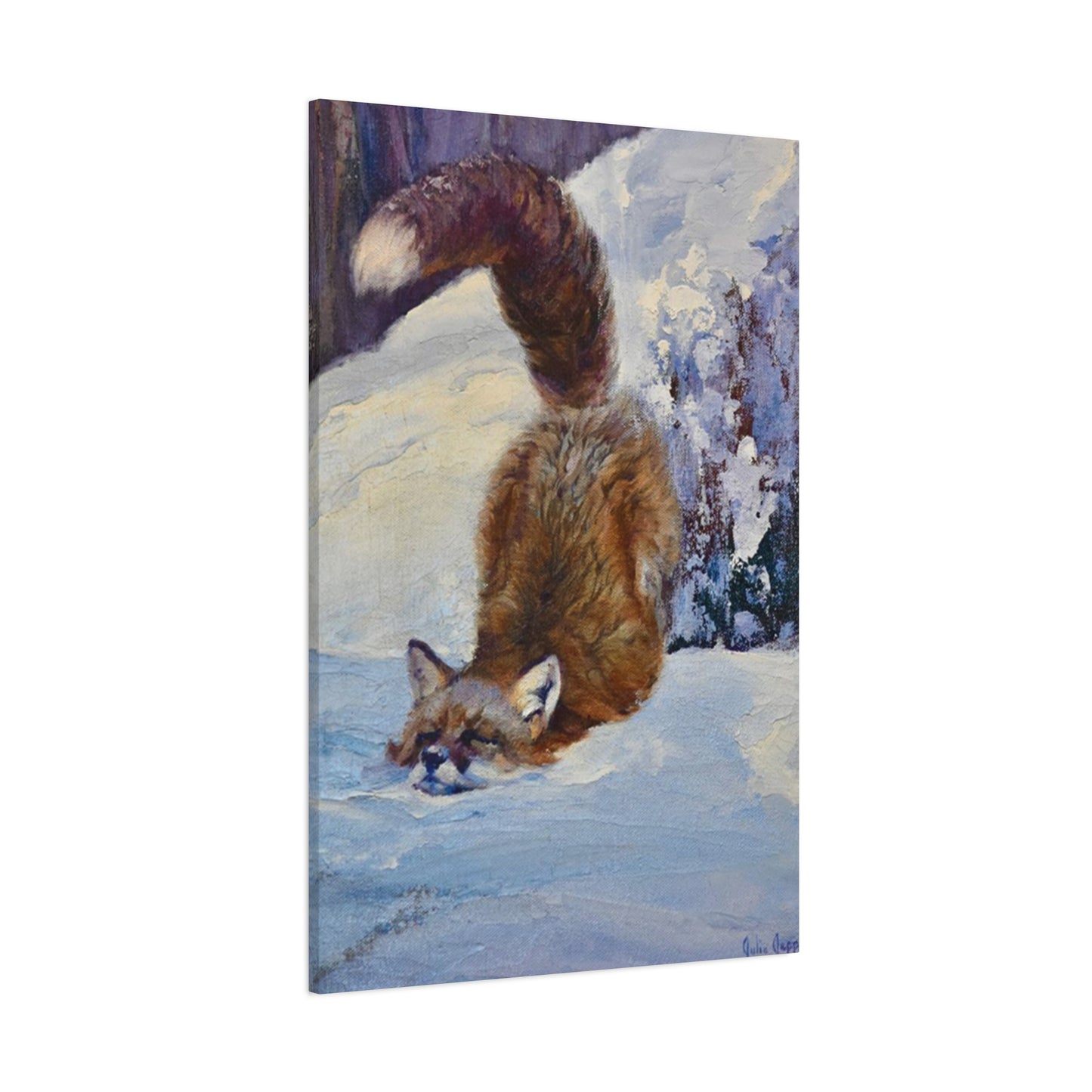
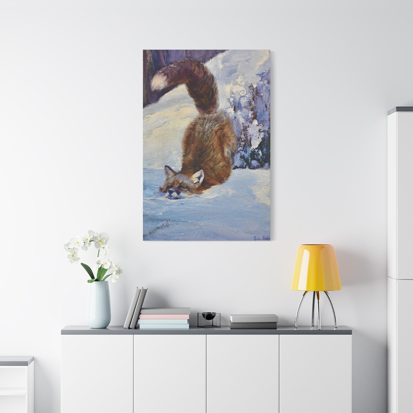
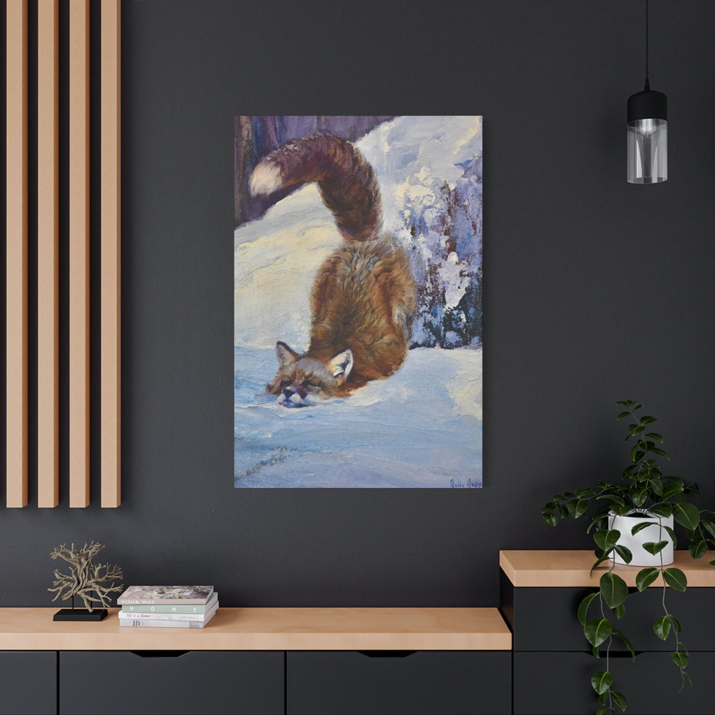
The color palette associated with foxes also contributes significantly to their decorative appeal. The classic red fox, with its russet coat, white chest, and black-tipped extremities, provides a natural harmony of warm and cool tones that complement a wide range of interior color schemes. Arctic foxes, with their pristine white winter coats, offer a different aesthetic entirely, bringing suggestions of purity, winter wonderlands, and crisp northern landscapes. Gray foxes and their intermediate colorations provide yet another option for those seeking something between these extremes.
Beyond mere physical characteristics, foxes carry symbolic weight that resonates with many people on a deeper level. Across world mythologies and folklore, these animals appear as tricksters, shape-shifters, guides, and messengers. In Japanese culture, the kitsune represents both mischief and wisdom, with the number of tails indicating the creature's age and power. Celtic traditions associate foxes with cunning and the ability to navigate between worlds. Native American stories often portray the fox as a clever problem-solver who uses intelligence rather than strength to overcome obstacles. When someone chooses to display imagery of these animals in their home, they may be consciously or unconsciously invoking these rich cultural associations.
Diverse Artistic Styles for Depicting These Woodland Creatures
The market for decorative pieces featuring these charming animals encompasses an extraordinary range of artistic approaches, each offering distinct aesthetic qualities and emotional resonances. Understanding these different styles helps buyers make informed decisions that align with their personal taste and existing interior design schemes.
Watercolor representations of foxes have gained tremendous popularity in recent years, particularly among those who favor soft, organic aesthetics. These pieces typically feature gentle color washes, visible brushstrokes, and a certain ethereal quality that suggests rather than explicitly defines form. Watercolor fox images often incorporate botanical elements—flowers, leaves, branches—creating compositions that situate the animal within a larger natural context. The translucent quality of watercolor paint allows for layering and blending that can produce remarkably subtle gradations of color, making each piece feel unique and handcrafted.
Geometric and abstract interpretations offer a completely different approach, appealing to those with more modern or minimalist sensibilities. These works might deconstruct the fox form into angular shapes, overlapping polygons, or interlocking patterns that suggest the animal through careful arrangement of abstract elements rather than realistic depiction. This style works particularly well in contemporary spaces with clean lines, neutral color palettes, and an emphasis on form over ornament. The intellectual pleasure of recognizing the subject through its geometric representation adds an extra layer of engagement for viewers.
Realistic photographic prints and hyperrealistic paintings serve those who want to bring the actual presence of these creatures into their homes as authentically as possible. These pieces showcase the incredible detail of fox anatomy—the individual hairs of their coat, the texture of their nose pad, the crystalline clarity of their eyes, the delicate structure of their whiskers. Such works often appeal to wildlife enthusiasts, photographers, and anyone who appreciates the technical skill required to achieve such faithful representation. They can serve as windows into the natural world, offering daily connection with wilderness that might otherwise be inaccessible to urban and suburban dwellers.
Vintage and retro-styled fox imagery taps into nostalgia and the aesthetic sensibilities of past eras. These might include illustrations reminiscent of children's book art from the mid-twentieth century, with their characteristic color palettes and simplified forms, or pieces that evoke the look of old natural history prints with their careful labeling and scientific precision. Victorian-era influenced designs might feature foxes within elaborate frames or surrounded by ornamental flourishes. Such pieces work beautifully in spaces decorated with antique or vintage furnishings, creating cohesive environments that feel transported from earlier times.
Whimsical and anthropomorphic representations dress foxes in human clothing, place them in unexpected scenarios, or give them exaggerated expressions that emphasize personality over naturalistic accuracy. These playful interpretations particularly appeal for children's rooms, nurseries, or any space where a sense of fun and imagination takes precedence over sophistication. A fox wearing a top hat and monocle, reading a book while sitting in an armchair, or having a tea party with other woodland creatures—these scenarios delight viewers of all ages while showcasing the artist's creativity and humor.
Selecting the Perfect Piece for Different Rooms Throughout Your Home
Each room in a residence serves different purposes and carries different energy, making the selection of decorative elements a thoughtful process that considers both function and atmosphere. Cute fox wall art can enhance virtually any space, but the specific style, size, and subject matter should vary according to the room's purpose and the mood you wish to create.
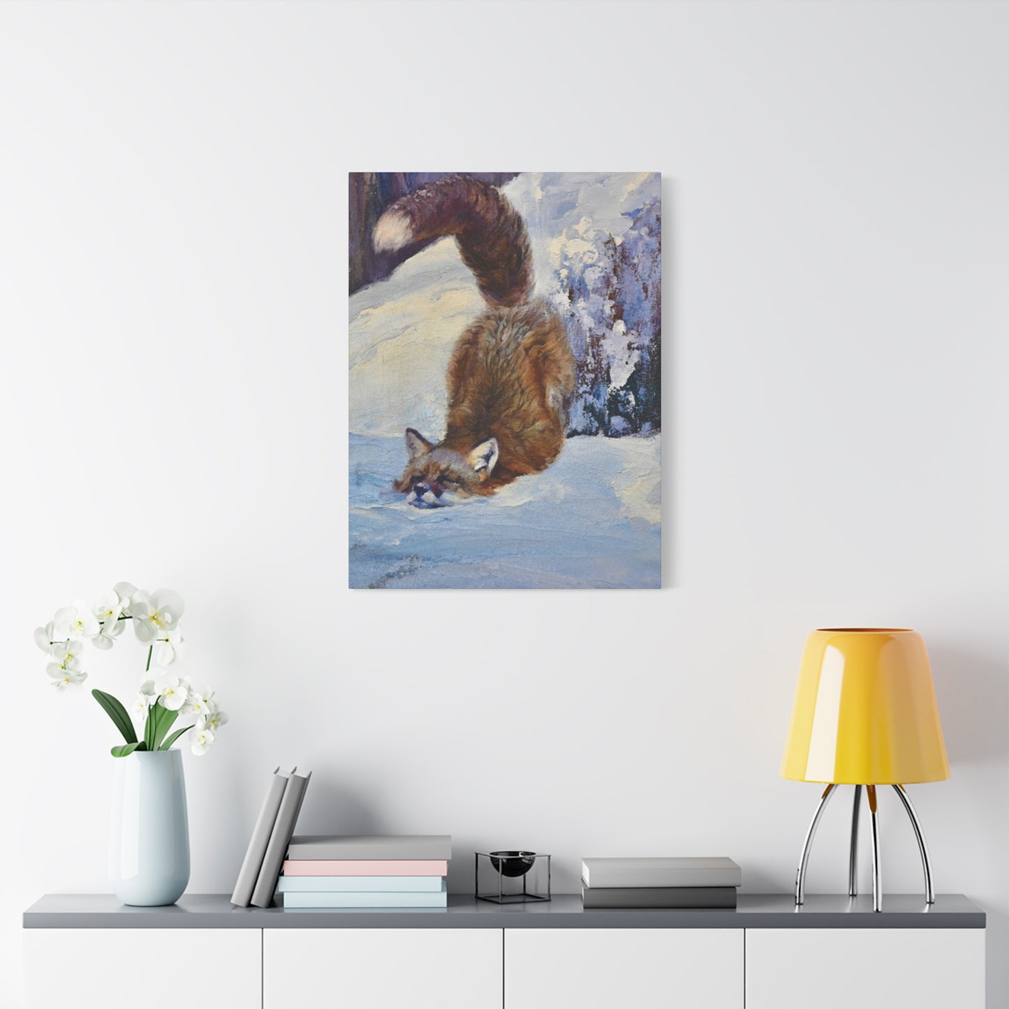
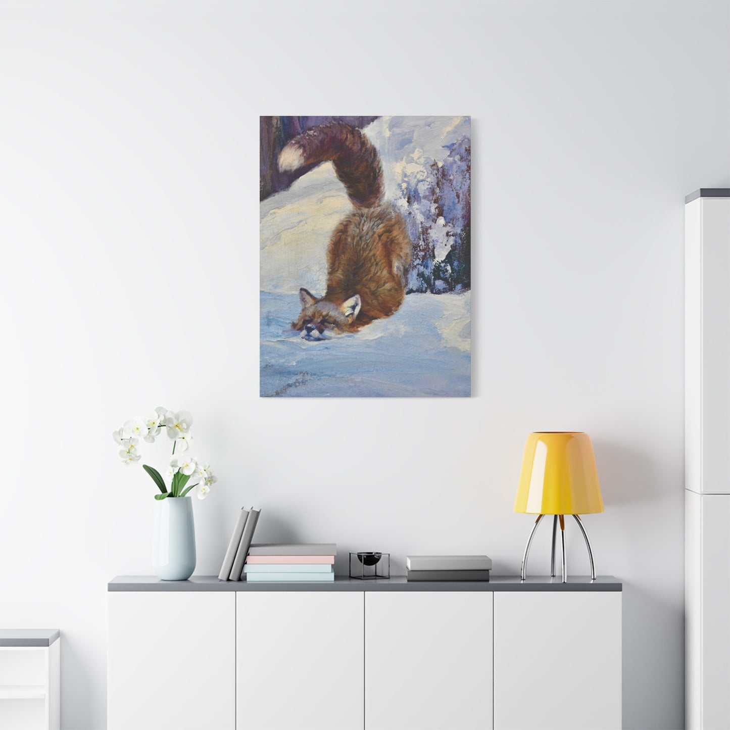
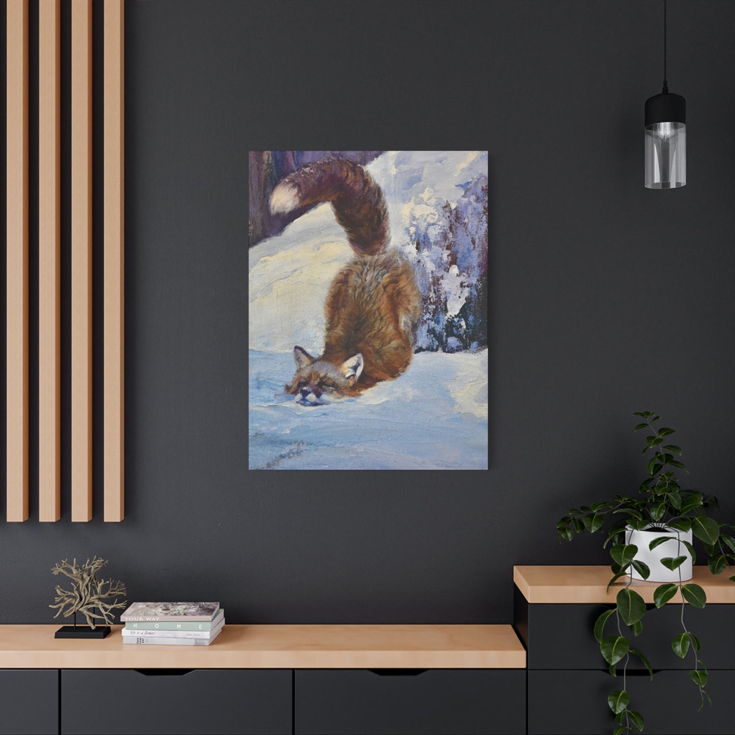
Living rooms and primary gathering spaces benefit from larger, statement pieces that can serve as focal points for conversation and visual interest. In these areas, you might choose dramatic representations—perhaps a large canvas showing a fox in mid-leap through snow, or a triptych that tells a visual story across three connected panels. The living room also accommodates more diverse styles since it typically welcomes adult visitors whose tastes may vary. You might opt for something sophisticated here, such as a minimalist line drawing or an elegant watercolor, that demonstrates aesthetic refinement while still celebrating the charm of these animals.
Bedrooms call for imagery that promotes relaxation and pleasant dreams. For these intimate spaces, consider softer representations—sleeping foxes curled into peaceful balls, foxes in gentle woodland settings surrounded by flowers and dappled sunlight, or dreamy, impressionistic pieces with muted color palettes. The bedroom is also an appropriate place for more personal choices that might not appeal to everyone but resonate deeply with the room's occupant. This could be the perfect spot for that quirky vintage print you love or the photograph of a fox kit that makes you smile every time you see it.
Children's rooms and nurseries present wonderful opportunities for playful, imaginative fox imagery. Here, brighter colors, cartoon-style illustrations, and narrative scenes work beautifully. Consider creating a whole woodland-themed environment by pairing fox prints with other forest creatures, trees, mushrooms, and fairy-tale elements. For nurseries, many parents prefer gentler, more soothing designs—perhaps a mama fox with her cubs, rendered in soft pastels with a lullaby-like quality. As children grow, their tastes evolve, so choosing pieces that can transition with them or planning for eventual updates becomes part of the decorating strategy.
Home offices and study spaces benefit from imagery that inspires focus while providing occasional visual breaks from work. In these environments, fox representations might lean toward the more intellectual or symbolic end of the spectrum. Consider pieces that emphasize the cleverness and problem-solving abilities associated with these animals—perhaps a fox depicted in alert, attentive posture, or abstract representations that engage the mind through pattern and form. The colors here might be more subdued, avoiding the high stimulation of very bright or busy pieces that could prove distracting during work hours.
Kitchens and dining areas, while sometimes overlooked in decorating plans, can be delightful spaces for fox imagery, particularly pieces with a lighter, more whimsical quality. A vintage-style print of a fox examining mushrooms or berries brings a touch of foraging folklore to spaces dedicated to food preparation and consumption. The kitchen is also a good place for smaller pieces or collections of related prints, which can be arranged in clusters on available wall space between cabinets and appliances.
Bathrooms, though typically the smallest rooms in a home, shouldn't be neglected when it comes to thoughtful decoration. A single well-chosen piece can transform a utilitarian space into a more pleasant, personal environment. For bathrooms, consider water-resistant prints or pieces under glass that can withstand the room's moisture levels. Smaller fox portraits or simple, elegant designs work well in these compact spaces without overwhelming the limited wall area available.
Entryways and hallways serve as transitional spaces that welcome visitors and set the tone for the rest of the home. Fox imagery in these areas might be selected to make a strong first impression—perhaps a striking black and white photograph or a bold, colorful painting that immediately catches the eye. Hallways, with their extended wall space, are also excellent locations for gallery-style arrangements of multiple smaller pieces that create visual interest along the length of the corridor.
Material Considerations for Longevity and Visual Impact
The substrate and production method used for decorative pieces significantly affect both their appearance and their durability over time. Understanding these material considerations helps ensure that your purchase will continue looking beautiful for years to come while also achieving the specific aesthetic effect you desire.
Canvas prints have become one of the most popular options for reproducing artwork, and with good reason. The texture of canvas adds depth and visual interest that flat paper lacks, creating a surface that interacts with light in dynamic ways. Canvas can be stretched over wooden frames (gallery-wrapped) so that the image continues around the sides, eliminating the need for additional framing and creating a clean, contemporary look. Alternatively, canvas can be framed traditionally for a more classic presentation. High-quality canvas prints, when produced with archival inks and properly stretched, resist fading and maintain their appearance for decades with minimal care required.
Paper prints encompass an enormous range of quality levels and characteristics. Fine art papers—with names like rag paper, cotton paper, or watercolor paper—offer superior longevity and color reproduction compared to standard poster paper. These substrates often have beautiful textures that enhance the printed image, particularly for works originally created with traditional media like watercolor or pastel. Paper prints typically require framing behind glass or acrylic for protection from moisture, dust, and physical damage, but this also provides opportunity to customize the presentation with matting and frame selection.
Metal prints represent a more recent innovation in image reproduction, involving a process that infuses dyes directly into specially coated aluminum sheets. The result is a luminous, almost three-dimensional quality with exceptional color saturation and clarity. Metal prints are highly durable, resistant to moisture and UV damage, and easy to clean, making them excellent choices for high-humidity environments or high-traffic areas. Their contemporary appearance suits modern interiors particularly well, though the high gloss finish may not appeal to everyone or work in all lighting situations.
Wood prints transfer images onto natural wood surfaces, allowing the grain and texture of the wood to show through and become part of the composition. This creates a rustic, organic aesthetic that works beautifully with farmhouse, cabin, or nature-inspired interior styles. Each wood print is unique due to variations in the wood itself, and the material brings warmth and tactile interest that other substrates lack. However, wood is more susceptible to warping with humidity changes and requires more careful placement away from direct moisture sources.
Acrylic and plexiglass prints sandwich images between or behind transparent plastic panels, creating a sleek, gallery-quality presentation with exceptional color depth and a glossy, modern appearance. The material provides protection while enhancing the image with its reflective qualities and dimensionality. These pieces are more expensive than many other options but offer a premium look that suits contemporary and minimalist spaces where they can serve as high-impact statement pieces.
Textile options like tapestries, fabric panels, and woven wall hangings bring softness and texture to wall decoration in ways that rigid materials cannot. These pieces often have a bohemian or eclectic quality and can help absorb sound in rooms where acoustics are a concern. Fabric pieces require more careful maintenance than hard surfaces but contribute to creating cozy, layered interiors with tactile variety.
Sizing Strategies for Visual Balance and Room Proportion
Selecting the appropriate size for decorative pieces requires consideration of multiple factors: the dimensions of the wall space, the viewing distance, the size of surrounding furniture, and the overall scale of the room. Getting these proportions right makes the difference between a piece that feels perfectly placed and one that seems awkwardly too large or disappointingly small.
For walls above sofas, beds, or other substantial furniture pieces, designers generally recommend that artwork span approximately two-thirds to three-quarters of the furniture's width. This creates visual connection between the furniture and the art while preventing either element from overwhelming the other. A standard sofa measuring 84 inches wide, for example, would be well-served by artwork ranging from 56 to 63 inches in width. This guideline provides a starting point, though personal preference and the specific characteristics of the room may justify variations from this rule.
Small pieces, typically those under 16 inches in any dimension, work best in intimate viewing situations—small wall sections between doorways or windows, arranged in collections or gallery walls, or in compact spaces where large pieces would overwhelm. These diminutive works invite closer inspection and can showcase fine details that might be lost in a larger reproduction. They also offer flexibility, as they can be easily rearranged, added to, or replaced as tastes evolve without requiring significant wall space adjustments.
Medium-sized pieces, ranging from 16 to 32 inches, represent the most versatile category. They're substantial enough to hold their own as standalone pieces while remaining manageable in scale for most residential spaces. This size range works well for most bedrooms, dining rooms, and smaller living areas. Medium pieces can also be effectively grouped in pairs or sets of three or more to create more elaborate arrangements that fill larger wall spaces while maintaining visual variety.
Large pieces, from 32 to 50 inches, make strong visual statements and work best in rooms with generous wall space and adequate viewing distance. These substantial works can serve as room focal points, anchoring furniture arrangements and establishing color schemes for entire spaces. In rooms with high ceilings, large pieces help scale the space appropriately, preventing walls from feeling empty or inhospitable. However, large pieces require careful consideration of viewing distance—hanging a 48-inch canvas in a small room where viewers can never step back more than a few feet may prevent proper appreciation of the image.
Oversized pieces, exceeding 50 inches, enter statement territory and are typically reserved for spaces specifically designed to showcase them. These dramatic works demand significant wall space free from competing visual elements and require substantial viewing distance for full appreciation. In appropriate settings, oversized pieces create impressive focal points that can define a room's entire aesthetic. However, their scale makes them less forgiving of placement errors or decorating changes, so they represent more permanent commitments than smaller options.
Multi-panel arrangements, like diptychs (two panels), triptychs (three panels), or larger polyptychs, offer creative ways to fill large wall spaces while maintaining visual interest through repetition and variation. These arrangements can span substantial widths while keeping individual panel sizes manageable. They also introduce rhythm and movement through the spaces between panels, creating more dynamic compositions than single large pieces. When selecting multi-panel pieces, consider whether the panels form a continuous image that must be hung in specific positions or whether they're related but independent compositions that allow more flexibility in arrangement.
Color Coordination with Existing Interior Palettes
The colors in your chosen decorative pieces should relate thoughtfully to your room's overall color scheme, either complementing existing hues or providing deliberate accent notes that enliven the space. Understanding basic color theory and how it applies to interior decoration helps ensure harmonious results.
Monochromatic approaches use variations of a single color family, creating cohesive, calming environments with subtle sophistication. For fox imagery, this might mean selecting pieces that emphasize the natural rust and orange tones of red foxes in a room decorated with warm terracotta, peach, and cream colors. Or you might choose pieces depicting arctic foxes in winter landscapes for a room with a palette of white, gray, and soft blue. Monochromatic schemes create restful environments with inherent unity, though they risk monotony if not enlivened with varied textures and subtle tonal variations.
Analogous color schemes use colors that sit next to each other on the color wheel, like yellow, orange, and red-orange, or blue, blue-green, and green. These palettes feel naturally harmonious while offering more variety than monochromatic approaches. A fox image with warm autumn foliage—featuring oranges, yellows, and gold tones—would beautifully complement a room decorated in similar warm hues. This approach maintains color family coherence while introducing enough variation to keep spaces visually interesting.
Complementary color approaches pair colors from opposite sides of the color wheel, like orange and blue, or red and green. These combinations create vibrant, energetic spaces with strong visual impact. A fox image with significant orange coloring against a blue-gray winter landscape, displayed in a room with blue accent walls or upholstery, demonstrates this principle. Complementary schemes require careful balance, as equal proportions of complementary colors can feel jarring. Typically, one color should dominate while the complementary color appears as a smaller accent.
Triadic color schemes use three colors evenly spaced around the color wheel, such as red, yellow, and blue, or orange, green, and purple. These palettes are naturally balanced and lively without the intensity of complementary schemes. A fox image incorporating orange fur, green forest background, and perhaps purple wildflowers could anchor a room decorated in these three color families, distributed among walls, furniture, and accessories.
Neutral-based approaches build palettes around beiges, grays, browns, and whites, allowing the artwork's colors to provide the primary color interest in the room. This strategy offers maximum flexibility for changing decorative elements over time, as the neutral background accommodates virtually any accent color. In such spaces, your fox imagery might be the primary source of color, its russet and white tones standing out beautifully against neutral surroundings.
When coordinating colors, consider not just hue (the actual color) but also value (lightness or darkness) and saturation (intensity or purity of color). A room might coordinate through similar values—all light and pale, or all deep and rich—even if the actual hues vary. Similarly, a space might unify through saturation levels, with all colors either muted and grayed or bright and pure. These subtler considerations often distinguish professional-looking interiors from amateur attempts at color coordination.
The psychological effects of different colors also merit consideration when selecting decorative pieces. Warm colors like the oranges and reds naturally associated with foxes create energetic, welcoming environments that stimulate conversation and activity. Cool colors—blues, greens, purples—promote calm, relaxation, and concentration. Understanding these effects helps you select imagery appropriate to each room's purpose. Active family spaces might benefit from warmer fox representations, while bedrooms might be better served by cooler interpretations featuring winter scenes or nighttime settings.
Arrangement Methods for Creating Gallery-Style Displays
Rather than hanging a single piece in isolation, many people prefer to create more complex arrangements that group multiple related pieces into cohesive displays. These gallery-style arrangements offer opportunities for visual storytelling and allow you to showcase collections of smaller pieces that individually might lack sufficient impact.
Symmetrical grid arrangements organize pieces in even rows and columns with consistent spacing between all elements. This formal, orderly approach works well in traditional interiors and creates a sense of calm organization. A grid might consist of four pieces of equal size arranged in a perfect square, six pieces in two rows of three, or nine pieces in a three-by-three configuration. The key to successful grid arrangements is mathematical precision—spacing must be exactly equal, and pieces must align perfectly to avoid a haphazard appearance that undermines the intended formality.
Asymmetrical salon-style galleries embrace a more organic, collected-over-time appearance, with pieces of varying sizes arranged in aesthetically pleasing but irregular patterns. This approach, inspired by the crowded picture walls of 18th and 19th century European salons, creates visual interest through diversity and allows for gradual collection building. Successful salon walls balance larger anchor pieces with smaller supporting works, maintain relatively consistent spacing between all pieces (typically 2-3 inches), and consider the overall envelope or perimeter shape created by the collection. While asymmetrical, these arrangements still require careful planning to avoid chaos—many people find it helpful to arrange pieces on the floor before hanging to perfect the composition.
Horizontal line arrangements align pieces along a central horizontal axis, with tops, bottoms, or centers matched across the collection. This creates a linear flow that leads the eye along the wall while maintaining order through the aligned element. Horizontal arrangements work particularly well in hallways, above long furniture pieces, or on walls with limited height but substantial width. Pieces in horizontal arrangements can vary in size but typically maintain some consistency in height or, if heights vary significantly, are arranged so that an imaginary line through centers or bases creates the organizing principle.
Vertical stack arrangements align pieces along a central vertical axis, creating upward movement that can make ceilings feel higher and narrow walls feel more proportionate. These arrangements work well on walls beside doorways, between windows, or in narrow spaces where horizontal arrangements would span too far into adjacent areas. Vertical arrangements might consist of three, four, or five pieces of decreasing size from bottom to top (creating a pyramid effect) or of uniform sizes for more formal appearance.
Cluster groupings bring pieces together in tight formations with minimal spacing, creating unified visual masses that function almost as single large elements. These clusters might consist of three pieces of similar size arranged in a triangle, four pieces in a diamond or square configuration, or larger numbers in more complex patterns. Cluster arrangements work well on wall sections that might not accommodate single large pieces but can support smaller grouped elements. They also allow you to collect related pieces gradually—starting with two or three and adding more over time.
Linear storytelling arrangements organize pieces in deliberate sequences that guide viewers through a narrative or progression. For fox imagery, this might mean arranging pieces to suggest the passage of seasons, the growth of cubs from kit to adult, or a journey through different habitats. These arrangements require pieces specifically selected or created as parts of a series, and their effectiveness depends on viewers understanding the intended sequence. Clear left-to-right or top-to-bottom organization helps communicate the narrative structure.
Framing Choices That Enhance Rather Than Detract
For pieces that require framing—primarily paper prints and certain photographs—frame selection significantly impacts how the artwork appears and how well it integrates with your room's aesthetic. Thoughtful framing enhances the art and ties it to its surroundings, while poor framing choices can diminish even beautiful images.
Wood frames offer warmth, texture, and a natural quality that pairs beautifully with wildlife imagery. The variety within this category is enormous—from rustic barn wood with visible grain and imperfections to sleek, polished hardwoods with refined finishes. Light woods like maple, birch, or pine create casual, airy feelings and work well with Scandinavian or minimalist aesthetics. Medium woods like oak or walnut offer versatility that suits most traditional and transitional interiors. Dark woods like mahogany or ebonized finishes provide formal elegance appropriate for more sophisticated spaces. The width of wood frames also affects their impact—narrow profiles feel modern and unobtrusive, while wider frames make stronger statements and can help smaller pieces command more presence.
Metal frames bring clean, contemporary lines and work exceptionally well in modern and industrial interiors. Aluminum and steel frames typically appear in finishes ranging from shiny chrome or brushed nickel to matte black or antiqued bronze. Metal frames complement the geometric fox representations discussed earlier and suit spaces with metal furniture or fixtures. Their slim profiles minimize visual weight, allowing the artwork itself to remain the focus. However, metal's sleek modernity may clash with traditional or rustic decorating schemes, so consider your overall aesthetic before defaulting to metal frames.
Painted frames offer unlimited color possibilities, allowing you to match or complement your room's palette precisely. White and black painted frames are neutrals that suit most situations—white for brighter, more casual spaces and black for sophisticated, gallery-like presentations. Colored painted frames can pick up accent colors from your room or from the artwork itself, creating visual connections that unify the space. The paint finish matters too—matte finishes feel contemporary and understated, while glossy finishes add a bit of glamour and reflect more light.
Ornate and decorative frames with carved details, gilt finishes, or elaborate corner treatments suit traditional, romantic, or maximalist interiors. These frames make strong statements themselves and can elevate simple prints into more significant decorative elements. However, ornate frames can also overwhelm delicate artwork or clash with simpler images, so they work best with pieces that can hold their own against the frame's presence. Vintage and antique frames fall into this category, offering authentic period details for those creating historically inspired spaces.
Float frames create a gap between the artwork and the frame's inner edge, making the piece appear suspended within the frame. This contemporary presentation draws attention to the artwork's edges and creates shadow lines that add depth and interest. Float frames work particularly well with canvas paintings, photographs printed to the edge without borders, and pieces where the edges themselves are compositionally important.
Shadow box frames extend deeper than standard frames, creating three-dimensional display spaces suitable for pieces with actual depth—collages, mixed media works, or mounted pieces with dimensional elements. While less common for standard prints, shadow boxes can add visual interest through their depth and are useful when you want to combine artwork with other meaningful objects in a single display.
Matting—the paper border between artwork and frame—serves both protective and aesthetic purposes. Mats create breathing room around images, preventing them from feeling cramped within frames. They also protect artwork from touching glass, where condensation could cause damage. Mat colors should typically be neutral—white, cream, gray, black—though colored mats can be used strategically to emphasize specific colors within the artwork. Mat widths should be proportionate to both the artwork and the frame, with larger pieces generally requiring wider mats. A common approach uses a wider bottom mat than top and sides, creating a subtle visual lift that counteracts the optical illusion that would otherwise make the image appear to sink within the frame.
Lighting Considerations for Proper Display and Preservation
How you illuminate your decorative pieces dramatically affects how they appear and how long they'll maintain their original quality. Proper lighting showcases artwork to its best advantage while minimizing damage from harmful light exposure.
Natural light provides the most accurate color rendering but also poses the greatest risk to artwork longevity. Ultraviolet radiation in sunlight causes fading, yellowing, and degradation of both pigments and substrates over time. If you hang pieces where they'll receive direct sunlight, consider using UV-filtering glass or acrylic in frames, window treatments that block UV rays, or UV-blocking window films. Alternatively, reserve sun-exposed wall spaces for pieces printed with archival inks specifically formulated for fade resistance, or accept that pieces in these locations may require replacement every few years.
Artificial lighting offers more control and less risk, though it still requires thoughtful planning. Ambient room lighting—overhead fixtures, floor lamps, table lamps—provides general illumination that allows artwork to be visible and enjoyed. However, ambient lighting alone often creates flat, uninteresting presentation without highlighting the artwork's specific qualities. Supplementing ambient light with accent lighting directed at specific pieces creates dimension, drama, and emphasis.
Picture lights mount directly to frames or walls above artwork, casting focused illumination downward across the piece. These lights are available in various styles from traditional brass to contemporary LED strips, and in sizes proportionate to different frame widths. Picture lights create professional, gallery-like presentation and allow artwork to remain visible and appreciated even in rooms with dimmed ambient lighting. Modern LED picture lights consume minimal energy, generate little heat, and typically offer adjustable color temperatures to optimize appearance.
Track lighting and adjustable recessed fixtures provide flexible options for lighting multiple pieces or entire gallery walls. These systems allow you to direct light precisely where needed and adjust as your displays change. The key to successful track lighting lies in positioning fixtures to minimize glare and reflection—light should strike artwork at angles around 30 degrees from vertical for optimal viewing without hotspots or glare that obscure the image.
Recessed or wall-mounted spotlights offer clean, architectural lighting solutions that eliminate visible fixtures while creating dramatic, focused illumination. These work particularly well in contemporary interiors where visible lighting hardware would clash with minimalist aesthetics. However, they require installation during construction or renovation, making them less practical for rental situations or spaces where flexibility is important.
Color temperature—measured in Kelvin—affects how artwork appears under different light sources. Lower color temperatures (2700-3000K) produce warm, yellowish light that enhances warm colors but can make cool colors appear dull or muddy. Higher color temperatures (4000-5000K) produce cooler, bluer light that enhances cool colors but may make warm colors appear washed out. Neutral color temperatures (3500-4000K) provide balanced illumination that renders most colors accurately. For artwork, choosing the right color temperature depends on the piece's color palette and the quality of light in the room generally. Ideally, accent lighting on artwork should roughly match the color temperature of the room's ambient lighting to avoid jarring contrasts.
Light intensity and dimming capability allow you to adjust how prominently artwork features in your space for different times and moods. Bright lighting creates energy and draws maximum attention to artwork, suitable for entertaining or daytime hours. Dimmed lighting creates intimacy and allows artwork to recede into the background for evening relaxation. Dimmers provide this flexibility, and many modern LED lighting systems offer both dimming and color temperature adjustment through smart controls.
Seasonal Rotation Strategies for Fresh Perspectives
Rather than viewing decorative choices as permanent installations, some people embrace seasonal rotation, changing displayed pieces with the calendar to keep their spaces feeling fresh and responsive to the world outside. This approach works particularly well with nature-themed imagery like fox art, where different pieces can reflect seasonal changes.
Winter selections might emphasize arctic foxes in snowy landscapes, foxes curled up in cozy dens, or scenes with evergreen forests and crystalline frost. The color palettes would lean toward cool whites, soft grays, icy blues, and the deep greens of winter conifers. These images reinforce the season's aesthetic while creating visual warmth through the charm of the creatures themselves, offering psychological comfort during months when nature might appear dormant and less inviting.
Spring displays could transition to pieces showing foxes with cubs, emerging from dens as new life appears throughout nature. Images incorporating spring flowers—crocuses, daffodils, cherry blossoms—pair beautifully with fox subjects, creating compositions that celebrate renewal and awakening. Color palettes shift to include soft pastels, fresh greens, and delicate florals that match the season's gentler, optimistic energy.
Summer imagery might depict foxes in full coats during the season's long light, perhaps hunting through meadows filled with wildflowers or resting in dappled forest shade. These pieces could incorporate the lush greens, vibrant flower colors, and golden light characteristic of summer months. The overall feel would emphasize abundance, activity, and the natural world at its most accessible and inviting.
Autumn selections return to the classic red fox aesthetic that many people first associate with these creatures. Images of foxes among fall foliage, with russet fur echoing the colors of turning leaves, celebrate the season's spectacular color display. Deep oranges, rich golds, warm browns, and burgundy tones create rooms that feel cozy and harvest-ready, preparing for the upcoming return to winter's introspection.
Implementing seasonal rotation requires some planning and storage solutions. Pieces not currently displayed need safe storage away from moisture, extreme temperatures, and physical damage. Flat files, portfolio cases, or simply careful wrapping and storage in dry closets or under beds keep artwork protected. Some people maintain dedicated storage systems with labeled sections for each season's pieces, making rotation quick and easy when the time comes.
The rotation schedule itself can follow calendar seasons, personal preference, or even more frequent changes for those who particularly enjoy variety. Some people change displays four times yearly at the equinoxes and solstices, while others prefer two rotations—one for the warm half of the year and one for the cold. More frequent changes are certainly possible but require greater time investment and larger collections of artwork to draw from.
Seasonal rotation offers additional benefits beyond simple variety. It allows you to purchase more pieces than you have wall space to display simultaneously, building substantial collections over time without overwhelming your walls. It keeps you engaged with your decorative choices, preventing the blindness that can develop when we see the same things every day and stop truly noticing them. It creates enjoyable rituals around the changing seasons, marking transitions with the small ceremony of changing artwork. And practically, it means pieces receive less continuous exposure to light and environmental conditions, potentially extending their lifespan.
Conclusion
While fox images can certainly stand alone as decorative focal points, they often work even better when thoughtfully combined with complementary decorative elements that create cohesive, layered environments with depth and personality.
Botanical elements pair naturally with wildlife imagery, reflecting the interconnected ecosystems these animals inhabit. Pieces depicting flowers, trees, ferns, mushrooms, or other plant life create context for fox subjects and expand the nature-inspired theme throughout a space. You might hang a fox print as a central element flanked by botanical illustrations, creating a triptych effect even with separate, unframed pieces. Or you could create a larger gallery wall that intersperses fox images with various plant studies, building a visual ecosystem on your wall.
Other woodland creature representations broaden the theme while maintaining coherence. Deer, rabbits, owls, raccoons, hedgehogs, and bears all share habitats with foxes and create opportunities for storytelling through grouped displays. A collection that includes various forest animals suggests a complete woodland environment rather than focusing exclusively on a single species. This approach works particularly well in children's rooms, where variety stimulates imagination and learning about different animals and their relationships.
Landscape imagery without animal subjects can serve as supporting pieces that establish setting and atmosphere. Images of forests, meadows, mountains, or streams create environmental context for wildlife subjects. A large landscape piece with smaller fox portraits creates natural spatial relationships—the landscape suggests the realm these creatures inhabit while the portraits allow closer connection with individual animals. This layering of scales mimics how we actually experience nature, perceiving both broad vistas and intimate details.
Textual elements—quotes about nature, single evocative words, or even simple dates or coordinates—add conceptual layers to visual displays. A favorite quote about wilderness or cleverness displayed near fox imagery reinforces themes and messages you want to emphasize in your space. Minimalist text prints in consistent fonts and colors can tie together visually diverse pieces, creating unity through repeated design elements even when the actual images vary significantly.
Three-dimensional elements break up the flatness of wall displays and add tactile interest. Small shelves installed among or beside framed pieces can hold natural objects—pinecones, interesting rocks, pieces of driftwood, small plants—or fox figurines and sculptures that extend the theme into physical space. These dimensional elements create resting points for the eye and opportunities for seasonal changes as you swap out displayed objects.
Share