Cubism Wall Art and Canvas Prints
Cubism Wall Art and Canvas Prints
Couldn't load pickup availability
Cubism Wall Art: Revolutionary Visual Expression Through Geometric Forms and Fractured Perspectives in Modern Interior Design
The dawn of the twentieth century witnessed an unprecedented transformation in how artists perceived and represented reality. This radical movement emerged in Paris during the early 1900s, fundamentally altering the trajectory of visual arts. Pablo Picasso and Georges Braque spearheaded this revolutionary approach, dismantling centuries-old conventions about representation and perception. Their groundbreaking work challenged viewers to abandon traditional expectations of realistic depiction, instead embracing fragmented, multi-dimensional perspectives that captured subjects from numerous angles simultaneously.
This artistic revolution didn't materialize from thin air. It grew from a rich soil of intellectual ferment, influenced by philosophical inquiries into the nature of reality, scientific discoveries about space and time, and cultural shifts away from Victorian rigidity. The movement represented more than aesthetic experimentation; it embodied a profound questioning of how humans comprehend their surroundings. Artists began deconstructing objects into geometric components, analyzing their essential structures, and reconstructing them on canvas in ways that revealed hidden truths about form and space.
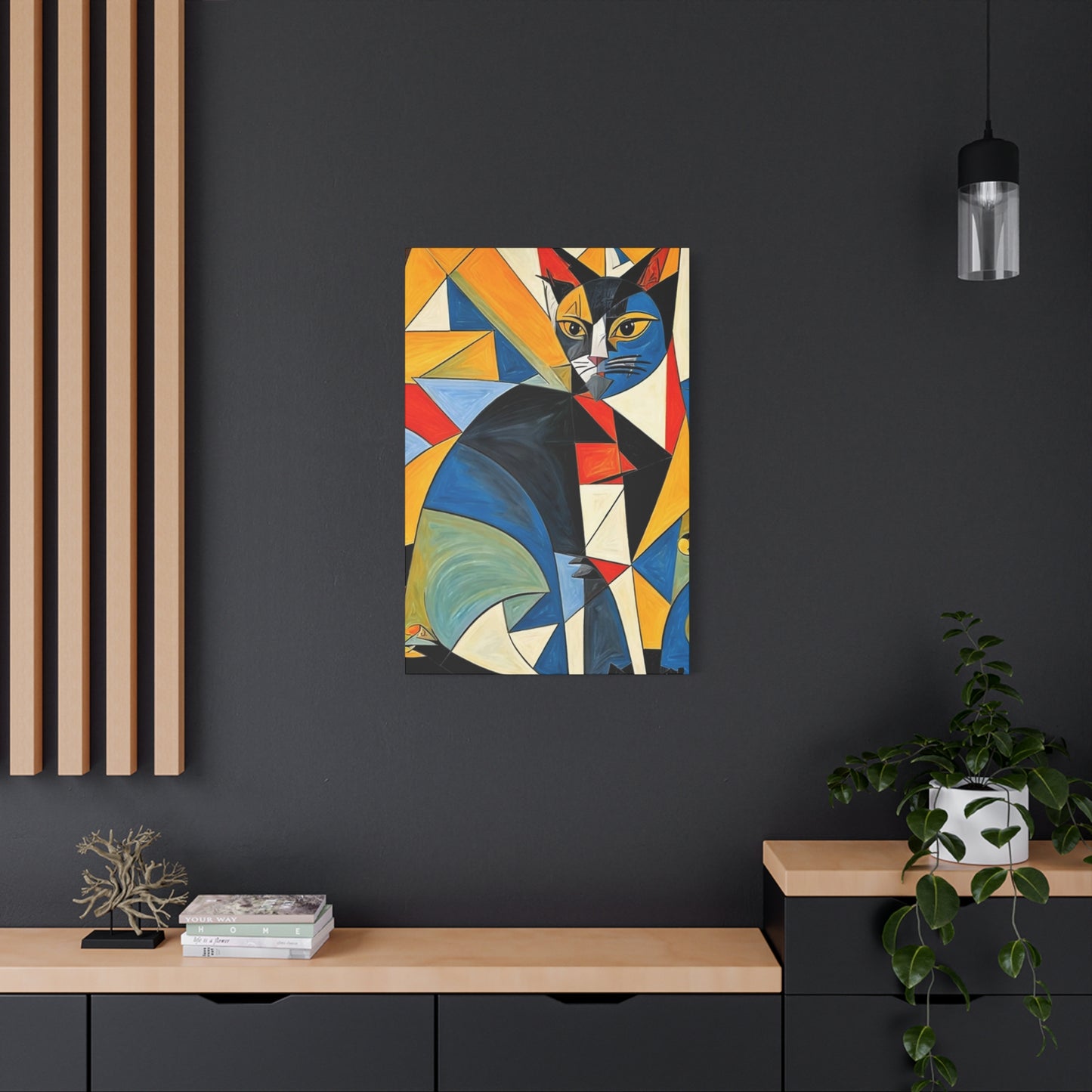
The early practitioners developed a visual vocabulary that prioritized intellectual understanding over emotional response. They painted still lifes, portraits, and landscapes through a lens of analytical scrutiny, breaking down guitars, bottles, newspapers, and human faces into overlapping planes and angular facets. This approach created compositions that seemed to vibrate with energy, as if viewers could observe subjects rotating before their eyes. The flattened picture plane became a stage for complex spatial relationships, where foreground and background merged, and objects appeared simultaneously opaque and transparent.
What distinguished this movement from previous artistic innovations was its systematic deconstruction of perspective itself. Since the Renaissance, Western art had relied on linear perspective to create illusions of three-dimensional space on flat surfaces. This new approach rejected that singular viewpoint, recognizing it as artificial and limited. Instead, artists presented multiple viewpoints coexisting within single compositions, acknowledging that human perception involves constant movement and shifting attention rather than fixed observation.
Analytical Phase Characteristics and Visual Properties That Define Early Geometric Fragmentation
The initial period of this artistic revolution, spanning roughly from 1908 to 1912, established foundational principles that would influence visual culture for decades. During these formative years, artists worked with restricted color palettes, primarily employing ochres, grays, blacks, and muted greens. This chromatic restraint served a deliberate purpose: it prevented color from distracting viewers from the primary focus on form, structure, and spatial relationships. The subdued tones created unified compositions where geometric facets interlocked like puzzle pieces, each plane carefully calibrated to suggest volume without resorting to traditional modeling.
Compositions from this period exhibit remarkable complexity despite their apparent austerity. Artists meticulously analyzed their subjects, breaking them into countless geometric fragments that hovered between representation and abstraction. A violin might be deconstructed into overlapping trapezoids, triangles, and parallelograms, with just enough recognizable details—a curve suggesting the instrument's body, a few strings, or a scroll—to anchor the composition in identifiable reality. This balance between recognition and abstraction created productive tension, engaging viewers in active interpretation rather than passive observation.
The treatment of space during this phase revolutionized compositional thinking. Traditional depth indicators—overlapping forms, atmospheric perspective, scale variation—were deliberately undermined. Objects in these paintings existed in shallow, compressed spaces where background elements pushed forward while foreground components receded. This spatial ambiguity challenged viewers to navigate compositions without familiar landmarks, creating visual experiences that demanded sustained attention and intellectual engagement.
Textural elements played crucial roles in these compositions. Artists incorporated various mark-making techniques to differentiate planes and suggest different materials. Stippling might indicate rough surfaces, while smooth brushwork suggested polished materials. Some painters began introducing stenciled letters, numbers, and other graphic elements, foreshadowing developments that would emerge more prominently in subsequent years. These textural variations added richness to otherwise monochromatic compositions, creating subtle visual interest that rewarded close examination.
Synthetic Evolution and Incorporation of Collage Elements Into Painted Compositions
Around 1912, a significant transformation occurred within the movement. Artists began expanding their chromatic ranges, introducing brighter colors and more decorative elements. This shift, known as the synthetic phase, represented not an abandonment of earlier principles but rather their evolution and expansion. Compositions became more playful, incorporating patterns like wood grain, wallpaper designs, and fabric textures. The geometric fragmentation continued, but with greater freedom and experimentation.
The introduction of collage represented perhaps the most revolutionary development during this period. Picasso's first collage, incorporating actual oilcloth printed with chair-caning patterns, shattered conventional boundaries between painting and sculpture, between art and everyday materials. This innovation opened extraordinary possibilities. Artists began gluing newspaper clippings, sheet music, wallpaper samples, fabric scraps, and other found materials directly onto their canvases. These physical additions created literal texture and introduced actual fragments of the real world into artistic compositions.
Collage elements served multiple functions within these works. Pragmatically, they provided ready-made textures and patterns, saving artists considerable time. Conceptually, they collapsed distinctions between representation and reality, between illusion and actual presence. A piece of newspaper glued to canvas didn't merely represent newsprint; it was newsprint, existing simultaneously as raw material and artistic element. This paradox enriched compositions with layers of meaning, inviting viewers to consider relationships between art and life, between high culture and everyday existence.
The synthetic phase also saw increased collaboration among artists working in this mode. Studios became laboratories where painters, sculptors, poets, and theorists exchanged ideas, critiqued each other's work, and pushed boundaries collectively. This collaborative environment fostered rapid innovation, with artists building upon each other's discoveries. The cross-pollination of ideas extended beyond visual arts, influencing literature, music, and performance. Writers experimented with fragmentary narratives and non-linear storytelling, while composers explored dissonance and rhythmic complexity.
Cubism wall art from this period exhibits greater chromatic richness and compositional variety than earlier works. Bright blues, vibrant reds, sunny yellows, and lush greens appeared alongside traditional earth tones. Patterns and decorative elements added visual complexity, creating compositions that balanced geometric rigor with ornamental pleasure. Despite increased color and embellishment, these works maintained structural sophistication, with careful attention to compositional balance and spatial relationships.
Influence on Interior Design Principles and Contemporary Spatial Arrangement Strategies
The impact of this artistic movement extended far beyond gallery walls, profoundly influencing how designers conceptualized interior spaces. The geometric vocabulary and spatial principles developed by early practitioners provided fresh approaches to architectural planning, furniture design, and decorative arts. Designers recognized that the same analytical methods used to deconstruct painted subjects could be applied to three-dimensional spaces, leading to innovative solutions for residential and commercial environments.
In residential settings, these principles encouraged more dynamic spatial arrangements. Rather than relying on traditional room layouts with clearly defined boundaries and functions, designers began creating flowing, interconnected spaces where different areas overlapped and merged. Open floor plans, now ubiquitous, owe much to this movement's rejection of rigid compartmentalization. Living areas, dining spaces, and kitchens blend together, creating environments where activities and perspectives shift naturally as occupants move through spaces.
Furniture design absorbed these geometric principles with enthusiasm. Designers created pieces featuring angular forms, asymmetrical compositions, and unexpected juxtapositions of materials. Chairs, tables, cabinets, and lighting fixtures incorporated geometric motifs, echoing the fragmented planes found in paintings. These furnishings functioned as sculptural objects that contributed to overall spatial compositions while serving practical purposes. The marriage of form and function, always important in design, gained new dimensions through this geometric lens.
Color schemes in interiors influenced by this movement often reflect both analytical and synthetic phases. Some designers favor restrained palettes of grays, blacks, whites, and earth tones, creating sophisticated environments where geometric forms take precedence. Others embrace vibrant color combinations, using bold hues to delineate spaces and create visual excitement. Both approaches can successfully incorporate cubism wall art, though careful consideration of relationships between artwork and surrounding environment ensures harmonious results.
Lighting design benefits tremendously from principles derived from this movement. The emphasis on multiple perspectives and shifting viewpoints translates beautifully to lighting schemes that illuminate spaces from various angles, creating complex patterns of light and shadow. Layered lighting—combining ambient, task, and accent sources—creates depth and dimensionality reminiscent of fragmented geometric planes. As natural light moves through spaces throughout the day, interiors transform, revealing different aspects and moods, much like viewing geometric paintings from various angles.
Selecting Appropriate Pieces for Specific Residential and Commercial Environments
Choosing cubism wall art for particular spaces requires thoughtful consideration of multiple factors. Scale represents perhaps the most critical consideration. A monumental piece that overwhelms a small room creates uncomfortable imbalance, while a diminutive work disappears in expansive spaces. Assessing wall dimensions, ceiling heights, and viewing distances helps determine appropriate sizes. In general, artwork should occupy roughly two-thirds to three-quarters of available wall space, though this guideline flexes depending on specific circumstances.
Subject matter significantly influences how pieces function within environments. Abstract geometric compositions without recognizable subjects offer maximum flexibility, complementing various design schemes without imposing narrative content. Works featuring identifiable objects—musical instruments, bottles, figures—introduce specific associations that may harmonize or clash with spaces' intended purposes. A fragmented guitar might enhance a music room while feeling arbitrary in a kitchen, though creative designers often exploit such unexpected juxtapositions for dramatic effect.
Color relationships between artwork and surroundings deserve careful attention. Pieces featuring palettes that echo existing color schemes create cohesive, harmonious environments. Alternatively, artwork with contrasting colors can serve as dynamic focal points, injecting energy into neutral spaces or providing visual relief in heavily patterned rooms. Neither approach is inherently superior; success depends on desired atmospheres and overall design intentions. Some designers prefer artwork that blends subtly with surroundings, while others favor pieces that command attention and dominate spaces.
Framing and presentation methods dramatically affect how cubism wall art functions within interiors. Traditional frames with ornate moldings often clash with geometric modernism, creating stylistic conflicts. Simple, clean frames in neutral tones typically serve these works better, though frameless presentations—particularly for prints on canvas—can create contemporary, streamlined appearances. Some designers use mat boards to create breathing room between artwork and frames, while others prefer direct mounting for more immediate visual impact.
Placement height significantly influences viewer experience. The standard recommendation—hanging pieces so that centers align with average eye level, approximately 57-60 inches from floor—works well in most situations. However, this guideline should be adjusted based on furniture placement, ceiling heights, and intended viewing positions. Artwork hung above seating areas can be positioned lower, while pieces in spaces where viewers primarily stand might be raised slightly. The key is ensuring comfortable viewing without neck strain or awkward positioning.
Grouping multiple pieces creates opportunities for dynamic installations. Gallery walls featuring several smaller works can generate impressive visual impact, particularly when pieces share thematic connections or stylistic similarities. Arranging geometric paintings in grid patterns reinforces their structural qualities, while asymmetrical groupings can create energetic, informal displays. Spacing between pieces affects overall impressions—tight groupings create unified compositions, while generous spacing allows each work to maintain individual identity while contributing to larger ensembles.
Color Theory Principles Applied to Geometric Abstract Visual Compositions
Understanding color relationships proves essential when working with cubism wall art. The movement's evolution from monochromatic analytical works to polychromatic synthetic compositions demonstrates how color can dramatically alter geometric paintings' character and impact. Early practitioners' restricted palettes created unity through limitation, forcing viewers to focus on structural elements. Later expansions into fuller chromatic ranges introduced new dimensions of visual interest and emotional resonance.
Complementary color schemes—pairing hues opposite on the color wheel, such as blue and orange or red and green—create vibrant, energetic compositions. When applied to geometric fragments, complementary colors generate visual tension and movement, as adjacent planes seem to vibrate against each other. This dynamism suits spaces intended for activity and social interaction, though it may prove overwhelming in environments designed for relaxation and contemplation.
Analogous color schemes employ hues adjacent on the color wheel, such as blues, blue-greens, and greens. These harmonious combinations create sophisticated, unified compositions that feel cohesive and restful. Geometric paintings using analogous colors work beautifully in bedrooms, studies, and other spaces where tranquility is desired. The subtle color transitions between adjacent planes create gentle movement without aggressive contrast, maintaining visual interest while promoting calm.
Monochromatic schemes, utilizing various values and saturations of single hues, emphasize tonal relationships and structural complexity. These compositions showcase how light and dark variations can create depth and dimension without chromatic diversity. Monochromatic geometric paintings often feel refined and elegant, suitable for sophisticated interiors where restraint and subtlety are valued. The limited palette prevents color from overwhelming form, allowing viewers to appreciate compositional intricacies and spatial relationships.
Triadic color schemes employ three hues equally spaced around the color wheel, such as red, yellow, and blue. These balanced yet diverse palettes create lively compositions with considerable visual energy. When applied to geometric fragmentation, triadic schemes generate complex color interactions as different hues occupy adjacent planes. These works function well in creative spaces, children's areas, and environments where playfulness and vitality are appropriate.
Temperature contrasts between warm and cool colors add another dimension to geometric compositions. Warm hues—reds, oranges, yellows—tend to advance visually, appearing closer to viewers, while cool colors—blues, greens, purples—recede. Artists manipulate these temperature relationships to create spatial depth within fragmented compositions. Warm-toned planes seem to project forward while cool-toned areas retreat, generating complex spatial relationships despite flattened picture planes. Understanding these temperature dynamics helps viewers appreciate how color contributes to structural complexity in cubism wall art.
Creating Harmonious Relationships Between Geometric Artwork and Surrounding Furnishings
Successful incorporation of cubism wall art into interior spaces requires careful attention to relationships between paintings and surrounding elements. Furniture styles, architectural features, decorative objects, and textiles all interact with wall-mounted pieces, creating unified environments or discordant clashes. Skilled designers orchestrate these relationships, ensuring that all elements contribute to cohesive overall compositions.
Furniture with clean lines and geometric forms naturally complements geometric paintings. Mid-century modern pieces, with their emphasis on simple shapes and functional design, particularly harmonize with this aesthetic. However, interesting contrasts can emerge when geometric artwork appears alongside furniture in different styles. Ornate Victorian pieces juxtaposed with fragmented paintings create surprising dialogues between historical periods and aesthetic philosophies. Such combinations require confident handling to avoid appearing random or confused, but successful executions can be striking.
Textile selections significantly impact how cubism wall art functions within spaces. Solid-colored fabrics in neutral tones create calm backgrounds that allow geometric paintings to command attention without competition. Patterned textiles introduce additional complexity, which can either enrich or overwhelm environments depending on scale, color, and pattern characteristics. Small-scale patterns typically coexist peacefully with geometric artwork, while large, bold patterns may compete for visual dominance. Careful calibration ensures that textiles and artwork enhance rather than undermine each other.
Architectural elements—windows, doors, moldings, built-in shelving—create structural frameworks within which artwork must function. Geometric paintings often respond beautifully to architectural geometry, with rectangular canvases echoing window proportions or aligning with door frames. Some designers deliberately position artwork to create visual dialogues with architectural features, perhaps aligning a painting's horizontal edge with a window sill or positioning a piece to balance an asymmetrical window arrangement. These thoughtful placements create sophisticated spatial compositions.
Sculptural objects and decorative accessories add three-dimensional elements to rooms featuring cubism wall art. Geometric sculptures in wood, metal, or stone can echo paintings' forms while introducing tactile qualities. Vases, bowls, and other decorative objects contribute shape, color, and texture. Successful accessorizing requires restraint—too many objects create cluttered, chaotic environments where nothing receives adequate attention. Selective placement of carefully chosen pieces allows each element, including wall-mounted artwork, to make meaningful contributions.
Plants introduce organic forms and living presence into spaces dominated by geometric abstraction. The contrast between nature's flowing curves and geometric angularity creates productive tension, softening spaces while adding vitality. Large potted plants can anchor room corners, their vertical growth balancing horizontal emphasis in many geometric paintings. Smaller plants on shelves or tables introduce color and texture without overwhelming spaces. The natural variation in plants—changing with seasons, growing and evolving—provides dynamic counterpoint to static artwork.
Lighting Schemes That Enhance Geometric Visual Elements and Spatial Relationships
Proper illumination dramatically affects how viewers experience cubism wall art. Light reveals colors, creates highlights and shadows that emphasize dimensional qualities, and influences overall atmospheric moods. Thoughtful lighting design enhances geometric paintings' impact while contributing to broader environmental goals. Multiple considerations guide effective lighting choices for spaces featuring these works.
Natural daylight provides ideal illumination for viewing artwork, revealing colors accurately and creating pleasant viewing conditions. However, direct sunlight poses conservation risks, potentially fading pigments over time. Windows should include curtains, blinds, or UV-filtering films to protect vulnerable pieces while allowing diffused natural light to enter spaces. North-facing windows in the Northern Hemisphere provide consistent, indirect light throughout the day, making them ideal locations for displaying valuable works. South-facing windows require more aggressive sun control but can be managed with appropriate window treatments.
Artificial lighting supplements or replaces natural light depending on time of day and specific circumstances. Several lighting types serve different purposes in spaces featuring geometric artwork. Ambient lighting provides general illumination, allowing safe movement through spaces and creating baseline visibility. Recessed ceiling fixtures, chandeliers, and floor lamps can all contribute ambient light. For spaces featuring cubism wall art, ambient sources should provide even, shadow-free illumination that doesn't compete with accent lighting focused on artwork.
Accent lighting specifically highlights artwork, drawing attention and enhancing visual impact. Track lighting offers flexibility, with adjustable fixtures directing beams precisely where needed. Picture lights mounted above frames provide focused illumination while adding decorative elements. LED strips concealed behind frames create dramatic halo effects, separating artwork from walls and adding contemporary flair. When positioning accent lights, aim for 30-degree angles from vertical to minimize glare while providing even coverage across entire surfaces.
Color temperature significantly influences how viewers perceive artwork. Measured in Kelvin, color temperature ranges from warm (yellowish, around 2700K) to cool (bluish, above 5000K). Neutral white light (3500-4100K) renders colors most accurately, making it ideal for viewing art. However, warmer temperatures create cozy, intimate atmospheres suitable for residential spaces, while cooler temperatures provide energizing illumination appropriate for work environments. Selecting color temperatures involves balancing accurate color rendering with desired atmospheric effects.
Dimming capabilities add versatility to lighting schemes. Adjustable intensity allows spaces to transform from brightly lit during active hours to subtly illuminated for relaxation and entertaining. For artwork specifically, dimming permits fine-tuning illumination levels to protect sensitive pieces while maintaining visibility. Modern LED dimming systems offer smooth, flicker-free control across wide intensity ranges, providing flexibility without technical complications.
Layered lighting—combining ambient, task, and accent sources controlled independently—creates the most versatile and effective schemes. This approach allows precise adjustment of lighting conditions for various activities and times of day. In living rooms featuring cubism wall art, for example, bright overall lighting might suit daytime reading, while evening entertaining might call for dimmed ambient light with accent lights emphasizing artwork. Bedrooms might use minimal ambient light with focused task lighting for reading and subtle accent lighting creating nighttime ambiance.
Framing Methods and Presentation Strategies for Maximum Visual Impact
How cubism wall art is framed and presented significantly affects its appearance and relationship with surrounding spaces. Framing serves multiple purposes: physical protection, visual enhancement, and spatial definition. Different framing approaches create vastly different effects, from traditional formality to contemporary minimalism. Understanding available options helps in making choices that best serve specific pieces and environments.
Traditional wooden frames with profiles ranging from simple to ornate have been used for centuries. For geometric paintings, simpler profiles typically work better than elaborate moldings, which can create stylistic conflicts. A clean, linear frame in natural wood or painted finish complements geometric forms without competing for attention. Frame width affects visual impact—narrow frames create subtle borders that barely separate artwork from walls, while wider frames establish stronger boundaries and make bolder statements.
Metal frames offer contemporary alternatives to wood. Aluminum frames in silver, gold, or black finishes provide sleek, modern presentations particularly suited to geometric abstraction. Their crisp edges and minimal profiles enhance rather than compete with artwork. Some metal frames feature squared profiles, while others present rounded edges—each creates slightly different visual effects. Metal frames work especially well in contemporary interiors with chrome, stainless steel, or other metal accents that create cohesive material vocabularies.
Floater frames create the illusion that artwork floats within frames, separated from frame edges by small gaps. This presentation works beautifully for canvas paintings, particularly those with painted edges. The floating effect emphasizes artwork's object-quality, acknowledging paintings as three-dimensional entities rather than purely visual phenomena. Floater frames come in various materials and finishes, from natural wood to painted or metal-clad options, allowing considerable stylistic flexibility.
Frameless presentations, particularly for canvas prints, create streamlined contemporary appearances. Gallery-wrapped canvases with painted edges can be hung directly, eliminating framing entirely. This approach maximizes visual impact while minimizing costs and creating clean, uncluttered presentations. However, frameless works offer less protection and may appear less finished or valuable than framed pieces. The choice between framed and frameless often reflects broader design philosophies—traditional versus contemporary, formal versus casual.
Mat boards, also called mats or mattes, create breathing room between artwork and frames. White or off-white mats are traditional, providing neutral transitions that don't influence color perception. However, colored mats can create interesting effects, potentially complementing or contrasting with artwork. Mat width affects visual impact—wider mats create more spacious, formal presentations, while narrow mats maintain closer artwork-to-frame relationships. For geometric prints and works on paper, mats serve important conservation functions, separating artwork from glazing to prevent moisture damage.
Glazing materials protect artwork from dust, moisture, and physical damage. Regular glass offers basic protection at modest cost but creates reflections that can obscure artwork under certain lighting conditions. Non-reflective glass reduces glare significantly, improving visibility, though it costs more and can slightly diminish color intensity. Acrylic glazing weighs less than glass and resists breakage, making it suitable for large pieces or high-traffic areas. Museum-quality acrylic with UV filtering provides premium protection, preserving colors while maximizing clarity. Conservation considerations should guide glazing choices for valuable or irreplaceable works.
Understanding Market Dynamics for Acquiring Original Works and Quality Reproductions
The market for cubism wall art encompasses everything from priceless museum masterpieces to affordable prints, with numerous options between these extremes. Understanding this market helps collectors and decorators make informed decisions aligned with their goals, budgets, and aesthetic preferences. Different acquisition strategies suit different circumstances, and knowing available options empowers better choices.
Original paintings from the movement's pioneering period rarely appear on the open market. When they do, they command astronomical prices, typically accessible only to major museums and extraordinarily wealthy collectors. These works belong to art history's most significant chapters, their rarity and cultural importance reflected in valuations. Most people interested in cubism wall art for residential or commercial spaces will pursue other options, as original works from the movement's founders exceed practical consideration.
Contemporary artists working in geometric styles offer more accessible alternatives. Many talented painters create original works inspired by the movement's principles, applying geometric fragmentation and multi-perspective approaches to current subjects and concerns. These pieces provide originality and artistic merit at more reasonable price points. Supporting living artists also contributes to vibrant contemporary art ecosystems. Galleries specializing in abstract and geometric art often represent these artists, providing opportunities to view works in person before purchasing.
Limited edition prints offer middle-ground options between unique originals and mass-produced reproductions. Artists create prints in controlled quantities—perhaps 50, 100, or 250 copies—each signed and numbered to certify authenticity and limitation. These prints often involve sophisticated reproduction techniques like giclée printing on archival papers or canvas, producing results closely matching originals. Limited editions maintain value better than unlimited reproductions while remaining more affordable than unique works.
Open edition prints provide the most economical access to geometric imagery. Mass-produced without quantity limitations, these reproductions cost significantly less than limited editions or originals. Quality varies enormously in this category. Premium prints using archival inks and substrates can look excellent and last for decades, while cheap productions on inferior materials deteriorate quickly and never look particularly good. Discerning quality requires examining materials, printing methods, and seller reputations. Reputable art publishers and galleries typically offer superior products compared to discount retailers.
Digital marketplaces have transformed how people discover and acquire cubism wall art. Online platforms connect buyers with galleries, artists, and print publishers worldwide, offering extraordinary selection impossible to access otherwise. However, online shopping presents challenges. Viewing artwork on screens provides imperfect representations of actual pieces—colors appear differently, sizes can be misjudged, and surface textures remain invisible. Careful attention to specifications, color accuracy disclaimers, and return policies helps mitigate these challenges. When possible, requesting physical samples before committing to major purchases reduces risks.
Auction houses occasionally offer geometric works from various periods and price ranges. Estate sales and consignments bring diverse pieces to market, sometimes at favorable prices. However, auction buying requires knowledge and discipline. Condition issues may not be apparent in catalog photographs, provenance questions can affect value, and competitive bidding can drive prices beyond reasonable levels. Successful auction buying demands research, careful inspection when possible, and firm budget limits to avoid emotional overspending.
Conservation Practices and Protective Measures for Preserving Valuable Pieces
Proper care ensures cubism wall art remains in excellent condition for future generations. Paintings and prints face various threats—environmental conditions, handling accidents, and inherent material vulnerabilities. Understanding conservation principles helps owners protect their collections while enjoying them. Many protective measures cost little or nothing to implement, requiring mainly awareness and consistent practices.
Environmental stability ranks among the most important conservation factors. Temperature fluctuations cause materials to expand and contract, potentially cracking paint layers, warping supports, and damaging frames. Relative humidity variations prove equally problematic, with high humidity encouraging mold growth and low humidity making materials brittle. Ideal conditions maintain temperatures between 65-70°F and relative humidity between 45-55%. While perfect control requires climate-control systems, avoiding extreme fluctuations makes significant differences. Keeping artwork away from heating vents, fireplaces, and exterior walls helps minimize exposure to temperature and humidity variations.
Light exposure gradually degrades artwork through photochemical reactions that fade colors and weaken materials. Ultraviolet radiation proves particularly damaging, though visible light also causes harm over time. Limiting light exposure extends artwork's lifespan significantly. UV-filtering window films, glazing materials, and artificial light sources reduce harmful radiation without completely eliminating illumination. When artwork isn't being actively viewed, reducing or eliminating light exposure provides maximum protection. Some collectors use curtains or covers to protect valuable pieces during extended absences.
Physical damage from handling, cleaning, and accidents poses constant risks. Artwork should be handled minimally, always with clean, dry hands or cotton gloves. When moving framed pieces, carry them by frames rather than grabbing artwork surfaces. Never stack framed works face-to-face without protective materials between them. When cleaning frames and glazing, use appropriate materials—soft, lint-free cloths slightly dampened with distilled water for frames, and specific glass or acrylic cleaners for glazing. Never spray cleaners directly on framed artwork; instead, apply cleaners to cloths first. Never attempt to clean artwork surfaces themselves without professional guidance.
Pest prevention protects against insects that feed on paper, canvas, wood, and adhesives. Regular inspection helps detect infestations early, when they're easier to address. Signs include small holes, powdery residues, and actual insect presence. Maintaining cleanliness reduces pest attraction—regular dusting and vacuuming eliminate potential food sources. Avoiding storage in damp basements or hot attics minimizes pest-friendly conditions. If infestations occur, professional conservators can treat affected works without causing additional damage.
Documentation creates valuable records for insurance, estate planning, and research purposes. Photographs showing overall appearance and any condition issues provide baseline documentation. Written records should include acquisition information, dimensions, materials, artist details, and any known provenance. Regular condition reviews, perhaps annually, allow early detection of developing problems. Detailed documentation proves invaluable if pieces are ever damaged, lost, or stolen, facilitating insurance claims and potential recovery.
Professional conservation services address problems beyond typical care measures. Tears, losses, discoloration, and structural failures require trained conservators' expertise. These specialists assess damage, recommend treatment options, and perform restorations using reversible methods that respect artworks' integrity. Conservation treatments can be expensive, but they're often essential for preserving valuable pieces. Establishing relationships with reputable conservators before emergencies arise ensures access to qualified help when needed.
Creating Gallery Wall Arrangements That Balance Cohesion with Individual Piece Identity
Gallery walls featuring multiple works create impressive focal points in residential and commercial spaces. These installations allow collectors to display more pieces than would be possible with single-artwork arrangements while creating visual interest through relationships among pieces. Successful gallery walls balance unity and variety, allowing individual works to maintain identity while contributing to larger compositions.
Thematic cohesion provides one organizational principle for gallery walls. Collections might focus on specific color palettes, subject matters, artistic periods, or stylistic approaches. A gallery wall devoted exclusively to geometric abstraction creates strong thematic unity, particularly effective for cubism wall art collections. However, completely homogeneous groupings risk monotony—introducing variations in scale, orientation, or frame styles prevents excessive uniformity while maintaining overall coherence.
Grid arrangements impose regular spacing and alignment, creating orderly, structured appearances. Works of identical sizes in uniform frames work perfectly in grid formations, generating clean, contemporary looks. However, grids can also accommodate size variations if careful planning ensures that alignments work mathematically. Grid arrangements suit formal spaces and minimalist aesthetics, their geometric precision echoing qualities found in the artwork they display. Installation requires careful measuring and leveling to achieve professional results—sloppy execution undermines grid arrangements' orderly intentions.
Salon-style arrangements embrace asymmetry and organic growth, mixing various sizes and formats in compositions where pieces fit together like puzzle pieces. These informal groupings feel collected over time rather than precisely planned. Successful salon walls require careful composition despite their casual appearances. Laying out arrangements on floors before hanging allows experimentation with different configurations. Generally, larger pieces anchor arrangements, with smaller works filling surrounding spaces. Maintaining relatively consistent spacing between pieces—typically 2-3 inches—creates unity amid variety.
Symmetrical arrangements provide classical balance, with compositions mirroring around central axes. A large central piece flanked by identical or similar works on each side creates formal, traditional arrangements. Symmetry conveys stability and order, suitable for conservative spaces where harmony and balance are priorities. While symmetrical arrangements can appear staid, introducing subtle variations prevents excessive rigidity while maintaining overall balance.
Color distribution across gallery walls significantly impacts visual effect. Concentrating similar colors in clusters creates areas of chromatic intensity separated by contrasting sections, generating rhythmic movement across walls. Alternatively, distributing colors evenly throughout creates balanced, unified appearances without distinct focal areas. Neither approach is inherently superior—effective color distribution aligns with specific works' characteristics and intended atmospheric effects.
Vertical and horizontal orientations contribute to gallery walls' visual dynamics. Predominantly horizontal arrangements emphasize width and stability, while vertical groupings create height and elegance. Mixing orientations generates more complex, energetic compositions. Some designers deliberately alternate orientations to create rhythmic patterns, while others place orientations more intuitively based on specific works' needs and overall compositional balance.
Scale relationships between pieces affect both practical and aesthetic considerations. Extremely large works dominate installations, naturally becoming focal points. Medium-sized pieces provide transitional scales, while small works add detail and visual interest. Groupings exclusively of very small pieces can appear precious or insignificant from distance, while collections of only large works may overwhelm spaces. Successful gallery walls typically incorporate multiple scales, creating hierarchies that guide viewers' attention while maintaining overall cohesion.
Conclusion
Cubism wall art demonstrates remarkable versatility, complementing diverse interior design styles. While geometric abstraction naturally aligns with certain aesthetics, thoughtful placement allows successful incorporation into varied environments. Understanding how geometric artwork interacts with different design vocabularies enables creative, unexpected combinations.
Minimalist interiors provide natural settings for geometric paintings. These spaces' emphasis on simplicity, clean lines, and restrained ornamentation aligns perfectly with geometric abstraction's formal qualities. In minimalist environments, individual artworks gain maximum impact through lack of competition from decorative elements. Neutral color schemes—whites, grays, blacks—create calm backgrounds that allow artwork's colors and forms to command attention. Minimalist spaces typically display fewer pieces than other styles, treating each work as significant focal point requiring adequate space and attention.
Industrial aesthetics, characterized by exposed structural elements, raw materials, and utilitarian fixtures, create interesting contexts for cubism wall art. The contrast between geometric paintings' refined compositions and industrial spaces' rough textures generates productive tension. Concrete walls, exposed brick, metal beams, and wooden floors provide robust backgrounds that prevent artwork from appearing precious or fragile. Bold, colorful geometric pieces introduce warmth and cultural sophistication to potentially cold industrial environments, humanizing spaces while respecting their architectural character.
Mid-century modern design shares historical connections with geometric abstraction—both emerged during periods valuing similar aesthetic principles. The clean lines, organic forms, and functional focus characteristic of mid-century furnishings harmonize beautifully with geometric artwork. Teak furniture, molded plastic chairs, and tapered wooden legs echo geometric paintings' emphasis on form and structure. Color palettes in mid-century interiors—often featuring oranges, teals, and warm earth tones—complement many geometric works' chromatic ranges.
Contemporary interiors, defined by current trends and cutting-edge design, embrace cubism wall art enthusiastically. These spaces often feature latest materials, technologies, and aesthetic innovations, creating dynamic environments where geometric abstraction feels perfectly at home. Large-scale installations, dramatic lighting, and bold color schemes characterize many contemporary interiors, providing exciting contexts for geometric artwork. The dialogue between contemporary design and geometric painting enriches both, creating sophisticated spaces that feel vital and culturally engaged.
Traditional interiors present more challenging but potentially rewarding contexts for geometric artwork. The contrast between traditional elements—ornate moldings, classic furniture styles, rich wood tones—and geometric abstraction's modernist vocabulary creates unexpected juxtapositions. When handled confidently, these combinations generate sophisticated eclecticism that transcends stylistic limitations. Keys to success include selecting appropriate scales, choosing frames that bridge stylistic gaps, and maintaining conviction about aesthetic choices. Tentative half-measures rarely succeed, while committed approaches can produce stunning results.
Scandinavian design's emphasis on simplicity, functionality, and natural materials creates sympathetic contexts for cubism wall art. Light color palettes, blonde woods, and minimal ornamentation allow artwork to make strong visual statements without overwhelming spaces. The Scandinavian approach values quality over quantity, treating fewer possessions with greater respect. This philosophy aligns well with displaying carefully selected artwork as significant cultural investment. Geometric paintings introduce color and visual complexity to Scandinavian interiors while respecting their fundamental values.
Bohemian aesthetics, characterized by eclectic mixing, rich colors, and global influences, can accommodate geometric artwork within their exuberant visual vocabularies. The key lies in treating geometric pieces as elements within larger compositions rather than isolated focal points. Surrounding geometric paintings with textiles, plants, and decorative objects from various cultures creates rich, layered environments where different elements engage in visual dialogue. Bohemian spaces' tolerance for complexity and pattern allows geometric works to coexist with numerous other visual elements without creating chaos.
Share