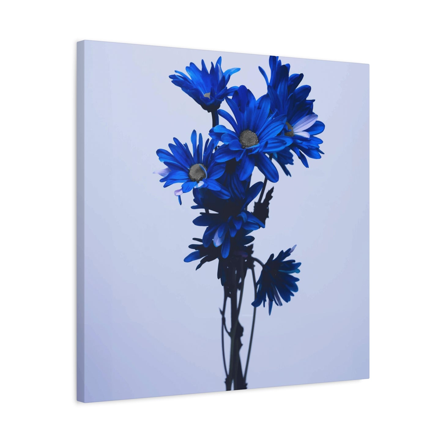
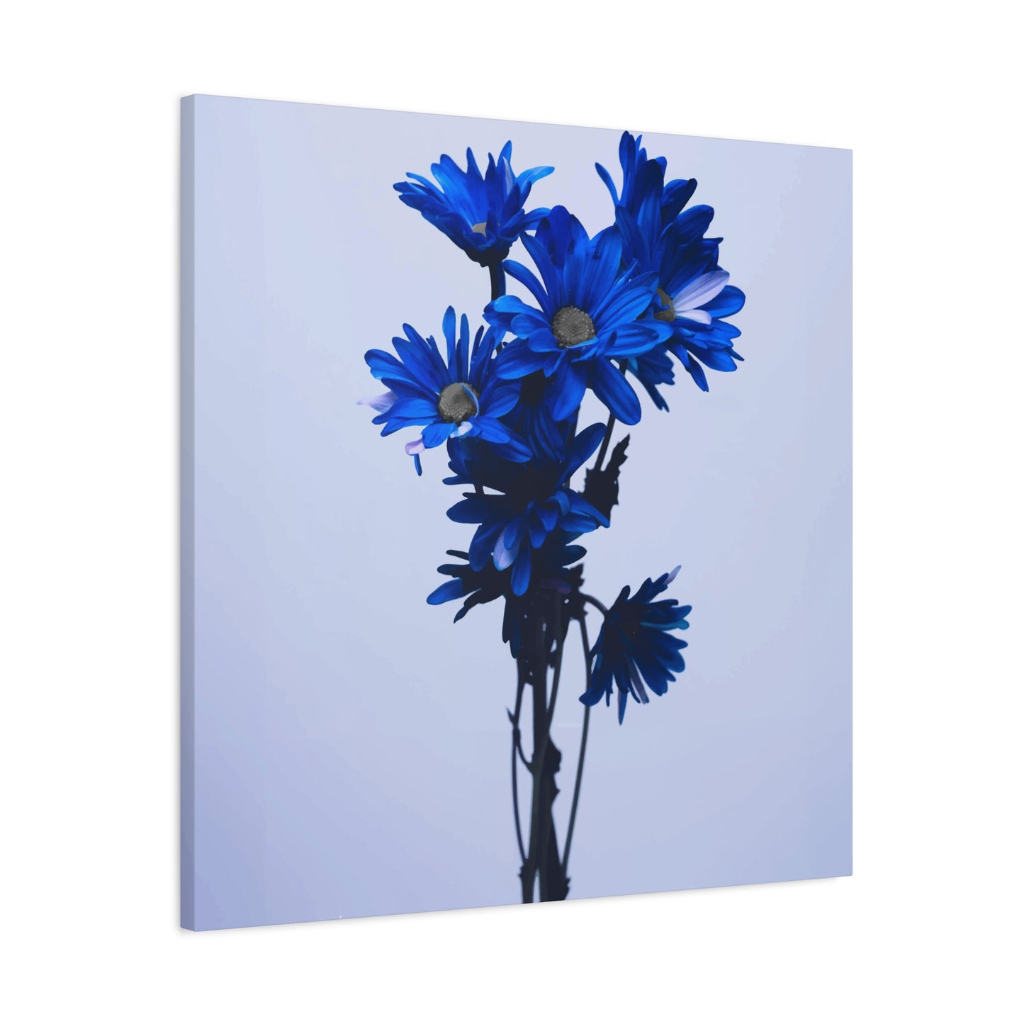
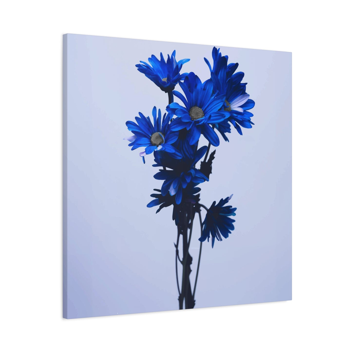
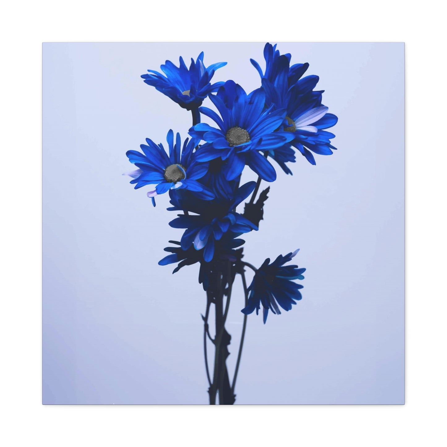
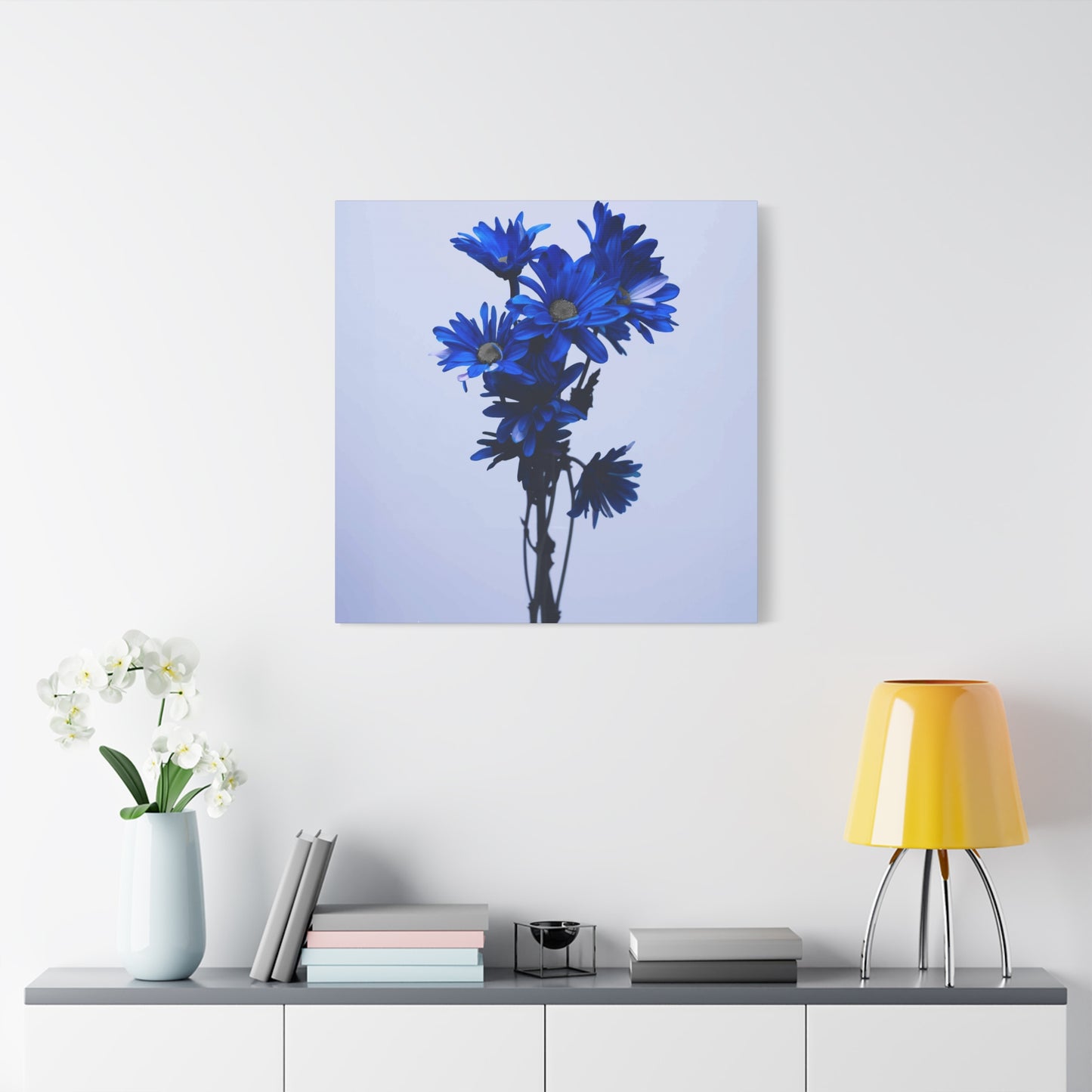
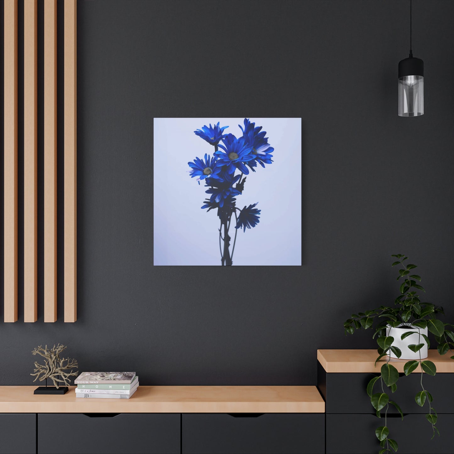
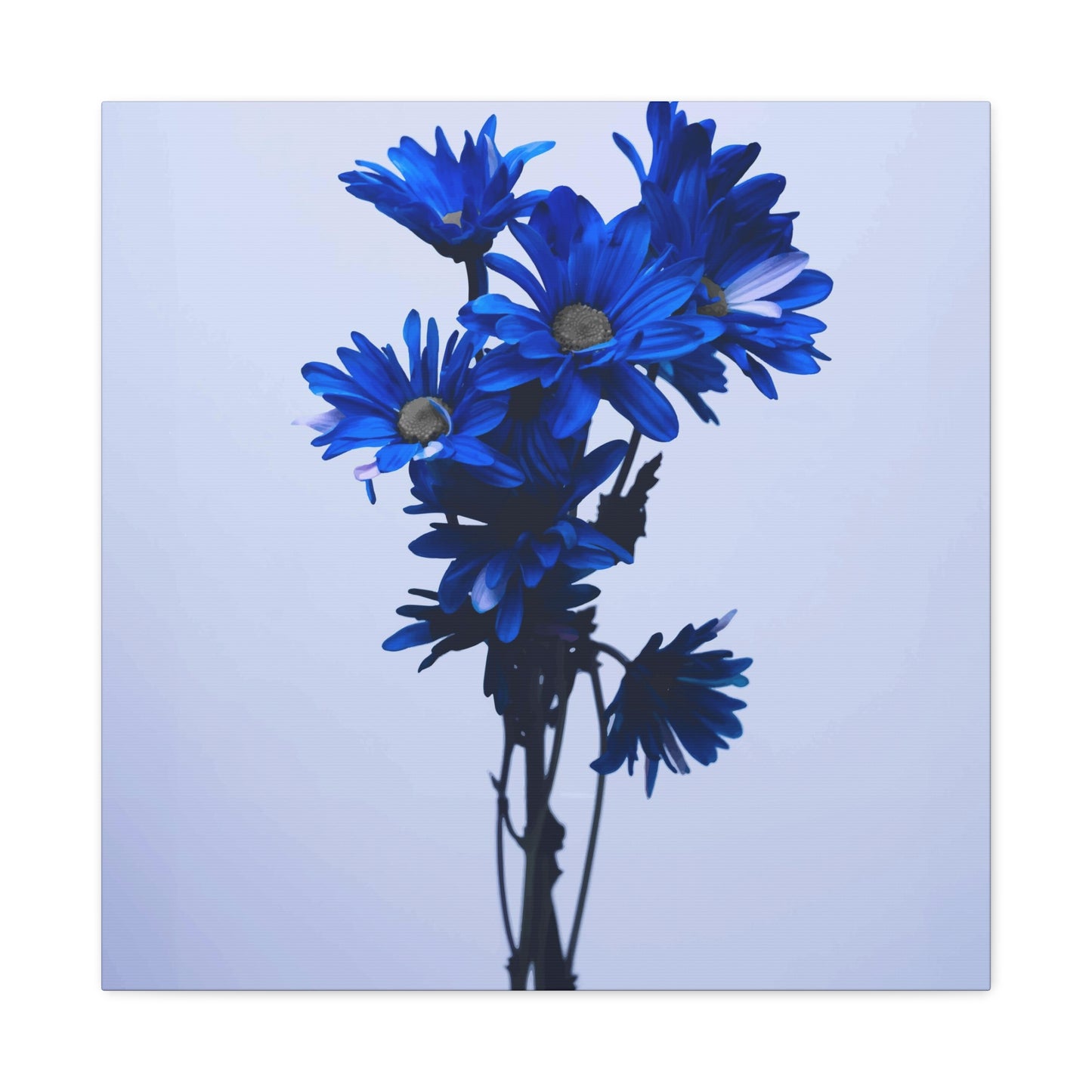
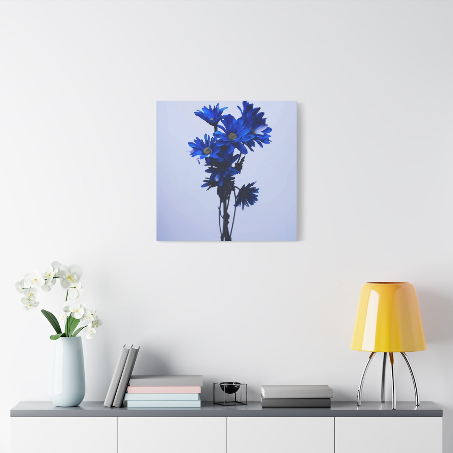
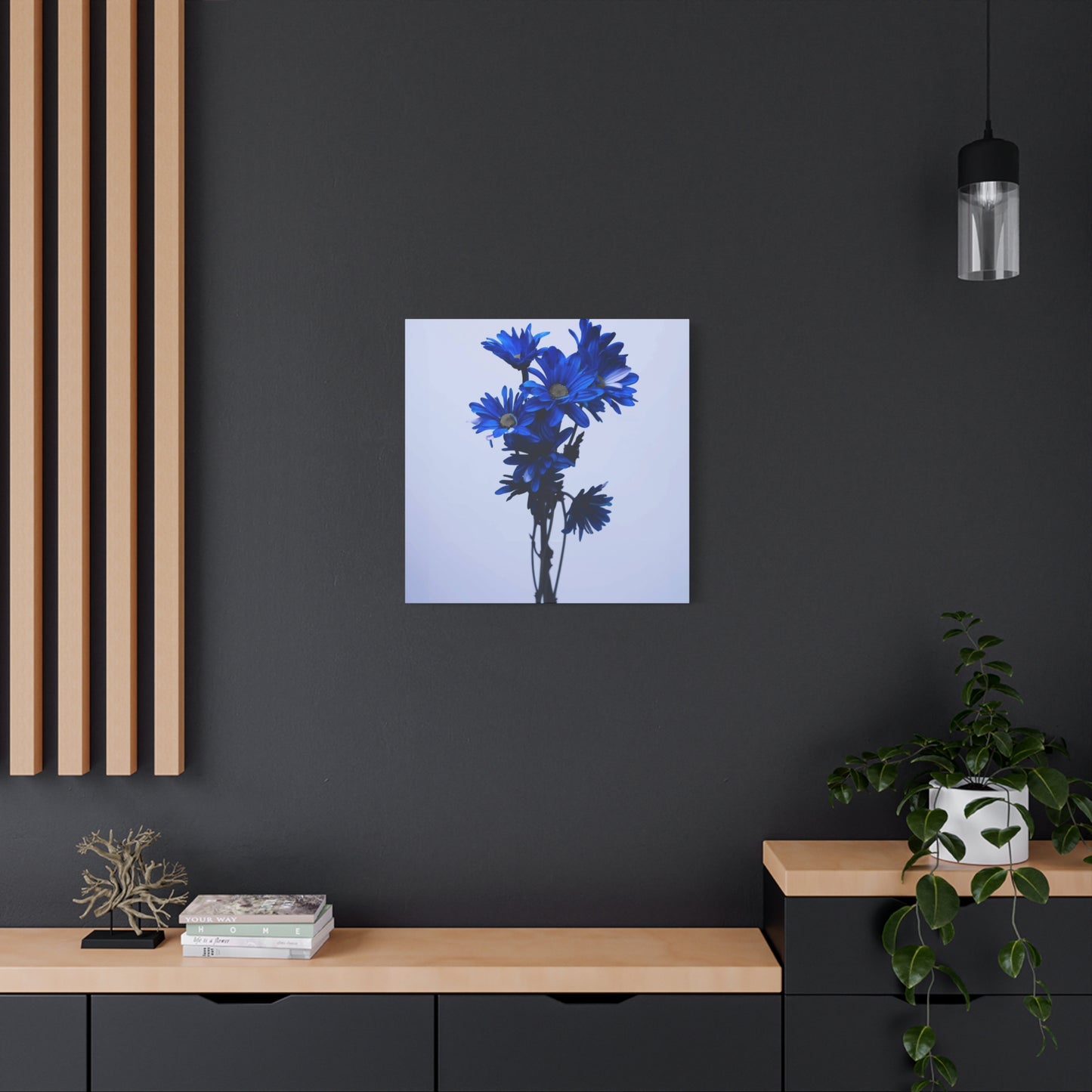
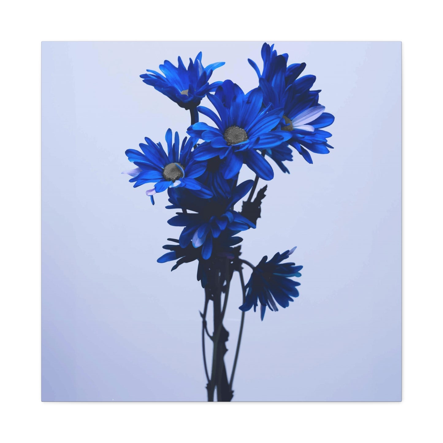
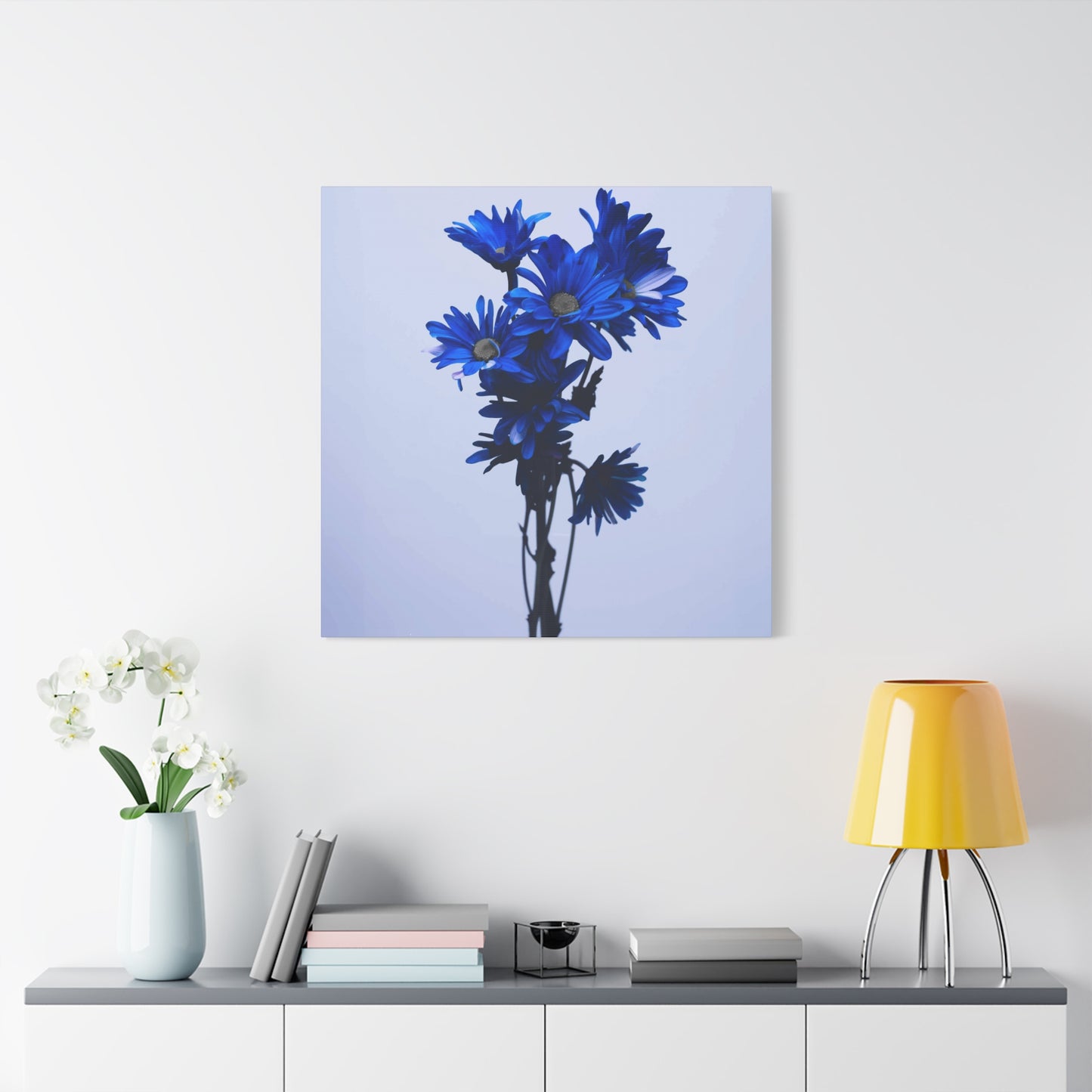
Blue Flower Wall Art & Canvas Prints
Blue Flower Wall Art & Canvas Prints
Couldn't load pickup availability
The Timeless Beauty of Blue Flower Wall Art: Redefining Spaces with Stunning, Nature-Inspired Décor
Blue flower wall art represents one of the most captivating and versatile design elements available to homeowners, interior designers, and art enthusiasts seeking to infuse their living spaces with natural beauty and serene ambiance. This comprehensive exploration delves into every conceivable aspect of incorporating floral botanical artwork into residential and commercial environments, examining the profound impact that azure-hued botanical representations can have on mood, aesthetic appeal, and overall spatial harmony.
Examining the Profound Visual Impact of Azure Botanical Artwork on Contemporary Interior Design Schemes
The incorporation of blue flower wall art into modern living spaces creates an immediate visual focal point that commands attention while simultaneously promoting tranquility. Azure tones possess unique properties within color theory that distinguish them from warmer palette options, offering cooling effects that can psychologically expand perceived room dimensions while fostering contemplative atmospheres conducive to relaxation and creative thinking.
When selecting pieces featuring cerulean blooms, cornflower petals, or navy botanical arrangements, homeowners discover transformative potential that extends far beyond mere decoration. These artistic representations of nature's most captivating specimens serve as bridges between outdoor environments and interior sanctuaries, allowing inhabitants to maintain connections with natural worlds even within urban settings or during seasons when gardens lie dormant beneath winter snows.
The versatility of floral artwork in sapphire and turquoise shades permits seamless incorporation across diverse design philosophies, from minimalist Scandinavian aesthetics to maximalist bohemian arrangements. Whether displayed as singular statement pieces commanding entire walls or arranged in carefully curated gallery configurations, these botanical representations demonstrate remarkable adaptability to existing color schemes and furniture selections.
Exploring Diverse Artistic Styles Within the Realm of Floral Botanical Representations
The spectrum of artistic interpretations available within the realm of blue flower wall art encompasses everything from photorealistic botanical illustrations to abstract expressionist interpretations where recognizable floral forms dissolve into suggestive color fields and gestural brushwork. This diversity ensures that individuals with varying aesthetic preferences can discover pieces that resonate with their personal sensibilities while complementing their existing environmental contexts.
Watercolor renditions of azure blooms offer delicate, translucent qualities that introduce softness and femininity to spaces, particularly effective in bedrooms, bathrooms, and reading nooks where gentle atmospheres enhance functional purposes. The characteristic bleeding of pigments in watercolor creations produces organic, flowing boundaries between hues that mirror the natural gradations found in actual flower petals, creating authentic connections to living botanical specimens.
Oil paintings featuring cobalt and indigo blossoms provide richer, more substantial visual weight suitable for larger spaces or rooms requiring stronger focal points. The dimensional quality achieved through layered brushstrokes and impasto techniques in oil media creates textural interest that photographs cannot capture, rewarding closer inspection while maintaining impact from viewing distances across spacious interiors.
Contemporary digital artwork and photographic prints have democratized access to high-quality floral representations, enabling reproduction of museum-quality images at affordable price points. These modern methodologies preserve intricate details of rare or exotic blooms that might never be personally encountered, bringing specimens from distant geographical regions into everyday living environments.
Understanding Color Theory Principles That Make Azure Floral Artwork Particularly Effective in Spatial Design
The unique position of blue within the visible spectrum creates specific perceptual effects that make it exceptionally valuable for interior design applications. Unlike advancing warm colors such as reds, oranges, and yellows that seem to move toward viewers, blue recedes visually, creating illusions of expanded depth and increased spatial volume particularly beneficial in smaller rooms or areas with limited natural light sources.
This recessive quality, when manifested through blue flower wall art, generates atmospheric perspective effects reminiscent of distant mountain ranges or ocean horizons, subconsciously suggesting expansiveness beyond physical wall boundaries. The psychological impact of these depth cues contributes to reduced feelings of confinement, potentially alleviating stress responses triggered by cramped or crowded environments.
Furthermore, azure tones demonstrate remarkable compatibility with both warm and cool color palettes, functioning as versatile neutrals that harmonize with golden woods, terracotta ceramics, brass fixtures, and warm textiles while equally complementing cooler grays, silvers, whites, and other blue variations. This chromatic flexibility simplifies the design process, reducing anxiety about potential clashing and enabling confident selection even without professional consultation.
The specific shade variations within the blue spectrum each carry distinct associations and atmospheric qualities. Lighter powder blues and sky tones evoke airiness, innocence, and gentle femininity appropriate for nurseries, guest rooms, or spaces dedicated to meditation and yoga practice. Medium cerulean and cornflower shades project reliability, stability, and traditional sophistication suitable for home offices, libraries, and formal dining areas. Deep navy, indigo, and midnight blues convey drama, luxury, and masculine gravitas that anchors contemporary living rooms, master bedrooms, and statement entryways.
Discovering the Botanical Species Most Frequently Depicted in Azure-Toned Floral Artwork
Certain flower species naturally occur in blue pigmentation, making them popular subjects for artists creating botanical representations. Hydrangeas, with their massive clustered blooms ranging from pale sky blue to deep violet-blue depending on soil pH, provide abundant visual interest through their spherical forms and delicate individual florets. These versatile shrubs translate beautifully into artistic media, whether rendered in tight photorealistic detail or loosely interpreted through impressionistic brushwork.
Delphiniums, featuring tall spires of true blue blossoms stacked vertically along sturdy stems, offer dramatic vertical elements that draw eyes upward, particularly effective in spaces with high ceilings or narrow wall expanses requiring elongated proportions. The architectural quality of delphinium flower spikes provides strong compositional structure within artistic arrangements, preventing compositions from appearing overly soft or ungrounded.
Forget-me-nots, despite their diminutive individual blooms, create charming subjects for intimate-scale artwork suited to smaller display areas or grouped collections. The sentimental associations connected with these symbolic flowers add emotional dimensions to artistic representations, particularly meaningful in memory-focused spaces like genealogy display areas or memorial corners honoring departed loved ones.
Morning glories, with their distinctive trumpet shapes and tendency toward climbing growth habits, introduce dynamic movement and directional flow within compositions. Artists frequently depict these ephemeral bloomers in various stages of unfurling, capturing transitional moments that metaphorically reference themes of awakening, new beginnings, and temporal beauty—concepts that resonate deeply within human consciousness.
Irises, particularly bearded varieties featuring complex petal structures and distinctive forms, have captivated artists throughout history from ancient Egyptian tomb paintings to Van Gogh's celebrated representations. The architectural complexity of iris blooms provides rich subject matter for detailed botanical illustration while their bold shapes remain recognizable even in highly stylized or abstract interpretations.
Investigating Material Choices and Printing Substrates for Botanical Artwork Reproductions
The physical materials upon which blue flower wall art appears significantly impact both aesthetic presentation and practical longevity. Canvas remains the most popular substrate for reproduced artwork, offering traditional fine art associations and dimensional texture that mimics hand-painted originals. Gallery-wrapped canvas, where printed material extends around wooden stretcher frame edges, eliminates framing requirements while creating clean, contemporary presentations suitable for modern minimalist aesthetics.
Paper-based prints span quality spectrums from inexpensive posters to museum-grade archival papers engineered for decades-long color stability. Fine art papers featuring cotton or alpha-cellulose compositions resist yellowing and degradation that plagues wood-pulp alternatives, justifying premium costs for pieces intended as long-term investments or family heirlooms. Textured watercolor papers enhance reproductions of original watercolor paintings, adding authentic tactile qualities that strengthen connections between reproductions and traditional artistic processes.
Metal prints, created through dye-sublimation processes that infuse inks directly into specially coated aluminum surfaces, produce luminous, almost backlit effects particularly stunning with blue flower wall art subjects. The inherent reflectivity of metallic substrates amplifies color vibrancy while creating subtle shifts in appearance depending on viewing angles and ambient lighting conditions. These contemporary presentations suit modern and industrial design schemes while offering superior moisture resistance beneficial for bathroom and kitchen installations.
Acrylic face-mounting, where prints are adhered behind clear acrylic panels, creates depth and dimensional interest through the transparent material's thickness while providing protective barriers against environmental contaminants, UV radiation, and physical damage. The resulting glossy, saturated appearance enhances color intensity, making this premium presentation method particularly effective for photographic floral images where detail clarity and chromatic punch are priorities.
Wood-mounted prints, adhering images to natural wood panels or engineered wood products, introduce organic textural contrast between smooth printed surfaces and visible wood grain patterns. This juxtaposition creates interesting visual tensions between refined artistic imagery and rustic material substrates, particularly effective in farmhouse, cottage, and nature-inspired design schemes where celebrating natural materials serves as central philosophy.
Examining Framing Options That Enhance Rather Than Overwhelm Botanical Artwork
The framing surrounding blue flower wall art significantly influences overall presentation, either harmoniously complementing artistic content or creating distracting conflicts that diminish visual impact. Frame selection requires careful consideration of multiple factors including artwork style, room décor, color palette, and desired mood or atmosphere.
Simple, clean-lined frames in neutral tones—whites, blacks, natural woods, or metallic finishes—typically serve floral artwork most effectively by providing definition and protection without competing for visual attention. White frames create fresh, airy presentations that amplify light-filled spaces while emphasizing artwork colors through stark contrast. Black frames provide sophisticated matting that grounds lighter compositions while creating dramatic impact in eclectic or gallery-style arrangements.
Natural wood frames introduce warmth and organic authenticity that reinforces connections between botanical subject matter and natural materials. Light oak, maple, or birch frames complement Scandinavian and minimalist aesthetics, while rich walnut, mahogany, or cherry woods enhance traditional and formal environments. The visible grain patterns and color variations inherent in genuine wood contribute subtle visual interest without overwhelming delicate floral imagery.
Metallic frames in gold, silver, brass, or copper finishes inject glamour and reflective elements that can elevate simple artwork into statement pieces. However, these attention-grabbing options require judicious application, typically most successful when other metallic accents appear throughout rooms in lighting fixtures, hardware, or decorative accessories, creating intentional design coordination rather than isolated anomalies.
Ornate frames featuring elaborate molding profiles, decorative corners, or applied embellishments suit vintage botanical illustrations and classical artistic styles but appear incongruous surrounding contemporary or minimalist floral representations. When employing decorative framing, ensure that ornamental complexity aligns with artwork period and style to maintain aesthetic cohesion.
Floating frames, creating gaps between artwork edges and frame interiors, produce modern, gallery-quality presentations that emphasize artwork as precious objects worthy of special display consideration. This technique works particularly well with canvas or wood-mounted pieces where substrate edges contribute to overall aesthetic rather than requiring concealment.
Analyzing Ideal Placement Locations Throughout Residential Spaces for Maximum Visual Impact
Strategic positioning of blue flower wall art dramatically influences both artwork visibility and room functionality. In living rooms serving as primary gathering spaces, large-scale botanical pieces above sofas or fireplace mantels establish focal points around which furniture arrangements naturally orient. The cooling qualities of blue tones help balance heat sources, whether actual fireplaces or metaphorical warmth generated by social interaction, creating environmental equilibrium.
Bedroom placements benefit from the calming properties inherent in azure color palettes, with floral artwork above headboards or opposite beds positioned to capture attention upon waking. The association between blue tones and sleep promotion makes these color choices particularly appropriate for spaces dedicated to rest and rejuvenation. Smaller botanical pieces on bedside tables or dressers extend the theme throughout rooms without overwhelming intimate spaces with excessive visual stimulation.
Bathrooms, frequently overlooked in artwork placement considerations, provide excellent opportunities for moisture-resistant floral prints that introduce spa-like serenity. The natural affinity between water elements and blue color palettes creates harmonious environments where botanical imagery reinforces connections to natural cleansing rituals and self-care practices. Ensure selected pieces feature protective glazing or inherently moisture-resistant substrates to prevent damage from humidity exposure.
Dining areas benefit from blue flower wall art that stimulates appetite through fresh, clean associations while avoiding the appetite-suppressing effects sometimes attributed to certain blue shade variations. Lighter, more delicate floral representations work well in breakfast nooks and casual dining spaces, while bolder, more saturated pieces suit formal dining rooms where dramatic impact enhances special occasion meals.
Home offices require careful artwork selection balancing aesthetic appeal with functional considerations. Blue floral pieces positioned within peripheral vision provide occasional visual breaks that rest eyes strained by prolonged screen exposure while the color's associations with productivity, clear communication, and mental clarity support work activities. Avoid placing highly detailed or visually complex pieces directly behind computer monitors where they create distracting focal competition.
Entryways and hallways, often neglected in décor planning, benefit tremendously from botanical artwork that establishes aesthetic themes carried throughout homes. Gallery walls featuring multiple coordinated blue flower pieces transform transitional corridors into destination spaces worthy of pause and appreciation rather than mere passageways between functional rooms.
Exploring the Relationship Between Lighting Conditions and Floral Artwork Visibility
Natural and artificial illumination profoundly affects how blue flower wall art appears within spaces, with identical pieces exhibiting dramatically different characteristics under varying light sources. North-facing rooms receiving cool, indirect natural light enhance blue tones naturally present in artwork, intensifying their visual presence while potentially shifting warmer accent colors toward cooler appearances. This natural light quality complements azure botanical subjects, creating harmonious environments without additional intervention.
South-facing exposures flood spaces with warm, direct sunlight that can overwhelm delicate blue pigments, necessitating UV-protective glazing on framed pieces or strategic positioning away from direct solar exposure. The yellowish cast of strong southern light may shift cool blue tones toward warmer teal or green appearances, requiring adjustment in surrounding décor colors to maintain intended color harmonies.
East and west-facing rooms experience dramatic lighting shifts throughout days, with eastern exposures enjoying cool morning light transitioning to indirect afternoon illumination, while western rooms endure harsh afternoon glare before settling into warm evening light. Blue flower wall art in these variable environments requires flexible positioning or supplemental artificial lighting to maintain consistent appearance regardless of time-dependent natural light fluctuations.
Artificial lighting choices dramatically impact artwork perception, with warm incandescent or halogen sources shifting blue tones toward purple or gray while cool LED or fluorescent lighting enhances true blue appearances. Modern LED systems offering tunable color temperatures provide flexibility to adjust lighting throughout days, potentially warming evening environments for relaxation while maintaining cooler, more alert-promoting illumination during active hours.
Accent lighting specifically directed toward artwork—through picture lights, track lighting, or adjustable spotlights—ensures consistent visibility regardless of ambient lighting conditions while emphasizing pieces as valued focal points deserving special attention. When illuminating blue flower wall art, ensure light sources provide adequate color rendering indexes (CRI values above 90) to accurately represent subtle color variations and prevent muddy or distorted color perception.
Investigating Size Considerations and Proportional Relationships in Artwork Selection
Determining appropriate dimensions for blue flower wall art requires analyzing both wall dimensions and surrounding furniture scales to achieve balanced, harmonious presentations. The common guideline suggesting artwork should span two-thirds to three-quarters of underlying furniture width provides reasonable starting points, though specific circumstances may justify deviations from these general principles.
In spaces with high ceilings or expansive empty walls, oversized statement pieces prevent artwork from appearing diminutive or lost within vast expanses. Single large-scale botanical images create bold, contemporary impressions while simplified styling requirements—one substantial piece versus multiple smaller items requiring careful arrangement—appeal to those preferring streamlined décor processes.
Conversely, smaller spaces or walls interrupted by architectural features like windows, doors, or built-in cabinetry benefit from appropriately scaled pieces that acknowledge spatial limitations rather than fighting against them. Attempting to force oversized artwork into confined areas creates claustrophobic feelings contradicting the expansive qualities typically desired in blue color palettes.
Gallery wall arrangements comprising multiple coordinated pieces offer flexible solutions accommodating various wall dimensions and configurations. Combining different sizes in asymmetrical arrangements creates dynamic visual interest while allowing gradual collection building over time rather than requiring significant upfront investments in single costly pieces. When assembling blue floral gallery walls, maintain consistent framing styles, mat colors, or tonal ranges to unify disparate elements into cohesive presentations.
Vertical versus horizontal orientations carry psychological and functional implications beyond mere dimensional differences. Vertical formats draw eyes upward, emphasizing ceiling heights and creating impressions of elevated grandeur particularly effective in entryways, narrow hallways, or rooms with impressive architectural features like exposed beams or vaulted ceilings. Horizontal orientations encourage lateral eye movement and can visually widen narrow spaces while providing stabilizing horizontal lines that ground rooms and create calm, peaceful impressions.
Delving Into the Process of Creating Harmonious Color Palettes Around Azure Botanical Focal Points
Building cohesive color schemes incorporating blue flower wall art as central elements requires understanding both basic color theory principles and subtle nuances distinguishing successful combinations from discordant failures. Monochromatic approaches utilizing various blue shades ranging from pale powder to deep navy create sophisticated, serene environments with inherent harmony derived from shared color families. This strategy proves particularly effective in spaces dedicated to relaxation, meditation, or sleep where visual complexity might prove overstimulating.
Analogous color schemes pairing blue with neighboring color wheel positions—greens and purples—produce naturally harmonious environments referencing botanical contexts where these hues commonly coexist. Blue-green combinations evoke aquatic themes and coastal aesthetics, while blue-purple pairings suggest twilight skies, lavender fields, or mysterious fairy-tale settings, each carrying distinct emotional resonances suitable for different spaces and purposes.
Complementary color theory positions orange directly opposite blue on traditional color wheels, suggesting these contrasting hues create vibrant, energetic combinations when paired. However, stark blue-orange pairings often appear jarring in residential contexts unless carefully balanced through varied saturation levels, proportional distributions favoring one dominant color, or incorporating neutral buffers that soften direct confrontations between chromatic opposites.
Triadic color schemes employing blue alongside two additional colors equidistant on color wheels—typically red and yellow—create bold, vibrant environments with inherent visual interest derived from diverse chromatic representation. These complex schemes require confident execution and careful balance to prevent chaotic appearances, generally most successful when one color dominates while others serve as accents.
Neutral foundations featuring whites, grays, beiges, or soft taupes provide versatile backgrounds allowing blue flower wall art to command attention without chromatic competition. This classic approach creates timeless sophistication easily updated through accessory changes while avoiding potential dated appearances sometimes associated with heavily trendy color combinations.
Understanding the Emotional and Mood-Influencing Properties of Azure Tones in Living Environments
The psychological impact of surrounding colors significantly influences occupant moods, energy levels, and even physiological responses like heart rate and blood pressure. Blue consistently ranks among colors most strongly associated with calmness, tranquility, and peaceful contemplation across diverse cultural contexts, making blue flower wall art particularly valuable in stress-prone contemporary lifestyles.
Exposure to blue environments has demonstrated measurable effects on human physiology, including reduced blood pressure, decreased heart rate, and lowered respiration rates—all markers of parasympathetic nervous system activation associated with relaxation responses. These physiological changes explain subjective experiences of calm when entering blue-dominated spaces, providing scientific validation for intuitive design choices favoring azure palettes in bedrooms, meditation rooms, and spa environments.
The association between blue and water—covering approximately seventy percent of Earth's surface and essential for all life—may contribute to the color's near-universal positive reception. Evolutionary psychology suggests humans evolved preferences for environmental features signaling resource availability, with water access representing critical survival advantage. Blue flower wall art may unconsciously trigger these ancient associations, promoting feelings of security and wellbeing through symbolic water connections.
Certain cultural contexts assign specific meanings to blue that inform appropriate usage contexts. In Western traditions, blue symbolizes loyalty, wisdom, confidence, and intelligence—attributes welcomed in home offices, studies, and spaces associated with important decision-making. Some Eastern traditions associate blue with immortality and healing, while particular Mediterranean cultures view the color as protective against evil influences, integrating blue elements into homes as spiritual safeguards.
Interestingly, blue demonstrates among the rarest pigmentations in natural food sources, potentially explaining some research suggesting blue environments may reduce appetite—a consideration when selecting dining area artwork. However, when blue appears in floral rather than food contexts, these appetite-suppressing associations typically diminish, allowing enjoyment of botanical beauty without unintended dining impacts.
Examining Seasonal Rotation Strategies for Maintaining Fresh, Dynamic Interior Environments
While permanent artwork installations provide stability and allow gradual appreciation of subtle details revealed through repeated viewing, seasonal rotation strategies introduce dynamic variability that maintains environmental interest and prevents décor stagnation. Blue flower wall art lends itself particularly well to seasonal rotation given the diverse seasonal contexts in which different blue-flowering plants bloom.
Spring collections might emphasize delicate forget-me-nots, early-blooming bluebells, or the first iris blooms, their fresh appearances reflecting seasonal renewal and natural awakening occurring outdoors. These lighter, more ethereal representations align with spring cleaning impulses and desires for fresh starts characterizing early-year periods.
Summer rotations could feature vibrant cornflowers, abundant hydrangeas at peak bloom, or dramatic delphiniums, their robust presences reflecting the season's generous abundance and maximal growth. Bolder, more saturated blue tones suit summer's intense light conditions and generally higher energy levels associated with longer days and outdoor activities.
Autumn transitions might introduce deeper navy, midnight, and indigo tones that harmonize with falling temperatures and lengthening shadows, perhaps featuring late-blooming asters or artistic interpretations emphasizing seed heads and fading blooms rather than fresh flowers. These more contemplative pieces support autumn's introspective qualities and natural preparations for winter dormancy.
Winter displays could emphasize frosted appearances, crystalline qualities, or highly stylized, almost abstract interpretations where recognizable floral forms give way to pure color and pattern play. Alternatively, vibrant summer bloom imagery provides welcome reminders of warmer seasons during dreary winter months when gardens sleep beneath snow cover.
Beyond purely seasonal rotations, artwork changes might correspond to holidays, personal milestones, or simply whims for environmental refreshment. Maintaining accessible storage for pieces not currently displayed protects investments while enabling spontaneous changes whenever inspiration strikes or current displays lose their novelty.
Investigating Budget-Conscious Approaches to Acquiring Quality Floral Botanical Artwork
Quality blue flower wall art need not require substantial financial investments, with numerous strategies enabling beautiful botanical displays within modest budgets. Digital printing democratization has dramatically reduced reproduction costs, making museum-quality images accessible at price points unimaginable in previous generations when original artwork or expensive lithographic prints represented only options.
Print-on-demand services allow purchasing individual pieces without minimum order quantities, eliminating inventory risks for sellers and enabling corresponding price reductions passed to consumers. These platforms frequently offer periodic sales, discount codes, and promotional pricing that further reduce costs for patient shoppers willing to monitor prices and purchase strategically.
Secondhand markets including thrift stores, estate sales, garage sales, and online marketplaces yield occasional treasures where valuable artwork sells for minimal prices due to sellers' ignorance or urgent liquidation needs. Developing recognition skills for quality framing materials, printing substrates, and artistic merit enables identifying diamonds among rough, potentially acquiring investment-worthy pieces at fraction of retail costs.
Do-it-yourself approaches ranging from printing downloadable files through local print shops to creating original artwork through painting, drawing, or mixed media techniques offer budget-friendly customization impossible with mass-produced items. Even limited artistic skills can produce charming results embracing imperfections as evidence of authentic handmade qualities increasingly valued in mass-production-dominated markets.
Rental services and subscription models emerging in art markets allow rotating artwork regularly while paying modest monthly fees rather than purchasing pieces outright. These arrangements suit commitment-phobic individuals uncertain about long-term aesthetic preferences while enabling frequent environmental refreshment at predictable costs.
Library and museum lending programs sometimes extend artwork borrowing privileges beyond books and media, enabling temporary home display of quality pieces that would otherwise remain inaccessible. These programs serve dual purposes of increasing art access while exposing borrowers to diverse styles potentially influencing future purchase decisions.
Exploring Sourcing Options From Individual Artists to Large-Scale Commercial Retailers
The marketplace for blue flower wall art spans enormous range from individual artists selling original works and limited-edition prints to massive retail corporations offering mass-produced décor items. Each sourcing channel presents distinct advantages and limitations requiring evaluation based on individual priorities, budgets, and values.
Independent artists, discoverable through art fairs, studio tours, online portfolios, and social media platforms, offer opportunities to acquire unique original works or limited-edition prints carrying special significance beyond mere decoration. Supporting individual creators provides personal satisfaction and sometimes enables commissioning custom pieces precisely matching specific visions or challenging spatial requirements. Building relationships with artists can yield gradual collection development at negotiated prices reflecting loyal patronage.
Online marketplaces aggregating multiple independent sellers provide vast selection while maintaining artist connections and often facilitating direct communication for questions or customization requests. These platforms handle transaction security, dispute resolution, and sometimes authentication verification, reducing risks associated with unfamiliar sellers while charging fees that moderately increase prices above direct artist purchases.
Commercial galleries and frame shops offer curated selections reflecting professional design expertise while providing personalized consultation services valuable for uncertain buyers. These establishments typically maintain higher price points reflecting physical overhead costs and expert staffing but deliver tangible value through immediate possession, hassle-free returns, and professional installation services when desired.
Mass-market retailers including furniture stores, home goods chains, and department stores provide affordable, immediately available options with generous return policies and predictable quality standards. While lacking uniqueness of artist-direct purchases, these sources serve practical needs for budget-conscious shoppers or those requiring quick solutions without time for careful selection processes.
Interior designers and art consultants access trade-only sources unavailable to general consumers, potentially delivering significant value through professional discounts offsetting consultation fees while leveraging expertise that avoids costly mistakes. These professionals provide holistic environmental planning ensuring artwork selections coordinate with broader design visions rather than existing as isolated elements.
Analyzing Maintenance Requirements and Preservation Strategies for Long-Term Artwork Enjoyment
Proper maintenance and preservation practices significantly extend blue flower wall art longevity while protecting financial and sentimental investments. Understanding appropriate care techniques for different materials and presentation formats prevents premature deterioration and costly restoration or replacement needs.
Dust accumulation represents the most common maintenance concern, with gradual buildup dulling colors and obscuring details. Regular dusting using soft, dry microfiber cloths or specialized art dusters removes particles without scratching surfaces or introducing moisture. For framed pieces under glass or acrylic, appropriate glass cleaners applied to cloths rather than directly onto surfaces prevent liquid seepage behind glazing where it might damage artwork or mats.
Sunlight exposure poses significant threats to artwork longevity, with ultraviolet radiation causing irreversible fading, yellowing, and brittleness in vulnerable materials. Even indirect natural light contains sufficient UV content to gradually damage unprotected pieces. UV-filtering glazing blocks approximately ninety-eight percent of harmful rays while maintaining visual clarity, representing worthwhile investments for valued pieces. Alternatively, positioning artwork away from windows or installing UV-filtering window films provides protection without glazing upgrades.
Humidity control prevents numerous deterioration mechanisms including mold growth, paper warping, adhesive failure, and metal corrosion. Maintaining indoor relative humidity between thirty and fifty percent protects most artwork types while supporting human comfort. In naturally humid climates or specific high-moisture rooms like bathrooms, dehumidifiers or improved ventilation may prove necessary.
Temperature stability matters less than extreme avoidance and rapid fluctuation prevention. Moderate, consistent temperatures prove ideal, avoiding placement near heating vents, air conditioning registers, fireplaces, or appliances generating heat. Thermal expansion and contraction from temperature swings stresses materials differently based on composition, potentially causing delamination, cracking, or warping over time.
Professional cleaning and restoration services address issues beyond routine maintenance capabilities, including removing stains, repairing tears, treating mold contamination, or reviving faded colors. While costly, professional intervention often proves more economical than replacing pieces when significant deterioration occurs, particularly for original artwork or items carrying sentimental value beyond monetary worth.
Understanding the Role of Matting in Presenting and Protecting Framed Botanical Prints
Matting, the border material separating artwork from frame edges, serves both protective and aesthetic functions frequently undervalued by casual observers. Proper mat selection dramatically influences overall presentation while providing critical conservation benefits that extend artwork longevity.
Conservation-quality mats, constructed from acid-free materials meeting archival standards, prevent chemical deterioration caused by acidic materials contacting artwork edges. Common wood-pulp mat boards contain lignins that gradually oxidize, releasing acids that discolor paper, weaken fibers, and ultimately destroy artworks from edges inward—a process sometimes requiring decades but inevitably occurring without acid-free barriers.
Mat width influences perceived artwork importance and visual impact, with wider mats creating more formal, gallery-quality presentations while narrow mats produce casual, accessible feels. Traditional framing wisdom suggests larger artworks accommodate proportionally wider mats, though contemporary aesthetics sometimes deliberately violate these conventions through oversized mats surrounding small prints or unexpectedly narrow mats creating edge-to-edge filled frames.
Mat color selection requires balancing multiple considerations including artwork colors, frame finishes, and surrounding room palettes. Classic white or cream mats provide neutral, timeless presentations that rarely appear dated, making them safe default choices when uncertain. Colored mats matching or complementing specific artwork hues create coordinated appearances but risk appearing overly matched or trendy, potentially limiting future room compatibility if décor colors change.
Multiple mat layers, combining different colors or creating stepped reveals between successive borders, add dimensional interest and customization opportunities. These treatments increase costs but deliver distinctive appearances impossible with single-layer matting, potentially justifying expense for special pieces deserving extraordinary presentation.
Float mounting, where mat openings reveal full artwork edges rather than overlapping borders, showcases deckled edges, artist signatures, or interesting paper textures that contribute to overall aesthetic. This technique suits prints intended as fine art objects rather than purely decorative elements, emphasizing craftsmanship and artistic process beyond mere image content.
Discovering Complementary Décor Elements That Enhance Blue Floral Artwork Displays
Blue flower wall art rarely exists in isolation, instead interacting with surrounding furniture, textiles, accessories, and architectural elements to create unified environments. Strategic selection of complementary décor items amplifies artwork impact while preventing pieces from appearing disconnected or irrelevant to broader room contexts.
Textile selections including throw pillows, curtains, area rugs, and upholstery fabrics provide opportunities to echo or contrast artwork colors while introducing textural variety that prevents monotonous visual fields. Repeating specific blue shades from artwork within room textiles creates intentional color coordination, though exact matches often appear overly contrived—instead aim for harmonious variations within similar tonal ranges.
Metallic accents in lighting fixtures, mirror frames, decorative objects, and hardware can enhance blue flower wall art depending on metal choice and artwork style. Silver and chrome metallics complement cool blue tones naturally while emphasizing modern, contemporary aesthetics. Gold and brass create richer, more traditional impressions that warmly contrast cool artwork palettes. Copper and rose gold offer trendy alternatives gaining popularity in transitional and eclectic design schemes.
Natural materials including wood furniture, stone surfaces, woven baskets, and live plants reinforce botanical artwork themes while adding organic authenticity that manufactured items cannot replicate. The inherent connection between floral subjects and natural materials creates philosophical coherence that satisfies subconscious desires for environmental logic even when consciously unnoticed.
Additional artwork and decorative objects should complement rather than compete with blue floral focal points. When assembling gallery walls or vignettes, vary sizes, shapes, and subjects while maintaining consistent color palettes or framing styles. Too much variety creates visual chaos, while excessive uniformity appears boring—successful balance allows individual pieces distinction while contributing to cohesive overall presentations.
Negative space deserves consideration equal to positive elements, with thoughtfully empty walls and surfaces providing visual breathing room that prevents cluttered, overwhelming environments. Blue flower wall art particularly benefits from generous surrounding space given the color's expansive, calming qualities potentially diminished by cramped positioning.
Examining the Influence of Interior Design Styles on Botanical Artwork Selection and Presentation
Different design philosophies carry distinct expectations regarding artwork styles, framing choices, and placement strategies. Understanding these conventions enables either confident adherence creating harmonious period-appropriate environments or deliberate violation producing interesting stylistic tensions that distinguish personal spaces from predictable formula applications.
Minimalist aesthetics favor simplicity, clean lines, and restrained color palettes where blue flower wall art serves as rare decorative indulgences within otherwise sparse environments. Single large-scale pieces command entire walls without competition, their solitary presence emphasized rather than diminished by surrounding emptiness. Simple frames in neutral colors or frameless presentations maintain uncluttered impressions essential to minimalist philosophy.
Scandinavian design shares minimalist restraint while incorporating warmer, more inviting elements that prevent cold austerity. Light wood tones, white walls, and abundant natural light create backdrops where blue floral artwork introduces natural color without overwhelming peaceful simplicity. Botanical subjects align perfectly with Scandinavian nature reverence and outdoor lifestyle connections central to Nordic design traditions.
Bohemian or eclectic styles embrace maximal decoration, pattern mixing, and collected-over-time appearances where blue flower wall art mingles with diverse objects reflecting inhabitant interests and travels. Gallery walls combining botanical prints with global textiles, vintage mirrors, and personal photographs create personalized environments impossible to replicate commercially. These relaxed, layered approaches suit creative personalities uncomfortable with rigid design rules.
Traditional or classical interiors favor symmetry, period-appropriate furniture, and formal presentations where blue floral artwork in ornate gold frames above marble mantels creates expected focal points. Botanical illustrations in antique styles or vintage scientific prints suit these environments better than contemporary photographic or abstract interpretations that might appear anachronistic.
Coastal or nautical themes naturally incorporate blue palettes where floral artwork maintains color cohesion while diversifying beyond predictable maritime imagery. Pairing botanical pieces with striped textiles, rope accents, and weathered wood furnishings creates beach-inspired environments without cliché anchor motifs and ship wheels.
Investigating the Symbolic Meanings and Cultural Associations of Blue Flowering Species
Beyond mere aesthetic appeal, many flowers depicted in blue wall art carry symbolic meanings adding layers of significance to purely decorative functions. Understanding these associations enables intentional selection of species representing desired concepts or avoiding inadvertently conflicting messages.
Forget-me-nots, with their romantic name and delicate appearance, universally symbolize remembrance and enduring love across Western cultures. Medieval legends attribute the name to knights gathering flowers for ladies before being swept away by rivers, their final words requesting romantic remembrance. This poignant symbolism makes forget-me-not artwork particularly meaningful in memorial spaces or areas honoring long-distance relationships.
Hydrangeas carry varied meanings across cultures, representing heartfelt emotion, gratitude, and grace in Victorian floriography while symbolizing understanding and apology in contemporary Western contexts. In Japanese tradition, hydrangeas associate with heartfelt emotion and thanks, their appearance during rainy season connecting them to sustenance and survival gratitude.
Blue irises represent hope, faith, and wisdom across many traditions, with specific symbolic significance in Greek mythology where Iris served as messenger goddess traveling on rainbows between divine and mortal realms. The flower's association with communication and connection makes it symbolically appropriate for entryways welcoming guests or home offices facilitating professional correspondence.
Morning glories symbolize affection, unrequited love, and the fleeting nature of life given their ephemeral blooms opening at dawn and wilting by afternoon. This carpe diem symbolism suits spaces dedicated to mindfulness practices or areas where temporal awareness receives emphasis.
Delphiniums represent an open heart, ardent attachment, and levity, with specific color variations carrying nuanced meanings. Blue delphiniums particularly associate with dignity and grace, making them symbolically suitable for formal spaces or areas where professional activities occur.
Conclusion
Blue flower wall art offers a captivating and sophisticated way to introduce nature’s elegance into modern interior spaces. Its delicate beauty, combined with the timeless appeal of botanical designs, creates a harmonious balance between natural elements and contemporary style. Whether displayed as a standalone piece or part of a larger gallery wall, blue flower artwork brings a sense of serenity, tranquility, and organic beauty to any room. The soft yet vibrant hues of blue flowers evoke feelings of calm, making them a perfect addition to spaces designed for relaxation, creativity, or peaceful reflection.
One of the key features of blue flower wall art is its ability to blend seamlessly with a wide range of interior design styles. From the minimalism of Scandinavian interiors to the opulence of traditional decor or the bohemian vibes of eclectic spaces, blue floral artwork adapts effortlessly, offering both bold statements and subtle accents. The variety of shades—ranging from soft pastel blues to deeper, more dramatic hues—makes it easy to find a piece that complements or contrasts with existing design elements. This versatility allows homeowners to integrate blue flower art into virtually any room, whether it’s a serene bedroom, a lively living room, or a sophisticated dining area.
What sets blue flower wall art apart is its unique ability to bring the outside in. Flowers have always symbolized life, growth, and renewal, and their representation on your walls can act as a reminder of the beauty and simplicity of nature. The color blue, often associated with peace, tranquility, and depth, enhances these qualities, bringing a calming influence into the home. For those who seek a sanctuary from the chaos of everyday life, blue flower art creates an environment where one can unwind and reconnect with the natural world. This connection to nature not only enhances the aesthetic of a room but also improves its emotional ambiance, making it a space that promotes relaxation and mental clarity.
Blue flowers, whether captured in detailed botanical illustrations, abstract representations, or modern watercolor styles, also hold symbolic significance. In many cultures, blue flowers represent mystery, serenity, and wisdom. They are often seen as symbols of hope and healing, making them especially meaningful in spaces where one might spend time to recharge or reflect. A piece of blue flower art can thus serve as more than just a decorative object—it becomes a powerful, symbolic statement of growth, tranquility, and personal connection to the beauty of nature.
Moreover, blue flower wall art is an excellent way to incorporate natural motifs into a room without overwhelming the space. While floral designs can sometimes be bold and complex, the soft, calming tones of blue flowers tend to bring an air of sophistication and restraint to the design. Their gentle presence elevates a room’s decor, enhancing it with an element of nature that doesn’t overpower the space but rather complements other design features. Whether you opt for a minimalist, single-bloom design or a more intricate, multi-floral composition, blue flower art can bring subtle elegance to the room while serving as a focal point that draws the eye without being too dominating.
In terms of practicality, blue flower wall art also pairs beautifully with a wide variety of furniture, colors, and textures. The natural tones of wood, leather, or metal are complemented by the soft, organic quality of blue floral designs, while the art’s cooler tones make it an excellent match for both light and dark-colored walls. It creates visual balance with neutral interiors, while also adding vibrancy and life to more muted palettes. Additionally, blue flowers work well in combination with other natural elements, such as plants, wooden furniture, or stone accents, creating a cohesive, nature-inspired theme that connects different aspects of the room.
Beyond its visual impact, the lasting appeal of blue flower wall art also lies in its timeless nature. While trends in interior design come and go, floral art has remained a constant fixture in home decor for centuries. Blue flowers, with their serene yet captivating beauty, never go out of style, ensuring that the artwork you choose today will continue to be relevant and adored for years to come. Its enduring charm means that blue flower wall art is not just a passing trend but an investment in long-term beauty and elegance for your home.
In conclusion, blue flower wall art is a powerful tool for transforming any living space with natural elegance and timeless beauty. Its ability to evoke feelings of peace, connection to nature, and visual harmony makes it an ideal choice for enhancing the atmosphere of a room, whether you're aiming for a calm retreat, a lively conversation piece, or an elegant accent. With its wide range of styles, colors, and interpretations, blue flower art offers endless possibilities for personalization and creativity in interior design. Whether you choose an intricate floral arrangement or a minimalist bloom, blue flower wall art will infuse your home with the timeless grace and serenity of the natural world.
Share