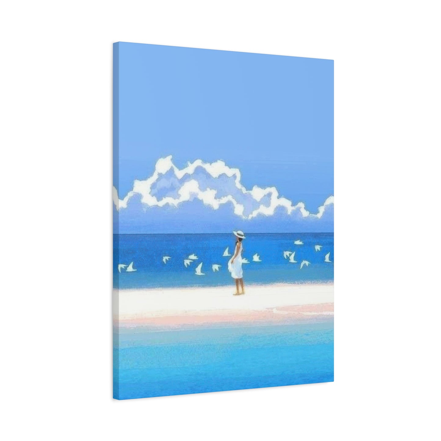
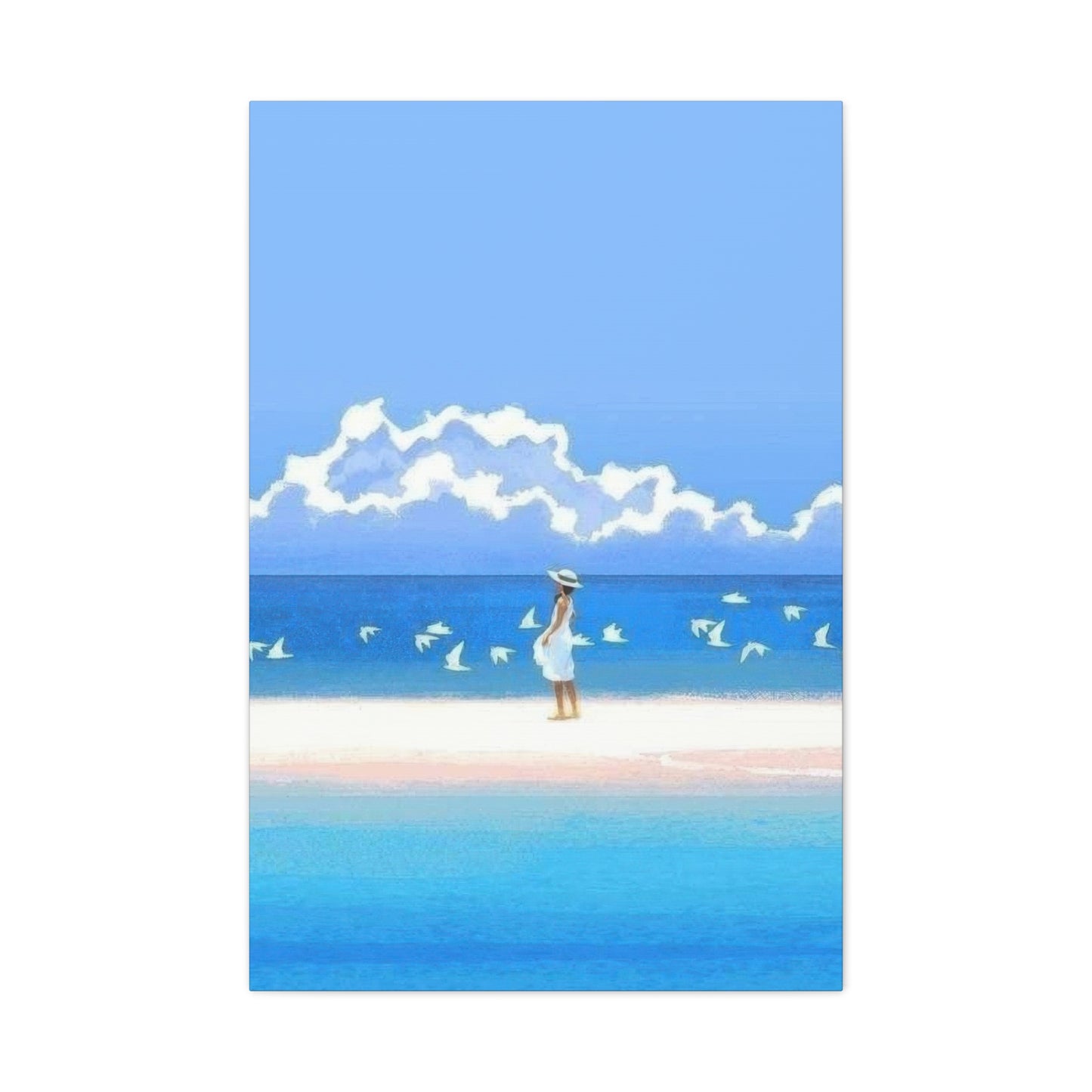
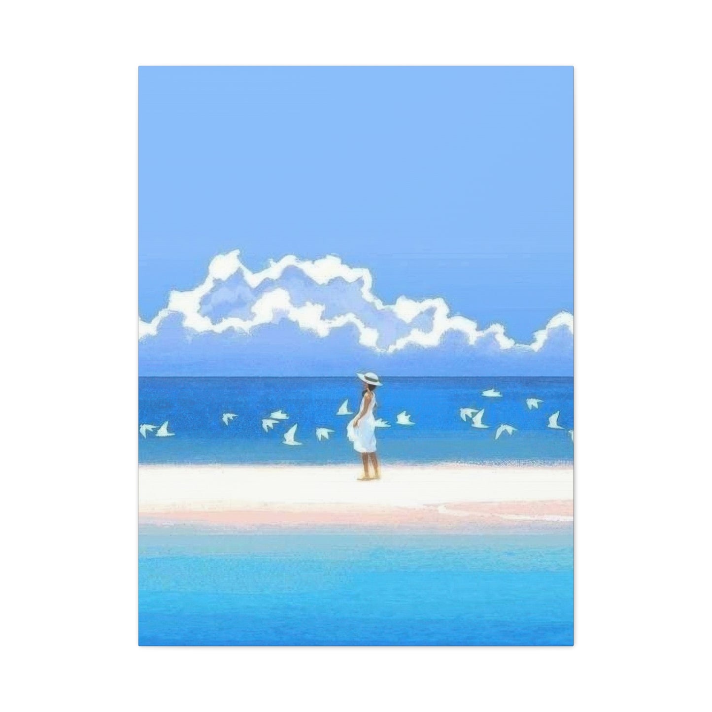
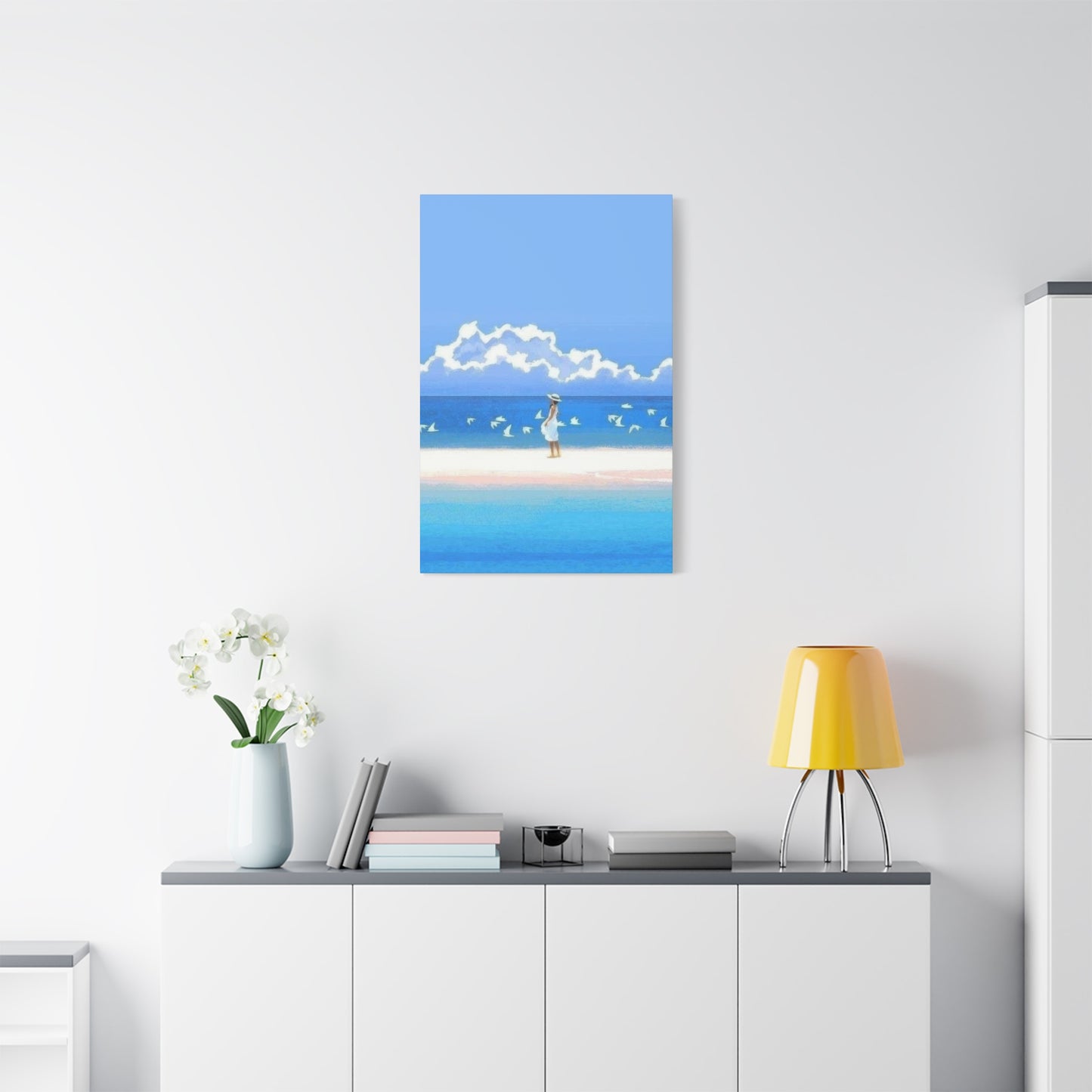
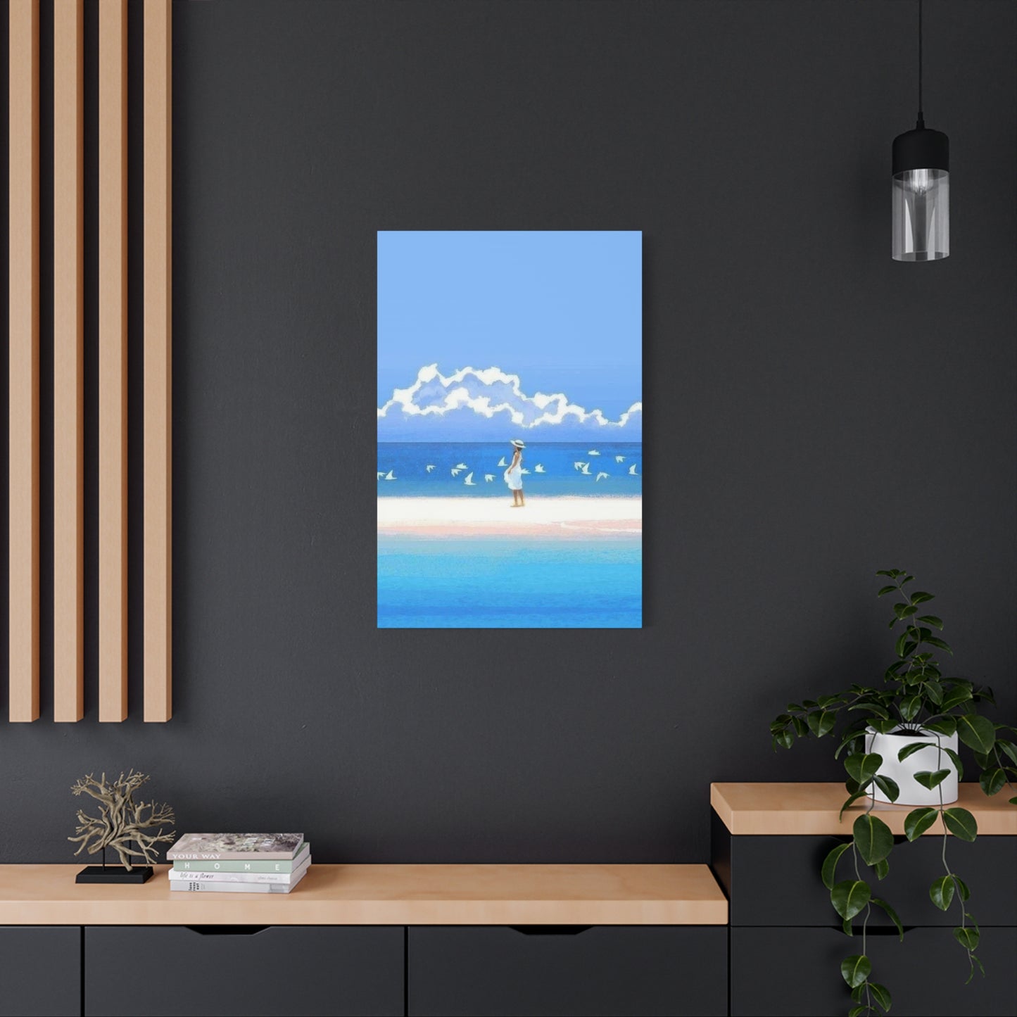
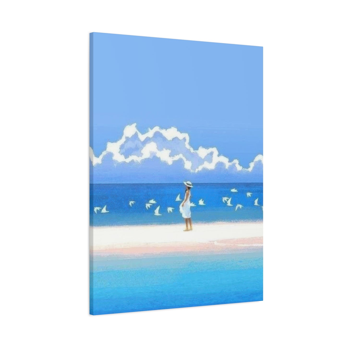
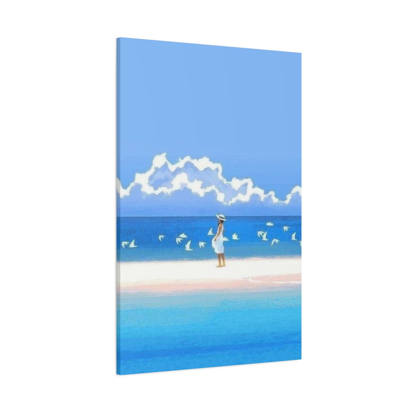
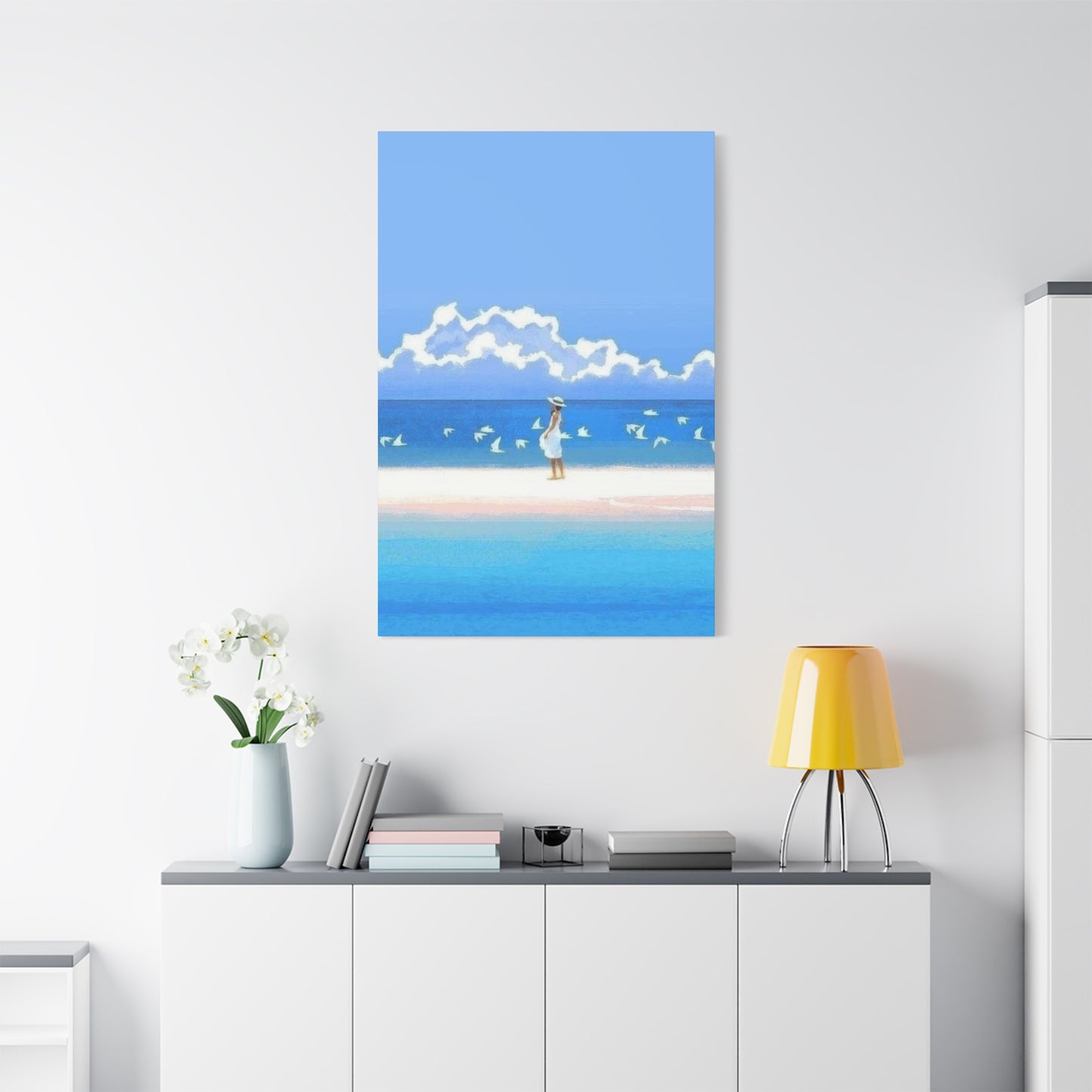
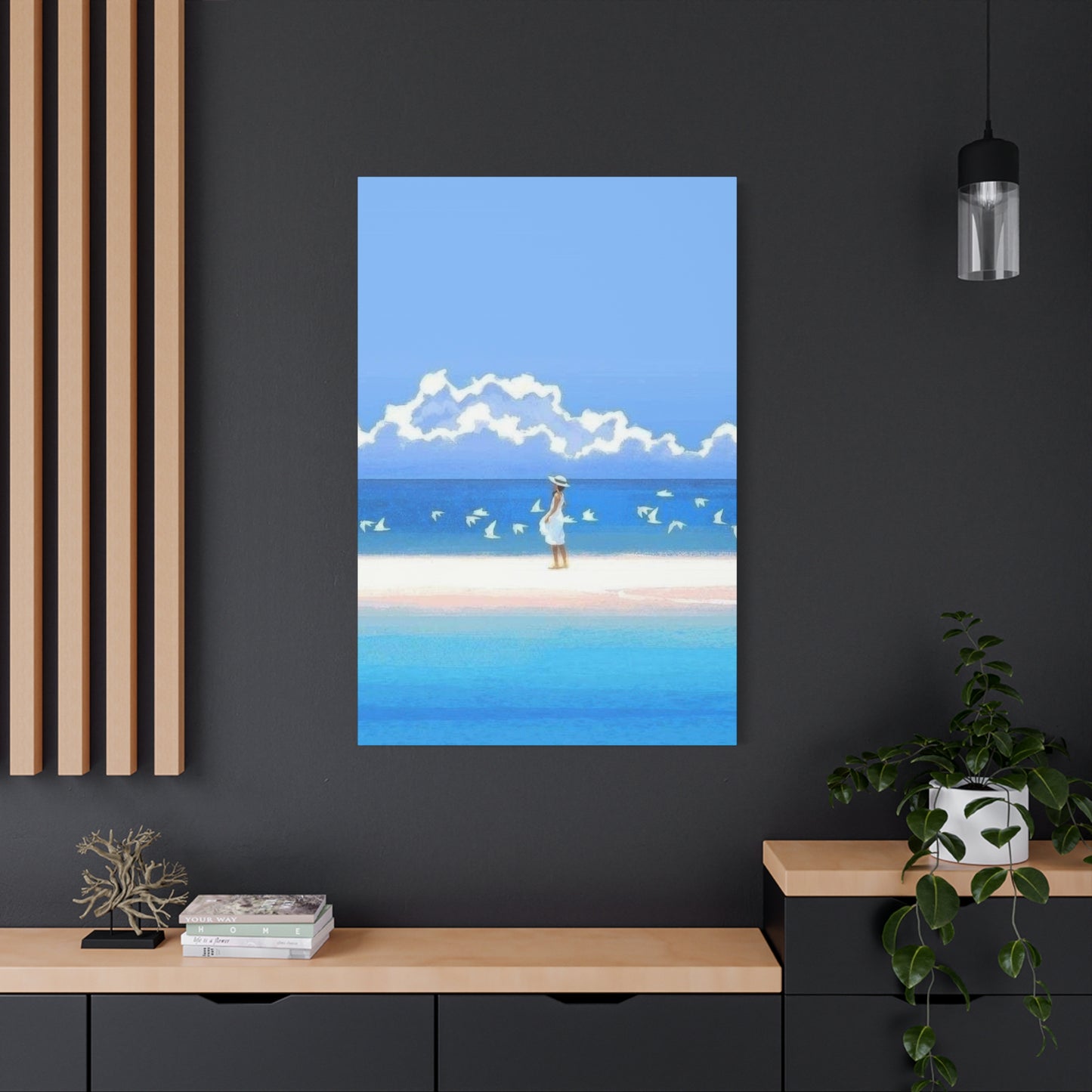
Cool Beach Wall Art & Canvas Prints
Cool Beach Wall Art & Canvas Prints
Couldn't load pickup availability
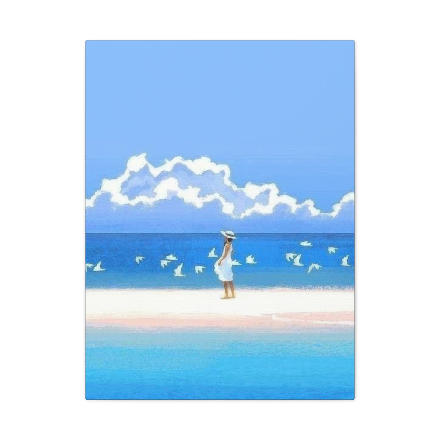
Discover the Perfect Cool Beach Wall Art to Elevate Your Coastal Living Spaces
The allure of coastal aesthetics has captivated homeowners and interior design enthusiasts for generations. When you think about transforming your living environment into a serene sanctuary that echoes the tranquil beauty of oceanside retreats, incorporating cool beach wall art becomes an essential element of your decorating strategy. These carefully curated pieces serve as windows to paradise, bringing the calming essence of waves, sand, and endless horizons directly into your personal spaces.
Why Incorporating Ocean-Inspired Artwork Creates Lasting Emotional Connections Within Your Home
The human connection to water runs deeper than mere aesthetic appreciation. Our brains respond to maritime imagery with measurable physiological changes, including decreased cortisol levels and reduced heart rates. When you position cool beach wall art throughout your residence, you're not simply hanging decorative objects—you're creating therapeutic environments that promote mental wellness and emotional balance.
Research in environmental psychology demonstrates that individuals exposed to coastal imagery experience enhanced creativity and improved problem-solving capabilities. The repetitive patterns found in wave formations, the organic textures of weathered driftwood, and the subtle gradations of blues and greens present in seaside landscapes all contribute to cognitive relaxation. This phenomenon occurs because our neural pathways associate these visual elements with vacation memories, leisure activities, and stress-free moments.
The color palettes inherent in oceanic artwork naturally complement a wide range of interior design schemes. Soft aquamarines blend seamlessly with neutral tones, while deeper navy accents provide striking contrast against lighter backgrounds. Sunset-inspired pieces introduce warm oranges, pinks, and golds that add energy without overwhelming spaces. This versatility makes seaside-themed decorations suitable for everything from minimalist contemporary apartments to traditional family homes.
Beyond the psychological benefits, maritime artwork serves as conversation starters and reflection points within social gatherings. Guests naturally gravitate toward compelling visual statements, and pieces depicting coastal scenes often spark discussions about travel experiences, favorite vacation destinations, and shared memories of time spent near water. These interactions strengthen social bonds and create welcoming atmospheres within your entertaining spaces.
Exploring Different Artistic Styles That Capture Shoreline Beauty in Unique Ways
The world of coastal-themed artwork encompasses an extraordinary variety of artistic expressions, each offering distinct visual experiences and emotional resonances. Understanding these different approaches helps you select pieces that align with your personal taste and complement your existing interior design elements.
Photographic representations capture the raw, unfiltered beauty of actual shorelines with stunning clarity. High-resolution images of crashing waves frozen in motion, serene sunrise moments over calm waters, or dramatic cliff formations provide realistic portrayals that transport viewers directly to specific locations. These pieces work exceptionally well in contemporary settings where clean lines and authentic representations take precedence over interpretive expressions.
Abstract interpretations of maritime themes offer more conceptual approaches to coastal imagery. Artists working in this style distill the essence of oceanic experiences into color fields, gestural brushstrokes, and non-representational forms. These pieces encourage personal interpretation and often integrate more seamlessly with diverse decorating schemes. The ambiguity inherent in abstract work allows viewers to project their own memories and emotions onto the artwork, creating deeply personal connections.
Vintage-inspired coastal prints evoke nostalgia for simpler times and traditional seaside communities. These pieces often feature retro color palettes, weathered textures, and imagery reminiscent of mid-century vacation posters or historical maritime charts. Such artwork introduces character and storytelling elements into spaces, suggesting rich histories and enduring connections to nautical traditions.
Watercolor renditions of shoreline scenes provide soft, ethereal qualities that work beautifully in bedrooms, bathrooms, and other intimate spaces. The translucent layers and fluid edges characteristic of this medium mirror the ever-changing nature of water itself. Watercolor pieces often feel lighter and more delicate than their oil or acrylic counterparts, making them ideal for smaller rooms or areas where you want to maintain an airy, uncluttered feeling.
Mixed-media creations incorporate actual materials collected from beaches—sand, shells, driftwood fragments, or sea glass—into the artwork itself. These three-dimensional pieces add tactile interest and physical depth to wall displays. The inclusion of authentic coastal elements strengthens the connection between the artwork and actual shoreline experiences, creating more immersive viewing experiences.
Selecting Appropriate Sizes and Configurations for Maximum Visual Impact Throughout Your Spaces
The dimensions and arrangement of your cool beach wall art significantly influence how effectively it transforms your environment. Thoughtful consideration of scale, proportion, and placement ensures that your selected pieces enhance rather than overwhelm your living areas.
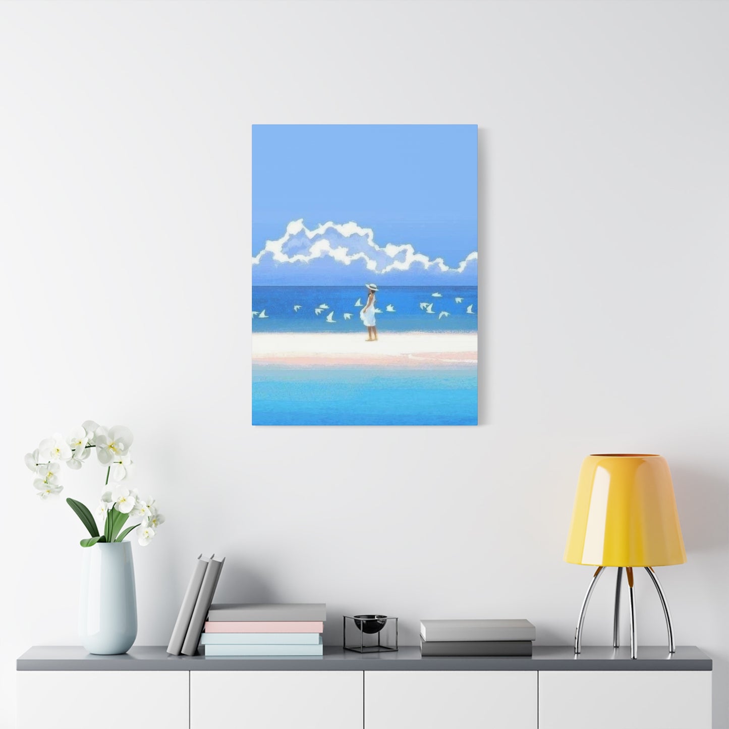
Large-scale statement pieces measuring four feet or more in width or height create dramatic focal points that anchor entire rooms. These substantial works demand attention and work best on spacious walls where they can be viewed from appropriate distances. Position oversized artwork above sofas, beds, or mantels where they naturally draw the eye and establish visual hierarchy within the space. When selecting large pieces, ensure that the scale matches the room's proportions—massive artwork in cramped quarters feels claustrophobic, while appropriately sized pieces create commanding yet comfortable presences.
Medium-sized pieces ranging from two to four feet in dimension offer versatility for various placement scenarios. These dimensions work well individually as secondary focal points or grouped together to create gallery-style arrangements. Consider medium-sized artwork for hallways, dining areas, or above console tables where they provide visual interest without dominating the architecture.
Smaller prints and canvases measuring under two feet serve as accent pieces that add finishing touches to vignettes and styled surfaces. Group multiple small pieces together to create cohesive collections that tell visual stories. Arrange them in grid patterns for structured, contemporary looks, or cluster them organically for more relaxed, bohemian aesthetics. Small-scale pieces also work beautifully on gallery ledges or shelving systems where you can easily rotate and refresh displays.
Creating gallery walls with multiple pieces requires careful planning to achieve balanced, cohesive results. Begin by laying out your arrangement on the floor, experimenting with different configurations until you find compositions that feel visually harmonious. Maintain consistent spacing between pieces—typically two to three inches—to create unified presentations rather than disjointed collections. Consider incorporating frames in coordinating finishes to tie disparate pieces together, or embrace eclectic approaches with varied frame styles for more personalized expressions.
Vertical arrangements draw the eye upward and make ceilings appear higher, particularly beneficial in rooms with lower ceiling heights. Horizontal configurations emphasize width and work well above furniture pieces or in rooms where you want to create calming, grounded feelings. Asymmetrical arrangements introduce dynamic energy and contemporary flair, while symmetrical placements feel more traditional and formal.
Understanding Color Psychology and How Oceanic Palettes Influence Mood Within Interior Environments
The colors present in coastal artwork directly impact the emotional atmosphere of your spaces. Developing awareness of color psychology principles enables you to select pieces that support your desired mood and functional needs for each room.
Various shades of blue dominate maritime artwork, and each tone carries distinct psychological associations. Pale sky blues promote tranquility and mental clarity, making them excellent choices for bedrooms and meditation spaces. These lighter tones visually expand rooms, creating perceptions of greater spaciousness. Medium cerulean blues balance energy and calm, working well in living rooms and family spaces where you want to encourage both relaxation and social interaction. Deep navy and midnight blues convey sophistication and depth, adding dramatic elegance to formal dining rooms or home offices.
Green tones ranging from soft sea foam to rich teal bring nature's rejuvenating qualities indoors. Lighter greens with yellow undertones feel fresh and optimistic, ideal for kitchens and breakfast nooks where you want to start days with positive energy. Deeper emerald and teal shades offer richness without the weight of darker colors, providing striking alternatives to traditional blue palettes while maintaining coastal connections.
Neutral tones including sandy beiges, warm taupes, and weathered grays ground coastal color schemes and prevent them from feeling too themey or childish. These earth-inspired hues reference beaches, driftwood, and natural shoreline elements while offering sophisticated restraint. Neutral-dominant artwork integrates easily with existing furnishings and allows flexibility for seasonal decorating changes.
Sunset-inspired warm tones introduce energy and vitality into maritime themes. Coral pinks, peachy oranges, and golden yellows evoke the magical moments when day transitions to night along coastlines. These warmer colors balance cool-toned rooms and add welcoming warmth to spaces that might otherwise feel too stark or cold. Consider sunset pieces for west-facing rooms that receive warm afternoon light, creating harmonious relationships between natural and artistic light sources.
White and off-white spaces within coastal artwork provide visual breathing room and prevent compositions from feeling too busy or saturated. These lighter areas allow eyes to rest and help other colors appear more vibrant through contrast. Pieces with significant white or negative space work particularly well in smaller rooms or areas with abundant patterns and textures that might compete for visual attention.
Discovering Where to Find Authentic and High-Quality Coastal Artwork That Matches Your Vision
Sourcing exceptional cool beach wall art requires knowledge of various marketplace options and quality indicators. Different purchasing venues offer distinct advantages depending on your budget, timeline, and desire for unique versus readily available pieces.
Local art fairs and coastal community markets provide opportunities to discover original works directly from creators. These venues allow you to examine pieces in person, assess quality firsthand, and often meet the artists behind the work. Many coastal communities host regular art walks and studio tours where you can explore diverse styles and price points. Purchasing directly from artists often means better pricing than gallery purchases while supporting individual creators within artistic communities.
Specialized galleries focusing on maritime and coastal artwork curate collections by established and emerging artists. Gallery professionals offer expertise in matching pieces to your specific needs and often provide valuable insights into artist backgrounds and creative processes. While gallery prices typically include markup, the curation, authenticity guarantees, and professional framing services often justify the investment for collectors seeking museum-quality pieces.
Online marketplaces have democratized access to coastal artwork from creators worldwide. These platforms allow you to filter by size, color, price range, and style, making it easier to find pieces matching specific criteria. When purchasing artwork through digital channels, carefully review return policies, shipping protections, and customer reviews. Request additional photographs showing details, textures, and true colors before committing to purchases, as screens don't always accurately represent actual appearances.
Custom commissioning allows you to collaborate with artists to create perfectly tailored pieces reflecting your specific vision. This approach works particularly well when you have challenging wall dimensions, specific color requirements, or want to incorporate personal memories from favorite beaches. Commissioned work requires longer timelines and often higher investments, but results in truly one-of-a-kind pieces unavailable elsewhere.
Print-on-demand services offer affordable options for accessing designs by artists worldwide. These platforms allow artists to upload designs that customers can order printed on various materials in multiple sizes. While these pieces lack the investment value of original artwork, they provide budget-friendly ways to experiment with coastal aesthetics without significant financial commitments. Quality varies considerably across printing services, so research company reputations and material specifications before ordering.
Estate sales, antique shops, and secondhand marketplaces occasionally yield remarkable discoveries at fraction-of-original-cost prices. Vintage coastal artwork carries inherent charm and often features craftsmanship standards no longer common in mass-produced pieces. Shopping these venues requires patience and willingness to hunt through inventory, but dedicated seekers often uncover extraordinary treasures.
Examining Different Material Substrates and How They Impact Durability and Aesthetic Qualities
The physical materials supporting your cool beach wall art influence both visual appearance and longevity. Understanding substrate characteristics helps you make informed selections appropriate for specific display locations and maintenance preferences.
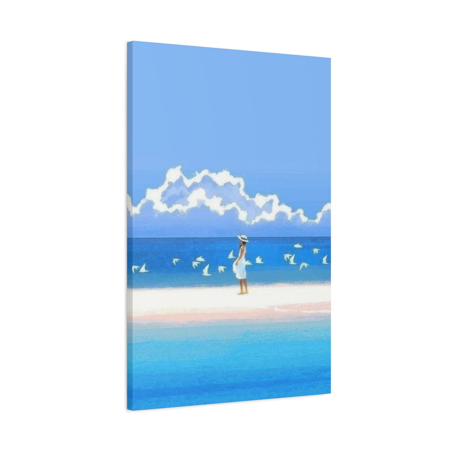
Canvas stretches offer classic presentations with slight dimensional texture that adds visual interest. Gallery-wrapped canvases with imagery continuing around edges eliminate the need for frames and create contemporary, floating appearances. Traditional stretched canvas with visible staples along back edges requires framing for polished presentations. Canvas naturally absorbs certain lighting conditions and works well in most indoor environments, though direct sunlight exposure over time may cause fading.
Fine art papers provide smooth surfaces that showcase intricate details and subtle color gradations beautifully. Paper-based artwork requires glazing and framing for protection from moisture, dust, and handling damage. Museum-quality papers resist yellowing and deterioration when properly cared for, maintaining their appearance for decades. The weight and texture of paper stocks influence final aesthetics—heavier papers convey quality and substance while maintaining flexibility.
Metal prints deliver striking contemporary appearances with brilliant colors and incredible depth. The sublimation printing process infuses inks directly into specially coated aluminum, creating waterproof, scratchproof surfaces ideal for bathrooms, kitchens, and outdoor covered areas. Metal prints reflect light dynamically, changing appearance throughout the day as natural light shifts. The sleek, frameless presentations work particularly well in modern and industrial-influenced interiors.
Acrylic face-mounting involves printing images on paper or canvas then adhering them behind clear acrylic panels. This creates glossy, gallery-quality presentations with impressive color vibrancy and dimensional depth. The protective acrylic layer shields artwork from UV damage, moisture, and physical contact while adding substantial visual impact through light reflection and refraction. These pieces carry premium price points reflecting their sophisticated production processes.
Wood panels and reclaimed lumber provide rustic, organic substrates perfect for coastal themes. Images printed or transferred onto wood surfaces maintain visible grain patterns and natural variations that enhance their handcrafted appearances. Wood substrates work beautifully in casual, beach-house-inspired interiors where imperfections and organic qualities contribute to overall charm. These pieces typically receive protective coatings making them suitable for most indoor environments.
Fabric tapestries and woven textiles offer softness and texture unavailable in rigid substrates. These pieces introduce acoustic-dampening properties beneficial in rooms where sound control matters. Fabric artwork drapes naturally, creating gentle movement and dimensional interest. While typically less formal than framed pieces, textile artwork brings warmth and tactile qualities that soften hard-surfaced interiors.
Mastering Lighting Strategies That Enhance Your Coastal Artwork and Create Ambient Atmospheres
Proper illumination dramatically influences how viewers experience your cool beach wall art. Strategic lighting choices enhance colors, create depth, and establish appropriate moods within your spaces.
Natural daylight provides the most accurate color rendering and changes throughout the day, creating dynamic viewing experiences. Position artwork perpendicular to windows when possible to minimize glare and prevent direct sunlight from striking surfaces. East-facing walls receive gentle morning light perfect for starting days with calm energy, while west-facing walls capture warm afternoon and sunset light that enhances pieces with warmer color palettes.
Picture lights mounted directly above or below artwork provide focused illumination that highlights your pieces as featured attractions. These dedicated fixtures come in various styles from traditional brass to sleek contemporary designs. Position picture lights to cast even illumination across the entire surface without creating hotspots or shadows. LED picture lights offer energy efficiency and minimal heat production, protecting artwork from thermal damage.
Track lighting systems provide flexibility for illuminating multiple pieces or adjusting focus as you rearrange displays. These adaptable systems allow you to direct light precisely where needed and easily accommodate changes to your collection. Choose track fixtures with adjustable beam angles and dimming capabilities to fine-tune illumination intensity based on time of day and desired atmosphere.
Recessed ceiling fixtures offer subtle, architectural lighting that doesn't compete visually with your artwork. Position recessed lights slightly forward of wall surfaces and aim them at approximately thirty-degree angles to minimize glare on glazed surfaces. Multiple recessed fixtures create even, shadow-free illumination ideal for gallery-style wall arrangements.
Accent lighting from floor lamps, table lamps, and sconces contributes to layered lighting schemes that create depth and interest. While not directly illuminating artwork, these ambient light sources influence overall room brightness and color temperature, affecting how viewers perceive your coastal pieces. Warm-toned ambient lighting enhances sunset and earth-toned artwork, while cooler lighting complements blue and teal-dominated pieces.
Color temperature selection significantly impacts artwork appearance. Warm white light (2700-3000K) creates cozy, inviting atmospheres that enhance warmer colors but may diminish cooler blues and greens. Neutral white light (3500-4100K) balances warm and cool tones, providing versatile illumination suitable for diverse palettes. Cool white light (5000K+) brings crispness and clarity that makes blues and greens appear more vibrant but may feel stark in intimate spaces.
Coordinating Coastal Artwork With Existing Furniture and Decorative Elements for Cohesive Interiors
Successfully incorporating cool beach wall art into your spaces requires thoughtful consideration of how pieces relate to surrounding furnishings and accessories. Cohesive design schemes balance repetition and contrast while maintaining visual flow throughout rooms.
Color bridging connects artwork to existing elements through shared hues. Identify secondary or accent colors within your chosen pieces and echo them through throw pillows, area rugs, curtains, or decorative objects. This repetition creates visual pathways that guide eyes around spaces and make rooms feel intentionally designed rather than randomly assembled. Avoid overly matchy-matchy approaches that feel contrived—subtle connections prove more sophisticated than exact color duplications.
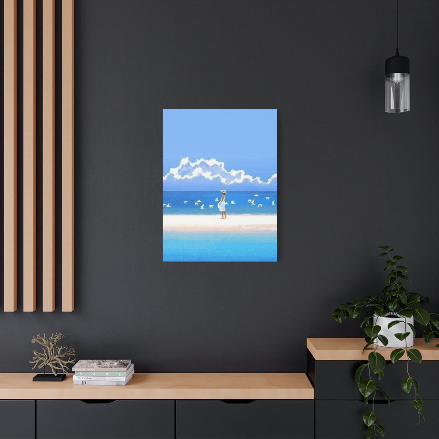
Contrasting your artwork against surrounding elements creates dynamic tension that energizes spaces. Dark artwork against light walls provides striking focal points, while light, airy pieces against darker backgrounds feel like windows opening to broader vistas. Consider the visual weight of furnishings when planning contrast—heavier furniture pieces balance substantial artwork, while delicate furnishings pair well with lighter, more ethereal pieces.
Textural relationships between artwork and nearby surfaces add dimensional interest. Smooth canvas or metal prints contrast beautifully with nubby upholstery, natural fiber rugs, or rough-hewn wood furnishings. Conversely, wood-substrate artwork echoes wooden furniture pieces, creating harmonious repetition of natural materials. Layering various textures prevents spaces from feeling flat or monotonous while adding tactile richness.
Scale relationships between artwork and furniture require careful calibration. Artwork should generally span two-thirds to three-quarters of the furniture width beneath it, creating visual anchoring without overwhelming. In dining rooms, artwork above sideboards or buffets should align roughly with the furniture edges or extend slightly beyond. Over sofas, center artwork above the seating area's midpoint and hang it high enough that seated individuals don't obstruct views.
Style consistency maintains cohesion across rooms while allowing personality expression. If your primary living spaces feature coastal artwork, consider carrying this theme throughout your home in varying intensities. Main entertaining areas might showcase your most substantial pieces, while bedrooms and bathrooms feature smaller coordinating works. This approach creates narrative flow as people move through your residence.
Creating balanced asymmetry introduces visual interest without sacrificing harmony. Pair larger artwork on one side of a wall with a cluster of smaller pieces on the other, ensuring the combined visual weight feels equivalent. This strategy works particularly well in living rooms where you want to create interest without formal symmetry.
Protecting Your Coastal Art Collection From Environmental Factors That Cause Premature Deterioration
Proper care ensures your cool beach wall art maintains its beauty for years or even decades. Understanding common deterioration causes allows you to implement protective measures that preserve your investment.
Ultraviolet radiation represents the most significant threat to artwork longevity. UV rays break down pigments, fade colors, and degrade substrates over time. Install UV-filtering glazing on framed pieces or apply UV-protective coatings to unframed works. Window treatments including cellular shades, UV-blocking films, or sheer curtains filter harmful rays while maintaining natural light. Position artwork away from direct sunlight paths, particularly in south-facing rooms receiving intense exposure.
Humidity fluctuations cause materials to expand and contract, leading to warping, cracking, and delamination. Maintain relative humidity between 40-60% using humidifiers in dry climates or dehumidifiers in humid regions. Avoid hanging artwork in bathrooms without adequate ventilation or near sources of moisture including humidifiers, aquariums, or poorly sealed windows. Canvas pieces are particularly sensitive to humidity changes, while metal and acrylic substrates tolerate moisture better.
Temperature extremes and rapid fluctuations stress artwork materials and accelerate deterioration. Avoid positioning pieces near heating vents, radiators, fireplaces, or air conditioning registers where they experience direct hot or cold air streams. Maintain consistent indoor temperatures between 65-75 degrees Fahrenheit. Attics, garages, and basements typically experience unsuitable temperature ranges for long-term artwork storage.
Dust accumulation dulls surfaces and can scratch delicate finishes when cleaning. Prevent buildup by regularly dusting artwork using clean, soft microfiber cloths or feather dusters. For framed pieces behind glass, clean glazing with appropriate glass cleaners applied to cloths rather than spraying directly. Canvas and paper artwork requires gentle brushing with soft-bristle brushes to avoid surface damage. Metal and acrylic pieces tolerate slightly more aggressive cleaning but still benefit from gentle approaches.
Physical damage from impacts, scratches, or handling causes permanent harm. Hang artwork securely using appropriate hardware for wall types and piece weights. In high-traffic areas or homes with young children and pets, consider positioning valuable pieces higher on walls or in less vulnerable locations. When moving or cleaning artwork, handle pieces by edges or frames rather than touching surfaces directly.
Insects including moths, silverfish, and beetles may damage paper-based artwork if they gain access. Maintain clean environments around artwork and address pest problems promptly. Store backup pieces in sealed containers with acid-free materials and inspect them periodically for signs of infestation.
Exploring Seasonal Rotation Strategies That Keep Your Spaces Feeling Fresh and Dynamic Throughout the Year
Regularly refreshing your cool beach wall art creates opportunities to enjoy different pieces while preventing visual stagnation. Strategic rotation approaches maintain interest without requiring constant purchases of new artwork.
Seasonal swaps allow you to emphasize different aspects of coastal themes throughout the year. During warmer months, showcase vibrant, energetic pieces featuring dramatic waves, bright skies, or active beach scenes. As temperatures cool, transition to more subdued works depicting misty shorelines, quiet winter beaches, or stormy seascapes that complement the season's contemplative mood. This rotation creates harmony between indoor environments and outdoor conditions.
Holiday-themed variations introduce festive touches without abandoning your coastal aesthetic. During winter holidays, incorporate pieces featuring lighthouses with seasonal decorations, snowy beach scenes, or maritime elements with subtle holiday colors. Summer celebrations call for bold, joyful artwork celebrating the season's peak beach moments. These specialized pieces appear briefly each year, maintaining their freshness and impact.
Mood-based rotations align your environment with changing emotional needs. During stressful periods, emphasize calm, minimalist coastal scenes with expansive negative space and soothing palettes. When seeking inspiration and energy, display dramatic sunset pieces or dynamic wave action shots. This responsive approach to curation makes your space an active participant in supporting your wellbeing.
Creating artwork libraries through careful storage allows rotation without additional purchases. Invest in proper storage materials including acid-free boxes, protective wrapping, and climate-controlled storage areas. Catalog your collection with photographs and notes about dimensions, colors, and emotional qualities to simplify selection when planning rotations. Well-maintained stored pieces retain their condition and provide years of enjoyment through regular circulation.
Gallery ledge systems eliminate the commitment of permanent hanging while facilitating frequent changes. These shallow shelves allow you to simply swap pieces by lifting and replacing them without tools or wall damage. Layer multiple pieces at varying heights for dimensional interest and easy visibility. Gallery ledges work particularly well in casual spaces where you want flexibility to respond to inspiration.
Digital rotation through electronic displays provides ultimate flexibility for those embracing smart home features. High-quality digital frames can display thousands of coastal images from your personal collection or subscription services. Program displays to change daily, weekly, or randomly, ensuring perpetual freshness. While lacking the tangible qualities of physical artwork, digital options offer unprecedented variety.
Incorporating Complementary Decorative Accessories That Enhance Your Coastal Design Narrative
Cool beach wall art forms the foundation of coastal interiors, but supporting accessories complete the aesthetic and reinforce thematic consistency throughout spaces.
Natural elements collected from actual beaches create authentic connections to coastal environments. Display shells, sea glass, coral fragments, and interesting stones in glass vessels, shadow boxes, or scattered across tabletops. These organic treasures introduce texture, color, and genuine beach provenance that manufactured decorations cannot replicate. Rotate displays seasonally using different finds to maintain freshness and reflect your ongoing relationship with coastal areas.
Nautical accents including rope details, anchor motifs, and maritime instruments reference seafaring traditions without feeling clichéd when used with restraint. Vintage brass telescopes, antique ship wheels, or weathered oars serve as sculptural elements complementing wall artwork. Choose authentic vintage pieces over mass-produced replicas when possible for greater character and quality.
Lighting fixtures inspired by maritime sources reinforce coastal themes while serving functional purposes. Pendant lights resembling ship lanterns, table lamps with driftwood bases, or fixtures incorporating rope details echo visual elements present in your artwork. Select pieces demonstrating quality craftsmanship rather than obvious, theme-park-style decorations.
Textile selections in natural fibers and coastal color palettes soften spaces and provide comfort. Linen curtains, jute rugs, cotton throw blankets, and canvas pillows introduce organic textures that complement cool beach wall art. Choose subtle patterns including stripes, waves, or geometric designs inspired by coastal architecture rather than literal beach imagery that competes with your artwork.
Plant selections bring living elements into coastal schemes. Choose varieties with architectural forms including succulents, palms, or sculptural branches that mirror organic shapes found in maritime environments. Plants in simple ceramic or weathered terra cotta containers maintain focus on the botanical specimens themselves rather than decorative pots.
Furniture pieces in natural materials ground coastal aesthetics in tangible reality. Weathered wood tables, woven rattan seating, and organic linen upholstery create foundations that support rather than compete with wall art. Select pieces with clean lines and quality construction that transcend trends, ensuring longevity matching your artwork investment.
Addressing Common Mistakes That Undermine Coastal Design Schemes and How to Avoid Them
Even enthusiastic decorators sometimes fall into predictable traps when incorporating cool beach wall art into their spaces. Awareness of common missteps helps you create sophisticated coastal interiors that feel authentic rather than contrived.
Overwhelming spaces with excessive beach motifs creates themed environments resembling commercial vacation rentals rather than personal homes. Resist the temptation to fill every surface with shells, starfish, and maritime references. Instead, allow your wall art to serve as primary coastal indicators while supporting elements remain subtle. This restraint prevents spaces from feeling like caricatures of beach houses.
Ignoring scale relationships produces awkward, unbalanced arrangements that diminish both artwork and spaces. Tiny pieces on expansive walls disappear and feel insignificant, while oversized artwork in compact rooms overwhelms and creates visual claustrophobia. Measure walls carefully and consider viewing distances before selecting sizes. When uncertain, larger pieces typically prove more successful than collections of small ones.
Limiting color palettes exclusively to blues and whites creates monochromatic schemes that lack depth and interest. While these colors dominate coastal themes, successful implementations incorporate varied tones, warm accents, and neutral anchors. Introduce sandy beiges, warm woods, coral touches, or sage greens that expand your palette while maintaining coastal connections.
Hanging artwork at incorrect heights compromises viewing experiences and disrupts visual flow. The center of artwork should typically align at eye level, approximately 57-60 inches from the floor. Over furniture, position pieces 6-8 inches above the furniture top. These standards ensure comfortable viewing and proper relationships between artwork and surrounding elements.
Neglecting lighting considerations diminishes artwork impact and creates frustrating viewing conditions. Dark rooms make artwork difficult to appreciate, while harsh lighting creates glare and washes out colors. Plan lighting schemes simultaneously with artwork selection, ensuring adequate illumination that enhances rather than compromises your pieces.
Prioritizing theme over quality results in collections of mediocre pieces rather than fewer excellent works. Cheap prints, poorly executed reproductions, and low-quality materials undermine entire design schemes regardless of how well they match your theme. Invest in fewer, better pieces that demonstrate artistic merit and quality construction. These selections maintain their appeal far longer than trendy, inexpensive alternatives.
Ignoring personal connection in favor of trend-following produces spaces that feel generic and impersonal. Your cool beach wall art should reflect your specific experiences, preferences, and emotional connections to coastal environments. Select pieces that resonate personally rather than those featured in current magazines or influencer accounts. This authentic approach creates spaces that truly feel like home.
Designing Gallery Walls That Tell Visual Stories Through Thoughtfully Curated Coastal Collections
Grouping multiple pieces of cool beach wall art creates opportunities for sophisticated visual storytelling and dynamic focal points that single pieces cannot achieve alone.
Thematic coherence ties diverse pieces together through shared subject matter, color families, or emotional qualities. Consider creating galleries focused on specific coastal elements such as waves, shorelines, lighthouses, or beach grasses. Alternatively, group pieces unified by artistic medium, time period, or geographic location. These conceptual threads transform random collections into intentional narratives.
Compositional strategies determine whether galleries feel cohesive or chaotic. Grid arrangements with uniform spacing and aligned edges create organized, contemporary presentations perfect for modern interiors. Salon-style arrangements with varied sizes, frames, and asymmetric spacing feel more collected and personal, working beautifully in traditional or eclectic spaces. Before committing to wall hanging, create full-scale templates using paper cutouts and temporarily position them with removable adhesive to evaluate arrangements.
Visual weight distribution ensures balanced compositions that feel stable rather than lopsided. Distribute larger, darker, or more visually complex pieces throughout the arrangement rather than clustering them in one area. Lighter, simpler pieces balance heavier works and prevent galleries from feeling bottom-heavy or top-heavy. Step back frequently during installation to assess overall balance from viewing distances.
Spacing consistency between pieces creates rhythm and unity. Maintain equal distances between all frames—typically 2-3 inches for smaller galleries or 3-4 inches for larger arrangements. Consistent spacing signals intentionality and creates visual harmony even when frame sizes and styles vary. Inconsistent gaps appear accidental and undermine the polished appearance you're working to achieve.
Frame coordination unifies diverse artwork without demanding exact matches. Consider a consistent color family—all warm wood tones, all metallics, or all painted finishes—while allowing variation in width, profile, and detail. Alternatively, embrace maximum variety with intentional eclecticism that celebrates each piece's individuality. Both approaches succeed when executed consistently throughout the entire arrangement.
Anchor pieces establish focal points within larger galleries. Position your most substantial or visually striking piece slightly off-center vertically and horizontally, then build surrounding works in response to this anchor. This creates hierarchical arrangements that guide viewer attention and prevent galleries from feeling like indistinguishable grids.
Examining How Different Room Functions Influence Appropriate Coastal Artwork Selections
The purpose and daily use patterns of specific rooms should inform which cool beach wall art you select for each space, ensuring pieces enhance rather than conflict with room functions.
Living rooms serving as primary gathering and entertaining spaces benefit from substantial statement pieces that spark conversation and create welcoming atmospheres. Select artwork with visual depth that rewards repeated viewing and remains interesting over time. Pieces depicting recognizable landmarks or dramatic natural phenomena often generate stories and discussions among guests. Since living rooms typically feature varied lighting throughout the day, choose artwork that performs well under both natural and artificial illumination.
Bedrooms require calmer, more contemplative artwork that supports relaxation and sleep preparation. Favor pieces with softer colors, simpler compositions, and peaceful subject matter including quiet beaches, gentle waves, or serene horizons. Avoid dramatic, energizing artwork that stimulates rather than soothes. Position pieces where they're visible from the bed, creating pleasant views as you wake and drift to sleep.
Bathrooms tolerate moisture better with certain substrates including metal prints, acrylic-mounted pieces, or properly sealed canvas. Select smaller-scale works appropriate for typically compact bathroom dimensions. Lighthearted, refreshing imagery complements the cleansing functions of these spaces. Avoid valuable or delicate pieces in bathrooms lacking excellent ventilation.
Home offices benefit from artwork that inspires focus and creativity without creating distraction. Abstract coastal pieces or minimalist compositions provide visual interest during breaks from screen time without demanding sustained attention. Position artwork at eye level from your seated position, ensuring comfortable viewing during momentary glances. Some research suggests certain blue tones enhance productivity and concentration, making them strategic choices for work environments.
Kitchens and dining areas accommodate artwork that celebrates abundance, gathering, and sensory pleasure. Vibrant sunset pieces, dynamic wave photography, or coastal landscapes with rich colors complement the social and nourishing functions of these spaces. Choose substrates that withstand humidity, temperature fluctuations, and potential food splatter. Position pieces away from cooking zones where grease accumulation might occur.
Hallways and transitional spaces benefit from series or collections that create rhythm as people move through areas. Consider multiple coordinating pieces positioned at regular intervals that build anticipation and guide movement. Since hallways typically have limited viewing distances, select works that read clearly and quickly rather than requiring prolonged contemplation.
Children's spaces call for playful, approachable coastal artwork that stimulates imagination while avoiding overly juvenile themes that children will quickly outgrow. Whimsical illustrations of sea creatures, colorful surf culture graphics, or age-appropriate photography allows spaces to mature with occupants. Include children in selection processes when appropriate, fostering personal connections and teaching aesthetic appreciation.
Conclusion
Proper framing elevates cool beach wall art from simple decoration to curated collection pieces while providing essential protection against environmental damage.
Frame material selection impacts both aesthetics and durability. Wood frames offer warmth, variety, and traditional appeal with options ranging from rustic barnwood to refined hardwoods. Metal frames provide contemporary, minimalist aesthetics particularly suited to modern interiors and photographic works. Composite materials combine affordability with diverse finish options, though quality varies considerably. Select materials that coordinate with existing furnishings and architectural details in each room.
Frame color and finish dramatically alter artwork presentation. Natural wood tones complement coastal color palettes beautifully, with lighter finishes enhancing airy, beach-cottage aesthetics and darker woods adding sophistication. White and cream frames create fresh, gallery-like presentations that allow artwork to dominate visually. Black frames provide striking contrast and contemporary edge, particularly effective with bold, graphic pieces. Metallic finishes including gold, silver, and bronze introduce elegance and work well with vintage or formal coastal artwork.
Matting serves both protective and aesthetic functions. Archival mats create barriers between artwork and glazing, preventing moisture transfer and physical contact. Colored mats introduce additional design opportunities—consider pulling accent colors from your artwork to create subtle connections, or use neutral mats that recede visually. Multiple mat layers add dimensional depth and luxury to presentations. Mat widths influence perceived importance—wider mats suggest greater significance and create breathing room around images.
Glazing options balance protection and clarity. Standard glass provides basic protection at economical costs but reflects light and offers no UV filtration. Museum glass eliminates reflections and filters harmful UV rays, making artwork visible from any angle while providing premium protection. Acrylic glazing weighs less than glass and resists shattering, offering practical advantages for large pieces or high-traffic areas, though it scratches more easily. Conservation-grade options justify their higher costs when protecting valuable pieces.
Frame profiles range from minimal to ornate, each creating different impressions. Thin, simple profiles maintain contemporary aesthetics and allow artwork to dominate. Wide, substantial frames create commanding presences and work beautifully with traditional or formal artwork. Ornate profiles with carved details or decorative elements suit vintage pieces or maximalist interiors. Consider the visual weight relationship between frame and artwork—bold pieces balance substantial frames while delicate works require subtler surrounds.
Float mounting creates dramatic presentations where artwork appears suspended within frames, surrounded by mat boards with visible edges. This contemporary approach emphasizes the artwork as an object and works particularly well with canvas, fabric, or dimensional pieces. Shadow box frames provide deep recesses accommodating three-dimensional elements including actual shells, sand, or other coastal materials incorporated into or accompanying the artwork.
Share