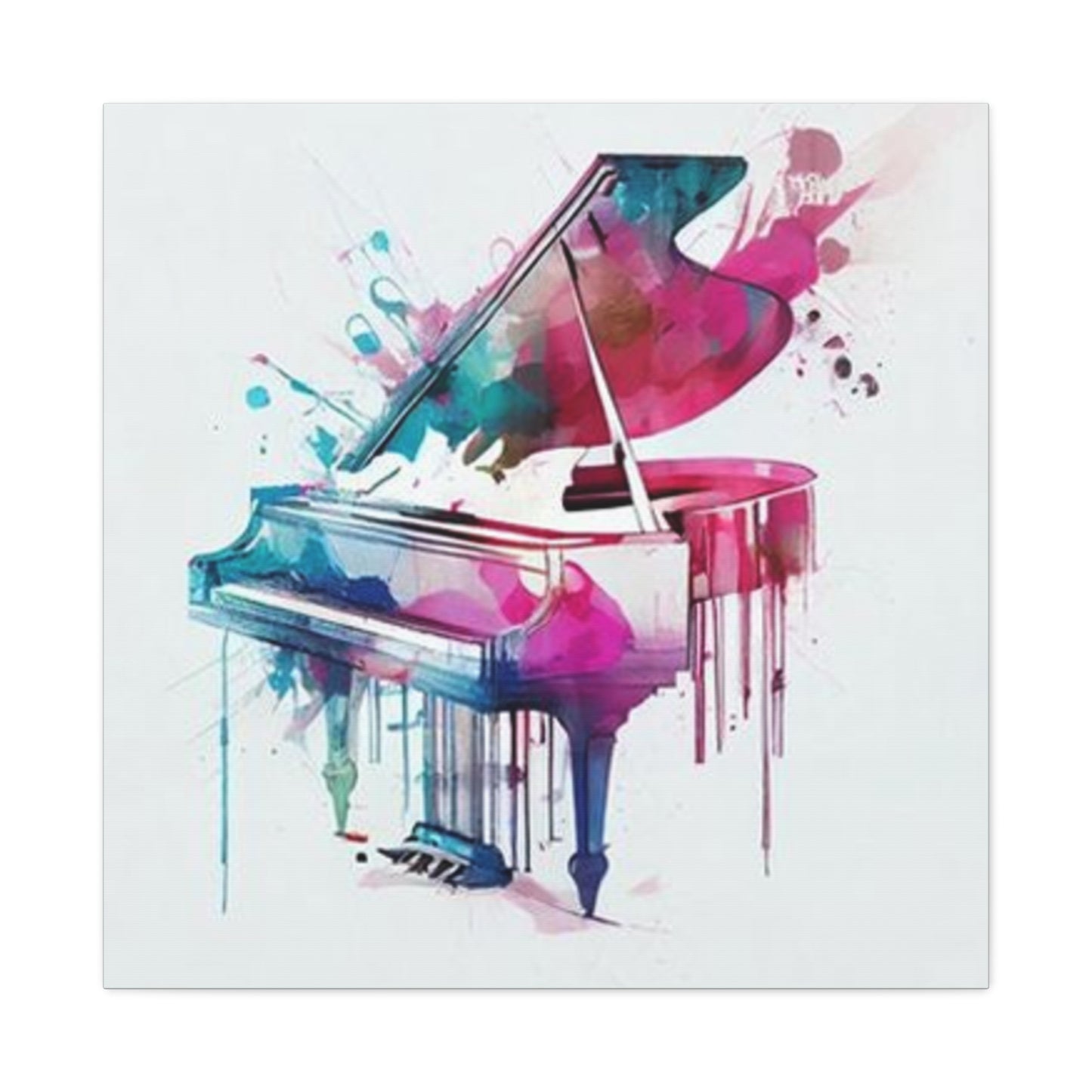
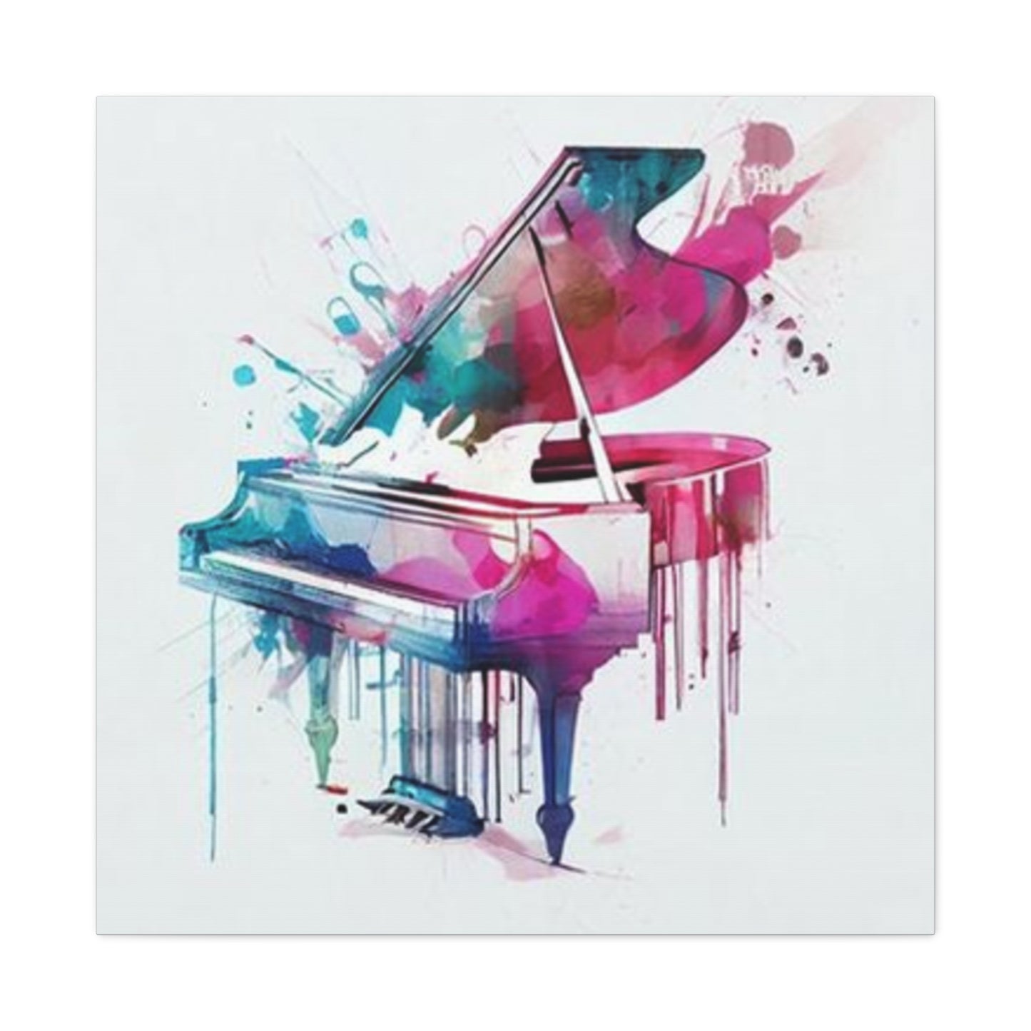
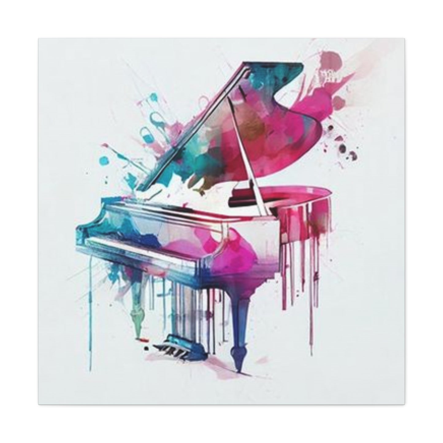
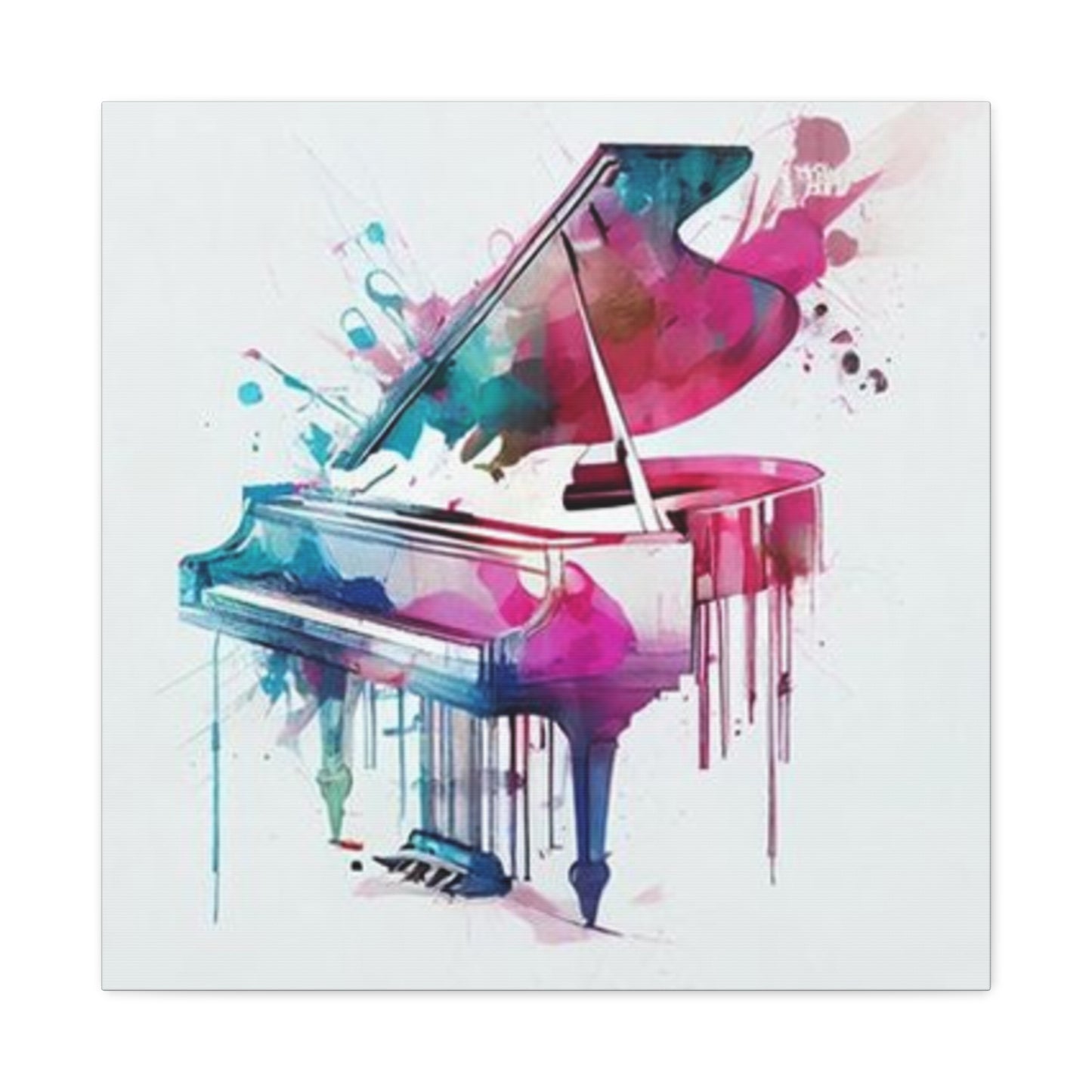
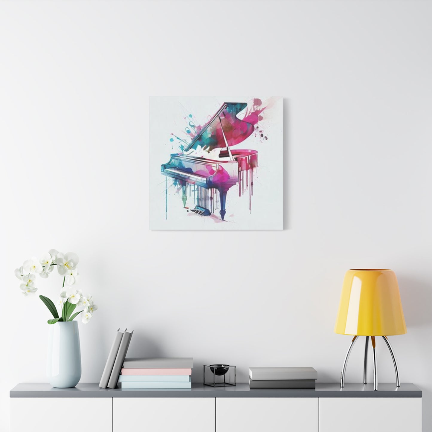
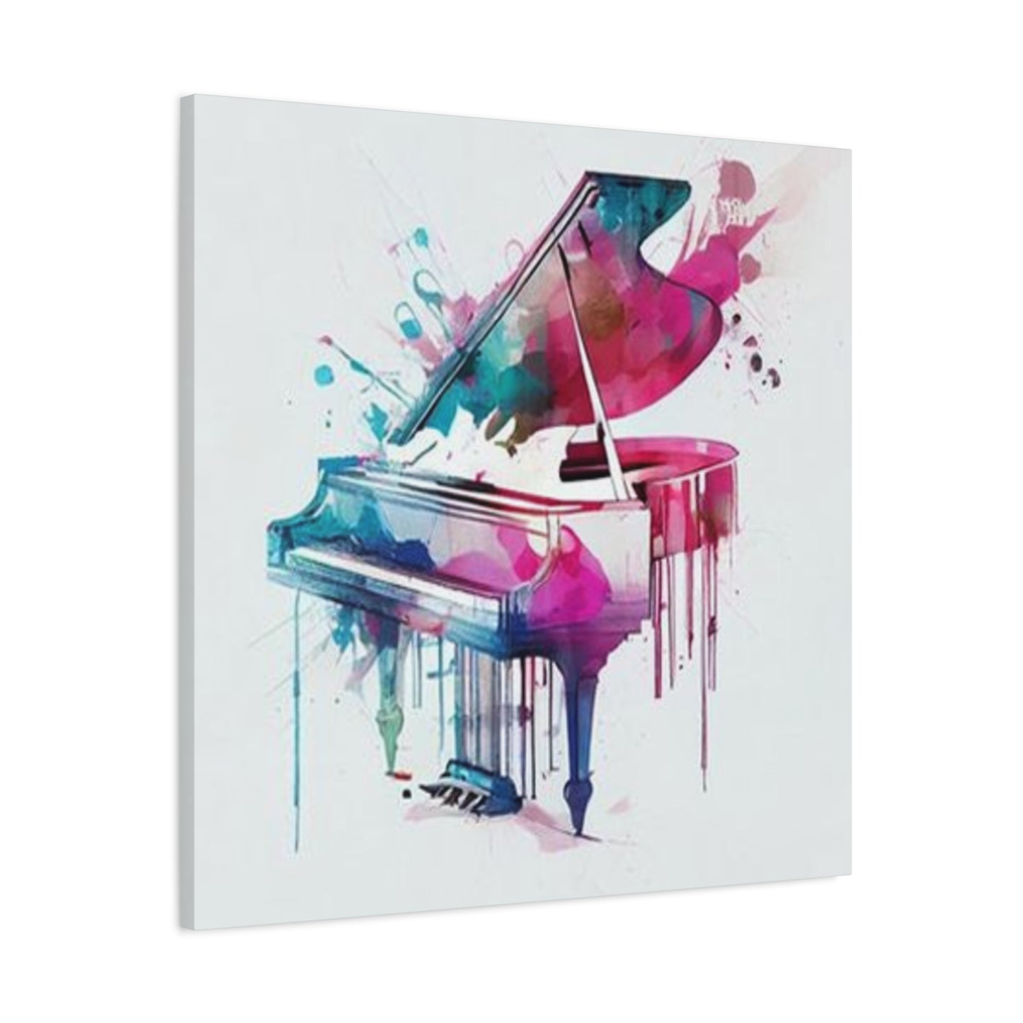
Colorful Piano Painting Wall Art & Canvas Prints
Colorful Piano Painting Wall Art & Canvas Prints
Couldn't load pickup availability
How Colorful Piano Painting Wall Art Transforms Modern Living Spaces Into Creative Sanctuaries
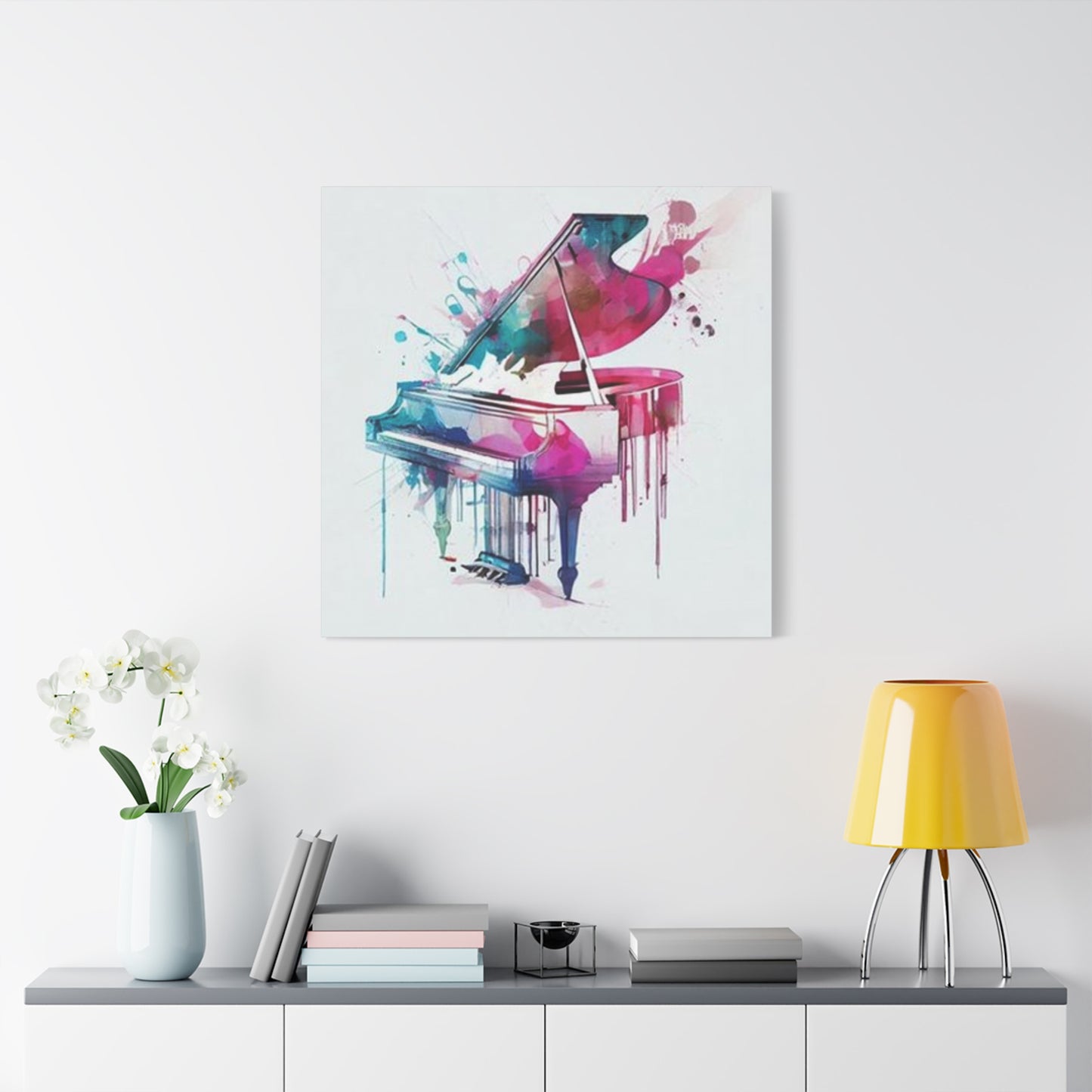
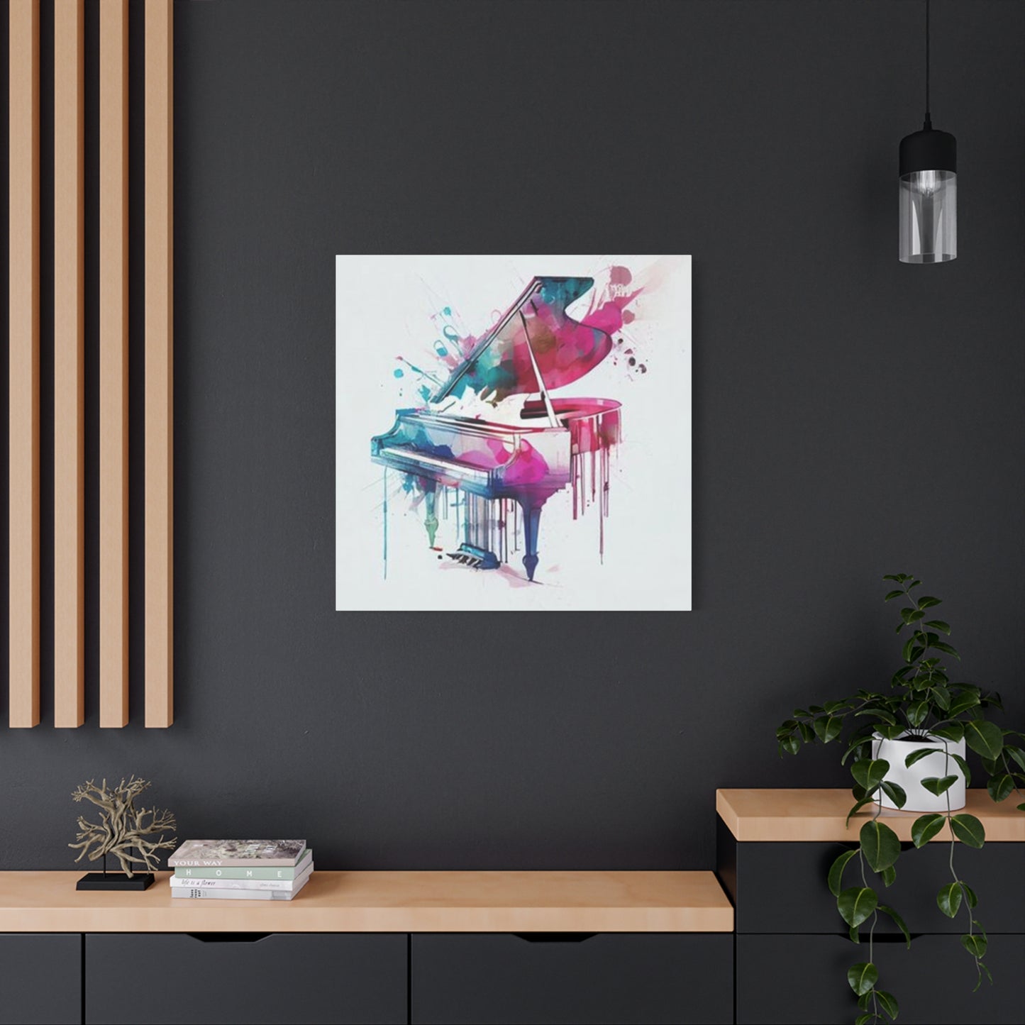
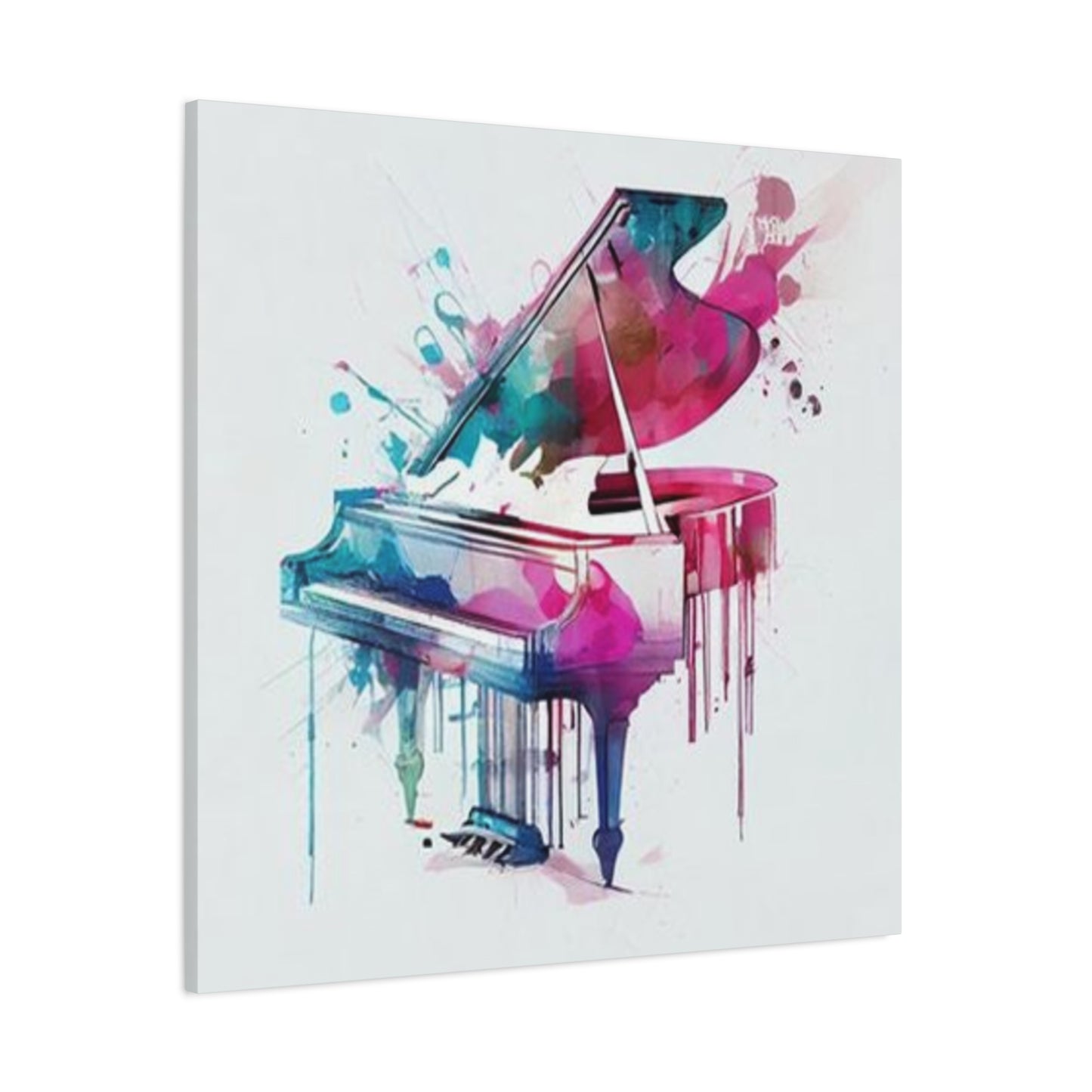
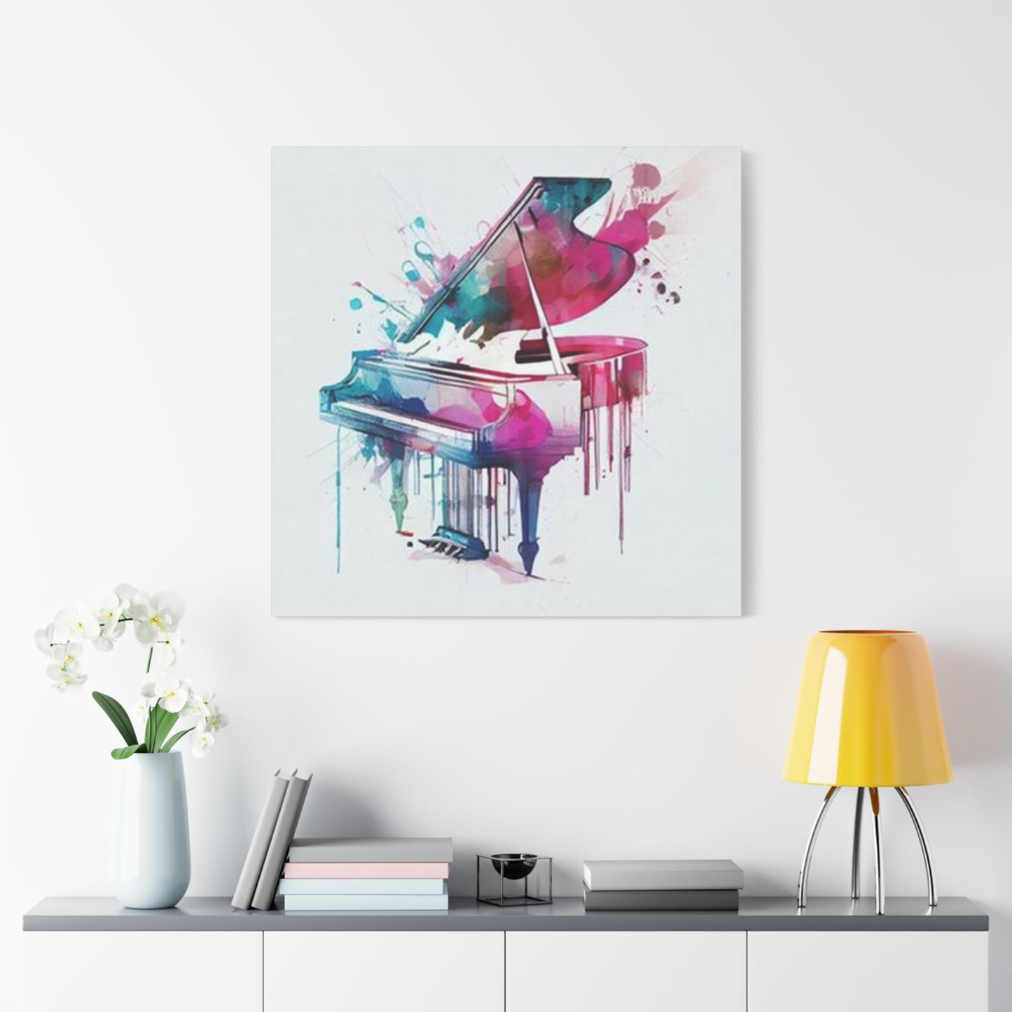
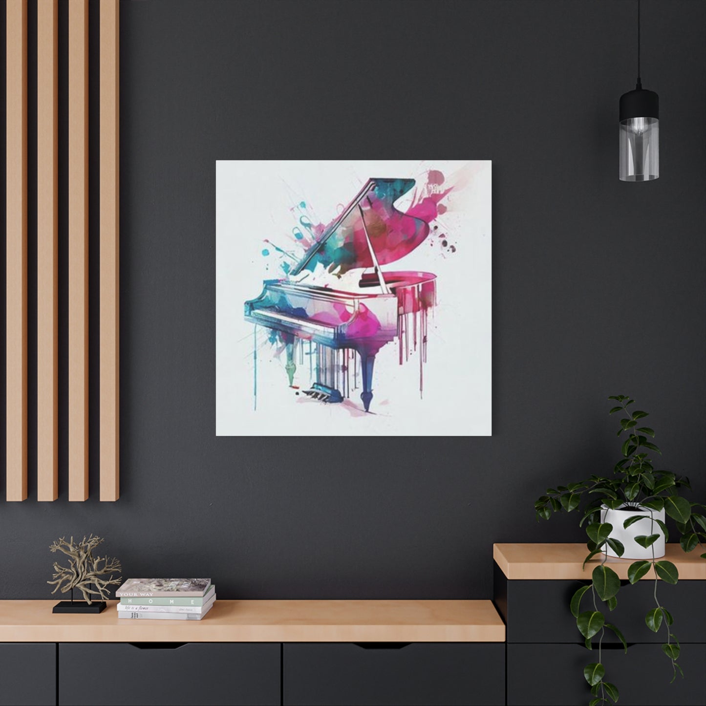
The realm of interior decoration has witnessed a remarkable shift toward incorporating musical themes through vibrant visual representations, with colorful piano painting wall art emerging as a captivating focal point for contemporary homes, offices, and creative workspaces. These stunning artistic creations blend the elegance of musical instruments with bold chromatic palettes, creating pieces that resonate with both music enthusiasts and art collectors alike. The fusion of melodic symbolism with expressive color schemes produces decorative elements that transcend conventional boundaries, offering homeowners and designers fresh possibilities for crafting distinctive atmospheres within their living environments.
The allure of these musical masterpieces extends far beyond mere aesthetic appeal, touching upon deeper human connections to creativity, emotion, and cultural identity. When positioned strategically within a room, a carefully selected piece featuring keyboard imagery rendered in vivid hues can establish an immediate conversational centerpiece while simultaneously reflecting the inhabitant's personality and artistic sensibilities. This particular category of decorative artwork has experienced exponential growth in popularity across diverse demographics, from young professionals seeking to inject vitality into their apartments to established collectors expanding their portfolios with pieces that celebrate both visual and auditory artistry.
The Profound Psychological Impact of Musical Imagery Combined With Chromatic Brilliance in Residential Settings
Research into environmental design reveals fascinating insights about how specific visual elements influence mood, productivity, and overall wellbeing within inhabited spaces. Musical imagery, particularly representations of keyboard instruments adorned with spectacular color variations, activates multiple cognitive pathways simultaneously. The human brain processes these pieces on several levels: recognizing the familiar form of the instrument, responding emotionally to the color combinations, and subconsciously associating the image with sound and musical memory.
The chromatic choices employed in these artistic works carry significant weight in determining their atmospheric impact. Warm tones like crimson, amber, and golden yellow infuse spaces with energy and enthusiasm, making them ideal selections for social areas such as living rooms or entertainment spaces. Conversely, cooler palettes featuring azure, emerald, and violet create calming environments suitable for bedrooms or meditation areas. When these temperature-based color families intermingle within a single composition, they generate dynamic tension that keeps the viewer's attention engaged without overwhelming their senses.
Neuroscientific studies have demonstrated that viewing representations of musical instruments can trigger auditory memories, essentially allowing people to "hear" the music through visual stimuli alone. This synesthetic phenomenon becomes particularly pronounced with colorful piano painting wall art, where the chromatic intensity amplifies the sensory crossover effect. Inhabitants of spaces featuring such pieces often report enhanced creative thinking, improved mood regulation, and stronger emotional connections to their surroundings compared to those with neutral or minimalist decorative schemes.
Exploring the Multifaceted Styles and Artistic Approaches Available in Contemporary Musical Canvas Creations
The market for keyboard-themed decorative artwork encompasses an impressive spectrum of artistic interpretations, each offering distinct visual characteristics and emotional resonances. Abstract expressionist approaches render the instrument through bold brushstrokes and fragmented forms, emphasizing feeling over literal representation. These pieces often feature dramatic color bleeding effects where multiple hues cascade across the canvas like visual melodies, creating compositions that feel spontaneous and emotionally charged.
Realist interpretations maintain recognizable instrumental forms while introducing unexpected chromatic treatments. A grand piano might appear in photorealistic detail except for its surface, which shimmers with iridescent rainbow gradients or unexpected complementary color pairings. This juxtaposition between familiar structure and surprising color creates cognitive interest, inviting viewers to reconsider their assumptions about everyday objects.
Pop art influenced pieces embrace bold outlines, flat color planes, and graphic simplicity reminiscent of screen printing processes. These works often feature high contrast between the keyboard imagery and background elements, creating striking silhouettes that read clearly from across large rooms. The graphic clarity makes them particularly effective in spaces with busy architectural features or patterned furnishings, as their strong visual statements cut through visual clutter.
Impressionistic approaches soften the instrumental form through dappled color application and blurred edges, suggesting rather than defining the subject matter. These gentler interpretations work beautifully in spaces designed for relaxation or contemplation, as their dreamlike quality encourages mental wandering and creative ideation. The subtle color transitions within impressionistic keyboard paintings create depth perception illusions, making walls appear to recede and spaces feel larger than their actual dimensions.
Strategic Placement Considerations for Maximizing Visual Impact and Spatial Harmony Within Various Room Configurations
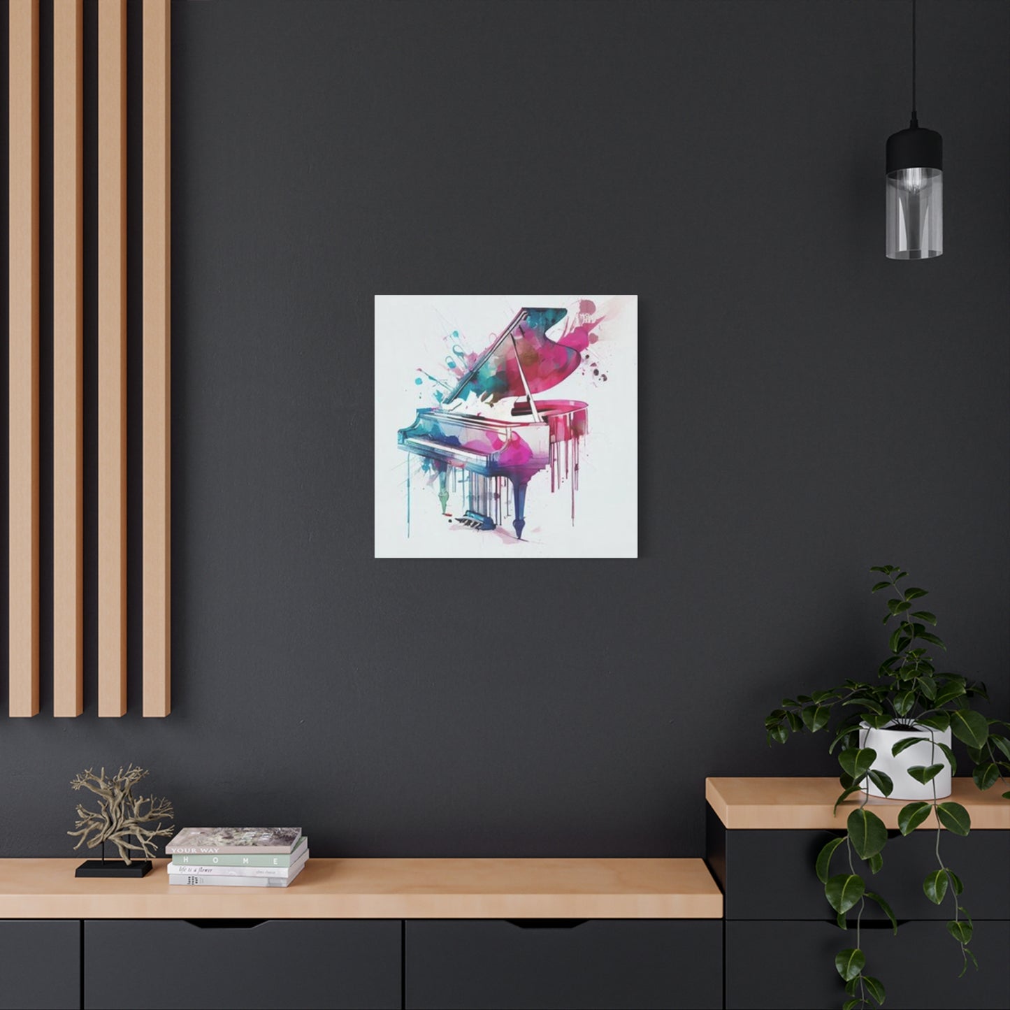
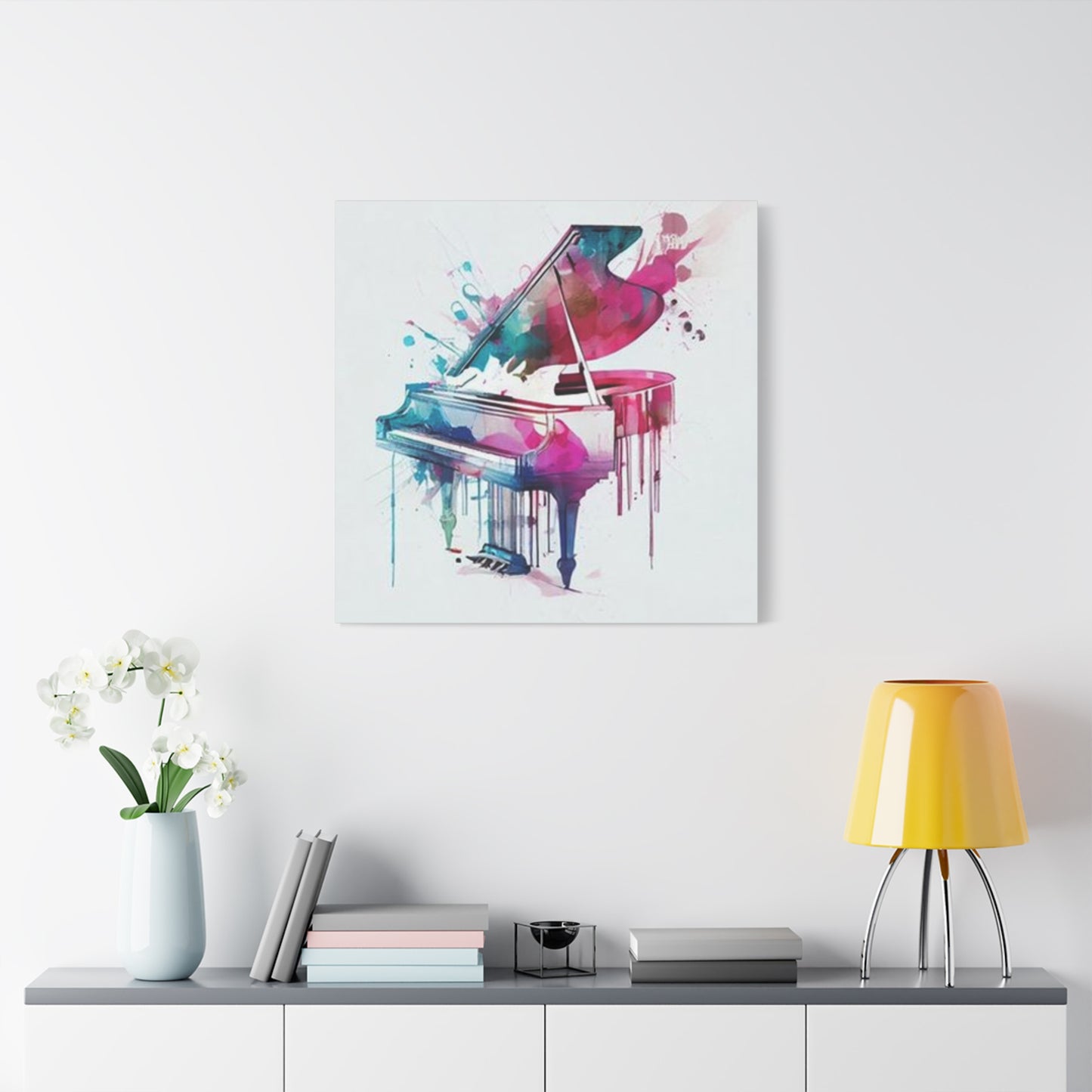
The positioning of colorful piano painting wall art within a space dramatically influences both its visual effectiveness and the room's overall aesthetic coherence. Scale relationships between the artwork and surrounding architectural elements require careful consideration. Oversized pieces command attention and work well as primary focal points in spacious areas with high ceilings, while smaller works function better as components within gallery wall arrangements or as accent pieces in intimate settings.
Lighting conditions profoundly affect how these chromatic compositions appear throughout the day. Natural illumination from windows creates ever-changing visual experiences as sunlight angles shift, causing certain hues to intensify while others recede. Artificial lighting sources offer more control but require thoughtful specification. Warm white bulbs enhance reds, oranges, and yellows while potentially dulling cooler tones, whereas daylight-balanced fixtures render colors more accurately across the spectrum. Directional spotlighting can create dramatic shadow effects and emphasize textural elements in pieces with heavy impasto application.
Wall color selection presents another crucial variable in successful artwork integration. Light neutral backgrounds—soft grays, warm whites, or pale beiges—allow vibrant musical paintings to dominate visually without competition. However, bold wall colors can create striking complementary or analogous relationships with the artwork when colors are chosen deliberately. A deep navy wall behind a piece featuring warm golden and copper tones generates sophisticated contrast, while an emerald wall paired with a painting incorporating similar green notes creates harmonious chromatic flow.
Furniture arrangement should guide viewers' eyes toward featured artworks rather than obstructing sightlines. Positioning a significant piece above a sofa, console table, or entertainment center creates natural visual hierarchy and anchors the furniture grouping. Conversely, hanging artwork where it must compete with television screens, large windows with compelling views, or other strong visual elements diminishes its impact and creates uncomfortable visual competition.
Understanding Material Substrates and Printing Methods That Influence Longevity, Appearance, and Value Retention
The physical composition of colorful piano painting wall art varies considerably based on production methods and material selection, with each approach offering distinct advantages regarding appearance, durability, and price point. Original paintings on stretched canvas represent the premium tier, featuring hand-applied paint layers that create unique surface textures and subtle color variations impossible to replicate through mechanical means. These authentic works command higher prices but offer investment potential, as original artwork by recognized artists typically appreciates over time.
Giclée prints on archival canvas provide accessible alternatives that capture original artwork's essence through sophisticated inkjet printing processes. High-quality giclée reproductions employ acid-free canvas substrates and lightfast pigment inks that resist fading for decades when displayed away from direct sunlight. The printing resolution reaches microscopic detail levels, faithfully reproducing brushstroke textures and subtle color gradations from original paintings. These pieces offer excellent value for consumers desiring gallery-worthy aesthetics without original artwork pricing.
Metal prints present dramatic contemporary alternatives where images are infused directly onto aluminum sheets through dye-sublimation processes. The resulting surfaces exhibit extraordinary color saturation and luminosity, with metallic substrates adding unique shimmer effects to chromatic elements. Metal prints resist moisture, scratches, and UV degradation more effectively than canvas or paper options, making them ideal for humid environments or high-traffic commercial spaces.
Acrylic face-mounting involves adhering photographic or digital prints to transparent acrylic sheets, creating pieces with incredible depth perception and color vibrancy. Light passes through the acrylic layer, interacting with the image beneath to produce almost three-dimensional visual effects. These pieces project modern sophistication and work particularly well in contemporary interiors with clean lines and minimalist sensibilities.
Wood panel substrates offer rustic charm when paired with colorful piano painting wall art, especially in spaces embracing farmhouse, industrial, or eclectic design schemes. The visible wood grain texture adds organic warmth that softens bold chromatic palettes, creating pleasing visual balance between natural and artificial elements. Wood-mounted pieces work exceptionally well in spaces featuring other natural materials like exposed brick, stone, or reclaimed timber.
Navigating the Diverse Marketplace for Musical Themed Decorative Artwork Including Online Platforms and Physical Galleries
Acquiring colorful piano painting wall art involves exploring various retail channels, each offering distinct advantages regarding selection breadth, pricing structures, and purchasing experiences. Online marketplaces provide unprecedented access to global inventories, allowing buyers to browse thousands of options from their homes. These platforms typically feature robust filtering systems enabling searches by size, color palette, price range, and style category, streamlining the selection process for specific needs.
Print-on-demand services offer remarkable flexibility through extensive catalogs of designs available in multiple size formats and substrate options. These platforms maintain no physical inventory, instead producing pieces to order, which eliminates overstocking waste while providing customers with numerous customization possibilities. Many such services allow buyers to preview how selected pieces will appear in their actual rooms through augmented reality smartphone apps, reducing purchase uncertainty and return rates.
Independent artist websites provide direct connections between creators and collectors, eliminating intermediary markups while enabling personal interactions about specific pieces. Many artists accept commission requests for custom works tailored to individual specifications regarding dimensions, color schemes, or compositional elements. These bespoke pieces ensure perfect alignment with existing décor while supporting working artists directly.
Physical galleries and home décor retailers offer tactile examination impossible through digital shopping. Viewing actual pieces under showroom lighting reveals surface textures, color accuracies, and scale relationships that photographs cannot fully convey. Knowledgeable gallery staff provide valuable guidance about artists' backgrounds, framing options, and placement strategies, though their expertise comes with typically higher price points compared to online alternatives.
Art fairs and craft markets present opportunities to discover emerging artists before their work gains widespread recognition. These venues often feature more affordable pricing than established galleries while maintaining quality standards through juried selection processes. The ephemeral nature of these events creates urgency that sometimes yields advantageous negotiations, particularly during final hours when vendors prefer selling remaining inventory over transporting it home.
Complementary Design Elements That Enhance Coherence When Incorporating Musical Artwork Into Existing Décor Schemes
Successfully integrating colorful piano painting wall art into established interiors requires considering how surrounding elements interact with the artwork's visual characteristics. Color coordination represents the most obvious connection point, with several strategic approaches available. Monochromatic schemes pull accent colors from the painting to use throughout the space in textiles, accessories, and smaller furnishings, creating unified visual flow. This approach works particularly well with pieces featuring diverse color palettes, as it allows selective emphasis of preferred hues while subordinating others.
Complementary color strategies embrace tension between the artwork and surrounding elements, pairing warm-toned paintings with cool-colored furnishings or vice versa. This dynamic approach generates visual excitement and energy appropriate for social spaces or creative work environments. However, it requires confident execution, as imbalanced implementations can feel discordant rather than intentionally contrasting.
Textural variety provides visual interest without relying solely on color relationships. Pairing smooth, glossy paintings with nubby woven textiles, rough natural wood, or soft velvet upholstery creates tactile diversity that engages multiple senses. These textural contrasts prevent spaces from feeling flat or one-dimensional despite coordinated color schemes.
Metallic accents in framing, lighting fixtures, or decorative accessories create bridges between colorful piano painting wall art and surrounding furnishings. Gold or brass finishes complement warm-toned paintings featuring reds, oranges, and yellows, while silver, chrome, or nickel finishes pair beautifully with cooler palettes dominated by blues, greens, and purples. Strategic metallic repetition throughout a space creates subtle visual rhythms that guide viewers' eyes around the environment.
Pattern mixing requires careful calibration when rooms include bold chromatic artwork. Generally, limiting patterns to no more than three distinct types prevents overwhelming visual chaos. When the featured painting employs abstract expressionist approaches with active, gestural mark-making, surrounding patterns should remain geometric and controlled. Conversely, paintings with clean graphic qualities can handle more organic, flowing patterns in textiles and wallcoverings without creating dissonance.
The Fascinating Evolution of Keyboard Instruments as Subjects Within Fine Art Across Centuries and Cultural Movements
Musical instruments have captivated visual artists for centuries, appearing in still life compositions, genre scenes, and allegorical works throughout Western art movements. Keyboard instruments specifically held particular symbolic significance during various periods, representing refinement, cultural sophistication, and domestic harmony in middle-class Victorian parlors depicted by genre painters.
The Baroque era saw harpsichords and early pianofortes featured in elegant interior scenes by Dutch and Flemish masters, often symbolizing the fleeting nature of earthly pleasures within vanitas compositions. These works typically employed muted, naturalistic palettes dominated by earth tones and subtle glazes that emphasized chiaroscuro lighting effects.
Impressionist painters of the late nineteenth century began experimenting with more vibrant color approaches when depicting musical subjects. Artists like Pierre-Auguste Renoir included pianos within sun-dappled domestic scenes, using broken color application and complementary hue pairings that prefigured modern approaches to colorful piano painting wall art. These works emphasized light's transformative effects on color perception rather than literal representation.
The modernist movements of the early twentieth century revolutionized musical instrument depiction through Cubist fragmentation, Futurist dynamism, and Surrealist dream logic. Pablo Picasso's collage works incorporated musical elements alongside geometric planes and multiple perspective points, while Marcel Duchamp explored mechanical motion through representations of musical mechanisms. These radical departures from representational traditions paved pathways for contemporary abstract interpretations.
Mid-century abstract expressionists largely abandoned recognizable subject matter, yet their gestural mark-making and chromatic experimentation established aesthetic vocabularies that contemporary artists draw upon when creating keyboard-themed works. The emotional intensity and physical immediacy of action painting translate effectively to musical subjects, as both domains emphasize feeling and spontaneity over calculated precision.
Pop art's emergence during the 1960s reintroduced recognizable imagery through graphic simplification and bold color application. Andy Warhol's screen printing processes and Roy Lichtenstein's comic-derived aesthetics influenced how subsequent generations approached decorative artwork, including colorful piano painting wall art designed for mass appeal rather than exclusive gallery contexts.
Practical Considerations for Properly Hanging and Securing Artwork to Prevent Damage While Ensuring Visual Balance
Installing colorful piano painting wall art requires attention to both structural integrity and aesthetic positioning. Wall composition affects hardware selection, as different materials demand specific fastening approaches. Drywall installations typically employ picture hanging hooks rated for appropriate weight capacities, with the hook's nail driven into the wall at a downward angle for maximum holding strength. For pieces exceeding fifteen pounds, locating wall studs and using wood screws provides superior support compared to drywall-only anchoring.
Plaster walls common in older buildings require drill-based installation using plastic anchors or toggle bolts rather than simple nail-in hooks. The brittle nature of aged plaster makes it susceptible to cracking when nails are hammered directly, potentially causing significant damage. Pre-drilling small pilot holes prevents cracking while ensuring secure hardware placement.
Masonry or concrete walls necessitate masonry bits and specialized anchors designed for dense materials. These installations require more effort but provide exceptional holding capacity for oversized or particularly heavy pieces. The permanence of masonry installations makes careful initial positioning crucial, as relocating hardware leaves visible holes requiring patching.
Hanging height follows established design principles, with artwork centers typically positioned at eye level, approximately sixty inches from the floor in residential settings. This guideline applies to average ceiling heights around eight to nine feet; spaces with higher ceilings may warrant slightly elevated positioning to maintain visual proportionality. When hanging pieces above furniture, maintaining six to twelve inches of clearance between the furniture top and artwork bottom creates appropriate visual connection without awkward gaps or cramped proximity.
Leveling tools prevent crooked installations that immediately strike viewers as unprofessional. Laser levels provide superior accuracy compared to traditional bubble levels, projecting perfectly horizontal reference lines against walls. For gallery wall arrangements featuring multiple pieces, establishing a consistent baseline or centerline before hanging any individual components ensures cohesive overall composition.
Wire versus D-ring hanging systems present different advantages. Wire allows micro-adjustments for leveling after initial installation and distributes weight across two hook points, reducing stress on single fasteners. However, wire can stretch over time, eventually requiring retightening to prevent sagging. D-rings mounted to frame backs provide more rigid hanging that maintains exact positioning indefinitely but requires precise placement of two separate wall hooks at exact distances matching the D-ring spacing.
Exploring Custom Commission Possibilities for Personalized Musical Artwork Reflecting Individual Preferences and Spatial Requirements
Commissioning original colorful piano painting wall art offers opportunities to obtain pieces perfectly aligned with specific vision, dimensions, and color requirements that existing inventory cannot satisfy. This collaborative process between patron and artist typically begins with consultation discussions establishing basic parameters including size specifications, general stylistic direction, and preferred chromatic ranges.
Many artists request photographs of the intended installation space to understand architectural context, lighting conditions, and existing décor elements. These environmental details inform compositional decisions, ensuring the finished piece harmonizes with its destined surroundings rather than existing as a decontextualized creation. Some artists visit client spaces personally when projects involve multiple pieces or particularly significant commissions.
Preliminary sketches or digital mockups provide preview opportunities before artists commit to final executions. These preparatory phases allow clients to request adjustments to compositional elements, color balances, or stylistic approaches while changes remain relatively simple to implement. Most commission agreements include limited revision rounds, with additional change requests beyond agreed parameters incurring supplementary fees.
Timeline expectations require realistic assessment, as custom artwork cannot be rushed without compromising quality. Original paintings demand adequate drying time between application layers, with oil paintings potentially requiring months to cure fully. Rush fees sometimes enable expedited completion for time-sensitive projects, though even accelerated schedules require minimum periods for proper execution.
Pricing structures for commissioned pieces vary considerably based on artist recognition, piece complexity, and size specifications. Emerging artists may charge several hundred dollars for modestly sized works, while established names command thousands or tens of thousands for comparable dimensions. Per-square-inch pricing models provide transparent cost calculations, though some artists prefer project-based fees that account for conceptual complexity beyond simple dimensional measurements.
Contracts documenting commission agreements protect both parties by establishing clear expectations regarding deliverables, timelines, payment schedules, and intellectual property rights. These formal arrangements prevent misunderstandings that could sour otherwise positive collaborative experiences. Most agreements require deposits before work commences, with remaining balances due upon completion and client approval.
Innovative Framing Solutions That Enhance Presentation While Protecting Valuable Artistic Investments From Environmental Damage
Framing choices dramatically impact how colorful piano painting wall art appears and endures over time. Canvas pieces stretched over wooden frames sometimes display without additional framing in gallery-wrapped presentations where painted edges extend around frame sides, creating clean contemporary aesthetics. However, adding external frames provides enhanced visual weight and protection from edge damage.
Floater frames create illusions of artwork floating within frame boundaries through recessed mounting that leaves gaps between canvas edges and frame moldings. This sophisticated presentation style works particularly well with contemporary pieces, emphasizing the artwork itself while the frame provides subtle definition. Floater frames are available in numerous finishes including natural woods, painted surfaces, and metallic coatings that complement various color schemes.
Traditional frames with rabbets that overlap artwork edges offer classic presentations appropriate for more formal or representational pieces. Profile depths ranging from narrow minimal moldings to substantial ornate frames create vastly different visual impacts. Generally, simpler frames allow bold chromatic artwork to dominate attention, while elaborate frames suit more subdued pieces requiring presentational enhancement.
Matting under glazing provides breathing room between artwork surfaces and protective glass or acrylic sheets when framing works on paper or canvas prints. This separation prevents moisture condensation from causing adhesion between artwork and glazing materials. Acid-free mat boards prevent chemical interactions that degrade paper over time, while colored mats can emphasize specific hues within the artwork or provide neutral buffers in coordinating shades.
Glazing materials protect surfaces from dust, moisture, and physical contact while potentially filtering harmful ultraviolet radiation. Standard glass provides basic protection at minimal cost but adds considerable weight and breakage risk. Acrylic alternatives weigh substantially less while resisting shattering, though they scratch more easily and attract static dust. Museum-quality glazing incorporates UV filtering that blocks up to ninety-nine percent of harmful wavelengths, dramatically extending artwork longevity at premium price points.
Understanding How Chromatic Choices Within Musical Artwork Influence Perceived Spatial Dimensions and Atmospheric Qualities
Color theory principles provide valuable frameworks for predicting how specific hues within colorful piano painting wall art will affect spatial perception and emotional atmosphere. Warm colors—reds, oranges, and yellows—advance visually, appearing closer to viewers than they physically exist. This optical effect makes warm-toned pieces feel intimate and engaging, drawing viewers inward while potentially making large spaces feel cozier and more approachable.
Cool colors—blues, greens, and purples—recede visually, creating impressions of distance and spaciousness. Rooms with limited square footage benefit from cool-toned artwork that makes walls seem to retreat, generating illusory expansion. However, cool palettes can feel aloof or melancholic in excess, requiring balance through warm accent elements in furnishings or lighting.
Value contrast between light and dark elements creates depth perception more powerfully than hue variations alone. High-contrast pieces featuring dramatic shifts between bright highlights and deep shadows read clearly from distances and command attention effectively. Lower contrast compositions with subtle value transitions create contemplative, nuanced effects requiring closer examination to appreciate fully.
Saturation levels—the intensity or purity of colors—dramatically affect energy levels within spaces. Highly saturated, vivid hues generate excitement and stimulation appropriate for social areas or creative workspaces. Desaturated, muted tones create calm, sophisticated atmospheres suited to relaxation areas. Many successful colorful piano painting wall art pieces employ saturation variations within single compositions, using intense chroma in focal areas while surrounding them with subdued passages that prevent visual exhaustion.
Simultaneous contrast phenomena cause colors to appear differently based on adjacent hues. A medium blue appears lighter when surrounded by dark navy but darker when surrounded by pale cyan. Artists manipulate these optical interactions to create vibrant visual excitement or subtle harmonies. Understanding these principles helps viewers select pieces that will interact favorably with existing wall colors and nearby furnishings.
Caring for and Preserving Chromatic Canvas Creations to Maintain Visual Integrity Throughout Decades of Display
Proper stewardship ensures colorful piano painting wall art remains vibrant and structurally sound throughout extended lifespans. Environmental conditions profoundly impact longevity, with temperature and humidity fluctuations presenting primary threats. Extreme heat accelerates chemical degradation in paints and substrates, while excessive moisture encourages mold growth and canvas sagging. Maintaining consistent indoor climates between 65-75 degrees Fahrenheit with 40-50% relative humidity provides ideal preservation conditions.
Direct sunlight exposure causes irreversible fading through photochemical reactions that break down pigment molecules. Even brief daily sun exposure accumulates damaging effects over months and years. Ultraviolet radiation proves particularly destructive, though visible light wavelengths also contribute to deterioration. Positioning artwork away from windows or installing UV-filtering window films protects pieces without requiring complete light avoidance.
Dust accumulation dulls surface appearances and can scratch delicate paint layers when wiped incorrectly. Regular gentle cleaning using soft, dry microfiber cloths prevents buildup without introducing moisture that might damage unvarnished surfaces. Compressed air dusters remove particles from textured surfaces without physical contact. For more substantial cleaning, professional conservators employ specialized techniques and materials beyond typical household capabilities.
Smoke residues from cooking, fireplaces, or tobacco products create yellowing films that permanently discolor unprotected surfaces. Adequate ventilation and air purification systems minimize atmospheric pollutants that gradually compromise artwork integrity. Kitchen and fireplace placement should be avoided when positioning valuable pieces.
Structural monitoring detects developing problems before they become severe. Canvas paintings may develop slack over time as stretcher bars shift or canvas fibers relax. Tightening keys (small wooden wedges) inserted into stretcher bar corners restore appropriate tension, eliminating ripples or sagging. However, over-tightening can stress canvas fibers to breaking points, making cautious adjustments preferable.
Professional conservation assessments every several years identify issues invisible to untrained observers. Conservators detect early signs of substrate degradation, paint layer separation, or mounting failures that will worsen without intervention. These preventive examinations cost considerably less than restorative treatments required after damage becomes extensive.
Creating Cohesive Gallery Wall Arrangements Incorporating Multiple Pieces for Maximum Visual Impact and Narrative Flow
Gallery walls featuring colorful piano painting wall art alongside complementary pieces create dynamic focal points exceeding single artwork impact. Successful arrangements balance several competing considerations including visual weight distribution, color harmonies, and compositional flow that guides viewers' eyes through intended sequences.
Symmetrical layouts employ geometric precision with evenly spaced pieces arranged in grid patterns or mirrored configurations. These formal arrangements project order and intentionality appropriate for traditional interiors or professional settings. Central focal pieces surrounded by smaller satellites in balanced distributions create stable, harmonious compositions that feel resolved and complete.
Asymmetrical arrangements embrace organic, spontaneous aesthetics through irregular spacing and varied size combinations. These casual layouts feel contemporary and personalized, appearing to have evolved gradually rather than being rigidly planned. Despite their relaxed appearances, successful asymmetric compositions maintain overall balance through strategic weight distribution that prevents one side from dominating.
Color progressions across multi-piece arrangements create visual journeys as viewers' eyes travel from warm to cool zones or light to dark values. These chromatic narratives add movement and interest beyond what individual pieces achieve isolation. Some collectors construct gradient walls where each piece represents a step along color spectrums, creating rainbow effects or sunset progressions.
Thematic connections beyond color create intellectual coherence within gallery walls. Pieces might share stylistic approaches, subject matter variations, or conceptual threads that reward attentive viewing. A wall might feature various musical instruments rendered in similar chromatic styles, or multiple keyboard interpretations showcasing different artistic movements from realism through abstraction.
Frame consistency versus variety presents strategic choices affecting overall impressions. Matching frames across all pieces creates unified, curated appearances suggesting institutional display. Mixed framing introduces eclectic, collected-over-time character that feels personal and unpretentious. Both approaches succeed when executed confidently with attention to proportion and scale relationships.
Template-based layout planning using paper cutouts or digital room planning tools prevents costly hanging mistakes. These mockups enable experimentation with numerous arrangements before committing to permanent installations. Photographing template layouts from various angles reveals how compositions will read from different room positions, ensuring effectiveness from primary viewing locations.
Examining Price Variation Factors Across Different Market Segments to Understand Value Propositions and Investment Considerations
The marketplace for colorful piano painting wall art spans enormous price ranges from affordable print reproductions costing under fifty dollars to investment-grade original works commanding five or six figures. Understanding factors driving these variations helps consumers make informed purchasing decisions aligned with their budgets and priorities.
Artist recognition represents the most significant price determinant for original works. Emerging creators with limited exhibition records and small collector bases price accessibly to build clientele, while established artists with museum acquisitions, critical acclaim, and secondary market presence command premium prices reflecting their market positions. A painting's intrinsic aesthetic qualities matter less to pricing than the creator's commercial reputation.
Edition sizes for reproductions inverse correlate with per-piece prices. Limited editions of fifty or fewer typically cost multiples of open-edition prints available in unlimited quantities. Numbered editions signed by artists command premiums over unsigned open editions despite identical visual qualities. These pricing structures reflect artificial scarcity creating collectible appeal beyond decorative function.
Substrate and production quality justify price differences within reproduction categories. Museum-grade giclée prints on archival canvas using professional-grade pigment inks cost more than standard poster prints on commercial paper stock, but they deliver superior longevity and appearance warranting higher investments. For pieces intended as long-term décor elements, quality upgrades provide better value than repeatedly replacing inferior items.
Size specifications dramatically impact pricing through material costs and labor requirements. Doubling linear dimensions quadruples surface area, proportionally increasing canvas, paint, and production time requirements. However, per-square-inch pricing often decreases for larger pieces, making oversized works better values than multiple smaller pieces totaling equivalent surface area.
Framing substantially affects final costs, sometimes exceeding artwork prices for elaborate custom frames. Pre-framed packages offer convenience and cost savings compared to separate artwork and framing purchases, though they limit customization options. Unframed pieces allow buyers to select frames matching their specific aesthetic preferences and budgets.
Provenance documentation establishing ownership lineage adds value to original works, particularly for pieces by recognized artists. Complete records tracing artwork from studio to current owner provide authentication assurance and enhanced resale potential. Pieces lacking documentation sell at discounts reflecting uncertainty about authenticity and condition histories.
Discovering Emerging Artists and Niche Markets Offering Distinctive Styles Beyond Mainstream Commercial Offerings
While major retailers and established galleries provide accessible entry points for acquiring colorful piano painting wall art, exploring alternative channels reveals unique pieces unavailable through conventional sources. Art school graduate exhibitions showcase emerging talents before they establish commercial representation, offering opportunities to acquire works at pre-appreciation prices. These educational institution shows often feature experimental approaches and fresh perspectives that challenge conventional aesthetic boundaries.
Open studio events allow direct studio visits where artists create work, providing insights into creative processes while enabling relationship building between creators and collectors. These intimate settings facilitate detailed discussions about specific pieces, artistic philosophies, and commission possibilities in casual environments. Studio visits often yield acquisition opportunities for works not yet publicly exhibited.
Social media platforms function as virtual galleries where independent artists share portfolios and sell directly to followers. Algorithms surface relevant content based on viewing patterns, exposing users to aesthetically aligned creators they might never encounter through geographic limitations. Many artists offer exclusive works or early access to their social media communities, rewarding engaged followers with special opportunities.
Regional art cooperatives and artist-run spaces provide alternatives to commercial gallery models, often featuring more affordable pricing since artists retain greater revenue percentages. These member-driven organizations emphasize community building and artistic experimentation over commercial concerns, resulting in diverse, adventurous selections.
Virtual reality gallery experiences represent emerging frontiers for artwork discovery, allowing users to navigate digitally rendered exhibition spaces from anywhere. These immersive platforms replicate physical gallery experiences while offering global access. Some VR galleries exclusively feature digital artists creating works specifically for virtual environments, expanding definitions of what constitutes colorful piano painting wall art into entirely new realms.
International marketplaces connect buyers with creators worldwide, providing exposure to diverse cultural perspectives and aesthetic traditions. African, Asian, Latin American, and other non-Western artists bring distinct sensibilities shaped by different artistic lineages and cultural contexts, enriching the available stylistic palette beyond Eurocentric traditions dominating mainstream markets.
Leveraging Musical Wall Décor Within Commercial Spaces Including Restaurants, Hotels, and Creative Office Environments
Colorful piano painting wall art serves valuable functions beyond residential contexts, enhancing commercial spaces through aesthetic elevation and brand identity communication. Hospitality venues particularly benefit from musical artwork that creates memorable atmospheric impressions distinguishing properties from competitors. A boutique hotel lobby featuring an oversized chromatic keyboard painting immediately establishes creative, artistic positioning that attracts design-conscious travelers.
Restaurant and bar environments employ musical décor to reinforce themes and influence customer experiences. Jazz clubs, piano bars, and upscale dining establishments use sophisticated keyboard artwork to telegraph musical connections while adding visual interest to walls between live performances. The chromatic intensity possible in contemporary pieces enlivens spaces that might otherwise feel static between service periods.
Corporate offices increasingly recognize environmental design's impact on employee satisfaction, creativity, and productivity. Progressive companies incorporate bold artistic elements including colorful piano painting wall art into workspaces, signaling cultural values around creativity and individual expression. Conference rooms featuring striking musical pieces create inspiring settings for brainstorming sessions and client presentations.
Music schools, conservatories, and performing arts centers employ musical artwork to reinforce institutional identities while creating inspiring environments for students and faculty. Large-scale installations in lobbies and corridors celebrate the artistic disciplines these institutions champion, creating cohesive visual branding throughout facilities.
Retail environments use musical décor strategically to influence shopping behaviors and dwell times. Chromatic artwork slows foot traffic as customers pause to admire pieces, increasing opportunities for product discovery and impulse purchases. Music retailers particularly benefit from keyboard-themed décor that reinforces their specializations while creating authentic, immersive shopping experiences.
Healthcare facilities incorporate artwork to reduce patient anxiety and improve healing outcomes. Studies document lower stress hormone levels and reduced pain perception in treatment spaces featuring engaging visual art. Musical imagery carries particularly positive associations, activating memories of enjoyable listening experiences that counterbalance medical environment anxiety.
Conclusion
Copyright law governs reproduction and display rights for colorful piano painting wall art, with implications for purchasers beyond initial acquisition transactions. Buying physical artwork generally grants ownership of that specific object while copyright remains with the creating artist unless explicitly transferred through written agreements. This means purchasers can display, sell, or donate their acquired pieces but cannot legally reproduce images for commercial purposes without artist permission.
Personal photography of owned artwork for documentation, insurance records, or social media sharing typically falls under fair use provisions, though legal interpretations vary by jurisdiction and usage context. Non-commercial sharing among friends and family raises minimal legal concerns, while commercial exploitation like printing merchandise featuring the artwork requires licensing negotiations.
Public display rights for commercially exhibited artwork require consideration. Temporary gallery exhibitions generally proceed through agreements between artists and exhibiting venues establishing terms, durations, and revenue sharing for any sales. Permanent installations in public spaces may involve artist retention of reproduction rights, with associated revenues from postcards, posters, or digital licensing supplementing initial commission fees.
Digital reproductions introduce complex considerations around authenticity and value. Owning high-resolution digital files enables producing unlimited physical copies on various substrates, potentially devaluing limited edition prints. Some artists embed digital watermarks or limit file resolutions for digital sales to prevent unauthorized reproductions while allowing personal display uses.
Derivative works created by substantially transforming existing pieces through collage, repainting, or digital manipulation may constitute new copyrightable creations or copyright infringement depending on transformation degrees. Legal standards around substantial transformation remain somewhat ambiguous, making conservative approaches advisable when creating works inspired by existing pieces.
International sales complicate intellectual property enforcement since copyright laws vary considerably between nations. Artwork purchased in countries with minimal copyright enforcement may face import restrictions or legal challenges in jurisdictions with stronger protections. Reputable sellers navigate these complexities, but private party transactions require buyer diligence regarding legal status.
Long-term display of identical artwork arrangements can lead to familiarity that diminishes impact as pieces fade into background awareness. Strategic rotation maintains engagement and allows collections to grow without exceeding available display space. Seasonal rotations create opportunities to feature pieces with chromatic palettes harmonizing with changing natural light qualities and holiday décor themes.
Spring rotations might emphasize colorful piano painting wall art featuring pastel tones and lighter values that complement season-appropriate textiles and floral arrangements. These refreshing palettes mirror natural phenomena like blooming gardens and increasing daylight duration. Lighter color temperatures create psychological uplift corresponding with seasonal mood improvements.
Summer installations can embrace bolder, more saturated chromatics reflecting season intensity and outdoor vibrancy. Warm-toned pieces featuring yellows, oranges, and reds harmonize with longer days and increased social activities. These energetic palettes support seasonal entertaining and casual living patterns.
Autumn transitions invite richer, more complex color schemes incorporating earth tones, jewel tones, and metallic accents. Pieces featuring deeper hues complement seasonal décor elements like harvested branches, gourds, and textured textiles. These sophisticated palettes create cozy atmospheres appropriate for indoor gathering as temperatures cool.
Winter displays might feature cooler-toned pieces with dramatic contrast suitable for holiday decorating periods. Silvery blues, deep purples, and crisp whites coordinate with traditional winter holiday palettes while creating serene atmospheres during darker months.
Share