Branch And Geometry Earth Tones Wall Art & Canvas Prints
Branch And Geometry Earth Tones Wall Art & Canvas Prints
Couldn't load pickup availability
Exploring Natural Aesthetics Through Branch And Geometry Earth Tones Wall Art: A Comprehensive Journey Into Organic Design Elements
The world of interior decoration has witnessed a remarkable shift towards incorporating natural elements and geometric patterns that speak to our innate connection with the environment. This comprehensive exploration delves into the fascinating realm of Branch And Geometry Earth Tones Wall Art, revealing how these distinctive pieces transform living spaces into sanctuaries of calm and sophistication.
Discovering the Timeless Appeal of Organic Patterns Combined with Natural Color Palettes
The marriage between organic branch formations and geometric precision creates a visual dialogue that resonates deeply with contemporary sensibilities. Branch And Geometry Earth Tones Wall Art represents more than mere decoration; it embodies a philosophy that honors both the chaotic beauty of nature and the ordered elegance of mathematical forms. These artistic compositions draw inspiration from forests, woodlands, and natural landscapes where branching structures follow mathematical principles while maintaining their wild, unpredictable character.
The aesthetic power of these pieces lies in their ability to bridge seemingly opposite concepts. Natural branches twist and turn with organic randomness, yet upon closer examination, they reveal underlying geometric patterns governed by Fibonacci sequences and golden ratios. When artists capture these elements and combine them with earth-toned palettes, they create works that feel simultaneously familiar and intriguing, grounding yet uplifting.
The color spectrum associated with earth tones encompasses a vast range of hues derived from natural pigments found in soil, clay, stone, and vegetation. These include warm terracottas, rich siennas, deep umbers, soft taupes, warm ochres, muted olives, and gentle creams. Each shade carries its own emotional resonance and historical significance, connecting viewers to landscapes across different continents and climates. When applied to Branch And Geometry Earth Tones Wall Art, these colors create compositions that feel rooted in the natural world while maintaining artistic sophistication.
Tracing the Evolution of Nature-Inspired Artistic Movements Across Centuries
Throughout human civilization, artists have drawn inspiration from the natural world, attempting to capture its essence through various mediums and styles. Ancient cave paintings depicted trees and foliage as sacred symbols, while medieval illuminated manuscripts featured intricate botanical borders combining organic forms with geometric frames. The Renaissance period saw artists studying natural phenomena with scientific precision, rendering branches and trees with anatomical accuracy while exploring mathematical proportions in composition.
The Arts and Crafts movement of the late nineteenth century marked a significant turning point, emphasizing handcrafted objects that celebrated natural materials and organic motifs. William Morris and his contemporaries created wallpapers and textiles featuring stylized plant forms that balanced naturalistic observation with decorative patterning. This philosophy influenced subsequent design movements, from Art Nouveau's flowing botanical forms to the Mid-Century Modern embrace of natural materials alongside clean geometric lines.
Contemporary appreciation for Branch And Geometry Earth Tones Wall Art builds upon these rich traditions while incorporating modern sensibilities. Today's creators blend traditional artistic techniques with digital tools, exploring new ways to represent the intersection of natural and geometric forms. The current popularity of these pieces reflects broader cultural trends toward sustainability, mindfulness, and reconnecting with the natural environment in increasingly urbanized societies.
The minimalist movement of the late twentieth century contributed significantly to current aesthetic preferences, stripping away excessive ornamentation to reveal essential forms. This approach aligned perfectly with the inherent elegance of branch structures and geometric patterns, both of which possess striking visual impact without unnecessary embellishment. Earth-toned palettes complemented this minimalist philosophy, offering rich visual interest without overwhelming spaces with saturated colors.
Examining the Profound Psychological Impact of Natural Elements Within Interior Spaces
Scientific research increasingly demonstrates the measurable benefits of incorporating natural elements into living and working environments. The field of biophilic design explores humanity's innate connection to nature and how architectural and decorative choices can support wellbeing through this connection. Branch And Geometry Earth Tones Wall Art serves as an accessible way to introduce biophilic elements into spaces where living plants may be impractical or insufficient.
Studies conducted across various institutions have shown that exposure to natural imagery reduces stress hormones, lowers blood pressure, and improves cognitive function. When individuals view representations of natural scenes, including branch patterns and organic forms, their nervous systems respond with measurable relaxation responses. The geometric components of these artworks add an element of order and predictability that humans find inherently satisfying, activating neural pathways associated with pattern recognition and aesthetic appreciation.
Earth tones specifically influence mood and perception in subtle yet significant ways. Unlike highly saturated colors that demand attention and can prove stimulating or even agitating, earth tones create a sense of stability and comfort. These hues mirror the colors of landscapes that have surrounded humanity throughout evolutionary history—the browns and greens of forests, the ochres and siennas of savannas, the grays and taupes of stone formations. Our neurological systems recognize these colors as indicators of safe, habitable environments.
The combination of branch imagery, geometric patterns, and earth-toned palettes creates what psychologists call a "restorative environment." Such environments allow the mind to rest from directed attention fatigue, the mental exhaustion that results from prolonged focus on demanding tasks. When placed in office spaces, these artworks can improve concentration and creativity. In residential settings, they promote relaxation and emotional balance. Healthcare facilities increasingly incorporate similar imagery to support patient recovery and reduce anxiety.
Analyzing the Diverse Styles and Compositional Approaches Available
The realm of Branch And Geometry Earth Tones Wall Art encompasses an impressive variety of artistic styles, each offering distinct visual characteristics and emotional qualities. Understanding these different approaches helps individuals select pieces that resonate with their personal aesthetic preferences and complement their existing interior design schemes.
Abstract interpretations represent one prominent category, where artists deconstruct branch forms into their essential lines and shapes, often fragmenting and reassembling them in unexpected configurations. These pieces might feature sweeping gestural marks suggesting branch movement, intersected by precise geometric elements like circles, triangles, or hexagonal grids. The earth-toned palette unifies these disparate elements, creating cohesion despite the abstract nature of the composition. Such works appeal to viewers who appreciate conceptual art and enjoy pieces that reward extended contemplation.
Realistic renderings occupy another segment of this artistic category, featuring detailed depictions of specific tree species rendered with botanical accuracy. These works might show oak branches with their characteristic angular growth patterns, willow branches with their graceful drooping forms, or pine branches with their distinctive needle clusters. Geometric elements might appear subtly within the composition—through the underlying structural framework, mathematical relationships between branch angles, or deliberate placement following principles like the rule of thirds or golden ratio. These pieces attract individuals who value naturalistic representation and want artwork that clearly celebrates specific aspects of the natural world.
Mixed media approaches combine various materials and techniques to create textured, dimensional works that blur the boundary between painting, sculpture, and installation. Artists might incorporate actual wood pieces, pressed botanical specimens, fabric, metal elements, or three-dimensional geometric components. The earth-toned palette might manifest through natural material colors—the gray of weathered wood, the brown of rusted metal, the cream of unbleached canvas—supplemented with pigments in complementary hues. These tactile works create dramatic focal points and work especially well in contemporary or eclectic interiors.
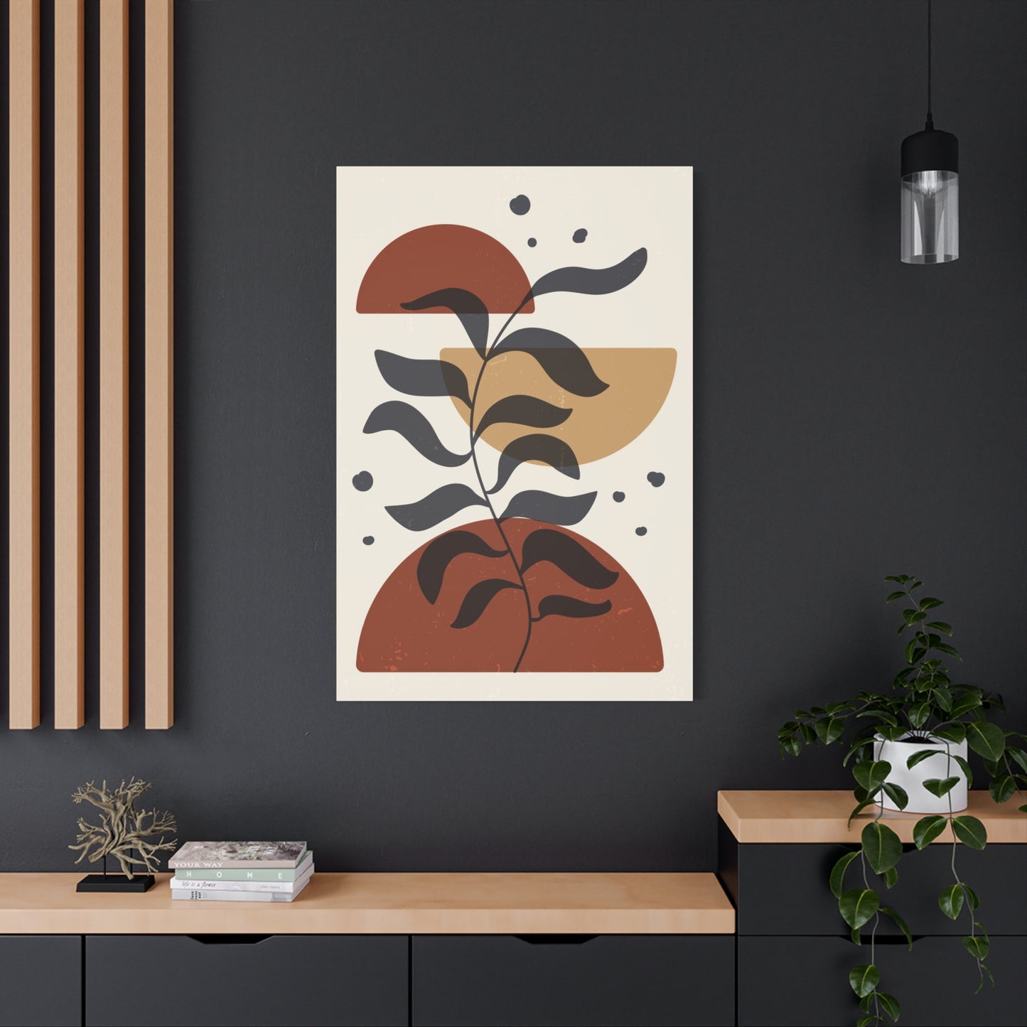
Minimalist interpretations strip away details to reveal the most essential elements of branch forms and geometric patterns. A minimalist piece might feature a single branch rendered as a simple line against a neutral background, intersected by one geometric shape in a contrasting earth tone. These works embody the principle that less communicates more, creating powerful visual statements through restraint and careful editing. They suit spaces where simplicity and calm are paramount, and where the artwork should provide visual interest without dominating the environment.
Graphic design-influenced pieces approach Branch And Geometry Earth Tones Wall Art through the lens of contemporary illustration and digital creation. These works often feature clean vector-style lines, flat color areas, and precise geometric shapes arranged in balanced compositions. The branch elements might be stylized into decorative patterns or reduced to essential silhouettes. The earth-toned palette appears in carefully selected color blocks that create striking contrast and visual rhythm. These pieces appeal to individuals with modern sensibilities who appreciate the clean aesthetic of graphic design.
Understanding the Foundational Principles That Create Visual Harmony
Successful Branch And Geometry Earth Tones Wall Art relies on mastery of fundamental design principles that govern how humans perceive and respond to visual compositions. These principles operate whether consciously recognized or not, shaping the viewer's experience and determining whether a piece feels balanced, dynamic, harmonious, or discordant.
Balance addresses how visual weight distributes across a composition. Symmetrical balance creates formal, stable arrangements where elements mirror each other across a central axis. Asymmetrical balance achieves equilibrium through careful placement of different elements—a large branch form on one side might balance against several smaller geometric shapes on the other. The earth-toned palette contributes to balance through value relationships, with darker tones carrying more visual weight than lighter ones. Radial balance, though less common, can create striking effects when branch forms emanate from a central point, intersected by concentric geometric patterns.
Contrast generates visual interest and directs viewer attention. In Branch And Geometry Earth Tones Wall Art, contrast manifests through multiple dimensions. The organic, irregular nature of branch forms contrasts with the precise, ordered quality of geometric shapes. Rough, textured surfaces contrast with smooth, flat areas. Darker earth tones contrast with lighter ones, creating value patterns that guide the eye through the composition. Contrast between positive and negative space—areas containing imagery versus empty background—defines forms and creates breathing room within complex compositions.
Rhythm establishes movement and flow, preventing static arrangements that fail to engage viewers. Artists create rhythm through repetition of elements at regular or varied intervals—multiple branch segments recurring throughout the piece, geometric shapes appearing in sequences, or color notes repeating in patterns. This rhythmic quality mirrors natural phenomena like the repetition of branches along a trunk or the recursive patterns found in fractal geometry. Earth tones contribute to rhythm through gradations and transitions, carrying the eye smoothly from one area to another.
Emphasis determines focal points where viewer attention naturally gravitates. A composition might emphasize a particular branch intersection, a striking geometric element, or a color accent that stands out from the predominant earth-toned palette. Creating effective emphasis requires understanding that not all elements can claim equal importance; some must recede to allow others to shine. Strategic placement, size variation, contrast, and isolation all contribute to establishing clear hierarchies of visual importance.
Unity ensures all elements work together cohesively rather than appearing as disconnected parts. The earth-toned palette itself provides unifying force, linking disparate branch and geometric elements through shared color relationships. Consistent application of medium and technique also promotes unity, as does thoughtful repetition of forms, lines, and shapes. Unity doesn't mean monotony; rather, it means that variety and contrast serve the overall composition rather than fragmenting it.
Proportion and scale govern the size relationships between different compositional elements. A small geometric shape near a massive branch form creates dramatic scale contrast and can make each element more impactful. Proportional relationships following mathematical ratios like the golden section often create particularly satisfying compositions, perhaps because these ratios appear throughout nature, including in branch growth patterns. Scale also refers to the artwork's size relative to its display environment, determining whether a piece will serve as a subtle accent or a commanding focal point.
Exploring Material Choices and Their Influence on Artistic Expression
The materials artists select for creating Branch And Geometry Earth Tones Wall Art profoundly influence the final work's character, longevity, and impact. Understanding these material considerations helps collectors make informed decisions and appreciate the craft behind each piece.
Canvas remains the most traditional substrate for painted works, offering texture that adds depth and interest. Cotton canvas provides an economical option with good archival qualities when properly primed, while linen canvas offers superior durability and a finer weave that supports detailed work. The canvas texture becomes part of the artistic statement, visible through paint layers and contributing to the overall aesthetic. Some artists leave portions of canvas exposed, allowing its natural cream or tan color to function as part of the earth-toned palette.
Wood panels present another popular substrate choice, particularly for pieces emphasizing natural materiality. Birch plywood provides a smooth, stable surface that doesn't warp with humidity changes. Hardboard offers similar stability at lower cost. Some creators use reclaimed wood, incorporating existing weathering, grain patterns, and coloration into their compositions. The wood itself becomes part of the artwork's statement about nature and sustainability. Wood's natural earth tones might show through paint layers or remain exposed in certain areas, creating organic color variations impossible to achieve with manufactured materials.
Paper supports range from economical drawing papers to luxurious handmade varieties with visible fiber content and deckled edges. Watercolor papers provide excellent surfaces for fluid media, with varying textures from hot-pressed smooth to rough cold-pressed finishes. Heavier weight papers resist buckling when wet media are applied. Some artists create works on paper that are later mounted to rigid backing for framing and display. The paper's inherent color—from bright white to warm cream to natural gray—influences the overall tonal range and may intentionally contribute to the earth-toned palette.
Metal substrates enable contemporary approaches, with aluminum panels providing perfectly flat, stable surfaces that support various application methods. Artists might paint directly onto prepared metal, print imagery using specialized processes, or attach other materials to metal backing. The industrial quality of metal creates interesting tension when depicting organic branch forms, while its durability suits large-scale installations. Some creators leave portions of metal exposed, using its silvery or bronzed finish as part of the compositional color scheme.
Acrylic paint offers versatility, fast drying times, and vibrant color that remains stable over time. Artists can apply acrylics in thin, watercolor-like washes or thick, textured applications. The paint adheres to virtually any properly prepared surface and cleans up with water during application. Acrylics maintain their flexibility after drying, resisting cracking even on flexible substrates. The extensive range of available earth tone pigments allows precise color matching to specific aesthetic visions.
Oil paint provides the traditional medium favored by many fine artists, offering rich color saturation and extended working time that permits complex blending and manipulation. Oils create luminous surfaces as light penetrates multiple layers. The medium requires longer drying times and ventilation during use, but results in exceptionally durable artwork. Earth pigments in oil paint have been used for millennia, connecting contemporary works to ancient artistic traditions.
Watercolor delivers transparent, delicate effects particularly suited to capturing light and atmospheric qualities. The medium's fluidity creates organic, unpredictable effects that complement branch imagery's natural character. Watercolors work best on paper and require careful technique since mistakes prove difficult to correct. The earth-toned palette finds beautiful expression in watercolor, with pigments like burnt sienna, raw umber, and yellow ochre producing glowing, translucent layers.
Mixed media approaches combine multiple materials for enhanced visual and tactile interest. Artists might incorporate collage elements, found objects, textile components, or dimensional geometric forms crafted from wood, metal, or acrylic. Natural materials like bark, leaves, or actual small branches occasionally appear, though preservation concerns must be addressed. Gold leaf or metallic foils add luxurious accents while maintaining earth-toned aesthetic through bronze, copper, or muted gold hues.
Mastering Color Theory Specific to Earth-Toned Palettes
Working effectively within earth-toned color schemes requires understanding both general color theory principles and the specific characteristics of these natural hues. While earth tones might seem limited compared to the full spectrum, they offer remarkable subtlety and expressive range.
Earth tones occupy specific positions on the color wheel, predominantly clustering in the warm sector. Browns represent neutralized oranges—orange hues with added complementary blue to reduce saturation. Terracottas and siennas retain more orange identity, reading as warm, inviting hues. Ochres lean toward yellow, though muted compared to pure yellows. Umbers shift toward cooler territory, with green or blue undertones that create sophisticated, complex hues. Taupes and grays bridge warm and cool, offering neutral elements that mediate between more assertive colors.
Understanding undertones proves essential when working with earth tones. Two browns might appear similar at first glance, but one contains red undertones while the other leans green. When placed together, these subtle differences become apparent and significantly impact the overall harmony. Successful compositions carefully consider these undertones, either maintaining consistency throughout the palette or deliberately contrasting warm and cool versions of similar values to create subtle tension.
Value—the lightness or darkness of colors—becomes particularly important in earth-toned work since saturation remains relatively low throughout the palette. High contrast between light and dark earth tones creates drama and defines forms. Low contrast produces subtle, sophisticated effects requiring careful observation to fully appreciate. The value structure underlying a composition determines its readability and impact from a distance, while color relationships become apparent upon closer viewing.
Monochromatic earth-tone schemes use variations of a single hue—different values and saturations of brown, for instance. These compositions achieve unity through color consistency while creating interest through value contrast and textural variation. Branch forms might appear in deep umber against backgrounds of pale tan, with geometric elements in mid-value browns providing intermediate tones. The restricted palette emphasizes form, pattern, and composition rather than color variety.
Analogous earth-tone schemes combine adjacent colors from the warm portion of the color wheel—perhaps ochres, siennas, and umbers, or terracottas, rust reds, and browns. These harmonious combinations feel naturally related, creating cohesive, easy-to-appreciate compositions. The slight hue variations provide enough diversity to maintain interest while the overall warmth creates welcoming, comfortable atmospheres.
Complementary approaches introduce cool elements to balance predominantly warm earth tones. A muted blue-gray or sage green provides contrast against browns and ochres, creating visual excitement while maintaining overall subtlety. These cooler accents might appear in geometric elements, offering contrast against organic branch forms rendered in warm earth tones. The complementary relationship creates vibration and energy without requiring highly saturated colors.
Triadic schemes using earth-toned versions of three equidistant color wheel positions create dynamic yet balanced compositions. Muted yellow-orange ochres, blue-green grays, and red-brown siennas form such a triad. These combinations offer more variety than analogous schemes while maintaining harmony through consistent low saturation. Geometric elements in one color might contrast with branch forms in another, unified by backgrounds in the third.
Creating depth through color requires manipulating temperature and value. Warm earth tones advance visually, appearing closer to viewers, while cool earth tones recede. Artists use this principle to create spatial illusion, rendering foreground branch elements in warmer browns and terracottas while pushing background geometric forms into cooler taupes and grays. Lighter values also advance in some contexts, while darker values recede, allowing manipulation of perceived depth through careful value orchestration.
Investigating the Symbolic Meanings Embedded in Natural Imagery
Branch And Geometry Earth Tones Wall Art carries layers of meaning beyond purely aesthetic considerations. These symbolic associations enrich the viewing experience, adding conceptual depth that resonates with human experiences and archetypal patterns.
Trees and branches hold profound significance across cultures and spiritual traditions. The tree of life appears in mythologies worldwide, representing connection between earth and heaven, physical and spiritual realms, conscious and unconscious aspects of being. Branches extending outward symbolize growth, expansion, and reaching toward potential. Their connection to the trunk represents rootedness and foundation, while seasonal cycles of budding, leafing, and shedding reflect life's continuous transformation.
The branching pattern itself embodies the principle of differentiation—the single trunk dividing into major limbs, which subdivide into smaller branches, which further divide into twigs. This pattern mirrors numerous natural and human phenomena: river systems, blood vessels, neural networks, family trees, organizational structures, and decision-making processes. Viewing branch imagery can unconsciously remind viewers of these patterns, evoking feelings of connection to larger systems and networks.
Individual tree species carry specific symbolic associations. Oak branches represent strength, endurance, and wisdom. Willow branches suggest flexibility, emotion, and intuition. Pine branches symbolize longevity, resilience, and prosperity. Birch branches connect to renewal, purification, and new beginnings. Artists may deliberately choose specific branch types to invoke these associations, adding layers of meaning for viewers familiar with plant symbolism.
Geometric forms likewise carry symbolic weight accumulated through centuries of use in art, architecture, and spiritual practices. Circles represent wholeness, unity, cycles, and perfection—concepts naturally complementing the cyclical nature of tree growth and seasonal change. Squares and rectangles suggest stability, order, and human construction, creating interesting tension when paired with organic branch forms. Triangles evoke direction, dynamic tension, and trinitarian concepts. Hexagons connect to natural patterns like honeycomb structures, bridging geometric precision and organic design.
The golden ratio and Fibonacci sequence, mathematical relationships often incorporated into geometric elements, appear throughout nature, including in branch growth patterns and spiral arrangements of leaves. When artists consciously reference these proportions, they create works that feel "right" in ways viewers may not consciously recognize but nonetheless sense. This mathematical harmony resonates with human aesthetic perception, possibly because our brains evolved recognizing these patterns as indicators of healthy natural environments.
Sacred geometry traditions view specific geometric forms as fundamental to the universe's structure, carrying spiritual significance. The Flower of Life pattern, composed of overlapping circles, appears in Branch And Geometry Earth Tones Wall Art that combines circular geometric elements with organic forms. The Sri Yantra, built from interlocking triangles, inspires compositions balancing angular geometric precision with the natural world's flowing forms. These references add contemplative depth for viewers attuned to such symbolism.
Earth tones themselves symbolize grounding, stability, and connection to the physical world. In color psychology, brown suggests reliability, comfort, and natural wisdom. These associations make earth-toned artwork particularly appropriate for spaces intended for rest, contemplation, or focused work. The colors literally ground viewers, counteracting the tendency of modern life to become abstracted from physical reality and natural cycles.
The combination of all these symbolic elements creates artwork that operates on multiple levels simultaneously. A piece might function purely as attractive decoration for a casual viewer while offering contemplative depth to someone exploring its symbolic dimensions. This layered quality contributes to the enduring appeal of Branch And Geometry Earth Tones Wall Art, as viewers discover new meanings and connections over time.
Determining Ideal Placement Strategies Within Various Room Types
Successfully incorporating Branch And Geometry Earth Tones Wall Art into living spaces requires thoughtful consideration of room function, existing design elements, lighting conditions, and traffic patterns. Strategic placement maximizes both aesthetic impact and the psychological benefits these pieces offer.
Living rooms serve as gathering spaces where families socialize, entertain guests, and relax. Branch And Geometry Earth Tones Wall Art functions beautifully as a living room focal point, particularly above seating arrangements. A substantial piece positioned above a sofa becomes a natural conversation starter while providing visual interest for seated occupants. The calming earth-toned palette prevents the artwork from overwhelming the space, while branch imagery brings nature's soothing influence indoors. Geometric elements add structure that complements typical living room furnishings without competing for attention.
Scale matters significantly in living room placement. Artwork should fill approximately two-thirds to three-quarters of the furniture piece's width when hung above it. Too-small pieces look lost and fail to anchor the space effectively, while oversized works can overwhelm. Gallery wall arrangements offer alternatives to single large pieces, combining multiple smaller works into cohesive compositions. When creating gallery walls with Branch And Geometry Earth Tones Wall Art, maintaining consistent framing and matting creates unity, while varying orientations and sizes adds dynamic energy.
Bedrooms benefit enormously from the tranquil, grounding qualities of Branch And Geometry Earth Tones Wall Art. The primary wall behind the bed provides ideal placement, creating a restful focal point visible upon entering the room. The neutral earth-toned palette promotes relaxation rather than stimulation, supporting better sleep quality. Branch imagery unconsciously connects sleepers to natural cycles of rest and renewal. Geometric elements provide subtle structure without the harsh angularity that might disturb rest.
Consider artwork size in relation to bed dimensions when selecting pieces for bedrooms. The artwork's width should not exceed the bed's width, and ideally spans about two-thirds of that distance. Hanging height should position the piece's center approximately 58 to 60 inches from the floor, following standard museum practice, though adjustments may be necessary based on ceiling height and personal preference. Bedrooms with lower furniture might benefit from slightly lower placement to maintain visual connection between artwork and furnishings.
Dining rooms and eating spaces present excellent opportunities for Branch And Geometry Earth Tones Wall Art, particularly in contemporary homes with open floor plans where dining areas adjoin living spaces. The earth-toned palette bridges different functional zones while maintaining visual continuity. Artwork in dining areas should withstand occasional viewing during meals without becoming distracting—earth tones' neutral quality prevents this problem while adding warmth and sophistication.
Position artwork where it's visible from primary seating but doesn't compete with the dining experience itself. Consider placing pieces on perpendicular walls rather than directly in diners' sightlines when seated. Scale should accommodate the viewing distance—dining rooms often allow for larger pieces since viewers typically remain several feet away. Lighting considerations become particularly important in dining areas; artworks should be illuminated to prevent them from disappearing during evening meals with dimmed ambient lighting.
Home offices and workspaces gain multiple benefits from Branch And Geometry Earth Tones Wall Art. The biophilic elements reduce stress and improve focus, while geometric components satisfy the mind's desire for order and pattern. Earth tones provide visual interest without the stimulation or distraction bright colors might create. Position artwork within view of workspaces but not directly behind computer monitors where glare might become problematic.
Consider placing artwork where it's visible during brief breaks from screen-focused work, allowing the eyes and mind to rest on something at a different focal distance. This practice reduces eye strain and mental fatigue. The contemplative quality of well-executed branch and geometric compositions makes them ideal for these restorative micro-breaks throughout the workday. Multiple smaller pieces might work better than one large work in office settings, providing variety without overwhelming the space.
Entryways and foyers create first impressions for arriving guests while setting the tone for the entire home. Branch And Geometry Earth Tones Wall Art in these transitional spaces offers welcoming warmth while establishing an aesthetic sensibility that prepares visitors for the interior design that follows. The natural earth-toned palette works across seasons, never appearing dated or overly trendy. Branch imagery symbolically welcomes guests like trees greeting visitors to a forest path.
Hallways and corridors transform from neglected spaces into gallery-like experiences with thoughtful artwork placement. Long, narrow passages particularly benefit from series of related pieces creating rhythm and movement. Branch And Geometry Earth Tones Wall Art lends itself well to sequential installations where variations on similar themes guide viewers through the space. Consider creating a progression from lighter to darker tones, or from organic branch-dominated compositions toward increasingly geometric pieces.
Bathrooms, often overlooked for artwork, become spa-like retreats with appropriate pieces. Branch And Geometry Earth Tones Wall Art suits bathrooms perfectly, as earth tones complement natural materials like stone, wood, and ceramic commonly found in these spaces. Moisture considerations require proper framing with sealed backing or use of moisture-resistant materials. The nature connection these pieces provide enhances the cleansing, renewal function bathrooms serve. Small to medium-scale works prevent overwhelming limited wall space while adding personality and polish.
Illuminating Artwork Effectively Through Strategic Lighting Choices
Proper lighting dramatically impacts how Branch And Geometry Earth Tones Wall Art appears and functions within spaces. Thoughtful illumination reveals subtle details, enhances colors, and ensures artwork remains visible across different times of day and lighting conditions.
Natural daylight represents ideal illumination for viewing artwork, revealing colors accurately and providing even, diffused light that minimizes glare. However, natural light poses conservation concerns. Ultraviolet radiation causes fading, while temperature fluctuations accompanying direct sunlight accelerate deterioration. Position Branch And Geometry Earth Tones Wall Art to receive indirect natural light rather than direct sun exposure. North-facing walls in northern hemisphere locations receive consistent, indirect light throughout the day. Windows with UV-filtering film or cellular shades protect artwork while allowing natural illumination.
Track lighting offers flexible solutions for illuminating artwork, particularly in spaces with multiple pieces requiring individual attention. Adjustable fixtures allow precise beam direction, highlighting specific works while controlling light spread. LED track fixtures provide excellent color rendering without the heat and UV radiation of older incandescent or halogen options. Position track lights at approximately 30-degree angles to artwork surfaces to minimize glare, adjusting as needed based on surface texture and reflectivity.
Picture lights mounted directly above or below artwork provide focused illumination that travels evenly across the surface. These dedicated fixtures suit formal settings and valuable pieces deserving special attention. LED picture lights offer energy efficiency and longevity without heat damage risks. Adjustable arm lengths accommodate different artwork sizes, while dimming capabilities allow intensity modulation for different times and purposes. Choose fixtures with color temperatures between 2700K and 3000K to complement earth tones' warm character.
Recessed ceiling fixtures create clean, unobtrusive lighting when properly positioned. Standard recessed lights create illumination pools that can highlight artwork when strategically placed. Adjustable gimbal trim recessed fixtures offer directionality similar to track lighting while maintaining the streamlined appearance of fixed recessed lights. Calculate placement carefully to ensure adequate coverage without hot spots or dark corners. Multiple fixtures may be necessary for larger pieces or gallery wall arrangements.
Ambient room lighting affects artwork appearance significantly, even when dedicated artwork lighting exists. Warm white light sources complement earth-toned palettes, enhancing their natural warmth and creating cohesive color schemes. Cool white or daylight bulbs can render earth tones flat or muddy. Consider artwork viewing when selecting bulbs for general room illumination, testing different color temperatures to determine which best supports both functional lighting needs and artwork presentation.
Dimming capabilities increase lighting versatility, allowing adjustments for different activities and times of day. Full brightness might serve daytime viewing and entertaining, while lower levels create ambiance for evening relaxation. Dimming also permits tuning light intensity to specific artwork needs—pieces with subtle tonal variations benefit from brighter illumination revealing details, while high-contrast works remain impactful at lower light levels.
Layer multiple lighting types for optimal results. Combine ambient illumination for general visibility with accent lighting highlighting specific artwork. This layered approach creates depth and visual interest while ensuring spaces remain functional. Control different layers independently for maximum flexibility. Smart lighting systems enable preset scenes optimized for different activities, including an "art viewing" mode with carefully calibrated intensities and color temperatures.
Avoid common lighting mistakes that compromise artwork appearance. Overlighting creates glare and washes out subtleties, while underlighting leaves pieces dim and muddy. Incorrect angles cast shadows or create hot spots with excessive brightness. Mismatched color temperatures between different light sources create visual confusion and render colors inaccurately. Lights positioned too close generate heat damage over time, particularly problematic with traditional incandescent fixtures.
Consider seasonal lighting changes, particularly in rooms with significant natural light. Summer's bright, long days may require minimal supplemental lighting, while winter's darkness necessitates stronger artificial illumination. Adjustable systems accommodate these variations, maintaining consistent artwork visibility throughout the year. Automated sensors can adjust artificial lighting based on available daylight, maintaining target illumination levels while conserving energy.
Conclusion
Branch And Geometry Earth Tones Wall Art represents an investment deserving protection through appropriate care practices. Understanding proper handling, cleaning, environmental control, and conservation principles ensures these pieces remain beautiful for decades or generations.
Environmental stability proves crucial for artwork preservation. Temperature fluctuations cause expansion and contraction in materials, leading to cracking, warping, and delamination. Maintain consistent temperatures between 65-75 degrees Fahrenheit, avoiding dramatic swings. Humidity control matters equally, with ideal relative humidity between 40-50 percent. Excessive moisture encourages mold growth and causes paper to buckle, while very dry conditions make materials brittle. Use humidifiers or dehumidifiers as needed to maintain stable conditions, particularly in basements, attics, or seasonal properties.
Direct sunlight poses significant conservation threats despite its appealing illumination qualities. Ultraviolet radiation breaks down organic materials and causes pigment fading, with some colors proving more vulnerable than others. Earth tones generally show good lightfastness compared to brilliant synthetic hues, but extended UV exposure still causes deterioration. Position artwork away from direct sun exposure, use UV-filtering glazing on framed pieces, install window treatments that block harmful rays, or apply UV-filtering window films.
Dust accumulation dulls artwork appearance and can cause abrasion if dragged across surfaces during cleaning. Regular gentle dusting prevents buildup, using soft, clean, dry microfiber cloths or professional-quality feather dusters. Avoid conventional dusters that may snag on textured surfaces or deposit oils. Never use water or cleaning solutions unless you have specific expertise with the materials involved. For valuable or delicate pieces, consider professional conservation cleaning rather than attempting it yourself.
Framing significantly impacts preservation, particularly for works on paper or canvas. Acid-free matting prevents yellowing and foxing (brown spotting). Proper spacing between artwork and glazing prevents condensation problems and keeps the piece from adhering to glass. UV-filtering glass or acrylic glazing blocks harmful radiation. Sealed backing prevents dust, insects, and moisture from entering from behind. Professional framers understand these conservation principles and can advise on appropriate choices for specific pieces.
Canvas works require special considerations. Never hang canvas pieces against exterior walls in humid climates, as moisture migrating through walls can cause mold and mildew. Ensure adequate air circulation behind stretched canvases. Periodically inspect canvas condition, checking for sagging that may require re-stretching, or cracks indicating humidity problems or poor-quality materials. Professional conservators can address canvas issues before minor problems become major damage.
Wooden supports expand and contract with humidity changes, potentially causing paint layers to crack or flake. This natural material response proves unavoidable but can be minimized through environmental control. Pieces on wood panels should be displayed away from heat sources like radiators or fireplaces that create localized temperature and humidity extremes. When transporting wooden works, allow them to acclimate gradually to new environments rather than exposing them to sudden changes.
Handle artwork carefully when moving or cleaning it, using clean, dry hands or white cotton gloves. Support pieces from behind or underneath rather than grasping frames or edges. Never touch artwork surfaces, as skin oils deposit residues that attract dirt and may cause staining. When removing hanging artwork, have two people work together on large, heavy pieces. Use appropriate hanging hardware rated for the work's weight, with substantial safety margins.
Storage requires particular attention for artwork not currently displayed. Store flat whenever possible, with acid-free paper or glassine separating pieces to prevent surface abrasion. Never lean artwork against walls long-term, as warping may result. Climate-controlled storage prevents the extreme temperature and humidity that plague attics, basements, and garage storage. Check stored artwork periodically for pest activity, moisture problems, or other issues. Consider professional art storage for valuable collections.
Document your collection through detailed photographs and written records including artist name, title, date, medium, dimensions, acquisition information, and any condition issues. This documentation serves insurance purposes and helps conservators if restoration becomes necessary. Update records when work is reframed, relocated, or undergoes any treatment. Digital documentation stored in multiple locations protects against loss of physical records.
Insurance coverage protects against theft, damage, or destruction. Standard homeowners or renters policies often have limited fine arts coverage with low per-item limits. Schedule valuable artwork separately, providing documentation of value through purchase receipts, appraisals, or comparable sales. Specialized fine arts insurance offers broader coverage including breakage during shipping, mysterious disappearance, and conservation treatment. Review coverage regularly, updating appraisals as market values change.
Professional conservation services become necessary when damage occurs or preventive treatment is advisable. Seek conservators certified by professional organizations, ensuring they have relevant specialization and ethical standards. Never attempt to repair damaged artwork with conventional adhesives, tapes, or paints, as these typically cause additional damage and complicate future proper treatment. Even minor tears, stains, or losses often benefit from expert attention.
Share