Blue Yellow Flower Abstract Colorful Wall Art & Canvas Prints
Blue Yellow Flower Abstract Colorful Wall Art & Canvas Prints
Couldn't load pickup availability
Modern Living Spaces Transformed: A Deep Dive Into the Impact of Blue Yellow Flower Abstract Colorful Wall Art
The realm of interior decoration has witnessed a remarkable transformation over recent decades, with homeowners and design enthusiasts increasingly gravitating toward pieces that combine natural inspiration with artistic interpretation. Among the myriad options available in the contemporary market, botanical-themed visual displays featuring vibrant chromatic palettes have emerged as particularly compelling choices for those seeking to infuse their living environments with energy, warmth, and visual interest. These decorative elements serve multiple purposes beyond mere aesthetics, functioning as conversation starters, mood enhancers, and reflective expressions of personal taste and sensibility.
The intersection of nature-inspired imagery and bold color schemes creates a dynamic synergy that resonates with diverse design philosophies, from minimalist Scandinavian approaches to maximalist bohemian expressions. The particular combination of cerulean and golden hues in floral representations carries symbolic weight across numerous cultures while simultaneously offering versatile compatibility with various interior palettes. This comprehensive exploration delves into every conceivable aspect of incorporating such decorative elements into residential and commercial spaces, examining their origins, production methods, placement strategies, psychological impacts, and long-term value propositions.
Understanding The Cultural Significance And Artistic Heritage Behind Floral Imagery In Residential Decoration
Throughout human civilization, flowers have held profound significance as symbols of beauty, transience, celebration, and natural abundance. Ancient Egyptians adorned their palace walls with lotus motifs, while medieval European tapestries frequently featured elaborate garden scenes. The tradition of bringing floral imagery indoors evolved from these historical precedents, adapting to changing artistic movements and cultural sensibilities. During the Impressionist era, artists like Claude Monet revolutionized how flowers were depicted, moving away from rigid botanical accuracy toward emotional interpretation and color exploration.
The transition from classical still-life paintings to contemporary abstract interpretations represents a fascinating evolution in artistic expression. Modern creators have liberated themselves from representational constraints, instead focusing on capturing the essence, energy, and emotional resonance of their botanical subjects. This shift aligns perfectly with contemporary interior design principles that prioritize feeling over literal representation, atmosphere over documentation. When executed with chromatic boldness and compositional confidence, these pieces achieve something remarkable: they simultaneously honor their natural inspiration while transcending it to become standalone works of visual impact.
The democratization of visual decoration through improved production methods has made such pieces accessible to a broader audience than ever before. What once required commissioning a skilled painter or purchasing prohibitively expensive original canvases can now be achieved through various reproduction techniques that maintain artistic integrity while expanding affordability. This accessibility has sparked renewed interest in botanical-inspired decoration across demographic segments, from young professionals furnishing their first apartments to established homeowners refreshing longtime residences.
Exploring The Psychological Influence Of Chromatic Choices In Living Environment Enhancement
Color theory represents a fascinating intersection of science, philosophy, and aesthetic practice, with research consistently demonstrating measurable effects of different hues on human mood, perception, and behavior. The particular combination of azure and amber tones found in certain floral representations carries specific psychological associations that warrant careful consideration when selecting decorative elements for various spaces. Understanding these dynamics enables more intentional, effective choices that align decorative selections with functional goals for each environment.
The cooler spectrum represented by various shades of blue has long been associated with tranquility, contemplation, and emotional stability. Chromatic research indicates that exposure to these tones can actually produce measurable physiological responses, including reduced heart rate and lowered blood pressure. In residential contexts, this makes such hues particularly appropriate for spaces designated for relaxation and restoration, such as bedrooms, reading nooks, and meditation areas. The calming influence helps counterbalance the overstimulation many experience in our constantly connected, information-saturated contemporary existence.
Conversely, warmer tones in the golden and amber range evoke entirely different responses, stimulating energy, optimism, and social engagement. These hues recall sunshine, autumn harvests, and precious metals—associations that carry universally positive connotations across diverse cultural contexts. When incorporated into living spaces, they introduce vitality and warmth that can transform potentially sterile environments into welcoming, animated ones. The strategic placement of such chromatic elements can effectively guide emotional responses to different areas within a home, creating desired atmospheres without relying on explicit messaging.
The brilliance of combining these contrasting chromatic families lies in their complementary nature. Rather than competing for visual dominance, they create a balanced dialogue that offers both stimulation and repose. This dynamic equilibrium proves particularly valuable in multi-functional spaces where occupants engage in diverse activities throughout the day. A living area that serves alternately as workspace, entertainment venue, and relaxation sanctuary benefits from such chromatic versatility, with different elements coming forward depending on lighting conditions, time of day, and viewer attention.
Beyond these general associations, individual responses to specific color combinations vary based on personal history, cultural background, and neurological differences. Some individuals possess heightened chromatic sensitivity, experiencing colors with unusual intensity, while others show relatively muted responses. This variability underscores the importance of personal reaction when selecting decorative elements—theoretical principles provide useful guidance, but individual resonance ultimately determines whether a particular piece succeeds in a given context.
Examining Various Production Methods And Material Considerations For Durable Display Pieces
The contemporary market offers decorative pieces created through numerous production methods, each presenting distinct advantages, limitations, and aesthetic characteristics. Understanding these differences empowers consumers to make informed selections aligned with their priorities regarding authenticity, budget, longevity, and environmental considerations. The landscape has evolved dramatically from the limited options available just decades ago, now encompassing everything from traditional stretched canvas to innovative substrates and printing technologies.
Canvas remains the most traditional and widely recognized substrate for decorative visual pieces, offering texture and depth that closely approximate original painted works. High-quality canvas pieces typically feature gallery-wrapped edges, where the image continues around the frame sides, eliminating the need for additional framing and creating a contemporary, finished appearance. The textile nature of canvas provides a tactile dimension absent from smoother substrates, with visible weave patterns contributing subtle texture that changes subtly with viewing angle and lighting. This dimensional quality helps pieces avoid appearing flat or poster-like, instead presenting substantial visual presence.
The stretching process itself requires considerable skill to achieve proper tension without distortion. Corners demand particular attention, as poorly executed techniques can create visible pleating or looseness that compromises visual integrity. Premium canvas pieces utilize solid wood stretcher bars with cross-bracing on larger dimensions to prevent warping over time. The canvas should be acid-free to prevent yellowing and deterioration, with many manufacturers now offering archival-grade options designed to maintain color fidelity for decades under proper conditions.
Alternative substrates have gained considerable traction in recent years, each offering unique characteristics. Acrylic panels present extraordinary clarity and depth, with light penetrating the material to create luminous, jewel-like effects. The glossy surface intensifies colors, making chromatic elements appear particularly vibrant and saturated. However, this reflectivity can prove problematic in environments with multiple light sources or large windows, as glare may obscure portions of the image under certain conditions. Acrylic also carries substantial weight, requiring robust mounting hardware, particularly for larger dimensions.
Metal prints represent another innovative approach, with specialized dyes infused directly into coated aluminum panels through sublimation processes. The resulting pieces display remarkable sharpness and chromatic intensity, with the metallic substrate contributing subtle shimmer that animates images with dynamic visual interest. These pieces prove exceptionally durable, resistant to moisture, fading, and physical damage beyond what canvas can withstand. The contemporary, polished aesthetic suits modern and industrial design schemes particularly well, though may appear incongruous in traditionally furnished spaces.
Wood panels offer yet another substrate option, combining natural material appeal with substantial durability. The visible grain patterns create unique interactions with printed images, introducing organic variation that ensures each piece displays subtle individuality. Different wood species contribute varying tones and grain characteristics, from the pale uniformity of birch to the rich, pronounced patterns of oak. These pieces typically feature sealed surfaces to protect against moisture and facilitate easy cleaning, while allowing the natural material to contribute its inherent warmth and character.
Paper-based prints represent the most economical approach but vary enormously in quality depending on paper weight, coating, and ink type. Museum-quality fine art papers can rival canvas in longevity and visual impact when properly framed behind protective glazing. However, budget paper options deteriorate rapidly, with colors fading noticeably within months when exposed to direct sunlight. These pieces require proper framing with UV-protective glass to achieve respectable longevity, adding considerably to total investment and complexity.
Discovering Strategic Placement Principles For Maximizing Visual Impact Throughout Different Room Functions
Successful incorporation of decorative visual elements extends far beyond simply hanging something on an available wall section. Thoughtful placement considers numerous factors including viewing angles, lighting conditions, surrounding elements, functional requirements, and architectural features. The same piece that creates dramatic impact in one location might disappear entirely or clash discordantly when positioned elsewhere, even within the same room. Developing placement literacy dramatically enhances the effectiveness of decorative investments.
The relationship between piece dimensions and wall space proves fundamental to successful placement. Interior designers typically recommend that decorative elements occupy between sixty and seventy-five percent of available wall width for optimal visual balance. Pieces significantly smaller than this proportion appear lost and insignificant, failing to command appropriate attention or establish presence. Conversely, oversized pieces can overwhelm spaces, creating visual tension rather than harmony. When working with smaller individual pieces, grouping multiple items creates sufficient visual mass to balance architectural scale.
Height placement deserves equal consideration, with the general principle suggesting center positioning at approximately eye level for standing adults—typically around sixty inches from floor to the piece's center. However, this guideline requires adjustment based on specific contexts. In dining areas where occupants typically sit, lowering placement height by several inches creates more comfortable viewing angles. Hallways often benefit from slightly higher positioning that accommodates the extended viewing distances typical in these transitional spaces. Spaces with unusually high ceilings may require raising pieces proportionally to maintain visual connection with the inhabited zone.
Lighting dramatically influences how decorative pieces appear and whether they achieve intended impact. Natural illumination changes throughout the day, with morning light carrying different qualities than afternoon or evening rays. Observing how light falls on various wall surfaces across different times helps identify optimal placement zones. South-facing walls in northern hemisphere locations receive the most intense light exposure, which can cause accelerated fading but also creates opportunities for dramatic display during golden hour periods. North-facing walls receive more consistent, even illumination that proves ideal for pieces with subtle chromatic nuances that benefit from stable lighting.
Artificial lighting requires equally careful consideration. Spotlights or track lighting can create dramatic emphasis on featured pieces, though improperly angled fixtures may produce glare that obscures viewing. Picture lights mounted above frames provide focused illumination that enhances visibility while creating sophisticated ambiance. However, these fixtures generate heat that can damage certain materials over time, particularly if positioned too closely. LED options minimize heat concerns while offering energy efficiency and extended operational life.
The surrounding context significantly impacts how pieces are perceived. Decorative elements positioned against busy wallpapers or adjacent to numerous competing visual elements struggle to establish presence. Clear visual breathing room allows pieces to command attention effectively. Negative space—empty areas surrounding focal elements—proves just as important as the elements themselves in creating balanced, sophisticated compositions. Overly cluttered arrangements dilute impact, preventing any single element from achieving prominence.
Functional considerations also influence optimal placement. High-traffic areas require mounting at heights that prevent accidental contact and damage. Spaces prone to moisture, such as bathrooms and kitchens, demand careful material selection and protective measures to prevent degradation. Areas receiving intense direct sunlight require UV-protective glazing or substrate choices with enhanced fade resistance. Rooms housing active children or pets benefit from secure mounting hardware that withstands occasional impacts.
Investigating Complementary Design Elements That Create Cohesive Living Environment Aesthetics
Decorative visual pieces never exist in isolation but rather participate in complex relationships with surrounding furnishings, architectural features, textiles, and accessories. Developing sensitivity to these relationships enables creation of cohesive environments where individual elements reinforce rather than compete with each other. This holistic approach distinguishes thoughtfully designed spaces from merely decorated ones, elevating overall impact beyond the sum of individual components.
Furniture selection and arrangement profoundly influence how decorative wall elements register within spaces. The visual weight, style, and coloration of major furniture pieces either harmonize with or clash against wall-mounted displays. A substantial piece featuring bold chromatic elements demands consideration during furniture selection to avoid overwhelming spaces or creating discordant combinations. Conversely, neutral furnishings in grays, taupes, or whites provide flexible foundations that accommodate diverse decorative directions without imposing stylistic constraints.
The scale relationship between furniture and wall decorations deserves attention. A large sectional sofa creates a substantial visual mass that requires proportional wall decoration to maintain balance. Small pieces positioned above such furniture appear insignificant and unmoored. Gallery walls or large-scale singular pieces provide sufficient visual weight to complement substantial furniture. Conversely, delicate furniture with visible legs and open construction pairs beautifully with smaller, more intimate decorative elements that match their refined scale.
Textile selections throughout spaces—from window treatments to throw pillows to area rugs—offer opportunities to echo or complement chromatic elements present in wall decorations. Drawing accent colors from prominent hues in decorative pieces creates subtle visual connections that unify spaces. This doesn't require exact matching, which often appears overly coordinated and lacks sophistication. Instead, working within related chromatic families while varying saturation and tone creates more nuanced, interesting relationships.
Patterns present in textiles and wallpapers interact complexly with visual decorations. Heavily patterned environments risk appearing chaotic when additional complex visual elements enter the composition. In such contexts, simpler decorative pieces with bold chromatic impact but minimal compositional complexity prove most effective. Conversely, minimally patterned environments with solid-colored surfaces welcome more complex, detailed decorative works that provide visual interest in otherwise restrained spaces.
Architectural features including moldings, built-ins, fireplaces, and windows create natural focal points that influence optimal placement of decorative elements. Rather than competing with these features, successful decoration typically works in dialogue with them. A fireplace mantel presents a natural focal zone where decorative pieces complement rather than overwhelm the architectural feature. Windows frame views that may compete with or enhance wall decorations depending on their quality and character. Overlooking uninspiring views may benefit from visually engaging decorative elements that provide alternative focal points, while spectacular vistas deserve respect through restrained decoration that doesn't compete for attention.
Lighting fixtures function as sculptural elements that contribute to overall visual composition. Chandeliers, pendant lights, and sconces possess aesthetic character that influences surrounding decoration choices. Modern geometric fixtures suit contemporary decorative pieces, while traditional crystal chandeliers harmonize with more classical visual elements. Considering existing lighting fixtures during decoration selection prevents stylistic clashes that undermine environmental coherence.
Analyzing Long-Term Value Propositions And Investment Considerations For Quality Decorative Elements
The marketplace offers decorative pieces spanning enormous price ranges, from mass-produced prints costing mere dollars to investment-grade originals commanding thousands or more. Understanding factors that justify these variations empowers more informed purchasing decisions aligned with individual circumstances, priorities, and expectations. While budget constraints legitimately influence choices, the relationship between cost and value proves more complex than simple price comparisons suggest.
Production volume fundamentally impacts pricing, with limited editions and unique pieces commanding premiums over mass-produced alternatives. This scarcity carries intrinsic value for collectors and enthusiasts who appreciate exclusivity. However, for those primarily concerned with aesthetic impact rather than investment or collector value, mass-produced pieces can deliver excellent results at accessible price points. The key distinction lies in understanding personal priorities and selecting accordingly rather than assuming higher prices automatically indicate superior appropriateness for individual needs.
Material quality and construction methods significantly impact longevity and maintenance requirements. Premium canvas pieces utilizing archival inks and acid-free materials maintain chromatic fidelity for decades, while budget alternatives may show noticeable fading within months. This durability differential can reverse apparent cost advantages, with inexpensive pieces requiring frequent replacement while quality alternatives provide decades of service. Calculating cost-per-year often reveals better value in moderately priced quality pieces versus rock-bottom alternatives.
The source and reputation of creators and sellers influences both initial pricing and long-term satisfaction. Established creators with proven track records command premiums reflecting their refined techniques and reliable quality. However, emerging talent often offers compelling value propositions, with prices yet to reflect their developing reputations. Online marketplaces democratize access to diverse creators worldwide, though navigating quality variations requires careful evaluation of samples, reviews, and seller communications.
Framing significantly impacts total investment for pieces requiring this treatment. Custom framing from specialized shops delivers precisely tailored results with premium materials but carries substantial costs that may equal or exceed the piece itself. Standard-size pieces that accommodate ready-made frames offer considerable savings while still providing protection and professional presentation. For canvas pieces with gallery-wrapped edges, framing becomes optional, reducing complexity and expense while supporting contemporary aesthetic preferences.
Resale potential varies dramatically based on numerous factors including creator reputation, edition size, condition, and market trends. Original works from recognized creators may appreciate substantially, while mass-produced prints typically hold minimal resale value. For most consumers, decorative pieces should be evaluated primarily on aesthetic criteria and personal enjoyment rather than investment potential. However, those specifically interested in collecting should research market dynamics, authenticate pieces carefully, and maintain proper documentation supporting provenance and authenticity.
Environmental considerations increasingly influence purchasing decisions as consumers develop awareness regarding production impacts. Locally sourced pieces reduce transportation emissions while supporting regional creators and economies. Prints utilizing eco-friendly inks and sustainable substrates minimize chemical exposure and resource depletion. Some manufacturers now offer carbon-neutral shipping or contribute portions of proceeds to environmental causes. While these considerations may add marginally to costs, many consumers find value in aligning purchases with personal environmental commitments.
Revealing Effective Cleaning And Preservation Practices For Ensuring Lasting Beauty
Proper care extends the lifespan and maintains the appearance of decorative pieces, protecting investments and preserving aesthetic impact. Different materials and production methods demand specific approaches, with techniques appropriate for one type potentially damaging to another. Developing literacy regarding proper care practices prevents inadvertent damage while ensuring pieces retain their visual appeal throughout many years of display.
Canvas pieces require gentle handling that avoids direct contact with printed surfaces. Dust accumulation should be addressed through soft, dry brushes or microfiber cloths used with minimal pressure to avoid abrading delicate ink layers. Vacuum cleaners with brush attachments set to low suction provide effective dust removal for larger pieces, though care must be taken to avoid direct surface contact. Moisture should be avoided entirely on unprotected canvas, as water exposure can cause swelling, warping, and potential mold growth in humid conditions.
For pieces protected behind glass or acrylic glazing, cleaning the protective surface requires appropriate techniques to avoid streaking and scratching. Glass cleaner should be applied to cleaning cloths rather than directly on surfaces, preventing liquid from seeping behind glazing and potentially damaging underlying materials. Microfiber cloths prove superior to paper towels, which may leave lint and create fine scratches over time. Acrylic requires special consideration, as it scratches more easily than glass and proves vulnerable to chemical damage from inappropriate cleaners. Specialized acrylic cleaners or mild soap solutions provide safer alternatives to glass cleaners containing ammonia.
Metal print surfaces typically feature sealed coatings that facilitate easy cleaning with slightly damp cloths. Their durability permits more assertive cleaning than canvas or paper, though abrasive materials should still be avoided to prevent scratching polished surfaces. These pieces prove particularly suitable for environments where regular cleaning is necessary, such as kitchens or commercial settings where air quality concerns demand frequent surface maintenance.
Wood-based pieces benefit from dusting with soft, dry cloths, with occasional treatment using wood-appropriate cleaning products that nourish underlying materials while removing accumulated grime. The natural material requires slightly more attentive care than synthetic alternatives but rewards this attention with developing character and warmth. Sealed surfaces resist moisture damage but shouldn't be saturated during cleaning, as prolonged exposure can compromise protective coatings.
Environmental controls provide the most effective long-term preservation. Maintaining consistent temperature and humidity levels prevents the expansion and contraction cycles that stress materials and mounting hardware. Ideal conditions typically range between sixty-eight and seventy-five degrees Fahrenheit, with relative humidity between forty and fifty-five percent. Dehumidifiers in damp climates and humidifiers in arid regions help maintain stable conditions. However, most residential environments fall within acceptable ranges without specialized equipment, particularly in climate-controlled living spaces.
Ultraviolet radiation represents the primary threat to long-term chromatic stability. Even pieces utilizing fade-resistant inks gradually deteriorate under sustained sun exposure. UV-filtering window films provide effective protection without significantly impacting visible light transmission or views. Alternatively, strategic placement avoiding direct sun exposure offers simple, cost-free protection. For particularly valuable or sentimental pieces, museum-quality UV-protective glazing provides premium protection, though at significant cost.
Periodic inspection catches developing issues before they cause significant damage. Checking mounting hardware ensures secure attachment, preventing falls that could damage both pieces and surrounding areas. Canvas pieces should be examined for loosening, which can be addressed through professional restretching. Signs of insect activity, particularly in organic materials like canvas and wood, demand immediate attention to prevent extensive damage. Professional conservation services address serious issues beyond typical maintenance, though preventive care minimizes the likelihood of requiring such interventions.
Exploring Diverse Stylistic Expressions Within Botanical-Inspired Visual Decoration
The broad category of nature-inspired visual decoration encompasses remarkable stylistic diversity, from photorealistic botanical studies to wildly abstract interpretations that retain only conceptual connections to their organic inspiration. Understanding this spectrum enables more nuanced selection aligned with personal aesthetic preferences and existing environmental contexts. No single approach proves objectively superior; rather, different expressions suit different sensibilities, spaces, and purposes.
Highly detailed, scientifically accurate botanical illustrations represent one end of this spectrum, continuing centuries-old traditions of documenting plant species through precise visual records. These pieces appeal to those appreciating craft, accuracy, and educational dimensions alongside aesthetic qualities. The meticulousness evident in such works demonstrates respect for subjects and commitment to excellence that resonates with viewers valuing these qualities. In spaces furnished with traditional sensibilities or academic atmospheres, such pieces feel particularly appropriate.
Impressionistic interpretations loosen representational constraints, prioritizing atmospheric qualities, emotional responses, and chromatic explorations over botanical accuracy. These pieces capture the feeling of encountering flowers in natural settings rather than cataloguing their structural details. Soft edges, visible brushwork, and chromatic harmonies create dreamlike qualities that evoke rather than document. Such approaches suit spaces seeking gentle, contemplative atmospheres where literal representation would feel too rigid or academic.
Abstract expressionism takes further liberties, using floral forms as departure points for compositions prioritizing color relationships, gestural energy, and compositional dynamics over recognizable imagery. Petals might dissolve into chromatic fields, stems transform into dynamic linear elements, and overall compositions balance representational hints with abstract assertion. These pieces demand more active viewer engagement, rewarding contemplation with discoveries that emerge gradually rather than immediately apparent. In contemporary spaces with adventurous design sensibilities, such works feel appropriately bold and challenging.
Minimalist botanical representations strip subjects to essential elements, eliminating extraneous details while retaining recognizable identity. Clean lines, simplified forms, and restrained chromatic palettes create sophisticated results aligned with modern design philosophies emphasizing clarity and intentional restraint. These pieces complement spare interiors where busy, complex works would overwhelm carefully cultivated simplicity. The apparent ease of minimalist execution belies the difficulty of determining which elements prove essential and which can be eliminated without losing essential character.
Pop art approaches inject bold graphics, unusual color choices, and cultural commentary into botanical subjects, creating playful, energetic results that challenge conventional representation. Flowers might appear in unexpected hues, with graphic outlines and flat color fields replacing naturalistic modeling. These pieces bring humor and irreverence to subjects often treated with reverence, appealing to those who appreciate wit alongside beauty. In youthful, energetic spaces or commercial environments seeking memorable visual branding, such approaches deliver appropriate impact.
Watercolor techniques introduce delicate transparency and flowing spontaneity to botanical subjects, creating effects ranging from subtle and ethereal to bold and dramatic depending on execution. The medium's inherent unpredictability introduces organic variation that mechanical reproduction cannot fully capture, contributing to pieces feeling alive and gestural rather than stiff and controlled. These works suit romantic sensibilities and spaces seeking gentle femininity without veering into cloying sweetness.
Mixed media approaches combine multiple techniques and materials within single compositions, creating textural variety and visual complexity that rewards close examination. Collaged elements, dimensional components, and varied mark-making create rich surfaces that change with viewing distance and angle. These pieces function as both visual focal points from across rooms and detailed studies from near distances, offering multiple levels of engagement. In eclectic environments that celebrate diversity and creative experimentation, such works feel particularly at home.
Investigating The Symbolism And Cultural Meanings Associated With Specific Floral Types
Beyond their immediate visual appeal, flowers carry rich symbolic associations accumulated across centuries of human culture. Different societies have assigned varied meanings to particular blooms, creating complex vocabularies of floral symbolism that informed everything from romantic courtship to diplomatic communications. While contemporary viewers may not consciously recognize these associations, they often register subconsciously, contributing to emotional responses and perceived appropriateness in different contexts. Understanding these symbolic dimensions adds depth to decorative selections.
Throughout European traditions, roses have carried particularly elaborate symbolic systems, with different colors conveying distinct messages. The language of flowers, or floriography, reached peak popularity during Victorian times when social conventions restricted direct emotional expression. Flowers provided coded communications that circumvented propriety constraints, with entire conversations conducted through carefully selected bouquets. While contemporary culture largely abandons such elaborate systems, residual associations persist, influencing how different flowers register emotionally.
Eastern traditions developed parallel but distinct symbolic associations, with particular flowers holding profound spiritual and philosophical significance. Cherry blossoms in Japanese culture represent the beautiful transience of existence, their brief flowering period metaphorically embodying Buddhist teachings regarding impermanence. Lotus flowers in Hindu and Buddhist traditions symbolize spiritual enlightenment and purity, as they emerge pristine from murky waters. These associations have spread globally through cultural exchange, enriching the symbolic vocabulary available to contemporary viewers.
Sunflowers carry associations of loyalty, adoration, and longevity across diverse cultures, their heliotropic behavior of tracking the sun across the sky inspiring metaphorical interpretations regarding faithfulness and constancy. Their substantial size and bold appearance make them natural subjects for large-scale decorative pieces, while their cheerful aspect contributes to uplifting emotional impacts. In domestic spaces, sunflower imagery introduces warmth and positive energy that feels welcoming and unpretentious.
Lilies present more complex associations, varying significantly across cultural contexts. While Christian traditions associate white lilies with purity and frequently feature them in depictions of the Virgin Mary, some Asian cultures connect them with death and mourning, making them inappropriate for casual decoration. Such cultural variations underscore the importance of considering audience and context when selecting specific floral subjects for display.
Poppies carry dual associations of remembrance and sleep, connected both to their role in military memorial traditions and their historical use in medicines and intoxicants. The vivid crimson of common field poppies creates dramatic visual impact while carrying somber undertones that may feel inappropriate in lighthearted contexts. However, in spaces honoring memory or providing contemplative sanctuary, their symbolic depth adds meaningful resonance.
Tulips historically carried enormous monetary value during the famous Dutch tulip mania of the seventeenth century, when rare bulbs commanded prices exceeding annual wages. While this speculative bubble eventually collapsed, tulips retained associations with wealth, cultivation, and refined taste. Their clean, simple forms and remarkable color range make them popular subjects for contemporary decoration, with their historical associations adding subtle sophistication.
Abstract floral interpretations partly liberate viewers from specific symbolic associations, allowing more universal emotional responses based on chromatic and compositional qualities rather than particular flower identities. This freedom proves valuable when seeking pieces with broad appeal unconstrained by potentially limiting symbolic baggage. However, even abstracted botanical forms often retain subtle cues that reference particular flower types, carrying symbolic associations for attentive viewers.
Examining The Relationship Between Chromatic Theory And Spatial Perception In Decorated Environments
Beyond their emotional and symbolic dimensions, colors demonstrate measurable effects on spatial perception, influencing how environments feel regarding size, temperature, and character. Strategic chromatic deployment through decorative elements and complementary design choices can dramatically transform how spaces register experientially, effectively reshaping rooms without structural modifications. Understanding these perceptual dynamics enables more intentional, effective decorative choices that address spatial challenges while pursuing aesthetic goals.
Cooler hues including blues, greens, and certain purples demonstrate recessive qualities, appearing to retreat from viewers and increase perceived spatial depth. Walls painted in cool tones seem farther away than those in warm colors, making rooms feel more spacious. Similarly, decorative pieces dominated by cool chromatic ranges contribute to expanded spatial perception when positioned strategically. This proves particularly valuable in compact urban dwellings where actual square footage constrains occupant comfort. Introducing cool-toned decorative elements helps counteract claustrophobic feelings without requiring costly renovations.
Conversely, warm hues including reds, oranges, and yellows demonstrate advancing qualities, appearing closer to viewers and reducing perceived spatial depth. While this might seem disadvantageous, it offers valuable tools for making overlarge, impersonal spaces feel more intimate and welcoming. Vast loft apartments or open-concept homes sometimes feel uncomfortably cavernous, lacking the comforting enclosure that defines successful domestic spaces. Warm-toned decorative elements help define and humanize such environments, creating psychological boundaries that increase comfort even without physical barriers.
The particular combination of cool blues and warm yellows present in certain floral pieces provides remarkable versatility, allowing them to function effectively across diverse spatial contexts. The chromatic balance prevents pieces from pushing too strongly toward either spatial expansion or contraction, instead maintaining comfortable equilibrium. This makes such pieces appropriate for rooms of varying sizes and proportions, adapting to spatial realities without fighting against them or exaggerating problematic qualities.
Chromatic saturation influences spatial perception independently from hue selection. Highly saturated, vibrant colors demand attention and appear to advance toward viewers regardless of whether they fall within typically warm or cool ranges. Brilliant turquoise, though technically a cool color, can demonstrate surprising visual assertiveness when highly saturated. Conversely, muted, desaturated versions of typically warm colors may recede more than expected. This saturation dimension provides additional control over spatial perception beyond simple warm-cool dynamics.
Value relationships—the relative lightness or darkness of chromatic elements—equally influence spatial perception. Light-valued colors expand spaces while dark values contract them. White walls make rooms feel larger than black walls, independent of hue selection. Decorative pieces featuring predominantly light values integrate more subtly into spaces, while dark-valued works create stronger focal points that organize attention and define zones within open areas. Strategic deployment of value contrasts creates visual hierarchy that guides experience through environments.
Chromatic temperature influences perceived ambient temperature through psychological associations. Blue-dominated spaces actually feel several degrees cooler than physically identical orange-dominated environments, a measurable phenomenon that influences thermal comfort perceptions. In warm climates or spaces receiving substantial solar heat gain, cool-toned decoration contributes to perceived comfort even without changing actual temperature. Conversely, spaces in cool climates benefit from warm chromatic elements that psychologically counteract chilly conditions.
The proportion of different chromatic elements within spaces influences overall impact. A small cool-toned decorative piece struggles to cool the perceived temperature of a predominantly warm environment. Effective chromatic influence requires sufficient presence to register meaningfully within the total visual field. This can be achieved either through large singular elements or multiple smaller pieces distributed throughout spaces, collectively reaching critical mass for perceptual impact.
Discovering Diverse Arrangement Strategies For Multiple-Piece Displays That Create Visual Harmony
While substantial single pieces create straightforward focal points, arrangements of multiple smaller items offer increased flexibility and visual interest when executed thoughtfully. However, such arrangements demand careful planning to avoid appearing cluttered or chaotic. Understanding compositional principles that govern successful multi-piece displays enables creation of sophisticated, cohesive arrangements that exceed the impact of individual components while maintaining visual order.
Gallery wall arrangements have gained enormous popularity in recent years, transforming previously neglected wall expanses into curated displays that communicate personality and sophistication. Successful gallery walls balance several competing considerations: sufficient visual mass to command presence, clear organizational logic that prevents appearing random, and appropriate spacing that allows individual pieces to register distinctly while contributing to collective impact. Achieving this balance requires experimentation and willingness to adjust initial plans based on actual visual results.
Symmetrical arrangements provide the most straightforward organizational approach, with pieces positioned in balanced configurations around central axes. This creates formal, orderly impressions suitable for traditional interiors and contexts demanding restrained professionalism. However, strict symmetry can appear rigid and uninviting if executed without sensitivity to subtle variations that introduce warmth. Perfect symmetry rarely occurs in nature, and spaces that mirror this natural irregularity often feel more comfortable than those imposing geometric perfection.
Asymmetrical arrangements offer increased dynamism and contemporary appeal, though they demand more sophisticated compositional skills to achieve successful balance. Rather than mirroring elements across central axes, asymmetric compositions balance visual weight more intuitively, with larger elements on one side counterbalanced by multiple smaller pieces or strategic empty space on the other. This mimics natural organizational patterns and often feels more relaxed and approachable than rigid symmetry.
Grid arrangements position pieces in regular rows and columns, creating clean, organized impressions that suit modern aesthetics. This approach works particularly well when displaying multiple pieces of identical or very similar dimensions, as the regular spacing emphasizes their relationship as a collection rather than unrelated individuals. However, grid arrangements can appear monotonous if executed too rigidly, benefiting from occasional variations in piece size or subtle spacing adjustments that introduce visual rhythm.
Salon-style arrangements pack numerous pieces closely together, covering substantial wall areas with minimal negative space between elements. This approach originated in historical art exhibition practices and has experienced revival in contemporary contexts. The dense arrangement creates vibrant, energetic impressions that work beautifully in spaces seeking dramatic impact and personality. However, such arrangements require substantial wall space and sufficient pieces to achieve appropriate density—sparse attempts at salon walls simply appear incomplete and awkward.
Horizontal arrangements emphasize width over height, creating linear compositions particularly suited to spaces above furniture pieces like sofas, console tables, or beds. The extended horizontal orientation complements the furniture's proportions while providing sufficient visual mass despite limited vertical dimensions. Varying the heights of individual pieces within the overall horizontal band introduces visual interest while maintaining the arrangement's fundamental linear character.
Vertical arrangements emphasize height, drawing the eye upward and making spaces feel taller. This proves particularly effective in rooms with lower ceilings or awkward vertical spaces like narrow wall sections beside doorways or windows. The ascending composition creates dynamic visual movement that energizes spaces while addressing potentially problematic architectural features through confident decorative assertion.
Geometric arrangements organize pieces into recognizable shapes—squares, circles, diamonds—creating strong graphic impact and organizational clarity. This approach requires careful planning and often benefits from physical templates or digital mockups that ensure accurate spacing before committing to wall mounting. The resulting compositions communicate intentionality and design sophistication that elevates perceived investment and thoughtfulness.
Organic arrangements eschew rigid organizational systems, instead positioning pieces intuitively based on visual balance and spatial flow. This produces the most natural, relaxed results but demands well-developed visual sensibility to avoid descending into apparent randomness. Successful organic arrangements appear effortless while actually reflecting considerable trial and refinement to achieve their casual confidence.
Investigating How Seasonal Variations Can Inspire Rotating Decorative Displays Throughout Calendar Cycles
While permanent decorative installations provide consistency and stability, rotating displays introduce variety and responsiveness to seasonal changes that mark time's passage and connect interior environments to natural cycles. This approach requires initial investment in multiple pieces but rewards this commitment with renewed visual interest and opportunities to experiment with different aesthetic directions without permanent commitment. The practice also prevents viewer fatigue that can develop even with beloved pieces when they remain unchanged for extended periods.
Spring-inspired displays celebrate renewal, growth, and emerging warmth after winter dormancy. Lighter, fresher chromatic palettes featuring new greens, soft pinks, and delicate yellows evoke blossoming landscapes and lengthening days. Floral subjects naturally align with springtime associations, though more abstract interpretations can equally capture seasonal spirit through appropriate chromatic and compositional choices. Introducing such displays as temperatures warm and natural light strengthens creates coherence between indoor and outdoor experiences.
Final Thoughts
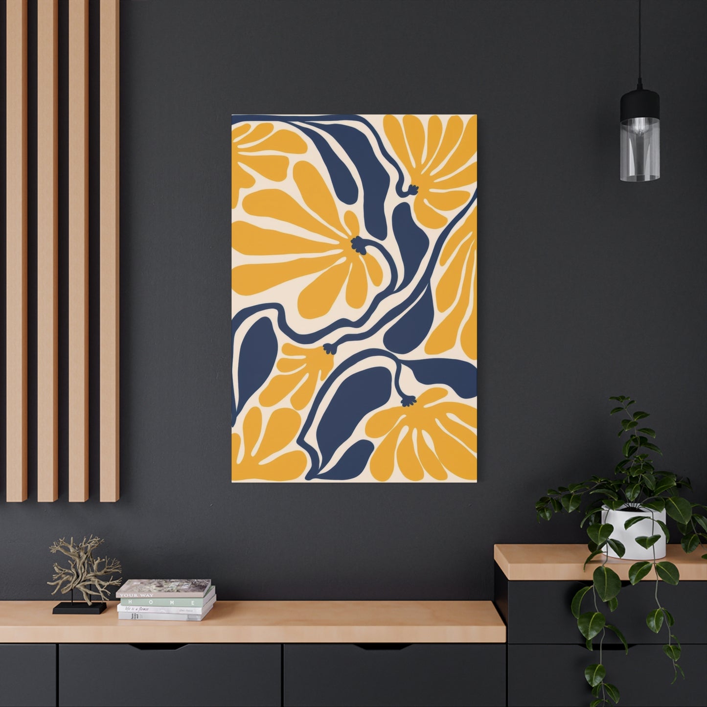
Blue yellow flower abstract colorful wall art is a dynamic and sophisticated way to breathe new life into any modern living space. This bold and captivating art form blends vibrant hues with intricate botanical shapes, offering a creative and contemporary interpretation of nature’s beauty. The contrast between the serene, calming blues and the bright, energetic yellows creates a visually stimulating yet harmonious effect, turning a simple wall into a statement piece that enhances the overall vibe of a room.
The use of abstract forms allows for greater creative freedom and gives the piece an immediate sense of movement and energy. The floral inspiration remains present, yet the abstract nature of the design elevates the concept, making it suitable for modern and eclectic spaces. The combination of the rich blue tones—often symbolizing tranquility, depth, and stability—with the uplifting yellow, which signifies joy, optimism, and vitality, creates a balance that energizes the room without overwhelming it.
This type of wall art works wonderfully in contemporary interiors, where bold design choices often play a central role. The combination of abstract and botanical elements can act as a bridge between various styles, making it perfect for those who enjoy mixing organic forms with modern design principles. Whether placed in the living room, dining area, or bedroom, blue yellow flower abstract wall art instantly creates a focal point, encouraging conversation while subtly tying together the various elements of the room.
One of the most powerful aspects of this wall art is its ability to evoke emotion and create atmosphere. The natural flow of floral shapes combined with vibrant color choices can stir feelings of joy, creativity, and rejuvenation. Whether it’s a striking, oversized canvas or a collection of smaller prints, the piece will infuse your home with a sense of liveliness and personality, transforming even the most minimalist spaces into vibrant, welcoming environments.
Beyond its aesthetic appeal, blue yellow flower abstract wall art carries a deeper, symbolic meaning. Flowers are often associated with beauty, growth, and the cycle of life, while the use of colors like blue and yellow can represent harmony and balance between calmness and energy. This emotional depth makes it more than just decoration; it serves as a reminder of nature’s ability to inspire and heal. In this sense, the artwork becomes a reflection of life’s beautiful contrasts, where tranquility and vitality coexist in perfect harmony.
The versatility of this style also allows it to complement various other décor elements. If you have a neutral color palette in your living space, the striking contrast of blue and yellow will stand out as a focal point, infusing the room with color and energy. Alternatively, if you’ve already embraced a more vibrant color scheme, the abstract floral design can provide a sense of balance and cohesion, tying together different hues without clashing.
Moreover, the ability of this type of wall art to capture the essence of both organic forms and modern abstract design means it can be easily adapted to a wide range of spaces. Whether you’re looking to add personality to an open-plan living room, soften the edges of a more industrial-style home, or create an energizing atmosphere in your home office, this art piece can set the tone for your space while maintaining a sense of sophistication and artistic flair.
In conclusion, blue yellow flower abstract colorful wall art is an outstanding choice for anyone looking to elevate their living space with a vibrant yet balanced focal point. The combination of abstract floral designs with bold, contrasting colors offers an exciting opportunity to blend nature-inspired beauty with contemporary visual art. Its ability to transform any room into a dynamic and harmonious environment makes it an excellent choice for modern homeowners who appreciate both creativity and emotional depth in their décor. Whether used to energize a space or to provide a visually engaging backdrop, this type of art brings sophistication, joy, and a sense of natural wonder to your home.
Share