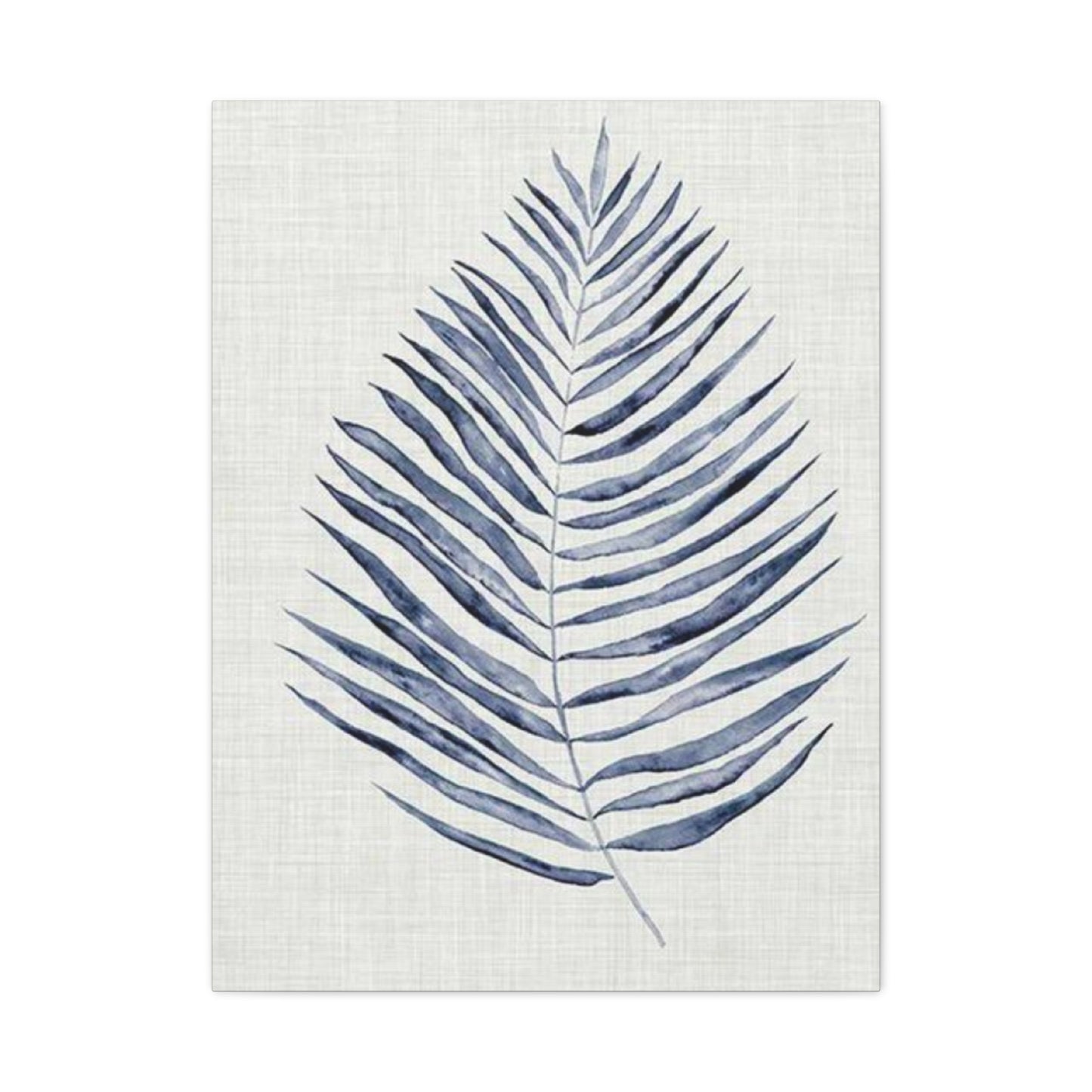
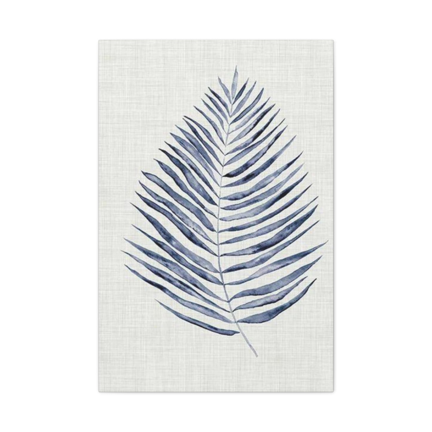
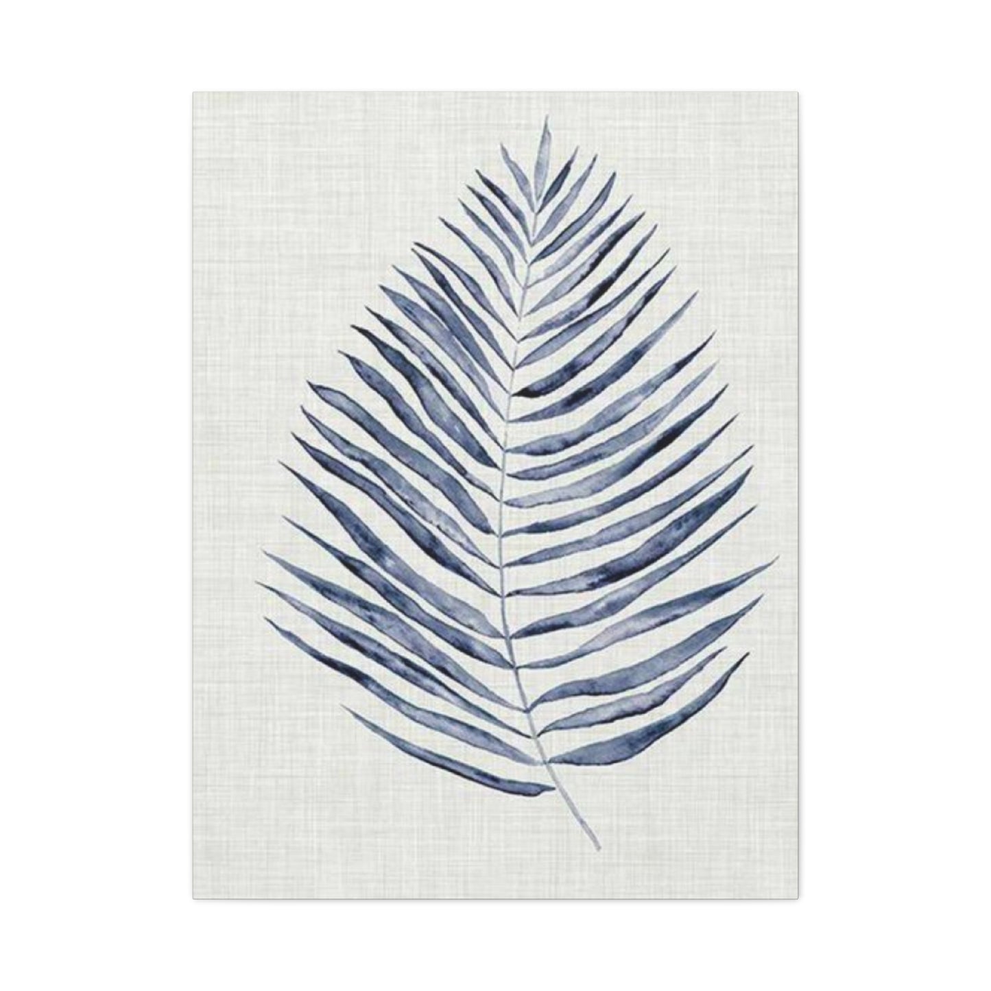
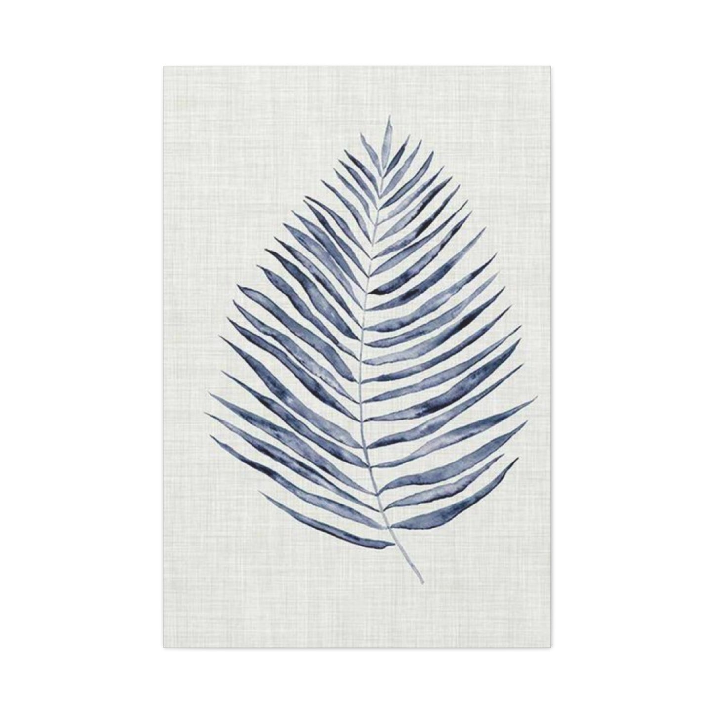
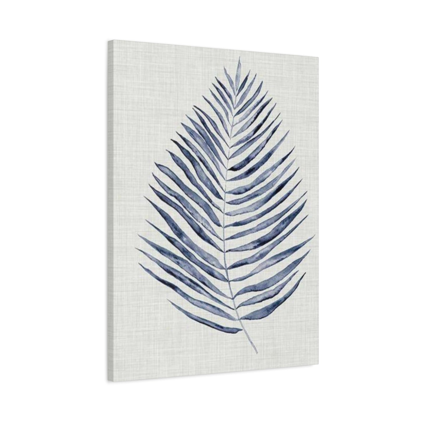
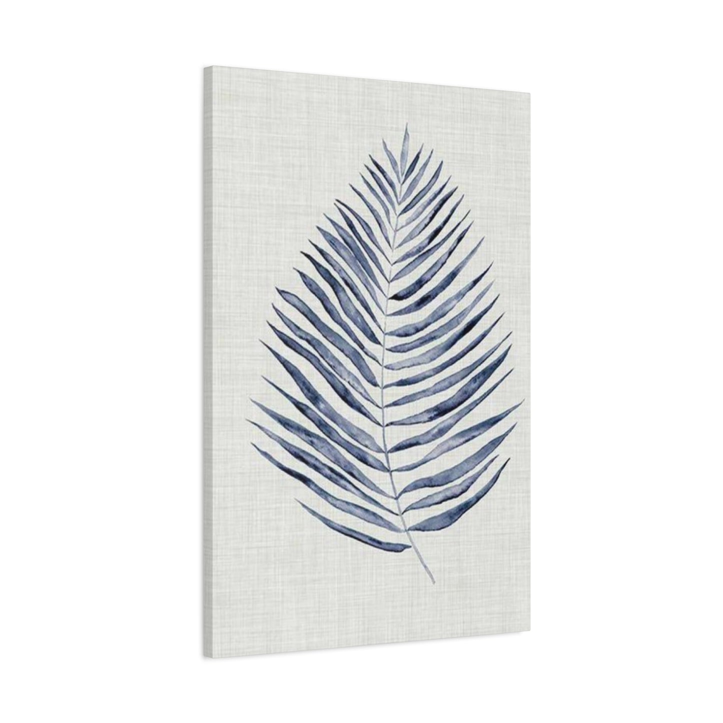
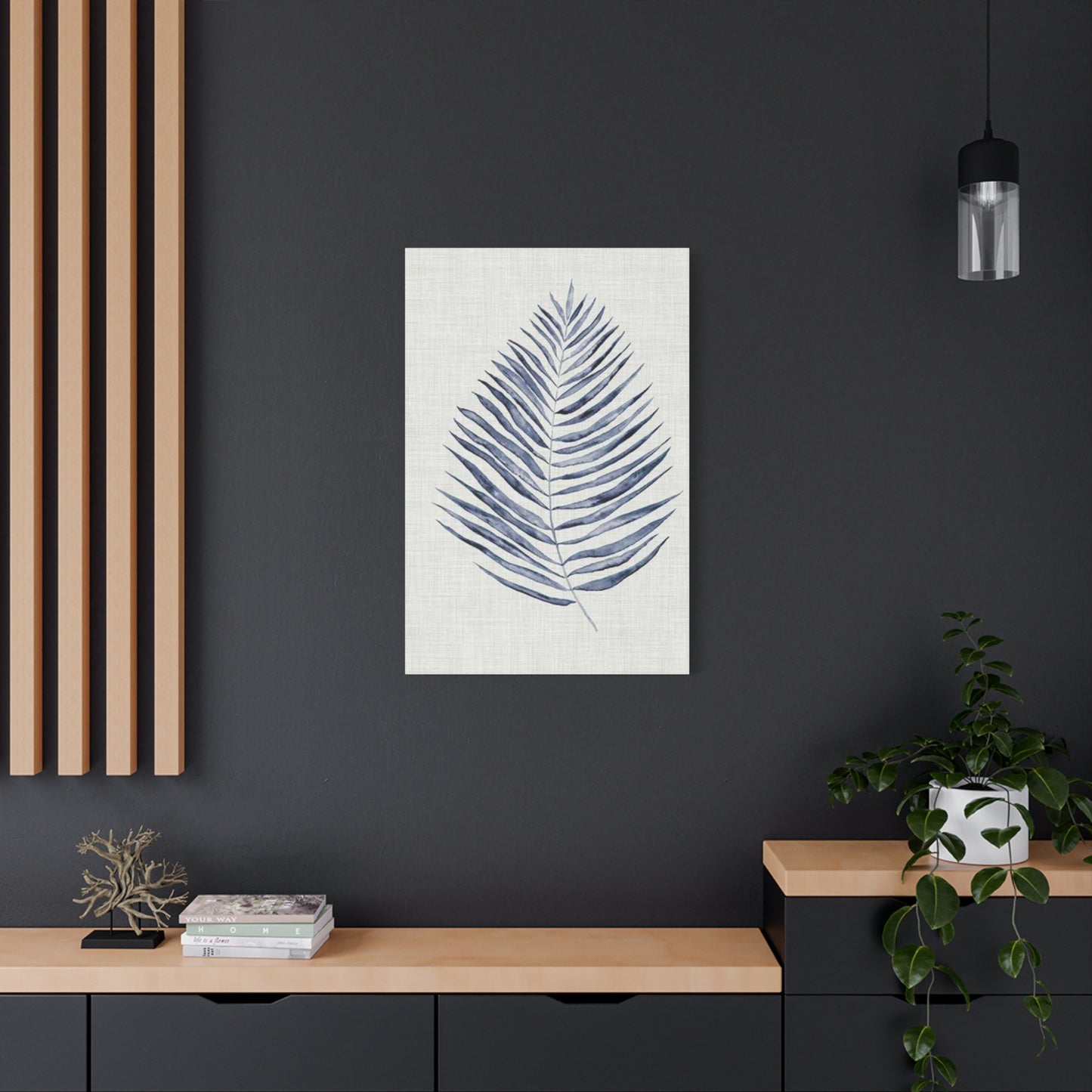
Blue Leaf Entryway Wall Art & Canvas Prints
Blue Leaf Entryway Wall Art & Canvas Prints
Couldn't load pickup availability
Bring Elegance to Your Home’s Entrance with Blue Leaf Entryway Wall Art: Setting the Tone for Your Space
The moment someone crosses the threshold into your home, their eyes naturally gravitate toward the visual elements that define your entryway. Among the myriad of decorative choices available, botanical-inspired pieces featuring azure foliage have emerged as a captivating trend that combines natural elegance with contemporary sophistication. These striking decorative elements serve as more than mere ornamental additions—they establish the aesthetic foundation for your entire residence while reflecting your personal style and creative sensibility.
The Magnetic Appeal of Botanical Artwork Featuring Azure Foliage in Residential Entrance Spaces
When considering decorative elements for the first room guests encounter, the selection process involves careful contemplation of color psychology, spatial dynamics, and atmospheric creation. Pieces showcasing cerulean botanical motifs possess an inherent capacity to transform ordinary corridors into extraordinary galleries that captivate attention and stimulate conversation. The tranquil nature of blue hues combined with organic leaf patterns creates a harmonious balance between serenity and visual interest, making these pieces particularly suited for areas that serve as transitional zones between the exterior world and your private sanctuary.
The popularity of these decorative elements stems from their remarkable versatility and timeless appeal. Unlike fleeting trends that rapidly lose their relevance, botanical representations in cool-toned palettes maintain their aesthetic value across seasons and shifting design preferences. The natural world has always provided endless inspiration for artistic expression, and when rendered in shades ranging from powder blue to deep navy, foliage patterns acquire an ethereal quality that transcends conventional botanical depictions. This unique characteristic allows blue leaf entryway wall art to complement diverse interior schemes, from minimalist Scandinavian aesthetics to richly layered bohemian environments.
The psychological impact of incorporating these pieces into your entrance cannot be overstated. Color theorists have long recognized the calming influence of blue spectrum hues on human perception and emotional states. When visitors encounter these soothing tones upon entering your residence, they experience an immediate sense of tranquility and welcome. The organic shapes of leaf patterns further enhance this effect by connecting occupants and guests to the natural world, even within urban environments where green spaces may be scarce. This biophilic connection satisfies an innate human need to maintain contact with natural elements, contributing to improved mood and reduced stress levels.
Exploring Various Stylistic Approaches to Azure Botanical Decorative Elements
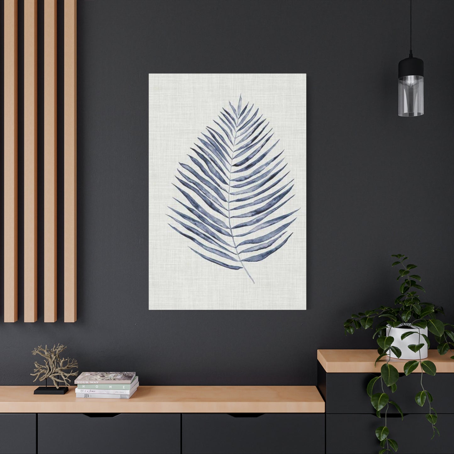
The market offers an extensive array of interpretations when it comes to blue leaf entryway wall art, each presenting distinct aesthetic characteristics and visual narratives. Watercolor renditions deliver a soft, dreamy quality that introduces gentle movement and fluidity to static spaces. These pieces often feature delicate gradations of color, with pigments bleeding into one another to create organic transitions that mirror the spontaneous beauty found in nature. The translucent quality of watercolor techniques allows underlying textures and paper grain to remain visible, adding depth and complexity to what might initially appear as simple botanical studies.
Photographic representations offer another compelling approach, capturing the intricate details of actual foliage through the lens of skilled photographers. These pieces might showcase macro perspectives that reveal the minute structures of leaf veins and cellular patterns, or they might present sweeping compositions that display entire branches in their architectural glory. The realism inherent in photographic works creates a documentary quality that appeals to those who appreciate scientific precision alongside aesthetic beauty. When processed with blue-tinted filters or captured under specific lighting conditions, these photographs achieve the desired chromatic palette while maintaining their representational accuracy.
Abstract interpretations push the boundaries of botanical representation, distilling leaf forms into their essential geometric components or reimagining foliage through non-representational color fields and gestural marks. These pieces appeal to collectors who appreciate conceptual approaches and avant-garde sensibilities. An abstract rendering might reduce a palm frond to a series of angular lines intersecting against a navy background, or it might explode the familiar shape of a monstera leaf into fragmented planes of varying blue intensities. This stylistic freedom allows artists to explore the emotional and symbolic dimensions of botanical subjects beyond their literal appearance.
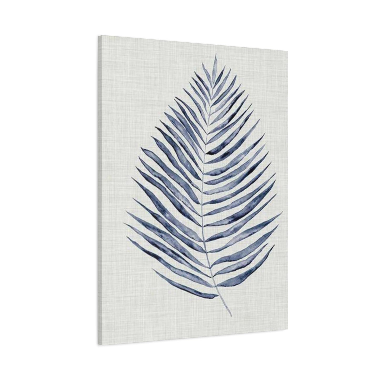
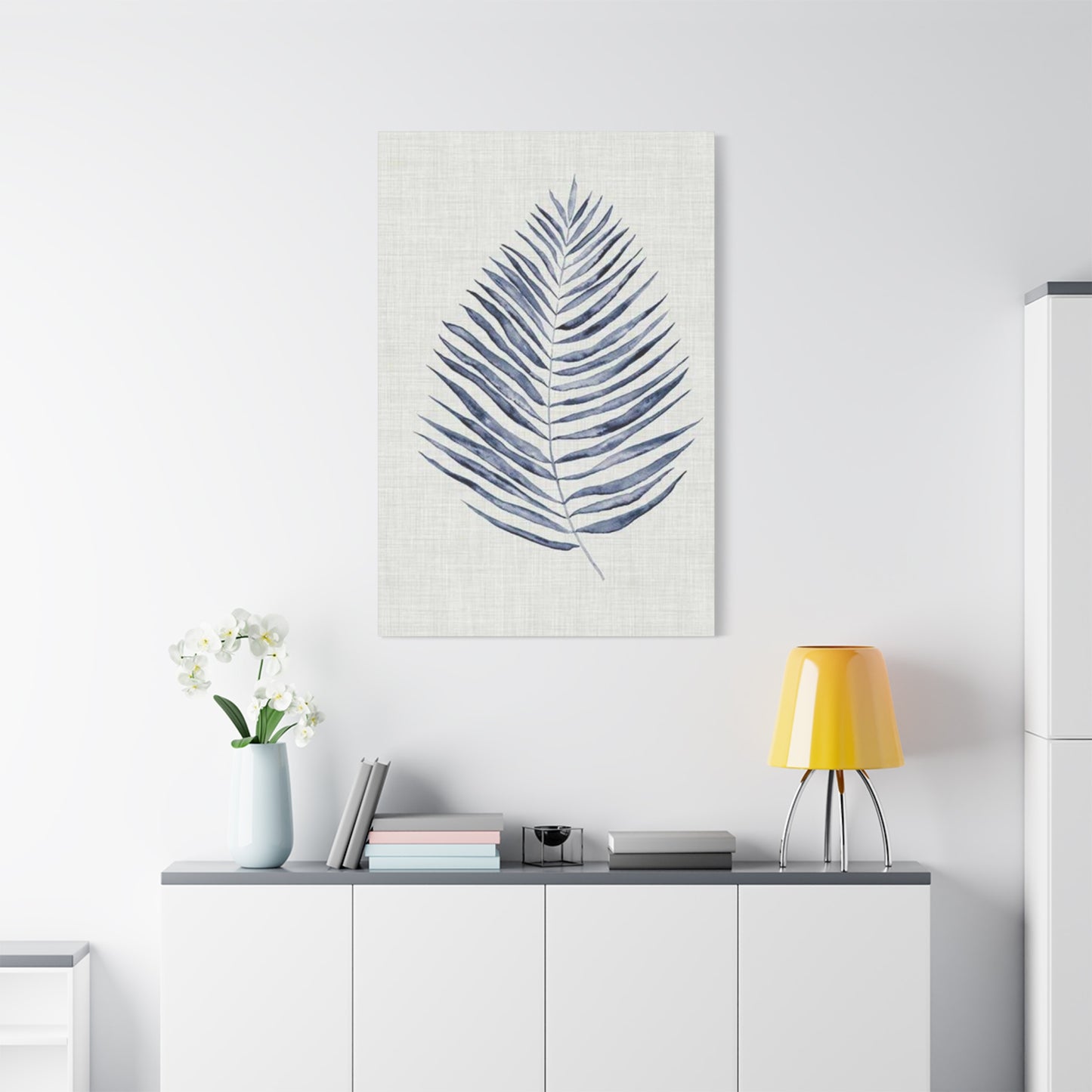
Minimalist designs strip away extraneous details to present simplified silhouettes and clean compositions that emphasize negative space and restrained color application. A single fern frond rendered in subtle gradations of slate blue against a pristine white background exemplifies this approach, creating visual impact through economy of means rather than elaborate detail. These pieces particularly suit contemporary interiors where clutter reduction and visual clarity take precedence. The simplicity of minimalist botanical art allows it to function as a sophisticated accent that enhances rather than overwhelms surrounding elements.
Vintage botanical prints draw inspiration from historical scientific illustrations, often incorporating aged paper textures, Latin nomenclature, and the precise draftsmanship characteristic of early naturalist studies. When reproduced or reimagined in blue monochromatic schemes, these nostalgic pieces bridge past and present, offering a sense of continuity and scholarly gravitas. The formal presentation typical of vintage botanical illustrations—with careful attention to anatomical accuracy and specimen labeling—lends an air of refinement and intellectual curiosity to entrance spaces.
Selecting the Ideal Dimensions and Arrangements for Maximum Visual Impact
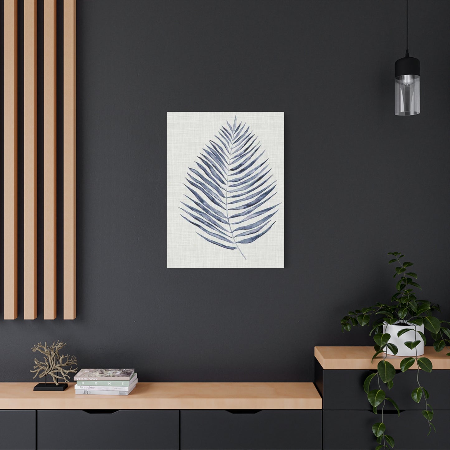
The relationship between artwork size and wall space significantly influences the overall aesthetic effectiveness of your entrance arrangement. A common misconception suggests that smaller entryways require proportionally diminutive pieces, but this approach often results in underwhelming visual presence. Instead, consider how a generously sized statement piece can actually make a compact entrance feel more intentional and curated. A large-scale canvas featuring oversized blue monstera leaves, for instance, can create a bold focal point that draws the eye upward, effectively enhancing the perceived height of the space while making a memorable impression.
Gallery arrangements offer an alternative approach that allows for greater flexibility and personalization. By clustering multiple pieces of varying dimensions, you create a dynamic composition that encourages extended viewing and closer examination. When assembling a gallery grouping, consider incorporating pieces that share the blue botanical theme but vary in style, scale, or specific plant species represented. This variation maintains visual coherence through color and subject matter while introducing enough diversity to sustain interest. The spacing between individual pieces requires careful consideration—maintaining consistent gaps creates orderliness, while varied spacing can introduce a more organic, collected-over-time aesthetic.
Diptychs and triptychs present another dimensional consideration, offering the opportunity to create panoramic compositions that span broader wall sections. A three-panel arrangement might depict the progressive stages of leaf unfurling, or it might present different species in a coordinated color palette. The slight gaps between panels in multi-part compositions add architectural interest and create natural divisions that help structure the visual narrative. These segmented presentations work particularly effectively in longer, narrower entrance halls where a single large piece might appear disproportionate.
Vertical orientations naturally complement the architectural features of most entryways, where walls typically extend higher than they stretch wide. A vertically composed piece featuring climbing vines or tall grasses rendered in aquamarine tones emphasizes the room's height while maintaining appropriate scale for narrower wall sections. Conversely, horizontal compositions can help balance excessively tall spaces or create visual width in areas that feel cramped. The directional flow within the artwork itself—whether branches extend horizontally across the picture plane or foliage rises vertically—further influences how the piece interacts with its architectural context.
Understanding Color Theory and the Psychological Resonance of Azure Palette Choices
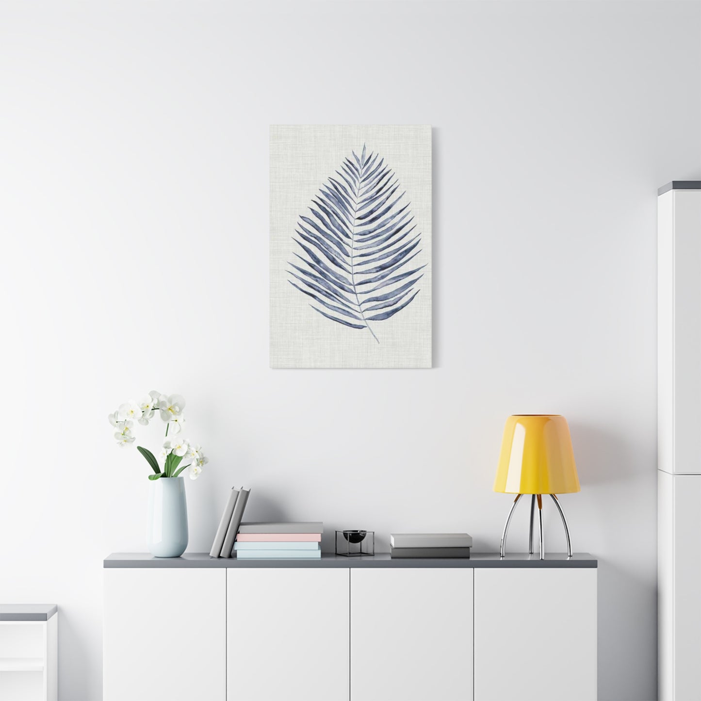
The specific shade of blue selected for botanical artwork significantly impacts the emotional atmosphere and visual harmony of your entrance space. Powder blues and robin's egg tones evoke freshness, youth, and airy lightness, making them excellent choices for small or dimly lit entryways that benefit from color-induced brightness. These lighter values reflect more ambient light, contributing to a sense of spaciousness and openness. The delicate nature of pale blue hues pairs beautifully with white or cream surroundings, creating a soft, serene ambiance that immediately puts visitors at ease.
Medium-value blues, including cerulean, cornflower, and periwinkle, strike a balance between vibrancy and restraint. These shades possess enough saturation to make definitive color statements without overwhelming surrounding elements. The moderate intensity of mid-range blues allows them to coexist harmoniously with both warm and cool color schemes, making them particularly versatile for those who anticipate periodic redecoration. These shades evoke clear skies and calm waters, carrying associations with stability, reliability, and peaceful contemplation.
Deeper navy, indigo, and midnight blue selections introduce drama and sophistication to entrance spaces. These rich, saturated hues create strong visual anchors that command attention and establish a sense of gravitas. The intensity of dark blues provides excellent contrast against lighter surrounding walls, making the artwork pop with three-dimensional presence. While some designers hesitate to incorporate dark colors in small spaces, strategically placed deep blue botanical pieces can actually enhance intimacy and create a jewel-box effect that feels intentionally cozy rather than cramped.
Teal and turquoise occupy a unique position in the blue spectrum, incorporating green undertones that strengthen their botanical appropriateness. These blue-green hybrids carry associations with tropical waters and exotic destinations, introducing an element of wanderlust and adventure to your entrance. The complexity of these blended hues—neither purely blue nor green—adds visual sophistication and pairs exceptionally well with natural materials like wood, rattan, and stone. Pieces featuring these shades work particularly effectively in coastal-inspired or globally influenced interiors.
The interplay between your chosen blue tones and surrounding color schemes deserves thoughtful consideration. Monochromatic approaches that layer various blue values create cohesive, soothing environments with subtle tonal variations providing visual interest. Complementary schemes that pair blues with warm oranges and corals introduce energetic contrast and visual excitement. Analogous combinations incorporating neighboring hues like purple and green maintain harmony while offering chromatic diversity. Neutral backdrops in white, gray, or beige allow blue botanical pieces to shine as primary color sources, while surrounding them with other saturated hues creates more complex, layered environments.
Material Considerations and Framing Choices That Elevate Botanical Presentations
The substrate and production method selected for blue leaf entryway wall art fundamentally influence both its appearance and longevity. Canvas prints offer a classic presentation with visible texture that adds tactile dimension to the viewing experience. The slight grain of canvas fabric creates subtle variations in how light interacts with the printed surface, introducing depth and preventing the flat appearance sometimes associated with paper prints. Stretched canvas presentations—where fabric wraps around wooden frames without additional bordering—deliver clean, contemporary aesthetics particularly suited to modern interiors.
Paper-based prints encompass tremendous variety, from standard photographic paper to specialized art papers with distinct textures and finishes. Smooth, glossy papers produce vibrant color saturation and sharp detail, making them ideal for photographic or highly detailed illustrations. Matte papers reduce glare and provide more subdued color rendering, creating sophisticated, gallery-quality presentations. Textured papers including watercolor stock, cotton rag, and handmade varieties introduce surface interest that enhances the artisanal quality of botanical subjects. The archival properties of paper choices significantly impact longevity—acid-free, lignin-free papers resist yellowing and degradation, ensuring your pieces maintain their visual integrity for decades.
Metal prints represent a contemporary alternative that delivers stunning luminosity and exceptional durability. The dye-sublimation process infuses inks directly into specially coated aluminum panels, creating images with extraordinary depth and vibrancy. The reflective qualities of metal surfaces make colors appear to glow from within, lending botanical subjects an almost three-dimensional presence. The inherent resistance of metal to moisture, fading, and physical damage makes these pieces particularly suitable for entryways where environmental fluctuations and accidental contact pose greater risks than in more protected interior rooms.
Acrylic presentations involve mounting prints behind clear acrylic sheets, creating glossy, light-refracting surfaces that deliver exceptional visual impact. The depth created by the acrylic layer introduces dimensionality that enhances the viewing experience, while the protective qualities of the material shield the underlying print from environmental damage. The contemporary, gallery-like appearance of acrylic-mounted pieces suits modern and minimalist interiors particularly well. Some presentations feature standoff mounts that create gaps between the acrylic and the wall, allowing light to filter around edges and creating floating effects that amplify the artwork's presence.
Framing decisions dramatically influence how botanical pieces integrate with surrounding decor. Natural wood frames in light oak, walnut, or bamboo reinforce the organic nature of botanical subjects while adding warmth and textural interest. The grain patterns visible in wood frames create subtle visual connections to the depicted foliage, strengthening thematic coherence. Metal frames in brushed brass, matte black, or polished silver deliver sleek, contemporary presentations that emphasize clean lines and geometric precision. White or cream frames create seamless integration with lighter wall colors, allowing the artwork itself to take center stage without competing borders. The width and profile of frames—from narrow, understated edges to substantial, gallery-style borders—should correspond to both the artwork's visual weight and the surrounding architectural scale.
Matting provides opportunities for additional customization and visual refinement. Double mats layering two colors create subtle depth and sophistication, with the narrow inner mat serving as a sophisticated accent that bridges the artwork and outer mat. The generous breathing room provided by wide mats allows botanical subjects to float within their frames, preventing crowded appearances and directing attention to the central imagery. Mat colors might echo hues present within the artwork, pull accent colors from surrounding furnishings, or introduce complementary contrasts that enhance color vibrancy through simultaneous contrast effects.
Strategic Placement Principles for Achieving Optimal Visual Balance
The vertical positioning of blue leaf entryway wall art significantly affects viewing comfort and spatial harmony. Industry guidelines typically suggest centering artwork at approximately 57-60 inches from floor level—roughly average human eye height when standing. This placement ensures that the visual center of the piece aligns naturally with viewers' sightlines, creating comfortable viewing angles that don't require excessive upward or downward gaze adjustment. However, architectural features and furniture placement may necessitate modifications to this standard. When hanging pieces above console tables or benches, maintaining 6-8 inches of clearance between the furniture top and frame bottom creates appropriate visual separation while maintaining clear relationships between elements.
Horizontal positioning requires equal consideration, particularly in asymmetrical or architecturally complex entryways. Centering artwork on the dominant wall creates formal symmetry that conveys traditional elegance and orderly composition. Off-center placements can introduce dynamic tension and contemporary flair, particularly effective when balanced by opposing visual weights like furniture arrangements or architectural features. In corridors or narrow halls, consider how the artwork relates to doorways, adjacent rooms, and traffic flow patterns. Positioning pieces to be visible from multiple vantage points—both upon entering and when moving through the space—maximizes their impact and functional presence.
Lighting dramatically influences how colors, details, and textures register to viewers, making illumination strategy an essential component of placement planning. Natural light sources introduce variability, with intensity and color temperature shifting throughout the day and across seasons. Positioning artwork perpendicular to windows minimizes direct glare on reflective surfaces while ensuring adequate illumination during daylight hours. Artificial lighting options include track lighting, picture lights, and recessed spotlights, each offering distinct advantages. Picture lights mounted directly above or below frames provide focused illumination that emphasizes specific pieces while creating dramatic shadowing effects. Track lighting offers flexibility, allowing you to adjust beam angles and positions as needed. Recessed spotlights deliver clean, architectural illumination without visible fixtures, maintaining minimal aesthetics while ensuring adequate visibility.
The color temperature of lighting sources significantly affects how blue tones appear. Cool-temperature bulbs (5000K+) enhance the vibrancy and clarity of blue hues, creating crisp, energetic presentations. Warm-temperature lighting (2700-3000K) can shift blue tones toward purple or gray, potentially muting their intended appearance. Neutral white lighting (3500-4100K) provides balanced rendering that maintains color accuracy while avoiding the sterile quality sometimes associated with very cool lighting. Consider installing dimmer switches to allow lighting adjustment based on time of day, desired atmosphere, and specific viewing circumstances.
Coordinating Botanical Artwork with Surrounding Furnishings and Decorative Elements
Creating cohesive entryway environments requires thoughtful consideration of how blue leaf entryway wall art interacts with furniture, textiles, and accessory selections. Console tables or entrance benches provide functional surfaces that anchor the space while offering opportunities for complementary styling. The material and finish of these furniture pieces should harmonize with the artwork's aesthetic—a rustic wooden console enhances the organic nature of botanical subjects, while a sleek glass or lacquered piece emphasizes contemporary sophistication. The scale relationship between furniture and artwork matters significantly; oversized pieces require proportionally substantial furniture to maintain visual balance, while delicate botanical prints pair beautifully with lighter, more refined furniture selections.
Textile elements including runners, throw pillows, and drapery present opportunities to echo or complement the blue palette established by botanical artwork. Selecting fabrics that incorporate similar blue tones creates chromatic continuity that unifies the space. However, exact color matching can appear overly coordinated and lacks visual sophistication—instead, choose shades slightly lighter or darker than those prominent in the artwork, or incorporate blues with different undertones to maintain harmony while avoiding monotony. Patterns and textures within textiles add another layer of visual interest; consider how geometric patterns might provide counterpoint to organic leaf shapes, or how nubby, natural-fiber textures reinforce botanical themes through material choices.
Accessory selections including vases, sculptural objects, and decorative boxes create layered compositions that add personality and refinement to entrance arrangements. Metallic accessories in brass, copper, or gold introduce warm accents that beautifully complement cool blue tones through complementary contrast. Ceramic pieces in white, cream, or coordinating blues reinforce the color story while contributing varied shapes and surface treatments. Natural elements like dried branches, stones, or preserved botanicals create literal connections between the depicted foliage and three-dimensional organic forms. The strategic placement of these accessories—some objects positioned in front of the artwork's sight line, others flanking it—creates depth and prevents the flat, predictable appearance of overly symmetrical arrangements.
Mirrors function as particularly effective companions to botanical artwork in entrance spaces, serving both decorative and practical purposes. The reflective surfaces bounce light throughout the space, enhancing brightness and creating impressions of increased square footage. Positioning mirrors opposite or adjacent to blue leaf artwork creates visual interplay as reflected images multiply the botanical presence throughout the room. The frame style of mirrors should coordinate with or complement artwork framing—matching finishes create cohesive presentations, while contrasting choices add eclectic interest. Consider proportion when combining mirrors and artwork; pieces of similar scale create balanced pairings, while combining a substantial mirror with smaller botanical pieces allows each element to claim its own visual territory.
Flooring selections establish foundational tones that significantly influence how botanical artwork registers visually. Light flooring in pale wood, stone, or tile creates bright, airy atmospheres that allow blue artwork to pop with maximum contrast. Dark flooring in rich wood tones or charcoal stone creates dramatic foundations that lend gravitas and sophistication to entrance spaces. The undertones present in flooring—whether warm reddish browns or cool grays—should inform surrounding color selections to maintain harmonic relationships. Area rugs introduce additional color, pattern, and texture while defining the entrance zone spatially. Botanical-themed rugs create thematic continuity with wall-mounted pieces, while geometric or abstract patterns provide complementary contrast.
Seasonal Rotation Strategies and Refreshing Your Entrance Aesthetic Throughout the Year
While blue leaf entryway wall art possesses timeless appeal suitable for year-round display, implementing seasonal rotation strategies keeps your entrance feeling fresh and responsive to changing moods and celebrations. Spring rotations might emphasize lighter, brighter blue tones paired with imagery of new growth—unfurling ferns, sprouting stems, and delicate young leaves that echo seasonal renewal. Accompanying accessories might include fresh flower arrangements in coordinating blues and purples, lightweight linen textiles, and natural elements like bird's nests or decorative eggs that reinforce springtime themes.
Summer presentations can lean into the boldness and vibrancy of the season with saturated turquoise and azure selections featuring lush, fully developed foliage. Tropical leaf varieties like monstera, banana leaves, or palm fronds evoke vacation destinations and leisurely summer days. Surrounding decor might incorporate woven baskets, rattan accents, and white or natural fiber textiles that create breezy, coastal-inspired atmospheres. Consider lighter, more transparent framing options that enhance the airy, unburdened feeling appropriate to warmer months.
Autumn transitions invite richer, more complex blue selections that harmonize with the season's characteristic warmth. Navy, indigo, and teal tones pair beautifully with the oranges, golds, and russet hues prominent in fall color schemes. While blue foliage doesn't occur naturally in autumn, the cool tones provide sophisticated contrast to seasonal warm accents introduced through accessories, textiles, and natural elements. Consider pairing blue botanical pieces with copper or brass accessories, warm wood tones, and textured fabrics in velvet or wool that introduce seasonal coziness.
Winter styling can embrace the cool elegance of blue hues, which naturally complement the season's aesthetic. Deep midnight blues and silvery steel tones evoke crisp winter nights and frost-covered landscapes. Pairing botanical artwork with metallic silver accessories, white or cream textiles, and minimal greenery creates sophisticated, serene environments appropriate to the contemplative nature of winter months. The evergreen nature of many botanical subjects makes them particularly suitable for winter display, maintaining connection to the natural world even when outdoor vegetation lies dormant.
Holiday-specific styling allows for temporary modifications that celebrate special occasions without requiring permanent changes to your core entrance design. During winter holidays, subtle additions like string lights, garlands, or seasonal florals can complement blue botanical pieces without obscuring them. For spring celebrations, incorporating pastels and fresh blooms creates festive atmospheres. Summer holidays might inspire nautical accents that play beautifully with blue tones. The permanent nature of wall-mounted artwork provides a stable foundation that grounds more ephemeral holiday decorations, preventing spaces from appearing chaotically overdecorated.
Commissioning Custom Pieces and Working with Artists for Personalized Botanical Creations
For those seeking truly unique blue leaf entryway wall art that perfectly aligns with specific aesthetic preferences and dimensional requirements, commissioning custom pieces offers unparalleled satisfaction. This process begins with identifying artists whose existing portfolio demonstrates stylistic compatibility with your vision. Platforms dedicated to connecting collectors with creators, local galleries, and artist studio open houses provide opportunities to discover talented individuals working in botanical genres. When evaluating potential collaborators, examine not only their artistic skill but also their communication style and receptiveness to client input—successful commissions require clear dialogue and mutual respect throughout the creative process.
Initial consultations establish project parameters including dimensions, color specifications, stylistic approach, and timeline expectations. Providing reference images that illustrate your aesthetic preferences helps artists understand your vision, even if the references depict different subjects or mediums. Be specific about the blue tones you envision—bringing paint chips, fabric samples, or photographs that capture your desired shades prevents misunderstandings and ensures color accuracy. Discuss whether you prefer realistic botanical representation or more interpretive approaches, and communicate any specific plant species that hold personal significance or aesthetic appeal.
Budget discussions require transparency and directness. Commission pricing typically reflects factors including piece dimensions, medium complexity, artist experience, and project timeline. Larger works command higher prices due to increased material costs and extended creation time. Complex techniques like layered watercolors, detailed pen work, or mixed media approaches increase pricing compared to simpler executions. Established artists with significant exhibition histories and robust collector bases necessarily charge more than emerging talents. Understanding these pricing factors helps set realistic expectations and prevents uncomfortable negotiations. Reputable artists provide clear pricing structures and payment schedules, typically requiring deposits before commencing work with balance due upon completion.
Progress updates maintain communication throughout the creation process and allow for course corrections if the developing work diverges from agreed-upon specifications. Many artists provide photographs at key stages—initial sketches, underpainting completion, halfway points—giving clients visibility into the evolving piece. These checkpoints offer opportunities to provide feedback while the work remains malleable enough to accommodate adjustments. However, recognize that excessive intervention or constant revision requests can stifle artistic expression and compromise the organic flow of creation. Trust the artist's expertise and limit feedback to substantive concerns rather than minor preferences.
Delivery and installation logistics require advance planning, particularly for large or fragile pieces. Discuss packaging methods that ensure safe transport, whether the artist ships directly or you arrange pick-up. Professional framing might be included in commission prices or handled separately—clarify these arrangements early to avoid surprises. If engaging separate framing services, communicate with the framer before work completion to ensure the piece arrives in appropriate condition and dimensions for your chosen framing style. Installation may require professional hanging services, particularly for heavy or valuable pieces where secure mounting exceeds typical picture-hanging complexity.
Preservation Practices and Long-term Care for Botanical Artwork in Entrance Environments
Entrance spaces present unique preservation challenges due to their proximity to exterior doors, which introduces temperature fluctuations, humidity variations, and potential exposure to direct sunlight. Understanding these environmental factors and implementing protective measures ensures your blue leaf entryway wall art maintains its visual integrity for years or decades. Temperature stability proves crucial for most art substrates and media, as repeated expansion and contraction caused by fluctuating conditions can damage materials over time. Canvas can sag or tighten, paper can warp or cockle, and adhesives can fail when subjected to ongoing temperature swings. While completely stable conditions may be unrealistic in entrance areas, minimize extreme fluctuations by avoiding placement directly adjacent to frequently opened doors or in front of heating/cooling vents.
Humidity control presents similar challenges, as excessive moisture encourages mold growth, paper deterioration, and adhesive failure, while overly dry conditions cause embrittlement and cracking. Most artwork thrives in relative humidity between 40-50%, though this range may conflict with human comfort or geographic climate norms. If your region experiences extreme humidity levels, consider installing dehumidifiers or humidifiers as needed. Ensure adequate air circulation around artwork by avoiding tight placement against walls—leaving small gaps allows air movement that prevents moisture accumulation. Regular inspection for signs of moisture damage including spotting, staining, warping, or musty odors allows early intervention before serious harm occurs.
Ultraviolet light represents one of the most significant threats to artwork longevity, causing fading, discoloration, and material degradation. Direct sunlight delivers the highest UV concentration, but even indirect natural light and certain artificial sources emit damaging rays. If your entrance receives natural light, install UV-filtering window films or opt for UV-protective glazing on framed pieces. Many acrylic and glass options include UV filtration that blocks 95%+ of harmful rays while maintaining optical clarity. For unglazed pieces like canvas, position them away from direct sun paths or install curtains/blinds that can be closed during peak sunlight hours. LED lighting emits negligible UV radiation, making it the safest artificial light source for illuminating artwork.
Physical protection involves safeguarding pieces from accidental contact, impacts, and handling damage common in high-traffic entrance areas. Secure mounting prevents pieces from shifting or falling due to door vibrations or accidental bumps. Use appropriate hanging hardware rated for the weight of your piece—heavy works require anchoring into wall studs or using heavy-duty wall anchors rather than simple picture hooks. Consider the traffic patterns in your entrance and position artwork outside primary pathways where luggage, packages, or extended arms might make contact. If young children or pets frequent the area, position pieces high enough to prevent curious hands or paws from reaching them.
Cleaning practices require gentle approaches that remove dust and grime without damaging surfaces or pigments. Unglazed canvases can be carefully dusted with soft, dry brushes or microfiber cloths, always brushing in consistent directions to avoid scratching. Never apply liquid cleaners directly to canvas or paper-based works, as moisture can cause irreversible damage. Glazed works including framed pieces behind glass or acrylic tolerate more assertive cleaning, though caution remains essential. Use glass cleaner applied to cleaning cloths rather than sprayed directly on surfaces, as overspray might seep behind glazing or frames. For valuable or antique pieces, consult professional conservators rather than attempting personal cleaning that might inadvertently cause harm.
Creating Gallery Arrangements and Building Collections Around Botanical Themes
Developing cohesive collections of blue leaf entryway wall art transforms individual pieces into curated presentations that demonstrate sophisticated aesthetic sensibility and intentional design thinking. Thematic collecting might focus on specific plant families, particular artistic styles, single artists, or coordinated color palettes. Palm species offer tremendous variety—from delicate fan palms to dramatic coconut palms—while maintaining recognizable familial characteristics. Fern collections showcase incredible diversity in frond shapes, sizes, and patterns while remaining clearly related through their fundamental structure. Focusing collections around specific themes creates narrative coherence that elevates individual pieces through their relationships to surrounding works.
Scale variation within collections prevents monotonous presentations and creates dynamic visual hierarchies. Combining one large statement piece with several smaller works establishes clear focal points while allowing supporting pieces to contribute without competing for dominance. Graduated sizing—arranging pieces from largest to smallest—creates rhythmic flows that guide eye movement around the space. Unexpected scale contrasts, like pairing an oversized close-up of a single leaf with tiny, detailed illustrations, introduces visual surprise that engages viewers and encourages closer examination.
Style mixing within botanical collections requires careful balancing to achieve eclectic sophistication rather than chaotic confusion. Combining photographic, watercolor, and graphic interpretations of similar subjects creates variety while maintaining thematic unity. The common thread of botanical subject matter provides sufficient cohesion to support stylistic diversity. Consider limiting the number of different approaches to maintain clarity—perhaps combining two or three distinct styles rather than incorporating every available technique. Maintaining consistent framing throughout the collection helps unify stylistically diverse pieces, creating visual structure that contains variety within an organized framework.
Color harmony considerations become more complex when assembling multiple pieces. Monochromatic collections utilizing various shades and tints of blue create serene, cohesive presentations with subtle tonal variations providing interest. Analogous schemes might incorporate blue-greens and blue-purples, maintaining chromatic relationships while introducing gentle color transitions. Limited contrast approaches could pair blues with single accent colors like coral, mustard, or warm wood tones that appear consistently across multiple pieces. Consider how frame colors contribute to overall palettes—white frames create clean separations between pieces, while wood frames add warm accent tones, and colored frames might echo or complement hues within the artwork.
Layout planning for multi-piece collections benefits from preliminary floor-level arrangement before committing to wall mounting. Creating full-scale paper templates corresponding to each piece's dimensions allows experimentation with various configurations without creating unnecessary wall damage. Consider both the interior composition of individual groupings and their relationship to surrounding architectural features. Maintain consistent spacing between pieces for orderly presentations, or vary gaps strategically to create organic, collected-over-time aesthetics. Ensure the overall arrangement's boundaries relate appropriately to furniture and architectural features—groupings should align with console table widths or doorway edges rather than appearing arbitrarily positioned.
Incorporating Three-Dimensional Botanical Elements to Complement Flat Artwork
While two-dimensional blue leaf entryway wall art serves as primary focal points, incorporating three-dimensional botanical elements creates depth and reinforces natural themes through tactile, sculptural forms. Living plants introduce literal connections to the botanical subjects depicted in artwork, bringing actual organic growth into your entrance. Consider how plant selections might echo shapes featured in your artwork—if displaying pieces with large, dramatic leaves like monstera or banana palms, incorporate live specimens with similarly bold foliage. Conversely, if your artwork features delicate ferns or ornamental grasses, select living plants with comparable refinement.
Container choices influence how living plants relate to surrounding decor. Ceramic vessels in blue glazes create direct color connections to botanical artwork, reinforcing chromatic themes through three-dimensional form. White or cream containers provide neutral foundations that maintain focus on foliage while coordinating with lighter framing choices. Natural materials including woven baskets, wooden planters, or stone vessels emphasize organic aesthetics and textural variety. Metallic containers in brass, copper, or brushed steel introduce contemporary sophistication and warm accents that beautifully complement cool blue tones.
Preserved botanical specimens including dried flowers, branches, and foliage offer low-commitment alternatives to living plants while maintaining organic presence. Preserved eucalyptus, pampas grass, or palm fronds arranged in tall vases create dramatic vertical elements that complement wall-mounted pieces without requiring ongoing care. The neutral tones typical of dried botanicals provide versatile foundations that coordinate with virtually any color scheme while contributing textural interest through their preserved forms. Consider dyeing or painting dried materials in blues that coordinate with your artwork palette for more explicit chromatic connections.
Sculptural botanical representations in metal, ceramic, or wood introduce artistic interpretations of natural forms through three-dimensional craft. Wall-mounted metal leaves create shadows and depth while maintaining the botanical theme established by flat artwork. Free-standing wooden sculptures of abstract plant forms add organic shapes to console table arrangements. Ceramic vessels featuring embossed or carved leaf patterns serve dual purposes as functional containers and decorative objects that reinforce thematic continuity. These artistic objects bridge the gap between depicted and actual botanical presence, creating layered presentations that engage multiple senses and dimensional planes.
Terrariums and glass-enclosed planting systems create miniature ecosystems that function as living art installations. These self-contained environments showcase plants in architecturally interesting vessels that become decorative objects in their own right. The glass walls of terrariums create visual connections to glazed artwork while introducing transparency and refracted light effects that add visual complexity. Geometric terrariums in brass or black metal frames deliver contemporary sophistication, while rustic wooden boxes with glass panels create farmhouse charm. The controlled environment within terrariums makes them particularly suitable for entryways where conditions might not support standard houseplants.
Budgeting Strategies and Finding Quality Pieces at Various Price Points
Building impressive displays of blue leaf entryway wall art need not require exorbitant expenditures, as quality pieces exist across wide-ranging price spectrums. Understanding where to allocate resources and how to identify value regardless of cost allows creation of beautiful entrance spaces within realistic budgets. Mass-produced prints from major retailers offer accessible entry points, with prices typically ranging from modest to moderate depending on size and printing quality. These reproductions make botanical art accessible to broad audiences, though individual pieces lack uniqueness. Quality varies significantly among mass-market sources—examine printing resolution, color accuracy, and material quality before purchasing, as rock-bottom prices sometimes reflect inferior production values that compromise appearance and longevity.
Print-on-demand services offer middle-ground options that combine reasonable pricing with greater selection and customization. These platforms allow you to choose specific images, sizes, and substrates, creating semi-custom pieces at accessible prices. The quality of print-on-demand products has improved dramatically, with many services offering archival papers, professional-grade inks, and various finishing options. However, consistency varies among providers—research companies thoroughly, examining customer reviews and sample images before committing to purchases. The inability to physically examine pieces before ordering presents risk, though generous return policies mitigate this concern.
Online marketplaces connecting independent artists directly with buyers offer opportunities to acquire original or limited-edition pieces at moderate prices while supporting working artists. These platforms feature tremendous stylistic diversity, allowing discovery of unique pieces that won't appear in every neighbor's home. Pricing remains competitive as artists avoid gallery commission structures, passing savings to buyers. Direct artist relationships also enable commission discussions and custom size requests. When purchasing through these channels, verify seller reputation through ratings and reviews, ensuring reliable transaction completion and quality assurance.
Local galleries and art fairs provide opportunities to physically examine pieces before purchasing while supporting regional creative communities. Gallery prices typically include markup covering operational costs, resulting in higher prices than direct-from-artist purchases, but the curated selection and condition guarantees justify increased investment for many collectors. Art fairs offer more casual environments where artists often sell directly, creating opportunities for conversation and occasionally negotiation. The limited-time nature of fairs sometimes results in end-of-event discounts as artists prefer selling inventory to transporting it home.
Original artwork represents the highest investment tier, with pricing reflecting material costs, creation time, artist expertise, and market demand. Emerging artists' originals often remain accessible to modest collectors, while established artists' works command premium prices justified by their reputation and market history. For those valuing uniqueness and investment potential, original pieces offer satisfaction that reproductions cannot match.
Final Thoughts
Blue leaf entryway wall art provides an elegant and refreshing way to create a lasting first impression in your home. The beauty of this art form lies in its ability to combine the calming, serene qualities of blue with the natural grace of leaf imagery, transforming your entryway into a space that feels inviting and full of life. The soothing shades of blue evoke a sense of tranquility, while the intricate or flowing leaf patterns bring the beauty of nature indoors, creating an atmosphere that is both peaceful and welcoming.
The versatility of blue leaf wall art allows it to complement a wide range of interior styles. Whether your entryway features a modern minimalist design or a more traditional, nature-inspired aesthetic, blue leaf art fits seamlessly into the space. The gentle blue tones can provide a refreshing contrast against neutral walls or can enhance a more colorful décor scheme. The combination of natural motifs and cool, calming blues brings a harmonious balance to the room, instantly elevating the overall vibe of your home.
Leaf imagery in wall art is deeply symbolic, representing growth, renewal, and the interconnectedness of all living things. In an entryway, this symbolism can evoke feelings of positivity and new beginnings, setting the tone for the rest of your home. The visual flow of the leaves can also create a sense of movement, making the space feel dynamic and alive, while still maintaining an air of elegance and tranquility. Whether the design features bold, graphic leaves or soft, delicate illustrations, blue leaf art adds a sense of sophistication and natural beauty that makes a strong visual impact without overpowering the space.
Blue, as a color, is known for its calming properties and its ability to promote relaxation and mental clarity. By incorporating blue leaf wall art into your entryway, you create a serene first impression for guests and family members alike, inviting them into a space that feels both stylish and peaceful. This effect is especially powerful when the entryway serves as the transitional space between the outside world and the rest of your home—an area where you want to set a welcoming, calming tone for the rest of your living environment.
The play of light on blue leaf wall art further enhances its charm. As the natural or artificial light in your entryway shifts throughout the day, the shades of blue within the artwork can change, adding depth and dimension to the piece. The delicate shadows and highlights that form as light interacts with the art can create a dynamic visual experience, ensuring that your blue leaf wall art remains a focal point that captures attention and sparks conversation, day or night.
Additionally, blue leaf art can serve as a versatile piece that works not only in the entryway but also in other areas of your home. Its calming colors and natural elements make it an ideal choice for spaces like living rooms, dining areas, or even bedrooms. The ability to adapt to various design themes makes it an excellent investment, offering timeless beauty that can be moved or adjusted as your décor evolves over time.
In conclusion, blue leaf entryway wall art is a wonderful way to add beauty, symbolism, and elegance to your home’s entryway. Its calming blue tones and natural imagery provide a sense of serenity while creating a memorable first impression for all who enter. Whether you prefer bold, abstract designs or more delicate, detailed depictions of leaves, this art form brings a refreshing touch of nature and sophistication to your living space. By choosing blue leaf art for your entryway, you’re not only enhancing the aesthetic appeal of your home but also setting a positive, welcoming tone for the rest of your interior.
Share