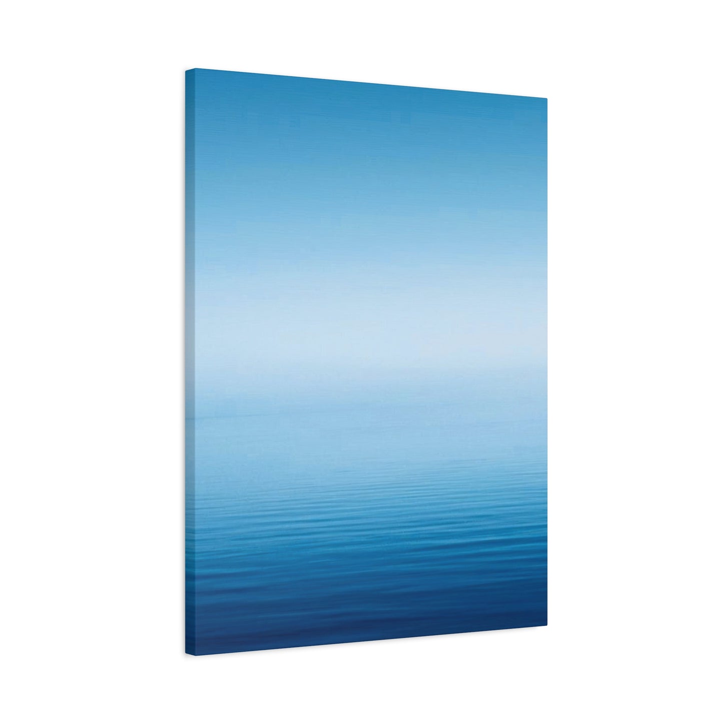
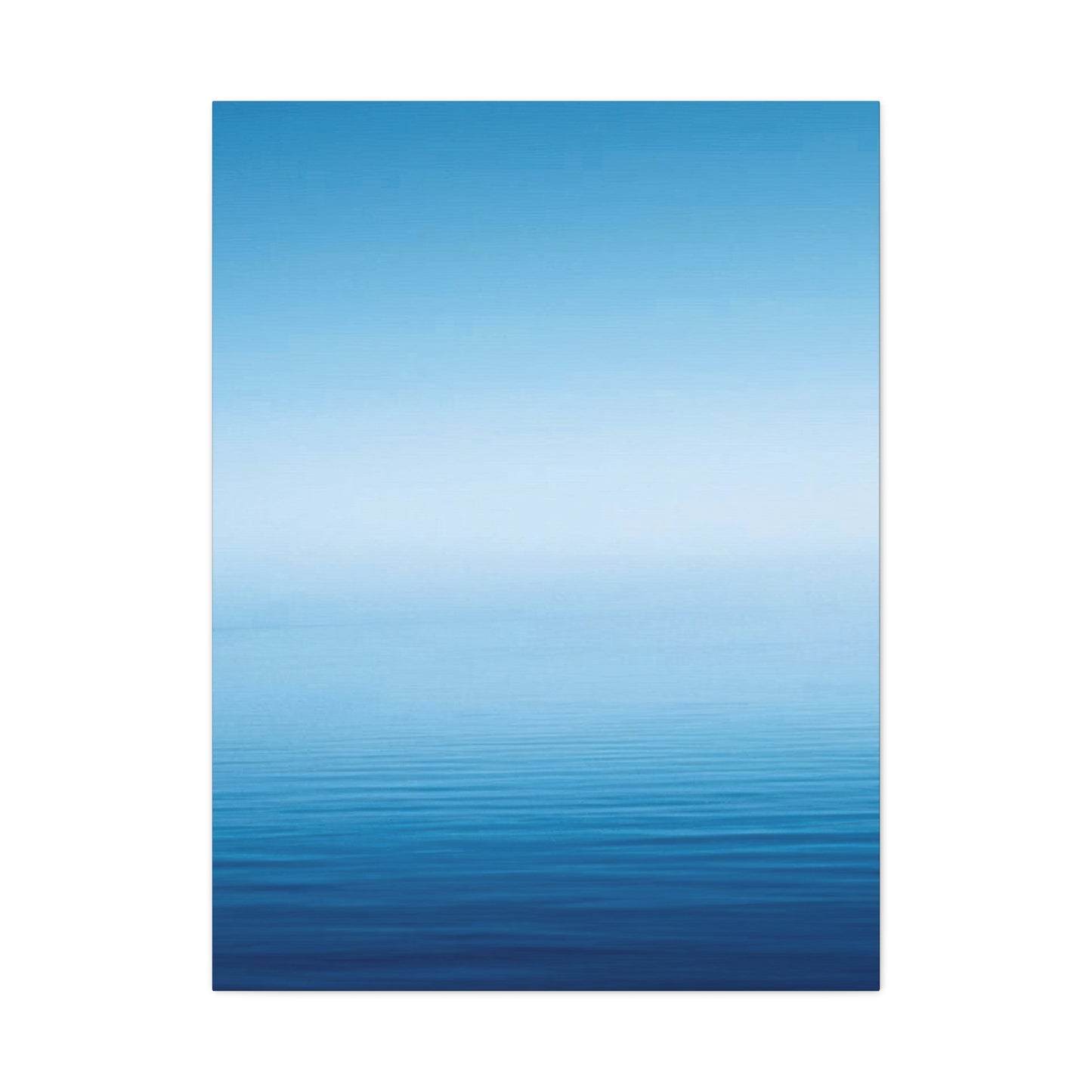
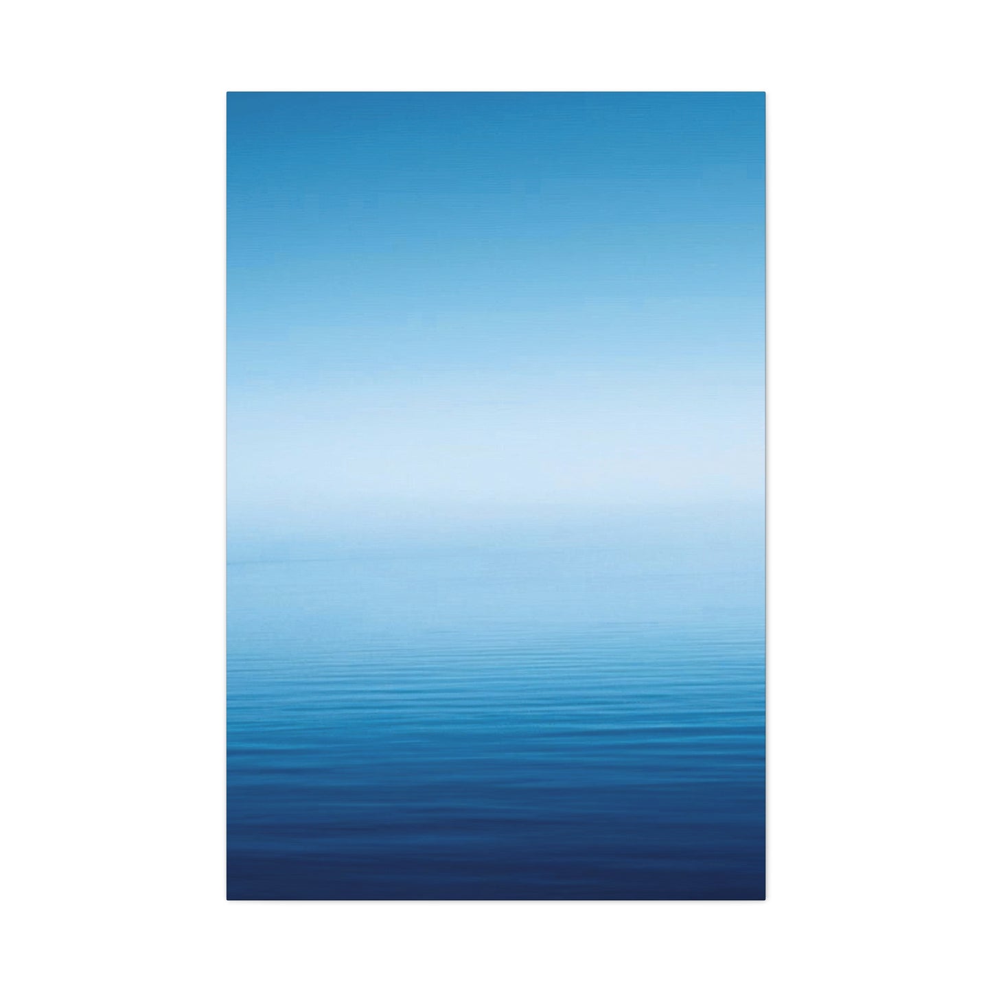
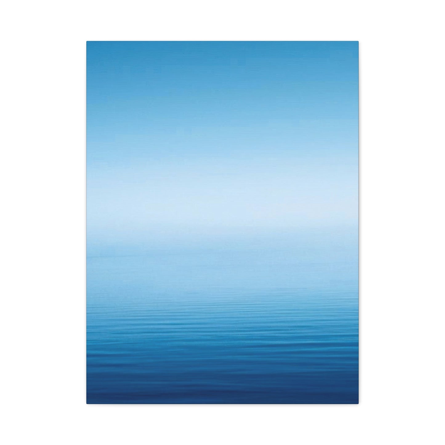
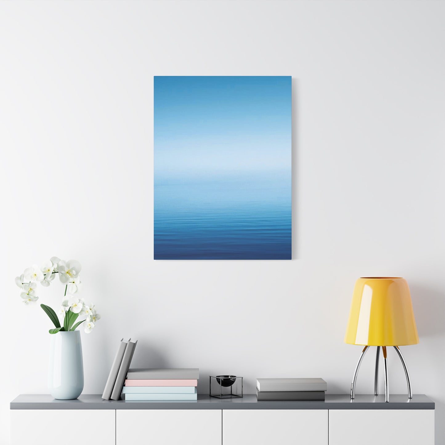
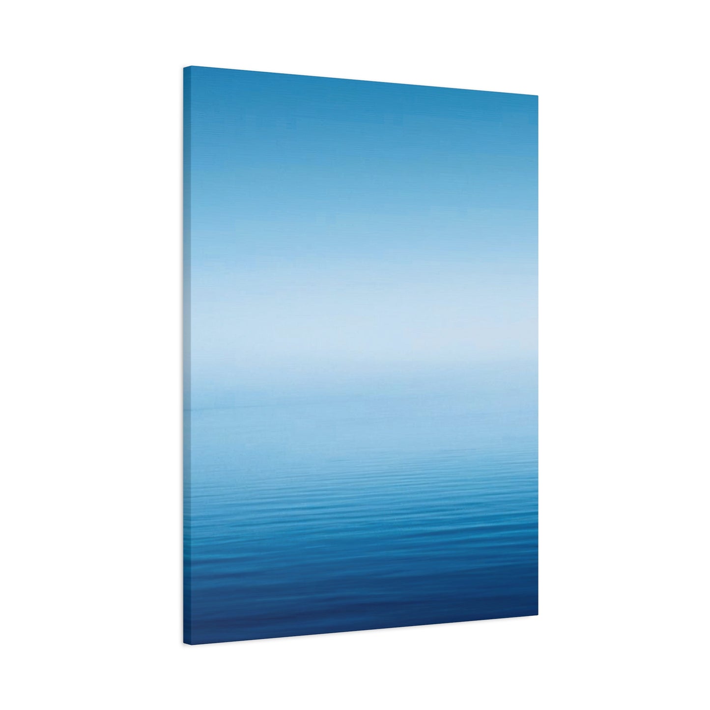
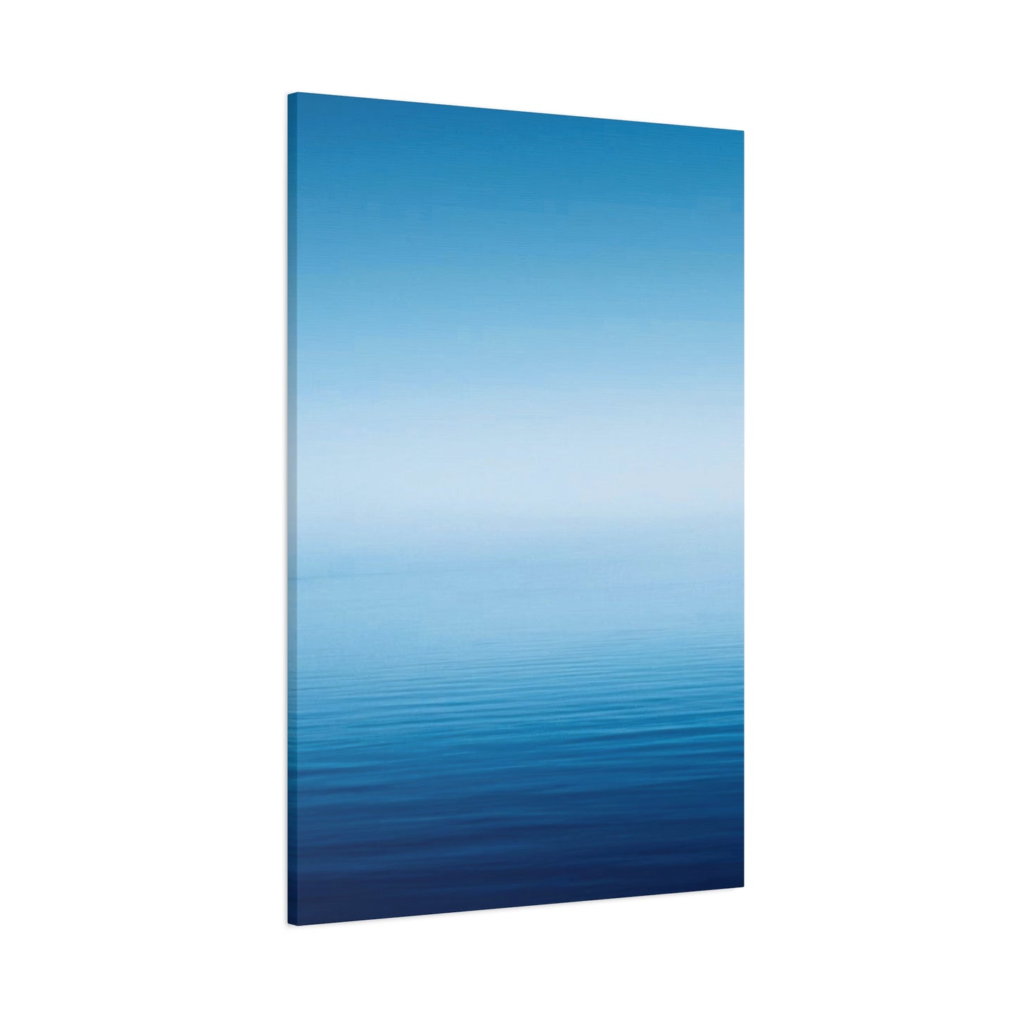
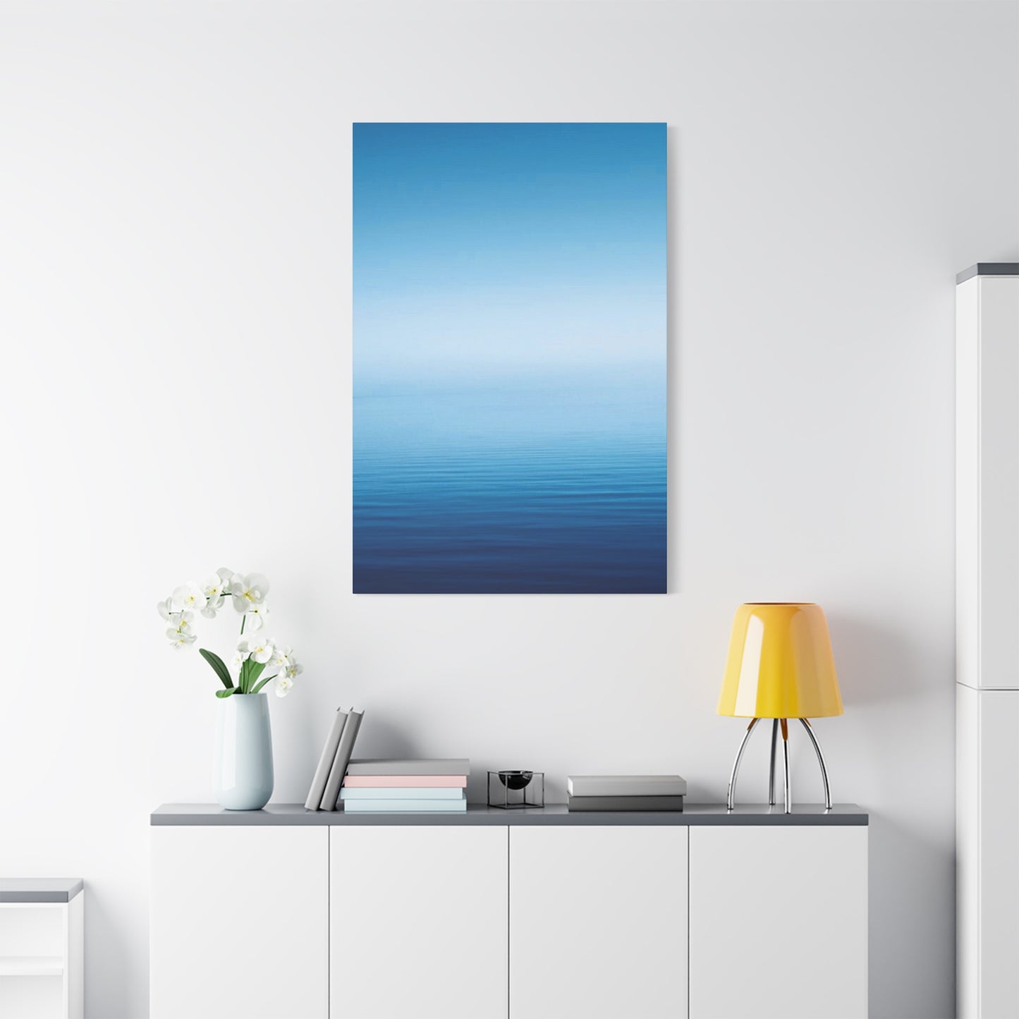
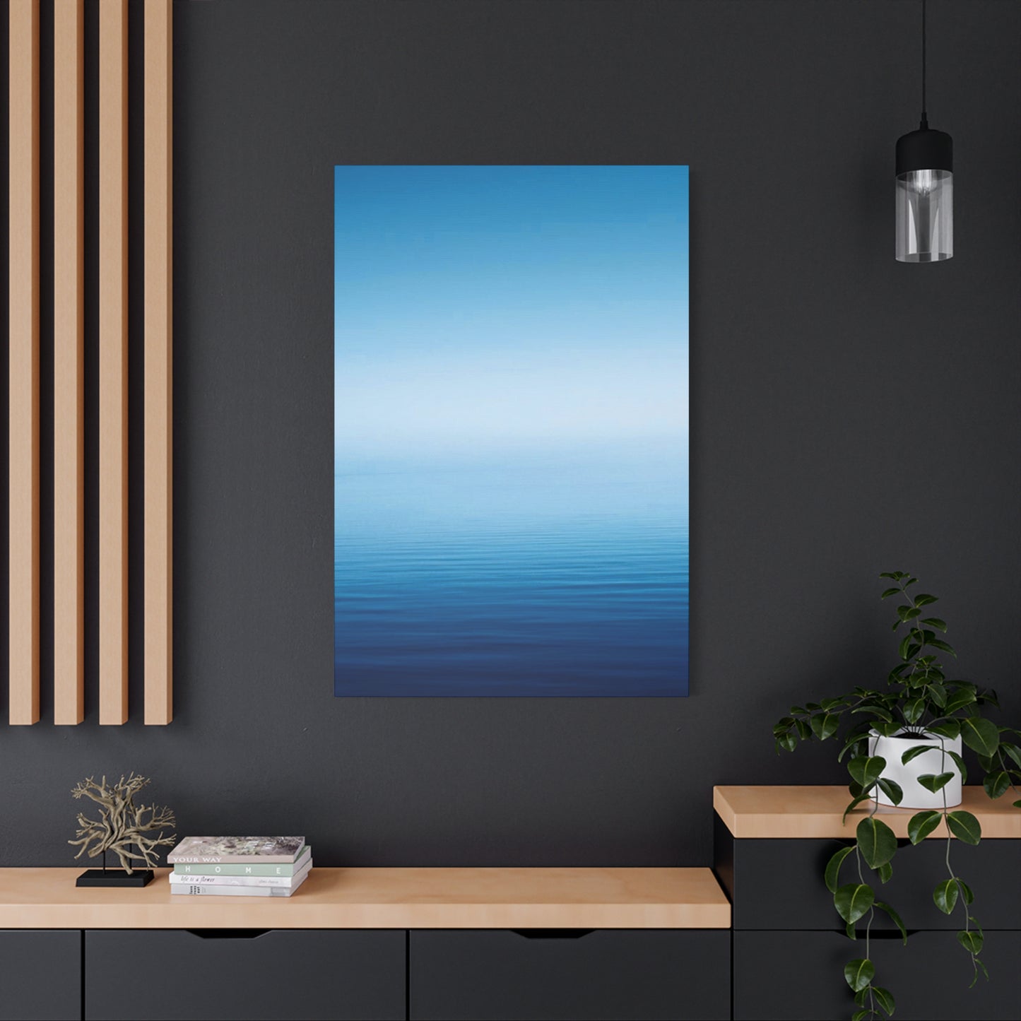
Blue Cool Gradient Wall Art & Canvas Prints
Blue Cool Gradient Wall Art & Canvas Prints
Couldn't load pickup availability
Revitalize Your Living Space with the Elegant Vibes of Blue Cool Gradient Wall Art
The world of interior decoration has witnessed a remarkable transformation in recent years, with homeowners and designers increasingly gravitating toward contemporary artistic expressions that blend sophistication with visual appeal. Among these trending decorative elements, blue cool gradient wall art has emerged as a captivating choice that brings depth, tranquility, and modern elegance to residential and commercial environments. This comprehensive exploration delves into every aspect of this stunning decorative phenomenon, examining its aesthetic qualities, practical considerations, and the profound impact it creates in various settings.
The Captivating Visual Language of Transitional Color Schemes in Contemporary Decoration
The artistic movement toward transitional color schemes represents a significant shift in how people perceive and appreciate visual aesthetics within interior environments. Unlike traditional artwork that features distinct boundaries and sharp contrasts, gradient-based decorative pieces create a seamless flow of hues that guide the observer's eye across the canvas in a soothing, almost meditative manner. This particular approach to visual representation has roots in various artistic movements throughout history, yet its contemporary interpretation brings fresh relevance to modern living spaces.
Blue cool gradient wall art specifically leverages the psychological and emotional properties of cooler color temperatures, creating an atmosphere that promotes relaxation, contemplation, and mental clarity. The gradual transition from deeper azure tones to lighter cerulean shades—or vice versa—establishes a visual rhythm that resonates with viewers on a subconscious level. This chromatic progression mirrors natural phenomena such as twilight skies, ocean depths, and atmospheric conditions, triggering innate responses that connect observers to the natural world even within urban environments.
The popularity of this decorative style reflects broader cultural trends toward minimalism, mindfulness, and the pursuit of serene living environments. In an era characterized by constant stimulation and digital overload, the gentle visual progression offered by gradient artwork provides a welcome respite for overstimulated senses. The absence of jarring transitions or aggressive contrasts allows these pieces to serve as focal points without overwhelming the surrounding design elements.
Exploring the Chromatic Spectrum Within Cool-Toned Gradient Compositions
The range of possibilities within blue cool gradient wall art extends far beyond simple two-tone transitions. Sophisticated compositions may incorporate multiple shades spanning the entire cool color spectrum, from deep navy and midnight blue through turquoise, aquamarine, and powder blue to nearly white arctic tones. Each variation creates a distinct emotional atmosphere and serves different functional purposes within interior design schemes.
Darker gradient compositions that progress from profound indigo to moderate cobalt create dramatic statements suitable for spaces where bold visual impact is desired. These deeper variations work exceptionally well in larger rooms where the intensity won't overwhelm the proportions, and they pair beautifully with contemporary furnishings featuring clean lines and metallic accents. The richness of saturated blues adds depth and sophistication, making spaces feel more intimate and curated.
Conversely, lighter gradient compositions emphasizing pale blues, soft teals, and near-white tones generate an airy, expansive feeling that makes smaller rooms appear more spacious. These gentler variations excel in bedrooms, meditation spaces, and areas designed for relaxation and rejuvenation. The subtle chromatic shifts maintain visual interest without demanding attention, allowing these pieces to enhance rather than dominate their surroundings.
Mid-range gradient compositions occupying the middle ground between these extremes offer versatility that adapts to various design contexts. These balanced pieces typically feature transitions from moderate blues through lighter shades, providing sufficient visual interest to serve as focal points while maintaining the calming qualities associated with cooler color palettes. Such versatility makes them popular choices for multipurpose spaces that serve different functions throughout the day.
The Profound Psychological Impact of Cool Color Palettes on Human Perception and Mood
Scientific research into color perception has consistently demonstrated that cooler color temperatures exert measurable effects on human physiology and emotional states. Blue hues, in particular, have been shown to reduce heart rate, lower blood pressure, and promote the production of neurotransmitters associated with calmness and mental clarity. These physiological responses translate into tangible benefits for individuals spending time in environments decorated with blue cool gradient wall art.
The calming influence of cooler colors makes them particularly valuable in high-stress environments or spaces dedicated to relaxation and recovery. Bedrooms featuring gradient blue artwork often facilitate improved sleep quality, as the soothing visual stimulus helps quiet racing thoughts and prepare the mind for rest. Similarly, meditation rooms, yoga studios, and wellness centers frequently incorporate these decorative elements to reinforce their therapeutic missions.
Beyond the direct physiological effects, cooler color palettes also carry cultural and symbolic associations that influence how people perceive and interact with spaces. Blue has long been associated with trustworthiness, stability, and professionalism in Western cultures, making it a strategic choice for office environments and commercial spaces where these qualities support brand identity. The gradient aspect adds a contemporary twist to these traditional associations, signaling innovation and forward-thinking approaches.
The gradient transition itself holds symbolic significance, representing concepts such as transformation, progression, and continuous growth. This metaphorical dimension adds layers of meaning that resonate with viewers seeking artwork that reflects personal values or aspirations. The absence of rigid boundaries within gradient compositions also suggests openness, flexibility, and the interconnected nature of experiences—themes that align with contemporary philosophical and spiritual perspectives.
Strategic Placement Considerations for Maximizing Visual Impact in Diverse Room Configurations
The effectiveness of blue cool gradient wall art depends significantly on thoughtful placement within the broader interior design context. Several factors influence optimal positioning, including room dimensions, lighting conditions, viewing angles, and relationships with surrounding design elements. Understanding these considerations enables homeowners and designers to maximize the aesthetic and emotional impact of these decorative pieces.
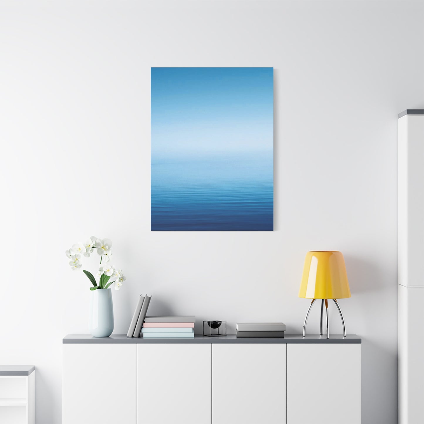
In living rooms and common areas, gradient artwork often works best as a central focal point positioned above seating arrangements or fireplace mantels. This placement naturally draws the eye and creates a visual anchor around which other design elements can be arranged. The horizontal or vertical orientation of the gradient should complement the room's proportions—vertical compositions emphasizing ceiling height in rooms with ample vertical space, while horizontal pieces accentuating width in more expansive layouts.
Bedroom placements require particular attention to viewing angles and lighting conditions. Positioning gradient artwork opposite the bed allows for contemplation during wakeful moments while maintaining sufficient distance to appreciate the full composition. Alternatively, placing such pieces above headboards creates an immersive backdrop that surrounds occupants with the calming chromatic progression. Avoiding placement directly opposite windows prevents glare issues that might obscure the subtle color transitions.
Office and workspace environments benefit from strategic placement that provides visual relief without distraction. Positioning gradient artwork within peripheral vision rather than directly in the primary line of sight allows workers to benefit from its calming influence while maintaining focus on tasks. This placement strategy harnesses the physiological benefits of cool colors without introducing competing visual stimuli that might reduce productivity.
Hallways, entryways, and transitional spaces offer unique opportunities for gradient artwork to guide movement through the environment. The directional flow inherent in gradient compositions can subtly encourage movement in particular directions, while the calming color palette creates welcoming atmospheres that ease transitions between different areas. These applications demonstrate how decorative elements can serve functional as well as aesthetic purposes.
Material Considerations and Medium Variations in Gradient Artwork Production
Blue cool gradient wall art manifests across numerous material substrates and production methods, each offering distinct aesthetic qualities and practical characteristics. Understanding these variations helps buyers select pieces that align with their specific requirements regarding durability, maintenance, visual effect, and budget constraints.
Canvas prints remain among the most popular formats for gradient artwork, offering a classic aesthetic that complements diverse design styles. High-quality canvas reproduction processes can capture subtle color transitions with remarkable fidelity, while the textured surface adds depth and visual interest that flat prints cannot match. Stretched canvas pieces arrive ready to hang, while rolled canvas offers more affordable shipping options for those comfortable with DIY mounting or professional framing.
Metal prints represent a contemporary alternative that imparts modern sophistication to gradient compositions. The printing process infuses dyes directly into specially coated aluminum surfaces, creating luminous, vibrant results with exceptional durability. The reflective qualities of metal substrates interact with ambient lighting to create dynamic visual effects that shift throughout the day as illumination changes. These pieces resist fading, moisture, and physical damage far better than paper or canvas alternatives.
Acrylic panels offer another modern presentation format that creates stunning depth through transparent layers. Printing behind clear acrylic creates a floating effect that adds dimensionality to gradient compositions, while the glossy surface enhances color saturation and luminosity. The substantial weight and contemporary aesthetic of acrylic pieces make them statement works suitable for upscale residential and commercial environments.
Traditional framed prints remain relevant for those preferring classic presentation formats or seeking to coordinate with existing framed artwork collections. The frame selection significantly influences the overall aesthetic—minimalist metal frames emphasizing contemporary sensibilities, while wooden frames adding warmth and traditional elegance. The matting choices also impact visual presentation, with lighter mats expanding the sense of space around the artwork while darker options creating more dramatic contrasts.
Size Selection Strategies for Proportional Balance in Various Spatial Contexts
Selecting appropriately sized gradient artwork represents a critical decision that profoundly affects the visual harmony of interior spaces. Undersized pieces appear lost and ineffective, while oversized works overwhelm their surroundings and disrupt spatial balance. Several guidelines help navigate these sizing decisions, though personal preferences and specific design contexts may warrant departures from standard recommendations.
For artwork positioned above furniture pieces such as sofas, consoles, or beds, the general principle suggests the artwork should span approximately two-thirds to three-quarters of the furniture's width. This proportion creates visual connection between the pieces while maintaining appropriate breathing room on either side. Vertical dimensions should complement ceiling heights—taller pieces emphasizing verticality in rooms with high ceilings, while broader horizontal compositions working better in spaces with lower ceilings.
Gallery wall arrangements incorporating gradient pieces alongside other artwork require careful attention to collective visual weight and spacing. The gradient piece typically serves as an anchor within such arrangements, with complementary works supporting rather than competing with its gentle chromatic progression. Maintaining consistent spacing between elements—typically two to three inches—creates cohesive arrangements that read as unified compositions rather than disconnected collections.
Standalone statement pieces demand sufficient wall space to breathe, with recommended margins of at least six to twelve inches on all sides. This breathing room prevents the artwork from appearing cramped and allows the gradient transition to exert its full visual impact. In particularly spacious environments, even larger margins may be appropriate to maintain proportional relationships with architectural elements.
Multi-panel installations offer flexibility for filling larger wall expanses while creating dynamic visual interest through panel arrangement. Triptych and multi-panel gradient compositions can create continuous chromatic progressions across multiple canvases or introduce subtle variations between panels for added complexity. Spacing between panels typically ranges from two to four inches, balancing visual separation with overall compositional unity.
Illumination Strategies for Enhancing Color Fidelity and Visual Drama
Proper lighting dramatically influences how viewers perceive and experience blue cool gradient wall art. Inadequate or inappropriate illumination can flatten subtle color transitions, introduce unwanted glare, or create color distortions that diminish the artwork's intended impact. Conversely, well-designed lighting schemes enhance color accuracy, create visual depth, and add dramatic dimension to gradient compositions.
Natural daylight provides the most accurate color rendering for gradient artwork, revealing subtle chromatic nuances that artificial lighting may obscure. However, direct sunlight should be avoided, as prolonged exposure causes fading and potential damage to many printing substrates. Positioning artwork on walls that receive indirect natural light offers ideal conditions—bright enough for accurate color perception without the harmful effects of direct solar radiation.
For environments relying primarily on artificial illumination, careful attention to color temperature proves essential. Cool white and daylight-balanced bulbs (5000-6500K color temperature) render blue tones most accurately and prevent the warm yellow cast that incandescent and warm LED bulbs introduce. However, some designers intentionally use warmer lighting to soften the coolness of blue gradient artwork, creating more balanced emotional atmospheres—a strategic choice dependent on the desired overall effect.
Dedicated artwork lighting through picture lights, track lighting, or recessed spotlights adds drama and ensures consistent illumination regardless of ambient lighting conditions. When implementing such systems, positioning lights at thirty-degree angles from the wall minimizes glare and shadows while providing even illumination across the artwork surface. Adjustable fixtures offer flexibility to fine-tune lighting as needed, accommodating different times of day and usage scenarios.
Ambient lighting schemes that incorporate indirect or diffused illumination create gentle, flattering conditions for gradient artwork appreciation. Cove lighting, wall washers, and uplights bounce illumination off ceilings and walls, creating soft, even light that reveals gradient transitions without harsh shadows or hotspots. These approaches work particularly well in spaces designed for relaxation, where aggressive direct lighting would contradict the calming influence of cool color palettes.
Harmonizing Gradient Artwork With Diverse Interior Design Philosophies and Styles
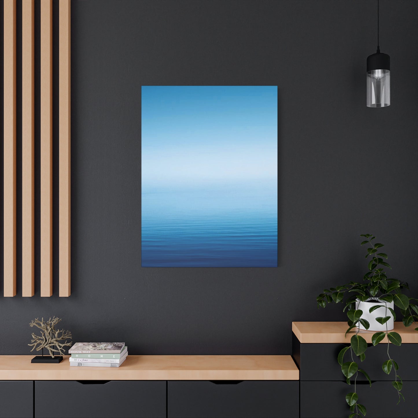
Blue cool gradient wall art demonstrates remarkable versatility across various design philosophies, from ultramodern minimalism to eclectically curated spaces. Understanding how these pieces interact with different design vocabularies enables strategic selection and placement that enhances rather than conflicts with existing aesthetic directions.
Minimalist and contemporary design schemes find natural synergy with gradient artwork's clean, uncluttered visual language. The absence of representational imagery or complex patterns aligns perfectly with minimalist principles emphasizing simplicity and reduction. In such contexts, gradient pieces often serve as rare touches of visual interest within otherwise austere environments, their subtle chromatic progressions providing just enough variety to prevent sterility while maintaining overall design discipline.
Scandinavian and Nordic-inspired interiors embrace gradient artwork as an extension of their characteristic light palettes and nature-inspired aesthetics. The cool tones complement the whitewashed woods, pale textiles, and abundant natural light that define these design approaches. Gradient pieces contribute to the serene, airy atmospheres Scandinavian design cultivates while introducing controlled color that prevents environments from feeling too clinical or cold.
Coastal and nautical design schemes naturally incorporate blue gradient artwork as reinforcement of their oceanic themes. The chromatic progressions echo water depths and seaside horizons, strengthening the connection to coastal environments that these design approaches seek to evoke. Pairing gradient pieces with natural textures such as weathered wood, rope, and linen creates layered environments that feel authentically connected to maritime settings.
Even traditional and transitional interiors can successfully incorporate gradient artwork when thoughtfully integrated. Classic framing treatments, strategic placement among more conventional artwork, and careful color coordination with existing palettes allow gradient pieces to complement rather than clash with traditional furnishings and architectural details. This cross-style versatility makes gradient artwork valuable for homeowners reluctant to commit fully to contemporary design while desiring fresh, updated elements.
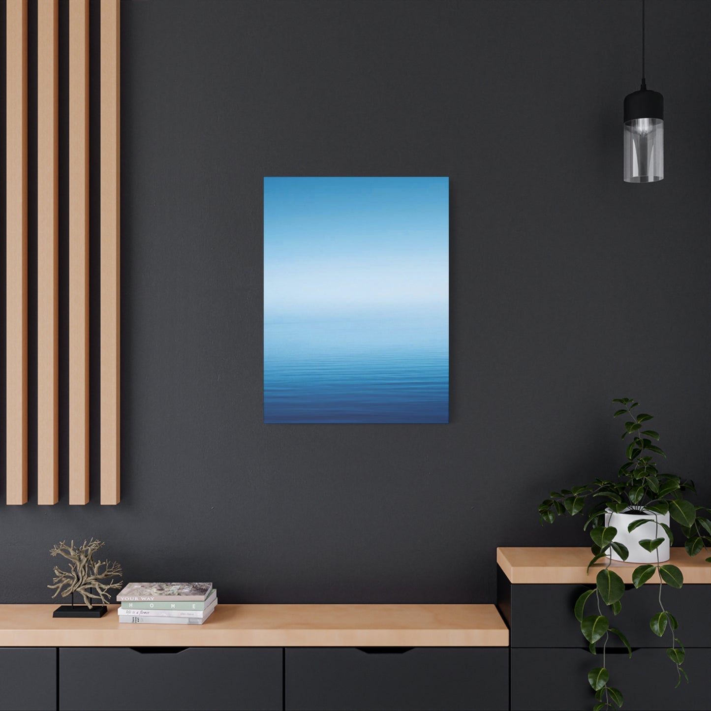
Industrial and urban loft environments benefit from the softening influence gradient artwork introduces to raw architectural elements. The cool blues provide visual relief against exposed brick, concrete, and metal surfaces while maintaining the contemporary sensibility these spaces embody. Metal-printed gradient pieces particularly suit industrial aesthetics, their sleek surfaces and modern production methods echoing the utilitarian materials defining these environments.
Complementary Color Schemes and Palette Coordination for Cohesive Interior Environments
Successfully incorporating blue cool gradient wall art requires thoughtful consideration of surrounding color palettes to create harmonious, intentional environments. While gradient pieces introduce multiple shades within single compositions, understanding color theory principles enables strategic coordination with furnishings, accessories, and architectural elements.
Monochromatic schemes extending the cool blue palette throughout the environment create serene, cohesive atmospheres with strong visual unity. Varying shades, tints, and tones of blue across textiles, furnishings, and accessories establishes clear color direction while preventing monotony through subtle variation. This approach works exceptionally well in bedrooms and relaxation spaces where consistent calming influence is desired.
Analogous color schemes incorporating neighboring hues such as greens and purples create richer, more complex environments while maintaining chromatic harmony. Cool-toned teals and aquamarines bridge the gap between blue and green, while lavenders and soft purples add warmth without abandoning the cool color family. These subtle variations create visual interest and depth while preserving the tranquil qualities associated with cooler palettes.
Complementary accent strategies introduce warm oranges, corals, and peachy tones to create dynamic contrast with cool blue gradients. These warm accents prevent environments from feeling too cold or austere while generating visual excitement through color opposition. Strategic placement of warm-toned throw pillows, artwork, or decorative objects creates focal points and visual punctuation within predominantly cool environments.
Neutral foundations combining whites, grays, and pale woods allow gradient artwork to command attention without chromatic competition. This approach gives gradient pieces maximum visual impact while maintaining flexibility for seasonal accent changes or evolving design preferences. Neutral environments showcase the subtle chromatic complexity within gradient compositions, allowing viewers to appreciate nuanced color transitions that busier color schemes might obscure.
Metallic accents in silver, chrome, and brushed nickel reinforce the cool sophistication of blue gradient artwork while adding reflective sparkle that enlivens spaces. These metallic elements echo the cool color temperature while introducing textural variety and visual interest. Gold and brass accents, while warmer in tone, can still coordinate effectively when used sparingly, adding just enough warmth to prevent environments from feeling sterile.
Curatorial Approaches for Gallery Wall Arrangements Featuring Gradient Compositions
Creating gallery wall arrangements that successfully incorporate blue cool gradient wall art requires balancing the unique qualities of gradient pieces with complementary works. The visual simplicity and chromatic flow of gradient artwork necessitates careful consideration when selecting and arranging accompanying pieces to avoid visual confusion or conflicting focal points.
The anchor approach positions the gradient piece as the central focal point, with surrounding artwork supporting rather than competing for attention. This strategy works particularly well when the gradient piece represents the largest work in the arrangement, its size and visual weight justifying its central position. Surrounding pieces typically feature simpler compositions, complementary color palettes, or thematic connections that reinforce rather than distract from the gradient centerpiece.
Symmetrical arrangements flanking a gradient centerpiece with matching or complementary works create formal, balanced compositions suitable for traditional and transitional interiors. This approach provides clear visual order and prevents the gradient piece from overwhelming its surroundings through careful proportional relationships. Symmetrical arrangements work especially well in formal dining rooms, entry halls, and spaces where architectural symmetry informs overall design decisions.
Asymmetrical arrangements offer more contemporary, dynamic alternatives that create visual movement and energy. Strategic placement of gradient artwork off-center within such arrangements generates tension and interest while allowing other pieces to balance the composition through careful size and color relationships. Asymmetrical approaches suit modern and eclectic interiors where less formal spatial relationships align with overall design philosophies.
Color-coordinated collections built around the blue gradient palette create strong visual unity while allowing individual pieces to contribute unique characteristics. Selecting companion artwork featuring cool tones, blue accents, or chromatic relationships to the gradient piece establishes clear curatorial direction while maintaining variety through different subjects, styles, or media. This approach demonstrates intentionality and sophisticated design sensibility.
Mixed-media arrangements incorporating photography, illustrations, and decorative objects alongside gradient artwork create rich, layered compositions with significant visual complexity. Careful attention to visual weight, color relationships, and thematic connections prevents such arrangements from appearing chaotic. The gradient piece often serves as a calming visual anchor that unifies more disparate elements through its subtle chromatic progression.
Seasonal Styling Adaptations and Evolving Decorative Contexts Throughout the Year
While blue cool gradient wall art maintains year-round relevance, thoughtful styling adjustments can emphasize seasonal connections and keep interior environments feeling fresh and responsive to changing contexts. These adaptations typically focus on surrounding accessories, textiles, and complementary decorative elements rather than relocating or replacing the artwork itself.
Spring styling emphasizes renewal and lightness through the introduction of fresh greens, soft yellows, and floral elements that complement cool blue tones. Lightweight textiles in natural fibers replace heavier winter materials, while botanical prints and nature-inspired accessories create connections to the awakening natural world. The blue gradient serves as a stable backdrop suggesting clear spring skies against which lighter, airier elements can shine.
Summer approaches might intensify coastal connections through the addition of nautical accessories, natural textures, and beach-inspired elements. Crisp whites and sandy neutrals combine with the blue gradient to evoke seaside escapes and vacation atmospheres. Lighter furniture arrangements and removal of heavy textiles create breezy, open feelings that align with summer's expansive energy while the cool blue palette provides visual and psychological relief from heat.
Autumn styling introduces warmer accent colors through rust, amber, and rich brown tones that create dynamic contrast with cool blue gradients. Natural elements such as dried grasses, branches, and seasonal botanicals add textural interest and connect interiors to the changing outdoor environment. The juxtaposition of warm autumn tones against cool blue creates visual richness that reflects the season's characteristic complexity and transition.
Winter styling embraces the cool palette more fully, adding deeper blues, silvery accents, and crystalline elements that echo cold-weather aesthetics. Luxurious textiles in velvet, faux fur, and chunky knits add warmth and comfort while complementing the sophisticated coolness of gradient artwork. Metallic accents in silver and mercury glass create sparkle and reflection that captures winter light, while the blue gradient suggests cozy evening skies or frozen landscapes.
Practical Preservation Strategies for Longevity and Sustained Visual Quality
Maintaining the pristine appearance of blue cool gradient wall art requires modest but consistent attention to environmental conditions and cleaning practices. While modern printing methods and protective coatings offer significant durability, understanding proper care extends the lifespan and preserves the visual impact of these decorative investments.
Ultraviolet radiation represents the primary threat to color stability in most printing substrates. Prolonged exposure to direct sunlight causes gradual fading that particularly affects lighter tones within gradient compositions, potentially disrupting the smooth chromatic transitions that define these pieces. Positioning artwork away from windows receiving direct sun, or filtering incoming light through UV-protective window films and treatments, significantly reduces this risk.
Humidity fluctuations affect different substrates variably, with canvas and paper-based prints proving more sensitive than metal or acrylic alternatives. Maintaining relative humidity between thirty and fifty percent prevents material deterioration, mold growth, and color bleeding that excessive moisture encourages. Conversely, extremely dry conditions can cause canvas to become brittle and prone to cracking, particularly along stretcher bar edges.
Regular dusting using soft, dry microfiber cloths removes accumulated particulates that dull surface appearance and potentially cause abrasive damage over time. Dusting frequency depends on environmental conditions, with high-traffic areas and homes with pets requiring more frequent attention. Avoid feather dusters that may scratch protective coatings, and never use water or cleaning solutions unless specifically recommended for the particular substrate.
For deeper cleaning when dry dusting proves insufficient, substrate-specific approaches ensure effective results without damage. Canvas prints tolerate gentle vacuuming using soft brush attachments, while metal and acrylic prints can be cleaned with slightly dampened microfiber cloths. Always test cleaning methods on inconspicuous areas first, and avoid excessive moisture that might seep behind protective coatings or damage substrate materials.
Climate control in rooms housing valuable artwork maintains stable conditions that prevent gradual degradation. Avoiding dramatic temperature swings, maintaining moderate humidity levels, and ensuring adequate air circulation all contribute to preservation. Rooms prone to extreme conditions—such as bathrooms with poor ventilation or sun rooms with significant temperature variation—represent challenging environments for any artwork regardless of substrate or protective treatments.
Sourcing Strategies for Discovering Quality Gradient Artwork Within Various Budget Ranges
The market for blue cool gradient wall art spans enormous price ranges, from affordable mass-produced prints to unique commissioned pieces commanding premium prices. Understanding the factors influencing cost and knowing where to find options at different price points enables informed purchasing decisions aligned with budget constraints and quality expectations.
Mass-market retailers and online marketplaces offer the most affordable entry points, with basic canvas prints and posters available at minimal cost. These options suit renters, temporary spaces, or situations where budget constraints outweigh long-term quality considerations. However, buyers should maintain realistic expectations regarding color accuracy, substrate quality, and longevity when purchasing at these price points.
Mid-range options from specialized home decor retailers and online art marketplaces balance reasonable pricing with improved quality. These sources typically offer better printing processes, higher-quality substrates, and more sophisticated color management than mass-market alternatives. This tier represents the sweet spot for many homeowners seeking noticeable quality improvements without investment-level pricing.
Independent artists and small studios produce original or limited-edition gradient artwork offering unique character and superior craftsmanship. While commanding higher prices than mass-produced alternatives, these pieces provide the satisfaction of supporting working artists while acquiring works with greater exclusivity. Many artists accept commissions, allowing buyers to specify dimensions, color progressions, and other details for truly customized results.
Gallery representations and established contemporary artists create gradient works positioning themselves as collectible art rather than mere decoration. These pieces command significant prices reflecting artistic reputation, exhibition history, and investment potential. Buyers at this level typically work with galleries, art consultants, or directly with artist representatives to source and acquire works.
Digital printing services enable custom creation of gradient artwork from digital files, offering complete control over dimensions, color specifications, and substrate choices. This approach suits buyers with specific vision who cannot find existing works meeting their requirements. Working with professional printing services ensures proper color management, substrate preparation, and finishing details that determine final quality.
Size-Appropriate Room Applications and Spatial Relationship Considerations
Different room types and functional spaces benefit from blue cool gradient wall art in varying ways, with optimal approaches depending on room purpose, dimensions, and architectural characteristics. Understanding these contextual factors enables strategic artwork selection and placement that enhances rather than conflicts with spatial function.
Primary bedrooms represent ideal candidates for cool gradient artwork given the proven calming effects of blue tones on sleep quality and relaxation. Positioning gradient pieces where they're visible from the bed but not directly overhead prevents distraction while providing gentle focal points during wakeful moments. Larger bedrooms can accommodate substantial statement pieces, while smaller sleeping quarters benefit from more modestly scaled works that avoid overwhelming intimate spaces.
Living rooms and family gathering spaces utilize gradient artwork to establish atmosphere while complementing diverse activities occurring in these multipurpose environments. The calming qualities of cool blue palettes create welcoming atmospheres for guests while supporting relaxation for household members. Sizing considerations in living rooms typically favor larger pieces that maintain visual presence across greater viewing distances typical of these more spacious areas.
Home offices and workspaces benefit from the focus-enhancing properties of cool color palettes while requiring careful placement that provides visual relief without distraction. Positioning artwork in peripheral vision rather than direct sight lines allows workers to benefit from the physiological calming effects while maintaining concentration on tasks. The professional associations of blue tones also reinforce productivity and serious purpose in work environments.
Bathrooms and powder rooms present opportunities for gradient artwork when environmental conditions permit. Spaces with adequate ventilation and minimal moisture exposure can successfully incorporate canvas or paper-based works, while high-humidity bathrooms require more durable metal or acrylic substrates. The association between water and blue creates natural thematic connections that feel intuitive and harmonious in these utilitarian spaces.
Entryways and hallways benefit from gradient artwork's ability to create welcoming atmospheres while guiding movement through transitional spaces. The directional flow inherent in gradient compositions can subtly encourage circulation in particular directions, while cool color palettes create calming first impressions for visitors. These applications demonstrate how decorative elements serve both aesthetic and subtle functional purposes in residential environments.
Understanding Print Quality Factors and Production Method Distinctions
The visual impact and longevity of blue cool gradient wall art depend significantly on production methods and print quality factors that may not be immediately apparent to casual buyers. Developing literacy regarding these technical considerations enables more informed purchasing decisions and realistic quality expectations at different price points.
Resolution and file quality fundamentally determine the crispness and color accuracy achievable in printed gradient artwork. High-resolution source files capturing smooth chromatic transitions without visible banding produce superior results, while lower-resolution files reveal obvious color steps that disrupt the seamless flow essential to effective gradient compositions. Professional print services typically require minimum resolutions of 150-300 DPI for quality results at intended display sizes.
Color management systems ensure printed results accurately match intended colors despite variations between computer monitors and printing substrates. Proper calibration and color profiling prevent disappointing disparities between digital previews and physical prints. Professional printing services employ sophisticated color management workflows, while consumer-level printing often lacks these refinements, resulting in inconsistent color reproduction.
Ink quality and formulation significantly impact color vibrancy, fade resistance, and longevity. Archival pigment-based inks offer superior lightfastness and longevity compared to dye-based alternatives, maintaining color integrity for decades when properly displayed. However, pigment inks command higher costs, contributing to price differentials between budget and premium printing services.
Substrate preparation and coating treatments protect printed images while influencing final appearance. Protective varnishes or UV-resistant coatings prevent fading and physical damage, though they may introduce slight gloss or texture that affects how light interacts with the artwork surface. Different substrates require specific preparation and coating approaches, with canvas, metal, and acrylic each demanding unique treatment protocols.
Printing technology itself varies from consumer-grade inkjet systems to professional giclée processes and specialized metal infusion methods. Giclée printing represents the gold standard for fine art reproduction, utilizing specialized printers, archival inks, and rigorous quality control to produce gallery-quality results. Metal printing employs heat transfer processes that infuse dyes directly into coated aluminum surfaces, creating exceptionally durable and vibrant results impossible with traditional printing methods.
Exploring Textural Variations and Surface Finish Options in Gradient Artwork
Beyond color and composition, the physical texture and surface finish of blue cool gradient wall art significantly influence visual appearance and emotional impact. These tactile qualities affect how light interacts with the artwork surface, contributing to overall aesthetic character and suitability for different design contexts.
Matte finishes absorb rather than reflect ambient light, creating subtle, sophisticated appearances that minimize glare and viewing angle limitations. This finish suits gradient artwork particularly well, as the absence of reflections allows viewers to appreciate subtle color transitions without visual interference. Matte finishes convey refined elegance and work beautifully in spaces with complex or bright lighting where glossy surfaces might create problematic reflections.
Glossy and semi-glossy finishes enhance color saturation and create more vibrant, eye-catching appearances through their reflective properties. These finishes can make colors appear more intense and luminous, though they introduce viewing angle sensitivities and potential glare issues in certain lighting conditions. Glossy finishes suit modern, energetic spaces where visual impact outweighs concerns about subtle viewing difficulties.
Canvas texture adds dimensional interest and traditional artistic character to gradient compositions. The visible weave pattern creates subtle surface variation that catches light and adds perceived depth. Canvas texture particularly enhances larger gradient pieces where the surface characteristics contribute to visual interest across substantial viewing areas. This classic presentation format bridges contemporary gradient aesthetics with traditional artistic conventions.
Smooth, glossy surfaces on metal and acrylic substrates create contemporary, high-end appearances suited to modern design sensibilities. The mirror-like finishes enhance color luminosity while reflecting surrounding environments, creating dynamic visual effects that change throughout the day. These slick surfaces convey modern sophistication and precision that aligns with minimalist and contemporary design philosophies.
Textured specialty finishes including brushed metals, frosted acrylics, and dimensional applications add unique character for buyers seeking distinctive alternatives to standard presentations. These specialty treatments command premium prices but deliver one-of-a-kind visual effects unavailable through conventional printing methods. Such options appeal to design-forward buyers willing to invest in truly distinctive decorative elements.
Frame Selection Principles and Presentation Format Impacts on Overall Aesthetic
When blue cool gradient wall art requires or benefits from framing, the frame selection significantly influences overall aesthetic impact and determines how successfully the piece integrates with surrounding design elements. Understanding framing principles enables strategic choices that enhance rather than detract from gradient compositions.
Minimalist metal frames in silver, chrome, or brushed aluminum complement contemporary gradient artwork while maintaining clean, modern aesthetics. These slim profiles provide necessary visual boundaries without overwhelming or competing with the gradient composition itself. The cool metallic tones harmonize naturally with blue color palettes, creating cohesive presentations that feel intentional and sophisticated.
Wooden frames offer warmth and traditional character that can either complement or contrast with cool gradient aesthetics depending on wood tone and finish. Lighter woods such as maple, birch, and whitewashed pine maintain overall coolness while adding organic texture. Darker woods like walnut, espresso-stained oak, or ebony create dramatic contrast that can either enhance or overwhelm gradient pieces depending on relative proportions and surrounding design contexts.
Floating frames that create space between the artwork edge and frame inner lip generate contemporary, gallery-style presentations. This dimensional separation adds visual interest while making artwork appear to float within the frame rather than sitting flush against backing materials. Floating presentations suit modern interiors and create premium appearance that justifies higher framing costs.
Matting considerations when framing gradient artwork deserve careful attention, as mat color and width significantly affect overall presentation. White and light gray mats maintain brightness and create breathing room around gradient compositions, while darker mats generate drama and contrast. Wide mats emphasize the artwork by creating substantial visual separation from the frame, while narrow mats maintain focus on the gradient itself with minimal distraction.
Frameless presentation options including gallery wraps, standoffs, and direct mounting offer sleek alternatives that eliminate frames entirely. Canvas gallery wraps extend gradient compositions around stretcher bar edges, creating finished appearances without frames. Metal and acrylic standoffs mount artwork slightly away from walls, creating floating effects with contemporary appeal. These frameless approaches suit modern minimalist interiors where traditional framing feels unnecessarily ornate.
Custom Commission Possibilities for Personalized Gradient Artwork Solutions
For buyers unable to find existing blue cool gradient wall art meeting specific requirements, commissioning custom pieces offers complete control over dimensions, color progressions, substrates, and other defining characteristics. Understanding the commission process enables productive collaboration with artists while managing expectations regarding timelines, costs, and outcomes.
Identifying appropriate artists for gradient commission work requires researching portfolios, reviewing previous work, and assessing technical capabilities specific to gradient creation. Not all artists work comfortably with abstract gradient aesthetics, making portfolio review essential for confirming alignment between artistic style and desired outcomes. Many artists showcase portfolio work through personal websites, social media platforms, and online art marketplaces.
Initial consultations establish project parameters including dimensions, orientation, color specifications, substrate preferences, and budget constraints. Providing reference images illustrating desired color progressions, intensity levels, and general aesthetic direction helps artists understand expectations. Discussing technical requirements such as hanging systems, finish preferences, and timeline expectations prevents misunderstandings that might compromise final satisfaction.
Color specification deserves particular attention in gradient commissions, as subtle chromatic variations dramatically affect emotional impact and design compatibility. Providing paint chips, fabric swatches, or digital color references helps artists match specific hues. Discussing whether transitions should be smooth or stepped, linear or radial, and whether multiple color families should be incorporated ensures alignment between envisioned and delivered results.
Mock-ups and approval processes allow buyers to review proposed compositions before artists commit to final production. Digital renderings or small-scale physical samples provide opportunities to request adjustments before substantial work begins. Clear approval protocols prevent costly misunderstandings while giving artists confidence to proceed with final creation knowing their approach satisfies client expectations.
Pricing considerations for commissioned gradient artwork reflect multiple factors including artist experience, complexity, dimensions, substrate costs, and timeline pressures. Rush projects command premium pricing, while flexible timelines may reduce costs. Larger dimensions require proportionally more materials and labor, directly impacting prices. Establishing clear budget parameters upfront prevents disappointing conversations later when quotes exceed expectations.
Multi-Panel and Triptych Configurations for Expanded Visual Impact
Large-scale blue cool gradient wall art installations frequently employ multi-panel configurations that distribute compositions across multiple separate canvases or substrates. These arrangements offer both practical and aesthetic advantages while creating dynamic visual experiences that single-panel works cannot match.
Triptych arrangements featuring three panels create balanced, classical compositions with strong visual rhythm. The central panel typically anchors the composition while flanking panels provide support and continuation. Gradient progressions may flow continuously across all three panels or feature subtle variations between sections. The divisions between panels create visual breathing room that prevents large-scale gradients from overwhelming viewers with unbroken expanses of color.
Diptych configurations employing two panels offer simpler alternatives suitable for narrower walls or more restrained design contexts. These arrangements work particularly well when gradient transitions progress from left to right or bottom to top across the panel division.
Final Thoughts
Blue cool gradient wall art is a timeless and sophisticated addition to any modern living space. This style of art not only enhances the aesthetic appeal of your home but also promotes a sense of calm and tranquility. The cool hues of blue, whether they transition from deep navy to soft sky blue or from teal to icy aquamarine, create a mesmerizing effect that can transform any room. Its ability to blend and shift in color offers a sense of movement and depth, providing a dynamic visual experience that is both soothing and intriguing.
One of the most compelling reasons to incorporate blue cool gradient art into your space is its versatility. Blue, as a color, is widely loved for its calming properties. It has long been associated with peace, serenity, and even mental clarity. Whether placed in a living room, bedroom, or even a home office, blue gradient art can provide a serene backdrop for relaxation or creative thinking. The gradient effect adds a modern, abstract touch that complements various interior styles, from minimalist to contemporary, making it suitable for virtually any space.
The ability to create depth and dimension on a flat surface is another significant advantage of gradient art. The gradual blending of shades creates an optical illusion of space, which can be particularly beneficial in rooms that feel cramped or lack visual interest. In smaller living areas, a large blue gradient piece can instantly make the space feel more expansive and airy, helping to open up the room and add a sense of movement. Even in larger spaces, blue gradient art can serve as a central focal point, drawing attention and guiding the flow of the room.
Another reason blue cool gradient wall art is so captivating is that it can work in harmony with both neutral and bold color schemes. It pairs beautifully with soft whites, greys, and beiges, all of which are common in modern interiors. Additionally, it complements vibrant accents like gold, copper, or even mustard yellow, adding depth to more colorful spaces. This adaptability makes blue gradient art a highly flexible design choice for various tastes and interior designs.
Furthermore, the emotional impact of blue cool gradient art should not be underestimated. Its calming tones can help to create a peaceful atmosphere in your home, which is essential for fostering relaxation and mental well-being. Art has the unique power to influence emotions and set the tone for a room. The subtle transitions in a gradient design can evoke feelings of tranquility, while the deeper blues may offer a sense of depth or introspection. Whether you're looking to create a restful sanctuary or a space that encourages creative thinking, the right piece of blue gradient art can help achieve that balance.
Ultimately, incorporating blue cool gradient wall art into your home offers more than just visual beauty; it provides a way to enhance the mood and function of your living spaces. It's an easy yet impactful way to elevate the aesthetic of any room, while simultaneously offering emotional benefits that promote a sense of peace, inspiration, and relaxation. By choosing a piece that speaks to you personally, you can create a space that feels both stylish and serene, making blue cool gradient wall art an ideal choice for anyone looking to elevate their modern home décor.
Share