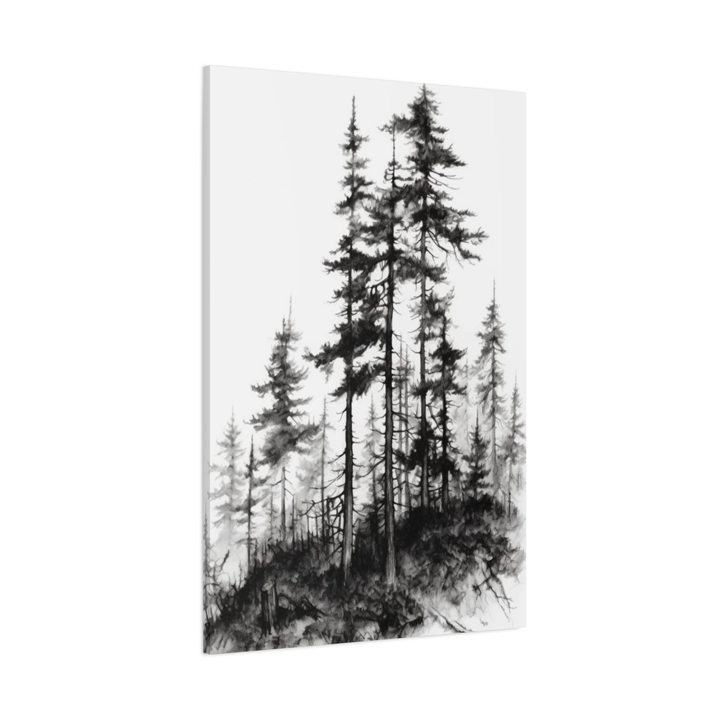
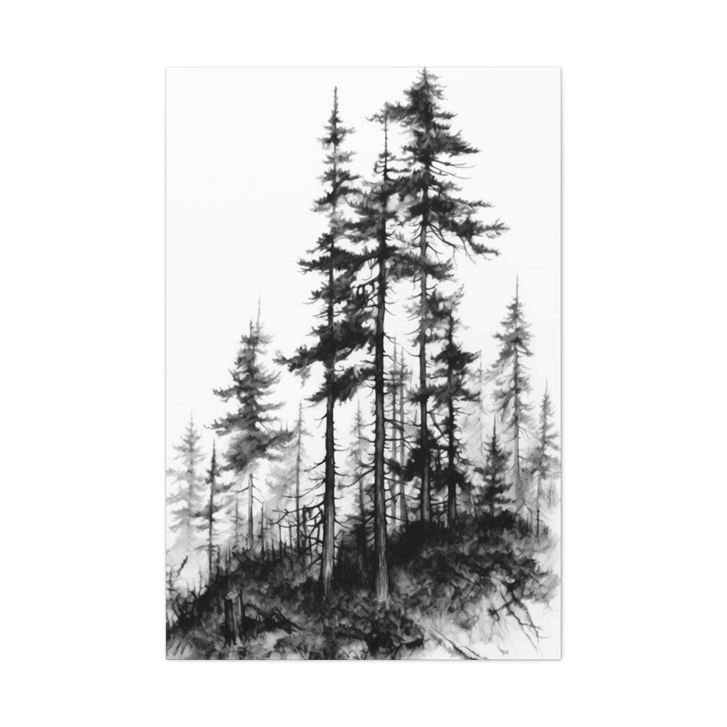
Black & White Trees Wall Art & Canvas Prints
Black & White Trees Wall Art & Canvas Prints
Couldn't load pickup availability
From Forest to Home: Transforming Your Space with Stunning Black & White Trees Wall Art
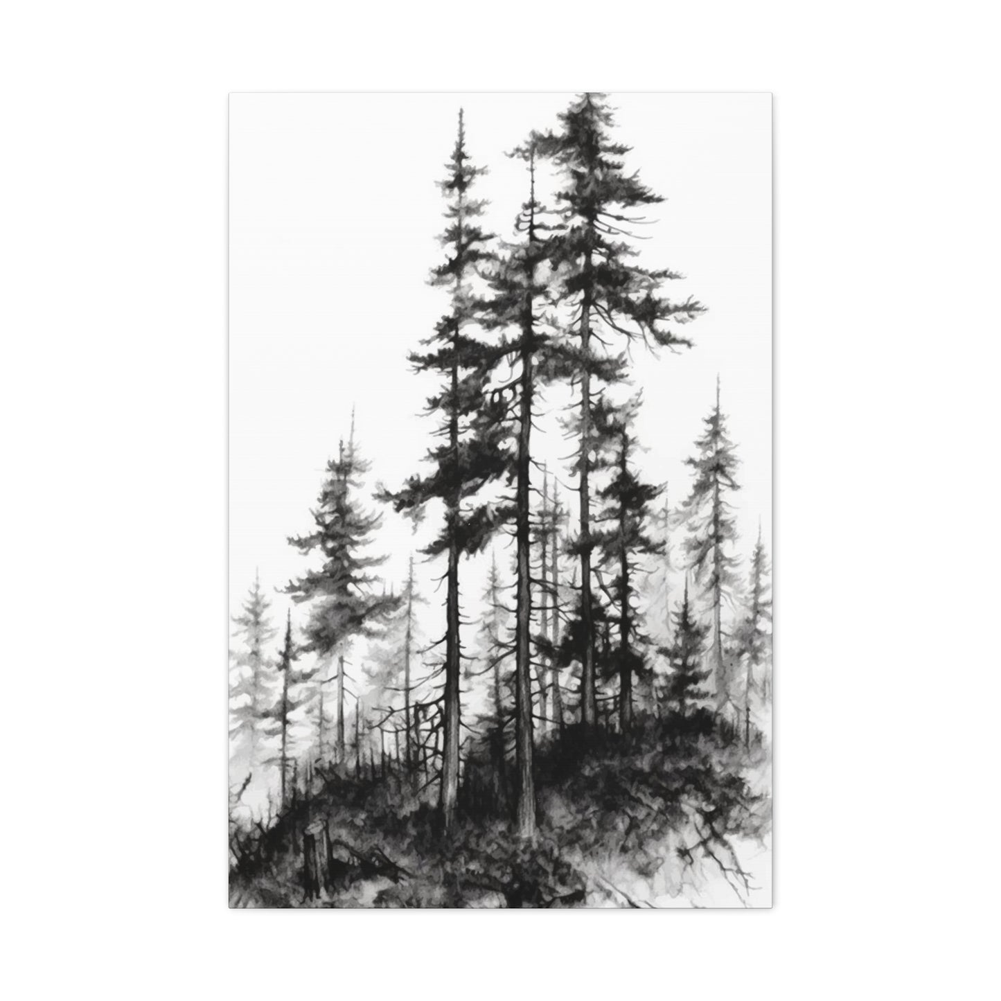
The allure of monochrome nature imagery has captivated interior design enthusiasts for decades, and among the most sought-after pieces are those featuring stark, dramatic tree compositions. Black & White Trees Wall Art represents more than just decorative elements; these pieces embody a timeless aesthetic that bridges the gap between contemporary minimalism and classical sophistication. When you introduce these striking visual elements into your home or workspace, you're not merely hanging pictures on walls—you're curating an atmosphere that speaks to depth, tranquility, and artistic sensibility.
The magnetic appeal of monochromatic tree imagery lies in its ability to strip away the distractions of color, leaving behind the raw, essential beauty of form, texture, and contrast. Each branch becomes a deliberate line, each leaf cluster a study in shadow and light. This reductionist approach to natural imagery doesn't diminish its impact; rather, it amplifies the emotional resonance and visual power of the subject matter. Whether you're drawn to the gnarled silhouettes of ancient oaks, the delicate tracery of bare winter branches against pale skies, or the geometric patterns created by orderly rows of cultivated trees, monochrome presentations offer a universal language of beauty that transcends cultural and stylistic boundaries.
Discovering the Timeless Appeal of Monochromatic Nature Photography in Interior Spaces
The journey into monochrome nature imagery begins with understanding why this particular artistic choice has maintained its prominence across changing design trends and shifting aesthetic preferences. Unlike colored photographs that can date themselves through the specific hues popular during their creation, Black & White Trees Wall Art possesses an eternal quality that remains perpetually relevant. This permanence stems from the fundamental human response to contrast, pattern, and the symbolic weight that trees carry across virtually all cultures and societies.
Throughout human history, trees have represented growth, endurance, connection between earth and sky, and the passage of seasons. When these powerful symbols are rendered in shades of gray, from deepest charcoal to brightest white, they take on an almost meditative quality. The absence of color invites viewers to project their own emotional experiences onto the imagery, creating a personal connection that makes each viewing experience unique. This interactive quality between artwork and observer transforms passive decoration into active engagement, making your living space more than just visually appealing—it becomes emotionally resonant.
The architectural qualities of trees themselves contribute significantly to their effectiveness as subjects for monochrome artwork. The fractal patterns found in branching structures, the textural contrasts between rough bark and smooth leaves, and the interplay between solid forms and negative space all become more pronounced when color is removed from the equation. These elements create compositions that are simultaneously organic and geometric, chaotic and ordered, complex and simple. Such paradoxes make tree imagery endlessly fascinating, ensuring that pieces remain visually interesting even after years of daily viewing.
Exploring Various Artistic Styles and Presentation Methods for Monochrome Tree Imagery
The world of Black & White Trees Wall Art encompasses an astonishing variety of artistic approaches, each offering distinct aesthetic experiences and emotional impacts. Understanding these different styles helps you make informed choices that align with your personal taste and the specific atmosphere you wish to create in your space. From photorealistic captures to abstract interpretations, the possibilities are as diverse as nature itself.
Photographic realism represents one end of the stylistic spectrum, where artists use cameras to capture trees with meticulous detail and tonal accuracy. These pieces often showcase the incredible complexity of natural subjects, revealing textures and patterns that might escape casual observation. High-contrast photography emphasizes dramatic differences between light and dark areas, creating bold, graphic compositions that command attention. Conversely, low-contrast approaches with subtle gradations of gray produce quieter, more contemplative pieces that reward sustained observation. Some photographers employ long exposures to blur movement in leaves or clouds, introducing an ethereal quality that contrasts with the solid permanence of trunks and branches.
Silhouette treatments strip trees down to their most essential outlines, creating stark profiles against white or light gray backgrounds. These minimalist compositions work exceptionally well in modern and contemporary settings, where clean lines and uncluttered visual fields are paramount. The simplicity of silhouettes doesn't equate to blandness; rather, these pieces make powerful statements through their restraint, allowing the elegant architecture of tree forms to speak without embellishment. Whether showing single specimens or groups arranged in deliberate patterns, silhouetted trees offer sophistication without pretension.
Illustration and drawing styles introduce human interpretation into tree representation, ranging from botanical precision to loose, expressive mark-making. Pen and ink drawings can capture extraordinary detail through patient crosshatching and stippling, creating richly textured surfaces that invite close inspection. Charcoal and graphite renderings offer softer, more atmospheric effects, with smudged and blended areas creating mysterious, dreamlike qualities. Woodcut and linocut prints bring a tactile, handcrafted element to tree imagery, with the inherent irregularities of carved blocks adding character and warmth that purely photographic methods cannot replicate.
Abstract interpretations push furthest from literal representation, using trees as starting points for explorations of pattern, texture, and compositional balance. These pieces might reduce trees to suggestions of vertical forms with organic texturing, or deconstruct branching patterns into networks of intersecting lines that only hint at their natural origins. Abstract approaches work particularly well in spaces where you want artwork to complement rather than dominate, serving as visual texture that enhances other design elements without competing for attention.
Selecting the Perfect Dimensions and Configurations for Maximum Visual Impact
Size considerations play a crucial role in determining how effectively Black & White Trees Wall Art functions within your space. The relationship between artwork dimensions and wall size, furniture scale, and room proportions can make the difference between a piece that enhances your environment and one that feels awkwardly placed or visually insignificant. Understanding these relationships empowers you to make selections that achieve the desired impact.
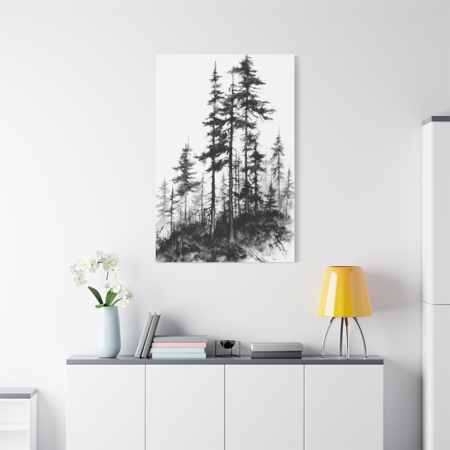
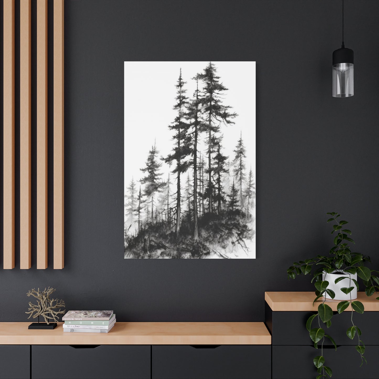
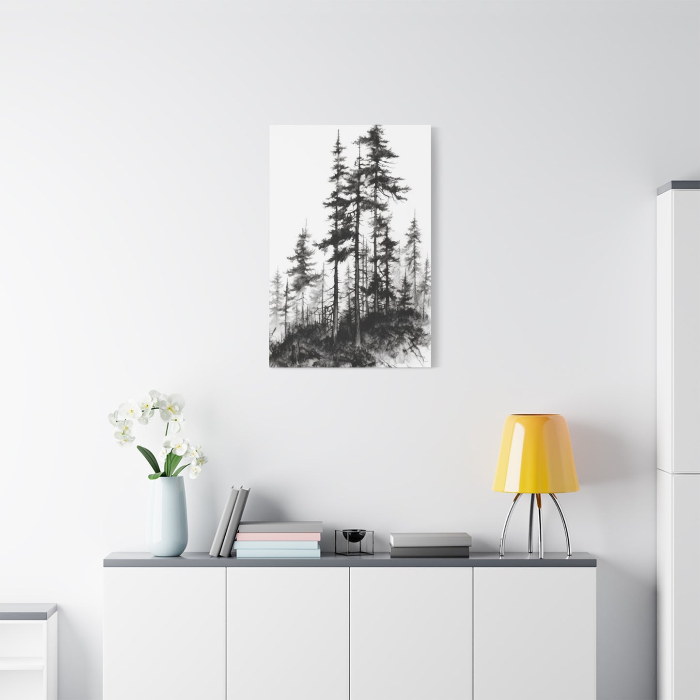
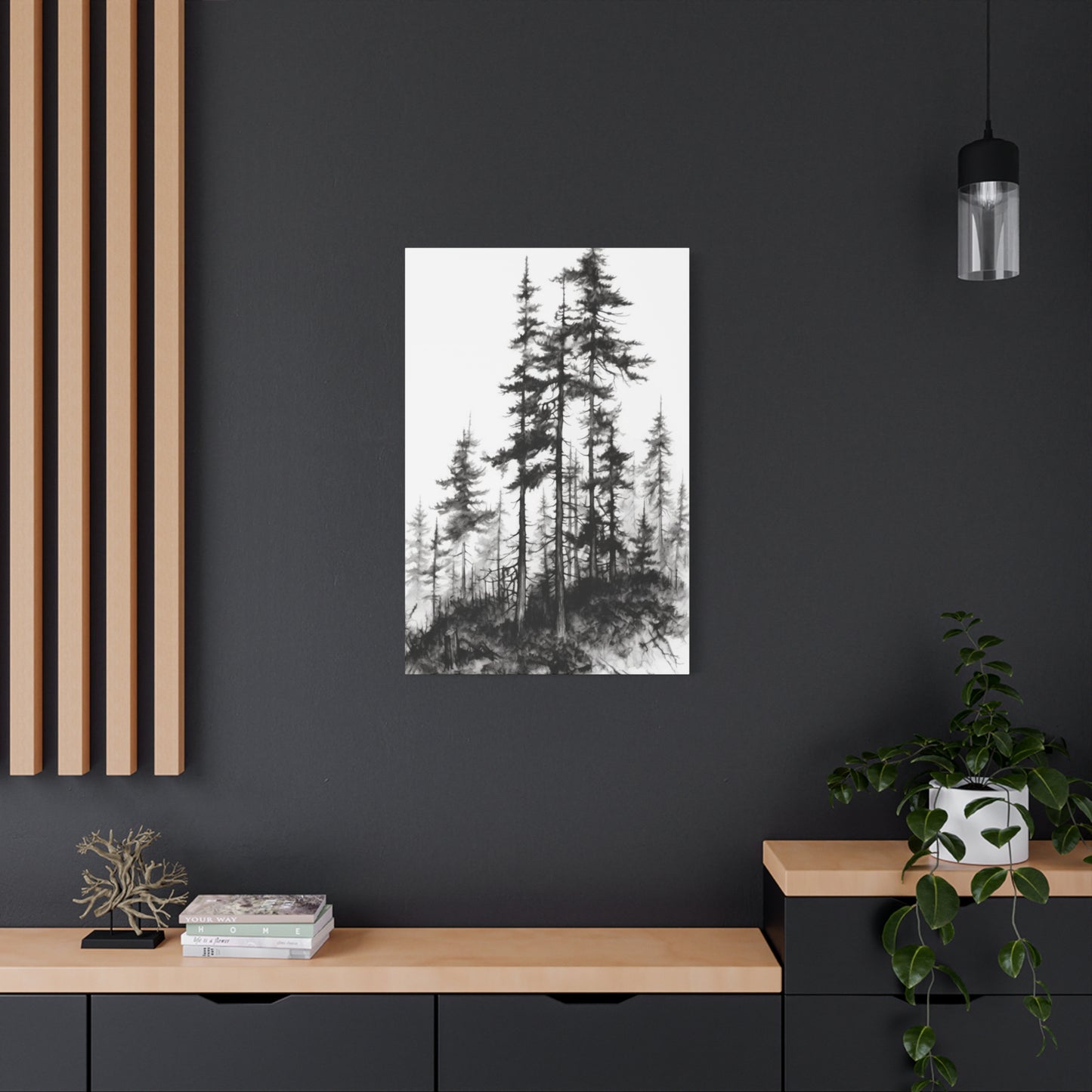
Large-scale single pieces, often measuring four feet or more in width or height, create commanding focal points that anchor entire rooms. These substantial artworks work best on walls with minimal interruption from windows, doors, or architectural details, where they can be appreciated as complete compositions without visual competition. The immersive quality of large-format tree imagery can make viewers feel as though they're standing in actual forests, bringing outdoor spaciousness into interior environments. This effect proves particularly valuable in urban dwellings where access to natural landscapes may be limited.
Medium-sized pieces, typically ranging from two to four feet in their longest dimension, offer versatility that makes them suitable for various locations throughout homes and offices. These works provide sufficient presence to serve as focal points in smaller rooms while remaining appropriately scaled for hallways, bedrooms, and dining areas. The moderate size allows for easier placement changes if you decide to refresh your decor, unlike larger pieces that often require more permanent installation considerations.
Small-format works measuring two feet or less in their largest dimension excel in creating groupings and gallery walls, where multiple pieces combine to form larger visual statements. Collections of smaller monochrome tree images can tell stories about seasonal changes, showcase different species, or simply create pleasing patterns through repetition and variation. The modular nature of small works allows for flexible arrangements that can evolve over time as your collection grows or your aesthetic preferences shift.
Multi-panel compositions, often called triptychs when consisting of three pieces or polyptychs for larger numbers, offer dynamic alternatives to single-panel presentations. These divided compositions can span impressive widths while maintaining manageable individual panel sizes for handling and installation. The visual rhythm created by gaps between panels adds interest and can help artwork adapt to architectural features like wall sections between windows. Some multi-panel pieces present continuous images that flow across divisions, while others show related but distinct scenes that form cohesive wholes through thematic or stylistic connections.
Understanding How Monochrome Tree Art Enhances Different Room Types and Functional Spaces
The versatility of Black & White Trees Wall Art makes it suitable for virtually any room in residential or commercial settings, though certain characteristics make it particularly effective in specific environments. Matching artwork style and subject matter to room function and existing decor maximizes both aesthetic appeal and psychological impact.
Living rooms and family gathering spaces benefit from tree imagery that invites contemplation and conversation. Pieces showing majestic specimens—ancient oaks with sprawling canopies, towering pines reaching skyward, or groves that suggest peaceful walks—create welcoming atmospheres that encourage relaxation and social interaction. The neutral palette of monochrome works allows them to coordinate effortlessly with changing color schemes as you refresh pillows, throws, and other accessories over time. In these social spaces, consider artwork that balances visual interest with versatility, avoiding pieces so abstract or challenging that they might alienate guests with conservative tastes.
Bedroom environments call for tree imagery that promotes tranquility and rest. Subtle, low-contrast compositions with soft gradations work beautifully above beds or on walls opposite sleeping areas, providing visual interest without stimulation that might interfere with winding down. Images of serene forest interiors with filtered light, bare winter branches against pale skies, or gentle willow forms create the calm, peaceful energy conducive to quality sleep. Avoid overly dramatic or high-contrast pieces in sleeping spaces, as these can feel too energetic for rooms meant to facilitate rest and recovery.
Home offices and workspaces benefit from tree imagery that inspires focus and creativity without causing distraction. Pieces showing strong, upright forms can subtly reinforce feelings of stability and growth, while images of light filtering through branches might spark innovative thinking. The monochrome palette prevents color-related visual fatigue during long work sessions while maintaining visual interest during breaks from screen time. Consider pieces with sufficient detail to reward brief periods of contemplation when you need mental refreshment, but not so complex that they pull attention away from work tasks.
Dining areas offer opportunities for more dramatic presentations, as these spaces are typically used for discrete periods rather than extended occupancy. Bold, high-contrast pieces create conversation-worthy focal points that enhance social dining experiences. Images of orchards, vineyard landscapes with prominent trees, or artistic interpretations of harvest themes can create thematic connections to the room's function. The sophisticated neutrality of monochrome presentations complements table settings of any color scheme, from everyday meals to formal entertaining.
Hallways and transition spaces excel with gallery-style arrangements of multiple smaller pieces or single narrow vertical compositions that complement corridor proportions. Tree imagery in these circulation areas can create visual journeys through your home, with seasonal progressions or species collections that give people something to discover as they move through spaces. The vertical emphasis of many tree compositions naturally suits the typically narrow, vertical wall areas available in hallways and stairwells.
Bathrooms might seem unconventional locations for fine artwork, but moisture-resistant Black & White Trees Wall Art can transform utilitarian spaces into spa-like retreats. Choose pieces showing water-edge scenes with trees reflected in calm surfaces, or forest imagery that evokes the rejuvenating qualities of natural settings. Ensure any pieces placed in bathrooms feature appropriate protective glazing or printing methods that resist humidity damage.
Examining Frame Styles and Matting Choices That Enhance Monochrome Nature Artwork
The presentation framework you choose for Black & White Trees Wall Art significantly influences its final appearance and how effectively it integrates with surrounding decor. Frames and mats serve practical protective functions while also contributing aesthetic elements that can either enhance or undermine the artwork itself. Thoughtful selection of these presentation components ensures your investment achieves maximum impact.
Simple black frames create classic presentations that emphasize artwork over presentation elements. The darkness of black frames effectively contains and defines images, creating clear boundaries between art and walls. This containment works particularly well for high-contrast pieces where the frame's darkness echoes the deepest shadows within the image itself. Black frames suit virtually all decor styles, from contemporary minimalism to traditional elegance, making them safe choices when you're uncertain about which direction to take. Various black frame profiles—from sleek, narrow moldings to substantial, chunky sections—allow fine-tuning of the overall presentation weight.
White and light-colored frames produce different effects, creating breathing room around imagery and often making pieces feel lighter and more open. These brighter frames work especially well for low-contrast images with predominantly lighter tones, where dark frames might create jarring transitions. In rooms with white or light walls, matching frame colors to wall tones can create seamless integrations where artwork feels embedded in the architecture rather than applied to surfaces. Conversely, white frames on darker walls create dramatic contrasts that draw maximum attention to displayed pieces.
Natural wood frames introduce warmth and organic texture that connect thematically with tree subjects. Light woods like maple, ash, or whitewashed finishes maintain brightness while adding subtle grain patterns that complement the natural forms within images. Darker woods like walnut, cherry, or espresso-stained options add richness and weight, creating more substantial, traditional presentations. The inherent variation in wood grain ensures each frame is subtly unique, adding handcrafted character that mass-produced metal frames cannot match. For environmental consciousness, seek frames certified as sustainably sourced or made from reclaimed materials.
Metal frames—particularly those in brushed silver, pewter, or bronze finishes—bring contemporary sophistication to monochrome tree imagery. The sleek profiles and industrial materials of metal frames suit modern and transitional interiors, where they bridge the gap between natural subjects and manufactured environments. Some metal frames incorporate subtle texturing or antiquing that adds visual interest without overwhelming delicate imagery. The durability of metal makes these frames excellent choices for high-traffic areas or commercial installations where longevity matters.
Matting considerations deserve careful attention, as mats profoundly affect how viewers perceive images. White and off-white mats remain most common, creating neutral borders that separate images from frames and provide visual rest areas for eyes. The width of matting influences perception—narrow mats of one to two inches create intimate, focused presentations, while wider mats of three to four inches or more lend formality and importance to pieces. Double matting, where a thin inner mat in a contrasting color shows beneath a wider outer mat, adds sophistication and can introduce subtle color accents that tie artwork to room schemes.
Colored mats offer ways to introduce hues into otherwise neutral presentations, though they require careful consideration to avoid clashing with monochrome imagery. Soft earth tones like taupes, warm grays, and muted greens can enhance natural subjects without overwhelming them. Bolder mat colors work only when they directly reference colors present in surrounding decor, creating intentional connections between artwork and environment. When in doubt, stick with neutral mat options that won't compete with the imagery itself.
Frameless presentations, where images are mounted on rigid backing without traditional frames, create ultra-contemporary looks that suit minimalist and industrial interiors. These streamlined presentations work best with strong images that don't require framing to establish presence. Float mounting, where images appear suspended within frames with visible space between picture edges and frame sides, creates sophisticated, gallery-quality presentations that emphasize the artwork as precious objects worth special display.
Investigating Printing Methods and Substrate Materials for Lasting Quality
The physical production of Black & White Trees Wall Art involves numerous choices that affect both appearance and longevity. Understanding these options helps you make informed decisions that balance initial cost against long-term satisfaction and durability. The intersection of artistic vision and material reality determines whether pieces remain vibrant for decades or fade into disappointing shadows of their original glory.
Giclée printing represents the gold standard for reproducing photographic and painted artwork. This method uses archival-quality inkjet printers with expanded color gamuts to create prints virtually indistinguishable from original photographs. Despite the name referencing color capability, giclée produces exceptional monochrome prints with subtle tonal gradations and deep, rich blacks. The archival inks resist fading for generations when kept away from direct sunlight, making giclée prints worthy investment pieces. These prints typically appear on fine art papers, canvas, or specialty substrates, each offering distinct textural and visual qualities.
Traditional silver gelatin printing, while less common in the digital age, produces monochrome photographs through light-sensitive chemical processes that many purists consider superior to digital methods. These prints exhibit unique tonal qualities and organic grain structures that digital processes struggle to replicate exactly. Authentic silver gelatin prints from limited editions or created by master printers carry both aesthetic and collectible value. However, they require careful handling and proper storage to prevent chemical degradation over time.
Canvas prints bring textural dimension to tree imagery, with the woven fabric surface adding tactile interest that flat papers cannot provide. The slight texture of canvas can enhance certain images, particularly those with painterly qualities or intentional grain. Stretched canvas wraps around wooden frames, creating three-dimensional objects that cast subtle shadows and require no additional framing or glazing. The gallery-wrap style, where images continue around side edges, eliminates the need for frames entirely. Canvas durability suits high-traffic areas, as the material resists tears and dents better than paper under glass. However, canvas can be prone to sagging over time without proper stretching and may show environmental effects like humidity changes more readily than framed pieces.
Metal printing creates startlingly sharp, luminous images by infusing dyes directly into specially coated aluminum sheets. The resulting pieces show incredible detail and dimension, with highlights that almost seem to glow. Metal substrates offer exceptional durability, resisting moisture, fading, and physical damage far better than paper or canvas. The contemporary aesthetic of metal prints suits modern interiors perfectly, though the industrial materials might feel incongruous in traditional settings. The relatively high cost of metal printing makes economic sense primarily for pieces you intend to display long-term in challenging environments.
Acrylic face-mounting involves adhering prints to the backs of clear acrylic sheets, creating depth and protecting images behind substantial transparent barriers. Light passing through acrylic enhances color saturation and adds luminosity, though this effect is more subtle with monochrome images than colored ones. The glossy, gallery-contemporary appearance of acrylic-mounted pieces makes strong statements in modern spaces. The considerable weight and fragility of acrylic require professional mounting and limit placement options compared to lighter alternatives.
Paper selection profoundly influences the character of printed pieces. Smooth, glossy papers maximize sharpness and tonal range, creating crisp images with deep blacks and bright highlights. Matte papers reduce glare and produce softer, more subtle renditions that many find more suitable for artistic subjects. Textured fine art papers—including those with cotton or rag content—add tactile dimension and often better absorb inks for exceptionally rich tonal qualities. Heavier paper weights (measured in pounds or grams per square meter) feel more substantial and resist warping better than lightweight alternatives.
Coating and protective treatments applied to finished prints extend their lifespan significantly. UV-protective sprays and coatings shield inks from light damage, while moisture barriers prevent water damage and prevent mold growth. Some protective treatments also make surfaces easier to clean, allowing gentle dusting or wiping without damaging underlying images. When investing in quality pieces, ensuring they receive appropriate protective treatments safeguards your investment against premature degradation.
Mastering Placement Principles and Hanging Strategies for Professional Results
Even the most exquisite Black & White Trees Wall Art fails to achieve its potential when poorly positioned or improperly hung. Strategic placement considers viewing angles, lighting conditions, relationship to surrounding elements, and practical hanging methods that ensure security and longevity. Approaching placement with deliberation transforms random wall decoration into curated, cohesive interior design.
Height placement follows general rules that create comfortable viewing experiences. The standard recommendation positions artwork so that its center sits approximately 57 to 60 inches from the floor—the average human eye level in standing positions. This placement ensures comfortable viewing without craning necks upward or stooping downward. However, context modifies this guideline. In rooms where people primarily sit, such as living rooms or dining areas, lowering artwork slightly accommodates the reduced viewing height. Conversely, in hallways where people typically move while standing, standard height or slightly higher positions work well.
Furniture relationships significantly influence appropriate artwork placement. Pieces hung above sofas, beds, or console tables should maintain proportional relationships with the furniture below. A common guideline suggests artwork width should measure between one-half and three-quarters of the furniture width beneath it. Similarly, maintaining four to eight inches of clear space between furniture tops and artwork bottom edges creates visual breathing room while establishing clear connections between pieces. Oversized artwork that dwarfs furniture beneath it or tiny pieces floating high above substantial furniture both create unbalanced, uncomfortable compositions.
Lighting conditions dramatically affect how monochrome artwork appears throughout the day and evening. Natural light streaming from windows can beautifully illuminate tree imagery during daylight hours, though direct sunlight causes fading and should be avoided through careful placement or window treatments. Artificial lighting requires thoughtful planning to enhance rather than diminish artwork. Picture lights mounted directly above frames provide focused illumination while creating gallery-quality presentations. Track lighting or adjustable ceiling fixtures offer flexibility to highlight specific pieces while meeting general room lighting needs. Avoid placing artwork directly opposite bright light sources, as glare on glazing makes viewing difficult and annoying.
Grouping multiple pieces requires attention to spacing, alignment, and overall composition. Gallery wall arrangements can feel overwhelming without planning. Begin by arranging pieces on the floor, experimenting with layouts until you achieve pleasing balance. Maintain consistent spacing between frames—typically two to four inches works well, though closer spacing creates unified fields while wider spacing emphasizes individual pieces. Align elements along consistent horizontal or vertical lines to create order within asymmetrical arrangements. Consider overall shape; groupings forming rectangular outlines feel orderly and contained, while organic shapes with irregular borders create more dynamic, energetic effects.
Hanging hardware selection matters more than many realize, as inadequate fasteners risk damage from fallen artwork while over-engineering creates unnecessary expense and wall damage. Picture hanging wire strung between D-rings attached to frame backs offers flexibility and easy leveling adjustments. For heavy pieces, two separate hanging points prevent rotation and distribute weight more evenly. Wall anchors appropriate to wall construction—whether drywall, plaster, masonry, or other materials—ensure secure mounting. When in doubt about proper hardware selection or concerned about valuable pieces, consult professional picture hangers who bring expertise and insurance coverage to the task.
Measuring and marking before hammering nails prevents frustrating do-overs and patched holes. Create paper templates matching frame dimensions and hang these templates with removable tape to preview placement before committing to permanent mounting. Use levels to ensure horizontal alignment, as even slight tilts create unsettling visual effects that undermine professional appearance. Mark mounting points with painter's tape and transfer measurements carefully, checking twice before drilling or hammering.
Environmental considerations extend beyond simple aesthetics. Avoid hanging valuable artwork in bathrooms without proper humidity control, as moisture damages papers, causes frames to warp, and promotes mold growth. Keep pieces away from heating vents and air conditioning outlets, as constant air flow carries dust and creates temperature fluctuations harmful to materials. In earthquake-prone regions, use earthquake-resistant hanging methods with closed hooks or wire systems that prevent frames from jumping off hooks during tremors.
Caring for and Preserving Monochrome Artwork for Decades of Enjoyment
Proper stewardship ensures Black & White Trees Wall Art retains its beauty and value for generations. While quality materials resist degradation naturally, proactive care prevents common problems and addresses minor issues before they become serious damage. A few simple practices incorporated into regular household routines provide substantial protection against the primary enemies of artwork: light, moisture, temperature, pollutants, and physical damage.
Light management ranks as the single most important preservation factor. Ultraviolet radiation breaks down inks, papers, and canvas fibers, causing irreversible fading and discoloration. Even pieces made with archival materials ultimately succumb to light damage without protection. Position artwork away from direct sunlight streaming through windows, or install UV-filtering window films that block harmful radiation while allowing visible light transmission. For irreplaceable or valuable pieces, use museum-quality glazing with UV protection that blocks up to 99 percent of damaging rays. Consider the cumulative nature of light exposure; even modest indirect light causes damage over years and decades. Rotating pieces in and out of storage distributes light exposure among multiple works, extending the display life of each.
Climate control prevents moisture damage, mold growth, and material degradation. Relative humidity above 65 percent promotes mold and mildew, while levels below 35 percent cause papers to become brittle and crack. Temperature fluctuations cause materials to expand and contract, stressing fibers and adhesives. Maintain consistent conditions between 65 and 72 degrees Fahrenheit with relative humidity between 40 and 55 percent. Use dehumidifiers in damp climates and humidifiers in arid regions to moderate extremes. Avoid hanging artwork on exterior walls in climates with extreme seasonal temperature swings, as these walls undergo greater temperature and humidity fluctuations than interior walls.
Cleaning practices must balance removing accumulated dust and grime against risking damage through improper methods. For framed pieces under glass or acrylic, clean glazing surfaces with appropriate cleaners—standard glass cleaner for glass, specialized acrylic cleaner for acrylic to prevent scratching. Spray cleaners onto cloths rather than directly onto glazing to prevent liquid from seeping behind frames. Use soft, lint-free cloths and wipe gently without pressing hard, as excessive pressure can scratch surfaces or stress frame corners. Clean frames themselves with slightly damp cloths appropriate to frame materials—wood frames may benefit from occasional treatment with wood conditioner, while metal frames simply need gentle wiping. Never apply liquids directly to unframed or unglazed artwork like canvas prints, as moisture damages materials and causes colors to run. Instead, use soft brushes or microfiber dusters designed for delicate surfaces.
Periodic inspections catch problems early when they remain manageable. Every few months, examine pieces carefully for signs of damage or degradation. Look for fading by comparing areas that are typically covered by mats or frames to fully exposed sections—noticeable differences indicate light damage is occurring. Check for discoloration, spotting, or tide lines that suggest moisture problems. Examine frames for separating joints, cracking finishes, or loose hanging hardware. Inspect glass or acrylic for cracks or separation from frames. Finding issues early allows for professional restoration before damage becomes extensive or irreversible.
Professional conservation and restoration services address problems beyond homeowner capabilities. When valuable pieces show significant damage—tears, severe fading, mold growth, water damage, or structural failures—consult conservators who specialize in works on paper or photographic materials. These professionals possess skills and materials to repair damage while preserving original integrity and value. Professional reframing every decade or two refreshes protective barriers and allows inspection of previously concealed areas. Conservators can also provide condition reports useful for insurance purposes and advise on specific care needs for particular pieces.
Storage for pieces not currently displayed requires careful preparation to prevent damage during dormancy. Never store artwork in attics, basements, or garages where temperature and humidity fluctuate wildly. Use archival storage boxes or portfolios that protect against dust, light, and physical damage. Interleave pieces with acid-free tissue paper to prevent surfaces from touching. Store flat rather than rolled when possible, as rolling stresses materials and can cause permanent curling. If rolling is necessary for large pieces, roll around archival tubes with large diameters and always roll with image side facing outward to prevent cracking. Store in climate-controlled interior closets or designated storage areas, and inspect stored pieces annually to ensure conditions remain appropriate.
Sourcing Quality Monochrome Tree Artwork from Various Providers and Channels
Finding the perfect Black & White Trees Wall Art requires knowing where to look and how to evaluate quality, authenticity, and value. The marketplace offers options ranging from mass-produced prints costing mere dollars to unique original works commanding thousands. Understanding this landscape helps you make purchases aligned with your budget, taste, and intentions for the pieces.
Direct artist purchases support creators while often providing best value and authentic provenance. Many photographers and visual artists sell work through personal websites where you can browse portfolios, learn about artistic processes, and purchase directly. These direct relationships sometimes allow customization—requesting specific sizes, signing, or even commissioning unique work. Artist prices typically undercut gallery retail since no intermediary takes a percentage, though artists naturally charge rates that reflect their time, reputation, and material costs. Research artists whose style appeals to you through social media platforms, juried art fairs, and artist directories. Purchasing directly builds relationships that can grow into ongoing collecting partnerships as you add to your collection over time.
Local galleries provide curated selections with the benefit of seeing pieces in person before purchasing. Gallery staff can educate about artists, materials, and proper care while offering services like custom framing and installation. The gallery markup increases prices compared to direct artist purchases, but this premium buys expertise, service, and often the assurance that pieces have been vetted for quality. Regional galleries often feature local artists, allowing you to discover and support talent from your own community while acquiring pieces with special geographic resonance.
Online marketplaces have democratized access to artwork from creators worldwide. These platforms aggregate thousands of artists, offering unprecedented selection across all price points and styles. Sophisticated search filters help narrow options by subject, style, size, and price. Customer reviews provide insight into quality and service from individual sellers. However, inability to examine pieces in person before purchase introduces risk—colors may not match screen representations, print quality may disappoint, and framing might prove substandard. Research sellers thoroughly, read reviews carefully, and understand return policies before committing to significant purchases.
Print-on-demand services offer convenient solutions for decorating on budgets, providing licensed imagery printed to order in various sizes and formats. These services work with artists who license work in exchange for royalty payments, theoretically ensuring creators receive compensation. Quality varies considerably between providers, from excellent archival prints to disappointing poster-quality products. Investigate specific providers' reputations, printing methods, and material specifications before ordering. Print-on-demand suits those seeking affordability and convenience over investment quality or collectibility.
Specialized fine art photography dealers represent established and emerging photographers, offering expertly printed limited editions with proper documentation. These pieces often come with certificates of authenticity, edition information, and artist signatures that verify legitimacy and support resale value. Prices reflect the higher quality, limited availability, and dealer expertise, positioning these purchases as collecting rather than simple decorating. For those who view artwork as long-term investment beyond mere decoration, fine art dealers provide appropriate venues.
Auction houses, both traditional and online, occasionally feature photographic and illustrative works including nature imagery. Auctions can yield bargains but also carry risks—pieces may be misattributed, conditions issues might not be fully disclosed, and competitive bidding can drive prices beyond reasonable levels. Thoroughly research any auction lots before bidding, and set firm price limits to avoid overpaying in the heat of competition.
Estate sales, thrift stores, and secondhand shops occasionally yield wonderful finds at exceptional prices, though quality can be hit or miss and finding specific subjects requires patience and frequent browsing. Consider these venues treasure hunts rather than reliable sources, and carefully examine any pieces for condition issues before purchasing. Previously owned artwork may need professional cleaning or reframing, so factor these costs into purchasing decisions.
When evaluating pieces regardless of source, examine closely for quality markers. Check printing sharpness—edges should be crisp and details clear without visible dot patterns from inferior printing methods. Assess tonal range from deepest blacks to brightest whites with smooth gradations between extremes. Inspect materials—heavier papers, quality canvas, or substantial alternative substrates indicate better production. Review framing for solid construction, clean corners, secure glazing, and appropriate hanging hardware. Request information about inks or printing methods, seeking archival specifications that promise longevity. For limited editions, verify numbering and artist signatures that authenticate pieces and establish their position within editions.
Creating Cohesive Interior Design Schemes Around Monochromatic Nature Imagery
Black & White Trees Wall Art serves as excellent foundation for building cohesive design schemes that extend throughout rooms or entire homes. The neutral palette naturally coordinates with any color scheme while the natural subject matter provides thematic direction that can inform other decorating choices. Thoughtfully developing these connections transforms spaces from collections of random objects into unified environments with clear aesthetic identities.
Color palette development often begins with the neutrals present in monochrome artwork—the various grays, from cool blue-grays to warm taupe-grays, that form the tonal range of pieces. Pull these shades into room schemes through paint colors, upholstery fabrics, and decorative accessories. This repetition creates visual rhythm and harmony, making artwork feel integrated rather than applied to spaces. Layer different values and textures within your chosen neutral range to build depth and prevent monotony. Introduce accent colors sparingly and deliberately, selecting hues that complement without overwhelming the sophisticated restraint of monochrome focal points.
Natural materials and organic textures extend the connection to nature suggested by tree imagery. Incorporate wood furniture with visible grain patterns that echo the bark textures visible in photographs. Choose fabrics with subtle texture—linen, cotton, wool, and other natural fibers—rather than synthetics with artificial sheen. Add woven elements like baskets, rattan seating, or jute rugs that reference the fibrous qualities of plant materials. Stone or concrete accents provide mineral counterpoints to organic materials, creating balance between soft and hard, refined and raw. These material choices create multisensory connections to nature that amplify the visual impact of wall art.
Pattern selection requires restraint to avoid overwhelming monochrome focal points. Simple geometrics, stripes, and subtle abstracts in black, white, and gray coordinate beautifully with tree imagery. Small-scale botanical prints used sparingly can create thematic connections without competing for attention. Avoid busy, multicolored patterns that distract from artwork and create visual chaos. When incorporating patterns, use them in limited doses—a single patterned accent chair, patterned throw pillows on solid upholstery, or patterned window treatments on otherwise plain walls.
Metallic finishes in light fixtures, hardware, and decorative objects introduce subtle glamour without disrupting neutral schemes. Silver, pewter, and brushed nickel complement cool grays, while brass, bronze, and gold tones enhance warm grays. Mix metal finishes deliberately rather than matching everything identically, as perfectly matched metals can feel sterile and show-room staged. The light-reflective qualities of metallic surfaces add sparkle and dimension to otherwise matte schemes centered on Black & White Trees Wall Art.
Furniture style selection depends on whether you want monochrome artwork to serve as bridge between styles or stand as contrasting element. In eclectic spaces, the universal appeal of tree imagery in grayscale helps disparate furniture pieces coexist more harmoniously. In style-specific rooms—whether Scandinavian modern, industrial loft, traditional elegance, or rustic farmhouse—choose artwork that shares key characteristics with the surrounding style. Modern spaces call for clean compositions with geometric arrangements, traditional rooms benefit from more romantic imagery with softer focus, and rustic settings pair well with rough-hewn, highly textured representations.
Lighting design creates atmosphere while ensuring artwork displays optimally. Layer multiple light sources—ambient lighting for general illumination, task lighting for functional needs, and accent lighting to highlight artwork and architectural features. Choose fixture styles that complement both artwork and overall room design. In contemporary spaces, minimalist fixtures with clean lines work well, while traditional rooms call for more ornate chandelier and sconce designs. Consider bulb color temperature carefully; cooler temperatures (4000-5000K) create crisp, energizing environments suitable for work spaces, while warmer temperatures (2700-3000K) generate cozy, relaxing atmospheres for living areas and bedrooms.
Decorative accessories complete design schemes by reinforcing themes and adding personality. Select pieces thoughtfully rather than cluttering surfaces with miscellaneous objects. Consider sculptural objects that reference natural forms—bowls of collected stones, interesting driftwood pieces, ceramic vessels with organic shapes. Books with beautiful covers, particularly those about nature photography or forests, can be displayed decoratively. Living plants in simple containers bring actual nature indoors, creating dialogue between represented and living specimens. Mirrors amplify light and create illusion of expanded space while their reflective surfaces add contrast to matte finishes elsewhere in rooms.
Final Thoughts
Stunning black and white trees wall art is a timeless addition to any living space, offering a unique way to transform your home with the subtle beauty of nature. Trees have long been symbols of strength, resilience, and growth, and when captured in monochrome, these qualities are emphasized in a way that is both elegant and impactful. The absence of color allows the intricate textures of bark, the delicate patterns of leaves, and the sweeping forms of branches to take center stage. The contrast between light and shadow brings depth to the composition, giving the trees a sense of dimension and life. This minimalistic approach to nature-inspired decor creates a visual experience that is as serene as it is striking.
One of the key reasons black and white trees wall art is so captivating is the way it highlights the raw beauty of the natural world. The fine details, whether it's the gnarled texture of an ancient oak or the soft sway of birch branches in the wind, are brought into sharp focus by the monochromatic palette. Without the distraction of color, the viewer is encouraged to appreciate the forms, shapes, and shadows that make trees so visually powerful. This also allows for a greater emotional connection to the piece, as the simplicity of black and white creates a meditative, calming atmosphere that invites quiet reflection and a deeper appreciation of nature.
The versatility of black and white tree art makes it ideal for any style of interior. In modern, minimalist spaces, these pieces can serve as bold focal points, offering a subtle yet sophisticated presence that contrasts beautifully with clean lines and neutral tones. In more rustic or bohemian interiors, the trees evoke a sense of natural elegance, grounding the space with their organic forms. Whether you hang a single large print or arrange a series of smaller pieces, black and white tree art can easily adapt to any room, adding layers of meaning and visual interest. The neutral color scheme ensures that it complements a wide range of furnishings and decor, whether your style leans toward the sleek and contemporary or the cozy and eclectic.
Beyond their aesthetic appeal, trees are deeply symbolic, representing everything from life and growth to wisdom and renewal. Displaying black and white tree art in your home allows you to incorporate these themes into your space, fostering an atmosphere of strength, tranquility, and connection to the natural world. A tree can symbolize personal growth, grounding, or even a deeper connection to the environment. By choosing this artwork, you invite those qualities into your home, making it not just a decorative piece, but a meaningful one that resonates with your values and lifestyle.
When it comes to displaying stunning black and white trees wall art, there are countless ways to create a cohesive and visually engaging arrangement. A single large-scale print can serve as a statement piece in a living room, above a fireplace, or as a focal point in a hallway. Alternatively, a series of smaller prints can create a gallery wall, with each tree offering a different perspective—perhaps a close-up of a tree trunk, a sweeping view of branches, or a silhouette of a tree against a dramatic sky. The variation in compositions brings a sense of movement and fluidity to the wall, while still maintaining a unified theme. The choice of framing is equally important in enhancing the art's overall effect. Sleek black or white frames provide a modern touch, while a natural wood frame can harmonize with the organic feel of the trees, adding warmth and texture to the artwork.
In conclusion, stunning black and white trees wall art brings a sense of timeless nature into your home, allowing you to create a space that is both calming and dynamic. The monochrome approach emphasizes the natural beauty and power of trees, offering a sophisticated and versatile way to integrate nature into your decor. Whether you're drawn to the intricate details of the bark, the grace of the branches, or the symbolic meaning of trees themselves, this artwork provides an emotional connection to the natural world that transcends color. It is a perfect way to elevate your living space with nature-inspired decor that feels both grounded and elegant, providing lasting beauty for years to come.
Share