Black & White Flower Pot Wall Art & Canvas Prints
Black & White Flower Pot Wall Art & Canvas Prints
Couldn't load pickup availability
Stunning Black & White Flower Pot Wall Art: Captivating Monochrome Botanical Displays That Redefine Interior Aesthetics
The realm of interior decoration has witnessed a remarkable surge in the popularity of monochromatic botanical displays, particularly those featuring floral arrangements in grayscale containers. The aesthetic appeal of black & white flower pot wall art transcends conventional decorative boundaries, offering homeowners and design enthusiasts a sophisticated means of enhancing their living spaces. This distinctive approach to wall decoration combines the timeless elegance of monochrome palettes with the organic beauty of botanical elements, creating visual compositions that captivate observers while maintaining a sense of refined simplicity.
The Profound Visual Impact of Monochromatic Botanical Displays in Contemporary Residential Spaces
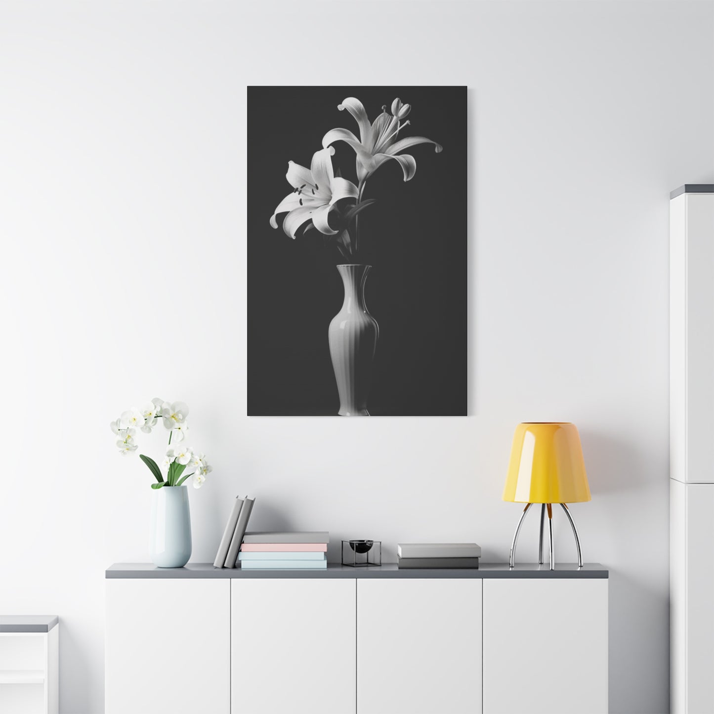
The strategic placement of monochromatic floral displays within residential environments generates an immediate transformation in spatial perception and atmospheric quality. When homeowners incorporate black & white flower pot wall art into their decorative schemes, they introduce a powerful visual element that commands attention without overwhelming the surrounding environment. The stark contrast inherent in grayscale presentations creates a dramatic focal point that draws the eye naturally, encouraging viewers to pause and appreciate the intricate details of both the containers and their botanical contents.
The psychological resonance of monochromatic color schemes extends beyond mere aesthetic preference, tapping into fundamental aspects of human visual perception and emotional response. Research in environmental psychology has demonstrated that individuals exposed to balanced monochrome environments often experience reduced mental clutter and enhanced cognitive focus. The absence of chromatic distraction allows the mind to engage more deeply with form, texture, and spatial relationships, creating a meditative quality that promotes relaxation and contemplation within domestic settings.
Furthermore, the versatility of grayscale botanical displays enables seamless coordination with diverse decorative philosophies, from minimalist Scandinavian approaches to industrial loft aesthetics. The neutral foundation provided by black and white tones serves as a universal canvas that complements rather than competes with existing color schemes, furnishings, and architectural features. This adaptability makes monochromatic floral arrangements particularly valuable for individuals who frequently update their interior design or who prefer a flexible decorative foundation that accommodates seasonal changes and evolving personal tastes.
Selecting Appropriate Containers for Grayscale Botanical Wall Presentations
The selection of suitable containers represents a critical decision point in the creation of effective monochromatic botanical displays. The material composition, surface treatment, and dimensional characteristics of vessels all contribute significantly to the overall aesthetic impact and longevity of wall-mounted arrangements. Ceramic containers remain a popular choice due to their durability, diverse surface treatments, and ability to maintain moisture balance for living botanical specimens. The weight and solidity of ceramic vessels convey a sense of permanence and quality that resonates with viewers seeking substantial decorative elements.
Metal containers offer an alternative aesthetic characterized by industrial elegance and contemporary sophistication. Powder-coated steel or aluminum vessels in matte black or stark white finishes provide a sleek, modern appearance that aligns particularly well with urban loft environments and minimalist design philosophies. The reflective properties of certain metal finishes can introduce subtle light play into compositions, adding dynamic visual interest as ambient lighting conditions shift throughout the day. However, potential concerns regarding weight distribution and mounting security must be carefully addressed when incorporating metal vessels into wall-mounted configurations.
Resin-based containers have emerged as a versatile alternative that combines aesthetic flexibility with practical advantages. These synthetic materials can be molded into virtually any form while maintaining relatively modest weight profiles, making them particularly suitable for expansive wall installations where multiple vessels must be mounted securely. The surface of resin containers can be treated to mimic ceramic, concrete, or stone textures, allowing decorators to achieve specific aesthetic effects without the associated weight penalties or expense of natural materials. Additionally, resin vessels often feature superior weather resistance, making them appropriate for covered outdoor installations or high-humidity interior environments.
Botanical Selection Strategies for Maximizing Visual Impact in Monochromatic Presentations
The choice of botanical specimens for grayscale presentations extends beyond simple color coordination to encompass considerations of form, texture, growth habits, and symbolic resonance. While the monochromatic nature of the containers establishes the foundational aesthetic, the selection of plant materials determines the ultimate character and emotional tone of the composition. Foliage plants with distinctive leaf structures—such as varieties featuring deeply serrated edges, dramatic venation patterns, or unusual geometric configurations—create compelling visual interest that remains engaging over extended viewing periods.
Flowering specimens introduce an additional dimension of complexity to monochromatic botanical displays. The strategic selection of blooms in colors that either harmonize with or deliberately contrast against the grayscale container palette generates diverse aesthetic outcomes. Pure white blossoms paired with black vessels create a classic high-contrast composition that evokes elegance and formality, while deep purple or crimson flowers in white containers introduce a romantic, slightly dramatic sensibility. The ephemeral nature of floral displays also introduces a temporal dimension to the artwork, as compositions evolve through blooming cycles, creating a living, changing piece that rewards sustained attention.
Succulents and cacti represent particularly practical choices for wall-mounted botanical arrangements due to their modest water requirements and structural integrity. The geometric precision and sculptural qualities inherent in many succulent varieties align beautifully with the clean lines and deliberate composition typical of monochromatic design approaches. Species such as echeveria, sempervivum, and various haworthia cultivars offer remarkable diversity in form while maintaining relatively compact growth habits suitable for wall mounting. The subtle color variations within succulent foliage—ranging from silvery blues to deep burgundy tones—provide visual richness without disrupting the essential monochromatic harmony of the overall presentation.
Compositional Principles for Arranging Multiple Vessels in Cohesive Wall Displays
The arrangement of multiple containers within a unified wall display requires careful attention to principles of visual balance, rhythm, and hierarchical organization. Unlike singular statement pieces, multi-vessel installations create complex visual relationships that must be carefully orchestrated to achieve coherence rather than chaos. The concept of visual weight becomes paramount in these arrangements, as larger, darker elements naturally command greater attention than smaller, lighter components. Strategic distribution of visual weight throughout the composition ensures that the viewer's eye moves fluidly across the entire display rather than becoming fixated on isolated elements.
Geometric organization schemes offer one approach to creating orderly, harmonious multi-vessel displays. Grid-based arrangements featuring regular spacing and alignment create a sense of structured elegance particularly well-suited to formal environments and architectural spaces characterized by strong linear elements. The predictability of geometric patterns provides a calming visual experience, establishing order and intentionality within the space. However, excessive rigidity in arrangement can sometimes result in displays that feel sterile or uninspired, particularly in residential environments where warmth and personality are valued.
Organic, asymmetrical arrangements present an alternative compositional strategy that embraces irregularity and natural variation. These configurations typically feature staggered heights, varied spacing intervals, and intentional departures from strict geometric alignment. The resulting compositions feel more dynamic and spontaneous, reflecting the irregularity inherent in natural botanical growth patterns. This approach demands a sophisticated understanding of visual balance, as the absence of geometric structure requires careful attention to the distribution of visual interest and the creation of subtle sight lines that guide viewer attention throughout the display.
Mounting Methods and Structural Considerations for Secure Wall Display Systems
The physical mounting of botanical displays presents distinct challenges related to weight distribution, moisture management, and long-term structural integrity. Unlike conventional artwork or decorative objects, living botanical specimens introduce variable weight loads as soil moisture content fluctuates with watering cycles. This dynamic quality necessitates mounting systems that provide substantial safety margins beyond the dry weight of vessels and their contents. Wall composition becomes a critical consideration, as different construction materials—drywall, plaster, brick, concrete—offer vastly different load-bearing capacities and require specific mounting hardware.
French cleat systems represent a particularly robust mounting solution for heavier botanical displays. These two-part mechanisms feature interlocking beveled edges that distribute weight evenly across a broad mounting surface while allowing for straightforward removal and repositioning of vessels. The French cleat approach proves especially valuable for arrangements featuring ceramic or concrete containers, where individual vessel weights may exceed several pounds when soil and botanical contents are included. The inherent stability of properly installed cleat systems provides peace of mind, eliminating concerns about sudden failures that could result in property damage or safety hazards.
Floating shelf configurations offer an alternative mounting approach that provides additional functional surface area while supporting botanical displays. These shelf systems create horizontal platforms from which multiple vessels can be displayed, allowing for more flexible arrangement options and simplified repositioning of individual elements. The visual effect of floating shelves aligns particularly well with contemporary and minimalist design aesthetics, as the concealed mounting hardware creates the illusion of levitating surfaces. Shelf-based mounting also facilitates the inclusion of complementary decorative objects—sculptural pieces, candles, or small artwork—that can enhance the overall compositional impact of the display.
Illumination Strategies That Enhance the Dramatic Qualities of Monochromatic Botanical Displays
Lighting design plays an instrumental role in maximizing the visual impact and atmospheric contribution of black & white flower pot wall art. The interplay between light and shadow becomes particularly significant in monochromatic compositions, where subtle gradations of tone and texture constitute primary sources of visual interest. Directional lighting techniques, such as those employed with track lights or adjustable spot fixtures, allow for precise control over highlight placement and shadow formation, enabling decorators to emphasize specific aspects of the composition while allowing other elements to recede into relative obscurity.
The color temperature of illumination sources significantly influences the perceived character of monochromatic displays. Cooler light temperatures, typically ranging between 4000K and 5000K, emphasize the crisp, clean qualities of white vessels while intensifying the depth and richness of black containers. These cooler tones align naturally with contemporary and modernist aesthetic sensibilities, creating an atmosphere of precision and sophistication. Conversely, warmer light temperatures in the 2700K to 3000K range introduce a softer, more inviting quality that can humanize monochromatic schemes and prevent them from feeling excessively austere or clinical.
Layered lighting strategies that combine ambient, task, and accent illumination create the most sophisticated and visually compelling results. Ambient lighting establishes overall visibility and spatial definition, while carefully positioned accent lights draw attention to botanical displays as featured elements within the room. The integration of dimming capabilities allows for dynamic adjustment of lighting intensity based on time of day, activity requirements, and desired atmospheric qualities. Evening hours might call for subdued accent lighting that creates intimate focal points, while daytime arrangements might benefit from brighter illumination that showcases botanical details and container textures.
Seasonal Rotation Strategies for Maintaining Visual Freshness in Permanent Display Locations
The strategic rotation of botanical specimens throughout the annual cycle prevents visual stagnation while allowing decorators to respond to seasonal shifts in natural light quality, indoor climate conditions, and personal aesthetic preferences. Spring installations might feature specimens with fresh, vibrant green foliage and delicate white or pale yellow blooms that echo the renewal occurring in outdoor environments. The incorporation of plants with emerging growth and unfurling leaves reinforces themes of awakening and regeneration, creating psychological connections between interior spaces and broader natural cycles.
Summer presentations can embrace more exuberant botanical selections characterized by robust growth habits and bolder visual presence. Flowering specimens in peak bloom contribute vibrant color notes that energize monochromatic container palettes, while larger foliage plants establish substantial visual mass that anchors compositions. The increased light availability during summer months supports the cultivation of more light-demanding species, expanding the range of botanical options available for display. Additionally, the warm season provides opportunities to temporarily relocate certain displays to covered outdoor areas, where they can benefit from natural air circulation and ambient environmental conditions.
Autumn rotations present opportunities to introduce botanical specimens with distinctive foliage coloration, including varieties featuring burgundy, bronze, or deep purple leaves that create striking contrasts against both black and white containers. The incorporation of ornamental grasses with their characteristic textural qualities and subtle movement adds dynamic visual interest particularly appropriate to the season. Dried botanical materials, including seed heads, preserved branches, and papery flowers, offer low-maintenance alternatives that maintain visual appeal throughout the season while requiring minimal intervention.
Care Protocols for Sustaining Living Botanical Specimens in Wall-Mounted Configurations
The successful cultivation of living plants within wall-mounted displays requires adapted care protocols that address the unique challenges posed by vertical growing environments. Water management emerges as the primary concern, as gravity naturally draws moisture downward, potentially creating uneven distribution patterns within container soil profiles. Overhead watering becomes impractical in wall-mounted configurations, necessitating alternative irrigation approaches such as careful pouring from narrow-spouted vessels or the use of specialized watering tools designed for difficult-to-reach locations. Some enthusiasts employ small turkey basters or laboratory-style pipettes that allow for precise water delivery to container surfaces.
Drainage considerations assume heightened importance in wall-mounted botanical displays, as excess water cannot be allowed to escape freely without risking damage to walls and flooring surfaces. Containers without drainage perforations require particularly cautious watering practices, as soil saturation can rapidly lead to root rot and plant decline. The incorporation of drainage layers using materials such as expanded clay pellets, activated charcoal, or coarse gravel creates reservoirs that capture excess moisture while maintaining adequate air circulation around root systems. Alternatively, some practitioners employ double-pot systems where perforated inner containers nest within solid outer vessels, allowing for periodic removal of inner pots to facilitate water drainage.
Nutrient supplementation becomes necessary for container-grown specimens, as the limited soil volume available in wall-mounted vessels provides finite mineral resources. Liquid fertilizer formulations applied at reduced concentrations during regular watering cycles provide steady nutritional support without risking the salt accumulation that can result from excessive fertilizer application. The specific nutritional requirements vary substantially across different plant categories, with flowering specimens typically demanding higher phosphorus levels to support bloom production, while foliage plants benefit from balanced formulations emphasizing nitrogen for robust leaf development.
The Symbolic Dimensions and Cultural Resonance of Monochromatic Botanical Imagery
The deliberate choice to present botanical subjects within monochromatic frameworks carries substantial symbolic weight that extends beyond purely aesthetic considerations. Throughout various cultural traditions, the pairing of black and white elements signifies concepts of duality, balance, and the integration of opposing forces. This symbolic framework resonates with philosophical traditions emphasizing harmony through the reconciliation of contrasts, lending monochromatic botanical displays an additional layer of meaning that enriches their presence within residential environments.
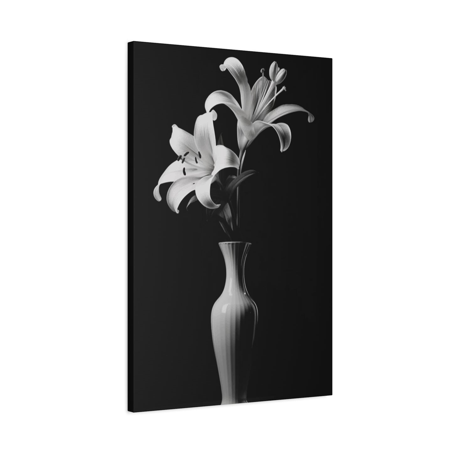
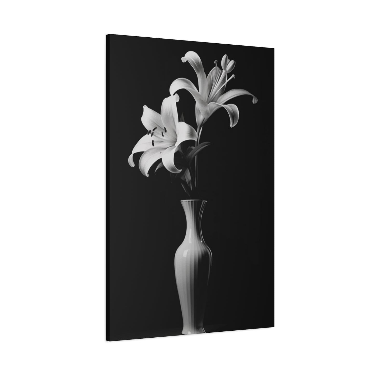
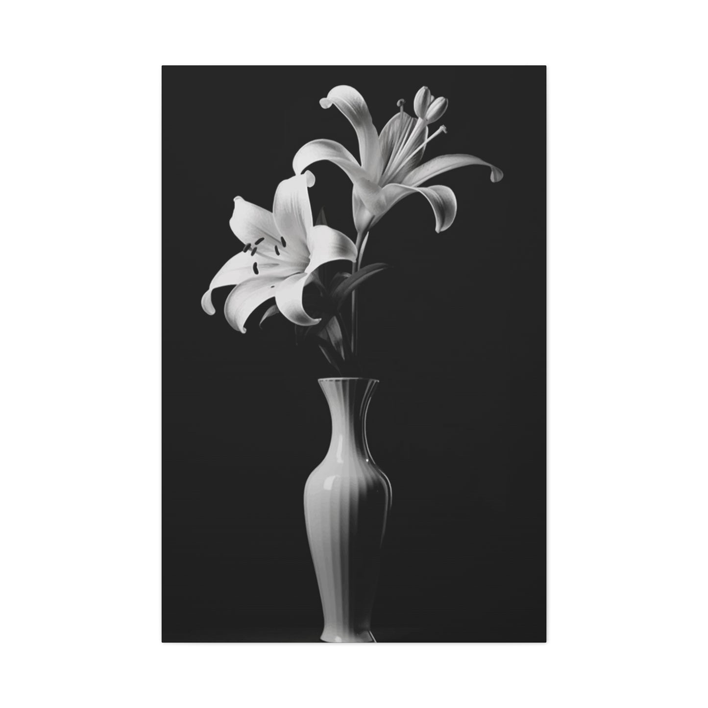
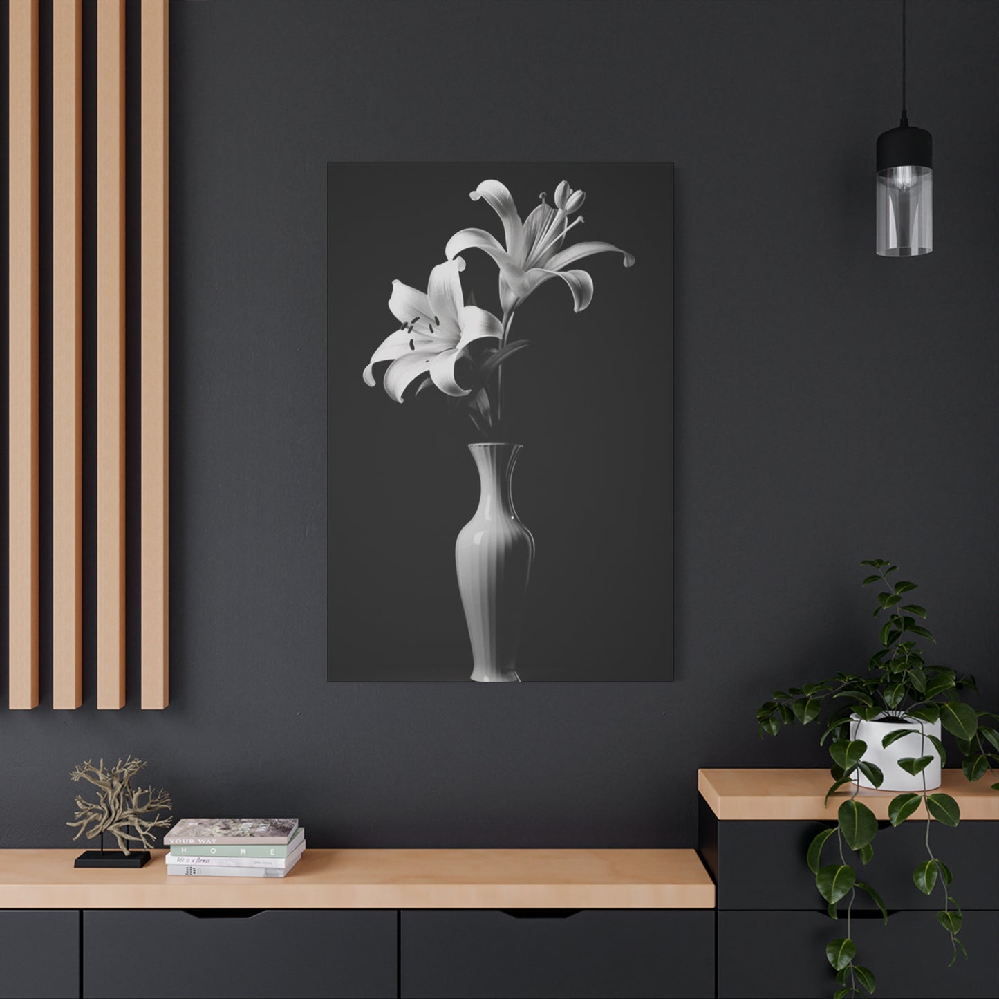
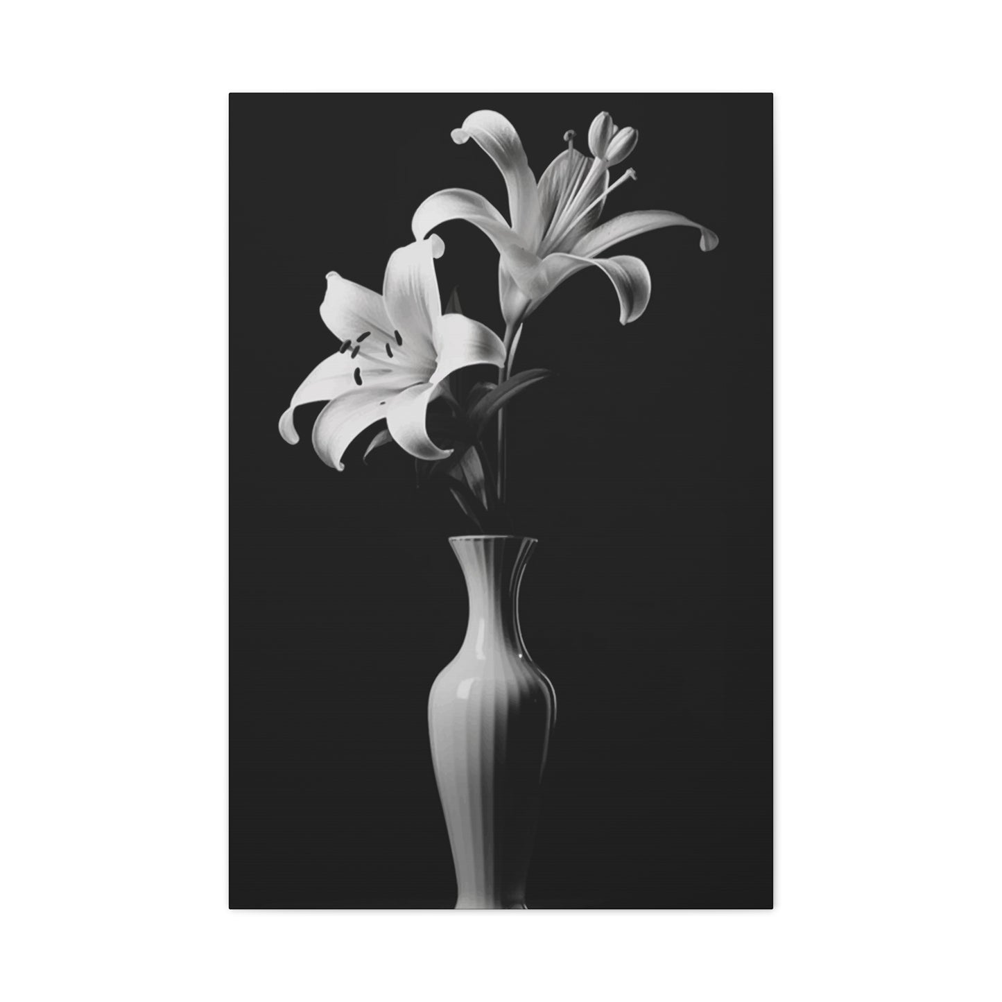
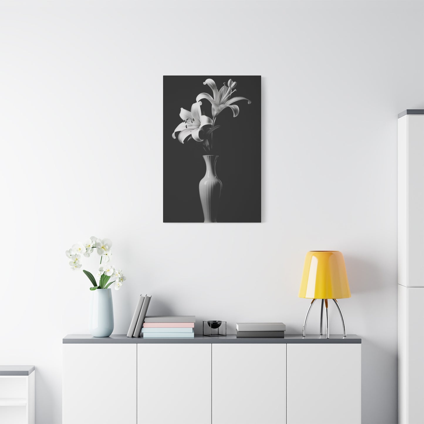
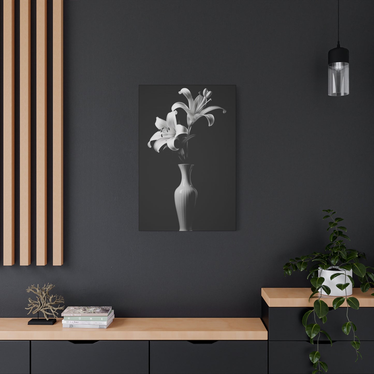
The specific botanical species selected for display often carry their own symbolic associations that interact with the monochromatic presentation. Lilies, for instance, have long been associated with purity and refined elegance in numerous cultural contexts, making them particularly appropriate candidates for white vessel presentations. Roses, with their complex symbolic vocabulary encompassing romantic love, mourning, and political allegiance depending on color and context, introduce nuanced meaning layers when presented in stark black containers. The informed selection of plant materials based on symbolic resonance allows decorators to craft displays that communicate specific emotional tones or thematic concepts beyond their immediate visual impact.
The Japanese aesthetic philosophy of wabi-sabi, which finds beauty in imperfection, impermanence, and incompleteness, offers a particularly relevant framework for appreciating monochromatic botanical displays. The natural processes of growth, bloom, and gradual decline that characterize living plant specimens align perfectly with wabi-sabi principles, creating displays that embody authentic beauty precisely because of their temporal nature and organic irregularity. This philosophical perspective reframes the inevitable changes in botanical displays not as deterioration requiring correction, but as valuable aspects of an ongoing aesthetic experience that rewards sustained attention and acceptance of natural cycles.
Sourcing Exceptional Vessels and Botanical Materials for Distinctive Presentations
The procurement of high-quality containers and botanical specimens represents a crucial phase in the creation of compelling monochromatic displays. Local artisan potters often produce distinctive ceramic vessels featuring unique glazes, textures, and forms unavailable through mass-market retail channels. These handcrafted containers introduce subtle irregularities and individual character that distinguish custom displays from generic arrangements. The establishment of relationships with local ceramic artists provides access to custom commission work, allowing decorators to specify exact dimensions, colors, and design details aligned with specific spatial requirements and aesthetic visions.
Specialized botanical nurseries focusing on uncommon varieties offer plant materials that transcend the limited selection available at general garden centers. These establishments typically maintain extensive inventories of rare cultivars, unusual species, and specialty specimens that enable the creation of truly distinctive displays. Staff at specialty nurseries often possess extensive horticultural knowledge and can provide valuable guidance regarding care requirements, growth characteristics, and aesthetic qualities of various botanical options. The investment in superior plant materials pays substantial dividends in the form of healthier specimens with greater visual impact and improved longevity.
The emergence of online marketplaces specializing in artisan goods and specialty botanical materials has substantially expanded access to exceptional display components. These digital platforms connect consumers with makers and growers worldwide, facilitating the acquisition of unique vessels and plant materials regardless of geographic location. However, the online procurement of botanical specimens requires careful attention to shipping timing, packaging quality, and vendor reputation to ensure that living materials arrive in healthy condition ready for display. The review of seller ratings, examination of detailed product photography, and consideration of shipping timelines relative to seasonal weather conditions all contribute to successful online acquisition of display materials.
Photographic Documentation Strategies for Capturing the Essence of Monochromatic Botanical Displays
The creation of compelling photographic records of black & white flower pot wall art presents unique technical challenges related to exposure control, contrast management, and the accurate representation of subtle tonal gradations. The extreme tonal range inherent in monochromatic displays—from pure black vessel surfaces to brilliant white containers and delicate plant tissues—can exceed the dynamic range capabilities of many camera sensors, resulting in images where either shadow details or highlight information is lost. Exposure bracketing techniques, where multiple images are captured at different exposure values, provide raw material for subsequent combination into high dynamic range composites that preserve detail throughout the tonal spectrum.
The selection of appropriate backgrounds significantly influences the visual impact of botanical display photography. Clean, neutral backdrops that neither compete with nor detract from the display itself allow the subject to command full attention. Seamless paper backgrounds in mid-gray tones provide versatile foundations that work equally well with both black and white primary subjects. Alternatively, textured backgrounds such as weathered wood, raw concrete, or fabric surfaces can introduce contextual information and tactile richness that enhances rather than obscures the primary subject, provided the background elements remain visually subordinate to the botanical display.
Lighting control represents perhaps the most critical variable in successful botanical display photography. The use of diffused light sources minimizes harsh shadows and specular highlights that can create distracting hot spots on vessel surfaces or blown-out areas on white containers. Large softboxes, umbrella reflectors, or even natural window light filtered through sheer curtains provide the gentle, even illumination that reveals form and texture without introducing excessive contrast. The strategic placement of fill lights or reflectors helps balance shadowed areas, ensuring that black vessel details remain visible rather than collapsing into featureless silhouettes.
The Intersection of Monochromatic Botanical Displays with Broader Interior Design Movements
The contemporary enthusiasm for monochromatic botanical displays exists within a broader context of evolving interior design philosophies that emphasize restraint, authenticity, and connection with natural elements. The minimalist movement, with its emphasis on essential forms, limited color palettes, and the elimination of superfluous decoration, provides fertile ground for the appreciation of black & white flower pot wall art. These displays embody minimalist principles by delivering substantial visual impact through carefully considered compositions rather than through profusion or ornamental excess.
The biophilic design movement, which seeks to strengthen human connections with nature through the integration of natural elements within built environments, finds practical expression through botanical displays. Research in environmental psychology has consistently demonstrated that exposure to natural elements—even through representations rather than direct contact—generates measurable improvements in stress reduction, cognitive performance, and overall wellbeing. The incorporation of living botanical specimens within monochromatic displays satisfies biophilic design objectives while maintaining aesthetic coherence with contemporary design vocabularies that prize clean lines and restrained palettes.
The Japandi aesthetic, which synthesizes Japanese minimalism with Scandinavian hygge principles, represents another design movement particularly compatible with monochromatic botanical displays. This hybrid approach embraces natural materials, simple forms, and neutral color schemes while maintaining warmth and livability. The emphasis on quality craftsmanship, authentic materials, and the beauty of functional objects aligns perfectly with the philosophy underlying thoughtfully conceived botanical displays. The Japandi framework provides a useful lens through which to evaluate potential vessels, botanical specimens, and compositional strategies, ensuring that resulting displays embody both aesthetic refinement and genuine functionality.
Custom Fabrication Approaches for Creating Personalized Display Vessels
The pursuit of truly distinctive monochromatic displays sometimes leads enthusiasts toward custom fabrication of unique vessel forms tailored to specific aesthetic visions or spatial constraints. Ceramic hand-building techniques, including coiling, slab construction, and pinching, allow individuals with basic pottery skills to create wholly original containers expressing personal design sensibilities. The freedom to specify exact dimensions, wall thicknesses, and surface treatments enables the realization of concepts that might not exist within commercial product lines. Air-dry clay formulations eliminate the need for access to ceramic kilns, democratizing pottery production and making custom vessel creation accessible to those without studio facilities.
Concrete casting represents another accessible fabrication approach yielding distinctive results with pronounced textural character. Simple mold forms constructed from cardboard, wood, or flexible silicone materials enable the production of geometric vessels with clean lines and substantial visual weight. The incorporation of pigments during mixing allows for precise color control, facilitating the achievement of true blacks or brilliant whites that may prove difficult to source in finished commercial products. Surface treatments including grinding, polishing, or deliberate distressing enable further customization, allowing fabricators to impart specific aesthetic qualities aligned with their design visions.
The repurposing and modification of existing containers through surface treatments presents a third avenue for creating customized display vessels. High-quality primers and paints formulated for adherence to challenging surfaces such as glass, metal, or glazed ceramic enable the transformation of ordinary containers into display-worthy pieces. Spray paint formulations in premium blacks and whites provide smooth, professional-quality finishes that rival factory-applied coatings. The addition of decorative techniques such as geometric tape masking, stenciling, or deliberate distressing through selective paint removal creates visual interest while maintaining overall monochromatic harmony.
Exploring Dimensional Variation Through Layered and Sculptural Display Configurations
The strategic manipulation of depth and dimensional layering transforms flat wall surfaces into dynamic spatial environments that engage viewers through physical three-dimensionality as well as visual composition. Stepped mounting systems that position vessels at varied distances from wall surfaces create shadow patterns that shift with changing light conditions, introducing temporal dynamism to static displays. The physical projection of elements into living space encourages closer examination and creates opportunities for viewers to appreciate displays from multiple angles, revealing compositional aspects invisible from frontal perspectives.
The integration of architectural shelf elements at staggered heights establishes horizontal platforms from which botanical displays emerge at various elevations. This approach creates complex spatial relationships where vessels exist in multiple depth planes, some positioned directly against vertical surfaces while others project forward from shelf edges. The resulting configurations possess sculptural qualities that transcend conventional notions of wall decoration, approaching the status of installation art pieces that reshape spatial perception within rooms. The interplay between positive space occupied by vessels and botanical materials and negative space around and between elements becomes a primary compositional concern, demanding careful orchestration to achieve balanced, harmonious results.
Corner installations present unique opportunities for creating immersive botanical environments that wrap around architectural transitions. The angular geometry of corner spaces naturally suggests radiating or cascading compositional structures where vessels appear to flow across adjacent wall planes. This approach transforms underutilized architectural features into prominent display zones that anchor room design and establish powerful focal points. The three-dimensional nature of corner installations invites circulation around the display, revealing constantly shifting relationships between elements as viewing perspectives change.
Material Combinations That Enhance Visual Interest While Maintaining Monochromatic Harmony
The thoughtful integration of diverse materials within unified monochromatic frameworks generates textural richness and tactile complexity without disrupting color coherence. The pairing of matte-finished vessels with glossy botanical foliage introduces surface variation that enlivens compositions through differential light interaction. Matte surfaces absorb incident light, creating soft, even tones, while glossy surfaces reflect light directionally, producing highlights and specular reflections that animate displays. This contrast in surface quality provides visual stimulation that prevents monochromatic schemes from feeling flat or monotonous.
The incorporation of natural materials such as driftwood, stone, or cork elements introduces organic irregularity that complements the living botanical specimens while maintaining neutral color values compatible with black and white vessels. Weathered wood pieces positioned as backing elements or integrated shelf components contribute textural depth and narrative suggestion, hinting at natural processes and temporal passage. River stones or slate fragments arranged as decorative accents around vessel bases establish visual connections with geological environments while their neutral gray tones harmonize seamlessly with monochromatic container palettes.
Metallic accents in silver, brushed nickel, or aged pewter finishes provide opportunities for subtle embellishment that enhances rather than overwhelms monochromatic displays. Mounting hardware featuring refined metallic finishes introduces precision-crafted details that signal quality and attention to detail. Decorative wire elements used to create climbing supports for vining plants or to establish linear compositional structures contribute visual interest through their geometric precision and reflective properties. The key to successful metallic integration lies in restraint and deliberate placement, ensuring that metallic elements serve as refinements rather than competing focal points.
The Role of Negative Space in Defining Compositional Strength and Visual Clarity
The conscious cultivation of negative space—areas deliberately left empty of vessels, botanical materials, or decorative elements—proves as crucial to compositional success as the placement of positive elements themselves. Adequate negative space around and between display components allows each element to register clearly in viewer perception, preventing visual confusion and maintaining legibility even in complex multi-vessel arrangements. This spatial breathing room creates visual pauses that guide viewer attention through compositions along intentional pathways, establishing rhythm and preventing overwhelming visual density.
The proportion of negative to positive space dramatically influences the emotional tone and aesthetic character of displays. Compositions dominated by negative space with relatively few botanical elements evoke minimalist sensibilities characterized by restraint, contemplation, and refined simplicity. These sparse arrangements direct concentrated attention toward individual vessels and specimens, elevating them to the status of singular aesthetic objects worthy of sustained consideration. The expansive emptiness surrounding isolated elements amplifies their visual impact through contrast and isolation, similar to the way a spotlight singles out a performer on an otherwise darkened stage.
Conversely, denser compositions featuring reduced negative space create impressions of abundance, vitality, and exuberant growth. These more profuse arrangements align with naturalistic aesthetic preferences and romantic sensibilities that celebrate biological fecundity and organic profusion. The challenge in denser configurations lies in maintaining sufficient negative space to prevent complete visual chaos, ensuring that individual elements remain distinguishable and that compositions retain underlying organizational structures. The strategic distribution of small pockets of emptiness throughout dense arrangements provides visual entry points and rest areas that facilitate viewer comprehension of complex displays.
Responding to Architectural Features Through Adaptive Display Design
The existing architectural characteristics of spaces intended to host botanical displays exert significant influence over appropriate design strategies and compositional approaches. Rooms featuring prominent horizontal lines—from crown molding, chair rails, or exposed beam structures—benefit from displays that either harmonize with or deliberately counterpoint these linear elements. Horizontal vessel arrangements that echo architectural banding reinforce spatial geometry and create visual coherence, while vertical compositions that contrast with dominant horizontal features introduce dynamic tension and visual interest through directional opposition.
Window placement and natural light patterns constitute critical architectural factors requiring careful consideration during display planning. Botanical specimens positioned in direct sun exposure face challenges including accelerated soil moisture depletion, potential leaf scorching, and exaggerated temperature fluctuations. However, these challenging conditions also present opportunities for cultivating sun-loving species that thrive under bright light conditions, including many flowering specimens and heat-tolerant succulents. The alternative strategy of positioning displays on walls perpendicular to window openings allows botanical elements to receive abundant indirect light while avoiding the harshest aspects of direct solar radiation.
Ceiling height and overall room proportions influence appropriate scale relationships between displays and their architectural contexts. Spaces with modest ceiling heights, typically eight feet or less, require displays scaled to maintain comfortable proportions that neither overwhelm compact volumes nor appear insignificant. Conversely, rooms with generous vertical dimensions can accommodate larger, more ambitious installations featuring substantial vessels and more expansive compositional structures. The relationship between display scale and architectural context proves crucial to achieving balanced, harmonious results that feel integrated within rather than imposed upon existing spaces.
Establishing Thematic Coherence Across Multiple Rooms Through Coordinated Display Strategies
The development of consistent botanical display approaches across multiple spaces within a residence creates visual continuity and thematic coherence that unifies disparate areas into a cohesive whole. This coordination need not involve identical vessel styles or botanical selections in every room; rather, it requires the establishment of unifying principles—such as consistent color palettes, recurring vessel shapes, or related plant families—that create recognizable connections while permitting room-specific variations. The result is a sense of intentional design extending throughout the home rather than a collection of isolated, unrelated decorative gestures.
The strategic variation of display scale and complexity across rooms based on their function and occupancy patterns ensures that botanical elements enhance rather than obstruct the intended use of spaces. Public areas such as living rooms and formal dining spaces can accommodate more elaborate, attention-commanding displays that serve as conversation pieces and aesthetic focal points. These prominent installations benefit from sophisticated compositional structures and carefully curated botanical specimens that reward extended viewing and reflection. Private spaces including bedrooms and personal offices might feature more modest, contemplative displays that support relaxation and introspection without demanding constant attention.
The concept of visual rhythm—the establishment of recurring motifs that appear throughout a residence—provides a framework for creating thematic continuity while avoiding monotonous repetition. A signature vessel style might appear in every room but paired with different botanical specimens appropriate to varying light conditions and spatial constraints. Alternatively, a consistent botanical family—such as ferns, succulents, or flowering specimens—might appear throughout the home but displayed in vessels varying in size, material, and surface treatment. These rhythmic recurrences create subliminal connections that register in viewer consciousness as evidence of thoughtful, coherent design thinking.
The Influence of Cultural and Geographic Context on Display Interpretation and Reception
The geographic and cultural context within which botanical displays exist significantly influences their interpretation and emotional resonance. In regions characterized by abundant natural vegetation and temperate growing conditions, interior botanical displays might be perceived primarily as decorative gestures that bring familiar outdoor elements into domestic spaces. Conversely, in arid environments or dense urban settings where access to vegetation is limited, interior botanical displays can assume heightened significance as vital connections to nature otherwise largely absent from daily experience. This contextual variation suggests that identical displays transplanted across different geographic and cultural settings may generate substantially different responses and serve distinct psychological functions.
Cultural traditions regarding the symbolic significance of specific plant species and their appropriate display contexts vary dramatically across different societies. In some traditions, certain plants carry specific ceremonial or spiritual significance that makes their use in decorative contexts either highly appropriate or potentially problematic. The lotus, for instance, carries profound spiritual meaning within Buddhist and Hindu traditions, making its incorporation into decorative displays a gesture rich with symbolic resonance that extends far beyond purely aesthetic considerations. Awareness of these cultural dimensions allows decorators to make informed choices that either embrace or consciously avoid specific symbolic associations based on their intentions and the cultural composition of anticipated viewers.
The historical associations of botanical imagery within specific cultural contexts provide additional layers of meaning that enrich contemporary displays. The Victorian language of flowers, which assigned specific meanings to different floral species, created elaborate symbolic vocabularies through which individuals communicated complex sentiments through carefully chosen botanical gifts and arrangements. While contemporary audiences may not possess fluency in these historical codes, residual associations often persist, lending certain botanical choices particular emotional tones. Red roses retain romantic associations, white lilies suggest purity or mourning, and ivy implies fidelity and attachment—all cultural inheritances that subtly influence how botanical displays register in contemporary perception.
Addressing Common Challenges in Maintaining Aesthetic Quality Over Extended Periods
The preservation of visual excellence in botanical displays over extended timeframes requires systematic attention to multiple maintenance dimensions. Dust accumulation on vessel surfaces and botanical foliage gradually diminishes visual clarity and crispness, creating a subtle degradation that can escape notice during daily observation but becomes apparent when displays are periodically photographed or when fresh installations replace established arrangements. Regular gentle cleaning using soft cloths or brushes removes particulate buildup, restoring the clean lines and surface qualities essential to monochromatic presentations. For delicate botanical specimens, brief exposure to gentle water mist or carefully directed compressed air dislodges accumulated dust without risking physical damage to fragile plant tissues.
The natural growth patterns of living botanical specimens inevitably alter compositional relationships over time, as plants extend new growth, shed older foliage, or gradually shift their overall form. This organic evolution can be embraced as a valuable aspect of living displays that distinguishes them from static artwork, or it can be actively managed through strategic pruning and grooming to maintain specific aesthetic arrangements. The philosophical approach to this maintenance dimension reflects broader attitudes toward the relationship between human intention and natural processes—whether displays should exhibit strict control and unchanging perfection, or whether they should celebrate organic variability and the authentic life cycles of botanical organisms.
The eventual decline and mortality of living specimens represents an unavoidable aspect of working with botanical materials. Rather than viewing plant loss as failure or disappointment, seasoned practitioners recognize these transitions as opportunities for renewal and evolution of displays. The replacement of spent specimens with fresh materials allows for seasonal variation, experimentation with new botanical varieties, and ongoing refinement of compositional approaches based on accumulated experience. This cyclical rhythm of establishment, maturation, decline, and renewal mirrors natural ecological processes and imbues displays with temporal depth absent from static decorative objects.
Conclusion
The deliberate manipulation of vessel and botanical specimen scale within unified displays generates hierarchical relationships that guide viewer attention and establish compositional structure. Large-scale elements naturally assume dominant positions within visual hierarchies, serving as primary focal points around which smaller components organize themselves. The placement of a substantial floor-to-ceiling installation featuring oversized vessels and dramatic foliage specimens creates an unmissable anchor point that establishes the spatial center of gravity for entire rooms. These commanding installations demand prominent positions along primary sight lines, ensuring that they receive appropriate visual emphasis relative to their scale and compositional ambition.
Medium-scale elements function as supporting players that expand upon and elaborate themes established by dominant features. These intermediate components might echo vessel styles, botanical families, or compositional strategies employed in primary installations while executing them at reduced scales appropriate to secondary viewing distances. The repetition of motifs across scale variations creates visual echoes that unify disparate elements into coherent wholes, much as musical compositions develop thematic material through variations in instrumentation, dynamics, and rhythmic values.
Small-scale accents introduce intimate details that reward close inspection and create opportunities for personal discovery. These diminutive elements might feature rare miniature plant varieties, intricate vessel decorations, or subtle material combinations that only become apparent upon deliberate examination. The incorporation of small-scale details creates multi-layered viewing experiences that remain engaging during repeated encounters, as viewers continually notice previously overlooked subtleties. This approach to scale variation ensures that displays operate successfully across multiple viewing distances, from across-room impressions to close-range scrutiny.
The deliberate limitation of chromatic range to monochromatic blacks, whites, and intermediate grays generates distinctive psychological effects that differentiate these displays from polychromatic alternatives. Color restriction eliminates the emotional associations and symbolic meanings carried by specific hues, creating a more neutral perceptual field where form, texture, and spatial relationships assume primary importance. This chromatic restraint can produce calming effects in viewers, as the absence of competing color stimuli reduces visual complexity and the cognitive processing demands associated with interpreting varied hues.
The high contrast potential inherent in black and white juxtapositions creates visual drama that captures attention and maintains engagement. Human visual systems are particularly attuned to luminance contrast—the difference between light and dark values—making monochromatic compositions with strong tonal variation especially eye-catching. This contrast sensitivity likely evolved to support predator detection, edge recognition, and navigation in varied lighting conditions, resulting in contemporary humans who respond viscerally to bold tonal contrasts even in decorative contexts far removed from survival scenarios.
Share