Bedroom Quote Wall Art & Canvas Prints
Bedroom Quote Wall Art & Canvas Prints
Couldn't load pickup availability
Bedroom Quote Wall Art: Creating Inspiring Personal Sanctuaries Through Meaningful Typography and Visual Expression
The arrangement of thoughtfully selected phrases and meaningful statements within sleeping quarters has emerged as a powerful method for shaping daily mindsets and emotional atmospheres. When individuals surround themselves with carefully chosen words displayed through artistic mediums, they create environments that continuously reinforce positive thinking patterns and personal aspirations. The visual presence of these statements serves as constant gentle reminders of core values, helping occupants maintain focus on what matters most in their lives.
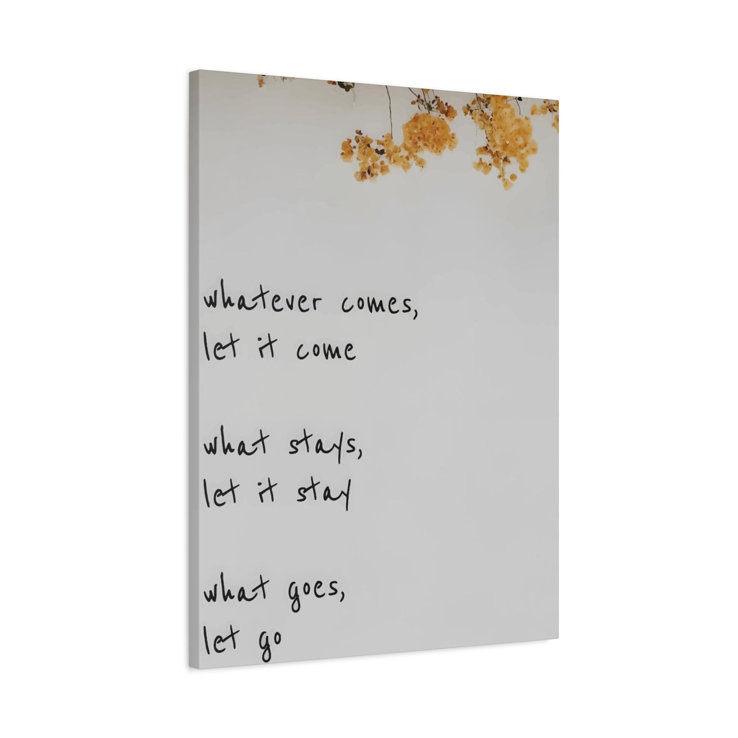
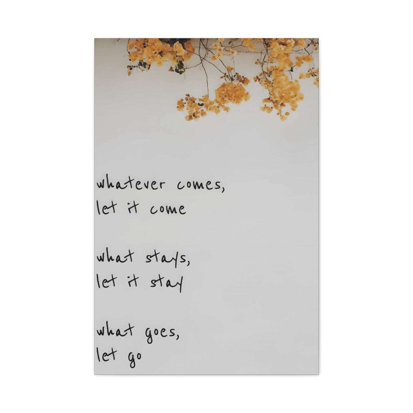
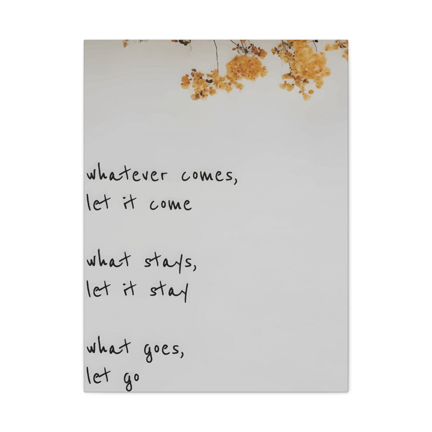
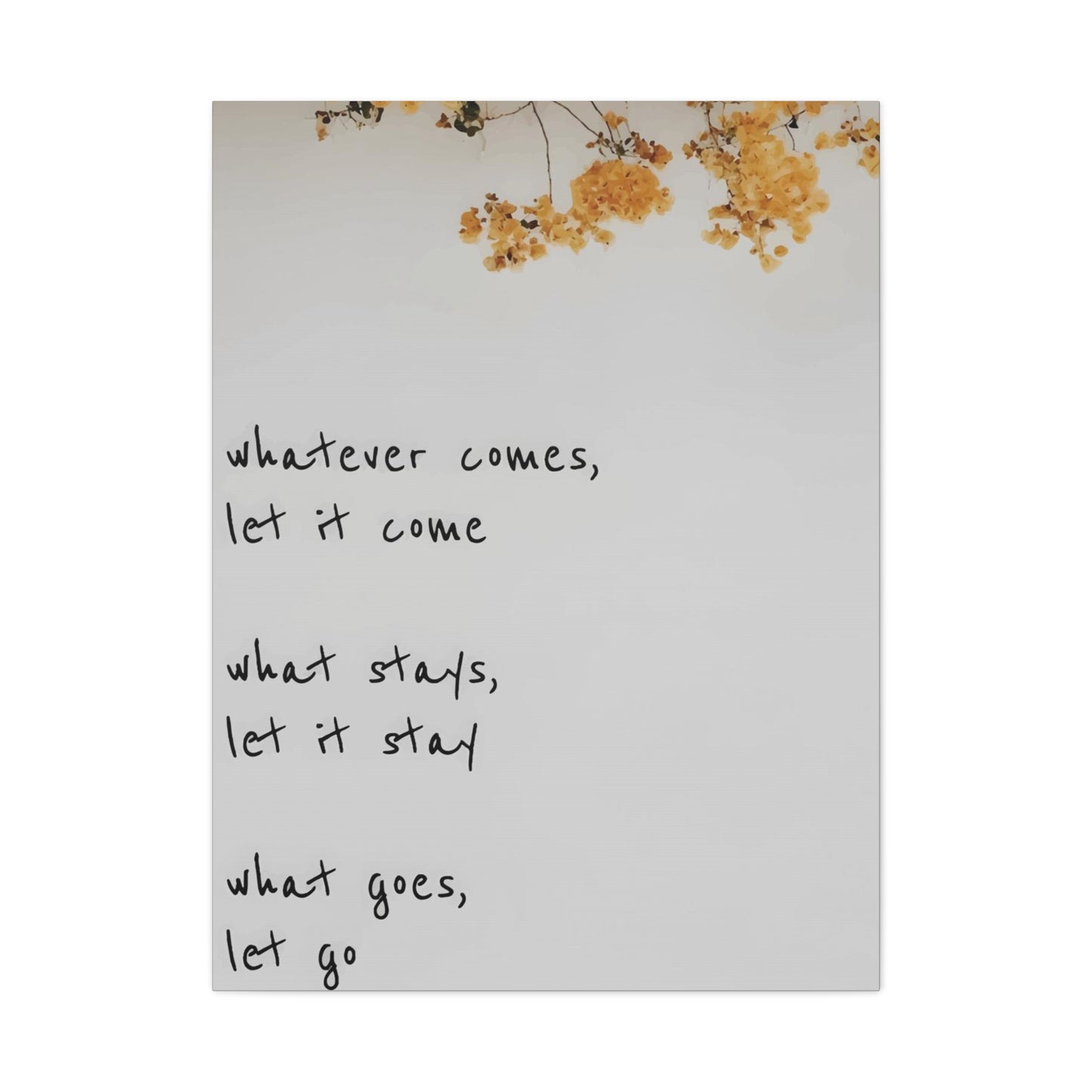
Bedroom quote wall art represents far from mere decorative elements; these pieces function as silent mentors that speak to the subconscious mind during the most vulnerable hours of each day. Upon waking, the first words encountered can set the entire tone for upcoming experiences. Similarly, the phrases observed before sleeping can influence dream patterns and subconscious processing throughout nocturnal hours. This cyclical exposure creates powerful conditioning effects that gradually reshape thought patterns and behavioral responses.
Scientific research into environmental influences on human consciousness reveals fascinating connections between visual stimuli and mental states. When meaningful phrases occupy prominent positions within frequently occupied spaces, the brain processes these messages through mechanisms similar to affirmations and meditation practices. Repetitive exposure strengthens neural pathways associated with the concepts expressed, making those ideas more readily accessible during decision-making moments and challenging circumstances.
The selection process for meaningful phrases demands careful consideration of personal goals, current life circumstances, and desired emotional states. Some individuals gravitate toward motivational declarations that ignite ambition and drive, while others prefer soothing sentiments promoting peace and contentment. The most effective choices resonate deeply with individual experiences and aspirations, creating genuine emotional responses rather than superficial acknowledgment.
Placement considerations extend beyond simple aesthetic arrangements to encompass strategic positioning that maximizes psychological impact. Phrases positioned directly within the line of sight upon waking carry particular significance, as does text visible from resting positions. These prime locations ensure consistent engagement with the selected messages, reinforcing their intended effects through habitual visual processing.
Exploring Diverse Artistic Styles for Expressing Written Sentiments in Sleeping Quarters
The realm of typographic artistry offers extraordinary variety, enabling individuals to discover visual presentations that align perfectly with existing decor schemes and personal preferences. From minimalist black-and-white compositions to vibrant multi-colored arrangements, the spectrum of available styles accommodates every imaginable taste profile. Understanding these different approaches helps in making informed selections that enhance rather than clash with established room characteristics.
Contemporary minimalist designs emphasize clean lines, generous negative space, and restrained color palettes. These approaches create sophisticated atmospheres that convey messages without overwhelming visual fields. Single-color presentations against contrasting backgrounds deliver maximum readability while maintaining elegant simplicity. Such designs particularly suit modern or Scandinavian-inspired interiors where clutter reduction and visual calm take precedence.
Vintage-inspired typography draws from historical printing methods, incorporating distressed textures, ornamental flourishes, and nostalgic color combinations. These presentations evoke specific temporal periods, from Victorian elegance to mid-century charm, adding layers of character and depth. Distressed finishes and antiqued appearances create impressions of cherished heirlooms rather than recent acquisitions, lending authenticity and warmth to personal spaces.
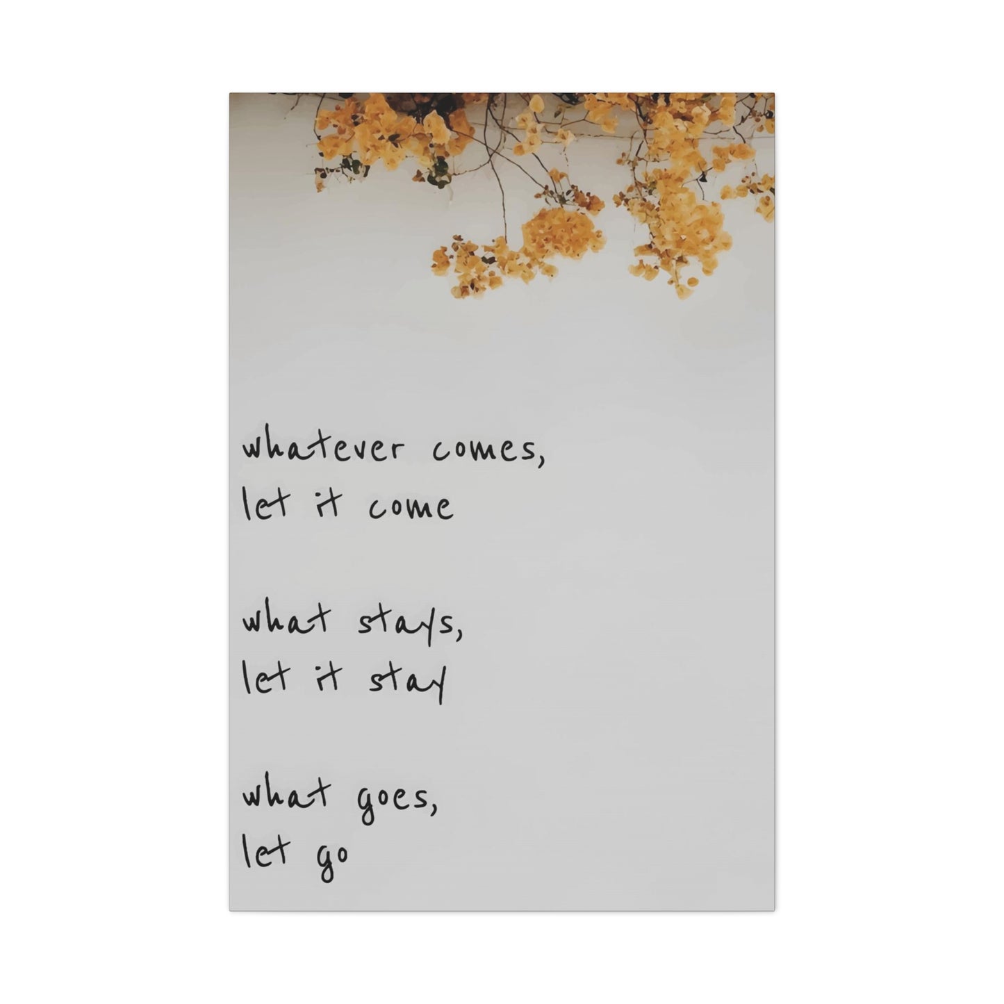
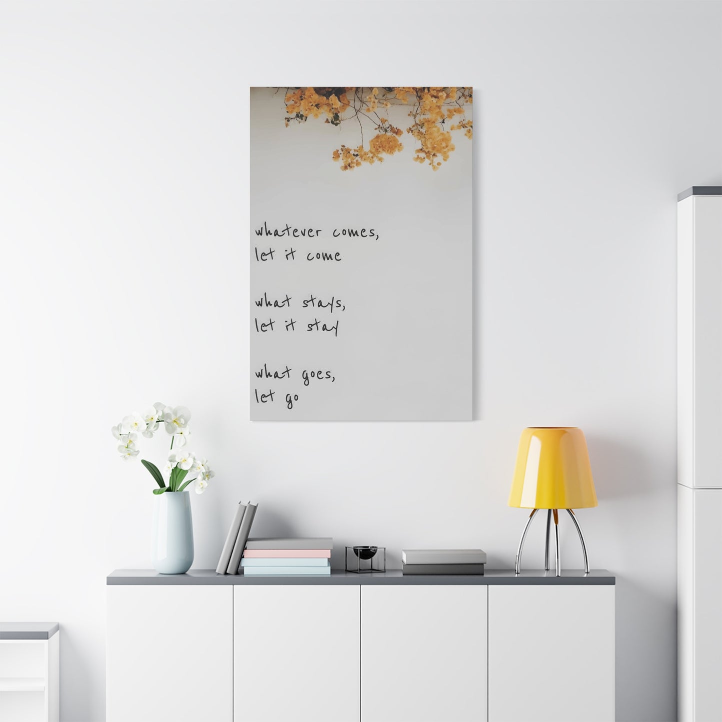
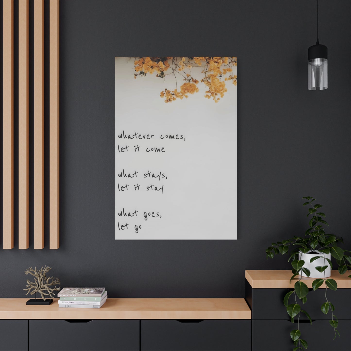
Calligraphic expressions showcase the beauty of handwritten letterforms, ranging from formal script variations to casual brush-stroke styles. These flowing presentations add organic, human elements to environments, softening the harder edges of printed text. The visible evidence of human creation in each curved line and flourish generates intimate connections between viewers and displayed messages, as though receiving handwritten notes from trusted friends.
Geometric arrangements structure text within shapes and patterns, creating visually striking compositions that transcend basic horizontal alignment. Circular formations, stair-step configurations, and radiating patterns transform simple phrases into dynamic visual elements. These approaches particularly appeal to individuals drawn to structured aesthetics and mathematical precision in artistic expression.
Watercolor treatments bring soft, dreamy qualities to textual presentations, with bleeding color transitions and fluid movements suggesting creativity and emotional depth. The organic nature of watercolor effects provides perfect counterbalances to the precision of letterforms, creating harmonious tensions between control and spontaneity. These styles work exceptionally well in spaces designated for relaxation and creative contemplation.
Rustic wooden presentations preserve natural grain patterns and organic textures, celebrating material authenticity while conveying messages. Whether featuring burned lettering, carved impressions, or painted applications, these pieces bring outdoor elements inside, creating connections with natural environments. The tactile qualities of wood add dimensional interest that purely printed pieces cannot replicate.
Material Considerations and Physical Formats for Textual Artistic Expressions
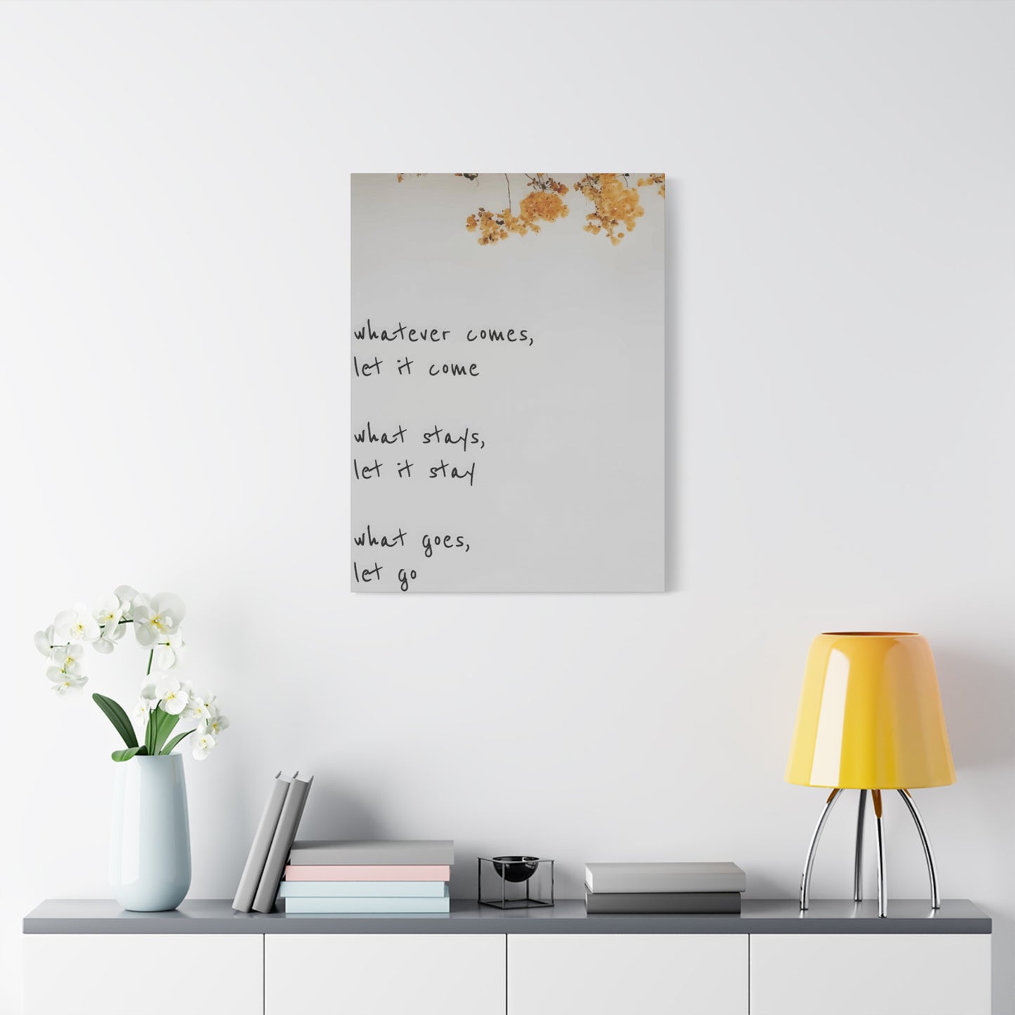
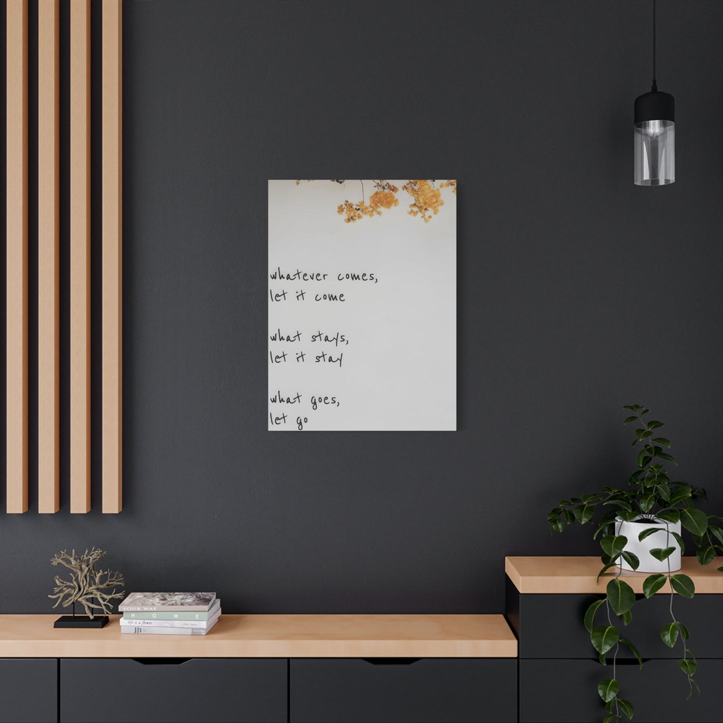
The physical substance through which phrases manifest significantly influences both aesthetic impact and practical longevity. Canvas stretched over wooden frames provides classic gallery-quality presentations with professional appearance and substantial presence. The textile surface accepts various printing methods beautifully, from traditional painting to modern digital transfers, while the wrapped edges eliminate the need for additional framing.
Metal prints deliver sleek, contemporary appearances with remarkable color saturation and resistance to environmental damage. The process infuses inks directly into coated aluminum sheets, creating permanent bonds that won't fade, peel, or deteriorate over time. These formats particularly suit industrial or modern minimalist spaces where high-impact visual statements complement streamlined aesthetics.
Wooden planks and reclaimed lumber pieces offer rustic charm with genuine material substance. Natural variations in grain patterns ensure each piece maintains unique character, impossible to duplicate exactly. Sealed surfaces protect against moisture while preserving authentic wood appearances, creating durable displays that withstand decades of use without degradation.
Acrylic sheets provide transparent or translucent options that allow light passage while displaying text. Layered effects become possible, with phrases appearing to float away from wall surfaces. The glossy finishes of acrylic reflect surrounding light, adding luminosity to darkened spaces. These formats create particularly striking effects when positioned near windows or light sources.
Vinyl decals offer flexible solutions that apply directly to wall surfaces without requiring hanging hardware. Removable varieties enable frequent changes without surface damage, perfect for renters or individuals who enjoy regular refreshment of surroundings. The seamless integration with wall surfaces creates illusions of painted or stenciled applications at fractions of the cost and effort.
Framed prints behind protective glass provide traditional presentations that safeguard artwork from dust, moisture, and physical contact. The frame selections themselves become design elements, ranging from ornate carved wood to sleek metal profiles. Glass options include regular, non-reflective, and UV-filtering varieties, each serving specific functional requirements.
Fabric banners and tapestries introduce textile warmth and acoustic benefits alongside visual messages. The soft materials absorb sound reflections that harder surfaces bounce back, contributing to quieter, more peaceful atmospheres. Hanging mechanisms range from decorative rods to simple thumbtacks, offering flexibility in presentation methods.
Dimensional Specifications and Proportional Relationships for Optimal Visual Harmony
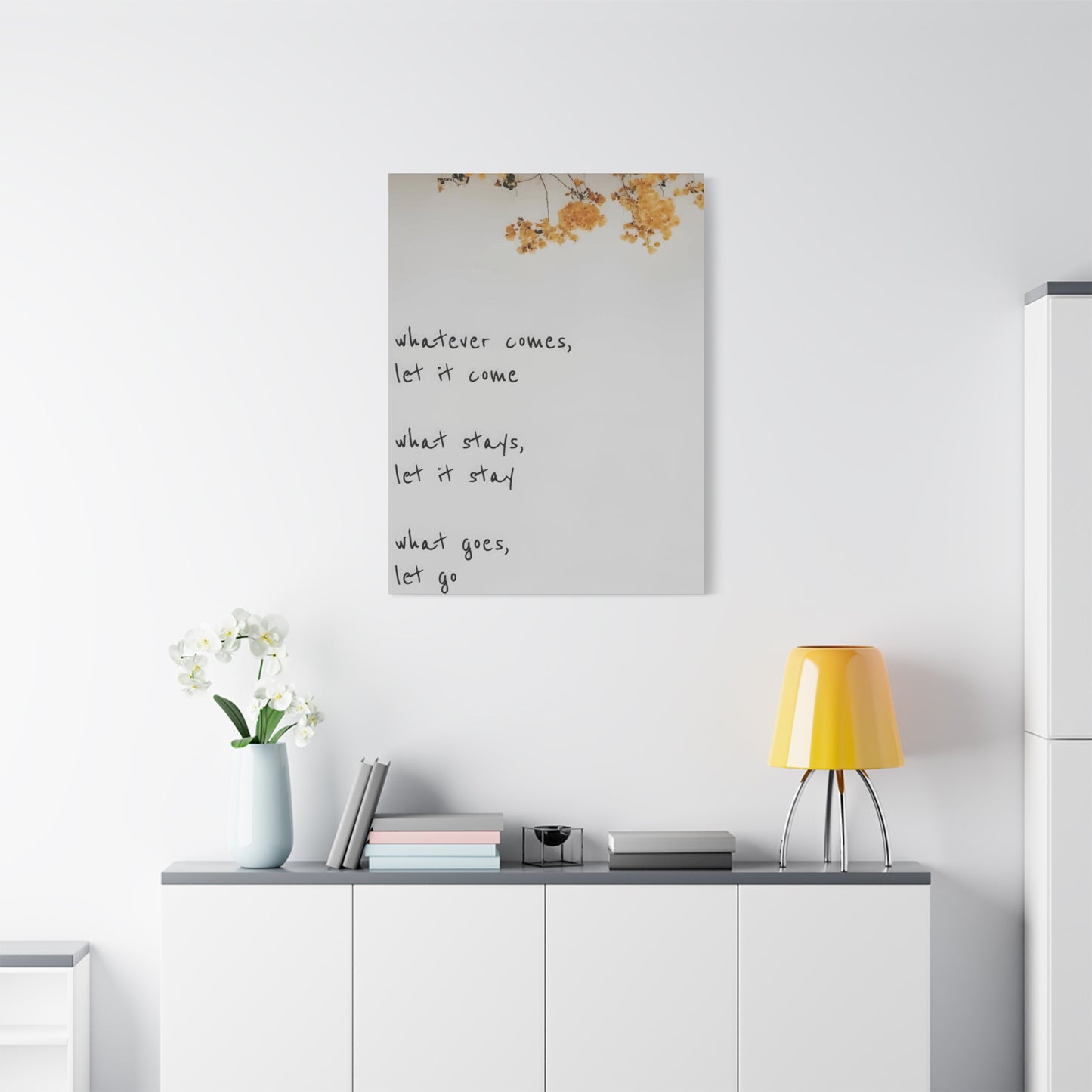
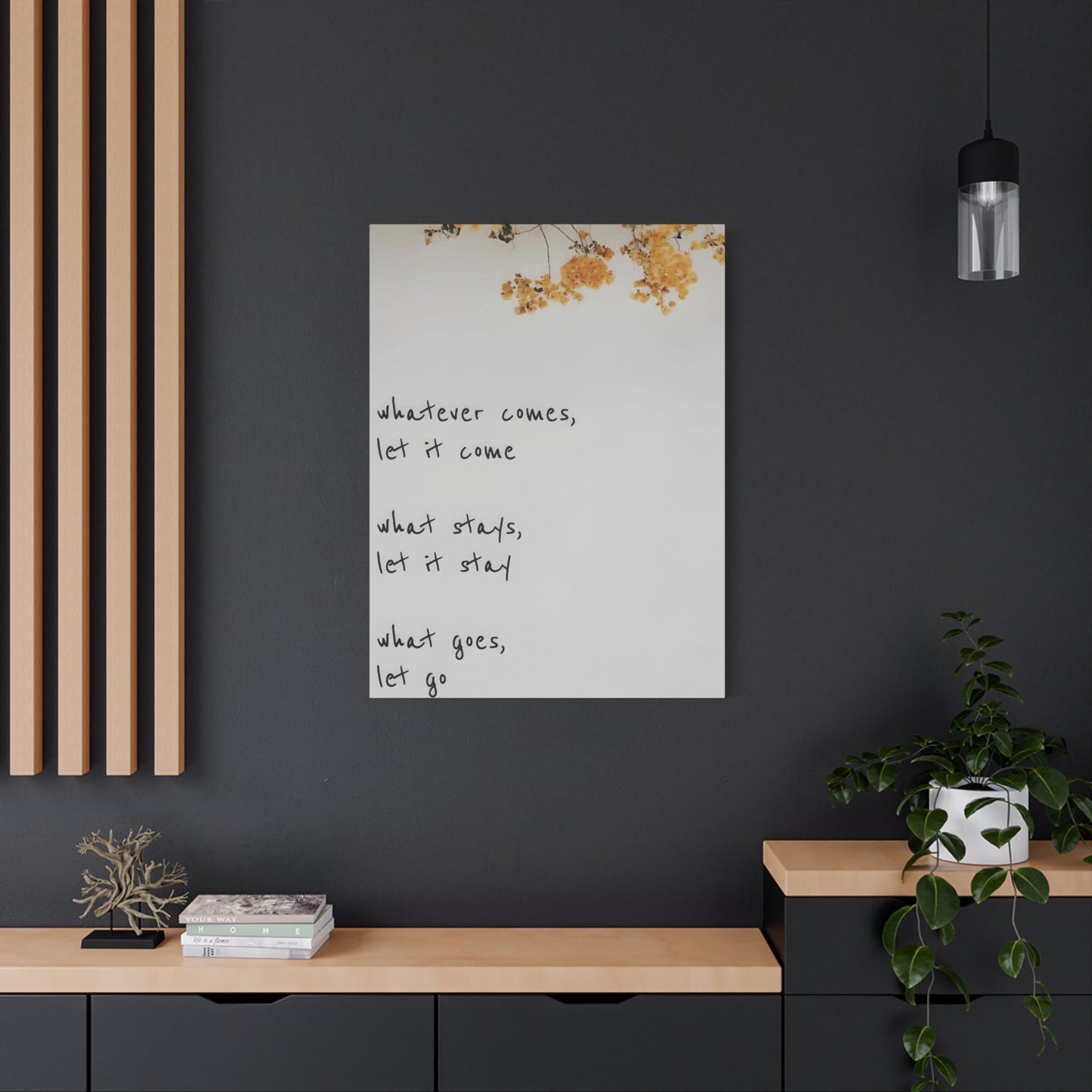
Selecting appropriate sizes requires careful assessment of available wall space and surrounding design elements. Oversized pieces make bold statements that dominate visual fields, functioning as primary focal points within rooms. These large-format presentations work best on expansive blank walls where surrounding furniture and accessories won't compete for attention. Single oversized pieces often prove more effective than multiple smaller items scattered across the same area.
Medium-sized pieces measuring approximately two to three feet in primary dimensions suit most standard sleeping quarters. These versatile dimensions provide substantial presence without overwhelming spaces, fitting comfortably above beds, dressers, or seating areas. The scale works equally well as standalone features or as components within larger gallery wall arrangements.
Small accent pieces measuring under two feet serve supplementary roles, filling gaps in existing arrangements or adding subtle touches without demanding primary attention. These compact formats excel in tight spaces like narrow walls between doors and windows, or in asymmetric balance arrangements pairing with larger pieces. Collections of small pieces arranged in grid patterns create unified visual impacts equal to single large formats.
Proportional relationships between art dimensions and furniture scales require consideration to maintain visual balance. General guidelines suggest that wall art spanning approximately two-thirds to three-quarters of the underlying furniture width creates harmonious relationships. For pieces hanging above beds, this typically translates to widths between four and six feet for queen and king-sized mattresses.
Vertical versus horizontal orientations affect spatial perceptions significantly. Tall vertical formats draw eyes upward, creating illusions of increased ceiling heights in rooms with standard eight-foot dimensions. Horizontal landscapes emphasize width, making narrow spaces feel more expansive. Square formats provide neutral options that work in nearly any configuration without directional bias.
Height placement influences both aesthetic appeal and functional viewing. Standard recommendations position artwork centers approximately fifty-seven to sixty inches from floor levels, aligning with average eye heights while standing. However, pieces intended for viewing primarily while lying down benefit from lower placements that accommodate reclined sight lines.
Gallery wall configurations combining multiple pieces demand careful planning to achieve cohesive appearances. Mapping arrangements on floor surfaces before committing to wall penetrations prevents frustrating false starts. Maintaining consistent spacing between pieces, typically two to three inches, creates unified presentations rather than scattered collections.
Color Psychology and Palette Selection for Enhancing Desired Emotional States
The chromatic choices surrounding textual presentations dramatically influence the psychological effects generated. Warm hues including reds, oranges, and yellows stimulate energy, passion, and enthusiasm. These vibrant tones suit morning-focused phrases designed to energize and motivate upon waking. However, excessive warm color saturation may prove counterproductive in spaces intended for relaxation and sleep preparation.
Cool tones encompassing blues, greens, and purples promote calm, peace, and introspection. These soothing shades align perfectly with evening wind-down routines and restful sleep preparation. Lighter cool variations create airy, spacious feelings, while deeper saturations add cozy intimacy. Cool palettes particularly suit phrases emphasizing tranquility, gratitude, and mindfulness.
Neutral palettes featuring blacks, whites, grays, and beiges provide versatile foundations that complement virtually any existing color scheme. These restrained approaches allow textual content to take precedence over chromatic impact, ensuring messages rather than colors capture primary attention. Neutral presentations age well, remaining relevant despite changing decor trends and personal preference evolutions.
Monochromatic approaches using single hues in varied saturations and tones create sophisticated, cohesive appearances with inherent unity. The limited palette focuses attention on textual content and compositional elements rather than color relationships. These presentations demonstrate restraint and intentionality, qualities that translate to perceived thoughtfulness.
Complementary color combinations pairing opposites on color wheels generate high-contrast vibrancy and visual excitement. Blue and orange, red and green, yellow and purple partnerships create dynamic tensions that demand attention. These bold choices suit energetic, motivational phrases that benefit from assertive presentations.
Analogous schemes combining adjacent color wheel neighbors produce harmonious blends with natural flow between hues. These gentle transitions create soothing visual experiences without harsh contrasts. The subtle variety maintains interest while preserving overall unity, perfect for contemplative phrases promoting peace and reflection.
Accent color strategies employ predominantly neutral palettes with strategic pops of vibrant hues highlighting specific words or design elements. This approach combines the versatility of neutrals with the impact of bold colors, allowing selective emphasis of key concepts within longer phrases. The restrained use of bright tones prevents visual fatigue while maintaining engagement.
Crafting Personalized Phrases That Resonate With Individual Life Journeys
The most meaningful textual expressions emerge from personal experiences, values, and aspirations rather than generic popular quotations. While famous sayings from renowned authors and speakers offer wisdom, customized statements reflecting unique circumstances create stronger emotional connections. The process of identifying truly resonant phrases requires introspective examination of current life stages and future intentions.
Morning affirmations benefit from present-tense declarations that assume desired states as current realities. Phrases beginning with "I am" followed by positive descriptors program subconscious minds to accept and manifest those qualities. Examples might include statements about worthiness, capability, or abundance, phrased as existing truths rather than distant aspirations.
Evening reflections suit phrases promoting gratitude, peace, and release of daily stresses. These gentler statements facilitate mental transitions from active engagement to restful recharge. Expressions acknowledging blessings, celebrating small victories, and encouraging surrender to natural rhythms support healthy sleep preparation.
Relationship-focused sentiments remind occupants of connections with loved ones and commitments to nurturing those bonds. Phrases emphasizing love, communication, and mutual support reinforce relationship priorities amid busy lives. These visible reminders prove particularly valuable in shared sleeping quarters, creating unified intentionality between partners.
Goal-oriented declarations maintain focus on specific objectives and desired accomplishments. Breaking large ambitions into smaller affirmation-style statements makes progress feel achievable rather than overwhelming. Visible goal reminders prevent daily distractions from derailing long-term pursuits, functioning as compass points guiding decisions.
Spiritual or philosophical principles reflecting core belief systems anchor daily actions in deeper meanings. Whether drawing from religious traditions, philosophical movements, or personal spiritual frameworks, these foundational statements provide stability during uncertain times. The visual presence of cherished principles offers constant grounding.
Humorous or lighthearted phrases inject playfulness and joy into daily routines. Not every message requires serious gravitas; witty observations and amusing perspectives lighten moods and reduce stress. Appropriate humor in personal spaces creates permission for imperfection and gentle self-acceptance.
Multilingual expressions honor cultural heritage or celebrate linguistic diversity. Displaying meaningful phrases in native languages or studied foreign tongues maintains connections with cultural roots while perhaps concealing personal meanings from casual observers. The aesthetic qualities of diverse alphabets and character systems add visual interest beyond semantic content.
Strategic Arrangement Principles for Creating Cohesive Visual Narratives
The composition of multiple pieces requires attention to visual flow, thematic connections, and spatial balance. Effective arrangements guide eyes through intentional paths, creating narrative sequences rather than random collections. The relationship between individual elements should feel deliberate rather than accidental, with each piece contributing to cohesive whole.
Symmetrical layouts centered on vertical axes create formal, balanced presentations that convey stability and order. These traditional arrangements suit classic decor styles and personalities that appreciate structure. Perfect symmetry requires matching pairs or carefully balanced groupings, with central focal points anchoring compositions.
Asymmetrical arrangements achieve balance through varied sizes and visual weights rather than mirror-image matching. These dynamic compositions generate more energy and movement than symmetrical alternatives while maintaining overall equilibrium. Strategic placement of larger, bolder pieces counterbalances groupings of smaller elements.
Linear progressions arrange pieces along horizontal or vertical lines, creating organized sequences that feel intentional without rigid symmetry. These straightforward layouts work beautifully in hallways, above furniture, or flanking architectural features. Consistent spacing between elements maintains unity throughout linear arrangements.
Cluster groupings gather pieces in loose, organic arrangements that feel collected over time rather than installed simultaneously. These casual presentations suit eclectic styles and personalities that resist rigid structure. Varied spacing and slight overlaps increase organic feelings while maintaining overall cohesion.
Grid systems organize pieces into structured rows and columns with consistent spacing throughout. These orderly arrangements suit modern aesthetics and create strong visual impact through repetition and alignment. Grid formats work particularly well with uniform-sized pieces or careful combinations of proportionally related dimensions.
Radiating patterns expand outward from central focal points, creating dynamic energy that draws attention inward before releasing it outward. These dramatic arrangements suit bold personalities and spaces that can accommodate unconventional layouts. The movement inherent in radiating patterns adds vitality to static wall surfaces.
Ascending or descending diagonal progressions create directional movement that guides eyes across wall surfaces. These dynamic arrangements add visual interest to otherwise plain surfaces while suggesting growth, progress, or flow. Diagonal orientations naturally feel more energetic than horizontal or vertical alternatives.
Color Coordination Strategies for Seamless Incorporation Within Existing Interior Schemes
Successful integration of textual artworks requires harmonization with established color palettes, furniture finishes, and decorative accessories. Rather than treating these pieces as independent elements, viewing them as components within larger design ecosystems ensures cohesive, professional-appearing results.
Exact color matching connects artwork directly to specific room elements like bedding, window treatments, or upholstered furniture. Repeating precise hues creates visual links that unify disparate elements into cohesive wholes. This approach particularly suits spaces with limited color palettes where consistency matters greatly.
Tonal variations using different values of existing room colors add depth while maintaining harmony. Incorporating lighter tints or darker shades of primary room colors provides connection without exact duplication. This strategy creates sophisticated layering that adds visual interest without introducing competing color stories.
Complementary accent introductions inject controlled doses of colors opposite primary schemes, adding excitement without overwhelming existing palettes. A predominantly blue room might incorporate orange-toned typography for vibrancy, while green spaces could feature red accents. Strategic use prevents chaotic appearance while maximizing visual impact.
Neutral bridging employs blacks, whites, grays, or beiges to connect with virtually any surrounding palette. These versatile non-colors provide safe options when uncertain about color coordination. Neutral presentations ensure textual content remains focus rather than chromatic choices.
Metallic incorporations through gold, silver, copper, or bronze elements add luxurious sophistication while coordinating broadly. Metallic finishes catch and reflect light, adding dimensional interest beyond flat color. These special finishes elevate perceived quality and create jewelry-like focal points.
Seasonal rotation strategies enable palette changes that refresh spaces without permanent commitments. Storing multiple artwork versions in different color schemes allows regular updates matching seasonal moods or decor shifts. This approach maintains novelty while maximizing artwork investment value.
Professional Printing Methods Versus Handcrafted Artistic Creations
The production method significantly affects final appearance, cost, and personal significance of finished pieces. Understanding available options enables informed decisions balancing multiple considerations.
Digital printing technologies deliver sharp, precise letterforms with excellent color accuracy and consistency. These modern methods reproduce designs exactly as created digitally, ensuring professional results without hand-skill requirements. Multiple identical copies become easily producible, enabling matched sets or replacements when needed.
Screen printing pushes ink through mesh stencils, creating bold, opaque results with distinctive textures. This traditional method produces limited editions with slight variations between prints that add handcrafted character. The process accommodates special ink types including metallics and textured varieties unavailable through digital printing.
Letterpress printing presses inked metal type or polymer plates into paper, creating subtle impressions alongside ink transfer. The dimensional quality of pressed letterforms adds tactile interest visible in raking light. This centuries-old method conveys craftsmanship and tradition, particularly appealing for vintage-styled presentations.
Hand painting enables complete customization with absolute uniqueness guaranteed. Brush strokes and tool marks record the creation process, making each piece demonstrably one-of-a-kind. The visible evidence of human creation generates stronger emotional connections than mechanically produced alternatives, though requiring either personal skill or commissioned artist services.
Calligraphy services provide handwritten elegance combining artistic letterforms with personal touches. Professional calligraphers transform phrases into visual artworks where letter beauty equals semantic meaning. These bespoke pieces become treasured possessions reflecting both message significance and craft appreciation.
Vinyl cutting machines slice adhesive-backed material into precise letterforms and designs, producing clean, professional results at home scales. These computer-controlled tools enable DIY creation without hand-lettering skills. The removable nature of vinyl applications provides flexibility unavailable with permanent methods.
Wood burning techniques inscribe text through controlled scorching, celebrating natural material beauty while creating permanent, maintenance-free results. The contrast between burned and natural wood creates rustic charm perfect for farmhouse or cabin aesthetics. Each piece develops unique character as wood grain influences burning patterns.
Establishing Proper Hanging Hardware and Secure Mounting Protocols
Correct installation ensures both aesthetic success and physical safety. Different wall compositions and artwork weights require specific hardware solutions.
Drywall anchors provide secure attachment points in hollow wall sections lacking structural studs. Various anchor types accommodate different weight ranges, from lightweight plastic expansion anchors to robust toggle bolts supporting substantial loads. Selecting appropriate anchor strength prevents failures that damage both walls and artwork.
Stud mounting offers maximum security when artwork positioning allows alignment with wall framing members. Wood screws driven directly into studs support considerably more weight than drywall anchors, essential for heavy pieces. Stud finders locate hidden framing, though strategic tapping often reveals stud positions through sound differences.
French cleat systems employ interlocking beveled strips, with one attached to walls and corresponding pieces mounted on artwork backs. These heavy-duty systems distribute weight across extended areas while enabling easy leveling adjustments. The secure engagement prevents accidental dislodgment while allowing intentional removal when desired.
Picture rail molding mounted near ceiling levels enables cable or chain hanging without wall penetration. These traditional systems suit historic homes or rental situations where wall damage requires avoidance. Adjustable cable lengths facilitate easy height modifications without hardware changes.
Adhesive strips provide damage-free alternatives for lightweight pieces in situations prohibiting nail holes. Modern formulations grip securely while removing cleanly when needed, protecting wall surfaces and security deposits. Weight limits require careful observation to prevent failures.
Sawtooth hangers attached to artwork backs hook over nails or screws for simple, economical hanging. These basic hardware solutions suit lightweight to medium pieces without requiring specialized installation skills. Center positioning ensures balanced hanging without tilting.
Wire hanging systems thread picture wire through eye screws or D-rings mounted on artwork sides. The wire drapes over wall-mounted hooks or nails, enabling minor positioning adjustments through wire sliding. This versatile method accommodates various artwork types and sizes.
Level verification ensures horizontal alignment that appears professional rather than hasty. Small bubble levels or smartphone apps confirm proper positioning before permanent attachment. Checking level at multiple points prevents unnoticed angular variations across longer pieces.
Illumination Strategies for Enhancing Visibility and Creating Atmospheric Effects
Proper lighting dramatically affects artwork presentation, ensuring readability while creating desired moods. Natural and artificial light sources require different considerations.
Natural daylight positions near windows provide excellent general illumination while creating dynamic changes throughout days and seasons. However, direct sunlight exposure risks fading inks and materials over time. Positioning artwork adjacent to rather than directly opposite windows captures ambient light while avoiding harsh direct rays.
Overhead ceiling fixtures provide general room illumination that includes artwork within overall lighting schemes. However, positioning directly above pieces casts shadows from frame edges and creates uneven illumination. Slightly offset placement improves coverage while maintaining sufficient brightness.
Picture lights mounted directly on frames or above artwork provide focused illumination highlighting specific pieces. These dedicated fixtures ensure consistent visibility regardless of room lighting conditions while creating gallery-quality presentation. LED options minimize heat generation that could damage artwork over time.
Track lighting systems enable adjustable spotlighting that directs beams precisely where desired. The flexibility accommodates artwork changes and repositioning without fixture modifications. Dimming capabilities allow atmosphere adjustments from bright viewing to subtle accent illumination.
Wall sconces flanking artwork provide balanced illumination from both sides, eliminating shadows while adding decorative lighting elements. The symmetrical placement reinforces formal presentations and traditional aesthetics. Coordinating sconce styles with room decor maintains design cohesion.
Accent lighting behind artwork creates halo effects that make pieces appear to float away from walls. This dramatic technique adds depth and emphasis while creating sophisticated ambiance. Installation requires careful spacing between artwork and wall surfaces to accommodate lighting fixtures.
Smart bulbs enable color temperature adjustments matching different times and activities. Cooler temperatures around five thousand Kelvin suit morning energization, while warmer tones near three thousand Kelvin promote evening relaxation. Programmable systems automate transitions without manual adjustments.
Seasonal Rotation Practices for Maintaining Fresh Perspectives and Renewed Inspiration
Regular artwork changes prevent habituation that diminishes impact over time. When displays remain static for extended periods, minds begin filtering them from conscious awareness, negating their intended purposes.
Quarterly rotation schedules align with natural seasons, creating opportunities to refresh spaces four times annually. Spring might feature growth-oriented phrases, summer celebration statements, autumn gratitude expressions, and winter reflection sentiments. Seasonal coordination extends to color palettes and imagery supporting textual messages.
Monthly changes maintain higher novelty levels, preventing mental adaptation that reduces conscious engagement. This frequency suits individuals particularly responsive to environmental stimuli or those pursuing rapidly evolving goals. The regular refresh rhythm becomes anticipated events rather than occasional occurrences.
Life stage transitions provide natural rotation triggers reflecting changing circumstances and priorities. New job positions, relationship developments, relocated residences, or accomplished goals warrant updated messages aligning with current realities. Artwork evolution mirrors personal growth, documenting life journey progression.
Storage systems preserving rotated pieces enable future reuse without repurchasing. Clear plastic containers protect against dust and damage while allowing inventory visibility. Cataloging systems with photographs help track collections and plan future displays.
Temporary displays using removable adhesive or leaning presentations enable experimentation without permanent commitments. Testing phrases and arrangements before permanent installation prevents regrettable mistakes. The low-risk approach encourages creativity and boldness.
Swapping with friends or family members provides cost-free rotation through shared collections. What feels stale in one person's space may inspire another, creating mutual benefit through exchange programs. These arrangements build community while refreshing environments.
Incorporating Meaningful Imagery and Iconography Alongside Textual Elements
Visual symbols and illustrations enhance textual messages while adding aesthetic richness. The interplay between words and images creates layered meanings exceeding either element alone.
Nature motifs including flowers, trees, mountains, and celestial bodies connect messages with organic world beauty and symbolism. Botanical elements suggest growth, while mountains represent challenges and achievements. Stars and moons evoke mystery and possibility, perfect companions for aspirational phrases.
Geometric shapes provide structured visual interest with symbolic meanings. Circles represent wholeness and cycles, triangles suggest stability or change depending on orientation, and spirals depict growth and evolution. These mathematical forms satisfy minds appreciating order and pattern.
Animal imagery incorporates qualities associated with different species. Birds suggest freedom and perspective, butterflies transformation, lions courage, and elephants wisdom and memory. Selecting creatures matching phrase meanings reinforces messages through symbolic resonance.
Decorative borders and frames contain text within defined boundaries, creating finished, polished appearances. Ornamental flourishes add elegance and sophistication, particularly effective with script typography. Border styles range from simple lines to elaborate Victorian scrollwork.
Watercolor washes and abstract backgrounds add color and movement without depicting specific subjects. These atmospheric effects create emotional tones supporting textual messages. Soft, flowing backgrounds suit contemplative phrases, while bold, energetic patterns complement motivational statements.
Minimalist line drawings provide visual interest without overwhelming textual content. Simple illustrations using single continuous lines or basic geometric shapes maintain focus on words while preventing blank, sterile appearances. This balanced approach suits modern aesthetics valuing simplicity.
Cultural symbols honor heritage and spiritual beliefs through meaningful iconography. Mandalas suggest cosmic order, Celtic knots represent interconnection, and various religious symbols anchor messages in faith traditions. These elements add personal significance beyond decorative functions.
Budget-Conscious Strategies for Acquiring Quality Textual Artwork
Beautiful, meaningful displays need not require substantial financial investments. Creative approaches and resourceful shopping enable impressive results within modest budgets.
DIY creation using free design software and home printing equipment produces custom pieces at minimal cost. Programs offering typography tools and design templates lower skill barriers while maintaining creative control. Standard printer limitations suggest smaller sizes or multi-page compositions assembled into larger pieces.
Print-on-demand services provide professional printing quality at reasonable prices, particularly when ordering multiple pieces simultaneously. These platforms offer various material options and sizes without requiring bulk purchases or long-term commitments. Frequent sales and promotional codes further reduce costs.
Thrift stores and secondhand markets yield existing frames and artwork ripe for transformation. Replacing dated prints with custom typography refreshes pieces at fractions of new purchase costs. Quality frames often cost more than their contents, making these sources particularly valuable for frame acquisition.
Template customization through online platforms enables personalization of professional designs without starting from scratch. Modifying existing templates by changing text, colors, and minor elements creates unique pieces while benefiting from skilled designers' foundational work. This approach balances customization with cost efficiency.
Material substitutions replace expensive substrates with budget-friendly alternatives achieving similar effects. Foam board approximates canvas texture at lower cost, while poster board serves simple printing needs. Strategic framing and matting disguise modest materials beneath professional presentations.
Seasonal sales align purchases with holiday promotions and clearance events. Black Friday, Cyber Monday, and post-holiday markdowns offer significant savings on home decor items. Planning ahead allows purchasing during discount periods rather than paying full retail prices.
Bulk purchasing with friends or family members qualifies for volume discounts while distributing costs. Group orders reduce per-unit prices and shipping expenses. Coordinating purchases creates opportunities for cost-sharing while each person receives desired custom pieces.
Addressing Common Challenges in Textual Artwork Selection and Display
Despite best intentions, certain obstacles frequently arise when incorporating these elements into personal spaces. Anticipating potential issues enables proactive problem-solving.
Decision paralysis when confronting unlimited options often stalls progress indefinitely. The overwhelming array of available phrases, styles, and formats makes choosing single options feel impossible. Creating shortlists based on specific criteria narrows fields to manageable numbers. Limiting initial decisions to one or two pieces rather than complete room transformations reduces pressure.
Scale misjudgment results in pieces too large or small for intended locations. Visualizing artwork proportions proves difficult without physical references. Creating same-size paper templates and temporarily positioning them reveals actual space requirements before purchasing. Photographing template placements enables consideration outside immediate environments.
Phrase regret emerges when initially exciting messages lose relevance or appeal over time. Words feeling perfect initially may later seem trite or inappropriate as circumstances evolve. Selecting timeless sentiments with enduring significance reduces regret likelihood, as does choosing removable formats enabling easy changes.
Coordination difficulties arise when attempting to match artwork with existing decor. Uncertain color relationships and style conflicts create hesitation and dissatisfaction. Photographing rooms and comparing against potential artwork images helps preview compatibility. Consulting color wheels clarifies complementary relationships.
Hanging anxiety about creating permanent wall damage or making irreversible mistakes prevents action. Fear of incorrect placement leads to prolonged delays or complete abandonment. Starting with removable options builds confidence before committing to permanent installations. Accepting that small holes easily repair themselves reduces anxiety.
Budget constraints limit access to preferred options, forcing compromises between vision and financial reality. Desired custom pieces or premium materials may exceed available resources. Phased acquisition spreads costs over time, allowing gradual collection building. Prioritizing favorite pieces for immediate purchase while delaying others maintains momentum within budget limits.
Partner disagreement about phrase selection or artwork styles creates domestic friction. Differing preferences complicate decisions in shared sleeping spaces. Compromise solutions might include rotating artwork selections, choosing neutral options both accept, or designating individual walls for personal expression.
Maintaining Pristine Conditions Through Proper Cleaning and Preservation Practices
Preserving appearance and structural integrity requires appropriate care suited to specific materials. Neglect leads to premature deterioration, while improper cleaning attempts cause irreversible damage.
Dust accumulation dulls colors and creates dingy appearances. Regular gentle dusting using microfiber cloths removes particles without scratching surfaces. Feather dusters and compressed air suit detailed areas where cloths cannot reach effectively. Establishing weekly or biweekly dusting routines prevents excessive buildup.
Canvas surfaces tolerate gentle vacuuming using brush attachments on low suction settings. This method removes embedded dust conventional dusting misses. Maintaining several inches distance prevents fabric distortion from suction force. Annual thorough vacuuming supplements regular surface dusting.
Glass-covered pieces require appropriate glass cleaner application avoiding frame damage. Spraying cleaner onto cloths rather than directly on glass prevents liquid seepage between glass and artwork or frame joints. Microfiber cloths eliminate streaking without chemical residues. Ammonia-free formulations protect wooden frames from moisture damage.
Wood pieces benefit from periodic treatment with appropriate conditioners maintaining moisture balance and preventing cracking. Natural oil-based products penetrate grain structures, nourishing wood while enhancing color depth. Applying thin coats with soft cloths and buffing excess prevents sticky residue accumulation. Annual conditioning typically suffices for indoor pieces protected from extreme conditions.
Metal artwork requires occasional polishing maintaining luster and preventing oxidation. Metal-specific cleaners remove tarnish without scratching surfaces. Protective coatings applied after cleaning slow future tarnishing. Frequency depends on environmental humidity and air quality affecting oxidation rates.
Acrylic surfaces clean with simple soap and water solutions, avoiding harsh chemicals causing hazing or cracking. Soft sponges or cloths prevent scratching during cleaning. Thorough drying after washing prevents water spot formation. Anti-static treatments reduce dust attraction between cleaning sessions.
Vinyl decals need only gentle wiping with damp cloths, avoiding excessive moisture compromising adhesive bonds. Harsh scrubbing or chemical cleaners damage vinyl surfaces and accelerate peeling. Minimal intervention maintains appearance without causing premature failure.
Environmental monitoring prevents damage from excessive humidity, temperature fluctuations, or direct sunlight exposure. Maintaining relative humidity between forty and sixty percent prevents material expansion and contraction. Avoiding direct sunlight exposure or using UV-filtering glass protects against fading. Climate-controlled environments maximize artwork longevity.
Exploring Niche Subcategories Within the Textual Artwork Universe
Beyond mainstream offerings, specialized niches cater to specific interests and communities. These focused categories enable finding perfect matches for unique preferences.
Literary quotations draw from beloved novels, poems, and plays, celebrating reading passions while decorating walls. Classic literature excerpts carry cultural weight and sophisticated associations. Contemporary fiction quotes connect with current literary movements. Author attribution adds context while honoring creators.
Song lyrics transform favorite musical moments into visual form, though copyright restrictions limit commercial availability. Personal lyrics from meaningful songs carry emotional significance connected to specific memories and experiences. Abstract lyrical phrases working independent of musical context avoid legal complications.
Movie and television dialogue immortalizes memorable cinematic moments and beloved character catchphrases. Cult classic references create insider connections with fellow fans. Iconic lines transcend original contexts, becoming cultural touchstones recognizable across demographics.
Philosophical musings from great thinkers throughout history provide intellectual depth and contemplative focus. Ancient wisdom from Socrates, Aristotle, and Confucius maintains relevance across millennia. Modern philosophical movements offer contemporary perspectives on timeless questions.
Scriptural verses anchor spiritual lives through displayed sacred texts. Various faith traditions offer profound wisdom suitable for daily meditation. Denominational differences suggest careful selection ensuring personal alignment. Original language presentations honor textual authenticity.
Scientific principles and mathematical equations appeal to analytical minds appreciating empirical truth and natural law beauty. Physics formulas, chemical structures, and mathematical theorems become decorative elements celebrating rationality. These intellectual displays suit academic personalities and STEM professionals.
Foreign language phrases expand beyond English confines, celebrating multilingual capabilities or cultural heritage. Latin aphorisms carry classical elegance, while modern languages honor ethnic backgrounds. Translations may or may not accompany original text depending on privacy preferences.
Humorous sayings and witty observations inject levity and personality into spaces. Clever wordplay, satirical observations, and amusing perspectives create welcoming, relaxed atmospheres. Humor reveals occupants' personalities and creates talking points with guests.
Custom family mottos and invented personal declarations establish unique household identities. Creating original phrases ensures complete uniqueness unavailable through commercial sources. Family values and shared aspirations become codified statements uniting household members.
Understanding Color Theory Foundations for Informed Palette Decisions
Chromatic choices dramatically affect emotional responses and aesthetic success. Grasping basic color relationships enables confident decision-making.
Primary colors red, blue, and yellow form foundational hues from which all others derive. These pure colors carry strong, clear identities and bold visual presence. Using primaries creates straightforward, unambiguous presentations suited to direct communication styles.
Secondary colors orange, green, and purple result from combining primaries in equal measures. These derivative hues offer expanded palette options while maintaining clear relationships to parent colors. Secondary selections coordinate easily with related primaries.
Tertiary colors blend primaries with adjacent secondaries, yielding nuanced variations like red-orange, blue-green, and yellow-orange. These sophisticated shades provide subtle alternatives to bolder primary and secondary options. Tertiary choices suit refined, understated aesthetics avoiding stark contrasts.
Warm colors advance visually, seeming to move toward viewers and occupy prominent positions within visual fields. Reds, oranges, and yellows energize and stimulate, creating active, engaging atmospheres. Warm palette dominance suits motivational content designed to inspire action.
Final Thoughts
Bedroom quote wall art is an incredibly effective way to transform your personal space into a sanctuary, where both style and substance can coexist. The right words—whether inspirational, comforting, or reflective—have the power to uplift the spirit, soothe the mind, and set a positive tone for the day ahead. When paired with thoughtful design and visual expression, these quotes go beyond simple decoration, offering a daily reminder of your values, aspirations, and personal journey.
The beauty of bedroom quote wall art lies in its ability to personalize a space. A bedroom isn’t just a place to sleep; it’s your personal retreat, where you can recharge and connect with your innermost thoughts. Incorporating meaningful quotes into this space allows you to create an environment that fosters peace, inspiration, and motivation. Whether it’s a line from your favorite book, a quote about love or self-care, or a phrase that sparks joy, these words help create a feeling of belonging and intention in your own private world.
Typography plays a key role in the impact of quote wall art. The choice of fonts, the balance between bold and delicate lettering, and the arrangement of words can amplify the message, evoking the right emotional response. For instance, flowing, cursive fonts can communicate softness and serenity, while bold, strong fonts may evoke empowerment and strength. The visual aspects of typography—how the words are spaced, how they interact with the surrounding design—add another layer of meaning, making the message more accessible and engaging. Whether you opt for minimalist black and white typography or something more whimsical and colorful, the combination of words and visuals allows you to customize your sanctuary with your unique voice and vision.
In addition to their visual appeal, quotes are powerful tools for reflection. The words you choose to hang on your wall become a reflection of your values, thoughts, and emotional state. Quotes about personal growth, resilience, or gratitude can act as daily affirmations, reinforcing your mindset and providing a sense of comfort or encouragement when needed. These simple yet profound messages can help you navigate life’s challenges, keeping you grounded and centered. Similarly, quotes about love, kindness, or joy can fill your space with positive energy, creating a comforting atmosphere that invites relaxation and introspection.
Bedroom quote wall art also offers a sense of timelessness. A well-chosen quote can stay with you for years, remaining relevant through different stages of life. As your personal journey evolves, the quotes you surround yourself with can act as anchors, keeping you aligned with your true self. Over time, these words can become ingrained in your daily routine, offering moments of pause and inspiration. They remind you of your dreams, your values, and what truly matters, making them an integral part of your bedroom’s design and function.
The beauty of quote wall art in the bedroom is that it’s entirely adaptable. Whether you prefer a single, impactful quote or a curated gallery of phrases that resonate with different aspects of your life, these pieces allow for endless creativity. You can mix and match styles, colors, and fonts to suit your personal taste or create a cohesive theme that aligns with the overall vibe of the room. If you want to bring a touch of nature into the mix, pairing inspirational quotes with botanical or abstract artwork can bring depth and harmony to the space. The versatility of this style of wall art makes it an ideal choice for anyone looking to create a unique, meaningful, and uplifting sanctuary.
Incorporating quote wall art into your bedroom creates more than just a visually pleasing space—it allows you to cultivate a personal environment that nurtures your mental and emotional well-being. Whether you choose to display motivational quotes to start your day on a high note, or comforting words that invite relaxation at night, these art pieces become part of your daily routine, shaping the atmosphere of your sanctuary.
In conclusion, bedroom quote wall art is an inspiring, transformative tool for anyone looking to create a space of personal empowerment, peace, and reflection. It’s an art form that combines visual expression with profound meaning, turning your bedroom into a place where your spirit can feel nurtured and inspired. Through carefully chosen words and thoughtful design, you can craft a sanctuary that speaks to your heart, fuels your aspirations, and creates an environment that reflects the best of who you are.
Share