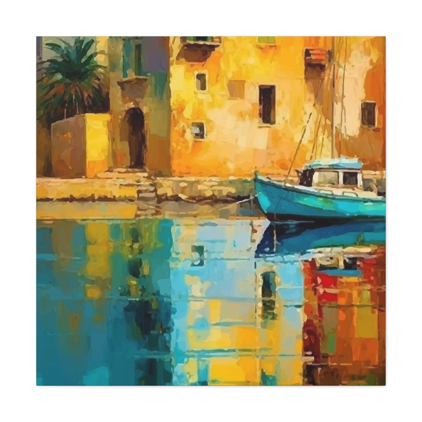
Beautiful View Wall Art & Canvas Prints
Beautiful View Wall Art & Canvas Prints
Couldn't load pickup availability
Stunning Landscape Pieces That Breathe Life Into Your Living Spaces- Beautiful View Wall Art
When you step into a room adorned with captivating landscape imagery, something magical happens. The atmosphere shifts, your breathing deepens, and suddenly you're transported to distant mountains, serene coastlines, or peaceful forest clearings. This transformative power of scenic artwork has captivated homeowners, interior designers, and art enthusiasts for centuries, yet its appeal remains as fresh and compelling today as ever before.
The remarkable thing about incorporating picturesque landscape pieces into your home is how they serve multiple purposes simultaneously. They don't merely fill empty wall space—they create windows to other worlds, conversation starters that spark memories and dreams, and focal points that anchor entire design schemes. Whether you're drawn to misty mountain ranges, sun-drenched beaches, rolling countryside vistas, or dramatic urban skylines, the right scenic artwork can completely redefine how you experience your living environment.
Discovering the Profound Impact of Scenic Landscape Artwork on Your Daily Existence
The influence of landscape imagery extends far beyond mere decoration. Research has consistently demonstrated that exposure to natural scenes, even through photographic or painted representations, can significantly lower stress hormones, reduce blood pressure, and improve overall mood states. When you surround yourself with images of tranquil forests, expansive ocean horizons, or majestic mountain peaks, you're essentially bringing the calming influence of nature directly into your personal sanctuary.
Consider how your mind responds when you gaze at a beautifully rendered sunset over distant hills or a peaceful lake reflecting morning light. Your thoughts naturally drift toward contemplation and relaxation. The constant mental chatter that accompanies modern life begins to quiet. This isn't merely anecdotal—neuroscience research has shown that viewing natural landscapes activates specific brain regions associated with reward processing and emotional regulation, essentially giving your mind a restorative break from daily stressors.
The psychological benefits become even more pronounced in urban environments where access to natural settings might be limited. City dwellers who incorporate landscape artwork into their apartments and condominiums often report feeling more connected to nature despite being surrounded by concrete and steel. This connection serves as a vital anchor for mental wellbeing, providing a visual escape that's available whenever needed, regardless of weather conditions or time constraints.
Beyond stress reduction, scenic artwork influences our cognitive performance. Studies examining workplace environments have found that employees with access to nature views—whether through windows or artwork—demonstrate improved concentration, enhanced creativity, and better problem-solving abilities. The presence of natural imagery appears to give our directed attention mechanisms a chance to recover, allowing us to return to demanding tasks with renewed focus and energy.
The aesthetic pleasure derived from beautiful landscape pieces also contributes to our sense of home satisfaction. When you genuinely love the artwork surrounding you, your entire living space feels more personalized and meaningful. This emotional connection to your environment can influence everything from how willingly you entertain guests to how effectively you relax during downtime. Your home becomes not just a physical shelter but an emotional refuge that reflects your values and aspirations.
Exploring the Vast Spectrum of Scenic Artwork Styles Available for Modern Homes
The world of landscape artwork encompasses an astonishing variety of styles, each offering distinct aesthetic qualities and emotional resonances. Understanding these different approaches helps you select pieces that genuinely speak to your personal sensibilities while complementing your existing décor.
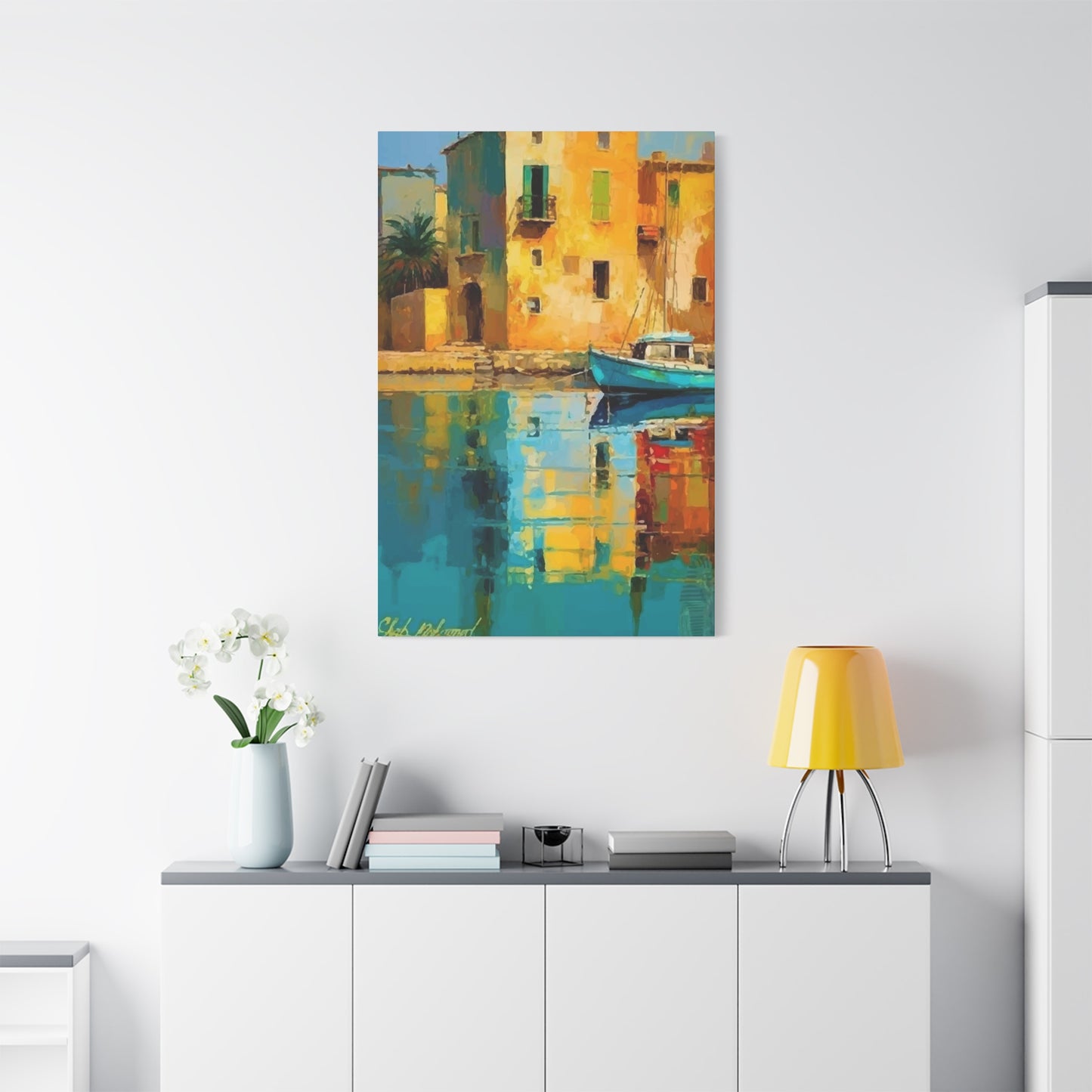
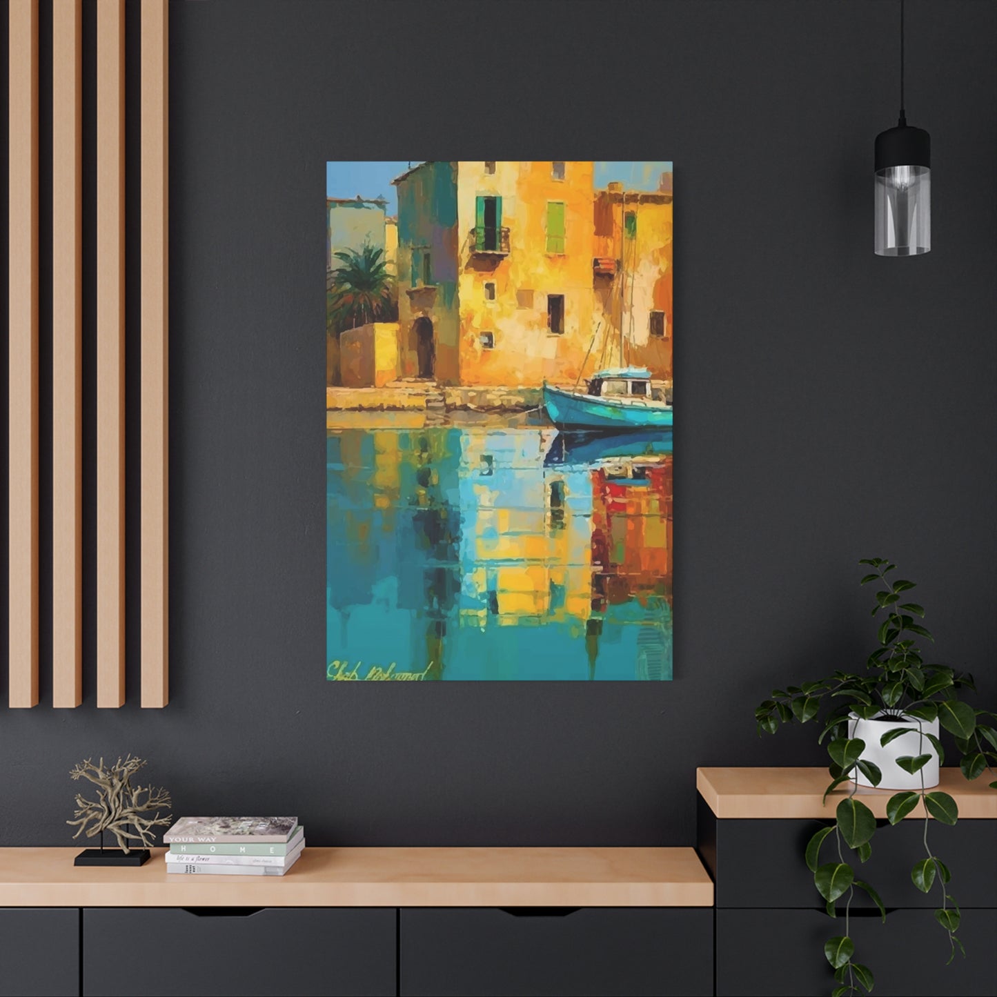
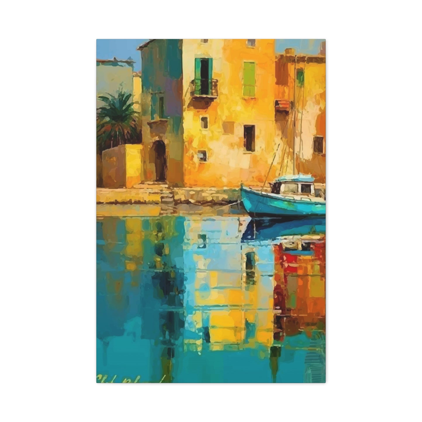
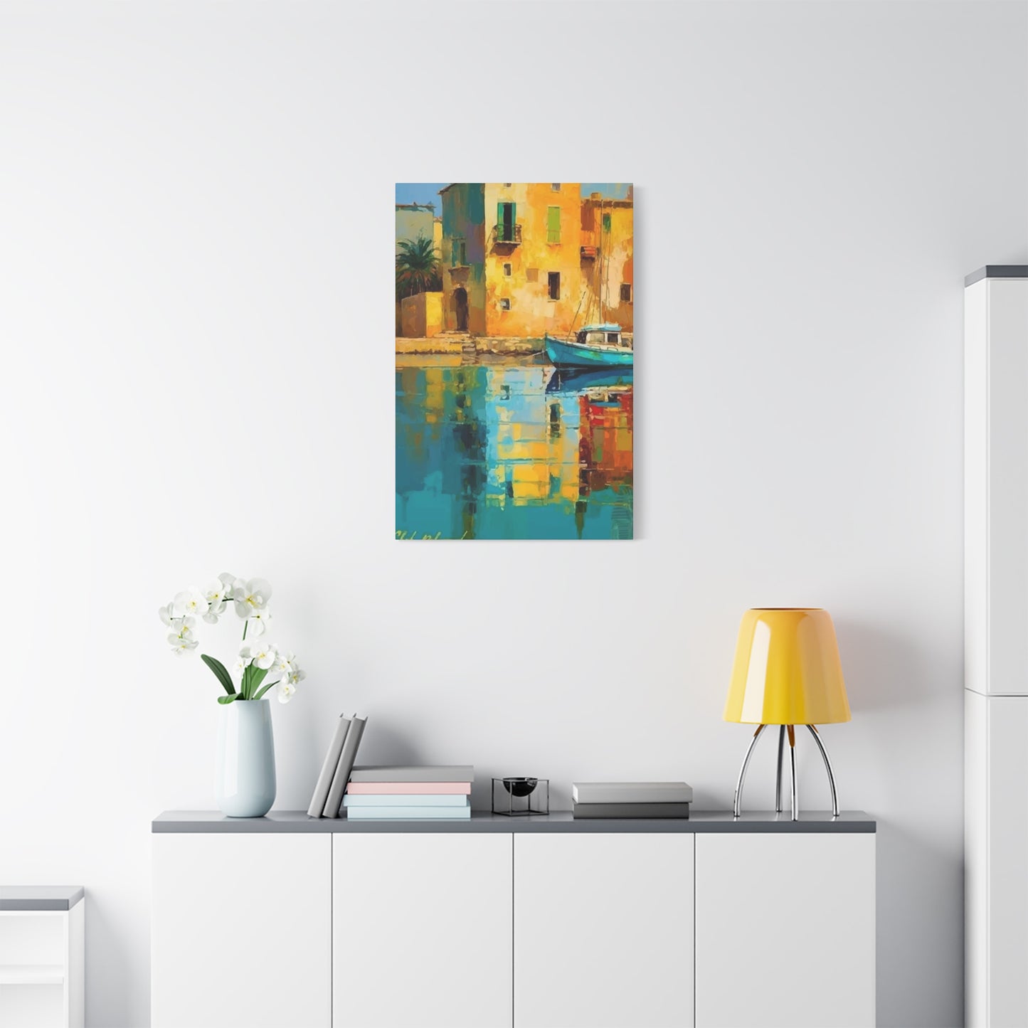
Photorealistic landscape pieces capture natural scenes with remarkable fidelity, preserving every detail of light, texture, and atmosphere. These works often appeal to those who appreciate the raw beauty of unaltered nature and want to bring that authenticity into their homes. A high-resolution photograph of Patagonian peaks or Norwegian fjords can serve as a stunning centerpiece that stops visitors in their tracks, inviting prolonged contemplation and admiration.
Impressionistic interpretations take a different approach, emphasizing mood and atmospheric qualities over precise details. These pieces use visible brushstrokes, vibrant color harmonies, and loose compositional elements to evoke the feeling of a place rather than documenting its exact appearance. An impressionistic coastal scene might capture the essence of sea breezes and salty air through swirling blues and energetic mark-making, creating an emotional response that purely realistic depictions sometimes miss.
Abstract landscape works push even further from literal representation, distilling natural scenes down to their fundamental elements—color relationships, geometric forms, and gestural movements that suggest rather than depict. These pieces work particularly well in contemporary interiors where bold design statements are valued. An abstract interpretation of desert formations or mountain silhouettes can add sophisticated visual interest while maintaining the calming influence associated with natural subjects.
Minimalist landscape artwork strips scenes down to their absolute essentials, often featuring vast expanses of sky, simple horizon lines, and muted color palettes. This approach resonates with those drawn to Japanese aesthetics, Scandinavian design principles, or zen-influenced spaces. A minimalist seascape showing nothing but ocean and sky can create a sense of infinite space and meditative calm that's particularly valuable in smaller rooms or cluttered urban apartments.
Vintage and nostalgic landscape pieces offer connections to specific eras and aesthetic movements. Whether drawn to the romantic landscapes of nineteenth-century painters, the saturated colors of mid-century travel posters, or the grainy quality of vintage photography, these works add layers of storytelling and cultural reference to your décor. They speak to our longing for simpler times and distant places while providing genuine artistic merit.
Contemporary mixed-media approaches combine photography, painting, digital manipulation, and various texturing methods to create hybrid works that defy easy categorization. These innovative pieces appeal to collectors who want something truly unique—artwork that reflects current artistic discourse while maintaining the timeless appeal of landscape subjects. A mixed-media piece might overlay photographic elements with painted sections, incorporate metallic foils, or use three-dimensional components to create depth and visual intrigue.
Selecting the Perfect Dimensions and Proportions for Maximum Visual Influence
Size matters tremendously when it comes to artwork, yet many people underestimate just how much scale affects a piece's impact. Understanding proportional relationships between your walls, furniture arrangements, and artwork dimensions is essential for creating harmonious, visually satisfying spaces.
Large-scale statement pieces—those measuring four feet wide or larger—command immediate attention and establish themselves as room-defining elements. These substantial works are ideal for expansive walls in living rooms, above sectional sofas, or in entry foyers where you want to make a dramatic first impression. A massive panoramic landscape stretching six or eight feet across can transform an otherwise ordinary room into a gallery-like space that feels curated and intentional.
When selecting oversized pieces, consider the viewing distance. Artwork intended to be seen from across a room can handle bold colors and dramatic contrasts that might feel overwhelming up close. Conversely, pieces viewed from typical conversation distances benefit from more nuanced color work and interesting details that reward sustained attention. The relationship between viewing distance and artwork scale should feel natural—you shouldn't need to step back into another room to appreciate a piece, nor should you need to lean in awkwardly to see what it depicts.
Medium-sized works, typically ranging from two to four feet in their longest dimension, offer tremendous versatility. These pieces work beautifully above bedroom headboards, in dining rooms, along hallways, or as part of gallery wall arrangements. Their more manageable scale makes them easier to relocate if you rearrange furniture or move homes, yet they still provide sufficient visual weight to anchor a space effectively.
Smaller landscape pieces excel in intimate settings—personal offices, reading nooks, bathroom walls, or as components within larger gallery arrangements. Don't dismiss these modest works as insignificant; a beautifully rendered small-scale landscape can create a jewel-like focal point that draws viewers close for careful examination. Collections of smaller pieces arranged thoughtfully can generate as much impact as a single large work while offering more compositional flexibility.
The proportional relationship between artwork width and height dramatically affects how pieces feel in a space. Horizontal panoramic formats emphasize width and create sensations of expansiveness, making them excellent for low-profile furniture arrangements or rooms where you want to visually widen the space. Vertical orientations draw the eye upward, making ceilings feel higher and narrow walls appear more balanced. Square formats offer stability and geometric satisfaction that works particularly well in contemporary settings.
Consider the golden ratio—approximately 1.618 to 1—when evaluating proportions. This mathematical relationship appears throughout nature and has been used in art and architecture for millennia because it creates inherently pleasing visual balance. Many landscape photographs and paintings naturally approximate this ratio, contributing to their aesthetic appeal even when viewers aren't consciously aware of the proportional harmony.
Understanding Color Relationships and Their Influence on Spatial Perception and Mood
Color functions as one of the most powerful tools in interior design, capable of completely altering how spaces feel and function. When selecting landscape artwork, understanding color relationships and their psychological effects helps ensure your choices enhance rather than conflict with your intended atmosphere.
Cool color palettes dominated by blues, greens, and purples create sensations of calm, spaciousness, and tranquility. Ocean scenes, forest interiors, and mountain landscapes bathed in twilight naturally feature these hues, making them excellent choices for bedrooms, bathrooms, or any space where relaxation is prioritized. Cool colors also possess the remarkable quality of appearing to recede, making them valuable for smaller rooms where you want to maximize the sense of available space.
Warm color schemes featuring reds, oranges, yellows, and warm earth tones generate energy, enthusiasm, and intimacy. Sunset landscapes, autumn foliage scenes, and desert vistas naturally showcase these temperatures, making them ideal for social spaces like dining rooms, kitchens, or conversation areas where you want to stimulate engagement and connection. Warm colors advance visually, creating coziness in larger rooms that might otherwise feel impersonal.
Neutral palettes built around grays, taupes, beiges, and soft whites offer versatility and sophistication. Misty morning scenes, winter landscapes, or minimalist compositions often feature predominantly neutral palettes that work seamlessly with virtually any décor style. These pieces serve as grounding elements that allow other design components—furniture, textiles, accessories—to shine without visual competition.
The interplay between dominant and accent colors within a landscape piece offers opportunities for design cohesion. If your sofa features deep blue upholstery, selecting artwork with complementary blue tones creates visual harmony that makes the entire space feel intentional and professionally designed. Conversely, introducing contrasting accent colors through artwork can provide visual excitement and prevent spaces from feeling monotonous.
Color saturation levels significantly affect mood and formality. Highly saturated, vibrant colors convey energy, playfulness, and contemporary sensibilities—think brilliantly colored tropical beaches or vividly rendered wildflower meadows. These works suit spaces where you want to make bold statements and embrace contemporary design attitudes. Desaturated, muted palettes project sophistication, timelessness, and restraint, working beautifully in spaces where elegance and refinement are priorities.
The temperature contrast within a single piece creates visual interest and dimensional depth. Landscape artwork that juxtaposes warm foreground elements against cool distant backgrounds—such as golden grasslands beneath blue mountain ranges—naturally draws the eye through the composition while creating a sense of atmospheric perspective that adds sophistication to the work.
Lighting conditions dramatically affect how colors appear throughout the day. Artwork viewed primarily in natural daylight reveals different qualities than pieces seen predominantly under artificial illumination. Cool LED lighting can emphasize blue undertones, while warm incandescent bulbs enhance yellow and red components. Testing artwork in the actual lighting conditions of its intended location helps ensure color relationships work as anticipated.
Creating Gallery Wall Arrangements That Showcase Your Landscape Collection Cohesively
Gallery walls have evolved from traditional symmetrical arrangements into expressive installations that reflect personal style while maximizing limited wall space. Creating effective gallery walls requires balancing spontaneity with careful planning to achieve arrangements that feel both curated and natural.
The foundation of successful gallery walls lies in establishing a unifying element that ties disparate pieces together. This might be a consistent subject matter—various landscape scenes from different locations—or a shared color palette that creates visual harmony despite differences in size, style, or framing. Some collectors unify galleries through consistent framing choices, while others embrace eclectic frame selections but maintain cohesion through subject matter or color relationships.
Layout planning prevents the frustration of multiple nail holes from trial-and-error arrangements. Create paper templates matching each piece's dimensions, then experiment with configurations on the floor or temporarily tape them to the wall. This process allows unlimited rearrangement without commitment, helping you discover the most effective composition before installing hardware.
Balanced asymmetry creates dynamic interest while maintaining visual stability. Rather than forcing perfect symmetry, successful gallery walls often feature larger anchor pieces balanced by groupings of smaller works. An oversized landscape photograph might occupy the upper right portion of an arrangement, balanced by three smaller pieces arranged in the lower left quadrant. This approach feels organic and collected rather than rigid and formulaic.
Spacing consistency prevents gallery walls from appearing chaotic or cramped. Maintaining uniform gaps between pieces—typically two to four inches—creates visual breathing room while establishing rhythm and cohesion. Consistent spacing signals intentionality, transforming what could be random clutter into a thoughtfully curated presentation.
Grid arrangements offer a more structured alternative to organic layouts. Arranging landscape pieces in orderly rows and columns creates architectural formality that suits contemporary spaces and provides visual relief in rooms with complex furniture arrangements or busy patterns. Grid layouts work particularly well when featuring a collection of similarly sized pieces or when establishing formal symmetry is important.
Salon-style arrangements embrace controlled chaos, featuring pieces of wildly varying sizes densely arranged to cover substantial wall areas. This approach originated in eighteenth and nineteenth-century art academies and creates drama while showcasing extensive collections. Successful salon walls maintain some organizing principle—perhaps arranging pieces by color gradient, subject chronology, or size progression—that prevents the arrangement from dissolving into visual noise.
Vertical stacking emphasizes height while occupying minimal horizontal space, making it valuable for narrow walls flanking doorways, windows, or architectural features. Arranging three to five landscape pieces vertically creates rhythmic repetition while drawing eyes upward, enhancing the perceived ceiling height and adding architectural interest to otherwise awkward spaces.
Matching Scenic Artwork to Various Interior Design Movements and Philosophies
Different design styles establish distinct aesthetic expectations, and selecting landscape artwork that aligns with these stylistic principles ensures cohesive, harmonious interiors that feel purposeful rather than accidentally assembled.
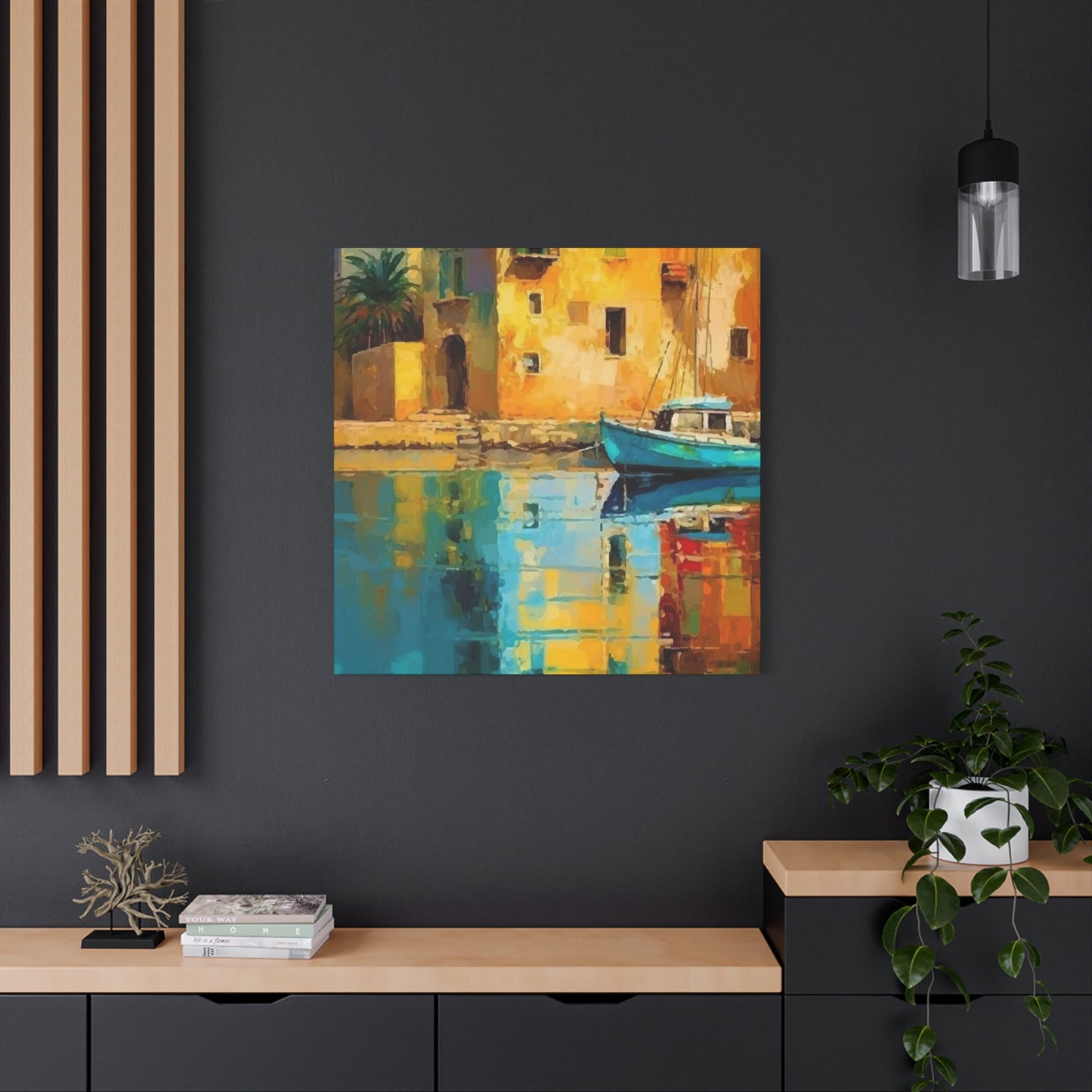
Contemporary design embraces clean lines, minimal ornamentation, and bold statements, making it receptive to dramatic landscape photography, abstract interpretations, and oversized statement pieces. Contemporary spaces often feature neutral backgrounds that allow artwork to function as primary color sources, so selecting pieces with decisive color palettes that complement furniture and accessories creates unified schemes. Large-scale panoramic landscapes, particularly those with graphic compositions or unexpected perspectives, align beautifully with contemporary sensibilities.
Traditional interiors reference historical precedents and value craftsmanship, symmetry, and timeless elegance. Classical landscape paintings featuring pastoral scenes, romantic interpretations of natural beauty, or works reminiscent of nineteenth-century landscape traditions complement traditional furnishings beautifully. Ornate gilded frames, muted earth tones, and compositions emphasizing classical beauty over contemporary edge suit these spaces perfectly.
Modern design, distinct from contemporary despite common confusion, refers specifically to mid-century aesthetics emphasizing organic forms, natural materials, and integration between indoor and outdoor spaces. Vintage landscape photography, particularly black and white works or images with the saturated color characteristics of mid-century film stocks, resonates with modern interiors. Simple frames in wood tones or black metal align with modern furniture silhouettes while landscape subjects reinforce the style's emphasis on nature connection.
Scandinavian design prioritizes simplicity, functionality, and connection to nature, making landscape artwork particularly appropriate for these light-filled, minimalist spaces. Stark winter scenes, coastal vistas, forest interiors, and other Nordic landscapes naturally complement Scandinavian design principles. Minimalist framing in light woods or white finishes maintains the airy quality essential to this aesthetic, while muted color palettes prevent visual competition with the style's characteristically simple furnishings.
Industrial design features exposed structural elements, raw materials, and urban edge, creating opportunities for landscape artwork that provides necessary softness and organic contrast. Black and white photography, particularly urban landscapes or natural scenes with strong graphic qualities, complements industrial spaces without softening their essential character. Minimalist framing or frameless mounting maintains the unfinished aesthetic while large scale ensures artwork holds its own against substantial furniture and architectural features.
Bohemian interiors celebrate eclecticism, global influences, and personal expression, offering tremendous freedom in landscape artwork selection. Vibrant colors, mixed media approaches, and pieces collected from travels or representing diverse geographic locations suit bohemian spaces beautifully. Layered arrangements, unexpected pairings, and personal meaning matter more than following conventional design rules, making this style particularly welcoming to adventurous collectors.
Coastal design evokes seaside living through light colors, natural textures, and nautical references, making beach landscapes, ocean scenes, and coastal vistas natural choices. However, avoiding overly literal interpretations prevents these spaces from feeling themed rather than stylish. Subtle coastal references, abstract water-inspired artwork, or landscapes featuring water elements without obvious beach imagery maintains sophistication while supporting the coastal narrative.
Investigating Material Choices and Printing Methods That Affect Artwork Longevity and Appearance
The substrate and printing method dramatically influence how landscape artwork appears, how long it lasts, and what spaces it suits best. Understanding these distinctions helps you make informed choices that balance aesthetic preferences, longevity requirements, and budget constraints.
Canvas prints remain tremendously popular for landscape artwork because they evoke traditional painting while offering affordability and versatility. Modern giclée printing on canvas produces remarkable color accuracy and tonal range, creating pieces that closely approximate original paintings at a fraction of the cost. Canvas naturally diffuses reflections, making it viewable from various angles without glare problems. Gallery-wrapped canvases that continue the image around frame edges create contemporary presentations that don't require separate framing, reducing both cost and visual weight.
The texture of canvas adds dimensional interest that flat prints cannot replicate, contributing to a handcrafted quality even in photographic reproductions. However, canvas is more vulnerable to damage than rigid substrates—tears, dents, and stains pose risks, particularly in high-traffic areas or homes with children and pets. Quality canvas prints treated with protective coatings resist fading and moisture better than untreated materials, extending their viable lifespan significantly.
Photographic paper prints offer unmatched detail resolution and color accuracy, making them ideal for landscape photography where fine details matter. Glossy papers produce vivid colors and deep blacks with almost three-dimensional depth, though they reflect light considerably and show fingerprints easily. Matte papers reduce glare substantially while creating softer, more subtle presentations that suit formal spaces and traditional design schemes. Semi-gloss surfaces balance these qualities, offering reasonable color saturation without excessive reflection.
Premium photographic papers designated for archival longevity use acid-free materials and specialized coatings that resist fading for decades when properly displayed away from direct sunlight. These museum-grade materials justify their higher costs when you're investing in artwork you expect to enjoy for many years or when printing limited editions meant to retain value.
Metal prints represent cutting-edge printing technology that infuses dyes directly into specially coated aluminum panels, creating luminous images with extraordinary vibrancy and dimensional depth. The metal surface adds a contemporary edge that suits modern and contemporary interiors beautifully while providing remarkable durability—metal prints resist moisture, scratches, and fading better than virtually any other medium. The inherent sheen of metal enhances colors and creates subtle metallic shimmer particularly effective with water scenes, sunset landscapes, and other subjects where luminosity enhances the subject matter.
Acrylic prints mount photographic prints behind transparent acrylic sheets, creating depth and protecting the image while producing a sleek, modern appearance with remarkable color saturation. Light passes through the acrylic, reflecting off the print and back through the acrylic, creating luminous effects that make colors appear almost backlit. These pieces work beautifully in contemporary spaces and particularly suit landscape subjects featuring water, sky, or other elements where enhanced luminosity improves the presentation. Acrylic's weight and frameless mounting requirements mean installation requires proper hardware and technique.
Wood prints use specialized printers that apply images directly to wood panels, allowing the natural grain and texture to show through and influence the final appearance. This creates unique, rustic presentations perfectly suited to cabin décor, farmhouse styles, or spaces where natural materials are emphasized. Each wood print is slightly different due to variations in grain patterns, ensuring true uniqueness. However, wood naturally expands and contracts with humidity changes, potentially causing slight warping over time, particularly with larger pieces.
Framed prints behind glass provide traditional protection against environmental damage while offering formal presentation options. UV-protective glass blocks harmful wavelengths that cause fading, substantially extending artwork longevity, though it adds cost and weight. Non-reflective glass reduces glare significantly, improving viewability in brightly lit rooms or opposite windows, though it slightly mutes colors compared to regular glass. The frame selection dramatically affects how the artwork integrates with your décor—ornate frames suit traditional spaces while simple profiles work better in modern contexts.
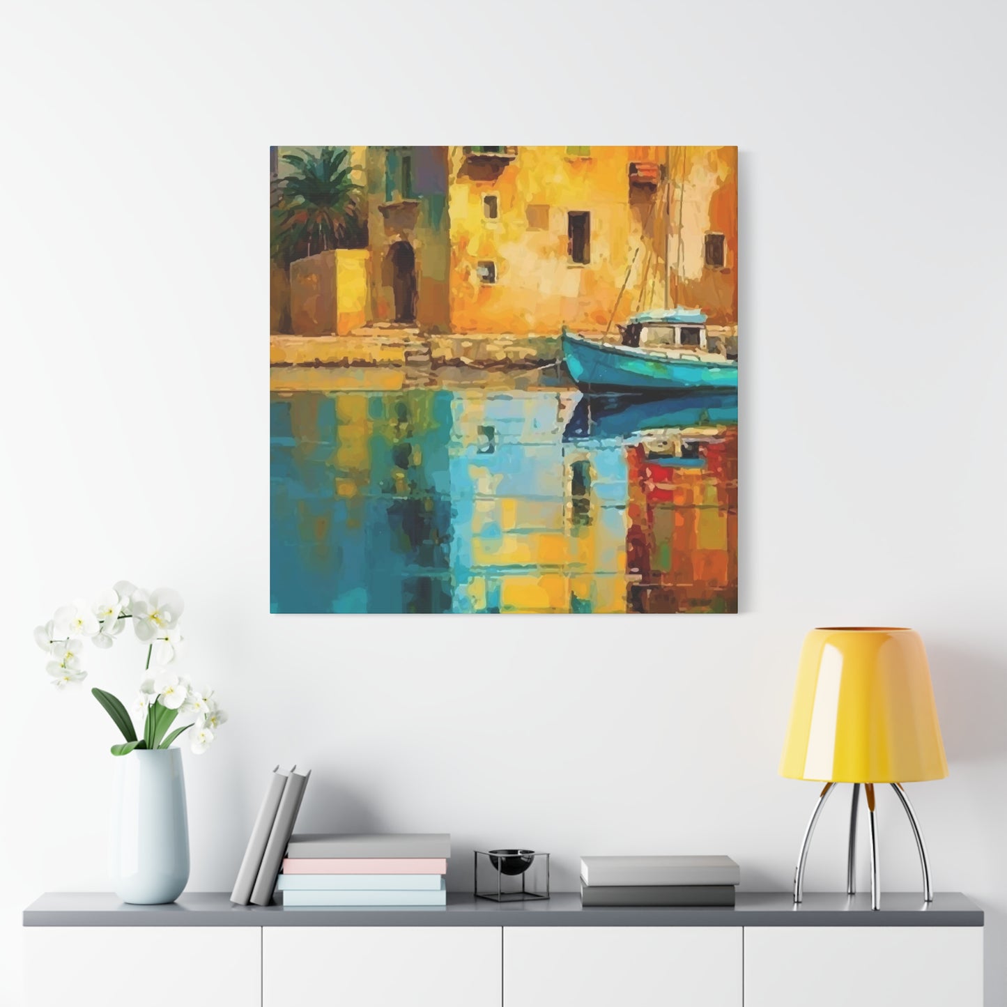
Positioning Artwork at Optimal Heights and Locations Throughout Your Home
Artwork placement dramatically affects both its visual impact and the overall room dynamics. Professional designers follow specific guidelines that maximize effectiveness while avoiding common positioning mistakes that undermine even exceptional pieces.
The standard rule suggests hanging artwork so its center sits at eye level, typically 57 to 60 inches from the floor. This height reflects average human eye level and creates comfortable viewing experiences. However, this guideline requires adjustment based on specific circumstances—if your household members are particularly tall or short, modify this standard accordingly. Similarly, artwork intended primarily for seated viewing, such as pieces above dining tables or in conversation areas, should hang lower to maintain appropriate sight lines from sitting positions.
Above furniture placements require careful proportion consideration. Artwork should occupy roughly two-thirds to three-quarters the width of the furniture beneath it, creating visual balance without overwhelming the arrangement or appearing too diminutive. The gap between furniture top and artwork bottom typically ranges from six to twelve inches—closer spacing creates tighter, more unified arrangements while greater separation allows each element to breathe independently.
Architectural features influence optimal artwork placement significantly. Hanging pieces above doors, windows, or fireplace mantels requires respecting these structural elements while avoiding awkward interruptions. Artwork should either align with architectural elements or deliberately contrast them rather than randomly intersecting their lines. Centering pieces on wall sections between windows or doors usually produces satisfying balance, though asymmetrical placements sometimes create more dynamic interest.
Corner placements offer opportunities often overlooked in artwork arrangement. A landscape piece angled slightly or positioned to terminate a hallway sight line draws attention and activates otherwise neglected spaces. Corners where two primary living areas meet benefit from artwork that bridges both spaces, creating visual flow between zones while marking the transition.
Lighting dramatically affects artwork appearance and thus influences optimal positioning. Avoid placing artwork where direct sunlight strikes it for extended periods—UV radiation causes irreversible fading even in archival-quality pieces. If your favorite wall faces windows, consider UV-filtering window treatments or select that location for pieces that won't suffer from gradual color loss. Alternatively, position artwork perpendicular to windows rather than opposite them, allowing natural light to illuminate pieces without direct exposure.
Artificial lighting placement requires similar consideration. Artwork positioned where ceiling fixtures create strong glare becomes difficult to appreciate and wastes the piece's potential impact. If existing lighting creates problems, consider relocating either the artwork or adding dedicated picture lights that illuminate at appropriate angles. LED picture lights offer energy efficiency while producing minimal heat that might otherwise damage artwork over time.
Traffic flow patterns influence both placement and artwork selection. High-traffic hallways and passages suit durable materials and simple frames that withstand occasional contact better than delicate presentations. Conversely, showcasing your most treasured pieces in protected locations where viewers can contemplate them without rushing past maximizes their impact and enjoyment.
Grouping multiple landscape pieces from related locations or similar subjects creates thematic coherence that enhances each individual work's impact. A series showing the same location across different seasons or times of day becomes more powerful presented together than scattered throughout the home. Similarly, grouping landscapes from a memorable trip creates a visual narrative that preserves memories while adding design cohesion.
Preserving Your Landscape Artwork Investment Through Proper Environmental Controls
Artwork represents both financial investment and emotional value, making proper preservation essential for maintaining its condition and enjoyment over decades. Environmental factors constantly affect artwork, but understanding and controlling these influences substantially extends longevity.
Light exposure constitutes the primary threat to most artwork, particularly pieces printed on paper or canvas. Both ultraviolet and visible light gradually break down pigments and substrate materials, causing colors to fade and whites to yellow. The damage accumulates irreversibly—each photon that strikes the artwork contributes to its degradation. Direct sunlight represents the most severe threat, but even ambient indoor lighting causes gradual deterioration over years of exposure.
Minimizing light exposure protects artwork without requiring complete darkness. Position pieces away from direct sunlight, particularly avoiding walls opposite large windows where reflected light concentrates. If your preferred location receives substantial natural light, UV-filtering window films or treatments block the most damaging wavelengths while maintaining room brightness. For artificial lighting, LED bulbs emit virtually no UV radiation compared to traditional incandescent or fluorescent sources, making them significantly safer for illuminating artwork.
Consider using dimmer switches or limiting illumination duration for dedicated artwork lighting. Your pieces don't require constant illumination—lighting them primarily when you're present to enjoy them dramatically reduces cumulative exposure while creating special moments when you deliberately showcase favorite works.
Humidity fluctuations pose serious risks, particularly for paper-based artwork and canvas prints. High humidity encourages mold growth, causes paper to cockle and warp, and can delaminate layered materials. Low humidity makes organic materials brittle and prone to cracking. Maintaining relative humidity between 40 and 60 percent protects most artwork types effectively. Whole-house humidifiers or dehumidifiers maintain consistent levels, preventing the dramatic seasonal swings common in many climates.
Avoid hanging artwork on exterior walls in humid climates or poorly insulated buildings, as these walls often experience temperature differentials that cause condensation. Similarly, bathrooms and kitchens generate moisture and temperature swings unsuitable for valuable artwork. If you must display pieces in these locations, select durable materials like metal prints specifically resistant to moisture damage.
Temperature extremes and fluctuations stress artwork materials, causing expansion and contraction that eventually lead to cracking, warping, or delamination. Maintaining stable temperatures between 65 and 75 degrees Fahrenheit suits most artwork types. Avoid positioning pieces near heat sources like radiators, fireplaces, or heating vents where localized temperature spikes occur. Similarly, avoid exterior walls or locations near air conditioning vents where cold drafts create stress.
Dust accumulation appears merely cosmetic but actually contributes to deterioration. Dust particles absorb moisture, creating localized humid microenvironments that encourage mold growth. Dust also contains abrasive particles that can scratch surfaces during cleaning attempts. Regular gentle dusting using clean, soft microfiber cloths prevents accumulation without damaging surfaces. For glass-covered pieces, spray glass cleaner on the cloth rather than directly on the glass to prevent liquid from seeping behind the frame.
Smoke damage, whether from cigarettes, fireplaces, or kitchen cooking, deposits sticky residues that discolor artwork and attract additional dirt. These residues prove extremely difficult to remove without causing additional damage. Preventing exposure represents the only effective strategy—avoid smoking near artwork and ensure adequate ventilation in kitchens and near fireplaces.
Insect damage, while less common than other threats, can devastate paper artwork, particularly in humid climates. Silverfish, beetles, and other insects feed on paper, adhesives, and sizing materials. Regular inspection catches infestations early, while controlling humidity and maintaining cleanliness reduces attraction. If you discover insect damage, consult a professional conservator immediately—DIY treatment often causes more harm than the original infestation.
Exploring Custom Framing Options That Enhance and Protect Your Landscape Pieces
Framing serves dual purposes—protecting artwork from environmental damage while enhancing its visual presentation. Understanding framing components and options helps you make choices that optimize both functions while respecting your budget and aesthetic preferences.
Mat boards create separation between artwork and glazing while adding visual breathing room that enhances presentation. The mat color dramatically affects how viewers perceive the artwork—white and off-white mats create clean, gallery-like presentations that work universally well, while colored mats can either complement or compete with the artwork. Conservative framing typically favors neutral mats, but carefully selected colored mats can enhance specific elements within landscape scenes.
Mat width affects visual weight and formality. Narrow mats create contemporary, casual presentations that maximize the artwork's visual dominance. Wide mats add gravitas and importance while providing additional separation from potentially distracting wall colors or patterns. Symmetrical mat borders create formal, traditional presentations, while asymmetrical proportions with wider bottom margins follow classical framing principles based on optical balance.
Multiple mat layers add dimensional depth and sophistication, particularly effective with landscape artwork where layering can echo the subject's depth and atmospheric perspective. A landscape photograph might feature a thin inner mat in a color pulled from the sky or foreground, surrounded by a wider neutral outer mat that creates breathing room and frames the inner mat's color accent.
Frame molding selection dramatically affects the overall presentation and how the piece integrates with your décor. Simple, narrow frames maintain contemporary sensibilities and keep focus on the artwork rather than the presentation. Substantial, ornate frames create traditional elegance and presence appropriate for formal spaces. Wood finishes ranging from natural to painted offer warmth and texture, while metal frames provide sleek, modern appearances with minimal visual weight.
The frame color relationship to artwork colors requires careful consideration. Frames that pick up colors from the artwork create cohesive presentations that tie the piece together. Neutral frames in black, white, or natural wood tones offer versatility and allow the artwork to dominate visually. Metallic frames in gold, silver, or bronze add luxury and work particularly beautifully with sunset landscapes or pieces featuring warm color temperatures.
Glazing options range from standard glass to specialized products offering UV protection, glare reduction, or both. Standard glass provides basic protection against dust and physical damage while remaining affordable, but offers no UV blocking and can create problematic reflections in brightly lit rooms. UV-protective glass blocks up to 99 percent of harmful ultraviolet radiation, dramatically extending artwork longevity while looking identical to standard glass. This upgrade represents wise investment for valued pieces you intend to display indefinitely.
Non-reflective or museum glass uses sophisticated coatings that virtually eliminate reflections, creating the illusion that no glazing exists at all. This premium option dramatically improves viewability in challenging lighting conditions and creates stunning presentations where the artwork appears to float on the wall without barriers. The cost premium is substantial, but for statement pieces in prominent locations, the improved viewing experience justifies the investment.
Acrylic glazing offers advantages for large pieces where glass weight becomes problematic or for spaces where safety concerns make glass inadvisable. Modern UV-protective acrylic provides protection comparable to UV glass while weighing significantly less. However, acrylic scratches more easily than glass and attracts dust through static electricity. Acrylic with anti-static treatments reduces dust attraction, improving both appearance and cleanliness.
Floating frames create the illusion that artwork hovers within the frame boundary, with visible gaps between the piece and frame molding. This contemporary presentation works beautifully with canvas artwork, wood prints, or other pieces with finished edges worth displaying. Floating installations add dimensional depth and contemporary edge while showcasing the artwork's physical character.
Understanding the Influence of Landscape Artwork on Perceived Room Dimensions and Atmosphere
Strategic artwork selection and placement can visually alter room proportions, creating the illusion of expanded or cozier spaces depending on your goals. Understanding these optical effects transforms artwork from mere decoration into architectural elements that actively shape spatial perception.
Expansive horizontal landscapes create the illusion of greater width, making narrow rooms feel less confining. Panoramic ocean views, sweeping prairies, or vast mountain ranges draw the eye laterally, encouraging horizontal scanning that subconsciously suggests greater available space. This effect works particularly well in corridor-like rooms, apartments with long narrow layouts, or any space where width limitations feel constraining.
Vertical landscape orientations emphasize height, drawing the eye upward and making ceilings appear higher than they actually measure. Towering forest scenes showing soaring trees, dramatic waterfall compositions, or mountain faces climbing toward peaks all encourage vertical eye movement that translates into heightened spatial awareness. Rooms with low ceilings benefit tremendously from vertically oriented landscape artwork that counteracts the compressed feeling.
Receding perspectives that show depth—paths disappearing into forests, rivers winding toward distant mountains, beaches extending toward horizons—create the illusion of three-dimensional space even on flat walls. This visual depth tricks the mind into perceiving the wall as less solid and confining, psychologically expanding the room. The effect proves particularly valuable in small spaces like powder rooms, narrow hallways, or compact home offices where physical expansion isn't possible.
Atmospheric perspective, where distant elements appear hazier and lighter than foreground features, creates powerful depth illusions that expand spatial perception. Landscapes showing layered mountain ranges receding into misty backgrounds or fields fading into foggy distances leverage this optical phenomenon beautifully. Selecting artwork that emphasizes atmospheric depth amplifies the spatial expansion effect beyond what flat, graphic compositions can achieve.
Color choices dramatically affect spatial perception. Cool colors—blues, greens, purples—appear to recede visually, creating the impression of greater distance and expanded space. Artwork dominated by cool palettes effectively pushes walls back, making rooms feel airier and more open. Conversely, warm colors—reds, oranges, yellows—advance visually, creating coziness and intimacy in oversized rooms that might otherwise feel impersonal.
Light and dark value distributions influence spatial perception significantly. Dark, moody landscapes can make walls seem to recede into shadows, creating mysterious depth particularly effective in dramatic, intimate settings. Light, bright landscapes reflect more illumination and create airy, open feelings that expand spaces visually. Matching these characteristics to your spatial goals ensures artwork supports rather than contradicts your design intentions.
Scale relationships between artwork and room dimensions require careful calibration. Oversized artwork in small spaces can feel overwhelming if not handled carefully, though paradoxically, one large statement piece often works better than multiple smaller works that make small spaces feel cluttered and chaotic. Conversely, artwork that's too small for large walls appears lost and fails to provide adequate visual anchoring, making the space feel disconnected and incomplete.
Conclusion
The specific landscape subjects you choose reveal much about your personality, experiences, and values while creating spaces that authentically reflect who you are. Understanding why certain scenes resonate helps you build collections with genuine meaning rather than following trends or purchasing whatever appears aesthetically pleasing.
Mountain landscapes appeal to those who value achievement, perspective, and natural majesty. The permanence and grandeur of peaks resonate with people drawn to stability and endurance. Mountain imagery often attracts individuals who enjoy hiking, skiing, or simply appreciating dramatic natural formations. These scenes create contemplative atmospheres while symbolizing aspiration and the rewards of sustained effort.
Ocean and coastal scenes attract individuals who find renewal near water and appreciate the rhythms of tides and waves. The infinite horizon where water meets sky creates feelings of possibility and freedom particularly appealing to independent spirits and creative thinkers. Coastal landscapes range from dramatic storm-tossed seas to serene sunrise beaches, offering emotional ranges from energizing power to profound tranquility.
Forest interiors appeal to those seeking shelter, mystery, and connection with living ecosystems. The enclosed feeling of being surrounded by ancient trees creates sanctuary sensations particularly comforting to introverts and nature-lovers. Forest scenes often feature filtered light, dappled shadows, and rich greens that create restorative atmospheres perfect for spaces where you seek peace and renewal.
Desert landscapes attract individuals who appreciate stark beauty, solitude, and the poetry of minimal environments. The extreme conditions, dramatic light quality, and sculptural formations found in arid regions create distinctive aesthetic experiences. Desert scenes often feature warm color palettes and strong geometries that work beautifully in contemporary interiors while evoking the Southwest, Middle Eastern regions, or other arid territories.
Share