Autumn in London Wall Art & Canvas Prints
Autumn in London Wall Art & Canvas Prints
Couldn't load pickup availability
Discover the Enchanting Beauty of Autumn in London Wall Art: A Comprehensive Exploration
The crisp air of fall brings with it a magical transformation across one of the world's most iconic cities, and capturing this seasonal metamorphosis through visual masterpieces has become an increasingly cherished pursuit for art enthusiasts and interior design aficionados alike. Autumn in London wall art represents far more than mere decorative pieces hanging on residential or commercial spaces; these carefully curated visual narratives encapsulate the essence of a city draped in amber, crimson, and golden hues, offering viewers a perpetual connection to the romance and nostalgia that defines this particular season in the British capital.
The phenomenon of seasonal artwork dedicated specifically to London during autumn months has witnessed a remarkable surge in popularity over recent decades. This artistic movement celebrates the unique atmospheric qualities that emerge when the metropolitan landscape undergoes its annual chromatic evolution, creating scenes that resonate deeply with both longtime residents and admirers from distant shores. From the rust-colored canopies of Hyde Park to the leaf-strewn pathways along the Thames embankment, these visual compositions capture fleeting moments that might otherwise disappear with the changing weather patterns.
Why Seasonal Metropolitan Artwork Captivates Modern Collectors and Decorators
The allure of autumn in London wall art extends beyond simple aesthetic appreciation, tapping into profound emotional and psychological connections that humans maintain with seasonal transitions. Research in environmental psychology demonstrates that individuals respond favorably to visual stimuli that incorporate natural elements and familiar landscapes, particularly when these scenes evoke positive memories or aspirational experiences. The combination of urban architectural grandeur juxtaposed against nature's colorful farewell performance creates a visual tension that engages viewers on multiple sensory levels.
Contemporary collectors gravitate toward these pieces because they serve multiple functions simultaneously. On one level, they operate as windows into a specific time and place, offering daily reminders of treasured journeys or dreams of future visits. On another level, they function as sophisticated design elements that introduce warmth, depth, and narrative complexity into living spaces. The rich color palette associated with fall foliage—ranging from burnt sienna to deep burgundy, from mustard yellow to chocolate brown—provides decorators with versatile options that complement a wide variety of interior design schemes.
Furthermore, the commercial art market has recognized the enduring appeal of London-specific imagery, with autumn scenes representing some of the most consistently popular themes among purchasers. Unlike generic landscape paintings that might feel impersonal or disconnected from viewer experience, autumn in London wall art carries with it layers of cultural significance and recognizable landmarks that foster immediate emotional engagement. Whether depicting the majestic dome of St. Paul's Cathedral framed by rust-colored tree branches or the gothic spires of Westminster Abbey emerging through morning mist, these compositions tap into a shared visual vocabulary that transcends geographical boundaries.
The Distinct Visual Characteristics That Define Fall Season Artwork from the British Capital
When examining autumn in London wall art, several distinctive visual elements consistently emerge across different artistic styles and mediums. Understanding these characteristics helps both collectors and creators appreciate the nuanced ways that artists capture this particular seasonal moment in this specific urban environment. The interplay between architectural permanence and natural transformation forms the conceptual foundation for most pieces in this category.
The color palette represents perhaps the most immediately recognizable feature of autumn-themed London artwork. Unlike the vibrant greens of summer or the stark whites and grays of winter, fall introduces a spectrum dominated by warm earth tones. Artists working in this genre carefully balance the muted stone grays of Georgian and Victorian architecture with the explosive colors of deciduous trees at their seasonal peak. This chromatic relationship creates visual harmony while maintaining dynamic contrast that keeps the viewer's eye engaged throughout the composition.
Lighting conditions during autumn months in London possess unique qualities that experienced artists exploit to maximum effect. The lower angle of sunlight during this period creates elongated shadows and a particular quality of illumination that photographers often describe as "golden hour" extended throughout much of the day. This diffused, warm light bathes familiar landmarks in an ethereal glow that differs markedly from the harsh brightness of summer or the flat gray light of winter months. Skilled artists capture this atmospheric phenomenon through careful attention to value relationships and subtle gradations of tone.
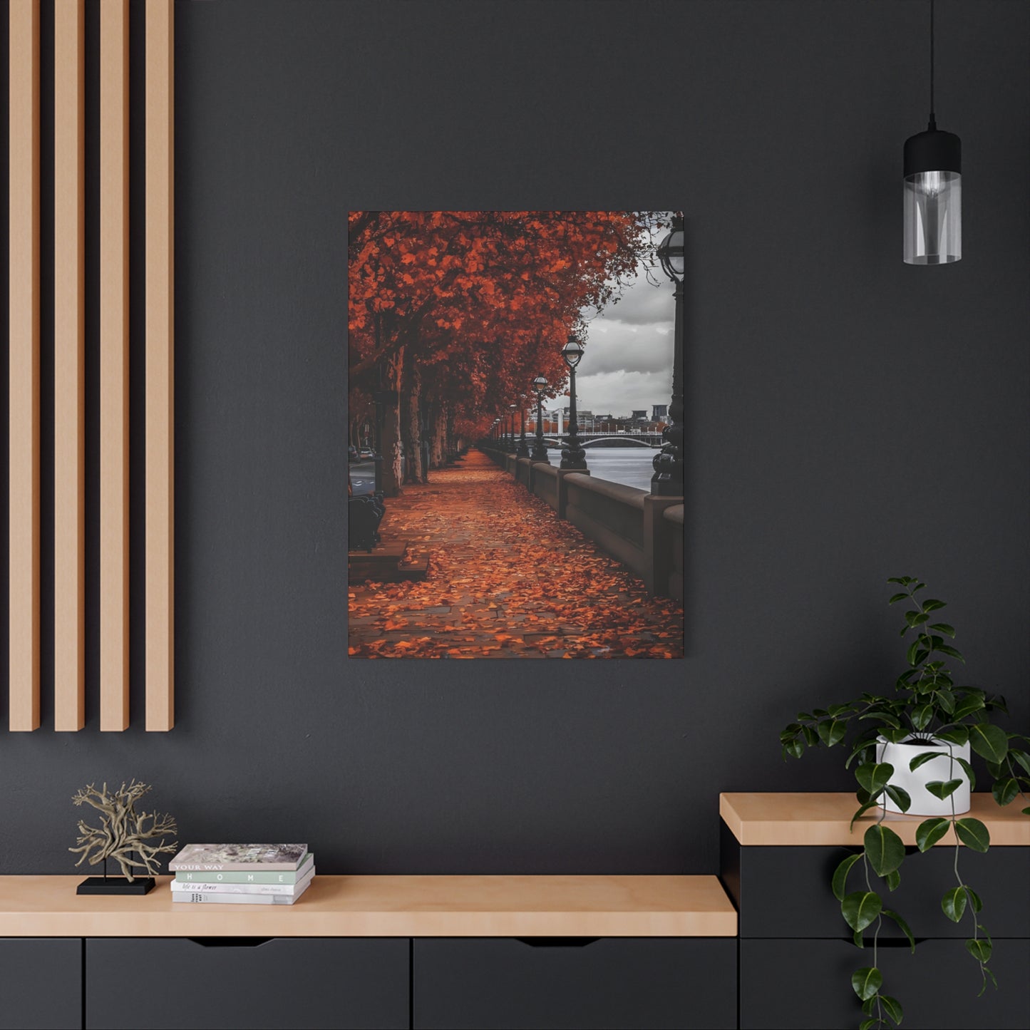
Weather patterns during the season also contribute significantly to the visual identity of autumn in London wall art. Morning fog rolling off the Thames River, light drizzle creating reflective surfaces on cobblestone streets, and dramatic cloud formations moving rapidly across the sky all provide atmospheric elements that enhance the romantic and sometimes melancholic mood associated with fall. These meteorological conditions add layers of visual interest while reinforcing the quintessentially British character of the scenes depicted.
Exploring the Vast Range of Artistic Styles Available for Fall-Themed London Imagery
The market for autumn in London wall art encompasses an impressive diversity of artistic approaches, each offering distinct aesthetic experiences and emotional resonances. From hyperrealistic photography to abstract interpretations, from traditional oil paintings to contemporary digital illustrations, the range of available styles ensures that collectors can find pieces perfectly aligned with their personal tastes and interior design requirements.
Photographic representations form one of the most popular categories within this genre. Professional photographers specializing in urban landscape imagery spend countless hours waiting for optimal conditions—the perfect moment when lighting, weather, and seasonal color converge to create extraordinary scenes. These photographs range from expansive panoramic vistas capturing multiple landmarks within a single frame to intimate close-up compositions focusing on small details like fallen leaves on historic iron railings or reflections in rain-puddles revealing architectural elements above. The documentary precision of photography appeals to collectors who value authenticity and the sense that they possess a genuine record of a specific moment in time.
Traditional painting techniques, particularly oil on canvas, remain highly sought after for autumn in London wall art. Artists working in this medium can employ various approaches, from the loose, impressionistic brushwork that captures the general feeling and atmospheric quality of a scene to meticulously detailed realism that rivals photographic accuracy. Oil paints offer unique advantages for depicting autumn landscapes, as their rich pigments and blending capabilities allow artists to recreate the complex color variations found in changing foliage and the subtle shifts in light quality that characterize the season.
Watercolor paintings bring a different sensibility to autumn London scenes, with their characteristic transparency and fluid application creating ethereal, dreamlike qualities. This medium proves particularly effective for depicting weather conditions—morning mist dissolving as daylight strengthens, rain-soaked streets reflecting colored lights, or clouds moving across autumn skies. The inherent spontaneity of watercolor techniques can imbue compositions with energy and movement that more controlled mediums sometimes struggle to achieve.
Contemporary digital art has emerged as a significant force within the autumn in London wall art market. Digital artists utilize sophisticated software to create everything from photo-realistic renderings to stylized interpretations that blend photographic elements with graphic design principles. This approach allows for manipulation of color, contrast, and compositional elements in ways that traditional mediums cannot easily replicate. The result often possesses a distinctive contemporary aesthetic that appeals to younger collectors and those furnishing modern residential or commercial spaces.
Mixed media pieces combine multiple techniques within single compositions, perhaps layering photographic backgrounds with painted elements, incorporating textural materials, or adding graphic overlays to traditional paintings. These hybrid works reflect contemporary art's tendency toward boundary-crossing experimentation while offering viewers complex visual experiences that reward extended contemplation.
Geographic Locations and Iconic Landmarks Most Frequently Featured in Fall Season Artwork
Certain locations throughout London appear with remarkable frequency in autumn in London wall art, having achieved iconic status as subjects that embody the city's seasonal character. These sites offer combinations of architectural interest, natural elements susceptible to dramatic seasonal change, and cultural significance that resonates with broad audiences.
The Royal Parks constitute perhaps the richest source of autumn imagery in London. Hyde Park, with its vast expanses of mature deciduous trees, transforms into a spectacular showcase of fall color each year. The Serpentine lake provides reflective surfaces that double the visual impact of surrounding foliage, while the park's various monuments and architectural features offer compositional anchors. Artists particularly favor the Italian Gardens, the Albert Memorial area, and the tree-lined avenues that create natural perspective lines drawing viewers deep into compositions.
Regent's Park offers similarly abundant autumn scenes, with its formal gardens, tree-lined pathways, and views toward Primrose Hill providing diverse compositional possibilities. The park's more structured landscape design, featuring geometric flowerbeds and precisely planted tree groupings, appeals to artists interested in balancing natural elements with human-designed order. The northern edge of the park, where London Zoo borders the greenspace, adds an element of narrative interest that some artists exploit in their compositions.
Greenwich Park provides elevated vantage points overlooking both parkland and the Thames River, with the classical architecture of the Royal Observatory and Queen's House adding historical gravitas to autumn scenes. The ancient sweet chestnut trees scattered throughout the park create particularly striking visual elements when their foliage reaches peak color. Artists appreciate the layering possibilities here, with foreground trees framing middle-ground park scenes and background views extending to the skyscrapers of Canary Wharf across the river.
Richmond Park, technically located beyond central London but included in most collections of London autumn scenes, offers the most expansive natural landscape within the metropolitan area. The park's population of red deer adds a unique element rarely found in urban park artwork, while its combination of grassland, woodland, and water features provides exceptional compositional variety. The ancient oak trees scattered throughout Richmond Park, some centuries old, present dramatic silhouettes against autumn skies that artists find irresistible.
Along the Thames embankments, autumn in London wall art captures the interplay between the river's constant movement and the seasonal changes occurring in riverside vegetation and park spaces. The view from Waterloo Bridge looking toward St. Paul's Cathedral, particularly during the brief window when autumn trees frame the iconic dome, represents one of the most photographed and painted vistas in the entire city. Similarly, the stretch of embankment from Westminster to Lambeth Bridge, with its mix of governmental architecture and riverside plane trees, provides rich material for artists exploring seasonal themes.
Individual landmarks also feature prominently in autumn-themed artwork. Big Ben and the Houses of Parliament, photographed or painted during autumn from various vantage points across the Thames or from nearby Victoria Tower Gardens, constitute essential elements in many collections. The Tower of London, surrounded by moat-side plane trees that turn brilliant yellow, offers a combination of medieval fortress architecture and seasonal color that creates dramatic visual contrasts. Tower Bridge, whether depicted from river level or elevated perspectives, becomes even more iconic when flanked by autumn foliage or reflected in the Thames beneath fall skies.
Residential neighborhoods known for their tree-lined streets also appear frequently in autumn in London wall art. Notting Hill, with its pastel-colored Victorian townhouses framed by golden autumn leaves, provides charming scenes that blend architectural beauty with seasonal transformation. The leafy squares of Bloomsbury, with their iron railings, historic lampposts, and traditional London plane trees, capture a more literary and intellectual ambiance. Chelsea's quieter streets, where wisteria and Virginia creeper clinging to brick walls turn spectacular shades of red and purple during autumn, offer intimate scenes perfect for smaller residential spaces.
The Emotional and Atmospheric Qualities That Make These Artworks Particularly Compelling
Beyond their obvious visual appeal, autumn in London wall art possesses powerful emotional and atmospheric dimensions that contribute significantly to its enduring popularity. These pieces function as more than mere decoration; they serve as emotional touchstones, memory anchors, and mood-enhancing elements within living and working environments.
Nostalgia represents one of the primary emotional currents running through much of this artwork. For individuals who have lived in or visited London during autumn months, these images trigger episodic memories—specific moments spent walking through parks, afternoons in museums when rain began to fall, or evenings when streetlights illuminated rain-slicked pavements. Even for those who have never visited the city, the imagery can evoke a generalized longing for European urban experiences, cosmopolitan lifestyle, or simply the romantic notion of autumn in a historic metropolis.
The melancholic beauty inherent in autumn scenes resonates with viewers on a primal level. Autumn represents transition, the acknowledgment that summer's vitality has passed while winter's austerity approaches. This liminal quality imbues the artwork with poignancy—beauty recognized as fleeting, perfection acknowledged as temporary. Artists working in this genre often emphasize this melancholic dimension through compositional choices: isolated figures walking through leaf-strewn parks, empty benches under canopies of colored leaves, or rain beginning to strip foliage from branches.
Conversely, autumn in London wall art can also celebrate abundance and warmth. The rich color palette associated with the season introduces visual warmth into spaces, particularly valuable during the cold months when the artwork is most frequently contemplated. Compositions featuring sunlight filtering through colored leaves, market scenes with autumn harvest displays, or cozy street views with warmly lit shop windows all emphasize the season's comforting aspects rather than its melancholic dimensions.
The atmospheric quality of these pieces significantly impacts their emotional effect. Misty morning scenes create mystery and contemplative moods, encouraging viewers toward introspection. Dramatic lighting with strong contrasts between illuminated areas and deep shadows produces more dynamic, energizing effects. Overcast days with soft, even lighting create calm, peaceful atmospheres that can have meditative qualities. Artists consciously manipulate these atmospheric variables to guide emotional responses.
Cultural associations also contribute to the emotional power of autumn in London wall art. London carries tremendous symbolic weight as a city representing history, culture, literary heritage, and cosmopolitan sophistication. When combined with autumn's romantic associations, the result produces imagery laden with multiple layers of meaning. For Anglophiles, these pieces affirm cultural connections and identity. For travelers, they serve as souvenirs of meaningful experiences. For urban dwellers anywhere, they represent an idealized vision of city life where historic architecture coexists harmoniously with nature.
Material Considerations and Presentation Formats for Displaying Seasonal Metropolitan Artwork
The physical manifestation of autumn in London wall art—the materials used, printing or creation processes employed, and presentation formats chosen—significantly impacts both the aesthetic effect and practical suitability for different environments. Understanding these material considerations helps collectors make informed decisions aligned with their specific needs and preferences.
Canvas prints represent perhaps the most popular format for displaying photographic or digitally created autumn in London wall art. The canvas texture adds a painterly quality to images while creating a more substantial physical presence than paper prints. Modern printing processes on canvas produce remarkable color fidelity and detail resolution, with archival inks ensuring longevity when properly cared for. Gallery-wrapped canvas, where the image continues around the wooden stretcher frame's edges, creates a finished appearance without requiring additional framing, though this approach works best for images with less critical compositional elements near the edges.
Paper prints, particularly those produced on high-quality fine art papers, offer different aesthetic qualities. Smooth papers showcase maximum detail and color saturation, ideal for hyperrealistic photographs or precisely rendered digital art. Textured papers add tactile interest and can complement certain artistic styles, particularly painterly approaches or works incorporating visible brushstrokes in the original. Matted and framed paper prints create a more formal, gallery-like presentation that suits traditional interiors and professional environments.
Metal prints have gained popularity for contemporary autumn in London wall art, particularly for photographic works. The process of infusing dyes directly onto specially coated aluminum sheets creates luminous quality with exceptional color vibrancy and depth. The result possesses a modern, sleek appearance with inherent durability resistant to moisture and UV degradation. Metal prints work particularly well for images featuring water, reflections, or wet surfaces, as the medium's inherent luminosity enhances these elements.
Acrylic face-mounting produces arguably the most luxurious presentation format for photographic autumn in London wall art. The process involves mounting a print behind a thick acrylic panel, creating extraordinary depth, color saturation, and a glass-like finish that seems to illuminate from within. This presentation format commands premium prices but delivers a gallery-quality appearance that serves as a focal point in high-end residential or commercial interiors.
For original paintings—whether oil, acrylic, or watercolor—the presentation typically involves traditional framing that protects and enhances the artwork. Frame selection dramatically impacts the overall effect, with choices ranging from ornate gilded frames that reference museum traditions to minimalist contemporary frames that emphasize the artwork itself. The matting width, frame profile, and finish should harmonize with both the artwork's character and the intended display environment's aesthetic.
Wood-mounted prints offer a more casual, accessible format particularly suited to bohemian or rustic interior styles. The visible wood grain and edges create an organic presentation that complements the natural elements featured in autumn scenes. This format often appeals to younger collectors or those furnishing spaces with less formal atmospheres.
Size considerations profoundly impact both the artwork's visual presence and its suitability for specific spaces. Large-scale autumn in London wall art creates dramatic focal points that command attention and define spaces. Oversized pieces work effectively above sofas, beds, or in spacious commercial environments like hotels, restaurants, or office reception areas. Medium-sized works offer versatility, working well in various residential and commercial contexts without overwhelming spaces. Small pieces suit intimate settings, gallery walls combining multiple related images, or spaces where subtlety is preferred over bold statement-making.
Color Theory Principles and Interior Design Harmonization Strategies
Successfully incorporating autumn in London wall art into living or working spaces requires understanding color theory principles and how the artwork's palette interacts with existing design elements. The warm, earthy tones characteristic of autumn scenes offer both opportunities and challenges when harmonizing with interior color schemes.
The dominant warm palette of most autumn in London wall art—golds, oranges, reds, browns, and rust tones—creates inherently cozy, welcoming atmospheres. These colors advance visually, meaning they appear to move forward in space, creating intimate, enveloping sensations. This quality makes autumn artwork particularly effective in spaces where warmth and comfort are desired: living rooms, bedrooms, reading nooks, or hospitality venues aiming to create welcoming ambiances.
When working with neutral interior color schemes—whites, grays, beiges, and blacks—autumn in London wall art provides vibrant color injections without requiring comprehensive redecorating. The warm tones complement neutral backgrounds beautifully, creating balanced compositions where the artwork becomes a controlled accent. This approach allows the seasonal colors to shine without competing with surrounding elements. Gray walls, in particular, create sophisticated backdrops that allow the rich autumn palette to appear especially luminous by contrast.
Rooms already featuring warm color schemes can accommodate autumn in London wall art through careful attention to tone and saturation relationships. If walls are painted in warm neutrals like beige or taupe, artwork with similar value levels creates harmonious, tone-on-tone effects, while pieces with higher saturation provide energizing contrasts. Spaces with warmer wall colors require consideration of complementary and analogous color relationships to avoid overwhelming visual heat.
Cool-toned interiors—featuring blues, greens, or cool grays—create striking juxtapositions with warm autumn artwork. This complementary color relationship produces dynamic visual tension that enlivens spaces. The cool backgrounds recede visually while the warm artwork advances, creating spatial depth. This combination works particularly effectively in contemporary interiors where bold contrasts align with modern design sensibilities.
Color temperature consistency throughout a room enhances cohesion. If selecting autumn in London wall art for a space with multiple color elements, consider the overall color temperature. Rooms with predominantly warm colors in furnishings, textiles, and finishes benefit from artwork emphasizing the warmer end of the autumn spectrum—reds, oranges, and golden yellows. Spaces with cooler elements might incorporate autumn artwork featuring more muted tones, emphasizing browns, gray-tinged greens, and subdued rust tones that bridge between warm and cool palettes.
The 60-30-10 design rule provides useful guidance when incorporating autumn in London wall art. This principle suggests that a space should feature a dominant color covering approximately 60 percent of the area, a secondary color at 30 percent, and accent colors at 10 percent. Autumn artwork can function in any of these roles depending on scale and room composition. A large autumn piece might provide the accent color that enlivens a predominantly neutral space, or it could reinforce a secondary warm color already present in furnishings.
Undertones require careful attention when matching autumn in London wall art with paint colors and furnishings. Many seemingly neutral colors contain subtle warm or cool undertones that become apparent when juxtaposed with strongly colored elements. Testing artwork placement before permanent installation helps identify potential clashes between undertones that might not be obvious when considering elements separately.
Lighting conditions dramatically affect how autumn in London wall art appears and interacts with surrounding colors. Natural daylight reveals the full color spectrum and changes throughout the day as light angles shift. Warm artificial lighting enhances the cozy qualities of autumn colors but can oversaturate reds and oranges. Cool LED lighting provides accurate color rendering but might create less harmonious relationships with warm artwork. Directional accent lighting allows precise control over how pieces appear, often enhancing dimensionality and color depth.
Strategic Placement Recommendations for Maximizing Visual Impact Throughout Different Room Types
The location where autumn in London wall art is displayed significantly influences both its visual effectiveness and the atmosphere it creates within a space. Different room types and specific wall locations offer distinct opportunities and challenges that thoughtful placement can address.
Living room placement provides opportunities for autumn in London wall art to function as a primary focal point or to support existing focal points. Above a sofa represents the most traditional placement, with the artwork anchoring the seating area and creating a visual destination that draws attention across the room. The piece should typically span between two-thirds and three-quarters of the sofa's width to achieve proper proportion. Height matters significantly—the artwork's center should hang approximately 57 to 60 inches from the floor, matching average eye level for standing viewers, with the bottom edge positioned 6 to 12 inches above the sofa back.
Fireplace mantels offer natural focal points that autumn in London wall art can enhance. Placing artwork above a mantel reinforces the room's architectural centerpiece while creating strong vertical emphasis. The cozy, warming associations of autumn imagery harmonize beautifully with the symbolic and literal warmth of fireplaces. Scale becomes particularly important here, as pieces must relate appropriately to the mantel's dimensions while not overwhelming the space.
Living room accent walls provide opportunities for creating gallery-style presentations using multiple pieces of autumn in London wall art. Arrangements might feature a single large central piece flanked by smaller complementary works, or a grid arrangement of same-sized pieces creating a unified composition. Mixing sizes and formats while maintaining consistent framing or matting creates dynamic yet cohesive displays.
Bedroom placement of autumn in London wall art contributes to the room's restful, intimate character. Above the bed represents the most common location, where the artwork becomes the first and last image viewed each day. The warm, nostalgic qualities of autumn scenes support the bedroom's function as a personal retreat. Pieces featuring quieter, more contemplative compositions work better than busy or dramatic images that might prove overstimulating in a space dedicated to rest.
Opposite the bed, on walls visible while lying down, artwork provides something to contemplate during quiet moments. This location works well for pieces with intricate details or narrative elements that reward extended viewing. The horizontal orientation often available on these walls suits panoramic autumn scenes showing expansive park vistas or riverside views.
Dining room placement transforms meals into more atmospheric experiences. Autumn in London wall art in dining spaces supports the room's gathering function by creating warm, welcoming environments conducive to conversation and connection. The harvest associations of autumn link naturally to dining's nourishing functions. Pieces featuring market scenes, park gatherings, or street views with visible cafes and restaurants reinforce these thematic connections.
Home office environments benefit from autumn in London wall art that provides visual relief during work sessions while maintaining professional aesthetics. Scenes with depth—long park pathways, riverside embankments, or streets receding toward distant landmarks—offer eyes respite from close computer work by encouraging focus at various distances. The warm color palette combats the potentially cold, sterile feeling of technology-heavy workspaces.
Behind desk placement creates a backdrop visible during video calls, conveying cultural sophistication and personality to remote colleagues and clients. Adjacent wall placement provides something to glance toward during phone conversations or while thinking, with the artwork potentially stimulating creativity without causing distraction.
Entryway and hallway locations make strong first impressions on visitors while transforming transitional spaces into destinations. Autumn in London wall art in these areas establishes the home's aesthetic character immediately upon entry. Hallway galleries featuring multiple autumn scenes create narrative journeys along corridors that might otherwise feel purely functional.
Kitchen spaces, often overlooked for serious artwork, can accommodate autumn in London wall art if pieces are appropriately scaled and protected from moisture and splatter. Smaller prints or canvas pieces depicting market scenes, harvest themes, or cozy street views with bakeries and tea shops create warm, nourishing atmospheres while breaking up expanses of cabinetry or empty wall space.
Bathroom placement, particularly in powder rooms or spacious master bathrooms, brings unexpected sophistication to often-neglected spaces. Autumn park scenes with water features naturally complement bathrooms while introducing warmth to potentially clinical-feeling spaces. Proper framing and placement away from direct water contact protect artwork from humidity damage.
Commercial spaces—offices, hotels, restaurants, cafes, and retail environments—utilize autumn in London wall art to establish brand identity, create welcoming atmospheres, and provide visual interest. Reception areas benefit from large, impressive pieces that make strong first impressions while potentially serving as conversation starters. Meeting rooms and conference spaces use artwork to soften potentially austere environments and provide visual focal points that rest participants' eyes during long sessions.
Lighting Strategies That Enhance Autumn Imagery and Preserve Artwork Longevity
Proper lighting represents a critical but often underestimated factor in displaying autumn in London wall art effectively. The right illumination enhances colors, creates dimensionality, and sets appropriate moods, while poor lighting diminishes visual impact and potentially damages artwork over time.
Natural light provides the most accurate color rendering, revealing the full spectrum present in autumn in London wall art. However, direct sunlight poses significant conservation risks, particularly for paper-based works, watercolors, and pieces created with fugitive pigments. Ultraviolet radiation causes fading, yellowing, and degradation of both image and substrate materials. Windows with UV-filtering treatments, sheer curtains, or blinds that diffuse direct sunlight allow natural illumination while reducing damaging radiation.
North-facing walls in the Northern Hemisphere receive indirect natural light throughout the day, making them relatively safe locations for artwork without requiring extensive UV protection measures. South-facing locations receive the most intense direct sunlight and require the most careful protection strategies. East and west-facing walls experience strong direct light during morning and evening hours respectively, requiring attention during those specific periods.
Ambient artificial lighting—the general illumination provided by ceiling fixtures, lamps, or architectural lighting—establishes baseline visibility for autumn in London wall art. Warm-toned ambient lighting with color temperatures between 2700K and 3000K enhances the warm colors in autumn scenes, creating harmonious, cozy atmospheres. Cooler ambient lighting above 4000K provides more accurate color rendering but creates less emotionally warm environments that may not complement autumn imagery as effectively.
Accent lighting dedicated specifically to illuminating artwork produces the most dramatic and controllable results. Picture lights mounted directly on frames or walls above artwork create focused illumination that makes pieces stand out from their surroundings while adding dimensionality through shadows and highlights. Traditional picture lights with candelabra bulbs or swing-arm designs suit traditional framing and formal interiors, while sleek LED picture lights complement contemporary presentations.
Track lighting and adjustable recessed fixtures offer flexible accent lighting solutions, allowing precise aiming and beam control. Fixtures positioned at approximately 30-degree angles from the wall and aimed at the artwork's center create even illumination without glare or hot spots. Beam spreads should match artwork dimensions—narrow beams for smaller pieces, wider floods for large works.
LED lighting technology has revolutionized artwork illumination by providing energy efficiency, minimal heat generation, and long lifespans while offering excellent color rendering capabilities. High Color Rendering Index (CRI) ratings above 90 ensure that the full color spectrum in autumn in London wall art appears accurate and vibrant. Some LED fixtures designed specifically for artwork include adjustable color temperature settings, allowing customization of the lighting warmth to complement specific pieces.
Layered lighting strategies combining ambient, accent, and task lighting create the most sophisticated and functional results. Dimmers on both ambient and accent lighting circuits allow adjustment based on time of day, activities occurring in the space, and desired moods. Bright illumination during daytime and active periods transitions to subdued lighting during evenings, with artwork remaining visible and impactful across varying conditions.
Avoiding common lighting mistakes prevents disappointing results and potential damage. Direct downward lighting from ceiling fixtures positioned close to walls creates significant shadows at artwork tops while leaving bottoms underilluminated, producing unflattering graduation effects. Fixtures too close to artwork create hot spots and uneven illumination. Lights aimed at glass or acrylic glazing at angles that cause glare make artwork difficult or impossible to view comfortably from primary viewing positions.
Museum-quality lighting addresses both aesthetic presentation and conservation concerns. Limiting light exposure to 150 lux (roughly 14 foot-candles) for sensitive materials like watercolors and paper prints significantly extends artwork longevity while providing adequate viewing illumination. More robust materials like oil paintings on canvas or prints under UV-protective glazing can withstand higher light levels, though moderation still promotes preservation.
Timer systems and smart home integration allow automated lighting control, ensuring artwork receives appropriate illumination when spaces are occupied while minimizing unnecessary exposure during unoccupied periods. Some sophisticated systems adjust lighting automatically based on ambient light levels, time of day, or occupancy, optimizing both viewing experience and conservation.
Frame Selection and Presentation Styles That Complement Autumn London Scenes
Framing choices profoundly impact how autumn in London wall art appears and how effectively it integrates with surrounding interiors. The frame functions as a transition zone between artwork and environment, either creating clear delineation or establishing visual continuity. Thoughtful frame selection enhances artwork while supporting overall design coherence.
Traditional wood frames with ornate profiles and decorative corners suit autumn in London wall art with classical or formal character. Oil paintings depicting historic landmarks, watercolors of royal parks, or prints with vintage aesthetic qualities benefit from frames that reference museum and gallery traditions. Gilded finishes in gold or silver leafing create luxurious presentations appropriate for formal living rooms, traditional dining rooms, or professional office environments where cultivated sophistication is desired.
Distressed or antiqued wood frames complement autumn in London wall art emphasizing nostalgic, romantic, or historical themes. The aged appearance harmonizes with the transient, melancholic qualities often present in autumn imagery while suggesting the passage of time that adds poignancy to seasonal subjects. Finishes in warm browns, weathered grays, or muted blacks work particularly effectively.
Simple wood frames in natural finishes or solid colors provide versatile options suitable for various interior styles. Clean profiles without excessive ornamentation allow the artwork to dominate while the frame provides necessary visual boundary and physical protection. Natural wood tones in oak, walnut, or maple echo the organic elements featured in autumn scenes, creating thematic unity. Painted wood frames in blacks, whites, grays, or specific colors drawn from the artwork's palette offer customization possibilities.
Metal frames deliver contemporary, minimalist aesthetics particularly appropriate for photographic autumn in London wall art or modern artistic interpretations. Slim profiles in black, silver, gold, or bronze provide definition without visual heaviness. The sleek appearance suits urban loft spaces, modern offices, or contemporary residential interiors where clean lines and uncluttered presentations are prioritized.
Gallery-style floating frames create sophisticated presentations where artwork appears suspended within the frame rather than covered by it. A gap between the artwork edge and the frame's inner rabbet creates shadow lines that add dimensionality and visual interest. This presentation style works beautifully for canvas prints, prints on thick paper, or any artwork with finished edges that contribute to the overall aesthetic.
Shadow box frames with increased depth accommodate dimensional elements, though they're less commonly used for autumn in London wall art unless the piece incorporates mixed media, collage elements, or other three-dimensional components. The added depth creates dramatic shadow effects that enhance visual presence.
Matting decisions significantly affect the final presentation, particularly for paper-based autumn in London wall art. Mat borders create breathing room around the image, preventing it from feeling cramped while providing visual rest areas that enhance focus on the artwork itself. Single mats in neutral colors—white, cream, gray, or black—offer timeless, versatile solutions suitable for various interiors and artwork styles.
Double matting with contrasting mat colors creates more sophisticated, layered presentations. The reveal mat (the thin inner mat visible between the artwork and the top mat) can introduce accent colors drawn from the artwork or the surrounding interior, creating subtle connections that enhance integration. Traditional approaches use neutral top mats with warmer reveal colors, but contemporary presentations sometimes reverse this relationship or introduce unexpected color combinations.
Mat proportions follow general principles where borders are larger at the bottom than the sides and top, creating visual balance that compensates for optical illusions making bottom-heavy presentations appear centered. Standard proportions might feature 3-inch sides and top with a 3.5-inch bottom on moderately sized artwork, scaling up or down based on artwork dimensions and framing context.
Frameless presentations create ultra-contemporary, minimalist aesthetics where the artwork stands entirely on its own. Museum board mounting on standoffs that space the print away from the wall creates floating effects with clean modernity. This approach works best with high-quality prints on substantial paper or canvas pieces with gallery-wrapped edges, displayed in contemporary interiors where frameless presentation aligns with overall design philosophy.
Matching frames to interior design styles ensures cohesion. Traditional interiors featuring classical architectural details, formal furniture, and rich material palettes call for substantial frames with decorative elements that complement the room's established character. Contemporary spaces with clean lines, minimal ornamentation, and emphasis on materials and form require simpler frames that don't introduce visual discord. Transitional interiors bridging traditional and contemporary elements benefit from frames balancing classic and modern characteristics—perhaps traditional wood materials in clean, simplified profiles.
Custom framing provides ultimate control over every presentation variable, allowing precise matching of profiles, finishes, mats, and glazing to specific artwork and display contexts. Professional framers offer expertise in selecting combinations that enhance artwork while addressing practical concerns like UV protection, moisture resistance, and structural integrity for various sizes and weights.
Conclusion
Contemporary autumn in London wall art exists within a rich continuum of artistic traditions and movements that have shaped how artists approach urban landscape depiction and seasonal representation. Understanding these historical influences provides deeper appreciation for current works while revealing how artistic conversations continue across decades and centuries.
The Impressionist movement of the late 19th century fundamentally transformed landscape painting by emphasizing immediate sensory impressions over detailed realism. Impressionist approaches to capturing light, atmosphere, and color harmonize naturally with autumn subject matter, where fleeting effects of sunlight filtering through colored leaves or the atmospheric qualities of morning mist demand techniques prioritizing visual impression over precise description. Contemporary artists creating autumn in London wall art frequently employ impressionistic strategies—loose brushwork, emphasis on color relationships, and attention to atmospheric effects—even when working in photographic mediums where post-processing can create similar aesthetic qualities.
The Tonalist movement, particularly influential in late 19th and early 20th-century American and European art, emphasized mood and atmosphere through limited color palettes and soft, indistinct forms often depicting landscapes at dawn, dusk, or in mist. This movement's legacy appears in autumn in London wall art featuring subdued tones, atmospheric perspective, and emphasis on emotional resonance over documentary accuracy. Works in this tradition create contemplative, somewhat melancholic moods perfectly aligned with autumn's transitional character.
Urban landscape traditions from artists like Canaletto, whose 18th-century Venetian views established conventions for depicting cities as aesthetic subjects, inform contemporary autumn in London wall art emphasizing architectural landmarks within seasonal contexts. The integration of specific buildings and monuments within larger compositional frameworks that include natural elements and atmospheric conditions follows patterns established by centuries of topographical painting where cities themselves function as artistic subjects deserving careful attention.
The Romantic movement's emphasis on emotional response to landscape, particularly nature's sublime and powerful aspects, manifests in autumn in London wall art that emphasizes dramatic lighting, weather effects, and the psychological impact of seasonal transition. While London itself typically appears as a relatively tame urban environment compared to the wild landscapes favored by Romantic painters like Turner or Friedrich, the movement's interest in atmosphere, light effects, and emotional resonance continues influencing contemporary artists.
Share