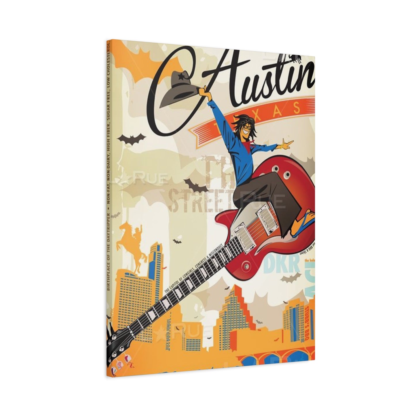
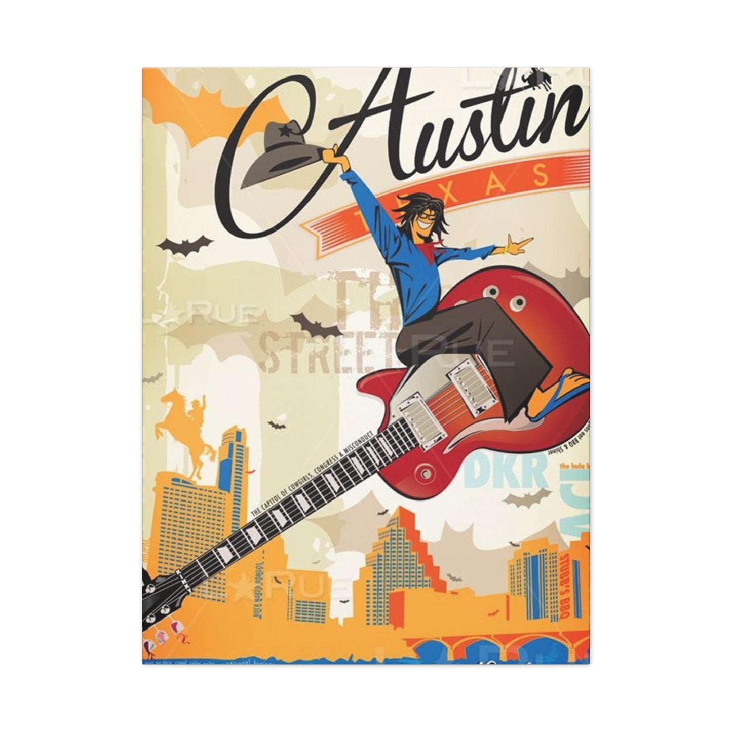
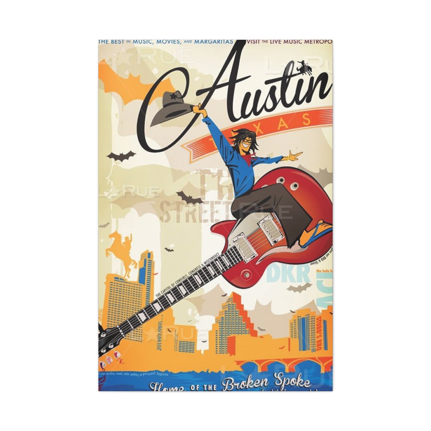
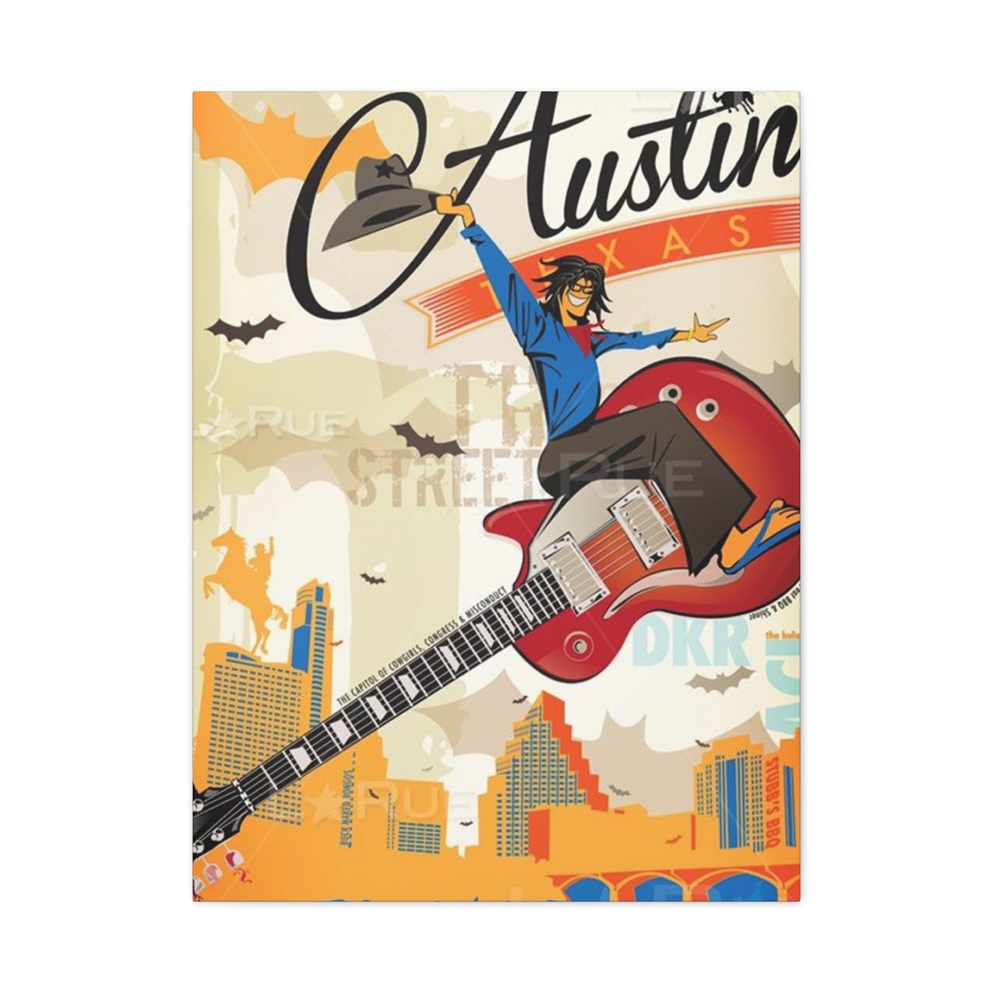
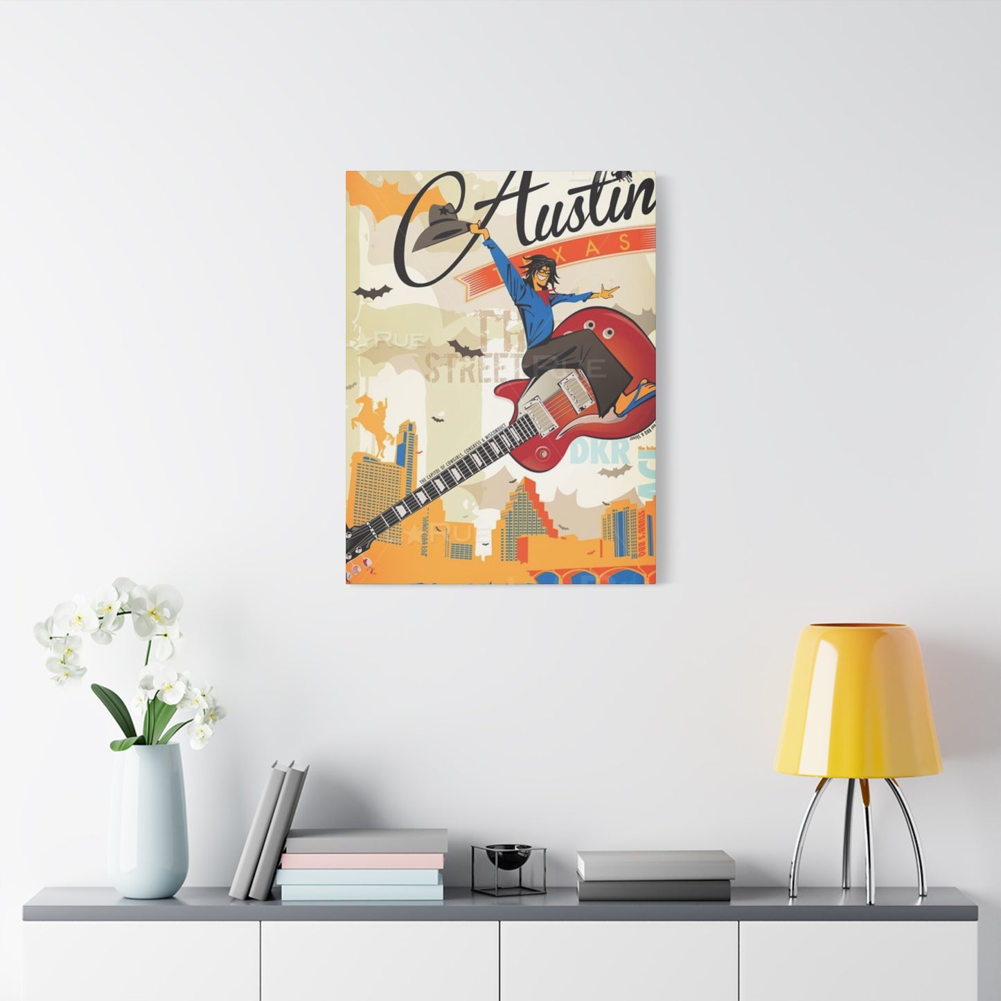
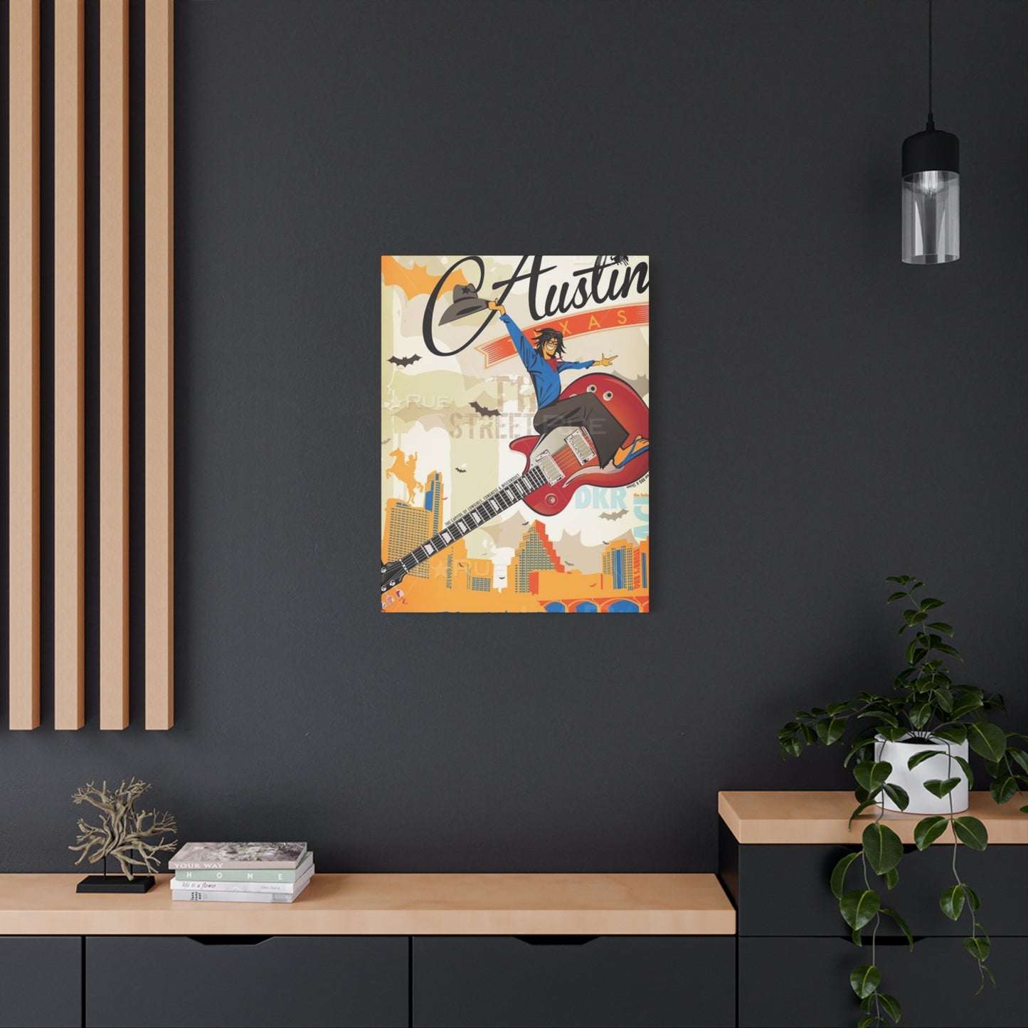
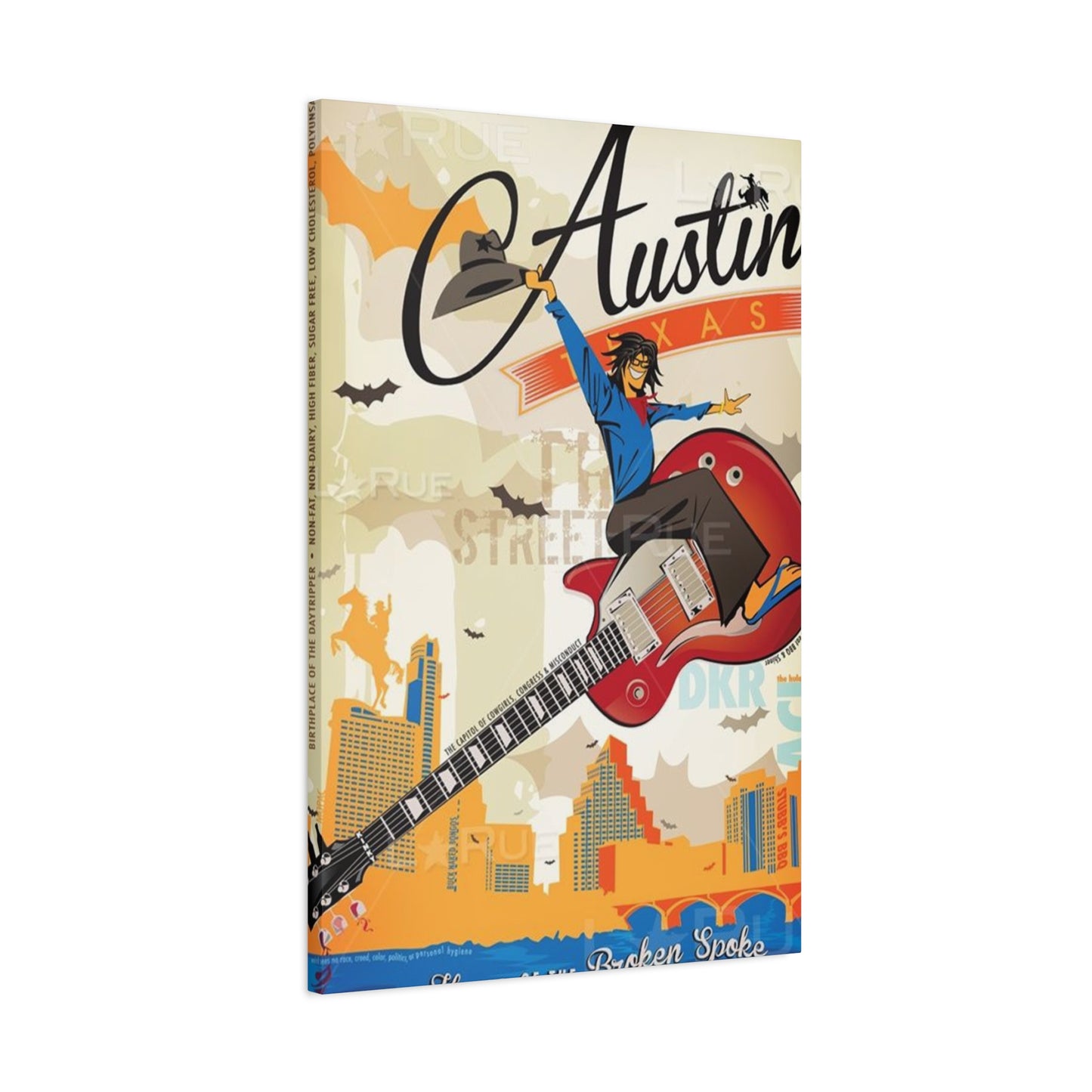
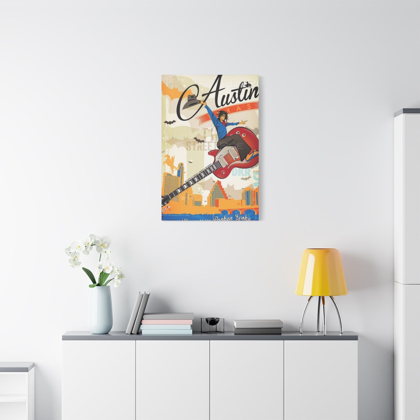
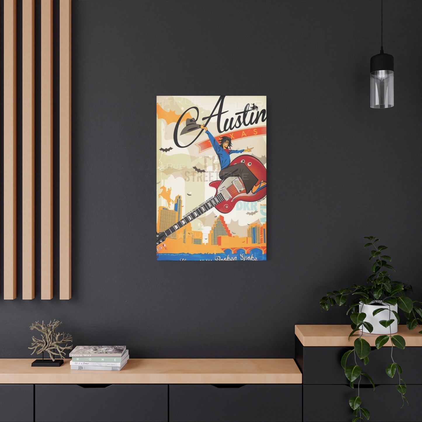
Austin Texas Poster Wall Art & Canvas Prints
Austin Texas Poster Wall Art & Canvas Prints
Couldn't load pickup availability
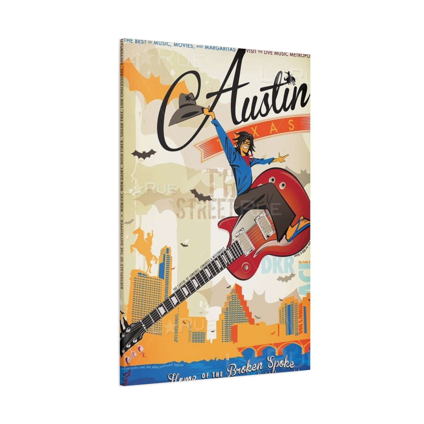
Austin Texas Poster Wall Art: A Colorful Expedition into Lone Star State Creativity and Visual Arts
The captivating realm of decorative visual pieces showcasing the vibrant capital of Texas represents more than mere ornamental additions to living spaces. These artistic representations carry profound cultural significance, embodying the spirit of a city renowned for its eclectic personality, musical heritage, and distinctive southwestern charm. Whether depicting the iconic skyline against twilight hues, legendary music venues that have hosted countless performers, or the natural splendor of surrounding landscapes, these visual masterpieces serve as windows into the soul of one of America's most dynamic metropolitan areas.
Why Visual Representations of Texas's Capital Create Lasting Impressions in Modern Interiors
The allure of incorporating imagery from this southwestern metropolis into residential and commercial environments stems from multiple compelling factors that resonate with diverse audiences. These artistic pieces function as conversation starters, memory preservers, and aesthetic enhancers simultaneously. For individuals who have established roots in this thriving city, such decorative elements evoke powerful nostalgia and reinforce their connection to a place they call home. The emotional resonance created by recognizing familiar landmarks, street scenes, or cultural symbols transforms ordinary walls into personal galleries of meaningful experiences.
Visitors who have experienced the unique atmosphere of this Lone Star State destination often seek tangible reminders of their journeys. A carefully selected visual piece serves this purpose admirably, capturing specific moments or general impressions that made their visit memorable. The versatility of available designs ensures that whether someone prefers photorealistic depictions, abstract interpretations, minimalist line drawings, or vintage-inspired compositions, suitable options exist to match their aesthetic preferences and interior design schemes.
The cultural significance embedded within these artistic works extends beyond personal sentiment. They represent a broader appreciation for regional identity, architectural evolution, and the distinctive character that differentiates this city from other urban centers. The bat colony emerging from Congress Avenue Bridge at dusk, the colorful food truck culture, the sprawling outdoor murals adorning building facades, and the lush greenery surrounding waterways all contribute to a visual vocabulary that makes this location instantly recognizable to those familiar with its charms.
Exploring Diverse Artistic Styles Available in Austin Texas Poster Wall Art Collections
The marketplace offers an extraordinary variety of artistic approaches when it comes to visual representations of this Texas capital. Understanding these different stylistic categories helps consumers make informed decisions that align with their personal tastes and existing interior aesthetics. Contemporary minimalist designs strip away extraneous details to focus on essential geometric forms and clean lines, often utilizing limited color palettes that emphasize sophistication and restraint. These compositions might reduce the cityscape to simplified silhouettes or employ negative space strategically to create visual impact without overwhelming the viewer.
Vintage-inspired creations draw inspiration from mid-century travel posters, retro advertising aesthetics, and nostalgic design sensibilities. These pieces often feature muted color schemes reminiscent of aged photographs, typography styles popular in bygone decades, and compositional approaches that evoke a sense of timelessness. The appeal of such designs lies in their ability to suggest history and permanence while simultaneously feeling fresh and relevant in contemporary settings. They bridge past and present, making them particularly suitable for spaces that blend traditional and modern elements.
Photographic reproductions capture the city's essence through the lens of talented photographers who have documented its streets, structures, and natural surroundings. These images range from sweeping panoramic vistas taken from elevated vantage points to intimate close-ups of architectural details, street art, or natural elements. The photographic approach offers authenticity and realism that some viewers prefer, providing windows into actual scenes rather than artistic interpretations. High-quality printing processes ensure that these photographs maintain their clarity, color accuracy, and tonal range when transferred to poster format.
Abstract interpretations liberate artists from literal representation, allowing them to distill the emotional essence, color palette, or energy of the city into non-representational forms. These compositions might utilize the warm terracotta tones prevalent in local architecture, the vibrant blues of Texas skies, or the energetic color combinations associated with the city's music scene and creative culture. Abstract pieces offer maximum flexibility for integration into various interior schemes since their lack of specific imagery allows them to complement rather than dominate surrounding design elements.
Illustrated designs showcase the talents of graphic artists and illustrators who bring personal stylistic signatures to their depictions. Hand-drawn elements, whether executed digitally or traditionally, introduce warmth and individuality that distinguishes these pieces from photographic alternatives. Illustration styles range from whimsical and playful to sophisticated and elegant, encompassing everything from cartoon-like simplicity to intricate pen-and-ink detail work. This category includes everything from map-based designs highlighting notable neighborhoods and landmarks to stylized portraits of iconic structures rendered with artistic flair.
Selecting the Perfect Size and Format for Your Display Space
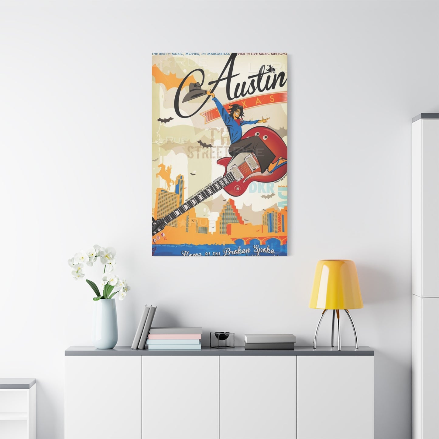
Determining appropriate dimensions represents a crucial consideration when acquiring decorative visual pieces for any environment. The relationship between artwork size and available wall space significantly impacts visual harmony and overall aesthetic success. Oversized pieces measuring several feet across work magnificently in spacious rooms with high ceilings, creating dramatic focal points that command attention and anchor surrounding furnishings. These substantial works prove particularly effective above sofas, beds, or console tables where their scale provides visual weight that balances furniture pieces below.
Medium-sized options typically ranging from eighteen to thirty inches in width or height offer versatility that makes them suitable for various locations throughout residential and commercial spaces. These dimensions work beautifully in entryways, hallways, home offices, and moderate-sized living areas where they provide visual interest without overwhelming other design elements. Multiple medium-sized pieces can be arranged in gallery-style configurations, creating dynamic wall compositions that tell more complex visual stories than single large works.
Smaller formats measuring under eighteen inches work wonderfully in intimate spaces, as accent pieces within larger arrangements, or in environments where wall space is limited. Bathrooms, small home offices, breakfast nooks, and narrow hallways benefit from these compact options that add personality and visual appeal without demanding extensive square footage. Collections of smaller pieces arranged in grid patterns or asymmetrical groupings create cohesive displays that generate significant visual impact through repetition and relationship rather than individual scale.
Consideration of viewing distance plays an essential role in size selection. Pieces intended to be appreciated from across spacious rooms should be proportionally larger than those positioned in areas where viewers will examine them from closer proximity. Detailed illustrations or photographs with fine elements require closer viewing to be fully appreciated, while bold graphic designs or simplified compositions remain effective even when viewed from considerable distances. The intended purpose of the space also influences appropriate sizing decisions, with busy areas benefiting from simpler, bolder designs that register quickly, while contemplative spaces can accommodate more complex compositions that reward extended observation.
Color Palette Considerations When Choosing Austin Texas Poster Wall Art
The chromatic characteristics of decorative visual pieces significantly influence their compatibility with existing interior color schemes and their psychological impact on space occupants. Understanding color theory basics helps consumers make selections that either harmonize with or strategically contrast against surrounding hues. Warm color palettes featuring reds, oranges, yellows, and earth tones evoke energy, warmth, and welcoming atmospheres. These hues naturally complement the terracotta, sandstone, and sunset colors frequently associated with southwestern architecture and landscapes, making them particularly appropriate for designs featuring this Texas destination.
Cool color schemes dominated by blues, greens, and purples create calming, serene environments that feel spacious and tranquil. Images capturing the Colorado River winding through the city, the lush greenery of Zilker Park, or twilight skies transitioning from deep blue to purple naturally incorporate these cooler tones. Such palettes work beautifully in bedrooms, bathrooms, or any space intended for relaxation and contemplation. The psychological effects of cool colors include reduced perceived temperature, enhanced focus, and decreased anxiety, making them valuable tools for creating restorative environments.
Neutral color schemes built around blacks, whites, grays, and beiges offer maximum versatility and timeless appeal. These understated palettes allow artwork to integrate seamlessly into diverse interior styles ranging from industrial lofts to traditional homes. Black-and-white photographic prints or sepia-toned vintage designs exemplify this approach, providing visual interest through composition, contrast, and subject matter rather than chromatic variety. Neutral-palette artwork proves particularly valuable in spaces where bold colors appear in furnishings, accessories, or architectural elements, as the restrained artwork prevents visual competition and maintains cohesive aesthetics.
Monochromatic schemes utilizing various tints, shades, and tones of a single hue create sophisticated, unified appearances. A piece rendered entirely in variations of blue, for instance, demonstrates how subtle gradations within one color family can produce depth, dimension, and visual interest without chromatic diversity. Monochromatic approaches feel inherently coordinated and harmonious, making them foolproof choices for individuals uncertain about color matching or working within restrictive existing color schemes.
Complementary color combinations featuring hues opposite each other on the color wheel, such as blue and orange or purple and yellow, generate vibrant, energetic visual experiences. Artwork employing complementary colors creates maximum chromatic contrast, ensuring pieces stand out dramatically against walls and surrounding elements. These dynamic combinations suit contemporary interiors, creative workspaces, and areas intended to stimulate conversation and engagement. The bold nature of complementary color schemes makes them less suitable for serene, restful environments but ideal for social spaces and energizing areas.
Framing Options That Enhance and Protect Your Visual Investment
The selection of appropriate framing solutions dramatically impacts both the aesthetic presentation and long-term preservation of decorative visual pieces. Frames serve multiple functions, including structural support, protection from environmental factors, and aesthetic enhancement that bridges the artwork itself with surrounding interior elements. Understanding available framing options empowers consumers to make choices that maximize the beauty and longevity of their acquisitions.
Traditional wooden frames offer timeless elegance and natural warmth that complements virtually any interior style. Available in countless species, stains, and finishes, wood framing ranges from rustic barnwood textures perfect for farmhouse aesthetics to sleek, dark mahogany suitable for formal settings. Oak, maple, walnut, cherry, and pine each bring distinctive grain patterns and natural colorations that can either complement or contrast with artwork colors. Wooden frames with ornate carved details suit traditional and classical interiors, while clean-lined wooden frames with minimal ornamentation work beautifully in modern and transitional spaces.
Metal frames constructed from aluminum, steel, or other alloys provide contemporary, streamlined appearances that particularly suit modern and industrial interior styles. These frames typically feature thin profiles that minimize visual bulk while providing substantial structural support. Available in finishes ranging from brushed nickel and chrome to matte black and bronze, metal frames offer durability and maintenance ease alongside their aesthetic contributions. The cool, precise character of metal framing complements minimalist artwork, photographic prints, and designs with strong geometric elements.
Floating frames create the illusion that artwork hovers within the frame structure, with visible space between the image edge and frame interior. This presentation style adds dimensional depth and contemporary sophistication to pieces, drawing attention to the artwork itself while providing subtle but effective framing. Floating presentations work particularly well with canvas-mounted pieces or thick poster stock, creating shadow effects that enhance visual drama. The modern aesthetic of floating frames makes them especially popular for contemporary interiors and gallery-style displays.
Gallery frames, also known as museum frames, utilize conservation-grade materials and construction methods designed to preserve artwork for extended periods. These frames typically include acid-free matting, UV-protective glazing, and backing materials that prevent deterioration from environmental exposure. While potentially representing higher initial investments, gallery frames provide superior protection that maintains artwork condition and value over decades. Collectors, preservation-minded individuals, and those framing valuable or irreplaceable pieces should seriously consider these premium framing solutions.
Matting serves both aesthetic and protective functions, creating visual breathing room between artwork and frame while physically separating the image surface from glazing materials. Mat colors significantly influence overall presentation, with white and off-white offering classic, neutral options that suit most imagery. Colored mats can either complement dominant colors within the artwork or provide strategic contrast that enhances visual impact. Double or triple matting, featuring multiple mat layers with different colors or widths, adds depth and sophistication to framed presentations, particularly for special pieces or formal settings.
Strategic Placement Principles for Maximum Visual Impact
The positioning of decorative visual pieces within residential and commercial environments significantly affects their effectiveness as design elements and their ability to engage viewers. Several guiding principles help optimize placement decisions regardless of specific space characteristics or design goals. Eye-level hanging represents the most fundamental placement guideline, positioning artwork so its center falls approximately fifty-seven to sixty inches from the floor. This height aligns with average human eye level, creating comfortable viewing angles that neither strain upward nor force downward gazes.
However, contextual factors often necessitate adjustments to this baseline recommendation. In spaces with exceptionally high ceilings, maintaining strict adherence to standard eye-level measurements may result in artwork appearing disconnected from surrounding architectural elements and furnishings. In such cases, positioning pieces slightly higher while ensuring visual connection with furniture or architectural features below creates more harmonious overall compositions. Conversely, in rooms with lower ceilings, maintaining appropriate clearance above furniture while respecting eye-level principles requires careful calculation and sometimes compromise.
Furniture relationships dramatically influence optimal artwork placement. Pieces hung above sofas, beds, console tables, or other substantial furniture items should relate proportionally to the furniture width, typically measuring between two-thirds and three-quarters of the furniture width to achieve balanced visual weight. Adequate clearance between furniture tops and artwork bottoms, usually six to twelve inches, prevents pieces from appearing to sit directly on furniture while maintaining visual connection between elements. This spacing allows for decorative objects like lamps, plants, or accessories to occupy furniture surfaces without interfering with artwork appreciation.
Architectural features including windows, doors, fireplaces, and built-in shelving influence placement opportunities and constraints. Centering artwork on wall sections between architectural features creates symmetrical, formal arrangements that feel stable and deliberate. Alternatively, asymmetrical placements that intentionally offset artwork from exact center points generate more dynamic, contemporary aesthetics particularly suited to modern interiors. Window treatments, heating vents, light switches, and other practical wall elements must be considered during placement planning to avoid awkward overlaps or accessibility issues.
Lighting conditions profoundly affect artwork visibility and impact. Natural light entering through windows creates beautiful illumination but also introduces potential damage risks from ultraviolet radiation exposure over extended periods. Positioning artwork away from direct sunlight or employing UV-protective glazing helps mitigate these concerns while allowing natural light appreciation. Artificial lighting offers greater control, with options including dedicated picture lights mounted above frames, adjustable track lighting systems, or strategically positioned accent lamps that wash walls with illumination. Proper lighting enhances color vibrancy, reveals surface textures, and ensures artwork remains visible during evening hours when natural light disappears.
Creating Gallery Wall Arrangements with Multiple Pieces
Assembling cohesive displays featuring multiple decorative visual pieces transforms ordinary walls into dynamic galleries that showcase personal style and curatorial sensibilities. Successful multi-piece arrangements require thoughtful planning regarding piece selection, spatial relationships, and overall compositional balance. Gallery walls can incorporate consistent elements throughout all pieces or deliberately embrace eclecticism through varied sizes, frames, and subjects united by common themes or color palettes.
Grid layouts arrange multiple pieces in precise rows and columns with consistent spacing between frames, creating orderly, structured appearances particularly suited to modern and minimalist interiors. This approach works beautifully with identically sized and framed pieces, producing clean, architectural wall compositions that feel intentional and controlled. Spacing between frames typically measures one to three inches, though larger gaps work effectively in spacious rooms with high ceilings where greater breathing room prevents compositions from appearing cramped.
Salon-style arrangements embrace deliberate irregularity, combining pieces of various sizes and orientations in asymmetrical configurations that feel organic and collected over time. This approach, inspired by traditional art salon displays, encourages creative freedom and personal expression while requiring careful attention to visual balance and weight distribution. Starting with a central anchor piece, typically the largest or most visually commanding work, provides a foundation around which smaller pieces can be arranged. Maintaining relatively consistent spacing between all frames despite size variations helps unify salon arrangements and prevents chaotic appearances.
Linear horizontal arrangements position multiple pieces in single rows along wall lengths, creating horizontal emphasis that makes walls appear wider and rooms feel more expansive. This approach works particularly well in hallways, above lengthy sofas or console tables, and in spaces where vertical wall space is limited but horizontal space is abundant. Varying piece sizes within horizontal arrangements while maintaining aligned tops or bottoms creates visual rhythm and prevents monotony.
Vertical stacking arrangements emphasize height by arranging pieces in single columns that draw eyes upward and make ceilings appear higher. These compositions work effectively in narrow wall sections flanking windows or doors, in stairwells where vertical space predominates, and in rooms where vertical emphasis benefits overall spatial perception. Vertical arrangements can follow strict alignment with centered pieces or offset pieces slightly for more dynamic appearances.
Before committing to wall mounting, creating full-scale templates from kraft paper or newspaper allows experimentation with different arrangements without creating unnecessary wall damage. Arranging templates on walls using removable painter's tape enables visualization of how various configurations will appear in actual spaces with real lighting and furniture relationships. This planning step prevents costly mistakes and ensures final arrangements meet expectations before any permanent mounting occurs.
Caring for and Preserving Your Decorative Visual Pieces
Proper maintenance and environmental management significantly extend the lifespan and preserve the appearance quality of decorative visual works. Understanding potential deterioration factors and implementing preventive measures protects investments and maintains aesthetic appeal for years or decades. Environmental conditions including light exposure, humidity levels, temperature fluctuations, and air quality all affect artwork longevity.
Light exposure represents perhaps the single most significant threat to artwork preservation. Both natural sunlight and artificial illumination contain ultraviolet radiation that gradually fades colors, yellows papers, and degrades materials through photochemical reactions. Positioning artwork away from direct sunlight or windows where indirect natural light creates less exposure risk helps minimize damage. UV-filtering window films, UV-protective frame glazing, and light-filtering window treatments provide additional protection layers. For artificial lighting, LED bulbs produce significantly less UV radiation than incandescent or fluorescent options while offering superior energy efficiency.
Humidity fluctuations cause paper-based materials to expand and contract repeatedly, eventually leading to warping, cockling, and structural weakness. Organic materials including paper and certain printing inks prove particularly susceptible to mold and mildew growth in consistently humid conditions. Conversely, extremely dry environments cause brittle, fragile conditions that increase tearing and cracking risks. Maintaining relatively stable humidity levels between forty and fifty percent protects most artwork types, achievable through whole-house humidification systems, dehumidifiers, or room-specific humidity control devices depending on climate and season.
Temperature stability matters nearly as much as humidity control, with consistent moderate temperatures proving far less damaging than frequent fluctuations between temperature extremes. Positioning artwork away from heating vents, radiators, fireplaces, and air conditioning registers prevents exposure to temperature extremes and the rapid fluctuations that occur when climate control systems cycle on and off. Exterior walls that experience greater temperature variation than interior walls present increased risks, particularly in poorly insulated structures or extreme climates.
Physical handling requires care to avoid oils, dirt, and moisture transfer from hands to artwork surfaces. When moving or adjusting framed pieces, grasping frames rather than touching glazing or exposed surfaces prevents fingerprints and potential damage. Wearing clean cotton gloves when handling unframed or unglazed pieces provides additional protection. Regular gentle dusting using soft, clean microfiber cloths maintains appearance without introducing cleaning chemicals or moisture that might damage surfaces.
Frame glazing, whether glass or acrylic, requires appropriate cleaning methods that avoid scratching or chemical damage. For standard glass, diluted ammonia-free glass cleaner applied to lint-free cloths rather than directly to glazing prevents liquid seepage behind frames where it might contact artwork. Acrylic glazing requires special care since it scratches more easily than glass; using cleaners specifically formulated for acrylic and ultra-soft cleaning cloths minimizes scratching risks.
Periodic inspection allows early detection of potential problems including frame damage, glazing deterioration, mat discoloration, or artwork surface changes. Addressing minor issues promptly prevents escalation into major problems requiring extensive restoration efforts. Professional conservation assessment and treatment should be considered for valuable pieces showing deterioration signs or those requiring reframing with conservation-grade materials.
Matching Austin Texas Poster Wall Art with Interior Design Styles
Successfully integrating decorative visual pieces into existing interior schemes requires understanding how different design styles approach wall decoration and which artwork characteristics complement specific aesthetic approaches. Contemporary interiors characterized by clean lines, neutral palettes, and uncluttered spaces benefit from bold, simplified artwork that makes strong statements without visual complexity. Black-and-white photography, minimalist line drawings, and graphic designs with limited color palettes complement contemporary aesthetics beautifully, providing focal points without competing with the spare elegance these spaces cultivate.
Modern farmhouse style blending rustic elements with clean contemporary lines welcomes artwork that bridges these seemingly contradictory influences. Vintage-inspired prints, distressed frame finishes, and imagery featuring architectural details or natural landscapes harmonize with farmhouse aesthetics while maintaining sufficient visual simplicity to avoid overwhelming these thoughtfully curated spaces. Warm color palettes featuring creams, soft grays, and muted earth tones tie artwork into broader farmhouse color schemes dominated by whites, neutrals, and natural wood tones.
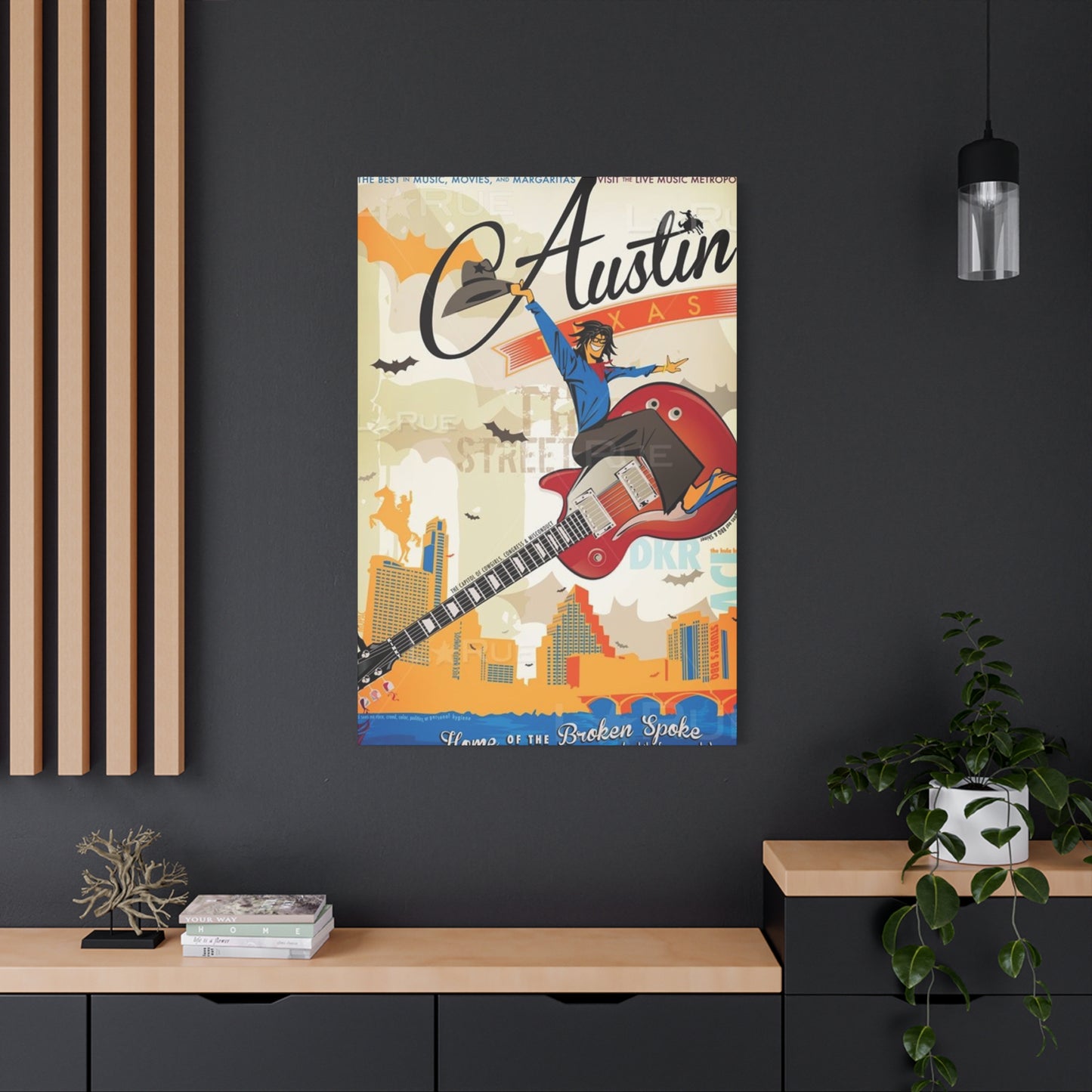
Industrial interiors featuring exposed brick, metal accents, concrete surfaces, and utilitarian fixtures pair magnificently with urban-themed artwork celebrating architectural elements, cityscapes, and raw materials. Black metal frames or raw wood options complement the honest, unfinished character of industrial design. Oversized pieces with bold graphics or dramatic photography match the generous scale typical of industrial spaces, many of which feature high ceilings and expansive wall surfaces demanding substantial artwork to avoid appearing insignificant.
Bohemian and eclectic styles embracing pattern mixing, vibrant colors, and personal collections of meaningful objects welcome diverse artwork selections that might seem incompatible in more formal design schemes. Gallery walls combining various frame styles, subject matters, and artistic approaches feel perfectly at home in bohemian spaces that celebrate individual expression over design rules. Colorful abstract pieces, illustrated maps, and vintage-inspired graphics all find comfortable places within eclectic interiors that prioritize personality over coordination.
Minimalist interiors represent the ultimate exercise in restraint, featuring only essential furnishings and decorative elements carefully selected for maximum impact. Single carefully chosen pieces gain enormous significance in minimalist spaces where every element receives careful consideration. Simple compositions, limited color palettes, and strong graphic qualities suit minimalist aesthetics perfectly, providing visual interest without the busy complexity that violates minimalist principles. Large-scale pieces work particularly effectively in minimalist environments where fewer larger elements replace numerous smaller objects.
Traditional interiors honoring classical design principles, formal furniture arrangements, and refined color palettes require artwork that respects these established conventions while providing appropriate visual interest. Framed prints featuring historical imagery, architectural studies, or naturalistic landscape scenes complement traditional aesthetics without introducing jarring contemporary elements. Substantial wooden frames with decorative molding details echo the formal furniture typical of traditional spaces, creating visual harmony across all design elements.
Scandinavian design emphasizing simplicity, functionality, and connection to nature welcomes artwork reflecting these values. Muted color palettes dominated by whites, grays, and soft pastels align with Scandinavian preferences for light, airy spaces. Nature-inspired imagery including landscapes, botanical subjects, and wildlife resonates with the Scandinavian emphasis on bringing natural elements indoors. Simple wooden frames in light finishes complement the blonde woods prevalent in Scandinavian furniture and architectural details.
Sourcing Quality Pieces from Reliable Vendors
Acquiring high-quality decorative visual works requires identifying trustworthy sources that offer genuine value, quality materials, and fair pricing. Various purchasing channels present distinct advantages and potential drawbacks that informed consumers should understand before making acquisition decisions. Direct purchases from individual artists provide opportunities to acquire original works or limited-edition prints while supporting creative professionals directly. Artists often maintain online portfolios or participate in local art markets where their work can be viewed and purchased. This acquisition method offers maximum assurance regarding work authenticity and provides opportunities for custom commissions tailored to specific preferences.
Online marketplaces specializing in art and home decor aggregate offerings from numerous artists and manufacturers, providing convenient browsing across extensive catalogs without visiting multiple physical locations. These platforms typically feature search and filtering tools that help narrow options based on size, color, subject matter, and price range. Customer reviews and seller ratings provide valuable insight into product quality and vendor reliability, helping prospective buyers make informed decisions. However, the inability to physically examine pieces before purchase represents a potential drawback, making generous return policies and detailed product descriptions particularly important.
Local frame shops and art galleries offer personalized service including professional guidance regarding selection, framing, and placement. Staff members often possess extensive knowledge regarding design principles and can provide valuable consultation that online shopping experiences cannot match. Physically viewing pieces in person before purchase eliminates uncertainty regarding colors, textures, and overall appearance. Many local establishments offer custom framing services that protect investments and optimize presentation quality. Supporting local businesses also strengthens community economies and preserves local artistic culture.
Home furnishing retailers increasingly offer curated selections of wall art alongside furniture and decorative accessories, providing convenient one-stop shopping for complete room furnishing projects. These retailers typically offer pieces selected by professional designers to complement current furniture collections and trending design styles. While convenience represents a significant advantage, selections may be more limited than specialized art sources, and uniqueness might be compromised when pieces appear in numerous homes.
Print-on-demand services allow consumers to upload personal photographs or select from extensive digital image libraries, producing custom prints in various sizes and formats. This option appeals to individuals seeking personalized pieces featuring personal photographs, unique image selections, or custom sizing unavailable through traditional retail channels. Quality varies significantly among print-on-demand providers, making research regarding printing methods, paper quality, and color accuracy essential before ordering.
Understanding Printing Methods and Material Quality
The processes used to transfer images onto physical substrates significantly affect final product appearance, longevity, and value. Different printing methods suit various artistic styles, budget considerations, and intended display conditions. Giclée printing represents premium quality suitable for fine art reproduction and limited editions. This process employs professional-grade inkjet printers utilizing archival pigment-based inks and acid-free papers or canvases. Giclée prints exhibit exceptional color accuracy, tonal range, and detail resolution while offering superior fade resistance that preserves appearance quality for decades under appropriate display conditions. The term giclée specifically denotes this high-quality printing approach, distinguishing such works from standard poster printing.
Offset lithography constitutes the traditional commercial printing method used for mass-produced posters, magazines, and books. This process transfers ink from metal plates to rubber blankets before applying images to paper, allowing rapid production of large quantities at economical costs. Modern offset printing achieves impressive quality, though typically not matching giclée standards regarding color depth and longevity. Offset-printed pieces suit buyers prioritizing affordability over archival quality or those seeking vintage aesthetics where slight imperfections contribute authentic character.
Digital printing encompasses various direct-to-substrate printing methods that transfer digital images directly onto paper, canvas, metal, or other materials without intermediate plates or screens. Quality varies tremendously depending on equipment quality, ink types, and substrate materials. Premium digital printing using pigment-based inks on quality substrates produces results approaching giclée standards, while entry-level digital printing may exhibit inferior color reproduction, limited tonal range, and rapid fading. Understanding specific equipment and materials used helps evaluate whether particular digital printing meets quality expectations.
Substrate selection proves equally important as printing method. Paper options range from basic poster stock to museum-quality archival papers engineered for permanence. Paper weight, measured in pounds or grams per square meter, indicates thickness and durability, with heavier papers feeling more substantial and resisting curling better than lightweight options. Acid-free papers prevent yellowing and deterioration over time, making them essential for pieces intended for long-term display. Texture choices including smooth, matte, or fine art papers with visible tooth affect how images appear and how surfaces interact with light.
Canvas substrates create gallery-wrapped presentations suitable for frameless display or traditional framing. Quality canvas materials include cotton, polyester, or cotton-polyester blends, with cotton generally considered superior for color reproduction and archival stability. Stretched canvases mounted on wooden stretcher frames arrive ready for hanging, though some buyers prefer floating frames that protect canvas edges while maintaining the dimensional depth that makes canvas appealing. Canvas prints suit contemporary and casual settings while feeling less appropriate for formal traditional interiors where framed paper pieces typically predominate.
Seasonal Rotation Strategies for Dynamic Wall Displays
Periodically changing displayed artwork prevents visual stagnation and allows spaces to evolve with seasons, occasions, or shifting personal preferences. Implementing rotation strategies requires planning regarding storage, handling, and selection criteria that guide which pieces occupy wall space during different periods. Seasonal rotations align displayed artwork with weather patterns and associated activities, creating environments that feel temporally appropriate and responsive to annual cycles. Warm autumnal palettes featuring oranges, browns, and golds replace bright summer colors as seasons change, while winter displays might emphasize cooler tones or holiday themes.
Occasion-based rotations celebrate birthdays, anniversaries, holidays, or other significant dates by temporarily displaying themed artwork that marks these events. This approach transforms living spaces into participatory elements of celebrations rather than static backdrops. Holiday-specific pieces might include only brief annual appearances, making their display feel special and anticipated. Removing holiday decorations promptly after occasions pass prevents spaces from feeling dated or neglected.
Mood-based rotation strategies respond to psychological needs or desired atmospheric qualities. During stressful periods, calming imagery featuring natural landscapes or serene color palettes might replace more energetic or complex pieces. When seeking inspiration or creative energy, bold abstract works or vibrant cityscape imagery could better serve occupants' psychological needs. This responsive approach treats environments as active participants in wellbeing rather than fixed settings immune to occupant states.
Proper storage protects pieces during periods when they're not displayed. Acid-free storage boxes or portfolios prevent dust accumulation and physical damage while archival tissue paper prevents surface-to-surface contact that might cause transfer or sticking. Storing pieces vertically rather than stacked horizontally prevents weight-related damage to pieces at stack bottoms. Climate-controlled storage environments with stable temperature and humidity protect pieces from environmental deterioration during storage periods.
Maintaining detailed inventories including photographs and location notes prevents forgotten pieces from languishing permanently in storage. Digital catalogs with tagged categories facilitate selecting appropriate pieces when planning rotations. Documentation also provides valuable records for insurance purposes and helps track acquisition histories including dates, sources, and costs.
Complementing Your Austin Texas Poster Wall Art with Accessories
Thoughtfully selected surrounding elements enhance artwork impact and create cohesive design schemes that feel intentional and complete. Shelf styling beneath wall-mounted pieces provides opportunities to echo artwork colors, themes, or stylistic qualities through three-dimensional objects. Books with cover colors matching artwork hues create subtle visual connections, while sculptural objects introduce dimensional variety that prevents walls from feeling flat and two-dimensional. Plants bring living elements that soften hard architectural edges and introduce organic shapes contrasting with geometric frames and rectangular artwork formats.
Lighting accessories including table lamps, floor lamps, or decorative accent lights positioned near artwork provide both practical illumination and design cohesion. Lamp bases echoing artwork colors or materials create visual relationships that tie disparate elements into unified compositions. Directional lighting highlights artwork surfaces, enhancing visibility during evening hours while creating dramatic shadow effects that add depth to wall displays.
Textile elements including throw pillows, blankets, and window treatments offer additional opportunities for color coordination and thematic reinforcement. Selecting textiles that pull minor colors from artwork rather than matching dominant hues creates sophisticated layered color schemes that feel complex and professionally designed. Patterns and textures in textiles add visual interest and tactile dimension that smooth artwork surfaces alone cannot provide.
Furniture placement relative to artwork affects both functional space use and aesthetic cohesion. Positioning seating areas to face wall displays invites artwork appreciation while arranging furniture perpendicular to featured walls allows artwork to provide pleasant peripheral visual interest without demanding constant attention. Coffee tables, side tables, and console tables beneath artwork displays provide staging areas for complementary accessories while grounding wall-mounted pieces through visual weight distribution.
Architectural details including crown molding, chair rails, or wainscoting create permanent framework within which artwork displays exist. Respecting these architectural elements during artwork placement prevents awkward overlaps while leveraging existing structure to enhance overall design harmony. Paint colors behind artwork significantly affect how pieces appear, with lighter walls causing artwork to pop forward prominently while darker walls can make pieces recede slightly. Testing artwork against various wall color samples before committing to paint selections helps ensure desired visual relationships.
Navigating Copyright and Licensing Considerations
Understanding intellectual property rights protects consumers from legal complications while ensuring artists receive appropriate compensation for their creative works. Original artwork and photographic images automatically receive copyright protection upon creation, granting creators exclusive rights regarding reproduction, distribution, and display. Purchasing physical artwork copies does not transfer copyright ownership unless explicitly stated in sales agreements, meaning buyers cannot legally reproduce purchased pieces for commercial purposes or public distribution without permission.
Licensed reproductions authorized by copyright holders represent legitimate acquisition options that support original creators through royalty payments. Many artists partner with publishers or manufacturers to produce authorized reproductions reaching broader markets while maintaining quality control over how their works appear. Licensed pieces typically include copyright information and sometimes artist signatures or edition numbers indicating their authorized status.
Public domain works including historical imagery, government-created materials, and works whose copyright protections have expired may be freely reproduced without permission or payment. Images created by federal government employees as part of official duties generally enter public domain immediately, making them freely available for reproduction. However, state and local government-created works may retain copyright protections, requiring investigation before assuming public domain status.
Fair use provisions allow limited reproduction of copyrighted works under specific circumstances including commentary, criticism, news reporting, teaching, scholarship, and research. However, fair use represents a complex legal defense rather than a clearly defined right, with courts evaluating use purpose, nature of original works, amounts used, and market effects when determining whether specific uses qualify. Consumers should not assume reproduction for personal use automatically qualifies as fair use, particularly when commercial alternatives exist.
When commissioning custom work, clear contractual agreements should specify copyright ownership, usage rights, and any restrictions on reproduction or modification. Some artists retain copyrights while granting buyers limited usage rights, while others transfer full copyright ownership for additional compensation. Understanding these arrangements before commissioning prevents future disputes or disappointment regarding reproduction rights.
Reverse image searches using tools widely available online help verify whether images offered for sale without clear attribution might infringe copyrights. Suspiciously low prices for seemingly professional imagery might indicate unauthorized reproduction. Purchasing from established, reputable sources with clear copyright compliance policies minimizes infringement risks and ensures appropriate creator compensation.
Conclusion
The distinctive character of Texas's capital manifests through numerous recognizable landmarks and cultural symbols that frequently appear in decorative visual works celebrating this unique location. The State Capitol building with its distinctive pink granite dome stands as an architectural centerpiece symbolizing governmental heritage and civic pride. Images capturing this structure from various angles and times of day offer diverse interpretations of this iconic landmark, from dawn's soft light illuminating its facade to dramatic sunset silhouettes emphasizing its commanding presence.
The Congress Avenue Bridge famous for hosting North America's largest urban bat colony provides another instantly recognizable subject. Images depicting the evening bat emergence, when hundreds of thousands of Mexican free-tailed bats spiral into twilight skies, capture one of nature's most impressive urban spectacles. The bridge itself, with distinctive architectural details and views along the Colorado River, offers visual appeal beyond its famous residents.
Music venue imagery celebrates the city's reputation as the live music capital, with legendary establishments having hosted countless performers across decades. Neon signs, marquee announcements, and crowd scenes from famous venues evoke the energy and cultural significance of the local music scene. Vintage-styled prints recalling concert posters from previous eras particularly resonate with music enthusiasts and those nostalgic for particular musical periods.
Natural landmarks including Barton Springs Pool, Mount Bonnell, and Lady Bird Lake showcase the abundant natural beauty surrounding urban development. Images capturing swimmers enjoying the constant seventy-degree spring-fed waters, panoramic vistas from elevated viewpoints, or kayakers gliding across calm lake surfaces celebrate outdoor recreation opportunities and environmental preservation efforts that distinguish this city from more concrete-dominated urban centers.
Street art and mural culture provide vibrant subjects reflecting creative community spirit and artistic expression. Famous murals including the "I love you so much" declaration and "Greetings from Austin" postcard-style mural serve as popular photography backdrops and symbolic representations of local personality. Capturing these works in visual pieces brings street art energy into residential and commercial interiors, celebrating grassroots creativity and urban aesthetics.
Share