


 (4.9/5)


The Ultimate Guide to Styling and Creating Canvas Prints
Canvas prints have evolved into one of the most influential elements in modern interior styling, not just because they display images, but because they transform them into tactile visual experiences. Unlike glossy photographs or standard framed posters, canvas prints carry a subtle texture that softens light, diffuses color, and gives artwork a more organic presence. This makes them uniquely adaptable to a wide range of interior styles, from minimal contemporary spaces to warm traditional environments.
What sets canvas prints apart is their ability to bridge personal expression and interior design. A single image can become a storytelling device, reflecting personality, memories, or aesthetic preferences while also contributing to the atmosphere of a room. Whether used as a central focal point or as part of a broader decorative composition, canvas prints influence how a space feels as much as how it looks.
Their versatility also comes from scale flexibility. A canvas can be small and intimate or large and immersive, allowing designers and homeowners to shape visual hierarchy within a space. This adaptability makes them a foundational element in modern décor planning.
Defining Purpose Before Creating Any Canvas Print
Every strong canvas design begins with purpose. Without a clear intention, even the most visually appealing image can feel misplaced or disconnected from its environment. The purpose determines the emotional tone, subject matter, color direction, and even the size of the final print.
Some canvas prints are created to evoke calmness and relaxation, often featuring natural landscapes, soft lighting, or minimal compositions. Others are designed to energize a space with bold colors, dynamic movement, or abstract forms. In many cases, canvas prints are used to preserve personal memories, turning photographs into lasting visual artifacts that carry emotional significance.
Purpose also extends to spatial function. A canvas placed above a sofa may need to anchor a living room visually, while one in a hallway might serve as a transitional visual guide. In a workspace, the purpose may shift toward inspiration or focus. Clarifying this intent early ensures that all design decisions remain consistent and meaningful.
The Importance of Visual Concept Development
Once the purpose is clear, the next step is developing a visual concept. This concept acts as the creative foundation for the entire canvas design process. It defines what the viewer should feel, notice, and interpret when engaging with the artwork.
A visual concept might be built around themes such as nature, urban life, abstraction, cultural symbolism, or personal storytelling. It can also be based on emotional tones such as serenity, nostalgia, energy, or curiosity. The key is to narrow the focus enough to create cohesion while still allowing creative flexibility.
A strong visual concept ensures that all design elements—color, composition, scale, and texture—work together instead of competing for attention. It also helps prevent visual clutter, which can easily occur when multiple ideas are combined without direction.
Selecting Images with Strong Composition Value
Not every image is suitable for canvas printing. The transformation from digital screen to physical surface requires careful attention to composition quality. Images with strong focal points, balanced structures, and clear visual hierarchy tend to translate more effectively onto canvas.
A well-composed image naturally guides the viewer’s eye. It may feature a central subject, leading lines, or balanced symmetry that creates visual stability. These qualities become even more important when the image is enlarged, as canvas prints often occupy significant wall space.
Images that are overly busy or lack a clear focal point can become visually confusing once printed. This is because the texture of canvas already introduces a level of softness, which can reduce clarity in complex compositions. Simplicity often enhances impact, especially in large-format prints.
Resolution and Clarity in Large-Format Printing
One of the most critical technical aspects of canvas creation is resolution. High-resolution images maintain detail when enlarged, ensuring that the final print remains sharp and visually consistent. Low-resolution images, however, tend to lose clarity, resulting in visible pixelation or softness.
Canvas texture naturally diffuses light and slightly softens edges, which means that image quality must compensate for this effect. A strong resolution ensures that even after this diffusion, the artwork retains its intended detail and structure.
Viewing distance also plays a role in resolution requirements. A large canvas intended for a living room wall may be viewed from several feet away, allowing for slightly lower perceived detail. In contrast, smaller canvases viewed up close require higher precision to maintain visual clarity.
Understanding this balance helps ensure that the final print performs well in its intended environment without appearing distorted or underdefined.
Color Theory and Emotional Influence in Canvas Design
Color is one of the most powerful tools in canvas styling because it directly influences emotional perception. Warm tones such as reds, oranges, and yellows tend to create feelings of energy, warmth, and intimacy. Cool tones like blues, greens, and soft grays promote calmness, relaxation, and clarity.
When designing a canvas print, color should always be considered in relation to the surrounding environment. A canvas does not exist in isolation; it interacts with wall paint, furniture, lighting, and other decorative elements.
Harmony occurs when colors blend naturally with the room’s palette, creating a unified atmosphere. Contrast occurs when colors intentionally stand out, drawing attention to the artwork as a focal point. Both approaches are valid, but each serves a different purpose within interior design.
Neutral color schemes, including black-and-white compositions, offer long-term flexibility because they adapt easily to changing décor styles. Subtle color grading can also unify an image with its environment without overwhelming the space.
Composition Techniques That Shape Visual Flow
Composition determines how the viewer’s eye moves across a canvas. It is the structural foundation that gives an image balance and clarity. One of the most widely used techniques is the rule of thirds, which divides an image into a grid to position key elements in visually engaging areas.
Symmetry is another powerful compositional tool, often used in architectural or minimal designs. It creates stability and order, making it ideal for formal or structured interiors. Asymmetry, on the other hand, introduces movement and energy, often used in modern or artistic settings.
Negative space is equally important. Empty areas within an image give the subject room to breathe and prevent visual overload. This is particularly effective in canvas prints because the physical texture already adds visual complexity.
A well-composed canvas feels effortless to view, guiding attention naturally without forcing it.
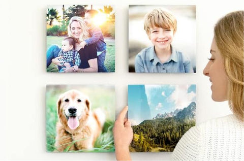
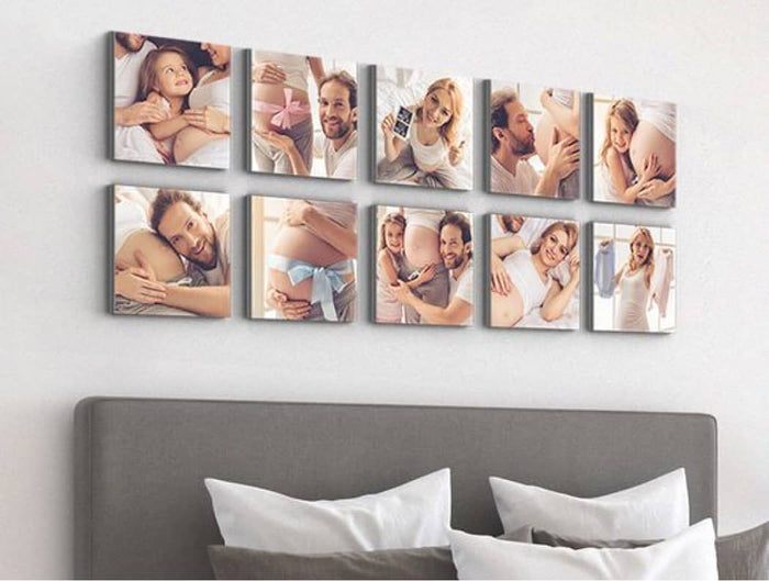
Choosing Canvas Size for Spatial Balance
Canvas size significantly affects how an artwork interacts with a room. Large canvases create strong focal points and can define the identity of a space, while smaller canvases serve as subtle accents that complement surrounding décor.
Proportion is more important than absolute size. A canvas should relate to nearby furniture and wall dimensions to maintain visual harmony. For example, a canvas placed above a sofa should align proportionally with the width of the seating area to create balance.
Oversized canvases work well in open spaces where they can anchor large walls, while medium or small prints are better suited for compact areas. Choosing the correct scale ensures that the artwork feels integrated rather than imposed.
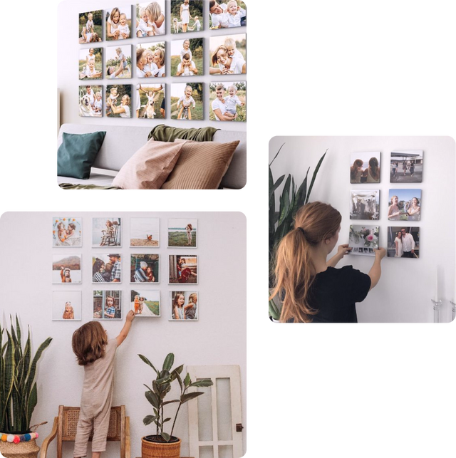
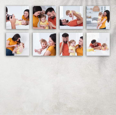
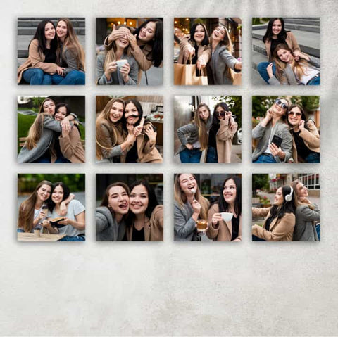
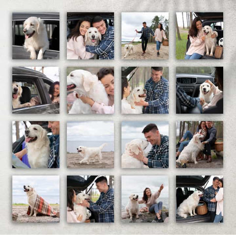
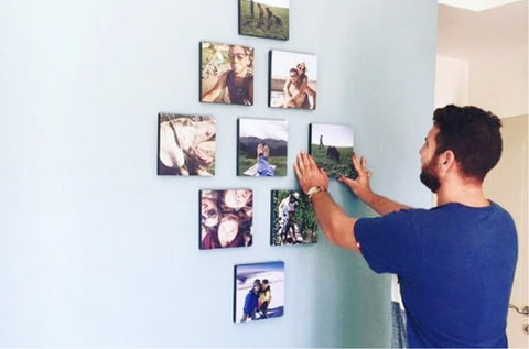
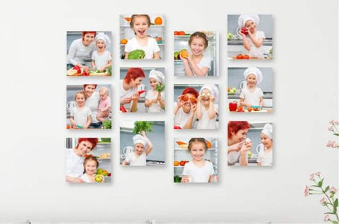
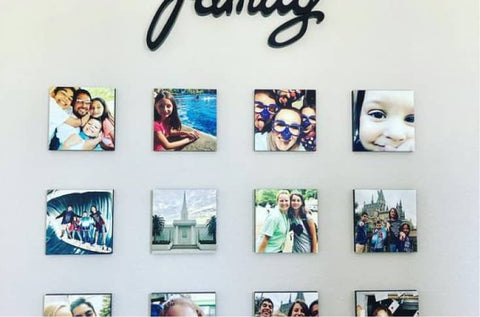
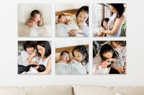
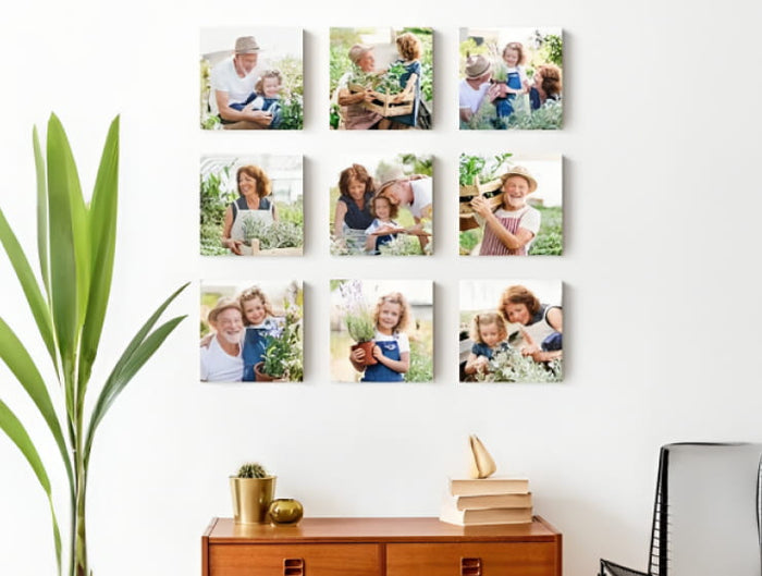
Planning Layouts for Single and Multiple Canvas Displays
Canvas prints can be displayed in various arrangements depending on the desired visual effect. A single canvas creates a strong focal point and is often used when the image itself is powerful enough to stand alone.
Multiple canvas arrangements introduce rhythm and structure. Triptych layouts divide a single image into three sections, creating continuity across panels. Grid layouts offer a more structured and orderly appearance, suitable for modern interiors.
Asymmetrical arrangements allow for creative freedom, combining different sizes and orientations to create a dynamic visual experience. However, consistency in spacing is essential to maintain cohesion across the display.
Aligning Canvas Design with Interior Style Themes
Different interior styles require different canvas approaches. Minimalist spaces benefit from simple compositions with neutral tones and clean lines. Scandinavian-inspired interiors often emphasize natural elements, soft lighting, and muted colors.
Industrial interiors can support stronger contrasts, darker palettes, and urban-inspired visuals. Traditional spaces tend to favor warm tones, classical subjects, and detailed imagery. Contemporary interiors allow for experimentation with abstract forms, bold colors, and unconventional compositions.
Matching canvas design with interior style ensures that the artwork feels intentional and integrated into the environment.
Preparing Digital Images for Print Transformation
Before an image becomes a physical canvas, it must be carefully prepared in its digital form. This involves adjusting brightness, contrast, and sharpness to account for differences between screen display and printed output.
Screens typically display brighter and more saturated images than printed materials. Without adjustment, printed canvases may appear darker or less vibrant than expected. Fine-tuning ensures that the final result remains visually balanced.
Cropping is also important, especially when adapting images to specific canvas dimensions. Maintaining the integrity of the composition during cropping ensures that key visual elements remain intact after printing.
The Role of Viewing Distance in Design Effectiveness
Viewing distance influences how a canvas is perceived. Large canvases viewed from a distance emphasize overall composition and color harmony rather than fine detail. Smaller canvases viewed up close require sharper detail and more precise composition.
This distinction affects decisions related to resolution, complexity, and visual intensity. A design that works well from afar may feel overwhelming up close, while a highly detailed image may lose impact when viewed from a distance.
Understanding viewing distance ensures that the canvas delivers its intended visual experience in real-world conditions rather than only on screen.
Evolving Canvas Prints from Decoration to Spatial Experience
Canvas prints in advanced interior design go far beyond decoration. They become part of the architecture of feeling within a space, influencing how people move, pause, and visually engage with their surroundings. At this level, canvas styling is not just about choosing images or colors, but about shaping spatial experience through intentional visual design.
A well-integrated canvas does not feel added onto a wall. Instead, it feels embedded within the room’s identity. This shift happens when design choices consider flow, proportion, rhythm, and emotional continuity across the entire space. The artwork becomes part of how a room is understood, not just how it is decorated.
Multi-Canvas Storytelling and Visual Continuity
One of the most expressive techniques in advanced canvas styling is the use of multi-panel compositions that extend a single image or concept across several frames. This approach transforms a static visual into a sequence, encouraging the viewer to mentally connect each segment into a unified whole.
When applied to landscapes, multi-canvas arrangements can create a sense of horizon expansion, as if the scene extends beyond physical boundaries. In abstract compositions, they introduce rhythm and fragmentation that enhances movement and energy. Even portrait-based designs can gain depth when divided carefully, allowing emotional focus to shift subtly across panels.
The spacing between panels becomes a silent design element. Too close, and the image feels compressed; too far, and the continuity breaks. The balance lies in creating separation that still preserves visual flow. This technique turns walls into cinematic experiences rather than static displays.
Spatial Rhythm and the Movement of the Eye
Advanced canvas design considers how the human eye travels across a room. This movement is known as spatial rhythm, and it plays a major role in how comfortable or engaging a space feels.
Horizontal arrangements tend to guide the eye smoothly across a wall, reinforcing stability and calmness. Vertical stacking draws attention upward, emphasizing height and structure. Diagonal or staggered arrangements introduce energy and unpredictability, often used in creative or expressive interiors.
When multiple canvases are used, their positioning should support natural visual flow rather than interrupt it. A poorly planned arrangement can cause visual hesitation, where the eye struggles to find direction. A well-planned one creates effortless movement, almost like visual breathing within the space.
Integrating Canvas Prints with Natural and Artificial Lighting
Lighting is one of the most influential factors in how canvas prints are perceived. The same artwork can appear completely different depending on whether it is illuminated by natural daylight, warm indoor lighting, or directional spotlights.
Natural light enhances softness and reveals subtle tonal variations within the canvas texture. Morning light often produces gentle highlights, while afternoon light can intensify contrast and depth. However, prolonged direct sunlight may gradually alter color vibrancy over time, making placement an important consideration.
Artificial lighting introduces more control. Warm lighting tends to enrich earthy tones and create a cozy atmosphere, while cool lighting enhances modern, minimal, or monochromatic designs. Directional lighting can be used to highlight specific areas of a canvas, adding depth and emphasis.
The interaction between light and canvas texture creates a dynamic viewing experience that changes throughout the day, giving the artwork a living quality within the space.
The Role of Negative Space in High-End Visual Composition
In advanced canvas styling, negative space is not empty—it is intentional design structure. It defines breathing room, balance, and focus within a composition. Without negative space, even the most visually striking artwork can feel crowded or overwhelming.
Large expanses of calm, unoccupied visual areas allow the viewer’s attention to settle. This is especially important in modern interiors where simplicity and clarity are valued. Negative space also enhances the impact of focal elements by isolating them visually.
In wall arrangements, negative space extends beyond the artwork itself. The spacing between canvases, their distance from furniture, and their placement on the wall all contribute to this sense of openness. Proper use of space ensures that the artwork does not compete with the environment but instead complements it.
Mixing Artistic Styles Within Unified Canvas Systems
Advanced canvas design often involves combining different artistic styles within a single visual system. This might include photography alongside abstract art, minimal line drawings paired with textured visuals, or realism blended with geometric design.
The challenge in mixing styles lies in maintaining cohesion. Without a unifying element, such as a shared color palette or thematic connection, the arrangement can feel fragmented. Successful combinations rely on subtle consistency rather than identical styling.
For example, a series of canvases might feature different subjects but maintain a consistent tonal range. Alternatively, they might share the same emotional theme, such as tranquility or motion, even if the visual styles differ. This allows diversity without visual chaos.
Seasonal Transformation Through Canvas Styling Adjustments
Canvas prints offer a unique advantage in interior design because they can adapt to seasonal changes without being physically replaced. By adjusting surrounding elements, their perception can shift throughout the year.
In brighter seasons, lighter accents and increased natural light enhance freshness and openness. During colder seasons, deeper tones and warmer lighting create intimacy and comfort. The same canvas can feel entirely different depending on its environmental context.
Even subtle changes such as nearby decorative objects, fabric textures, or lighting temperature can influence how a canvas is perceived. This adaptability makes canvas prints long-term design elements that remain relevant across changing moods and environments.
Creating Emotional Atmospheres Through Visual Direction
Canvas prints play a powerful role in shaping emotional atmosphere within interiors. Every visual choice—from subject matter to color tone—contributes to how a space feels emotionally.
Soft gradients and natural imagery tend to evoke calmness and relaxation. Bold contrasts and dynamic forms create energy and stimulation. Monochrome compositions often introduce sophistication and clarity, while warm-toned visuals create intimacy and comfort.
When designing a canvas for a specific emotional impact, it is important to consider not just the image itself but how it interacts with surrounding space. Furniture style, lighting, and room function all influence emotional perception.
A successful canvas design aligns emotional intent with environmental context, creating a seamless psychological experience within the room.
Depth Perception and Physical Canvas Structure
The physical structure of a canvas significantly influences how depth is perceived. The thickness of the frame, the way edges are wrapped, and the shadow it casts on the wall all contribute to the illusion of dimensionality.
Edge-wrapped designs create continuity by extending the image around the sides, giving the artwork a seamless and immersive feel. This approach works particularly well for panoramic or abstract visuals.
In contrast, sharp-edge finishes emphasize boundaries, creating a more defined and structured appearance. This can be effective in minimalist or formal interiors where clarity and order are important.
The physical depth of the canvas also affects how light interacts with it, producing subtle shadow gradients that enhance its presence on the wall.
Curating Visual Hierarchy in Multi-Canvas Installations
Visual hierarchy refers to the arrangement of elements in order of importance. In multi-canvas installations, hierarchy determines which artwork draws attention first and how secondary elements support it.
A dominant central canvas often serves as the focal point, while surrounding pieces act as extensions or complements. Alternatively, equal-weight arrangements distribute attention evenly across all panels, creating balance and uniformity.
Hierarchy can also be influenced by size variation, color intensity, or placement height. Larger, brighter, or centrally positioned canvases naturally attract more attention, guiding the viewer’s interpretation of the entire composition.
When hierarchy is well-managed, the entire installation feels intentional and structured rather than random.
Maintaining Long-Term Visual Integrity and Material Stability
Canvas prints are designed for durability, but their long-term appearance depends on environmental conditions and care. Exposure to excessive sunlight can gradually reduce color intensity, while humidity may affect the tension and surface quality of the canvas material.
Proper placement within stable indoor environments helps preserve both color and texture. Avoiding direct exposure to heat sources or moisture-heavy areas ensures that the canvas maintains its original quality over time.
Dust accumulation can also affect visual clarity, so gentle cleaning using soft, dry methods is typically sufficient to maintain surface integrity.
Longevity in canvas design is not only about material strength but also about maintaining visual relevance within evolving interior spaces.
Conceptual Expression Through Abstract and Non-Literal Design
Abstract canvas prints allow for deeper creative interpretation because they are not tied to literal representation. Instead, they rely on form, color, texture, and movement to communicate meaning.
This freedom allows abstract designs to adapt to a wide range of interiors without conflicting with existing themes. A single abstract piece can evoke multiple interpretations depending on viewer perception and surrounding context.
Flowing shapes may suggest movement or emotion, while geometric structures can imply order and logic. Color transitions can represent mood shifts or energetic tension.
Because abstract canvas prints do not impose a fixed narrative, they integrate easily into both personal and professional environments, offering flexibility and emotional openness.
Conclusion
Canvas prints occupy a unique space where art, design, and personal expression come together in a single visual form. Their strength lies not only in the images they display but in how they interact with space, light, and emotion. When thoughtfully designed, a canvas print becomes more than decoration—it becomes part of the atmosphere of a room, influencing mood, guiding attention, and shaping how a space is experienced on a daily basis.
Throughout the process of creating and styling canvas prints, every decision plays a role in the final outcome. From selecting a meaningful concept to refining composition, adjusting color balance, and considering scale, each step contributes to visual harmony. The relationship between the artwork and its environment is equally important, as lighting, spatial flow, and interior style all determine how the canvas is perceived.
Advanced approaches such as multi-panel arrangements, mixed artistic styles, and intentional use of negative space demonstrate how canvas design can move beyond simplicity into more expressive and immersive territory. These techniques allow walls to become dynamic visual experiences rather than static surfaces.
Ultimately, canvas prints succeed when they feel intentional, balanced, and emotionally aligned with their surroundings, creating a lasting visual presence that continues to engage over time.